The Google TV app gets a much-needed redesign, but there's one missing piece
Google has started rolling out the "Highlights" feed for the Google TV app as part of a broader redesign.

What you need to know
- The Google TV app has received a massive redesign.
- Its bottom navigation bar has been revamped, with the library and watchlist tabs combined into a single hub.
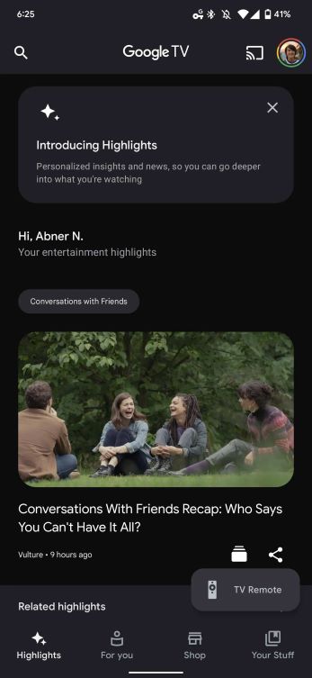
- Google has also begun to roll out the new Highlights feed, which displays a personalized feed of entertainment news and reviews based on your preferences.
Google has been gradually pushing for the Google TV app to become your go-to destination for discovering new movies and shows as well as managing your watchlist. To that end, the search giant has begun to roll out a new design for the app.
Perhaps the most noteworthy element of the redesign is the new "Highlights" tab, which displays a personalized feed of entertainment news, reviews, and more content based on movies and shows you like. In March, Google unveiled the new tab as part of a broader Android update for various services, including Google Photos, Gboard, live transcription, Google Assistant, and more.
According to 9to5Google, the Highlights feed is now available for some Google TV app users running version 4.32.50. The new tab includes a way to like or dislike a movie or show, in addition to YouTube videos and articles based on your preferences.
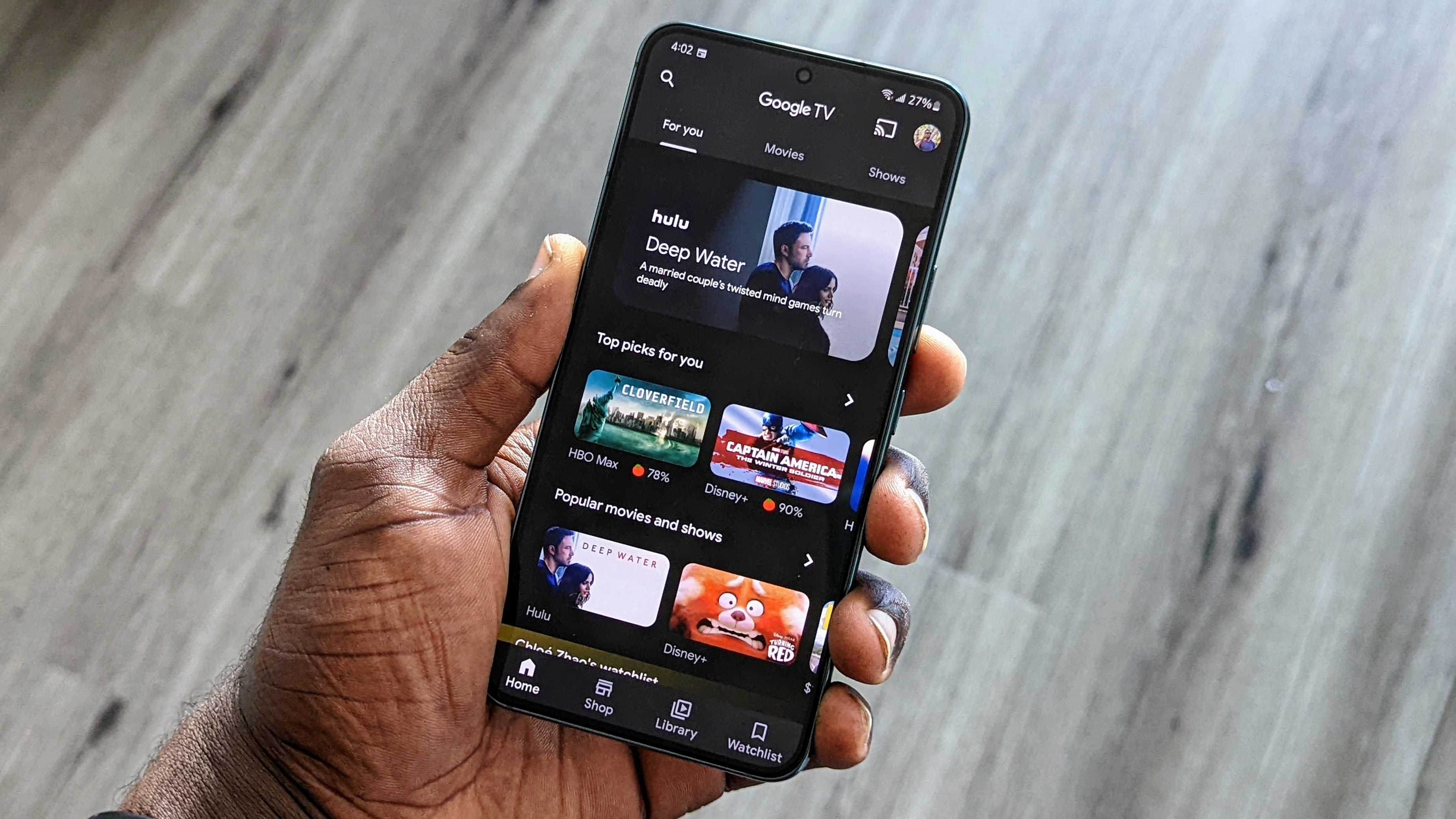
The feed sits as the first tab on the bottom navigation bar, replacing the Home tab. Speaking of that tab, it has now been replaced by the "For you" tab, which sits beside Highlights. Except for the new name and the removal of the "Movies" and "Shows" tabs at the top, there are no significant changes with the new tab. However, you can still access the shortcuts for those destinations by scrolling down the page.
Next to "For you" is the "Shop" tab, which will contain all the streaming content that you can rent or buy. These are currently all available in the Play Movies & TV section of the Play Store. Google announced in March that it would remove that tab as part of the transition this month. Given Google TV's deeper integration with many of the best Android TVs, the move makes sense.

Google has also combined the "Library" and "Watchlist" tabs, which were previously separate. It's now called "Your Stuff," though there aren't many changes.
However, the app's new design left out the Material You theme that Google teased in early March. It's still a welcome change that should make it easier to discover content and watch it directly on your TV, which will be a breeze once the Google TV app gains the ability to cast shows and movies directly to your TV later this year.
Be an expert in 5 minutes
Get the latest news from Android Central, your trusted companion in the world of Android

Jay Bonggolto always keeps a nose for news. He has been writing about consumer tech and apps for as long as he can remember, and he has used a variety of Android phones since falling in love with Jelly Bean. Send him a direct message via Twitter or LinkedIn.
