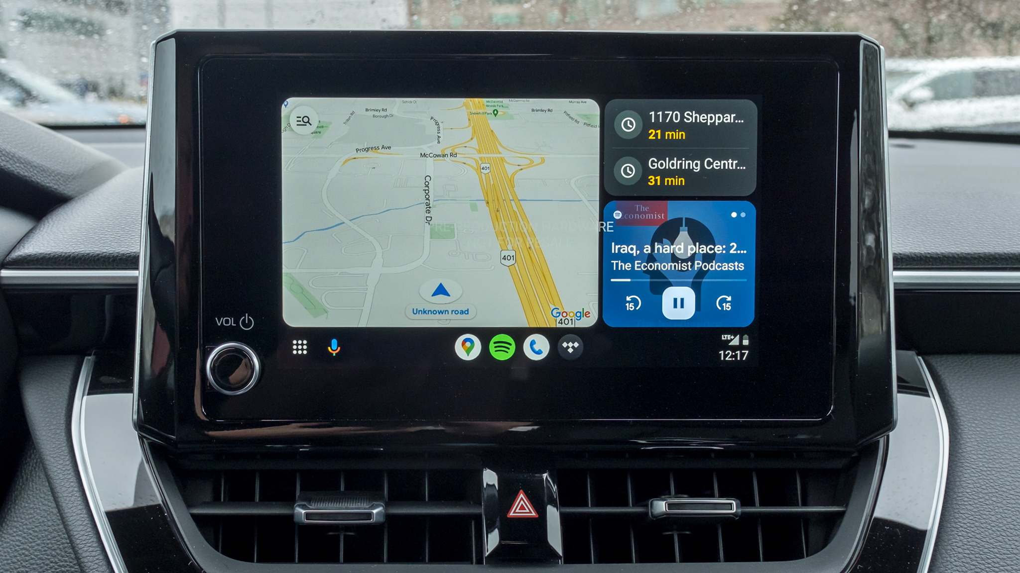
Google Maps' updated color scheme graces Android Auto as well
Those Apple Maps-inspired colors are now available across every platform imaginable.

What you need to know
- Google Maps' updated color scheme features mint green for parks and forests, along with shades of gray for roads.
- The new color scheme is not only reflected on the map itself but also extends to various UI elements, such as text, the navigation line, and the direction card.
- While the color change offers some usability improvements, it may initially feel jarring for users accustomed to the previous palette.
Google Maps is introducing a revamped color scheme on Android Auto, replacing warm colors with cooler tones.
The updated colors bring a more modern and vibrant feel to the navigation experience. Roads are now gray, water is a brighter greenish-blue, and parks are a bluish-green. This change is part of a wider rollout of updated colors and UI for Google Maps across all platforms (via 9to5Google).
The navigation line is now a more vibrant blue, making it easier to follow your route. The direction card at the top of the screen also gets a darker shade of green with improved text contrast. But the biggest change is the new color palette for different map elements. Parks and forests are now a refreshing mint green, making them stand out from roads, which are now a cool gray.
Street crossing signs pop in white, making them easier to spot when you're zoomed out. Plus, in nature spots, trail paths take a back seat in the new colors. Buildings and big structures are rocking shades of gray and light yellow. And freeways are going for a darker gray with a touch of blue.
The new color palette is not just limited to the map itself. It also applies to other parts of the UI, such as the text, the navigation line, and the direction card.
The updated Maps colors were previously made available on Android, iOS, and the web, embracing a cooler color palette that mirrors Apple Maps' aesthetics. However, this shift has raised concerns about color differentiation, particularly between water bodies and green spaces, which now share a similar tone. This could potentially make it challenging for users to accurately distinguish between these two elements on the map.
The update elicited mixed responses from users. While the changes are subtle, the shift from the familiar warm tones to a cooler palette can be jarring for those accustomed to the app's previous look.
Be an expert in 5 minutes
Get the latest news from Android Central, your trusted companion in the world of Android

Jay Bonggolto always keeps a nose for news. He has been writing about consumer tech and apps for as long as he can remember, and he has used a variety of Android phones since falling in love with Jelly Bean. Send him a direct message via Twitter or LinkedIn.
-
Mooncatt I don't know if "grace" is the proper term. The new pastel colors are fugly and the lower contrast makes it harder to read.Reply -
fuzzylumpkin Reply
Yeah, it's really not a good look, litterally or figuratively, given the purpose of the app. Navigation needs to be plain and clear, otherwise people get hurt.Mooncatt said:I don't know if "grace" is the proper term. The new pastel colors are fugly and the lower contrast makes it harder to read. -
spARTacus So far the new colour scheme and via Android Auto doesn't really bother me. However, didn't blow me away either. I think I figured it was basically a gimmick. I also think I first noticed it in my car about a week ago. On my tablet however, the new Google Maps layout for searches and directions sucks in landscape mode. Almost unusable.Reply -
mykey2k I only noticed the better blue line and card at the top. I use Google Maps in Satellite mode. If I wanted boring I'd use Waze or Apple Maps.Reply
