Android Auto tests a new Material You style redesign for settings
A cleaner, recognizable look.

What you need to know
- Android Auto beta tests a Material You redesign for its settings in its 8.6 build.
- The redesign brings its settings page more in line with Google's latest Material You design language across phones and apps.
- The new design is still being worked on as there are some inconsistencies with its design in the beta.
Android Auto seems to have an upcoming update in the works that will make a UI interface fall in line with other Google products.
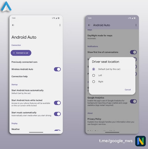
The new redesign that's pending a public release was posted by Google News on Telegram. Apparently, version 8.5 of Android Auto had brought in Material3SettingsActivity. This would only later become functional with beta version 8.6 where the function could be activated which would reveal the Material You-styled redesign for the Android Auto settings page.


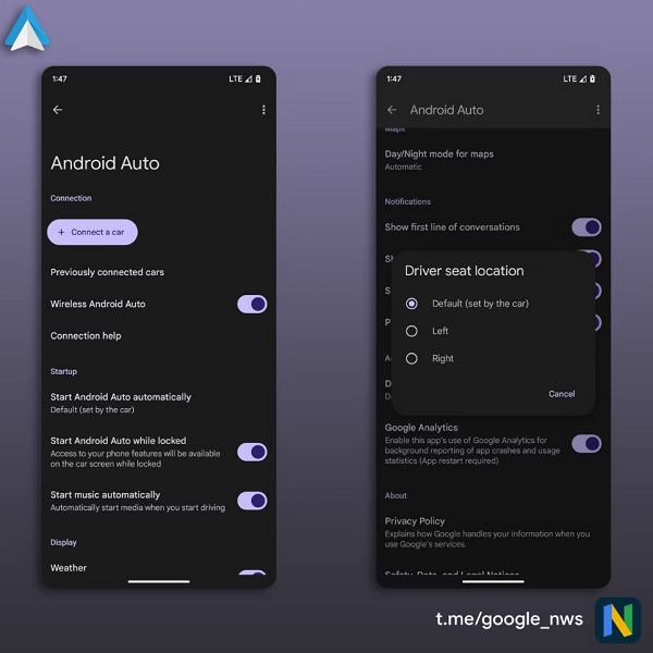
Android Auto's new settings design offers users the option of using either light or dark mode. The option of altering your design theme is most likely to conform to whatever theme you've chosen specifically for your device.
Google's recent iteration of Material You is playing a much larger role now with the header for this settings page being displayed much more prominently. Beneath it, and also with the toggleable settings, are Google's pill-shaped icons which are becoming more common across its apps.
The page's redesign is still in its testing phase as Google News informs that there are some slight inconsistencies with the work. When tapped, certain areas of the page are still displaying the old Material Design 1 that this new Material 3 version will end up replacing.
Google has been interested in unifying its ecosystem by incorporating its Material You design language for a seamless experience across all of its products. The company has been making adjustments by redesigning the Home app and by offering a dark-themed Google Assistant across its devices (to user disagreement).
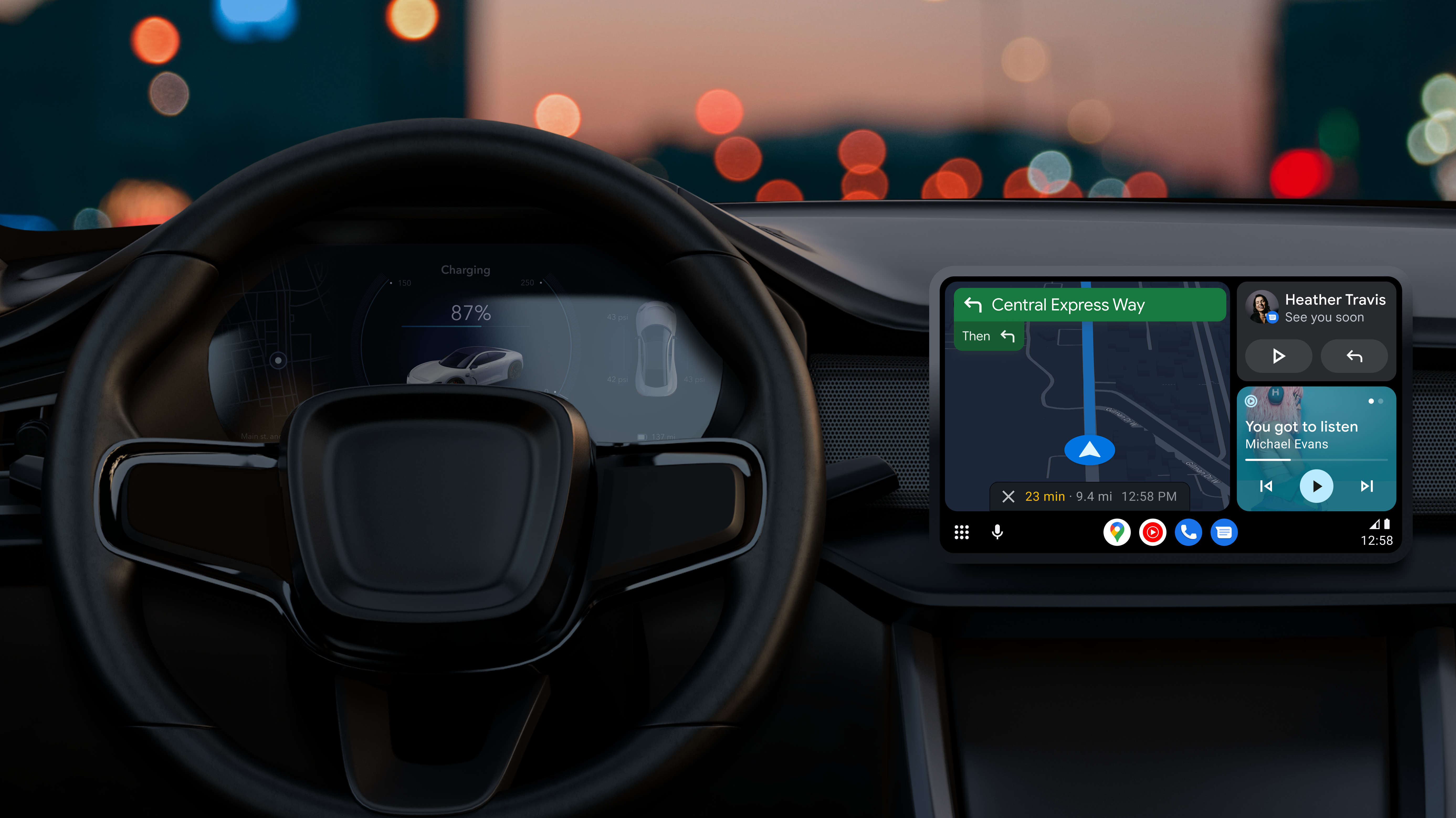
Additionally, Google has been working on retooling the design of Android Auto for users driving around town. Its Coolwalk redesign finally entered public testing two weeks ago which brings in new UI features such as split screen. Google has also touched up the media cards displayed on the display to grow or shrink depending on certain factors like if a user receives a message.
Be an expert in 5 minutes
Get the latest news from Android Central, your trusted companion in the world of Android

Nickolas is always excited about tech and getting his hands on it. Writing for him can vary from delivering the latest tech story to scribbling in his journal. When Nickolas isn't hitting a story, he's often grinding away at a game or chilling with a book in his hand.
