New Android Auto Coolwalk redesign finally enters public beta
It's finally here for anyone who wants to try it out.
Get the latest news from Android Central, your trusted companion in the world of Android
You are now subscribed
Your newsletter sign-up was successful
What you need to know
- Google announced a major redesign for Android Auto earlier this year.
- The update was originally expected to launch over the summer.
- Google is now releasing the updated UI as a public beta on the Play Store for users to try.
- The beta includes more than a few new changes since the redesign was first announced.
Earlier this year, Google revealed that it was preparing a major redesign for Android Auto. While we expected the Coolwalk design to arrive over the summer, it was eventually a no-show, leaving us wondering when (or even if) it would actually reach consumers. Well, the wait is finally over, as Google has launched a public beta of the new UI, bringing a few new features and changes along with it.
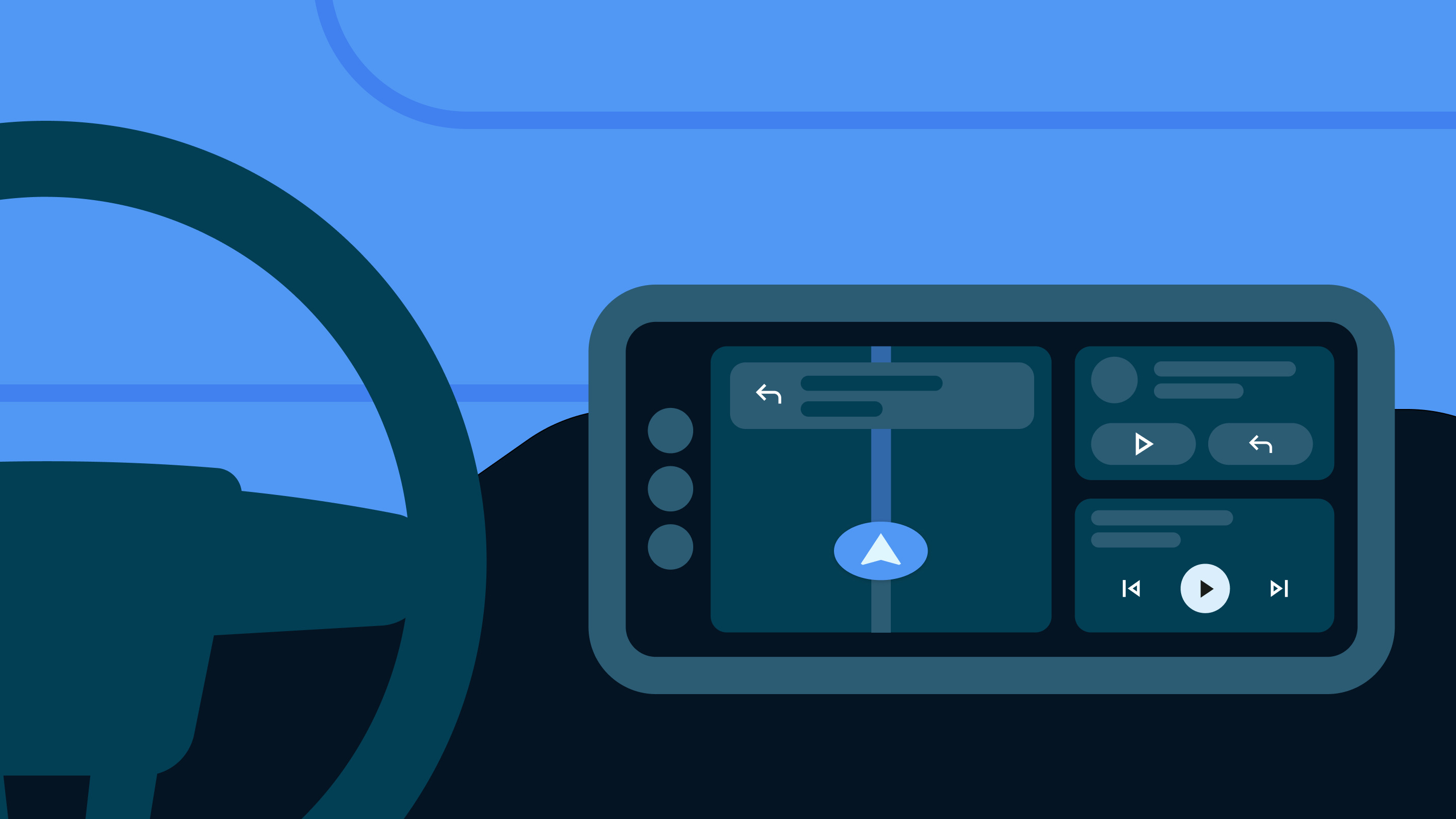
As a reminder, Coolwalk was introduced at Google I/O 2022, bringing a dynamic split screen UI to Android Auto that would adjust better to various screen sizes. The idea was to make the essential apps and features more easily accessible with just a tap, allowing drivers to focus better on the road.
It turns out Google was busy fine-tuning the experience, which appears to be the reason why it was delayed. As a result of some feedback from early testers, Google is now ready to give us the full picture of the features and changes we can expect with Coolwalk, along with a look that's been updated since it was first shown off.
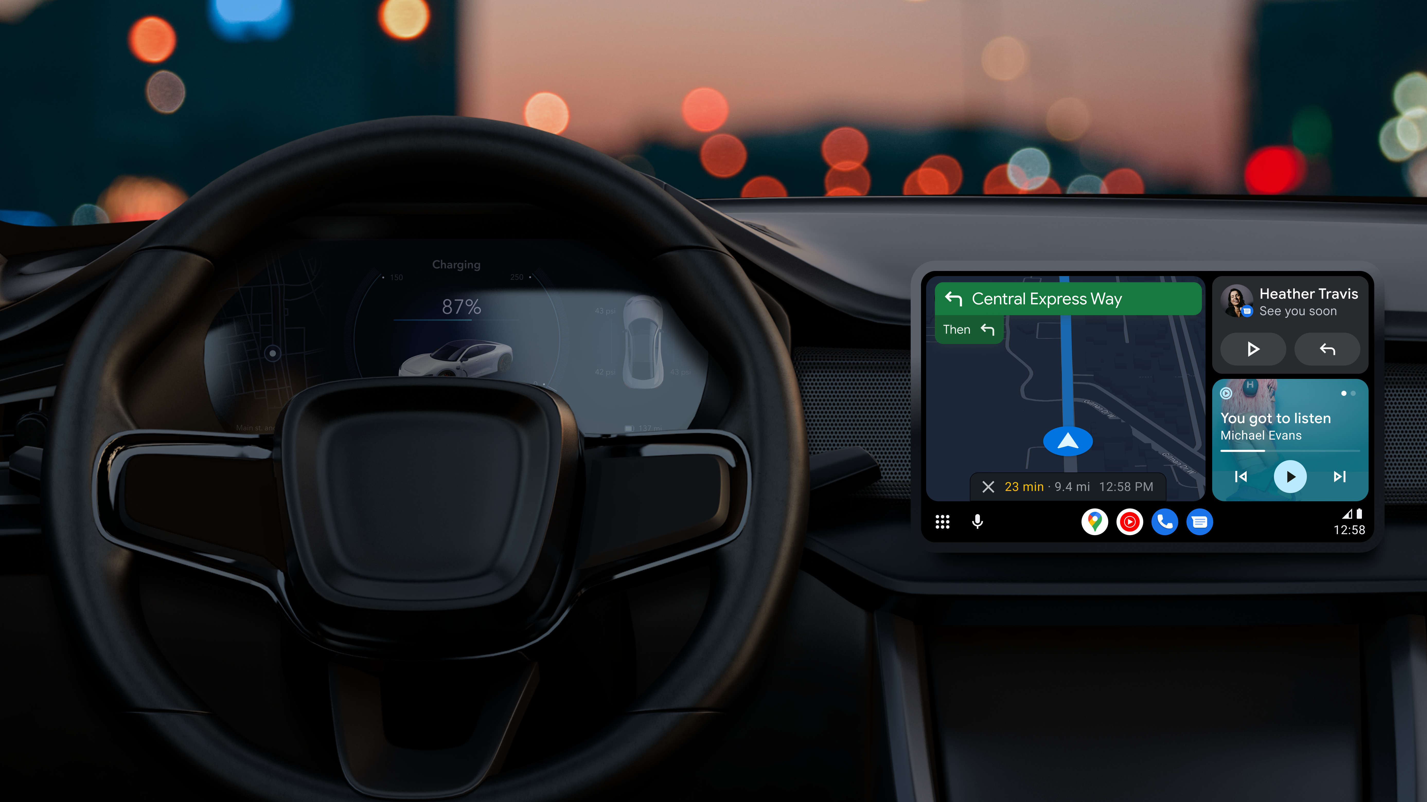
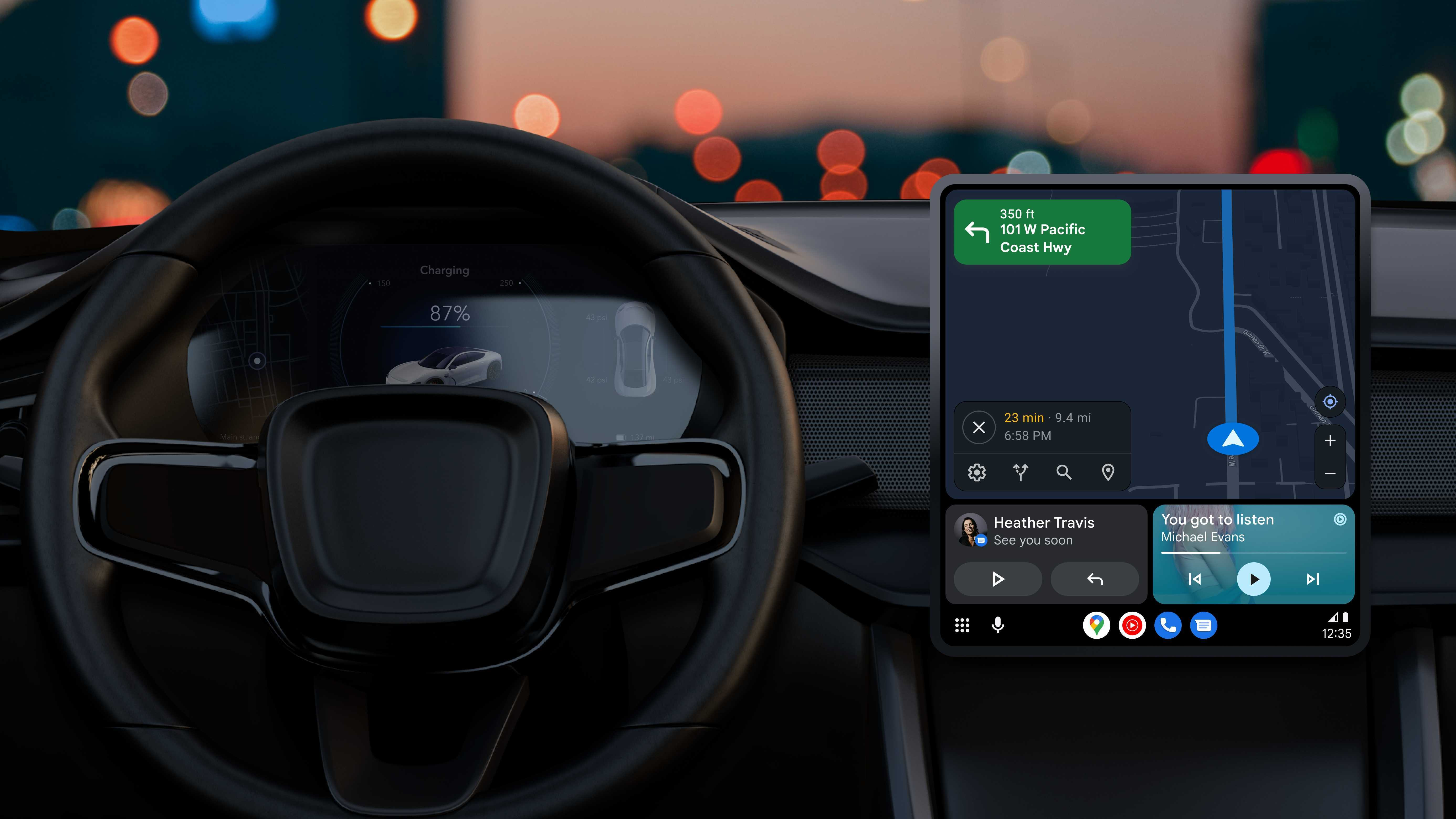
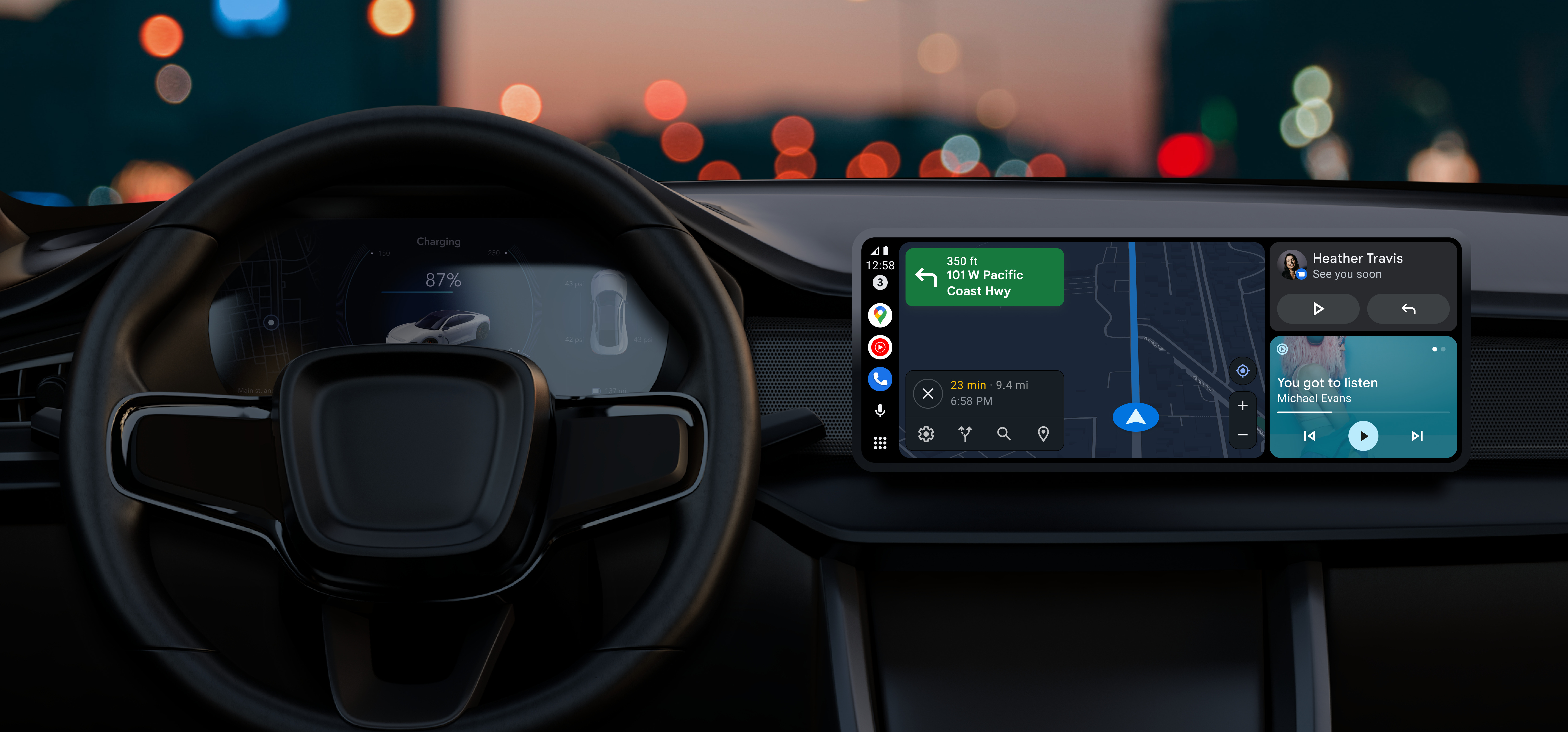
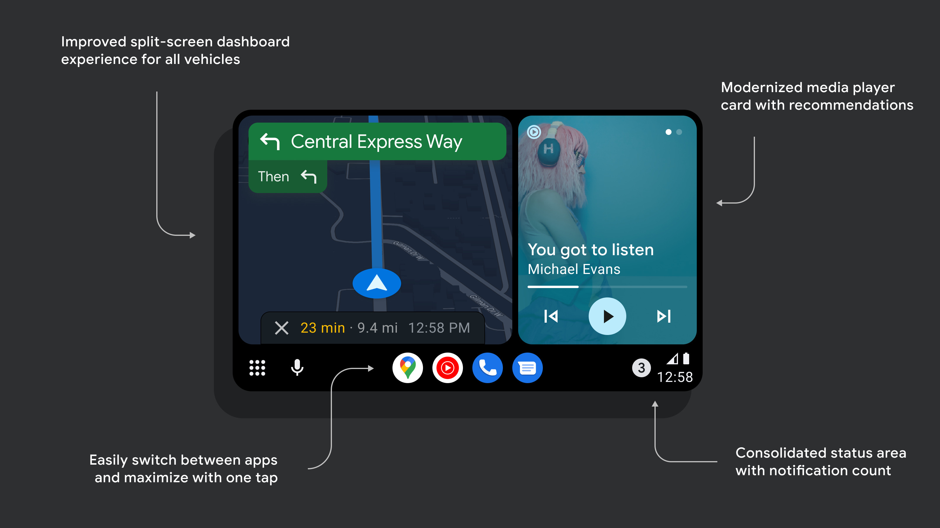
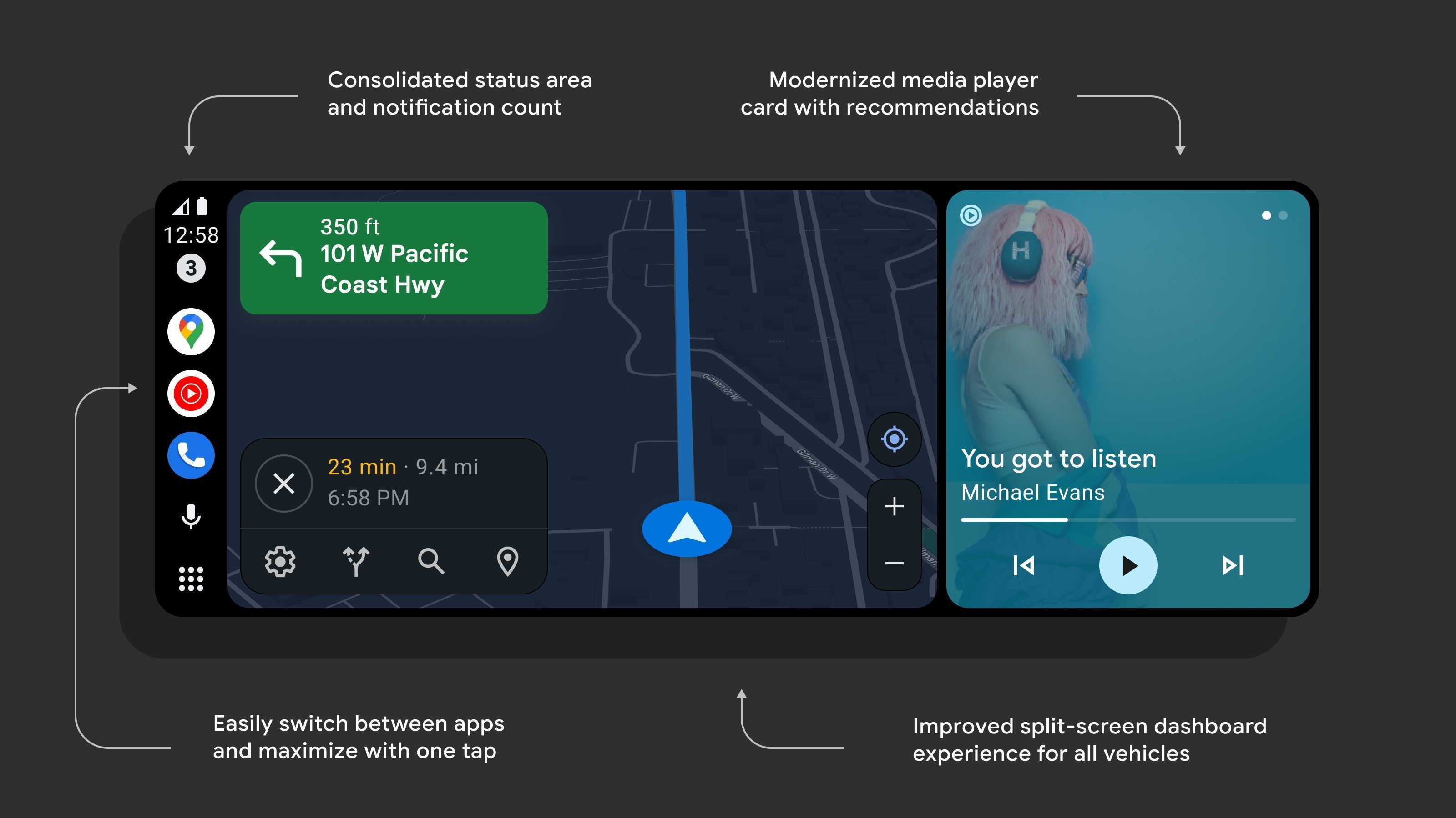
As part of the split screen UI, the map will be placed closer to the driver in the new dashboard for improved reachability. Users will also be able to change the size of the map, allowing it to fill the entire display if they so choose for a better look at their route.
Google has also redesigned the media card, allowing it to grow and shrink dynamically, such as when a new message comes in. It also lets users quickly access Google Assistant recommendations for media with just a swipe.
The app dock gets some changes, too, allowing users to easily switch between recent apps with one tap instead of having to dig in the app menu. Additionally, Google consolidates notifications and icons into one section so users can easily view the number of unread messages.
Lastly, Google says the overall UI has been updated to better match the company's Material You design language.
If you're interested in trying out the new Coolwalk redesign, you can sign up for the public beta through the Google Play store to get started, although you may have to wait for spots to open up if you're not already enrolled. As of now, it shows me that the testing program is currently full.
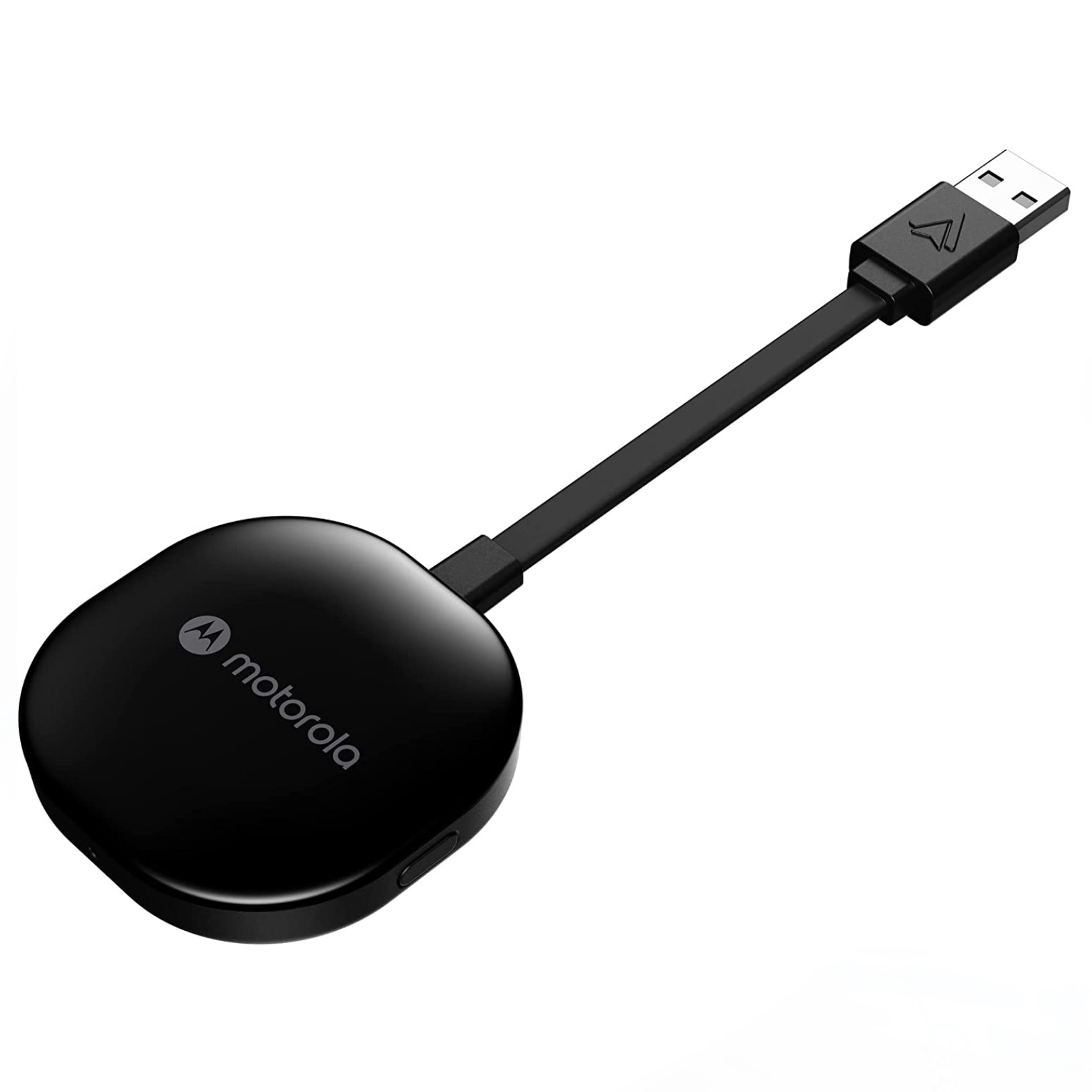
Want to use Android Auto without plugging in your phone every time? The Motorola MA1 is a neat little dongle that allows you to connect wirelessly, leaving your charging port free for whatever else you might need it for.
Get the latest news from Android Central, your trusted companion in the world of Android

Derrek is the managing editor of Android Central, helping to guide the site's editorial content and direction to reach and resonate with readers, old and new, who are just as passionate about tech as we are. He's been obsessed with mobile technology since he was 12, when he discovered the Nokia N90, and his love of flip phones and new form factors continues to this day. As a fitness enthusiast, he has always been curious about the intersection of tech and fitness. When he's not working, he's probably working out.
