Apple made the worst Android phone of 2021

Recently at its Worldwide Developer Conference, Apple unveiled iOS 15, macOS Monterey, and FaceTime for Android — well, kind of. The new FaceTime links capability isn't a native Android app; it just allows you to join FaceTime calls via your web browser using — you guessed it — a good old-fashioned hyperlink.
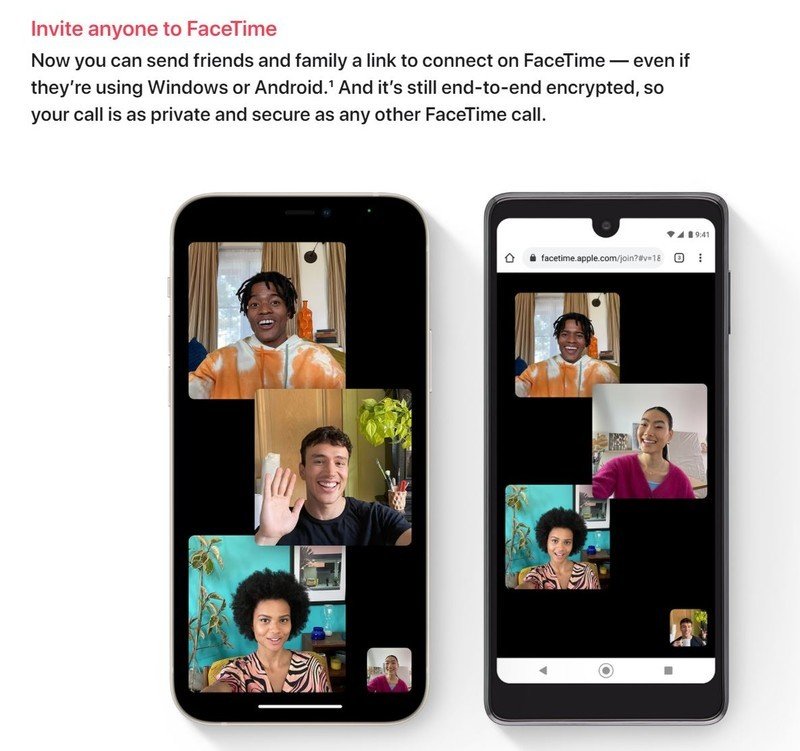
But while Apple expanded its ecosystem with some genuinely cool and impressive additions last week, the thing that caught my eye wasn't a new Apple feature or operating system. Instead, it was the company's take on what an Android phone looks like in 2021, which it used to demo the upcoming FaceTime experience for green-bubblers.
The phone appears on the official iOS 15 preview page and looks like this, presented next to Apple's latest iPhone 12 Pro.

Of course the Android device — that's the one on the right, by the way — isn't a real product.
Apple is just as adept at making deliberately ugly things as it is deliberately beautiful things.
Instead, Apple's terrible, hypothetical 2021 Android phone is an unholy cocktail of design elements from the past few years, assembled Frankenstein-style in the least appealing way possible. This nightmare of a telephone combines the dimple cutout notch of devices like the Essential Phone with thick, uneven bezels of the kind long since banished from any respectable handset, finished with a nasty plastic-looking outer frame.
The most infuriating thing about this design might be the presence of a notch housing the selfie camera in addition to a hefty top bezel which could also quite easily house the selfie camera. This is clearly what happens when someone goes out of their way to make a phone look deliberately, almost comically terrible.
Aside from the aneurysm-inducing screen borders and misaligned status bar, there also appears to be no power key present on this Android phone, presumably because nobody would ever want to switch it on.
Be an expert in 5 minutes
Get the latest news from Android Central, your trusted companion in the world of Android
In 2021, even the cheapest, crappiest Android phones look pretty decent when shown from the front in the form of a promotional render. This obviously presents a dilemma for Apple, whose goal is to demonstrate Android compatibility while still making Android phones, in general, look icky. Cupertino couldn't just show FaceTime on the latest Galaxy S21 Ultra. Aside from not wanting to highlight a direct competitor that actually exists, Apple would likely need to negotiate with Samsung to show the S21's mug on its website.
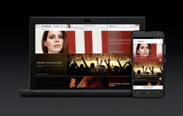
In fact, it's not the first time Apple has chosen to create its own deliberately gross-looking Android phone for the purpose of showcasing Android support. Back in 2015, when Apple Music debuted on PC and Android as well as Apple's platforms, we got this ancient Android artifact that looked about five years out of date.

And thus, today, we have the Apple Android Telephone 4G, only available from AT&T a sketchy eBay storefront with zero feedback score.
There's no official spec sheet for Apple's horrible Android concept device, but if one existed, it'd probably look something like this.
Android Telephone 4G Specifications
| Category | Features |
|---|---|
| CPU | ARM Cortex, er uhh.. *trails off* |
| RAM | Yes |
| Storage | Also yes (SD card soldered to the PCB) |
| Networking | "4G" HSPA+ with Enhanced Backhaul |
| Display | 1cm unnecessary, off-center notch with display area below |
| Camera | A single King Edward potato |
| Power | 6X AA batteries. Replace for instant fast charge. |
| Time | 9:41am |
| Other features | Can sometimes FaceTime with its iPhone-using betters |
| OS | Look, that's enough questions, alright, you want it or not? |
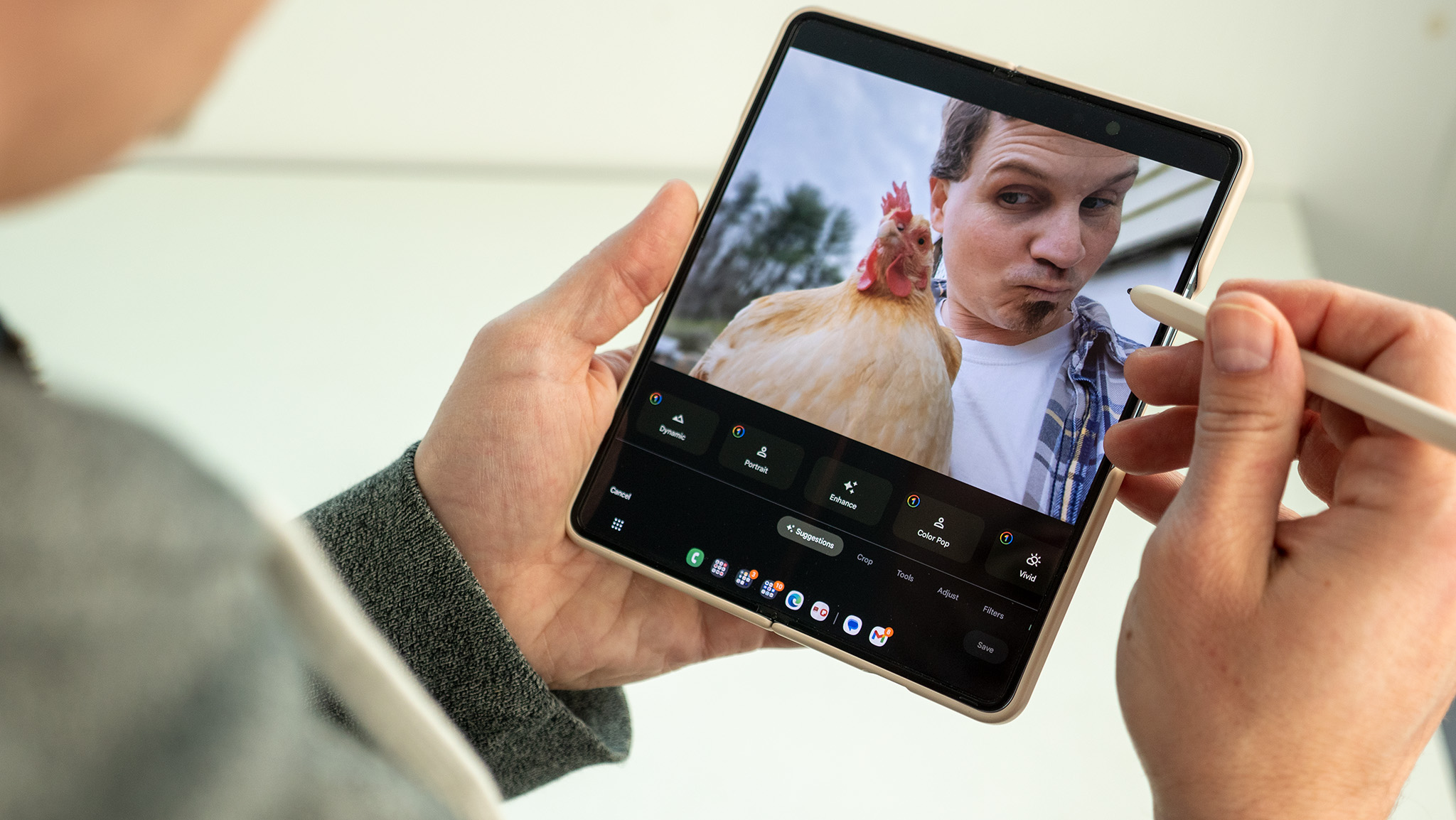
So maybe it's not the very best Android phone you can buy. But at least this guy seems happy enough with his purchase. (Or maybe, after eleven long years, he's just happy to see his friends.)


Alex was with Android Central for over a decade, producing written and video content for the site, and served as global Executive Editor from 2016 to 2022.
