iOS 14's App Library and widgets prove just how amazing Android's home screen has always been

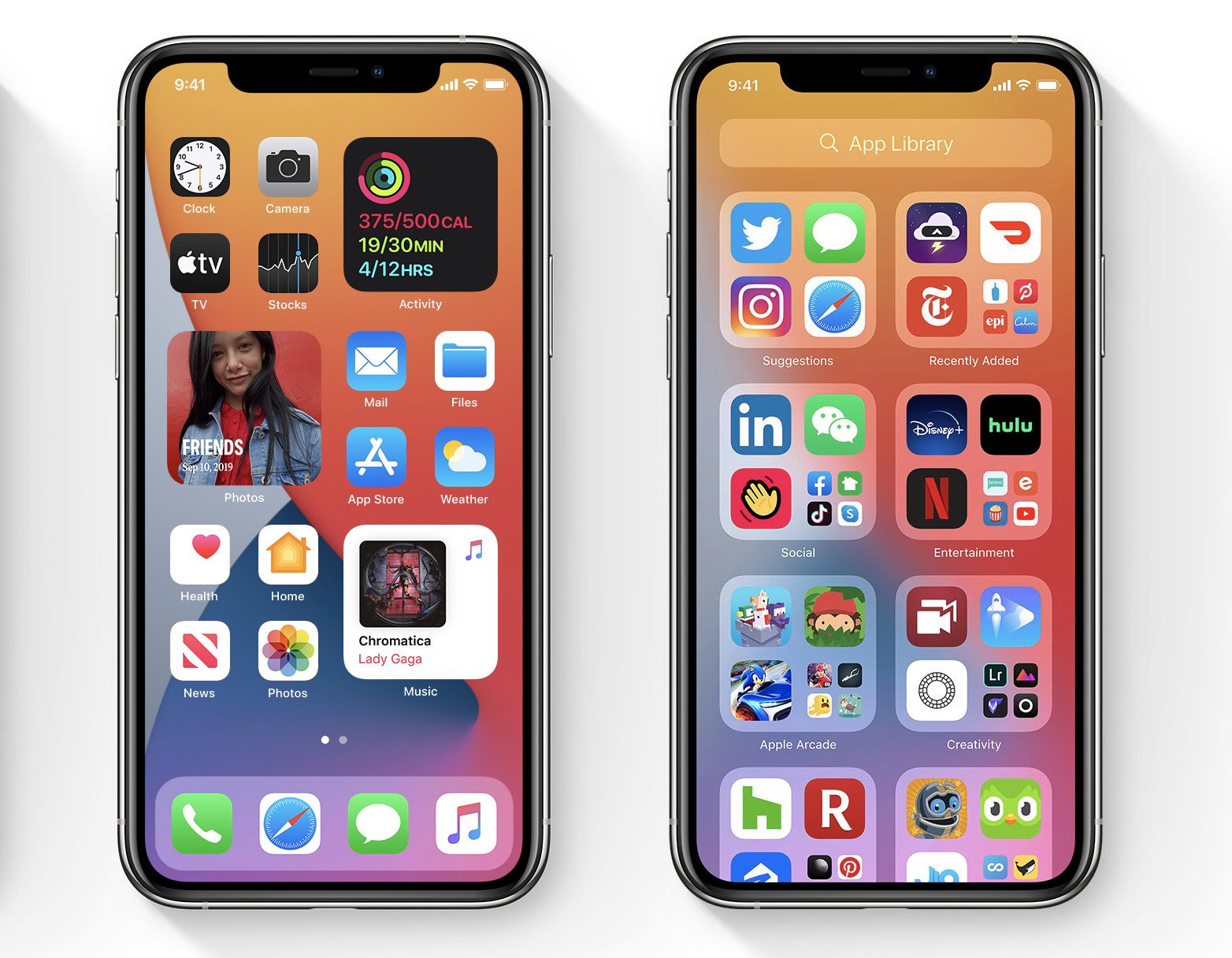
Apple's latest iPhone software, iOS 14, introduces one of the biggest visual and functional changes to the platform: a redesigned home screen experience with widgets and an app drawer. Like most iOS features from the past 10 years, there's some line that can be drawn to its appearance first on Android. But in this case, Apple's changes to the iPhone's home screen experience are actually directly competitive to what Android has — and in some ways, they're better.
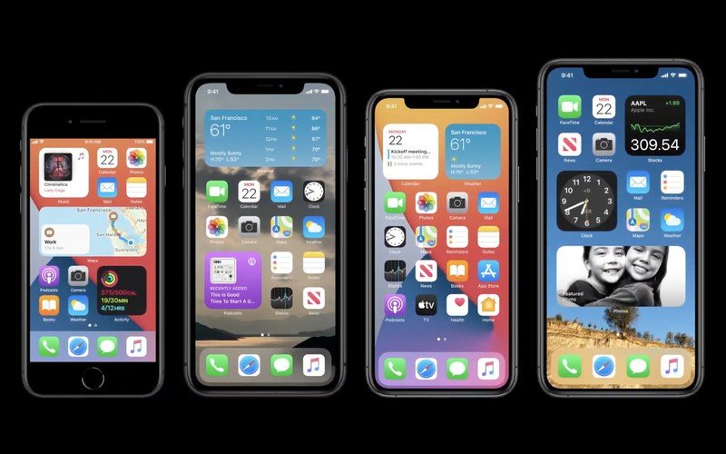
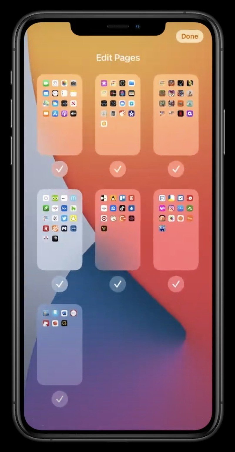
One of the oldest tropes in the technology world is how iOS has a "boring" home screen that's just a grid of icons. Well, now that's over: iOS 14 has a robust framework for dynamic and resizable widgets across your home screens, as well as options for deleting home screen pages to house your less-used apps in a separate auto-managed app library.

I fully expected iOS widgets to be restricted and basic, but they aren't — they follow most of the same characteristics as Android's. Widgets can be resized to 2x2, 4x2, or even larger, and dynamically update with information. They can be placed anywhere on the home screen, and you can have multiple widgets on each screen. Apple also has its own "smart stack" widget that comprises widget views from multiple apps and can update depending on the time of day — for example with news in the morning, calendar midday, and an activity summary in the evening. The only area I don't see Apple duplicating Android's functionality is in small app icon-sized widgets to launch specific functions, and widgets that scroll. (We'll get a better idea of the full restrictions soon, I'm sure.)
But the core place where Apple's widget system could beat out Android is the place where it wins constantly: app developer support. Widget support on Android is good, but it isn't universally great, and the quality varies widely. Despite recent kerfuffles, Apple has an incredible track record of getting developers to adopt new operating system features, and widgets will be no exception. And considering just how competitive developers are to get prominent "first page" positioning on your phone, any chance they have to take up the space of four (or more) apps on your home screen instead of just one is too good to resist. Being among the first apps to roll out an excellent iOS widget in its category will be huge for that app's exposure.

With less room across the main home screens for individual apps, Apple has finally given in and replicated Android's app drawer model. Rather than have every installed app strewn across home screen pages, you can now choose how many pages you want, and if you have too few pages to hold your apps, the apps will be consolidated into a new "app library" — aka, app drawer. This library categorizes apps into groups based on their function, and then highlights specific apps at the top with "suggestions" and "recently added" folders. Every app is available alphabetically too, and Spotlight search continues to be a dramatically better on-device search for pulling up apps than on any company's Android build.
This is absolutely an improvement for iOS, especially this far into its life where people are more than capable of handling the separation of home screens and the app library. You can easily argue that Apple has even done better than Android here with the auto-generated categories in the app library, particularly compared to some of the convoluted systems that Android makers put in place in their launchers (LG, why doesn't your app drawer stay sorted?!). Pick up any normal person's Android phone and you'll see a cringe-worthy hodgepodge of default folders and cruft, from the home screen to the app drawer — it's tough to say that a little bit of automation wouldn't be an improvement there.
Customizability and personalized functionality used to be Android's big wins over iOS. Now Apple offers a lot of that practical customization in the home screen experience, and in some ways does it a whole lot cleaner than Android does. And depending on how developer support evolves, we could see a situation where iPhone users are having a better widget experience than Android users — an odd flip of the narrative. Sure iOS still doesn't have replaceable launchers, icon packs, fonts or anything like that; but these changes are big for the functionality and daily experience of using an iPhone.
Be an expert in 5 minutes
Get the latest news from Android Central, your trusted companion in the world of Android
Sure Android did it first (by a long shot), but Apple's widgets and app drawer look really well done.
Now there is something to be said for this being "too little too late," as most Android users have already gone through the entire arc of being really excited about widgets, stagnating through the years of finding out that most widgets just aren't that useful, and settling in to where most people just use one, or maybe two, widgets and never try anything else. One thing we've learned on Android is that not all widgets are inherently useful, and you often prefer to just go into an app. But at least iPhone users have the opportunity to see what the hype has been about — even if most people will only use a single widget at any given time.
And regardless, they can finally learn the virtue of having an app drawer separate from the home screen pages. Whether it's a copy of Android or not isn't the point — this is clearly better than what iOS offered before.
Andrew was an Executive Editor, U.S. at Android Central between 2012 and 2020.

