Apple could be the best thing to ever happen to Android widgets in years
Traditionally, here's how new mobile features work: Android adds a functional but somewhat clumsy feature, developers lose interest in said feature in three to five years, Apple refines the feature to mesh with its "simplified" (read: boring) software design and repackages it for iOS, and then the feature is finally embraced and utilized on both platforms.
We've seen this time and time again: NFC payments, face unlocking, live wallpapers, the list goes on. But this year, Apple finally copied something that's been on my wishlist for years: home screen widgets.
Widgets aren't new to iOS; they've been available for the Today view and the lock screen since iOS 10, but with iOS 14 they're finally making the jump to the home screen and getting the ability to be resized rather than those full-width glanceable widgets we saw before. And this Android die-hard is cheering because if any section of the Android home screen really needs fresh energy, it's widgets.
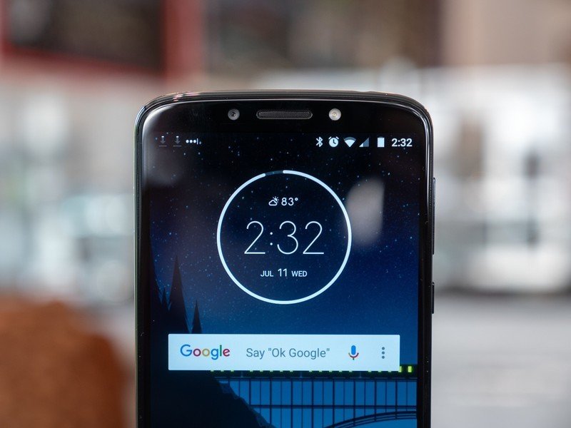
Android widgets have existed for longer than I've been an Android user, and I came to the party in January 2012. And since January 2012, there's been maybe three updates to widgets at a system level. This means that while most folks still have one (and only one) widget on their homescreen — a pre-installed time/weather widget like the At a Glance on Pixels or the Samsung Weather widget — most folks don't really know what widgets are or care that they're there.
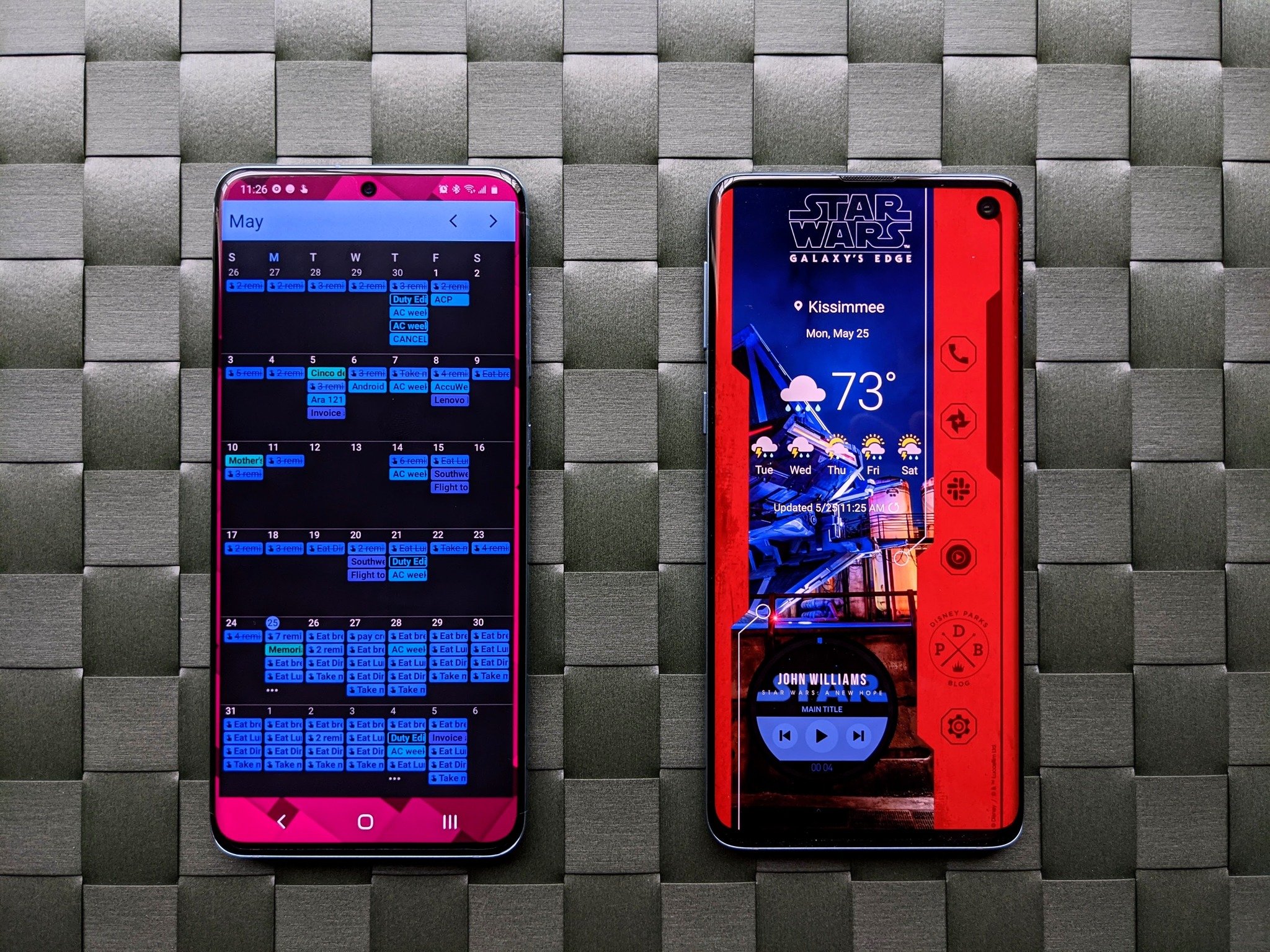
This is a shame because widget can be insanely useful when they're done well. Case in point: I'm a music fiend, so I like to keep a music widget on my home screen so that I can quickly pause or switch tracks while I'm moving from one app/activity to another. Back when I could traipse off the Walt Disney World in the afternoon or evening after working from home, I'd maintain a weather widget with an hourly forecast so I'd know when to start checking radar for approaching storms.
Widgets are useful. They're also staler than last year's fruitcake.
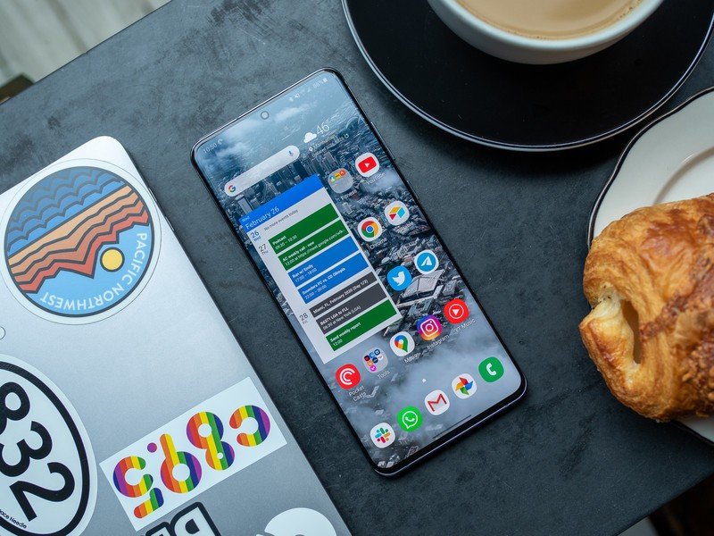
When you look at one of our phone reviews, you can tell when it's an Andrew Martonik review because he's had the same Google Calendar widget on his home screen for over five years now. Our own Daniel Bader keeps the Todoist widget handy, and Google Keep sat on my own home screen for years and years before I got into KWLP theming.
Widgets are one of those things that users tend to set and forget, and the same mindset seems to hold true for developers, with most apps seldom (if ever) updating its widgets. This is where Apple comes in: while developers are adding or updating widgets for Apple, there's a good chance they'll do the same for their Android widgets — after all, why do a job twice when you can do it properly the first time? — and hopefully this means that we'll finally get some new blood into a space that's been largely unchanged in the last three years.
Be an expert in 5 minutes
Get the latest news from Android Central, your trusted companion in the world of Android
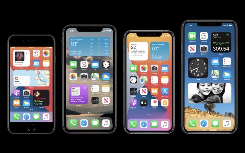
Apple's widget guidelines are going to be very specific — after all, Apple is nothing if not meticulous about its precious bubble-loving interface — so expect to see a lot of widgets gain that same bubbled edge in the next few months, but that attention to detail is something that Android widgets could use because like so many things on Android, design language on widgets is kind of like going to a bazaar: everyone's doing their own thing in their own style.
We wouldn't want Google making all widgets look exactly the same — after all, if they did that, KWLP and Android theming would be hobbled — but there are certainly a few things Google needs to fix with widgets, too:
- Widgets need to be saved/processed in a standardized way. Right now, widgets are handled in different ways by different launchers and don't back up properly, nor do they transfer along with your app layout when you're importing to a new launcher.
- Widget resizing should be more dynamic. KWGT and a couple of other widgets handle this well, but the large majority of app widgets do not do not resize well (if at all). By creating more uniform guidelines for dynamic widgets, Google could help make widgets more paletable than the 1x1 and 4x1 widgets that looks okay in 2014 but just look stale in 2020. This would also go a long way on Android tablets, where widgets have always looked god-awful because no one optimizes widgets for screens that size outside custom widget creators.
- Widgets should be universal. Whenever I look at the home screen of my Chromebook, I just let out a soft sigh. Such a wide canvas would be the perfect place to put some widgets like a calendar widget, or a Google Keep to do list, or the world clock that I currently have pinned to my dock as a Chrome app. Bring widgets to Chromebooks!
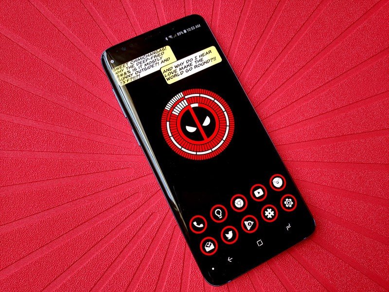
It's too late for these changes to come to Android 11, but they could certainly start working on them for next year. (And while they're at it, they could do the same for icon packs since Adaptive Icons aren't fixing their inconsistent icon issues.) Widgets are useful morning, noon, and night, and while they've been asleep at the wheel in Android for years, there are millions of users out there that could use a good widget if their favorite apps offered them up.
- Why wait for developers to act? Here's the best app for building your own sweet widget
Ara Wagoner was a staff writer at Android Central. She themes phones and pokes YouTube Music with a stick. When she's not writing about cases, Chromebooks, or customization, she's wandering around Walt Disney World. If you see her without headphones, RUN. You can follow her on Twitter at @arawagco.

