Android Wear 2.0 review: A massive upgrade for the wrist
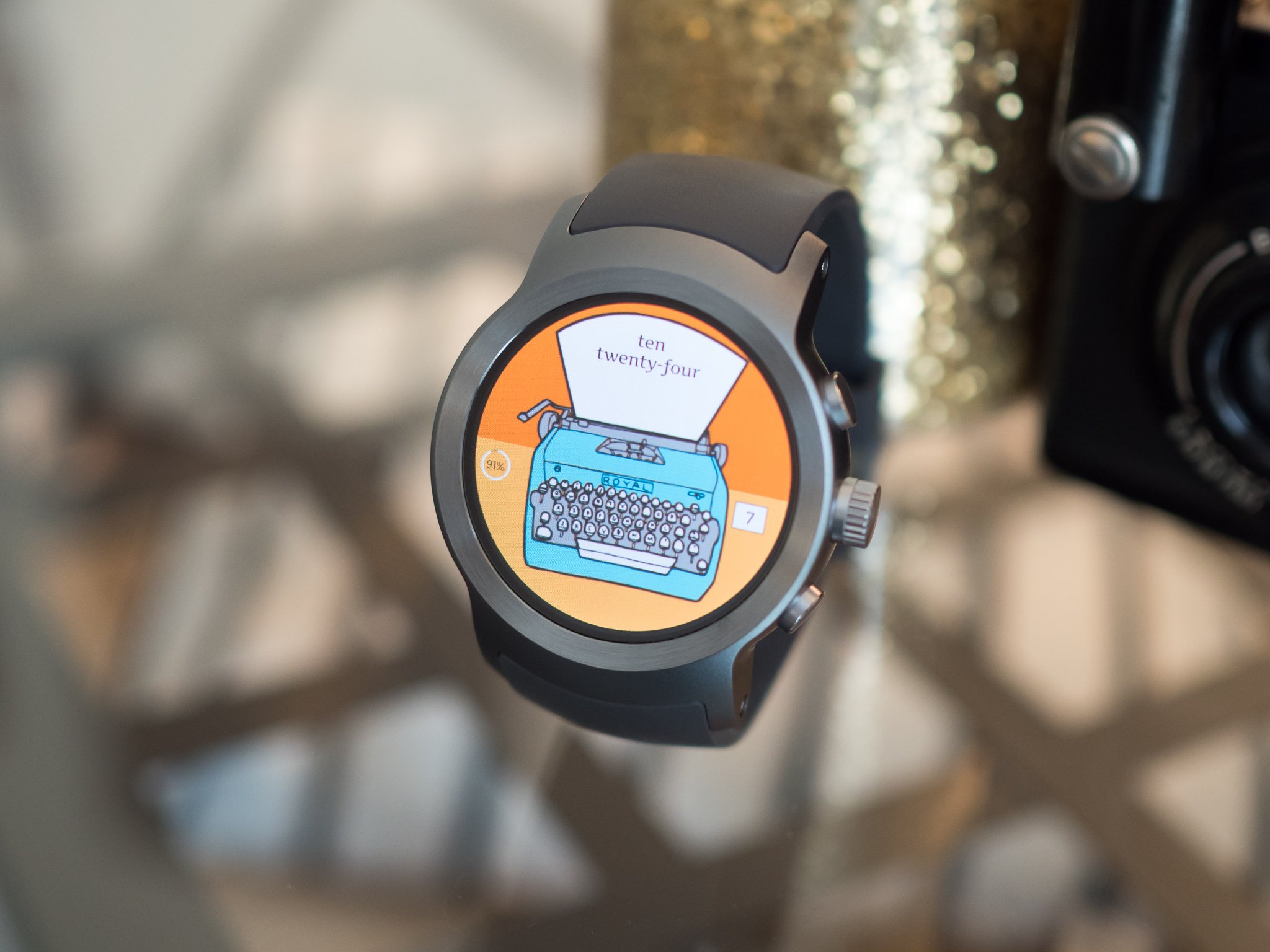
Are smartwatches dead? Are smartwatches the future? Is my sock drawer full of smartwatches? Over the last year, we've seen a lot of hand wringing and hot takes about the future of wrist computers. It doesn't really matter who the manufacturer is or what operating system is running on it, you can find opposing opinions on the future of this tech category. For Google's part, smartwatches started out as an extension of a larger wearables strategy. Android Wear wasn't going to just be for watches, it was going to be on anything connected that you wore. Why, Google Glass may one day be considered part of Android Wear.
For Google's part, smartwatches started out as an extension of a larger wearables strategy.
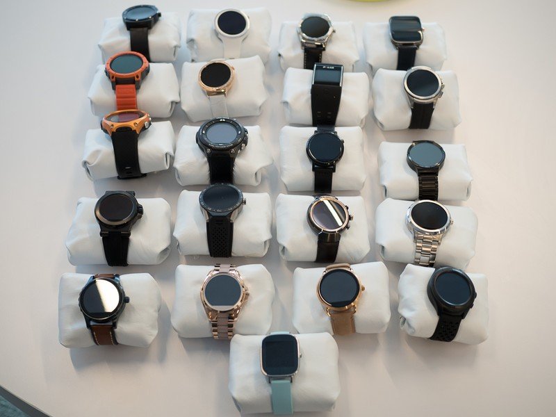
Plans change, and Android Wear has since become an OS for many different manufacturers to explore what people want in a wrist computer. It turns out there isn't one answer. Some of us want a thin, svelte notification portal to occasionally glance at. Some of us want a standalone phone on our wrist with Android Pay, storage for music, and a full fitness tracking experience. Some of us want to leave our phones in the water-tight box and use our watch as a fish finder. The point is, it became clear there was never going to be a single hardware design and feature set for everyone, and while Android Wear had made this diversity clear over the last two years in terms hardware, the software hasn't kept up.
Welcome to Android Wear 2.0, an almost-modular watch operating system built to make it easier to build a unique software experience on top of the hardware of your choice. But does that make this the watch OS for everyone... or for no one?
Hungry for more?
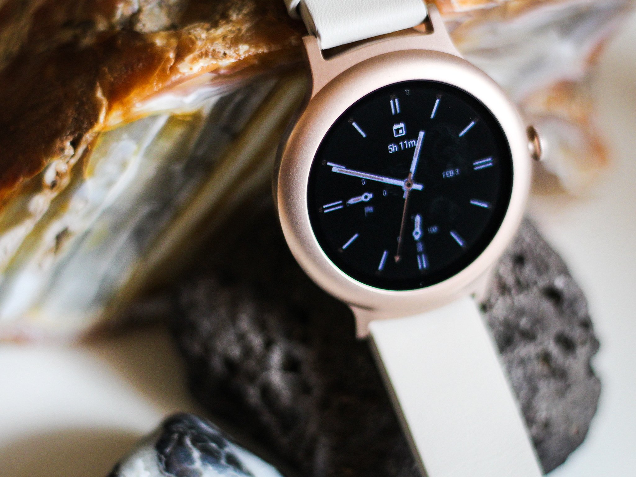
Android Wear 2.0 is a complete overhaul of Google's wearable platform, but the hardware is just as important. Check out what LG and Google have done together with two new watches built specifically for Android Wear 2.0!
- Read our complete LG Watch Sport review here!
- Read our complete LG Watch Style review here!
About this review
I'm writing this review after months of using Android Wear 2.0 in its Developer Preview form, with particular focus on the final build of the preview for two weeks. This review was written alongside the release of the LG Watch Sport and LG Watch Style, the first watches made with Google specifically for Wear 2.0.
Read more: These are the watches being updated to Android Wear 2.0
Be an expert in 5 minutes
Get the latest news from Android Central, your trusted companion in the world of Android
Assistant and Passwords and Play Store and More
Android Wear 2.0 Initial setup
In most situations, Android Wear is still very much a tethered platform. You connect it to your phone via Bluetooth, and through that connection the phone serves information to and receives instructions from the watch. In previous versions of Android Wear this relationship was always primary-secondary; the watch did nothing without information from the phone. Android Wear 2.0 changes this relationship quite a bit, turning the watch into a largely standalone platform that relies on the phone for a data connection to process instructions entirely on its own.
The initial pairing process for Android Wear hasn't changed much, but it is now step one in a much larger process. Your phone pairs to the watch, checks for software updates, and now asks you for your Google Account as though you were logging in to a new phone. You can move multiple accounts to the watch if you have more than one on your phone, allowing you to switch between work and personal if desired, and when the data is transferred you get a resting notification on your phone letting you know that a Google account was sent over. You know, just in case someone moved your account to a watch in order to steal your data.
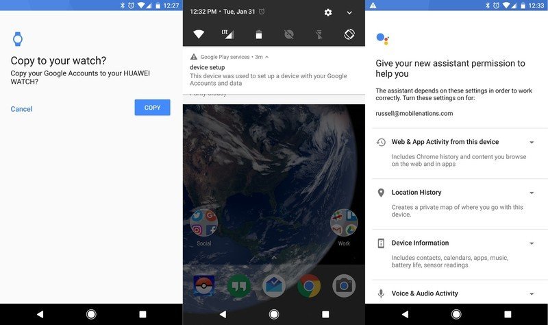
Unlike previous versions of Android Wear, you're far from done. No app icons have been moved from your phone to the watch, because apps don't exist simply as secondary access terminals to the app on your phone anymore. Android Wear apps are separate from Android phone apps, installed and in many cases used independently of the phone. This is great for keeping your watch free of a long list of icons you may never use, but it also means Google's staple apps aren't yet on your watch. If you want Hangouts or Google Maps, for example, you need to install them from the Play Store on the watch, or from the web straight to your watch.
If you want Hangouts or Google Maps, you need to install them from the Play Store on the watch.
Activating the Play Store and installing apps is simple enough, but now you need to enable any other features you may want to use on your watch before you're fully set up. Want to use Google Assistant from your wrist? You need to enable the feature on the watch, then go back to your phone and confirm on your phone you want Google Assistant on your watch. Android Pay, if your watch supports it, has a similar setup. You can only enable it on the watch if you have a lock screen set up on your wrist — yeah, you read that right — and then you can confirm on your phone you want Android Pay.
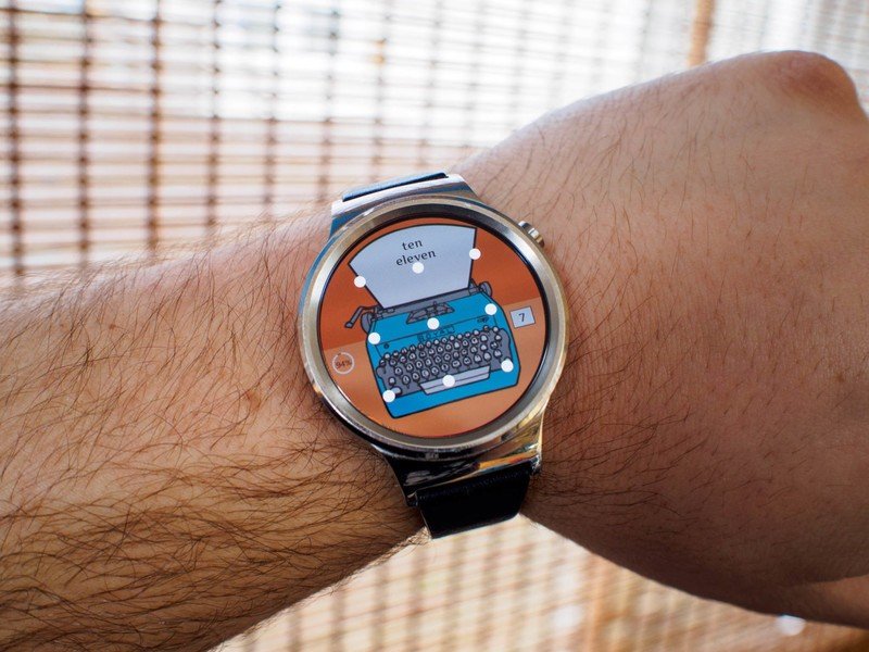
Android Wear security is just like Android security now. You can use pin unlock, password unlock, or pattern unlock. When this security measure is in place, you're asked to "unlock" your watch any time it leaves your wrist thanks to the heart rate monitor. Neither of these unlock mechanisms on your wrist is particularly convenient, but the pattern lock allows you to unlock your phone without using a keyboard on a 1.3-inch display. If you aren't using Android Pay, it's not a requirement to have the feature enabled.
The one great part about this setup process is the lack of prompts. After the setup tutorial to show you how to swipe notifications and choose watch faces, you don't have to to enable any of this. If all you want is a way to see notifications on your wrist and respond with your voice when you can, you never have to worry. If you do want these features, it means setting up an Android Wear 2.0 watch is considerably more complicated than it has been in the past. But it can also do much more.
Hope you like buttons and knobs
Android Wear 2.0 Interface
By the time you get to the end of setting up Android Wear 2.0, something about the user interface becomes abundantly clear — you're going to be doing a lot of scrolling. Previous iterations of Android Wear avoided interfaces that were more than a single swipe, unless it was an email or some other form of message. The interface itself was largely contained to single "cards", and that experience is now almost entirely gone.
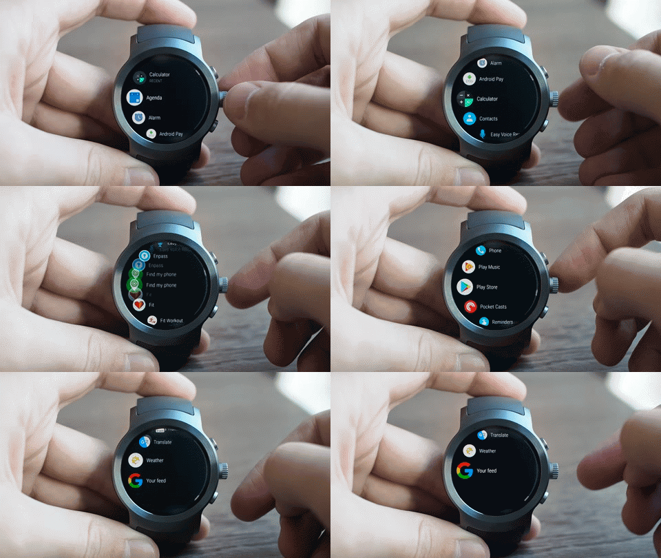
Every app scrolls; the app launcher scrolls; and of course your messages still scroll. The amount of swiping in Android Wear is significant, unless of course your watch has a rotating button on the side to scroll as you turn. It's clear from this design change Google anticipates a lot of future watches to include Gear S3-style rotating bezels or LG Watch Sport and Style rotating side buttons.
In an attempt to prepare for the future of Android Wear, there's some weirdness in using a hardware scrolling mechanism right now. As far as the OS is concerned, this rotating piece of hardware can be programmed to do multiple things. In most menus it scrolls up and down. In Google Maps it zooms in and out. Developers have the freedom to make this piece of hardware do whatever they want, and because not every app has been updated to support Android Wear 2.0 sometimes the thing you can do with the rotating hardware is nothing at all. It's a little confusing to spin the crown on the LG Watch Sport and, in some apps, have nothing at all happen, but this is likely to be a temporary frustration.
Developers have the freedom to make the rotating piece of hardware do whatever they want.
Perhaps more important than directly encouraging users to turn a button on the side of the watch is how much more frequently you'll be pressing them. In the past, the button on the side of your Android Wear watch was used to return you to the watch face or back out of a menu. The interface was a single large cascading menu for you to interact with, but with Google Assistant replacing Google Now, and your App Drawer living behind a button press, the physical button on the watch is now the primary interaction mechanism, which is significant.
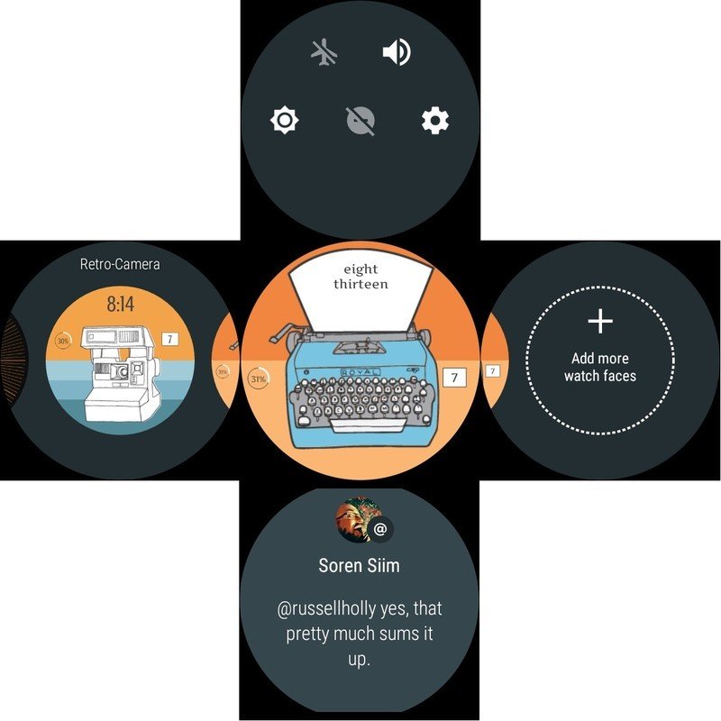
From the watch face, you can swipe down for quick settings, swipe up to see unread notifications, and swipe left and right to swap watch faces to whatever is stored on the watch. The button on the side accesses your app drawer, an alphabetical list of apps you have installed with the most recently used app at the top. Each app is standalone now, so you navigate to the app you want just like you would on your phone. If your Android Wear watch has multiple buttons on the body, these buttons can be programmed to launch specific apps so you're not stuck frequently swiping through the app drawer to get to them.
Notifications for Android Wear 2.0 are one of the best reflections of how Google's visual design has changed over the last two years. As a user, you are no longer sorting through a stack of digital cards as you triage notifications from your phone. Instead you have flat panels with muted colors and bright text filling the display. This new design increases information density, ensures the cards are easier to read in just about every environment, and there's some improved control over notification priority that has been desperately needed for a long time. Status notifications, like uploading something to Facebook, are sent to the bottom of the stack to disappear instead of placed on top to show you the thing you're already doing on your phone.
Overall, Android Wear 2.0 is a great deal simpler to navigate than its predecessors.
Quick Settings exists mostly to replace the features you lose on the watch button by moving the App Drawer and Google Assistant there. You can no longer double-click the button in order to activate Theater Mode, so instead you swipe down and tap on the sun in your Quick Settings. You can no longer triple-click to access the brightest mode the screen has to offer, so you swipe sown and tap the sun icon again. This section is a little more useful if you're able to turn cellular on and off on watches with LTE support, or if you regularly use the watch to control notifications in Do Not Disturb, but that's about it. It's a quick alternative, not really any better or worse than what was there before.
Overall, Android Wear 2.0 is a great deal simpler to navigate than its predecessors. You're unlikely to ever get lost in this interface, because everything is a direct action. If you're using apps, you press the button and go there. If you're checking notifications, they're always right in front of you. Gesture controls still work exactly the same as they always have, and the number of actions you take to complete most tasks is limited to one or two taps. This design can become as complicated as you choose depending on how many apps you use on a daily basis, but the overall design approaches simplicity from a new position and it works well.
Okay, so we're doing this
Android Wear 2.0 Features
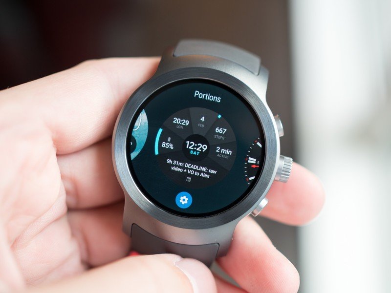
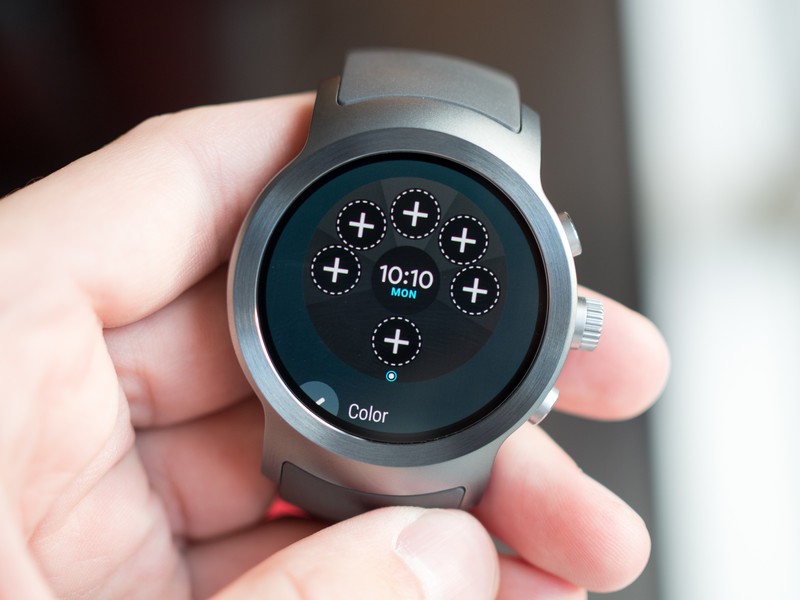
Visually, the face of Android Wear is going to appear very similar. Watch faces are available by the truckload in the Play Store, and that's not going to go away anytime soon. What you will start to see is an effort to make those watch faces a great deal more customizable, and useful, than we've seen in the past, thanks to Google's new Complications API.
This setup has been cribbed right from the Moto 360, and it's fantastic. Watch face creators can now designate areas on the face for users to plug in information from all over the watch. Any app that supports complications can feed data to the face, and users get to choose how that information fits. We're already seeing several watch face creators moving to implement this API in the Developer Preview, which means tons of new options for the already massive list of watch faces.
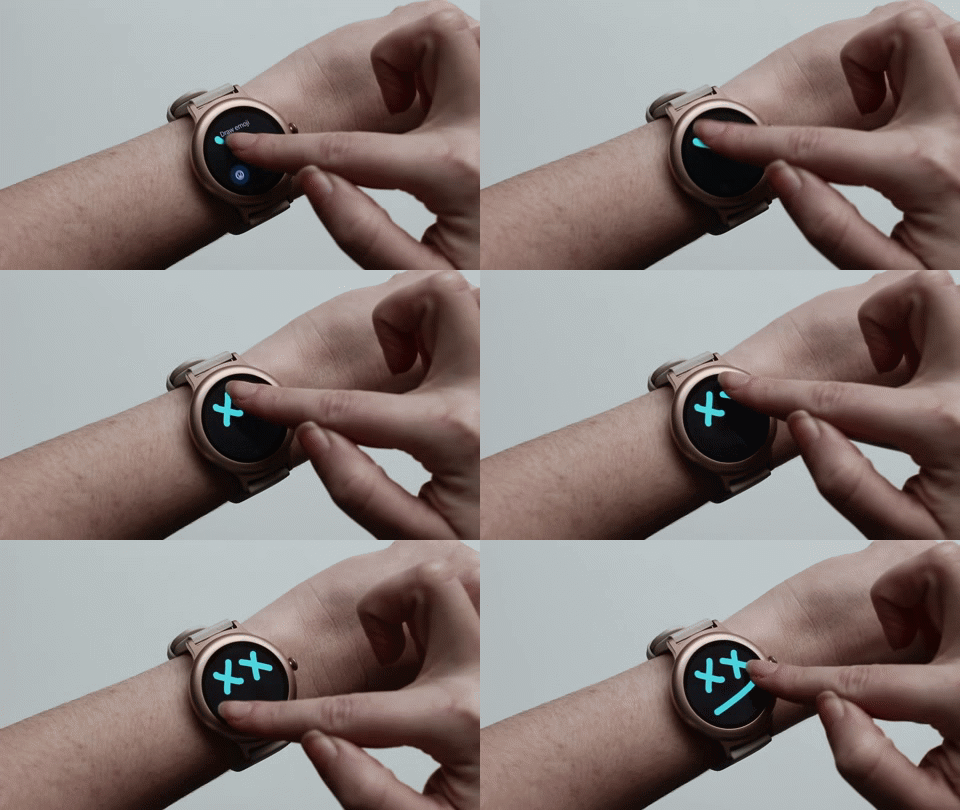
The biggest feature changes in Android Wear 2.0 fall into place when you go to use the watch as though your phone is just there to serve data. Some of this sounds downright silly when you say it out loud — replying to emoji by drawing on the screen, swiping on a teeny tiny virtual keyboard when voice alone is insufficient, or scrolling through the Play Store on your wrist in search of new apps.
Existing Android Wear owners may frown on these kinds of interactions, due to the size of the display and the kind of latency expected with these experience, and in some cases they'll probably be right. But Android Wear 2.0 does not exist for a single kind of user. If you're someone who has no interest in keyboards and emoji, there's never a situation where you're forced to use it. Everywhere you find handwriting and emoji writing, you'll also find voice and quick replies.

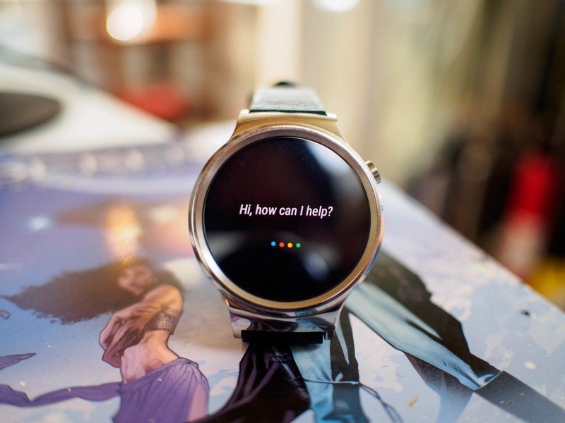
The same can be said for Google Assistant. You can choose to have your watch always listening for the Assistant launch phrase, but it's frequently not as fast to launch as your phone or Google Home. Being able to say "OK Google" while your phone sits on the table or in the cupholder of your car is not the same as pressing and holding the button on your watch until the four colorful orbs show up, either. The important thing about Assistant being on your wrist is that it's there just in case. It's a way to fill the gap for some interactions, and for others it could very well become the default way to use the service.
Android Wear 2.0 does not exist for a single kind of user.
In the quest to create individual Googles for everyone, Assistant needs to be everywhere and work identically. The biggest challenge associated with Assistant on the wrist right now is lag. If Assistant isn't immediately available, like it is elsewhere, it's simply less useful on the wrist. It's likely this will be where we see older Android Wear watches running the 2.0 update appear less optimized.
Google's big shift in Android Wear with the 2.0 update is apps. Being able to install apps on your watch and have them run entirely independently of your phone is significant. People who almost never use Google Keep on their phone but love having lists on their wrists can accomplish this without cluttering up the primary app drawer. Fitness apps can be built specifically for Wear that require no phone at all. This is how Google creates the same Android Wear experience regardless of the phone platform you're using. If the app is on the Play Store, and the Play Store is on the wrist, it won't matter that you have an iPhone connected.

But there are things missing from this isolated experience that complicates Wear in ways that aren't entirely necessary. Play on Android Wear is slow, often taking anywhere from 3-5 seconds to fully load. The auto-update feature that is enabled by default doesn't tell you when an app has been updated or why, and choosing to do so manually is tedious. You also can't really tell from the watch how much data you're using in any meaningful way, which means you have to check with your phone.
This is by far the most complete feeling version of Android Wear to date.
An important part of any OS that doesn't get nearly as much attention as it deserved most of the time is the Accessibility section, and the biggest addition to Android Wear in this particular category is that it now actually has an Accessibility section. Magnification gestures allow you to triple tap on the screen and zoom in, text-to-speech and TalkBack modes use the speaker to read content to you, Select to Speak will call out menu options, and you can even set the power button to end a call.
These features combined make it clear Google is thinking about watches as more than just luxury items. This now becomes an emergency communication tool for the elderly, an assistive device for the blind, and a functional alternative to a large phone when that simply isn't an option for someone.
We know that Google is still working with developers to do more with Wear as 2.0 is adopted by more manufacturers as well. The ability to launch apps based on behavior — fitness apps launching when the watch detects a significant amount of movement — is something we'll see a lot more of in the coming year. In previous versions of Android Wear it felt like Google had created a lot of options and then waited for developers to wander in and create things for users. Android Wear 2.0 is a lot more focused on letting users build their own experience, which allows developers to help users adjust that experience as the need arises. It's a big shift, and it requires a little more work on behalf of the user than previous attempts at wearables, but this is by far the most complete feeling version of Android Wear to date as a result.
Go make it your own
Android Wear 2.0 Bottom line
So what is this new version of Android Wear, exactly? Is it an attempt to put a phone on your wrist? Could this be a way to sneak the Play Store onto the wrists of iPhone users? Is this an attempt to fight off stagnation by stuffing in every feature your relatively small user base demands? In a way, it's probably all of these things. But in the process, it's actually none of these things.
Android Wear 2.0 is the perfect encapsulation of "Be Together, Not the Same" in hardware form. Google was already ahead of the pack with personalization in the form of watch faces, and by enabling hardware manufacturers to offer more unique watches there's a lot of potential for this platform moving forward. No two people are going to have the exact same experience, but at the same time there's a consistency that can be appreciated by anyone interested in having a computer on their wrist that also tells time.

