Android quick settings, ranked
None of us wants to go digging into a long list of settings and menus just to toggle Bluetooth or adjust the screen brightness on our phone. That's why we have quick settings in our notification shade. All hail the quick settings and long may they reign. But like everything else, not all quick setting implementations are created equal.
That means we need to look at the offerings from the big five — Google, HTC, LG, Motorola and Samsung — and see who does it the best. This is not a scientific kind of look. No slide rules or amperage meters were involved, and my dog was the only animal used in the testing procedure (he thinks they are all delicious, by the way). This is just me using these phones and seeing which one I complain about the least when I want to turn Wifi on or lock my phone into portrait to do some reading.
Enough about the rigorous testing procedures that left me thirsty and miserable. Let's get to the ranking.
HTC
HTC has the best quick settings.
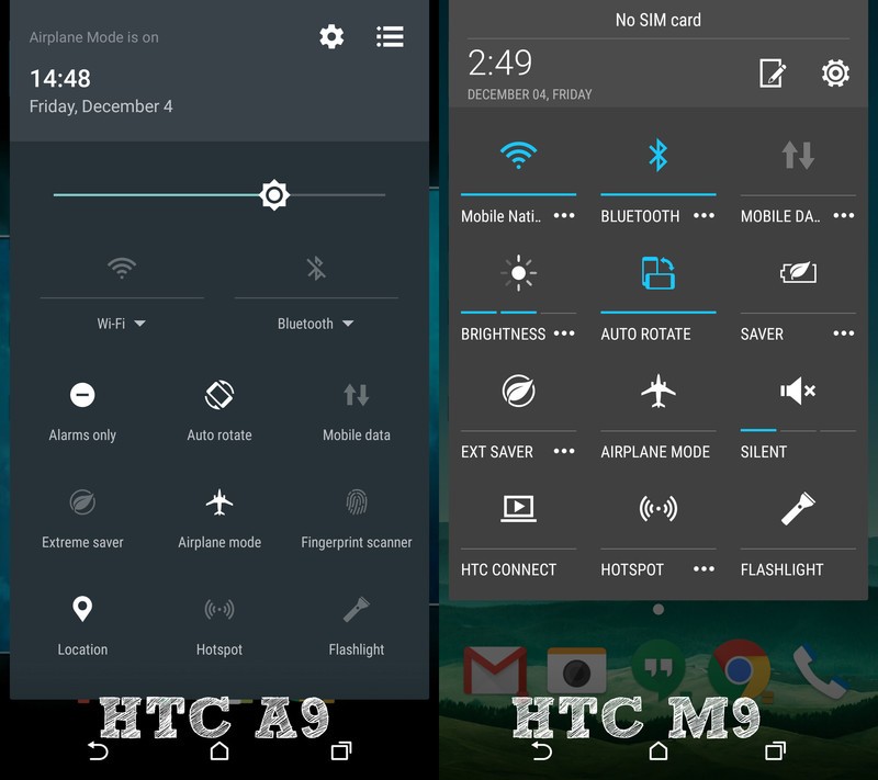
They use the gesture method, where you can pull down with two fingers (or pull down normally, twice) and that means two things — real estate in the notification pane isn't taken by settings and sliders that are always in your face, and you can have access to more settings without any scrolling around. I want to see all the settings I think are important, not just a few. And I don't want half of the room for notifications taken by them all the time.
HTC wins over Google or Motorola because they have more (and arguably better) settings, not because their implementation is better. And because Sense 7, as seen on the A9, brings the brightness slider back to the quick settings panel.
Nice work HTC.
Be an expert in 5 minutes
Get the latest news from Android Central, your trusted companion in the world of Android
Google Nexus
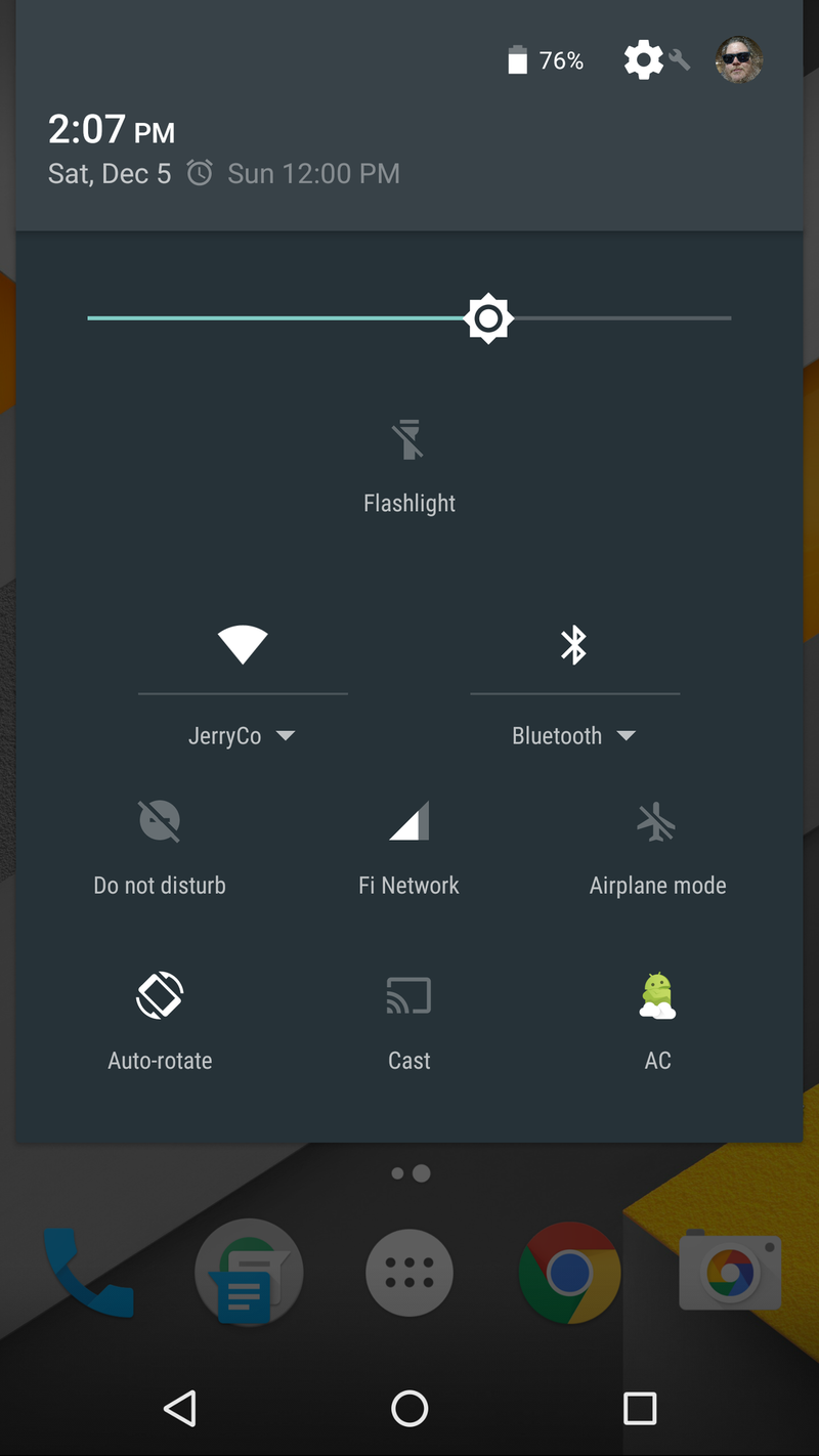
Coming in at number two is Google's own Nexus software. Missing a few settings — like a battery saver toggle — means the Nexus software only gets second place. You still can use a two-finger gesture to pull the settings panel down to keep it from being visible all the time, but to be the best means you need to have access to all the important things.
What makes the Nexus quick settings better than Motorola's almost perfect clone? System UI tuner and an app like Custom Quick Settings. I like changing what I see and how I see it, and being able to add a shortcut to just about anything via an app from Google Play is pretty awesome.
Motorola
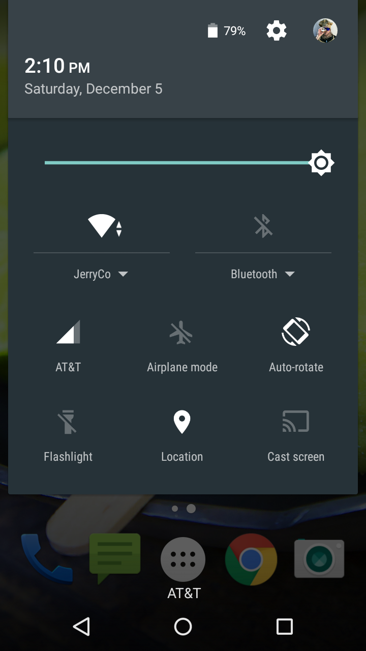
Nothing fancy. Nothing silly. Just what you need made easy to get to without forcing me to scroll to read my notifications. Long live gestures, or something.
Really, I don't much care for gestures because I use too many phones with too many gestures. But I can remember the two-finger swipe because it's pretty universal. Something like Nova Launcher and its infinitely customizable gesture settings — seriously I think you can set a gesture to take out the garbage on Tuesday with Nova — might be easier and only require one hand, and if you're not trying to juggle four or five phones at one time you should look into it.
Samsung
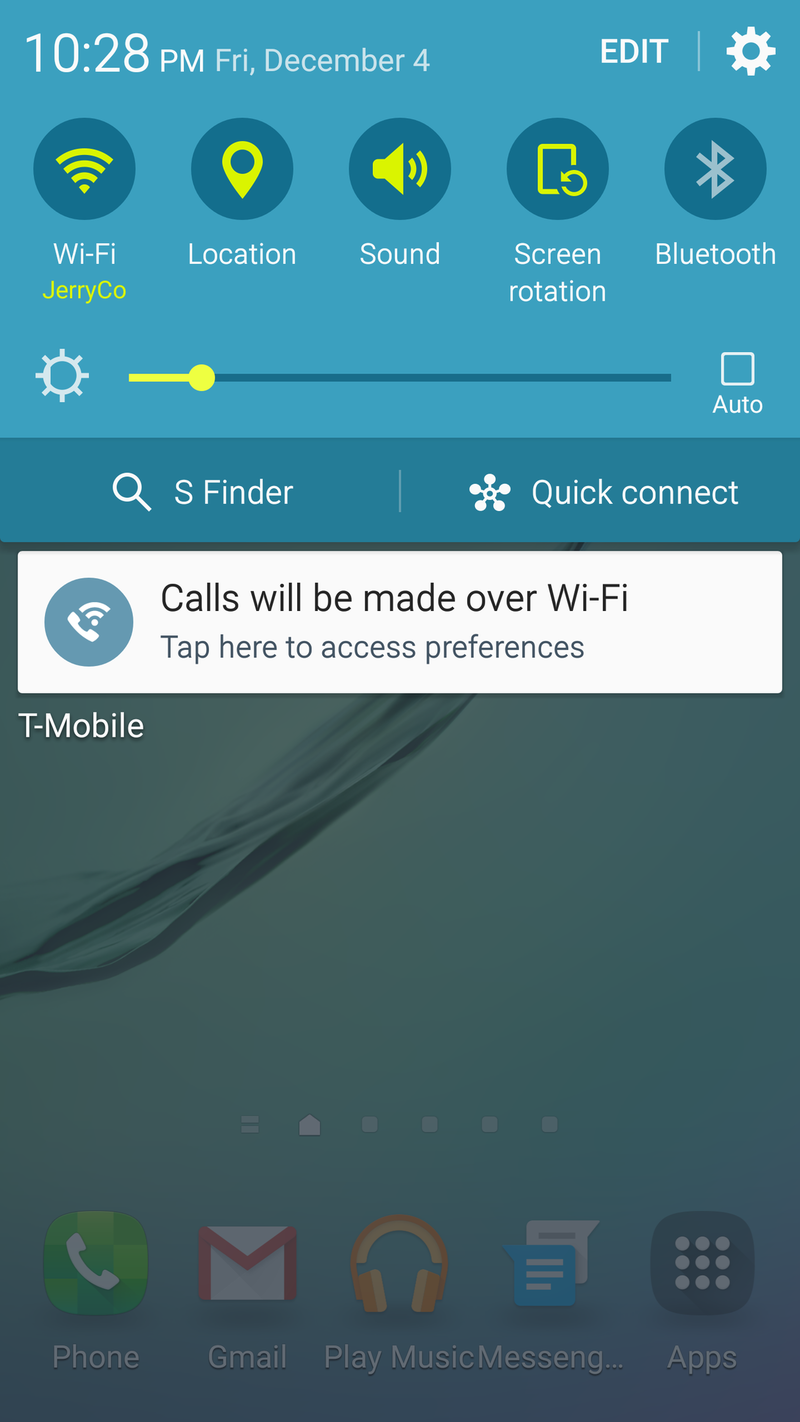
Wow. Such blue. So Impress.
Credit to Samsung for carrying on with their color scheme in the quick settings. The blue on the S6 edge is really a nice touch. Too bad I have to see it all the time.
I want to be able to toggle a few things and adjust my brightness quickly, so I want quick settings. But I also want to be able to see notifications from all my email accounts, or social media accounts or IM accounts and everything else without having to scroll down or dismiss the ones at the top to see the ones at the bottom.
If Samsung implemented a way to separate quick settings from notifications (maybe tap the home button while you have the tray open or something) they would get the number one spot because I like the blue. We have color screens for a reason. It's 2015 for crying out loud. Add your own bit of outrage to finish things off here.
LG
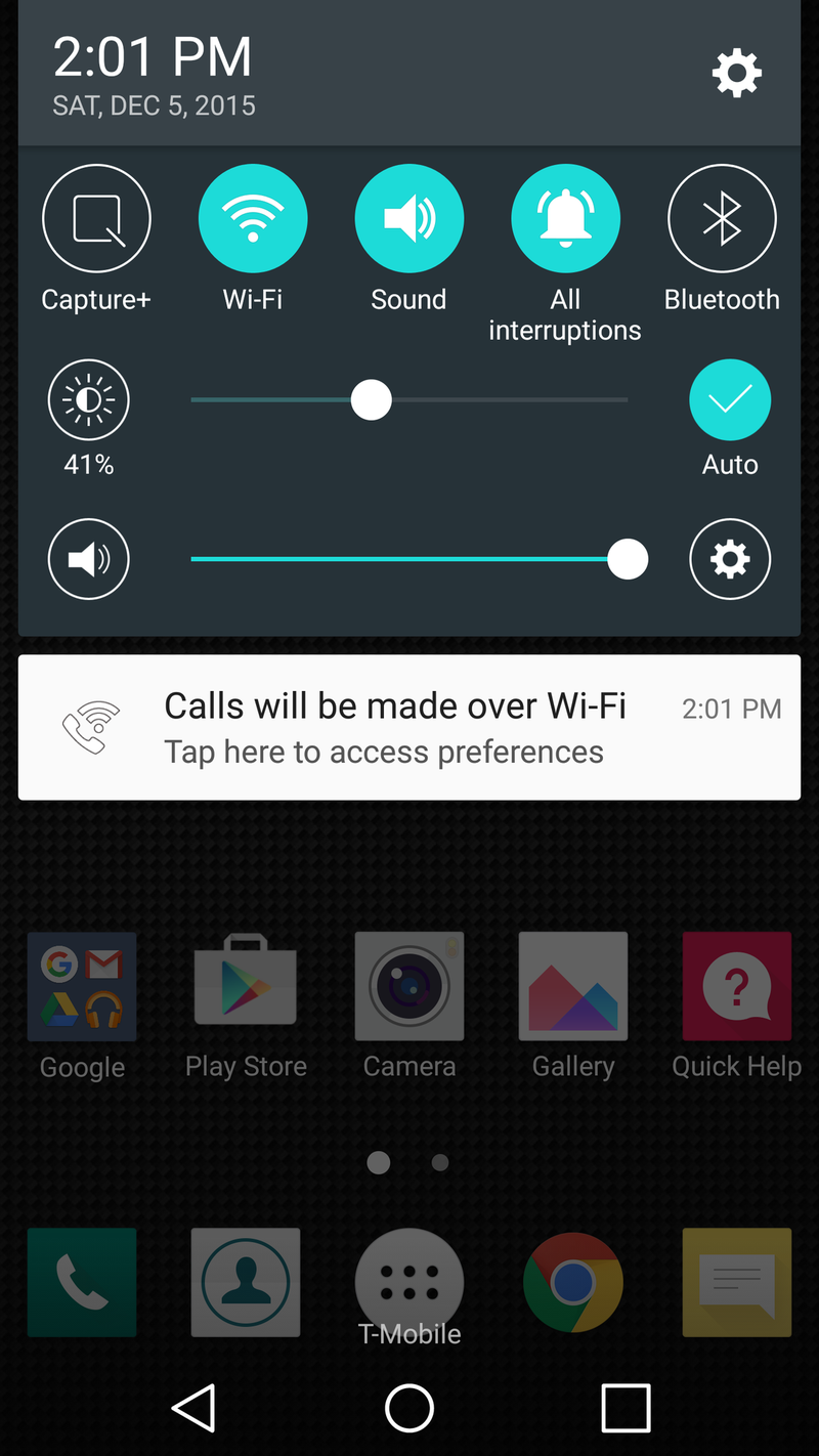
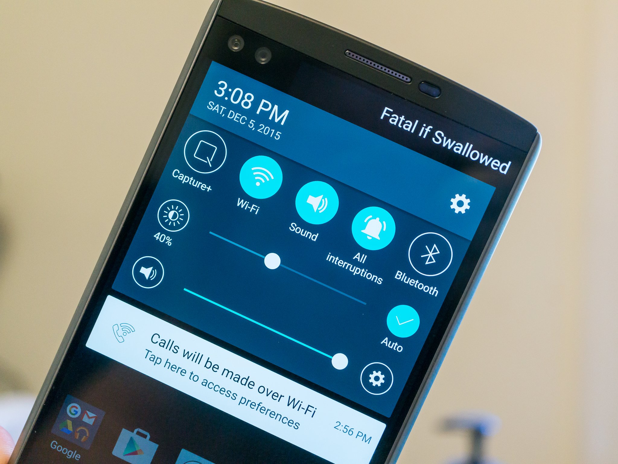
An extra line of quick settings is useful. When you use it for a volume slider you take that usefulness and throw it away. There's just too much here to take away room for my notifications. Yeah, that's becoming sort of a theme from me I think.
Anyway, I get that I can hide the sliders in the settings. But I want the screen brightness slider. I also want it to be out of my face when I don't want the brightness slider.
If only the newest LG phone had something like a second screen that quick settings could be dropped into. Dat signature doe. Everyone needs a signature. Mine says Fatal if Swallowed.
And no, I don't hate LG's phones. I love LG's phones, especially the V10 that's built like a Sherman tank. That's why I want them to do better.
Your favorite?
Thankfully, the world isn't full of people who think like me. Even I couldn't take much of that.
We all have a favorite and a reason that it is our favorite. Take a minute to jump into the comments and share yours and tell us all why you think the way you think. Maybe I'm missing something in my quest to get these quick setting menus out of my face until i need them. I want to know the things I'm missing!

Jerry is an amateur woodworker and struggling shade tree mechanic. There's nothing he can't take apart, but many things he can't reassemble. You'll find him writing and speaking his loud opinion on Android Central and occasionally on Threads.
