Android Q beta 3 review: Dark theme, gesture navigation and more notification changes
We've been using "Android Q" since early March, and Google even released a beta update in early April. But what's been clear from Day 1, as is the case with previous beta programs, is that this isn't really Android Q. It's mostly Android 9 Pie with some work-in-progress interface elements and lots of under-the-hood API changes for developers to start testing their apps against the new platform version. From a consumer perspective, there wasn't a whole lot of merit to installing it; you didn't get much in the way of interesting features or design to look at, and it was considerably broken and unstable.
But Google I/O marks the turning point where we start to see the Android Q beta turn into something resembling a finished operating system. One that actually has new features and changes from Pie that we can look at and experience for ourselves. It comes as Android Q beta 3, officially, but this release is considerably larger than the previous two. We finally see Google's new dark theme, a redesigned and improved gesture control system, and plenty of other tweaks. Here's how it's all coming together running on my Pixel 3.
How to get Android Q on your Pixel right now
Dark theme is here!
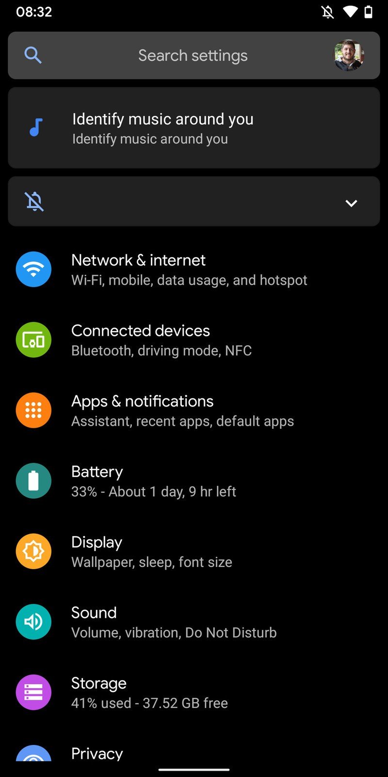
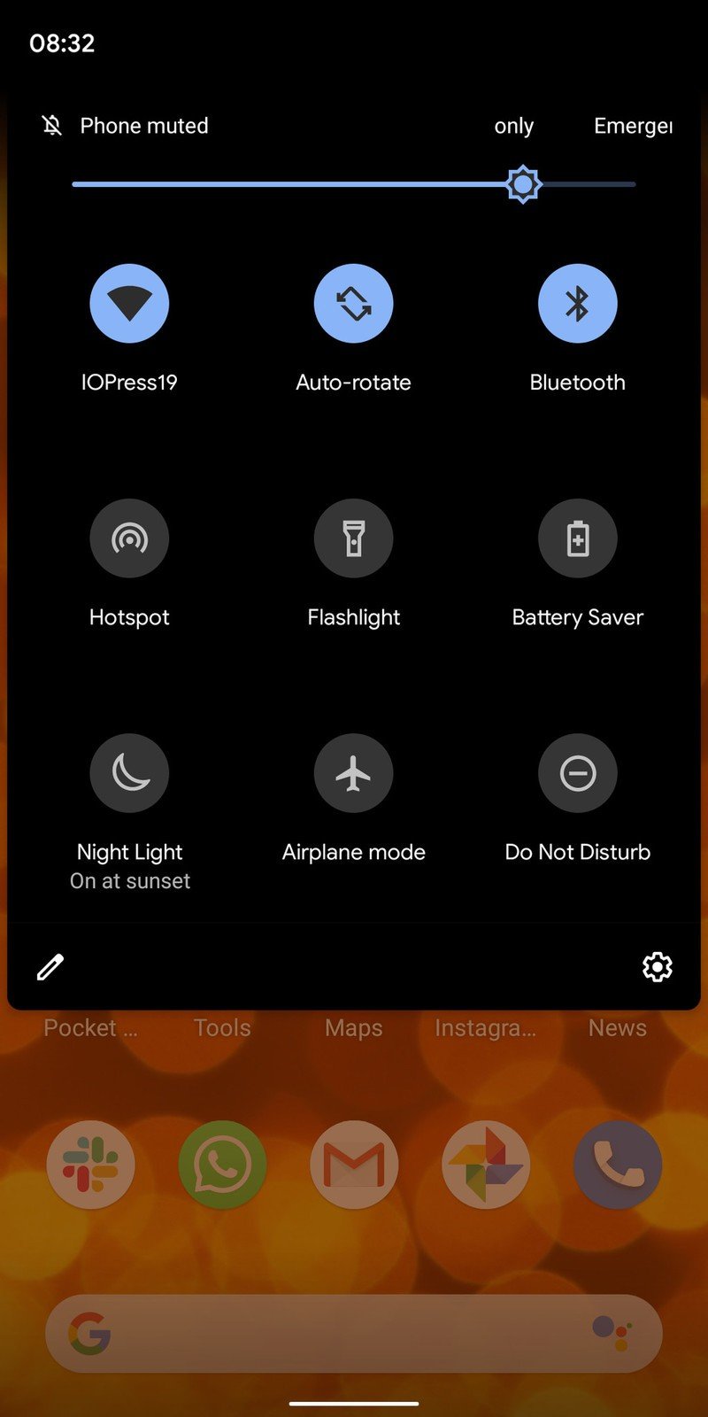
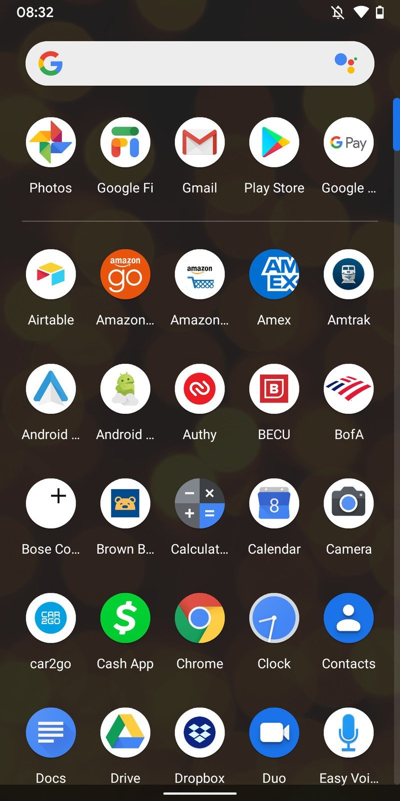
We already had a taste of what Google's dark "theme" would be in Pie, where large parts of the interface would invert colors when you had a dark wallpaper. But now in Android Q, you can just toggle it on permanently if that fits your design sensibilities. Like so many other dark themes, dark theme will also come on with battery saver mode.
The system dark theme looks good, but it'll look even better when apps support it.
Unsurprisingly, the dark theme looks good. Google's subtle use of whites, greys and blues in the dark theme makes it feel like a properly designed interface and not just an inversion switch flipped on the entire thing. There's also still a good amount of transparency in use in dark theme, and all of the animations and transitions still look great even when the interface is blacked out.
The more important part of this dark theme transition, though, is what Google's doing to get app developers to join the effort and provide you with a fully dark theme experience. Right now if you toggle on dark theme in Android Q, it's just the system that goes dark — every app you jump into stays the same, which typically means lots of whites and greys and a jarring experience. But Google has new tools for app developers that let them flip over to a compatible dark mode whenever the system does, rather than just with an in-app toggle.
At first we'll see lots of simple implementations that just invert colors and don't put a ton of thought into how things look; but over time the hope is that developers think about the fact that Android Q devices will be on the rise and customers will appreciate having apps that switch along with the rest of what they see on their phone.
Be an expert in 5 minutes
Get the latest news from Android Central, your trusted companion in the world of Android
Getting used to the new gesture navigation system
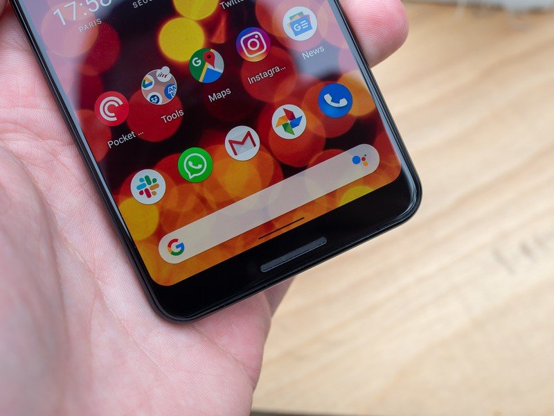
Android 9 Pie's gesture navigation system was ... controversial, let's say. And it never really felt finished in any way. Google knows this, and has scrapped it for something new in Android Q. The new gesture navigation no longer straddles the line with the old button system — it's all-in on swiping gestures for home, recents and back, which is a first for Google even though various Android manufacturers have been implementing some sort of all-gesture navigation for years now.
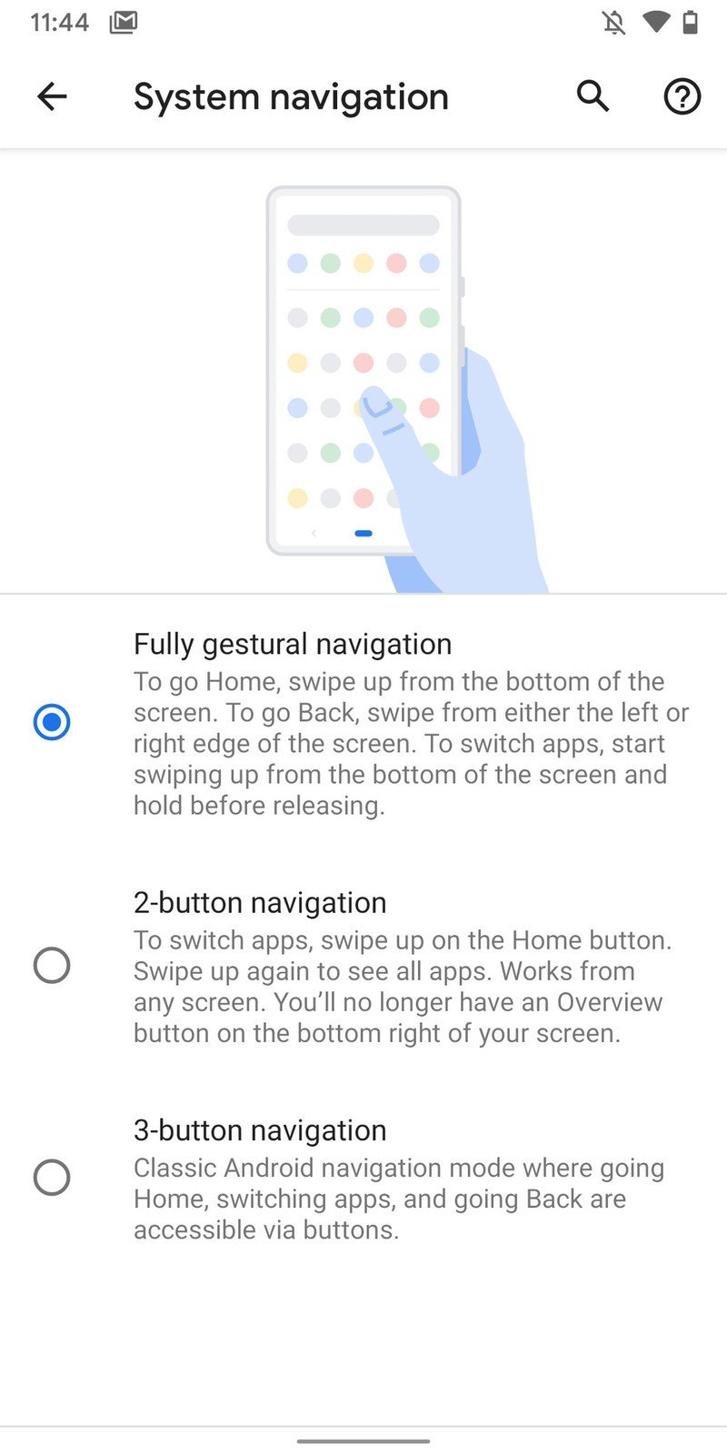
Here are the basics. A short/quick swipe up from the bottom of the screen sends you home. A slightly longer swipe up (in distance or speed) will bring up the multitasking view. Keeping your finger on the screen after that longer swipe up, and then continuing that swipe right or left will send you to the previous or next app, respectively. Swipe in from off the screen anywhere on the left or right side to go back — including exiting an app, just as though you pressed the back button on any previous Android version.
There's a small bar centrally at the bottom of the screen, but that's simply a reminder of where the home area is than anything else — the home, multitasking and back gestures all originate from the very edge of the screen and don't require touching any specific part of the screen. You can swipe up anywhere on the bottom of the phone to go home or get into the multitasking view, and you can swipe along the entirety of the sides of the screen for the back gesture.
It sounds unintuitive to read, but it makes sense when you use it. The weighting of the gestures can (and likely will) change, so I don't put too much stock in them for this beta release. But once you get used to how far to swipe, and pass the muscle memory of constantly reaching down to the bottom bar for back and multitasking, it's easy to fall into a habit with the gestures. Quickly switching between previous apps is particularly fast because it can be completed with one continuous swipe (and go in either direction with no extra effort), and the usability benefits of being able to go back from both sides are clear.
You quickly get used to the gesture navigation, and switching between apps is markedly improved.
The only real problem with the gesture navigation is that it completely interferes with every app that uses a swipe-in gesture from the left side to reveal a hidden drawer. These drawers simply do not work in Android Q, because the entirety of the left edge of the screen is dedicated to the back gesture recognition area. This is the one part of the muscle memory of using Android phones for a decade that has not been changed in the day using the latest Android Q beta, and I suspect it's going to take me a good long while to finally change my thinking on it.
Obviously you can always still reveal these in-app drawers by tapping the "hamburger" button in the top-left corner, but there are clear usability issues with reaching the very upper corner of Android phones that are increasingly large and especially tall. Not to mention that it's just downright less convenient to reach up for a button rather than quickly swipe in from the edge. Developers can force certain views of their app to ignore the gesture areas, but Google views this option as being applicable to situations like games or drawing apps that need full screen control with no accidental gesture input. And if there's one thing we know about the Android app ecosystem, it's that old design habits die hard ... and slowly.
These gestures are mostly good, but the app drawer problem is going to exist for a long time.
There are two ways I'd personally address this problem. The first would be to only enable the slide-in gesture for the back button on the right side of the screen, leaving the left edge to work just as it does today with slide-in drawers in apps. This would actually simplify things for users as well, so you don't have the slightly confusing situation of both a left-in and right-in gesture performing the same action. The other would be to let the double-sided gesture areas remain, but only make them active in the bottom half, or even bottom third, of the screen. That would leave the top portion of the display for slide-in gestures in apps, and leave the bottom, closer to the home gesture area, for top-level system navigation.
The caveat to all of this is that we're still on beta software, and Google isn't making any claim that this implementation of the new gesture system is final. But there are going to be growing pains as Android Q devices get out into the world and people start experiencing these new gestures with old apps — not to mention the different ways they could be implemented with custom interfaces from other companies.
Google changed notifications. Again.
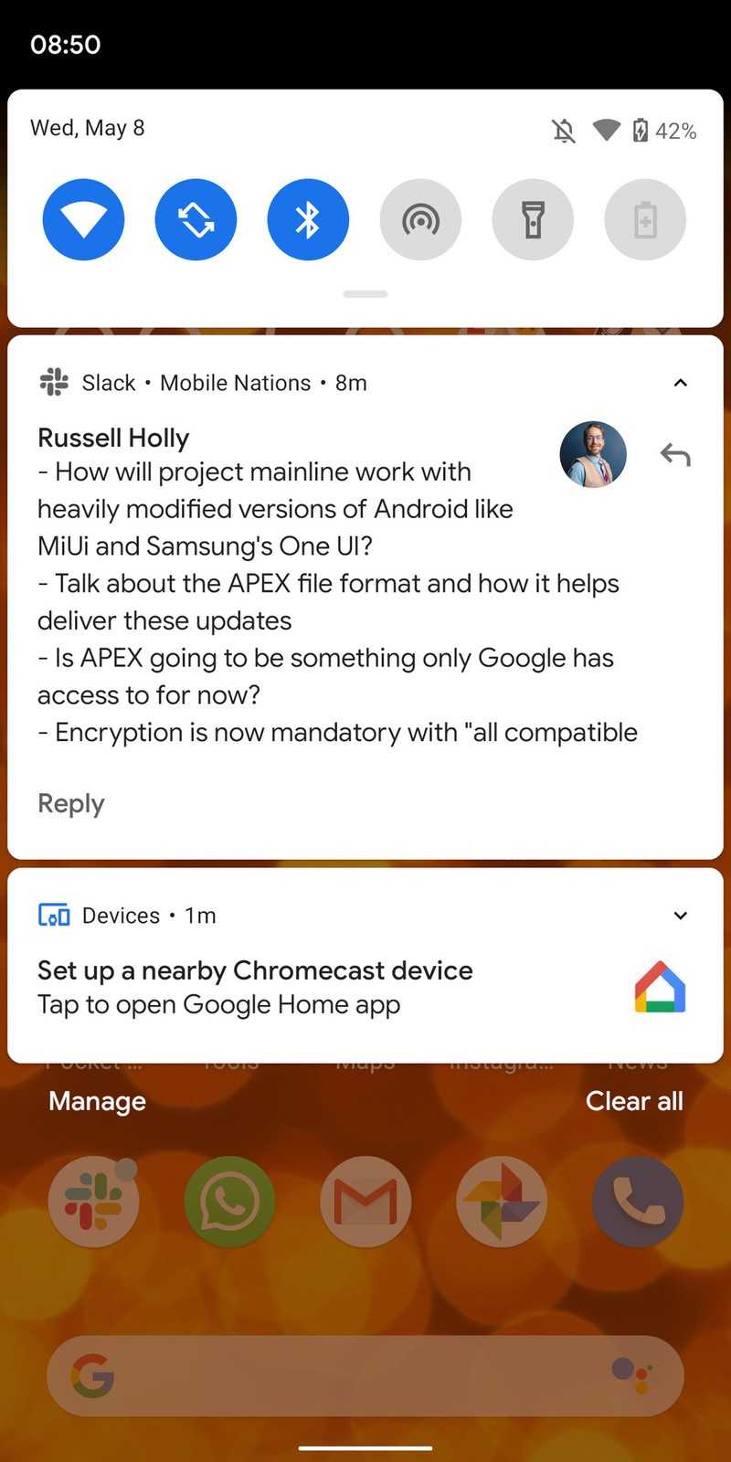
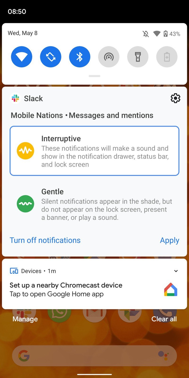
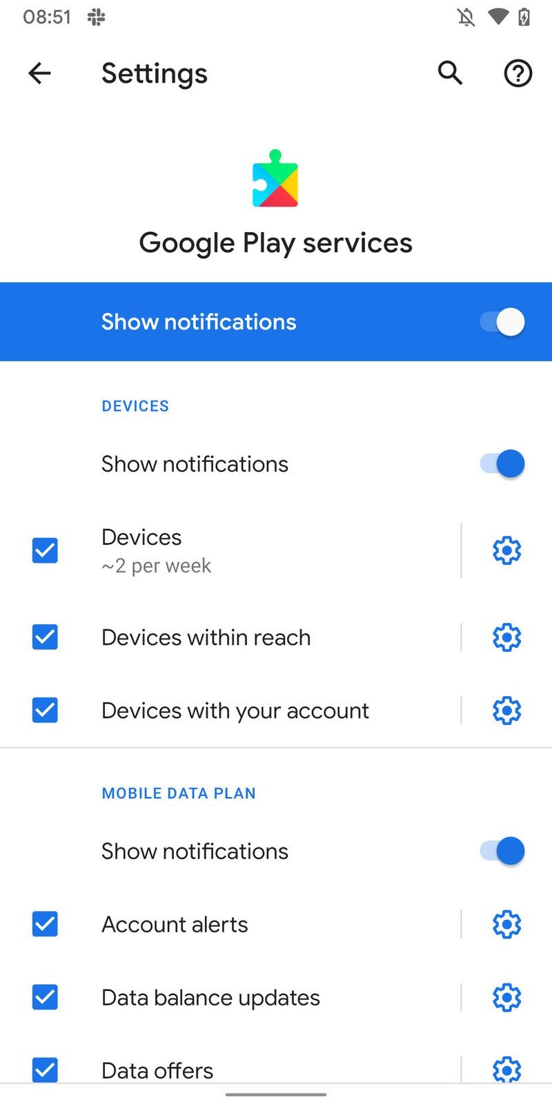
With all of the bluster over the gesture navigation, dark theme and privacy changes, it feels like not enough time is being spent focusing on the fact that Google has completely changed the way it handles notification priorities. Again. But it feels like a step in the right direction this time.
Yes, another notification change — but this one is for the better.
Notifications are now grouped into two simple channels: interruptive and gentle. Interruptive notifications sit at the top of your notification shade, and as the name suggests will actually interrupt you — you'll get sound and vibration when they arrive, and they'll sit at the top of your notification shade and lock screen. Gentle notifications come in more subtly — likely without sound, and sometimes with no vibration, and are grouped below a separator in the notification shade to indicate they're less important.
App developers will be able to define the default state of their notifications to be interruptive or gentle, but you always have control over where you place notifications — either on a per-app basis, or per notification channel inside each app. A swipe left on a notification takes you straight to a view where you choose interruptive or gentle, and once you tap "apply" it's set that way until you change it. It'll take a little configuration at first, particularly before apps have been updated to be mindful of these new settings by default, but this is much more intuitive than the current long lists of notification channels and snoozing in Android 9 Pie.
So much more happening
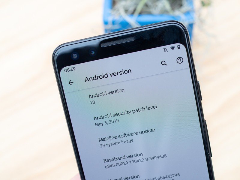
Many of Google's headline features in Android Q that were announced and even demonstrated at Google I/O aren't here yet. Live captions, offline Google Assistant actions, new privacy settings and more will all come with later releases of Q, and some will even wait all the way until the Pixel 4 is announced. We'll keep diving into Android Q as the betas are updated and new features are uncovered!
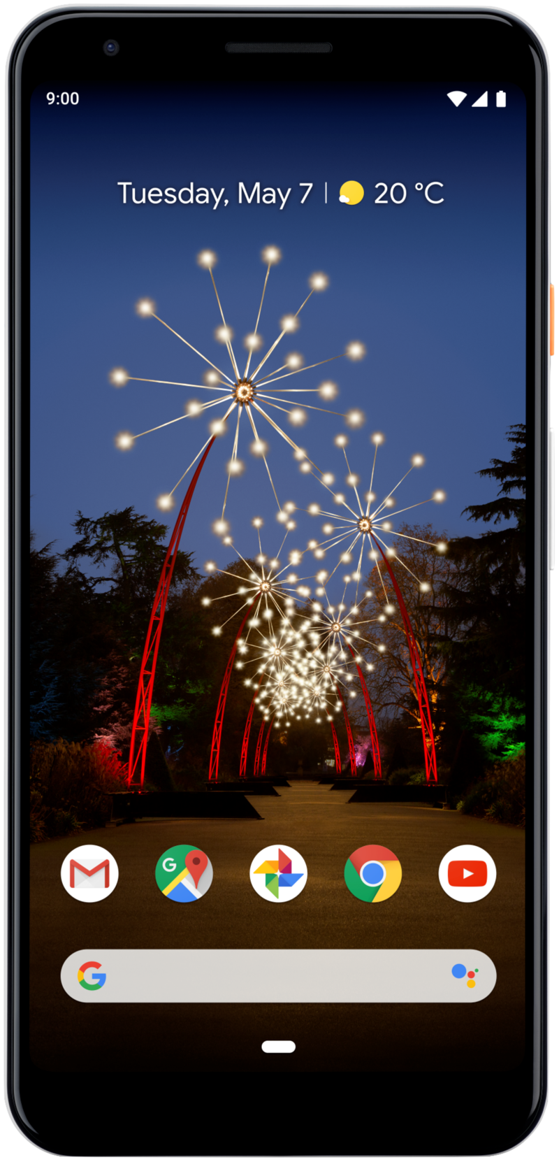
A remarkable mid-ranger from Google
If you've been dying to get your hands on a Pixel 3 XL but can't justify its $800 starting price, the Pixel 3a XL was made just for you. It has the same camera found on the Pixel 3, Android Pie out of the box, and it's guaranteed to get software updates for three years.
Andrew was an Executive Editor, U.S. at Android Central between 2012 and 2020.


