With Android Pie's new gestures, how long until the back button is a thing of the past?

A lot of the announcements from this year's Google I/O were surprises, but we all knew we'd be seeing new developments in Android Pie. Google released a public beta after its presentation, available through an OTA update (previously there was only an early developer preview), and while there quite a few new features, the one that stood out the most — at least, for me —was Android's new gesture-based navigation controls.
That's right, if you've ever been jealous of your iPhone X-touting friends, or the long-discontinued webOS interface Apple took inspiration from, you won't have to be for much longer. Phones running Android Pie (which, as it turns out, includes more than just the Pixels this time around) can already be operated using gestures rather than the traditional three-button layout, and I can't wait to try it for myself.
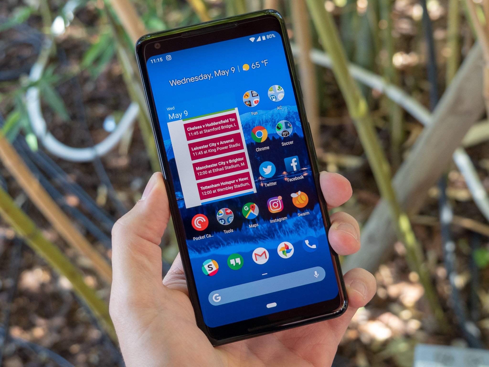
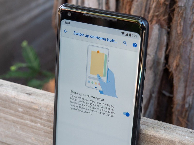
I've been using the iPhone X for a few months now, and while not perfect, I've come to love the gesture-based navigation scheme. Swipe up from the bottom to go home, swipe left or right to jump between apps, and swipe up and over to access your full recent app list. Android Pie isn't dissimilar; there's only one button visible from the home screen, and tapping it will still take you home, but now you can slide the button to the right to flip through recent apps, taking the place of the dedicated multitasking button. You can also swipe up to view all of your recent apps, or swipe even further up to access your app drawer.

Jump into another screen, though, and you'll see a familiar face resurface — the back button is still alive and well in Android 9 Pie, though its absence in the home screen makes it clear that Google is trying to phase it out soon. But when exactly will that be?
This wouldn't be the first time Google got rid of an important navigation button. Remember how essential the Menu button used to feel as part of the core Android experience? These days, a phone with a Menu button feels like an ancient relic, and I wouldn't be surprised if, in a few years, the back button felt the same way. iOS has gotten along fine for a decade now without a back button, so why can't Android?
Phasing out such a key part of Android's user interface takes time; even after the Menu button was killed off in stock Android, it stayed on as a legacy button for years while Google waited on developers to catch up. While this phase-out will likely take just as long, if not longer, it won't even start until Google officially kills it off. We need to see an alternative method of going back within apps and menus; iOS allows you to go back by swiping over from the leftmost end of the screen, but frustratingly, that only works some of the time, so I'd like to see something a bit more consistent.
Why not replace the back button with a swipe to the left from the new middle button? Or a different action, like a double tap on the button? Whatever the case, as difficult as it would be at first, I'd love to see Google completely eliminate the back button and reduce navigation to a single point for gestures at the bottom of the screen. Unless Google makes some last-minute changes to Android Pie before the final build, I'm not expecting that to happen this year, but I've been wrong plenty of times before. This would be a nice surprise.
Be an expert in 5 minutes
Get the latest news from Android Central, your trusted companion in the world of Android
Would you be on board with a fully gesture-based navigation scheme on Android, like iOS on the iPhone X? And would you be okay with the death of the back button, or will Google have to one day drag you away from it, kicking and screaming? Let us know in the comments below!
Hayato was a product reviewer and video editor for Android Central.

