Android O's notification coloring is an abomination

Not every idea is a good idea. And some good ideas aren't nearly as good as they sound once put into use. I'm not sure where the idea of colorizing media notifications in Android O fits into the "good" scale of ideas, but I know one thing. It's an idea that needs to change.
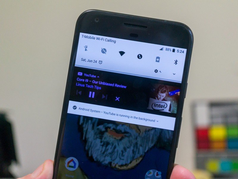
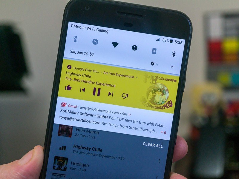
In case you're not up to snuff with what I'm talking about — even when launched Android O will take about a year to get on the majority of phones out there — the new version allows developers to build rich media notifications that include playback controls, album art and a different color template based on the album or video thumbnail. right now, Google Play Music and YouTube will give you these new colorized notifications if you're running the Android O beta.
And they are a mess.


The twitch level is off the charts when I see something like this.
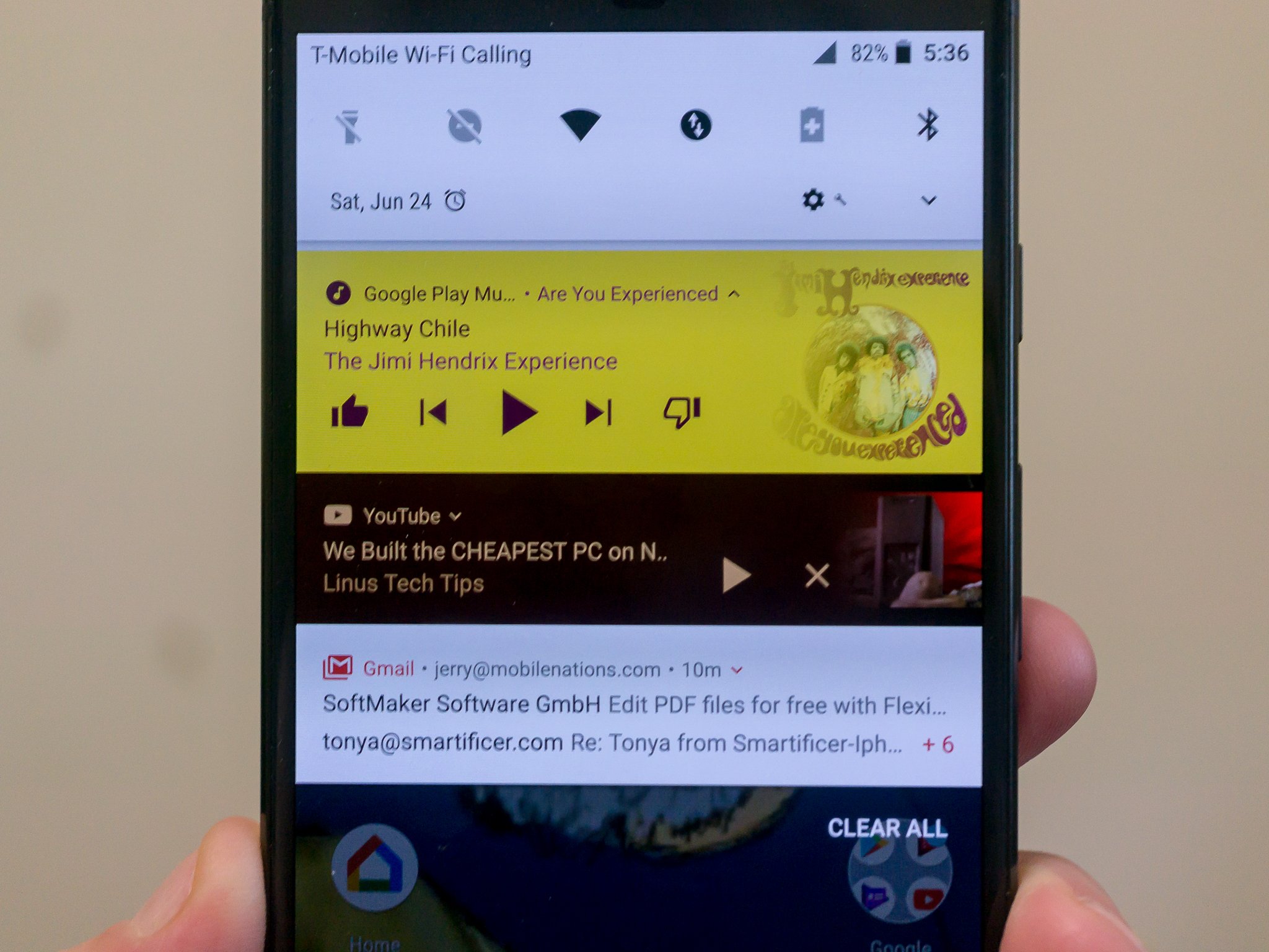
Alone, they're not horrible. A notification that's not base gray with darker gray lettering (on the Pixel launcher, because that's different on every phone) is neat. A splash of color goes a long way and can help brighten things up. But eventually, you'll come across a colorized notification that's a color combo you can't read (Tom Petty's Damn the Torpedos) in Google Play will throw a pink notification with white lettering that refuses to show up in a photo of an AMOLED screen). I am on the lookout for a black on black notification, but so far even AC/DC has failed me.
It gets worse when you have two of the new rich colorized notifications or a normal notification and a colorized notification or any mix of either. The photos above demonstrate. This is not a good look.
The idea can be fixed if given a little attention.
OK, this is a beta. I know this. That means there's a chance the final product won't look anything like this, but that chance is slim. But I still want to give my feedback while there is time. Readability issues are easy enough to fix. Every color has a numerical value, and the software can be written so that certain numerical values won't ever be shown together. No more white text on light pink. But that still doesn't fix the fact that you might have one light pink notification beside (or above in this case) a normal one. Or one light pink one and one orange one. Or two brown ones with different color text.
Be an expert in 5 minutes
Get the latest news from Android Central, your trusted companion in the world of Android
And this is just the Pixel so far. Who knows how things will look on a Samsung or Huawei phone that has a pretty custom job going on up top for notifications. Which is part of the problem. Android can be too openy. It's cool that developers and users are able to change up how things look, but there needs to be a bit of control in some places. As mentioned in a recent episode of the Android Central Podcast, sometimes Google needs to stop suggesting how things are done and make a rule that needs to be followed. Especially for apps in Google Play.
Notifications with album art and controls are awesome. Can we make sure they look awesome?
The idea of having album art or thumbs in the notification is awesome. But they could be isolated from the rest of the notification area. Or something. I'm not a graphic designer, but I know at least a few work at Google. All I know is that no matter what phone I'm using, I never want to see the mess in the example photos.
A lot of people are going to disagree with me here, and that's fine. You should be able to have your stuff look the way you like. So should I. Let's hope there's an easy to find setting to kill the color when O makes its way into the world.

Jerry is an amateur woodworker and struggling shade tree mechanic. There's nothing he can't take apart, but many things he can't reassemble. You'll find him writing and speaking his loud opinion on Android Central and occasionally on Threads.
