Android Oreo features you'll love: Colored notifications
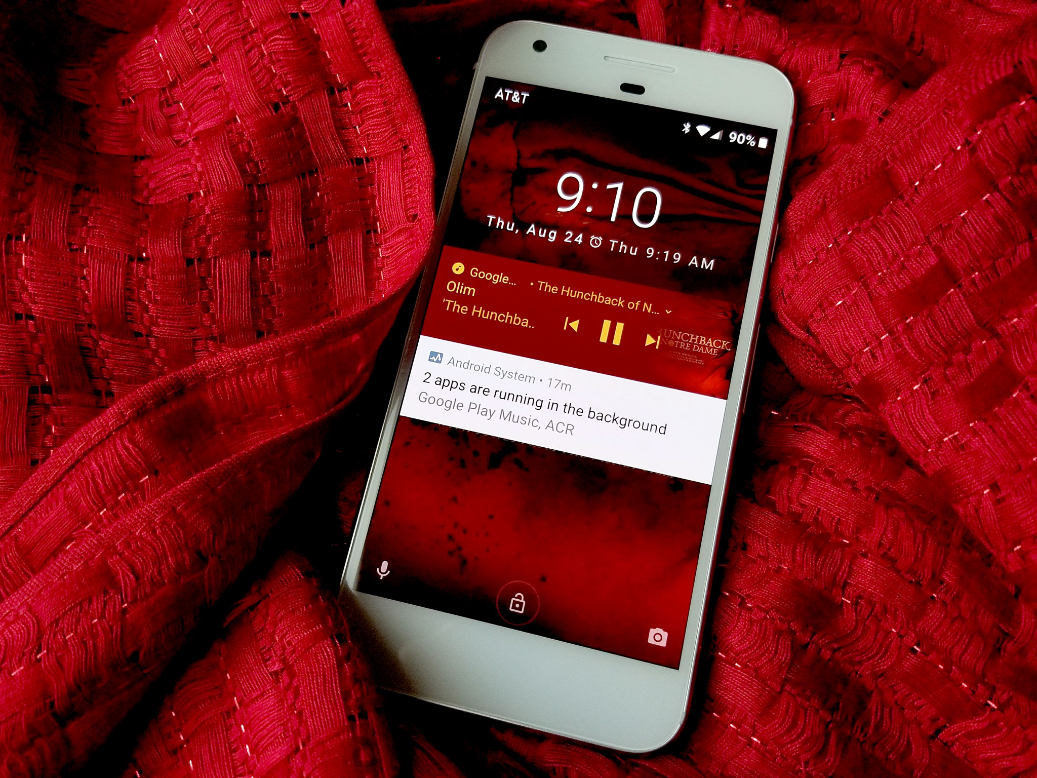
Android Oreo is full of little tweaks and fixes to the Android experience both behind the scenes and in plain sight, and while there's plenty to be excited about, my hands-down favorite feature isn't Android finally fixing their emoji problem or the colorful new notification dots on my home screen. It's a divisive and inescapable feature on Android Oreo, and one my esteemed superior Jerry Hildenbrand called an abomination back during the Developer Preview.
My hands-down favorite part of Android Oreo is the colored media notifications. I can't stop staring at them, and if you're lucky enough to be on Android Oreo, I bet you won't stop staring at them, either.
Background color me enchanted
It's mesmerizing to watch the lock screen completely shift in theme and color from song to song, album to album.
In Oreo, Google introduced a massive overhaul of notifications, and among the many, many cool new bells and whistles for notification channels and notification previews, there's a new notification feature that requires no user effort very little developer action: Background colors.
Background colors allow developers to make their color more vibrant and easy-to-spot among a sea of notifications by making the notification a customized color. Google has repeatedly stressed that this is only to be used for ongoing tasks that require immediate glanceability and recognition from users, such as navigation, phone calls, and media controls.
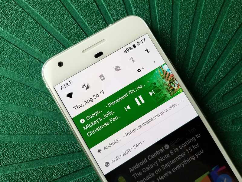
For media controls, rather than selecting a singular color for the notification based on the app's color, media playback notifications can instead draw colors out of the album artwork. Android then uses those colors to make a notification that blends the artwork into the notification while making the notification itself pop in your notification shade.
The results are breathtaking, especially on the lock screen.
Notification transformation
By combining background colors for notification with full screen album art on the lock screen, you can change the entire feel of your lock screen just by switching to the next song in your playlist. It's mesmerizing to watch the lock screen completely shift in theme and color from song to song, album to album. Don't take my word for it.
Be an expert in 5 minutes
Get the latest news from Android Central, your trusted companion in the world of Android
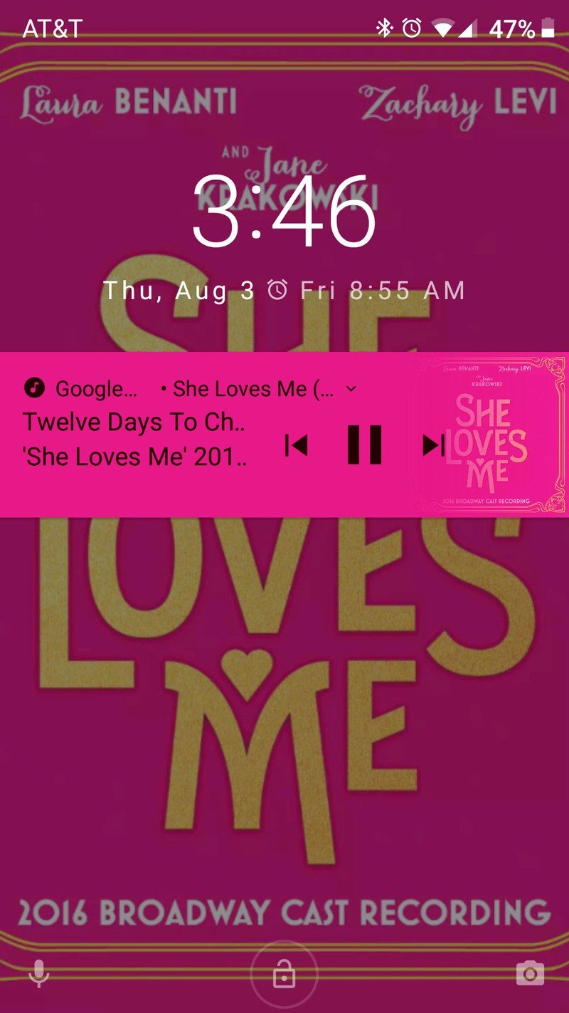
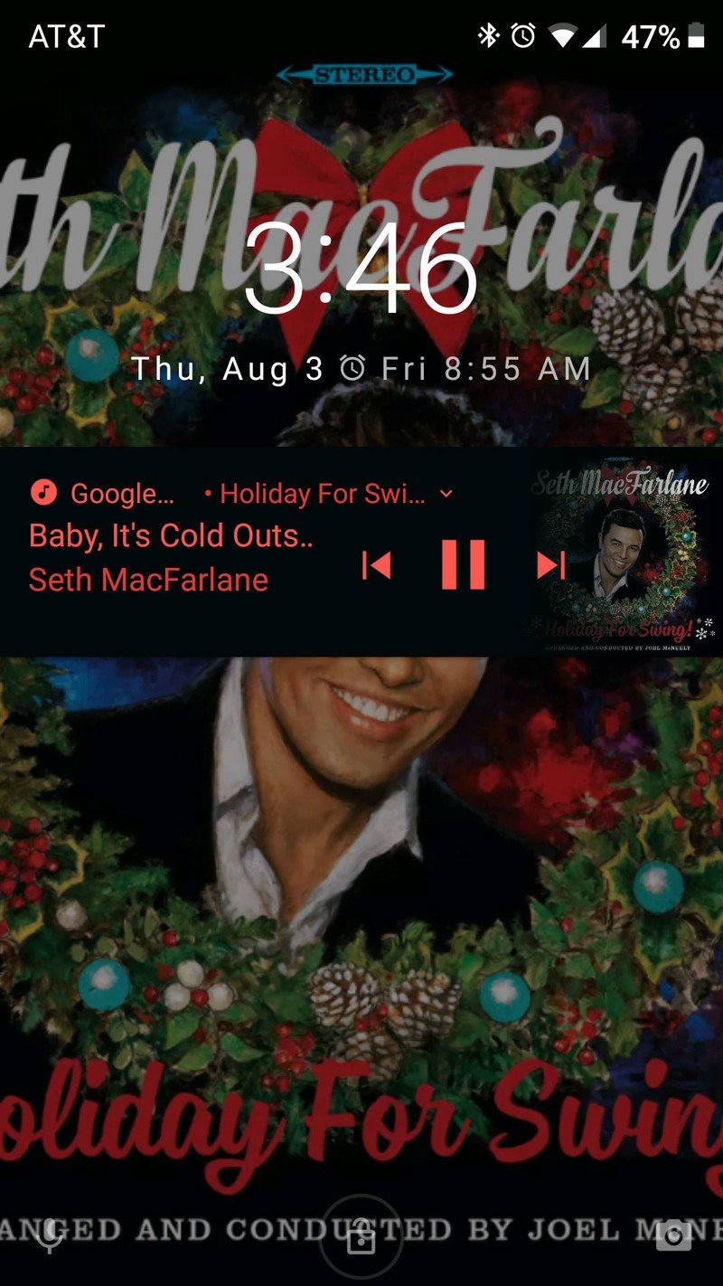
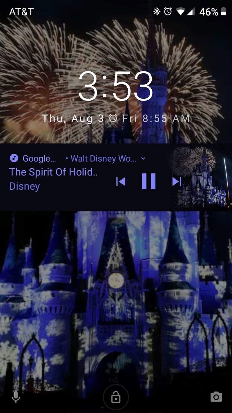
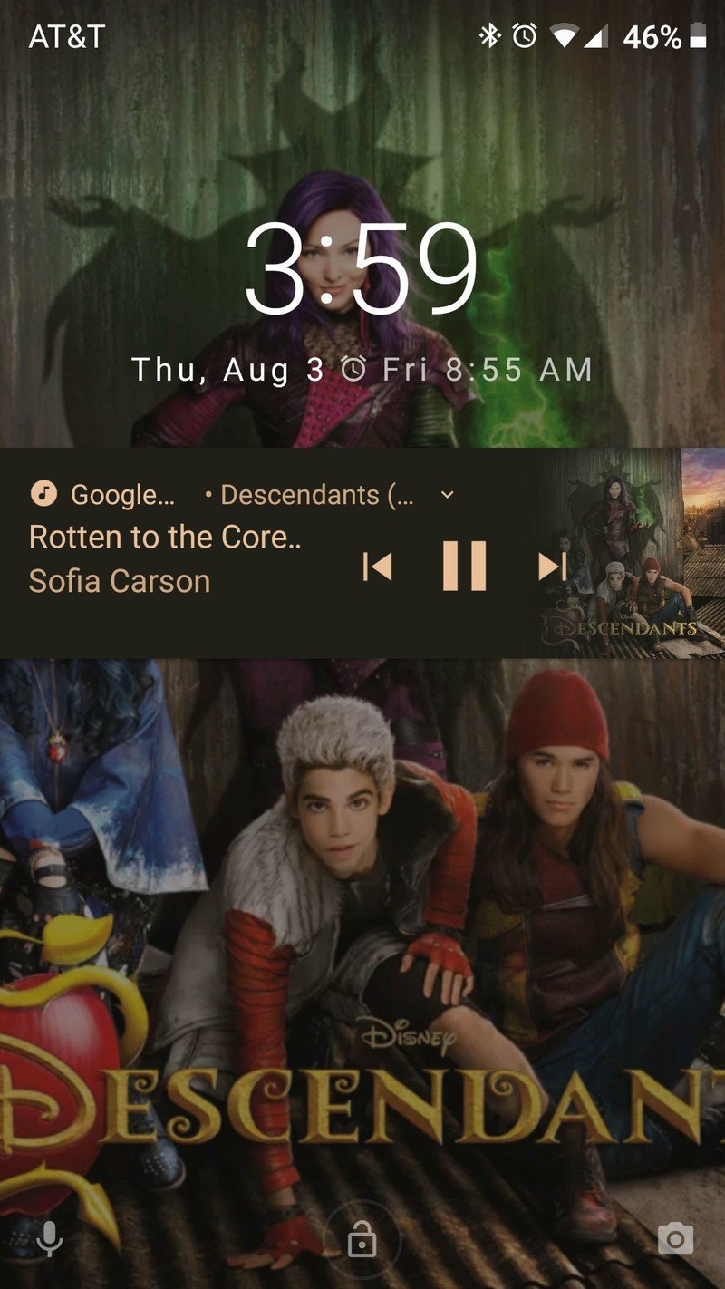
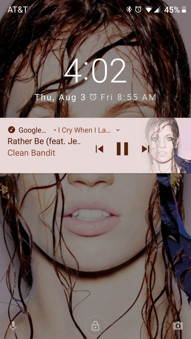
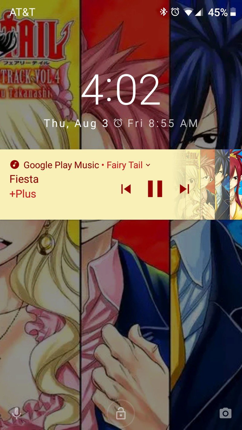
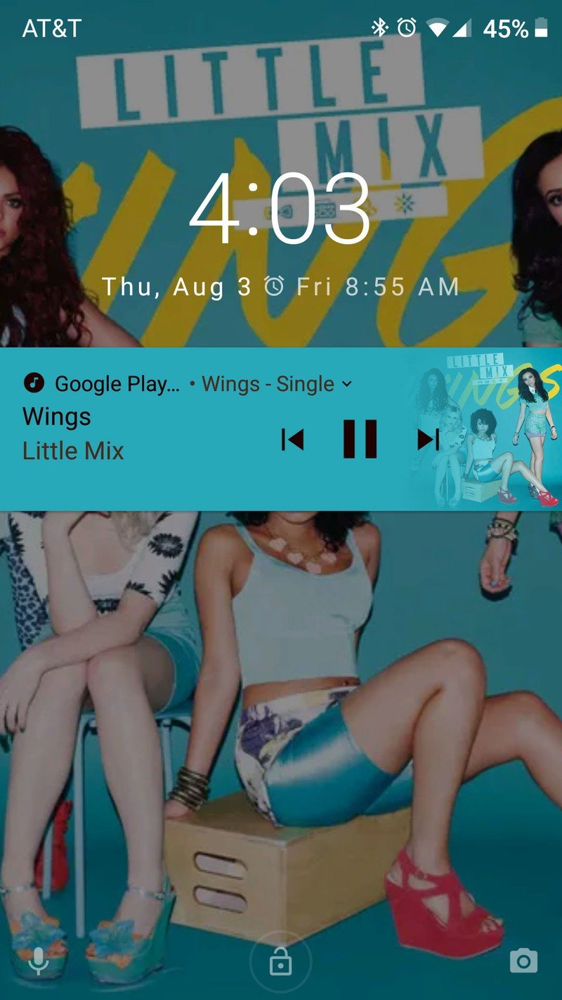

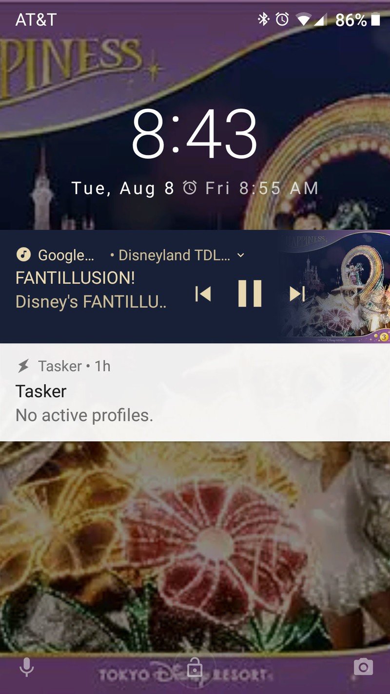
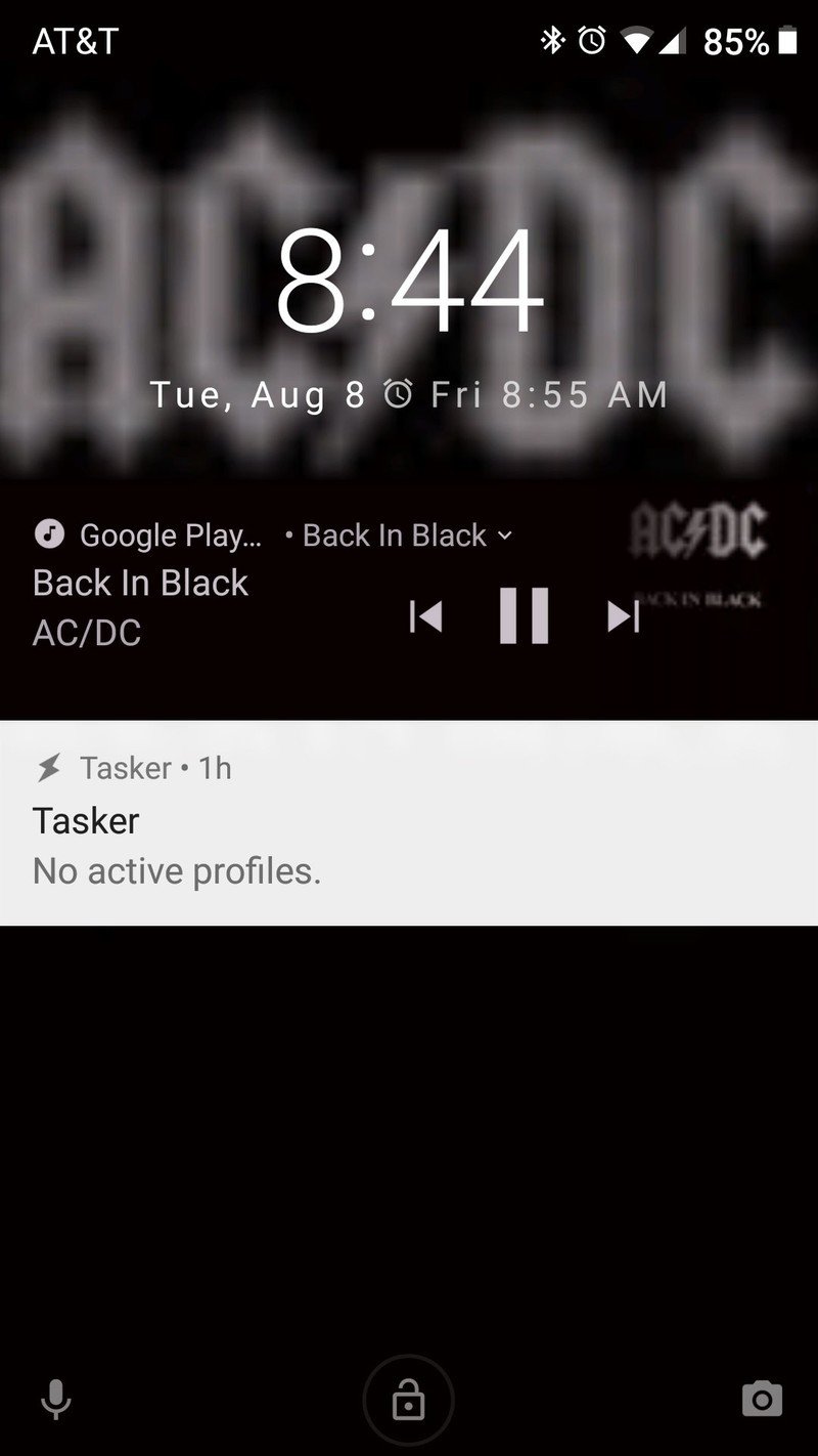
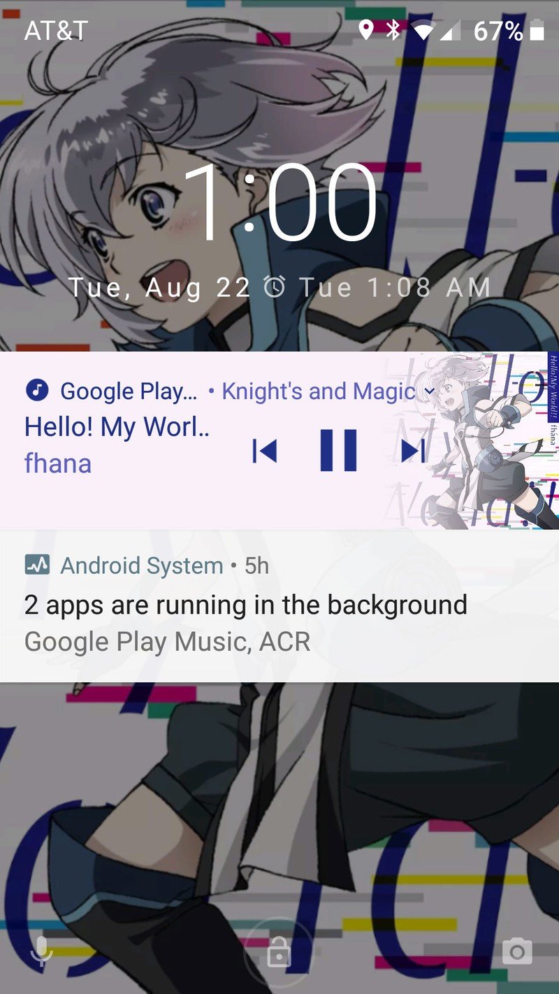
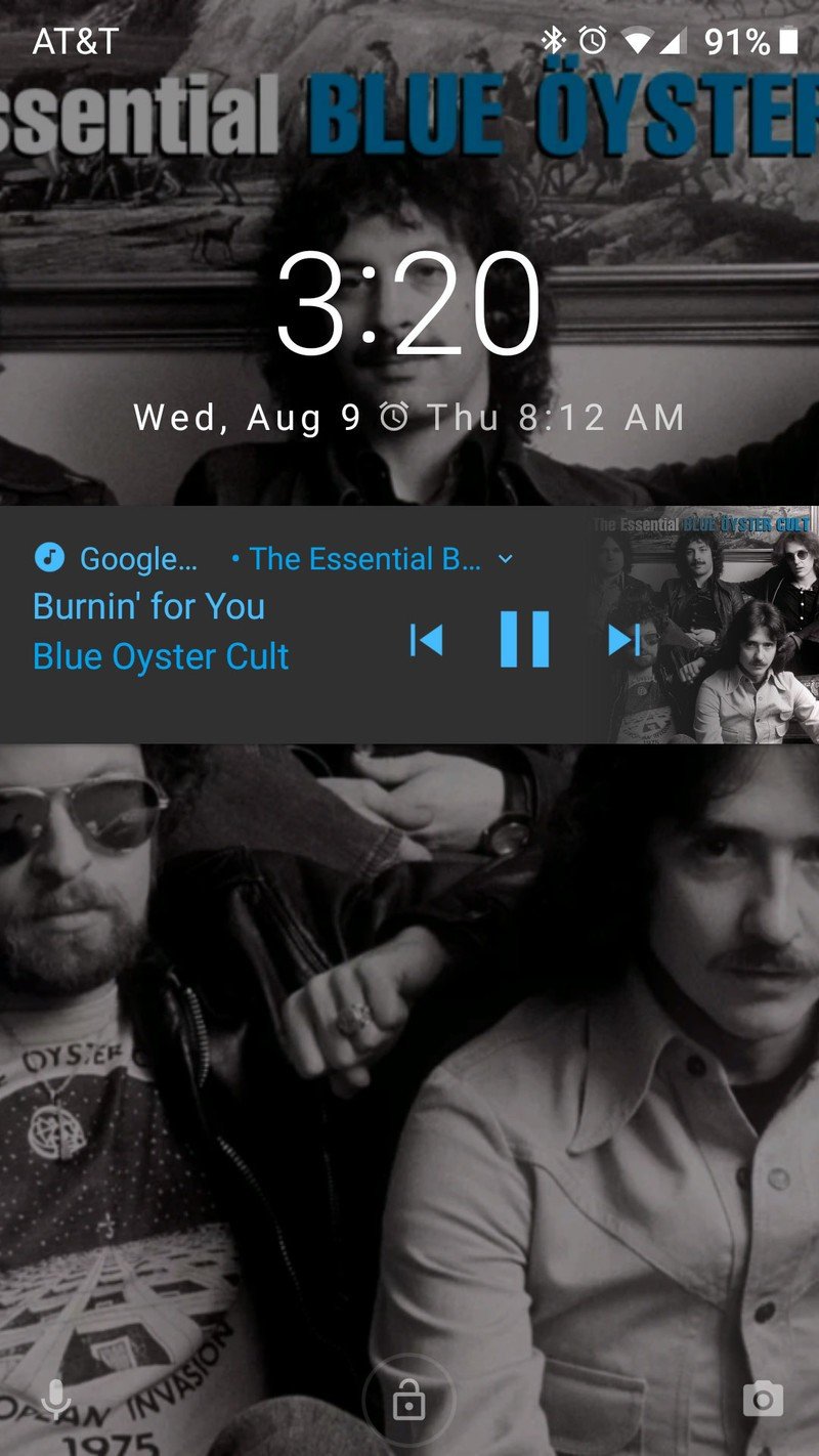
I've been screenshotting these notifications ever since I came to the Android O beta last month, and a month later I can say I don't want to go back to anything else. They're playful, they're radiant, and they're intoxicatingly addictive. I've thumbed through dozens of songs just looking at what they do to the notification, and to the lock screen. They're beautiful, and it makes a girl wish that they'd do this with the Google Play Music home screen widget.
Beautiful chaos: dueling background colors
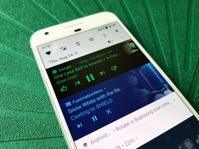
When Jerry spoke of these colorized notifications being an abomination, he admitted that alone they could be quite beautiful. However, when mixed in with a sea of white notifications or with another colored notification, that beauty can fade to garishness as the two album arts and background colors clash. If you think that this is a rare instance, I'd remind you many of us keep up a paused music notification even as we stream video to Chromecasts or listen to videos with YouTube Red's background play so that we can restart our tunes easily once we're done.
Alone they could be quite beautiful; together, they're... interesting.
I personally like seeing my media notifications differentiate themselves from the rest of the drawer, and while they may not always match as perfectly as boring white notifications, each presents their own tone and their own beauty. They add to each other. I don't want colored notifications coming to every app, and given the guidelines, there's little chance of that happening, but I wouldn't mind just a little more color invading the notification shade.
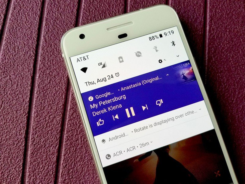
Are you enchanted or cursed by these vibrant notifications? Are you apprehensive of how they could be abused by developers or hampered by Android manufacturer themes? Do you just care that your music keeps playing, color be damned? Sing out in the comments.
Ara Wagoner was a staff writer at Android Central. She themes phones and pokes YouTube Music with a stick. When she's not writing about cases, Chromebooks, or customization, she's wandering around Walt Disney World. If you see her without headphones, RUN. You can follow her on Twitter at @arawagco.

