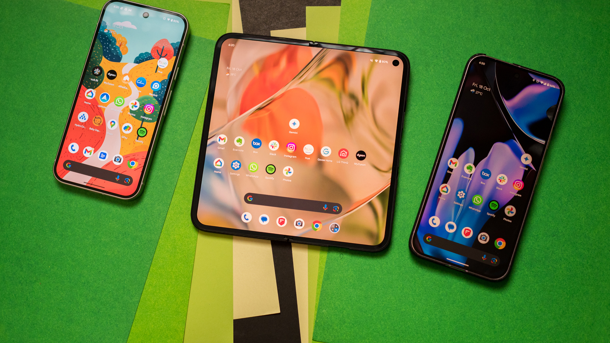
Android Oreo will make you love notifications again
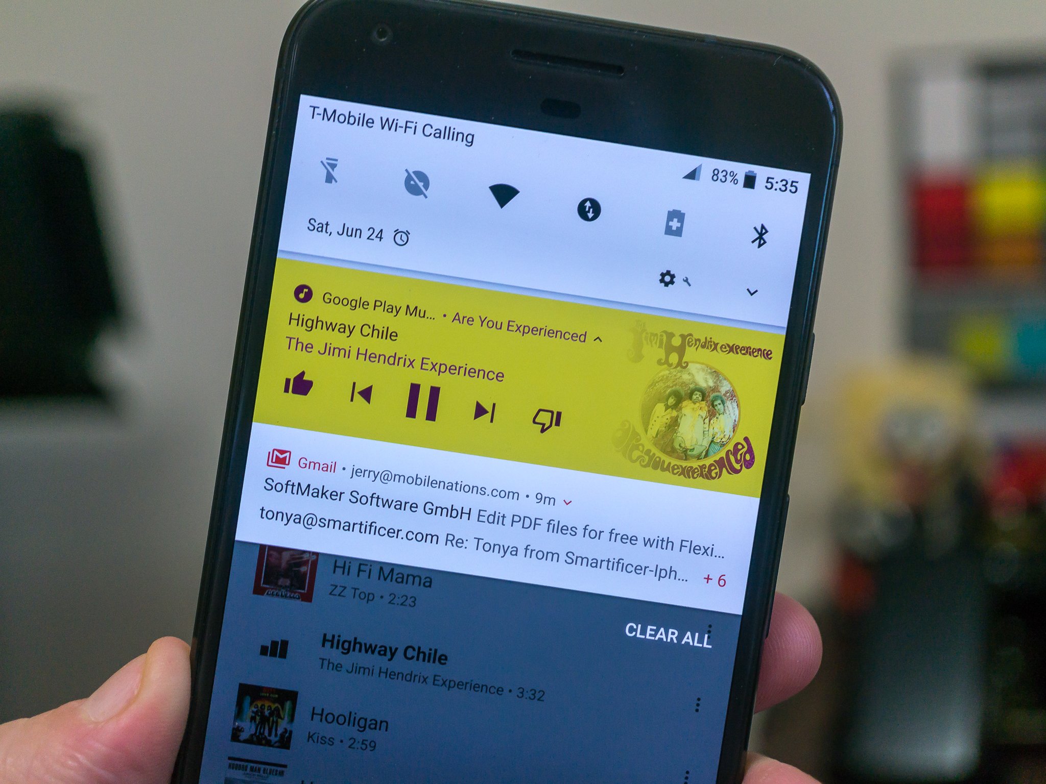
One of the major areas that get updated with Android Oreo is the notification system. Notifications and the tray method of showing them to us have long been one of Android's strong points and making changes to something that's already great can be difficult. Android Oreo builds on the current rich notification system that started a few versions ago and brings these new features.
Notification channels
Applications can now have different categories for the notifications they show us, and which ones are displayed and how is up to the user to define. Google's YouTube app is a great example of how these changes work.
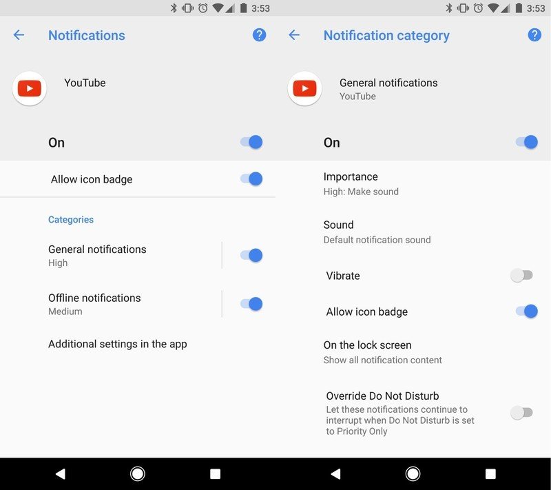
There are three categories of notification in YouTube on a phone with Android Oreo. Two of those categories are handled by your Android on a per phone basis (General notifications and Offline notifications) and the third is a section of account-based settings like notifications of highlighted videos or when someone you subscribe to uploads a new video.
If you enable one of the categories, you have fine-tuning controls like importance (a system setting that has important notifications make a sound, vibrate or peek open), what sound they should play if sounds are enabled, whether they should show an icon notification badge and more.
You'll find this in the applications' settings, but only if the developer specifically targeted Android Oreo when they built the app.
More: How to set up Android Oreo's notification channels
Notification badges
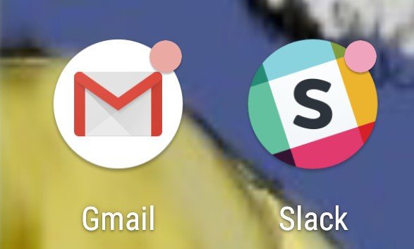
We're all familiar with "notification dots" that some manufacturers add to their launcher and third-party home replacements bring to any phone. With Android Oreo they are now part of the operating system and won't rely on a third-party solution.
Be an expert in 5 minutes
Get the latest news from Android Central, your trusted companion in the world of Android
When you have a notification for an app that you haven't yet looked at, the app's icon will display a small colored dot in the upper-right corner. These badges follow the rules for notification channels if the app has enabled those, and are tied into cloud messaging so if you've checked on a computer or tablet, they go away on your phone.
These won't replace existing solutions from apps like Nova Launcher, so you'll be able to keep using what you already enjoy. If you would rather not have badges on your icons you can turn them off in the app's notification settings.
Notification snoozing

Sometimes you don't want a notification to disappear, but you aren't able to check an app right away. Notification snoozing lets you postpone things.
"Slow swiping" (pressing and sliding to the right) on a notification now gives you a timer icon in addition to the settings icon we've been seeing since Android Marshmallow. Tapping on it removes the notification from your tray but doesn't mark it as "read", and after a set amount of time, it will come back. Notifications reappear with the same level of importance they first appeared with so you'll hear a sound of it will peek if you have it set to do so.
Checking an app from another location (like your tablet) can remove a snoozed notification, and they can be updated without reappearing — if you were to snooze a Gmail notification, another new email wouldn't bring it back until the time is up.
Notification timeouts
Developers can now build a timer into a notification and have it disappear after it expires, even if the notification hasn't been checked. This is handy for things that are time-sensitive like happy hour specials at your favorite restaurant. Knowing that appetizers are Buy One Get One Free until 7 PM is awesome, but seeing it at 8 PM isn't.
Background colors
Notification can have a predetermined background color, including different colors for each notification category.
Google suggests that this is used only for "ongoing tasks which are critical for a user to see at a glance" like driving directions in the Maps app or an ongoing phone call. The color can be preset by the developer, or dynamic as we see in media players with persistent notifications.
This can make any ongoing notification stand out so you won't have to scroll through a long list to see them. It also places a lot of responsibility on app developers to make sure their notifications don't clash with any theming of the notification tray.
Messaging style improvements
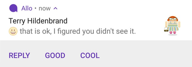
Notifications can now provide more information in both collapsed and expanded forms. These changes were designed for your favorite messaging app. With Android Oreo, it can give quick reply bubbles when collapsed, or give message history when expanded.
This is a great way to give rich notifications a little context. If you can't remember the previous messages in a conversation, you no longer have to open the app to read the most recent ones.
Notification settings and dismissal
Notification settings are tools for developers that help set the text displayed when you link from a notification back to the apps actual notification settings. This should allow developers to be a little more user-friendly and help guide us when they're using Notification channels.
Notification dismissal is a new method of the Notification Listener service that lets an app know if the notification was removed because a user checked it or if it was removed for another reason, like snoozing.
Notifications are a big deal on a device designed to help us communicate. It's great to see plenty of attention given to them at the operating system level!

Jerry is an amateur woodworker and struggling shade tree mechanic. There's nothing he can't take apart, but many things he can't reassemble. You'll find him writing and speaking his loud opinion on Android Central and occasionally on Threads.
