Android L preview: Notifications and lockscreen
Android L takes the design of this operating system in a different direction, and nowhere is that more apparent right when you start using it than in the lockscreen and notification area. The now-familiar Google Now card paradigm is alive and well throughout the interface of Android L, taken to the next level with the new ideas and colors present in the Material Design language that the software is built on.
At the same time as the big visual redesign, the notification pane and lockscreen have both received functionality changes that bring the most important information forward to you and make accessing your phone's controls a little easier. While what we have available now in the Android L Developer Preview likely only scratches the surface of what we'll see in a final release, we're excited to take a walk through notifications and the lockscreen in Android L.
A new look for notifications
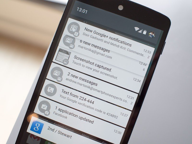
While looks and functions have changed, the drop-down notification pane has been a part of Android since version 1.0. We're now looking at the latest incarnation of that notification pane idea in Android L, and it's actually a notable departure all around. Swiping down from the top of your screen pulls up a new interface that "floats" on top of your homscreen, and actually doesn't reach the full width of the screen or slide all the way down to the bottom, adding to the subtle effect. The clock shifts over to the left side of the top bar, while your Google profile picture appears next to the battery on the right.
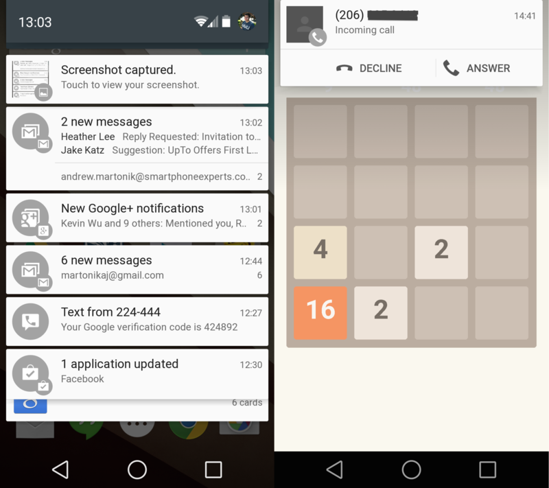
Below that top bar are your notifications, now shown in a striking white color with rounded corners and drop shadows, just like cards in Google Now. Newer notifications at the top show up in another subtle animation when you swipe down initially, with older notifications sliding out from underneath and expanding down. Individual notifications can be swiped away to either side, or expanded with an additional swipe down if that app's notifications support it.
A subtle horizontal line below the standard notifications separate them from ongoing notifications, such as the status of your device when it's plugged into your computer or a weather update from Google Now. As the number of notifications piles up, at the bottom of the list you'll notice older notifications start to stack up on top of each other, fading away and indicating their age. As you swipe away notifications from the top, you'll see the list at the bottom expand again to fill the room.
There's a new class of notifications in Android L called "Heads-up Notifications" as well, which were briefly shown off in the Google I/O keynote but we now understand a bit more. Heads-up notifications come down from the top of the screen, even in full-screen apps and games, to give you important information such as an incoming call or a very important chat message. You can take action on them by tapping the message or the expanded action buttons, or swipe them away to get back to your app. And no, there's no way at this time to clear all notifications at once, it seems.
Starting with Jelly Bean, apps can declare what priority — max, high, default, low, min — their notifications should be (more on this from the Android Developer site), and in L, those that declare themselves "max" priority will show up as a Heads-up Notification type. We've noticed Facebook Messenger oddly (but honestly not surprisingly) makes all of its notifications the max priority, but we'd hope as L gets further into development that app developers will take it upon themselves to declare the proper priority so they're not spamming us with drop-down notifications.
Be an expert in 5 minutes
Get the latest news from Android Central, your trusted companion in the world of Android
The entire notification experience is nice to use once you get over the striking visual differences from KitKat, as most everything works just as you're used to, but with new animations and styles. Matias Duarte and the rest of the design group at Google talked about the animations throughout Android L being subtle and something that you simply notice but aren't strong enough to draw your full attention — I'd say that's a pretty accurate representation of what you see here.
Accessing quick settings
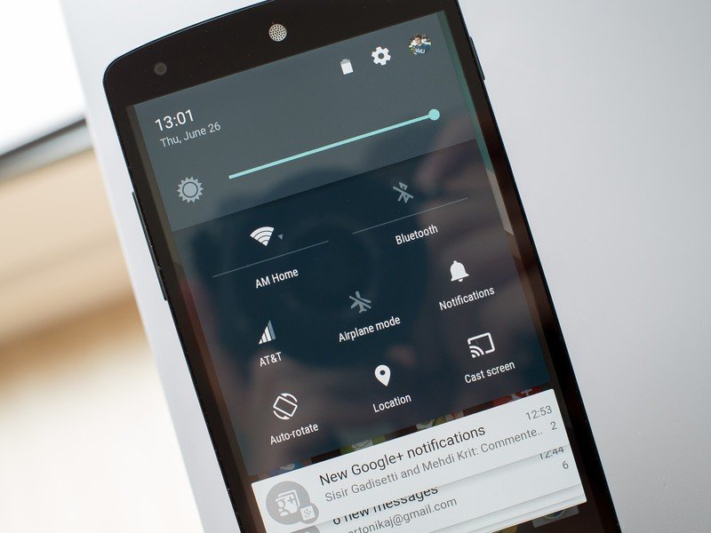
With all of the new notification pane design, we're thankful Google didn't forget about the quick settings panel. The two-finger swipe from the top of the screen is gone in Android L, replaced by a tap on the top bar or additional swipe down after expanding the notification pane first. Once you expand the quick settings menu, you'll find a full brightness slider at the very top, followed by Wifi, Bluetooth, Mobile data, Airplane mode, Notifications, Auto-rotate, Location and Cast screen buttons. Missing is the ability to toggle auto brightness and see the battery percentage — you'll have to go into the full settings to do those.
For Wifi and Bluetooth, tapping the top icon of either one will toggle the radio on or off, while pressing the name under the icon (separated by a small line) will take you into the settings menu. Tapping Airplane mode, Auto-rotate and Location simply toggle those functions, while the Notifications and Cast screen buttons have deeper functions.

Tapping the Notifications button reveals a secondary panel to control notification volume and access the new "Do not disturb" function in Android L. Tap the button in this pane and you can enable Do not disturb for a set period of time — between 15 minutes and 8 hours — or turn it on until you turn it back off again. Notifications received while Do not disturb is turned on show up silently in the notification bar as "Notification hidden," which you can tap to reveal. We'll be diving deeper into Do not disturb mode in Android L in a separate post, but needless to say it's a welcomed addition to the OS and importantly finds its place in the quick settings menu.
Using the lockscreen
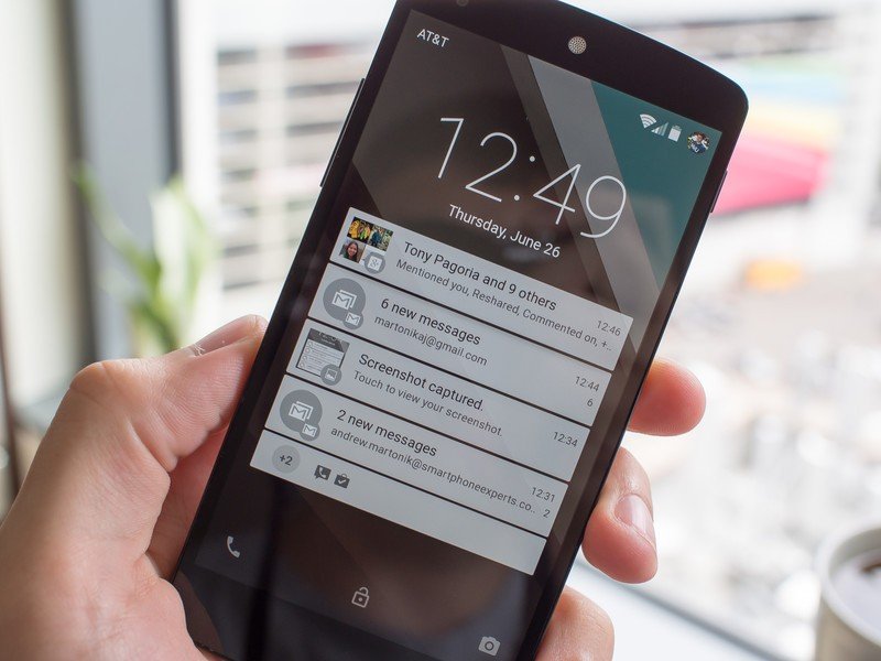
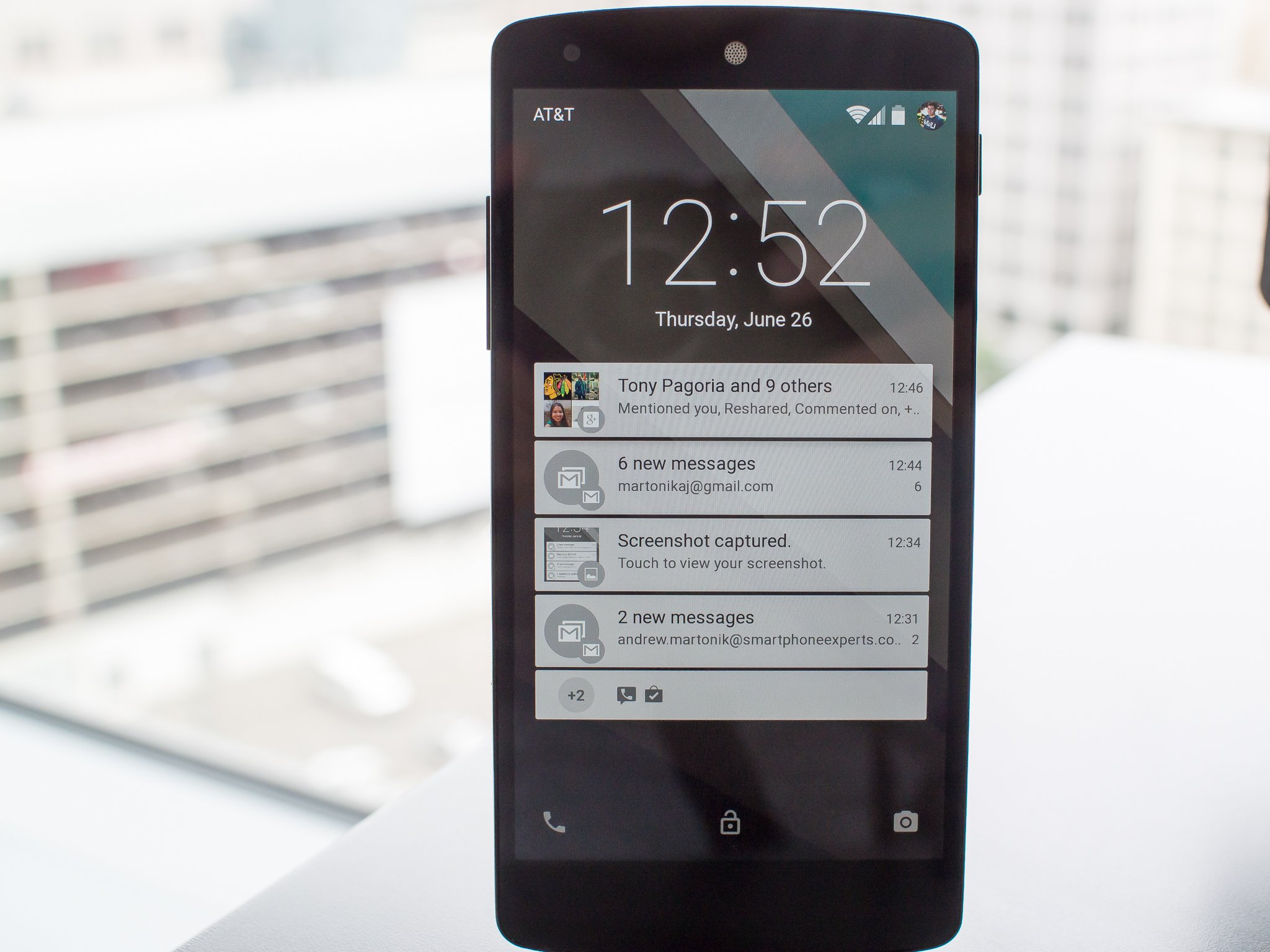
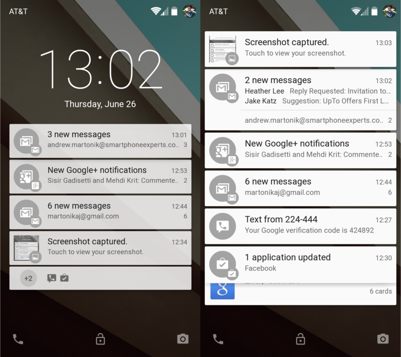
In Android L, the lockscreen and notification pane are getting closer to convergence. When you power the screen on, you'll be greeted by a clock with the date on the top portion of the screen, along with a listing of your most important notifications underneath it in the same style as you see on the homescreen when you pull down the notification pane. You'll get the top four notifications listed, with a small "+" and the number of additional notifications there are below it. Your network, battery state and profile picture show in the top right — just as they do in the notification pane — along with your carrier information in the top left corner and three icons — phone, unlock and camera — on the bottom.
Assuming you forego having a PIN, pattern or password (or in later builds have a trusted Bluetooth device connected), there are four basic gestures that are available to you on the lockscreen. Swiping down across any portion of the screen will expand the small view of your notifications to show a full list of all notifications, which you can then interact with in all of the usual ways. A swipe up on the screen sends you to the homescreen, while a swipe from the right launches the camera (same as KitKat) and a swipe from the left launches your phone dialer.
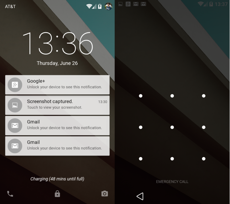
If you choose to go with the aforementioned versions of lockscreen security, the functionality of the lockscreen changes a bit. By default, notification display changes to only show the app and number of notifications, while hiding the content of the message. For example you'll see that there's a Gmail notification, along with the message "Unlock your device to see this notification." Swiping down on the screen simply gives an expanded list of these style of notifications.
Dive into the settings and you can enable full-content notifications while using lockscreen security, if you prefer, and you can also turn off lockscreen notifications altogether.
At least based on what the current Android L Developer Preview has to show us, I think we can call the lockscreen widgets introduced in Android 4.2 a failure as they aren't even included in this release of the software. Considering that very few people really took advantage of the lockscreen widgets and that the notification pane is now taking over your lockscreen the moment you power on your phone, there's really little need for them either. Having quick access to your phone dialer, notifications and camera with simple swipes on the lockscreen is just about all most people will want to do — anything more and they can probably just unlock their phone.
More on Android L
We'll be diving deeply into several different features of Android L, and right now you can follow along with even more words and visuals on the latest version of Android:
- Android L developer preview hands-on
- In pictures: Android L
- Here are the Android L Developer Preview factory images
Andrew was an Executive Editor, U.S. at Android Central between 2012 and 2020.

