Fade to black: Why Android's dark theme rumors don't matter anymore and matter more than ever
The whispers have started up again, the way they do every few months before the next Developer Preview or the next version release. Maybe this will finally be the year Android N brings back the dark theme. Android O will have a system dark theme! Android P has to have a dark theme!! It's a new year, and now the song has started up again. At last, at last, Android Q will be the one to do it, to bring back the glorious dark theme that Android had so long ago.
Except we already got that dark theme back years ago. What we need now is beyond any dark theme we've seen before, and it goes far beyond Android.
[[ image has a burned-in watermark ]]
When I came to the Android ecosystem at the beginning of 2012, I was enamoured with its deep charcoal hues and soft blue accents. To be sure, Android was still rough around the edges in those days, but that Holo color scheme was one I had to be dragged away from. I cried when Google Play Music's UI was inverted from charcoal and blue to orange and white, and for over five years, every time I contacted Google Play support, I asked them to give me back my dark theme.
These blinding white UIs made Android unbearable at night — especially when my eye strain was stabbing me by sunset — and, oh, how I wanted a dark theme back. It's one of my rallying cries: #DarkThemesNow #DarkThemesForever! But around the time of Oreo's release, when the system dark theme vanished into the ether once more, I had an epiphany: we have dark themes now, on more Android phones and better Android phones than ever.
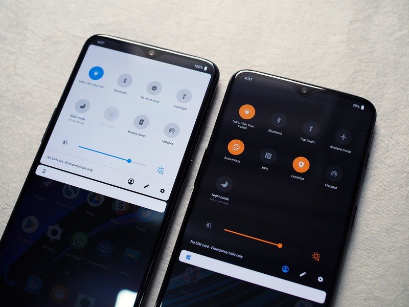
The OnePlus 6T's three-mode, hex-color accented theming system is just about perfect, so much so I actively wish Google would steal it, but that would only solve half the problem. You can get a dark system theme now, but that system theme only reaches a handful of manufacturer apps and system popups.
Android already has better dark system themes than ever before.
What we need is a dark theme that will reach all of your apps and services — not a system-wide dark theme but an ecosystem-wide dark theme — and that's the dark theme that Google has been struggling with for the last five years. We've seen a rise in dark themes both from third-party apps and Google apps; YouTube on Android finally got a dark theme last year. We've seen Google admit that black themes are better for battery. We've even seen teams for various Google services testing dark themes in various shapes and forms.
Be an expert in 5 minutes
Get the latest news from Android Central, your trusted companion in the world of Android
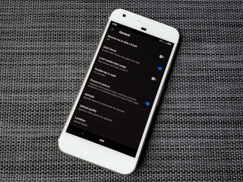
But this is a dark theme that's going to go beyond Android, and with that in mind, I ask two small favors of you. Firstly, please keep pestering every service and app you love for a dark theme if they don't already have one yet. Building a dark theme is a useful feature — and it can be a major boon to readability for users with failing vision — but it takes effort, time, and user demand, so users, demand darkness!
Second, the next time you see someone whispering in a forum about Google bringing back a system dark theme with the next version of Android, remind them that we already have system dark themes. It's an ecosystem dark theme we need, and there's still a lot that has to happen before we get it. In the meantime, we need patience, persistence, and cookies.
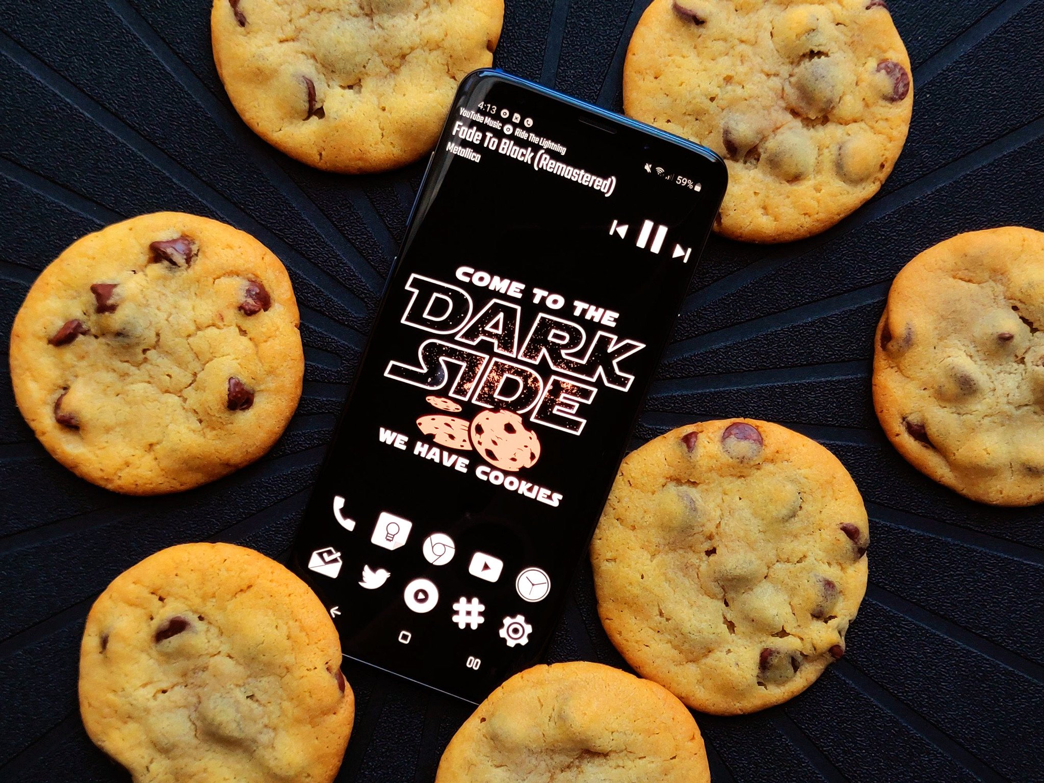
The Dark Side always needs cookies.
Ara Wagoner was a staff writer at Android Central. She themes phones and pokes YouTube Music with a stick. When she's not writing about cases, Chromebooks, or customization, she's wandering around Walt Disney World. If you see her without headphones, RUN. You can follow her on Twitter at @arawagco.

