Android Auto without a touch screen is weird, but I kinda dig it

I don't ask for many features when choosing a rental car, but Android Auto is usually top of the list. Having that bigger screen for Google Maps on long drives is so handy, and the large UI for calls and music genuinely make me a safer driver. I've gotten so used to it, it's difficult to really enjoy a car without it.
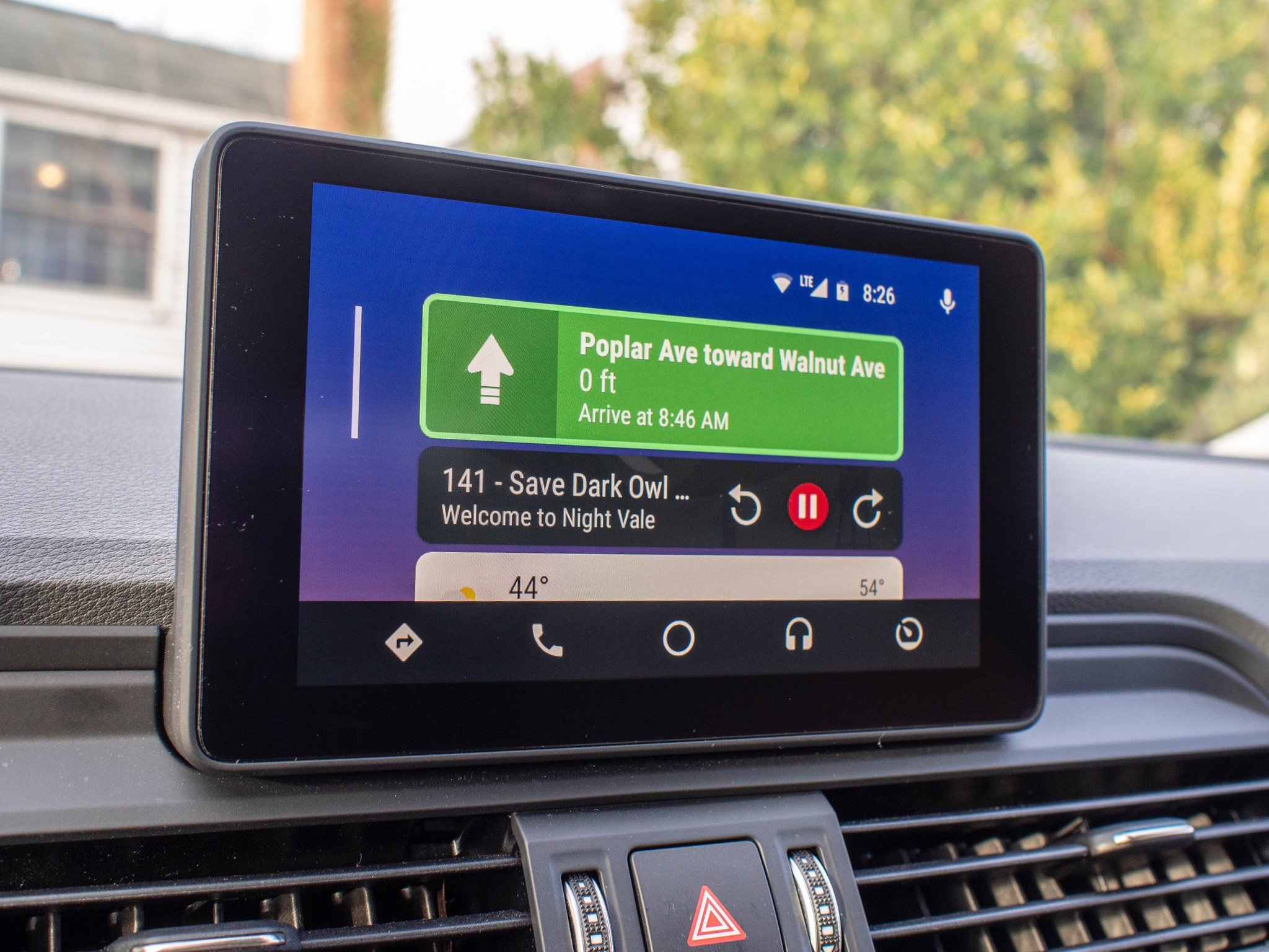
This time, my rental car was a little different. I was provided a 2018 Audi Q5 Quattro, which on top of a ridiculous 248 horsepower engine came with an Android Auto interface that did not include a touchscreen.
Wait, what's happening here?

There's very little about Android Auto that isn't clearly designed to be touched. Even when you just use the Android Auto app on your phone, the UI is designed for you to be able to make quick glances and mash a finger against a big button with little concern for accuracy. It's pretty hard to miss these big buttons, which is a big part of the appeal especially on a larger display.
But the 7-inch media display in the 2018 Q5 has no touch capabilities. It's just glass. That's because the entire rest of the Audi-made interface is controlled with a dial down next to the shifter knob. It's a large button that can be twisted left or right, and pressed in to select, but also can be shifted in the standard D-Pad set of directions. There are quick actions for music and volume controls on the steering wheel, but you did basically everything else with this dial.
To say this took some getting used to is a bit of an understatement. If I wanted to jump to the Google Play Music interface from the Google Maps interface, I had to pull down on the dial so I could access the quick launch buttons, and then rotate the dial to the one I wanted and press down to select. To get back to the main interface from this bottom nav, I needed to push the dial up. If I wanted to access the Hamburger Menu on any screen, I needed to slide the dial to the left. Anytime I would rather use my voice, I needed to slide the dial to the right and wait for the telltale ding to come through the car speakers.
As you can see, this added a lot of extra steps to pretty much everything. There's no situation in which tapping the touch screen wouldn't have been a shorter trip for using this interface, but it was also clear Google and Audi made sure every part of the Android Auto interface was still accessible.
I mostly don't hate this

I'll be honest, the first few hours of driving this car were not my favorite. I felt like I was learning a whole new system, and everything felt inconvenient. Had I only used that car for a single day, my opinion would have been very different and I'm guessing the folks at Audio wouldn't have wanted to answer my phone calls in the future.
Be an expert in 5 minutes
Get the latest news from Android Central, your trusted companion in the world of Android
By the time I finished my 16-hour drive, the Audi system felt natural.
But right around the six hour mark, it all sort of clicked. Navigating the dial became muscle memory. I found I knew the UI well enough that I didn't really need to look at the screen while I was driving to make changes on it. If I wanted a new playlist in Play Music, or if I wanted a different podcast in Pocket Casts, I knew how many dial clicks it took to get there. I mostly use my voice in Google Maps or when I want to call someone, which felt mostly the same as using my car back home.
By the time I finished my 16-hour drive, the Audi system felt natural. I maybe even felt a little bit safer, because I could recognize I was focused even more on the road that I usually was. The only real difference was with notifications. If I got a text message it was always noticeably less convenient to dismiss those than it was with a touch interface. But I have most of my notifications turned off when I drive anyway, so this was a fairly infrequent thing to encounter even after 34 hours of drive time in the vehicle.
I'm not convinced I want this to be the default, but after spending so much time in this car I found myself wondering how much I would use the touchscreen if it was even an option in this car. It made me wonder if Google and other car manufacturers would consider building systems were multiple input methods for these media modes were considered standard. And to that point, what if a company like Logitech made a car-friendly dial for every car that worked with the Android Auto app instead of requiring a separate display?

