Android 7.0: Better and more interactive notifications

Getting notifications on your phone isn't something new or something that started with Android. Whether we're talking about annoying pop-up boxes or that addictive red blinking light, our phones have always been able to tell us it wants our attention.
But with Android 7.0, things are going to get a lot better, largely because developers now have more control over the way notifications are displayed.
Let's talk about the changes and new features.

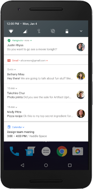
- Direct Replies are something you might have already seen on your phone with some apps. The Hangouts app is an example. If someone sends you a message in Hangouts, and you have no other pending notifications, you get a single message view that you can reply to right from the notifications shade. Since this has been possible since the original Nexus 6 launched, a good number of apps have coded it in.
These kinds of actionable notifications have been further refined in Android 7.0, and the developers can decide to add more context to the notification (think a multi-line chat history in that Hangout's notification, for example) and keep the notification active after you reply if a return response is anticipated. You could have a running Hangouts chat, complete with history, right in your notification shade. And because it's a native view of an app that's already active, it's light on resources.
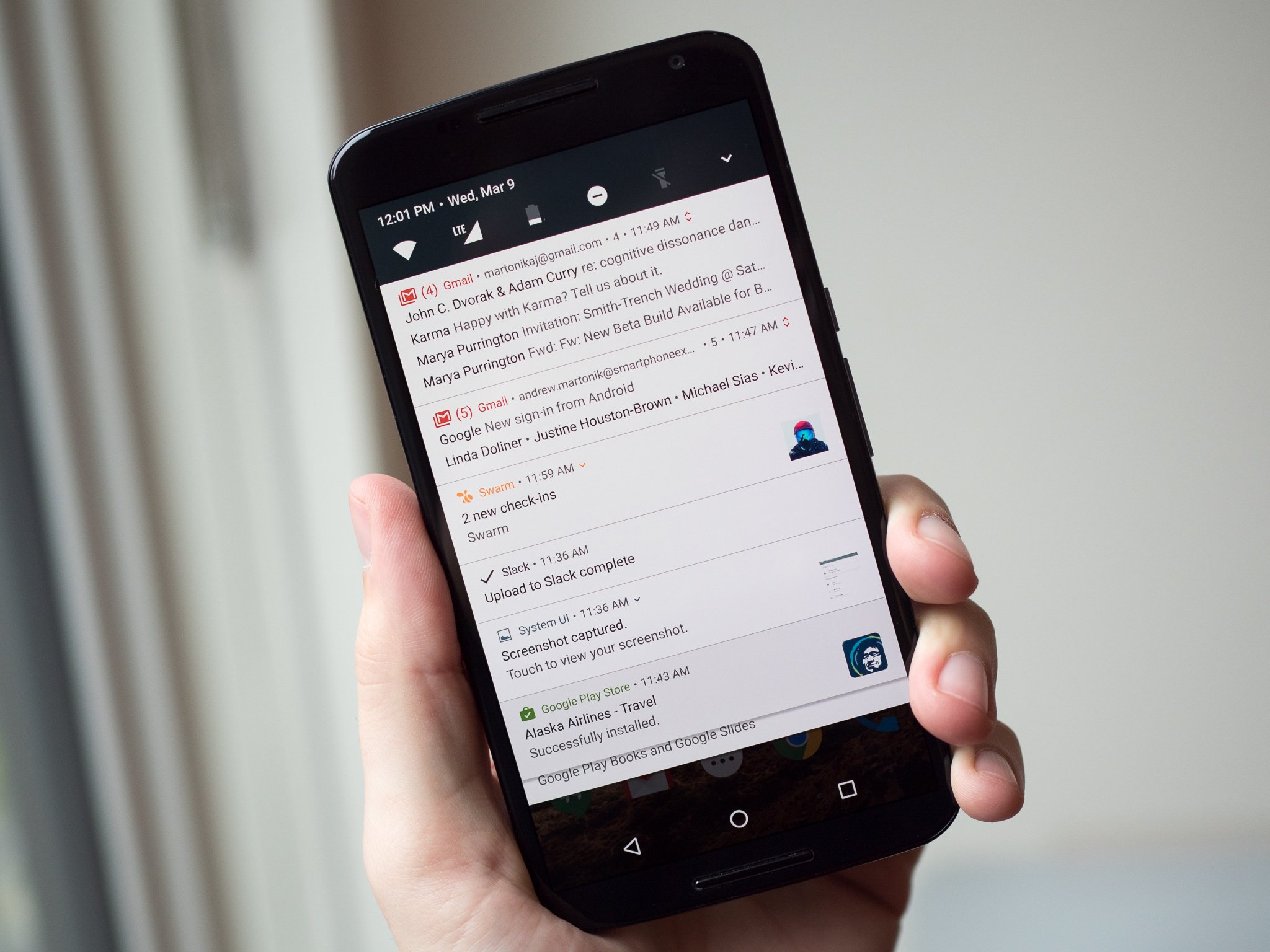
- Bundled Notifications are the improved version of the "stacks" we've seen since Lollipop — using Nougat's new visual styling features. This is why they may feel familiar to you — app developers have been able to implement a form of them for well over a year.
Simply, when multiple notifications for a single app are received, they can be bundled together into a single group. This group can be expanded to see the individual messages. Changes in Android N allow developers to "progressively" expand the notification stack so that they can add context to the group or each notification. That means in our Hangouts example, you could expand a notification bundle showing 3 unread messages and see the chat history for one or all of them — and with the Direct Reply feature, you could act on them.
Developers can use these new features in their apps and still be compatible with older versions of Android
These changes may feel familiar to anyone using an Android with Lollipop or higher because the behavior is built on changes made in Android 5.0 (API 21). They are also what we already use on Android Wear watches with a new visual style. Because of this, Bundled Notifications and inline Direct Replies are backward compatible with any application built for Lollipop or higher. All the developer really needs to do is check that they meet the new best practices. Even if they don't bother, the existing API functions seamlessly call on the newer versions. This is important because the reality is that many apps we use every day rarely get updated.
Even better news is that using existing support libraries, developers can implement these changes and still have an app that works as intended for versions of Android as old as Honeycomb (Android 3.0). That's 98.2% of all Android devices still in use.
Be an expert in 5 minutes
Get the latest news from Android Central, your trusted companion in the world of Android
- Notification Peeking brings back the old pop-up display for an incoming notification, but makes them smarter. A developer can use the peeking window to display the latest incoming notification of a bundled group. Our Hangouts notification is now collapsible and expandable to see content as we like, we can reply to each individual message thread and we could (if implemented by the developer) set things up so a reply can "peek" on our screen for a moment or two — and allow us to directly reply from the peeking window.
- Custom Views and Message Styles let a developer change how the notifications look for a particular app. This can be very important when you are creating bundles and peeking, and can help us as users get the right information at a glance. Message Styles allow customization of a notification's labels, and now our Hangouts notification has a title — "Chat with Dad" or "Bad Jokes" — and if there are multiple participants, each reply could be labeled or colored.
Wrapping it all up, Custom Views allow a developer to define the artwork of a notification bundle (the icon) or define an icon for an individual notification, then use everything else without building their own user interface. A great app can have a unique notification style without worrying about how to handle replies, bundle multiple notifications into a stack and define the individual labels for each view without doing any of the heavy lifting themselves.
So far, these changes appear subtle, and that's because we've only seen Google's take on their implementation. Nobody making Android phones has to keep things low-key and mostly white, and developers now have some tools to make notifications for their apps stand out. We won't like them all, but the next great idea can be built using these tools.
Make notifications great again.

Jerry is an amateur woodworker and struggling shade tree mechanic. There's nothing he can't take apart, but many things he can't reassemble. You'll find him writing and speaking his loud opinion on Android Central and occasionally on Threads.
