It wasn't always easy to answer the question "What is Android?" in a single sentence that adequately explained everything. Android has always been a complex, almost out of control thing in the way it it constantly changed and adjusted to suit the needs of whoever is using it. While that's an exciting thing to watch unfold from a technical perspective, explaining this to someone who just wants a smartphone to check Facebook and play some video games is mostly just confusing.
With Android 5.0 Lollipop, with Material Design taking over the interface and Google's apps taking a more active approach to encouraging use all throughout the UI, an easy answer to that seemingly simple question might have been that this was now Google's Operating System. This year, with Android 6.0 Marshmallow, we're seeing a level of refinement to Material Design and to the underlying features that came with it. That refinement in many places includes the ability to substitute Google's apps and services with whatever you want, and at the same time making it easier for developers to build those alternatives and have them work just as well as what Google offers by default.
What is Android? With the 6.0 Marshmallow release, Android is the most personal operating system you can put on a phone or tablet. Here's our review.
Article continues below 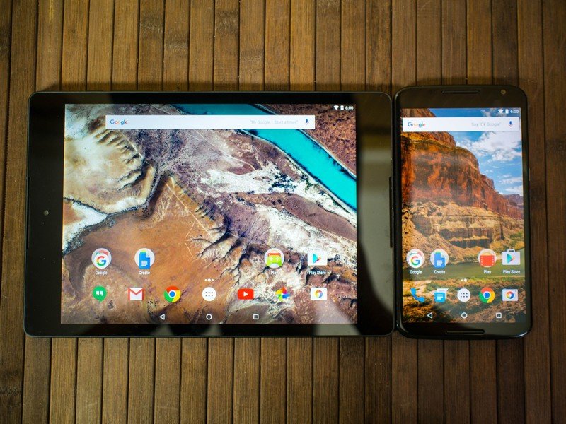
What you see is what you get
Android 6.0 Visual changes
Many people look to Android 5.0 Lollipop, released in the fall of 2015, as the start of Google placing a high priority on visual design and ensuring a fluid UI for everything. The introduction of 60 frames-per-second animations and the introduction of bright colors across the entire interface was a significant change from the dark, clumsy interfaces in Android's Holo UI. What we're seeing in Android 6.0 isn't a visual overhaul, but instead a step closer to completing the Material Design visual experience. With that comes a lot of little changes all over the place, some so small you're unlikely to notice them at first and others that dramatically change the way you look at that part of the interface.
The new Google launcher
The most striking of all the visual changes is Google's launcher. The desktop of this launcher doesn't look at that different when you first see it, but interacting with the icons on the desktop will reveal some animation refinements. Launching an app causes the animation to grow outward from the icon, wherever it is places on the desktop. You see a brief flash of this animation every time you open an app from the desktop, with exception to the Google search app. Since this is the Google Now launcher, tapping on the Google icon will cause the UI to shift to Google Now, where you have access to search and whatever contextually relevant information Now has been holding on to.
Get the latest news from Android Central, your trusted companion in the world of Android
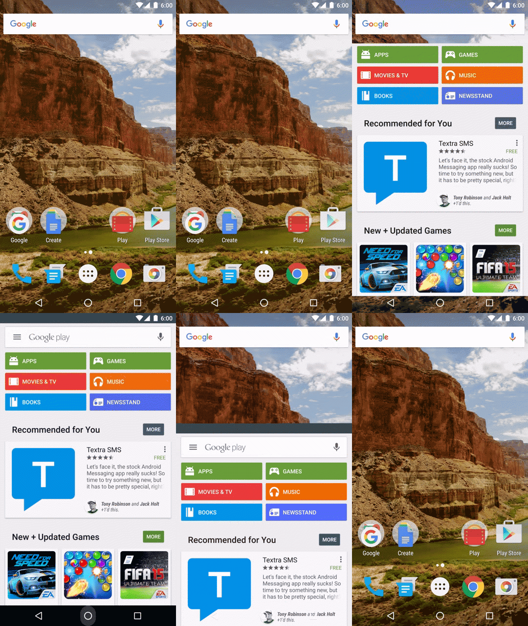
If you're reaching for something that isn't on the desktop, you'll notice Google has shifted to a vertically scrolling and alphabetically sorted list for all of your apps now. Thanks to the dramatically improved inertial scrolling, this launcher makes it significantly faster to get to the app you want when compared to the paginated launcher of the previous generation and even the old vertical scrolling launcher from some of the original versions of Android. a quick flick will get you from top to bottom in an instant, while more controlled sliding offers a more graceful look at what apps are on your shelf. You can also grab the scroll bar on the right side of the screen now, and as you pull it down to the bottom of the page you'll see an alphabetical representation just above you finger, which works alongside a visual pulse at the first app starting with each letter of the alphabet as you move down the list.
There are four apps at the top of this launcher that behave a little differently than the rest of the apps in the app drawer. This section of the launcher is now for Google to recommend apps for faster access, based on your usage over time. If you use Google Play Books at round the same time every evening, or the Android Central app around lunchtime every day, Google will offer those apps at the top of the page during those general times for you to more quickly access. In our testing, the apps on this top shelf change all day based on your activity, and in many cases does a great job making sure apps you frequently use are at the top.
Notifications
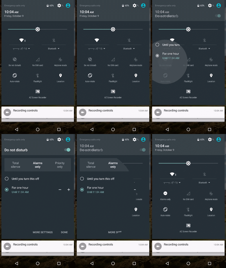
Google's efforts to change the way notifications affect us as we use our phones and tablets throughout the day sounded great as a concept, but there aren't many Android Lollipop users out there who would disagree with calling the change entirely too confusing. The implementation of priority notifications, specifically when things like alarms are involved, needed some polish with this new version of Android.
This year Google has moved notification controls to the Quick Settings panel. From here you can now set Do no disturb mode with a handful of options. You can disable all sounds entirely with the freshly renamed Total silence mode, use the default Alarms only mode to ensure you're only disturbed by your alarm app, or the customizeable Priority only mode that lets you choose what apps are allowed to bother you. These notification preferences can be enforced for specific periods of time, or they can be set until you go in and turn Do not disturb off.
A consequence of this new format for notifications is the streamlining of the volume control panel. Tapping a volume rocker will now only reveal a single line for notification volume control, with an expansion arrow that gives you access to media volume control and alarm volume control. Like before, these control modes become the primary in your volume tray if media is playing. Overall, these changes make for a much cleaner and significantly less confusing interface without sacrificing much in the way of functionality for those who enjoy priority notifications.

Text selection
Cut, copy, and paste have started moving to a new home on Android with the 6.0 update. Previously, highlighting text by long press would cause an action bar to appear with these options and a few others depending on what app you are in. Now those options, and whatever others make sense based on what app you are in, will appear in a smaller bar right above the text you have highlighted so you can get to it quickly.
It's a small change, and as of this writing not even all of Google's apps support the UI change just yet, but where it can be used this little feature is great.
Direct share
It is now significantly easier to share something directly to a single person on Android. In the past, sharing something with a friend usually meant copying a link to your clipboard to paste elsewhere or using the app share function in whatever app you were in and crawling through the contacts list to find the person you want to share with. Direct share makes things a lot easier, though it'll probably be a little while before everything supports it.

On top of the list of usual suspects for sharing a link or text snippet, including your social network apps of choice and your email clients, you'll see contact bubbles for people you've recently interacted with. There's a small icon in the contact bubble referencing the app you were using to communicate with that person, and when you tap on their icon you'll be taken to that conversation with whatever you wanted to share in the text field ready to go once you press send.
This is significantly faster than digging through individual contact managers, but there's some obvious limits to the way this works. Each app is only allowed to take up a maximum of five bubbles in the direct share tray, which itself only appears to support eight bubbles. This means you're only going to get the people you've most recently interacted with in apps that support the feature, and in most apps that information is going to come from active conversations or whatever messages you last received. It also means you can't delete conversations once you're done with them if you want that contact to remain on the direct share list.
This has all the right pieces for a great new feature, but it's not quite there yet. More apps will need to support direct share for it to be useful, and when that happens we'll see how well Google handles half a dozen direct share lists vying for space on this list, especially if you as the user would prefer to only see one or two.
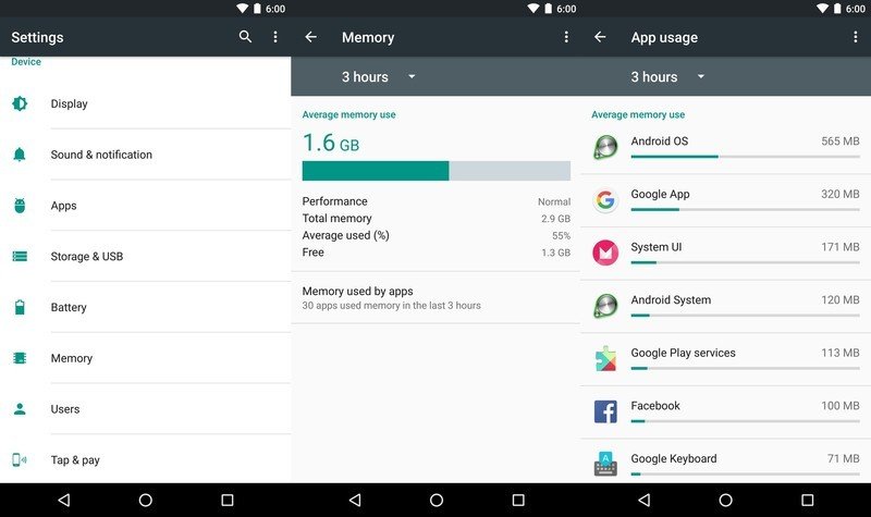
New Memory manager
In the device section of Settings you'll find a new Memory button, and like the Battery manager its job is to show you how much memory is being consumed and what apps are doing the consuming. The meter offer a quick glimpse into your system and lets you know if performance is being negatively affected by too much RAM being used. If you want more information about your system over time, the drop down menu in the top left lets you look back over the last 24 hours to see how apps have behaved overall.
This is a relatively small change, and something most people won't end up using, but has the potential to make tracking down misbehaving apps significantly easier depending on the circumstances.
Custom Chrome tabs
Apps are cool, but there are still tons of things we use every day that require a browser to access information. Lots of app developers have been getting around this by using WebView to basically create stripped down browsers from within their app, so users don't get distracted and go do something else. Since these WebView creations aren't really a part of your regular browser, there's no way for your browser to use the information from that app. This means no way to bookmark the information for later or keep it tucked away as a tab for quickly switching back and forth conveniently.
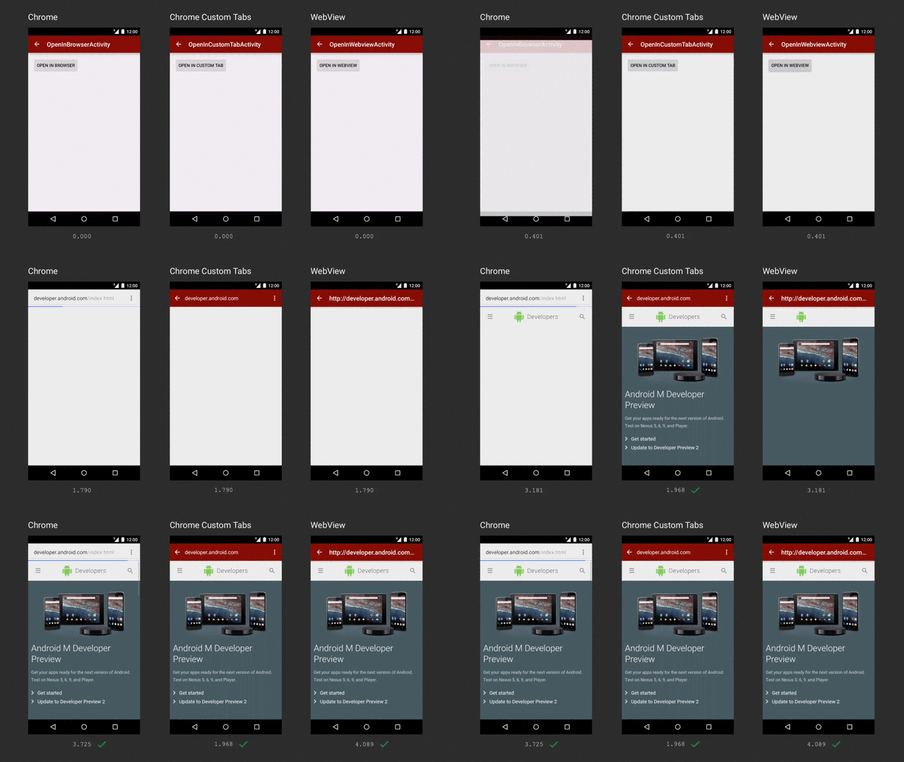
Google's solution lets developers use the core parts of he browser app to deliver those webpages, and naturally the first browser to support this is Chrome. Custom Chrome tabs promise to load pages faster and play nice with the rest of your Chrome experience, so you can still use most of Chrome's features even though you are inside a different app. Most important for developers, the look and feel of these custom tabs can be visually similar to the rest of the app so it doesn't feel like you've been taken away from the buttons that got you to this page in the first place.
The best part about this experience is it's not limited to Chrome. Any Android browser can implements these APIs and create the same experience through their service. This means even though Chrome is installed by default, there's no worry that other browsers are being treated as second-class citizens on the platform.
Tablet UI changes
Gone are the days where Android on larger screens was just a stretched out version of the interface. Google has struggled to clearly define what makes a tablet more functional than a big phone in the past, but with Android 6.0 there's some clever visual differences that make using the primary interface much nicer.
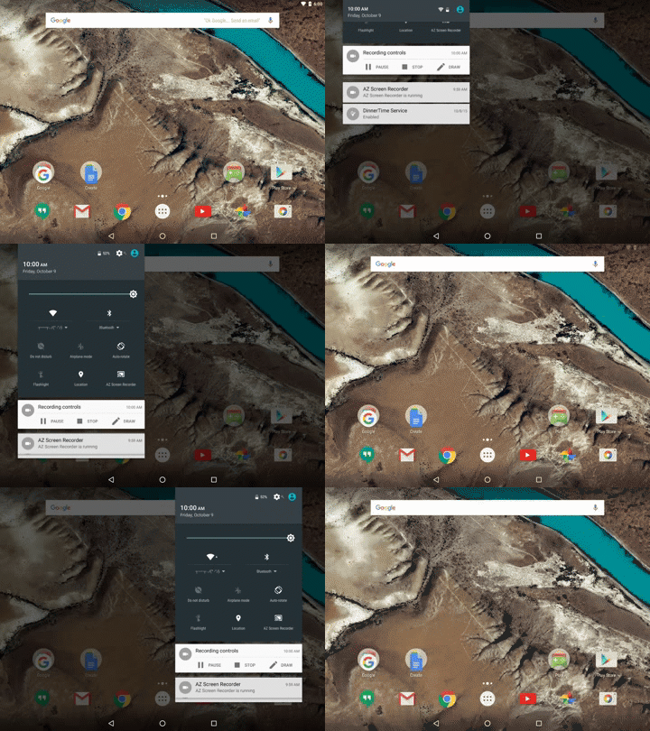
For starters, the notification tray is no longer locked to the center of the screen and it doesn't take up the whole display. Whether it's portrait or landcape, you can pull down the notification shade and it will fall from the location of your finger. The smaller interface here is much easier to manage, and is similar enough to the phone interface that you aren't learning something new to use it.
The launcher, on the other hand, does nearly fill the screen. The four columns we see on the phone interface are expanded to seven on the tablet interface, and the design takes into account whether you're portrait or landscape and behaves accordingly by ensuring there's padding around the icons and around the launcher drawer itself.
Most of the rest of the interface is similar to what we've seen in Android 5.0. The Settings and Google Now panels adjust to support the extra screen real estate, and the whole OS animates well and fills the added space appropriately.
The search company improves search
Android 6.0 Getting better at answers and guesses
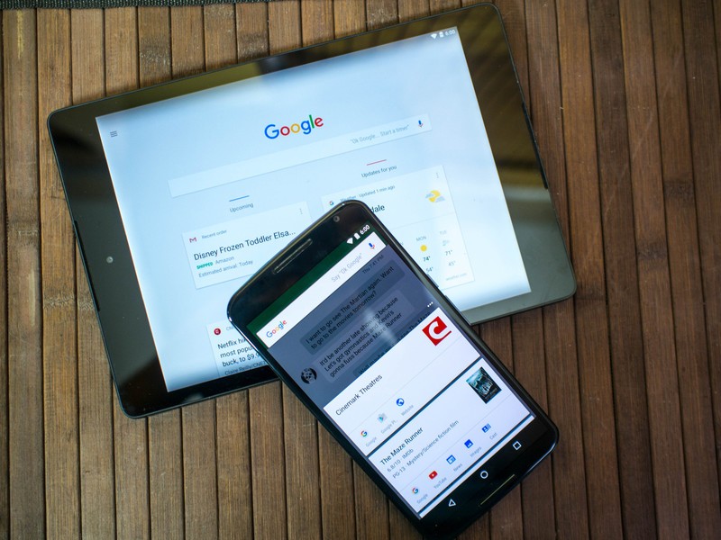
If there's one big thing Google has been constantly improving on over from day one, it's the ability to give you the information you want in the best possible container. In the early days that meant building a killer search engine, but with more and more people using the mobile web as the only web there's a need to streamline and improve where necessary. We've seen Google make tremendous strides over the last couple of years with voice search and predictive suggestions through Google Now, but Android 6.0 introduces dramatic improvements to these features that will make your phone a deeply personal experience over time.
Conversational voice actions
By now you're probably used to being able to speak a command to set an alarm or text a friend. Maybe if you're really adventurous you've had Google fire up YouTube to play the Jurassic World trailer with nothing but your voice, or you've asked about the weather in a place you've never been before to show off to your friends. Voice commands are a handy thing to have, and now that modern Android phones have had the ability to wake u the voice search by hearing "Ok Google" anywhere in the interface there's a good chance a lot of people have used the feature on occasion. Android 6.0 opens the doors for app developers to do a lot more with voice actions, and with any luck eventually some of them will actually use it.

The new voice interaction APIs make it possible for developers to engage directly with users through the voice search system, and unlike the current implementation that interaction can be a two-sided conversation. For the most part, this secondary interaction will be things like the third party app you've summoned with your voice asking if you're sure before taking you away to the app. The example Google provides in their documentation is the ability to ask to play music using TuneIn Radio instead of Play Music, and TuneIn replies by asking what genre of music you want to listen to.
It's a very cool demo on paper, and right now that's all it is. Asking Google to play music on TuneIn right now launches the app, but nothing else happens. While we're only a few days in Marshmallow's public release, Google is really going to need to encourage developers to take advantage of this. Alternatively, since this isn't a Google-only feature, a third party service with support for more apps could be installed and take advantage of this setup.
Better assistant functions
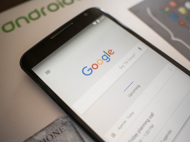
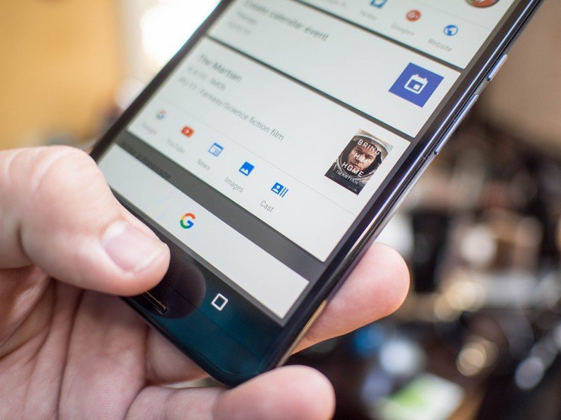
Google has had a great assistant service for a while now, but not everyone wants to use Google Now. The new Assist API makes it possible to completely replace Google Now with your assistant service of choice, and that service will have all of the same basic user-facing launch and data access points as Google Now. As a function of these changes, the swipe up to launch Google Now has been replaced with a long press on the home button. If you choose to use another assistant app and that app has taken advantage of the new Assist APIs, that assistant can be launched the same way as Google Now.
While these functions do great things for making Google Now better, opening the doors so another service can be treated basically the same as Google Now is a big deal. In a world where Microsoft seems focused on building an ecosystem on Android instead of forking the OS to build their own experience, this API goes a long way towards letting the user choose what ecosystem they want to get their information from.
Now on Tap
Google Now is no longer just a suggestion engine you access through the Now page in Google's launcher or through suggestions in your notification panel. While those functions are still alive and well, not to mention improving on a daily basis, there's a new function for Google Now that can be accessed just about anywhere in the OS. It's called Now on Tap, and basically it takes a look at what is currently on your screen and offers you information and potential system functions based on what it can see.
Now on Tap is basically decreasing the total number of buttons you need to push by looking at the contents of your screen and guessing.
For example, you can be in a chat with someone about going to see a movie and when you hit Now on Tap you'll get a button to search for more information on the movie you mentioned in the conversation. Next to that search information, you'll get related things like trailers and ratings for that movie. If you brought up a theater during that conversation, and the name of the theater is on the screen, you'll get a button to search for that theater. When looking up a person, you'll get things like social network accounts alongside the search prompts. It's not pulling the trigger and searching for you, but queuing up potential searches and related information you might want to perform based on the text and images and links on the screen.
This is a cool idea if you see a photo of someone in an article and you want some additional information on that person, but for things like movie searches there's something of a disconnect. For some reason Now on Tap doesn't connect the dots and head immediately to showtimes for that movie in your area, something Google's search engine already does. Some of that is because Now on Tap isn't doing the search until you explicitly give the command, which is also why you can't ask a question through voice command based on the information you see on Now on Tap. The lack of follow through in some of this is a little frustrating.
Where you will see follow through demonstrated to spectacular effect is in apps with a lot of obviously personal information. Specifically, the ability to pull dates and details from things like emails and suggest creating a calendar event based on the contents of the email. This is something Google Now was already mostly capable of by grabbing keywords and offering things like drive time from your current location to something in your calendar or email. With Now on Tap, this kind of thing is basically decreasing the total number of buttons you need to push by looking at the contents of your screen and guessing.
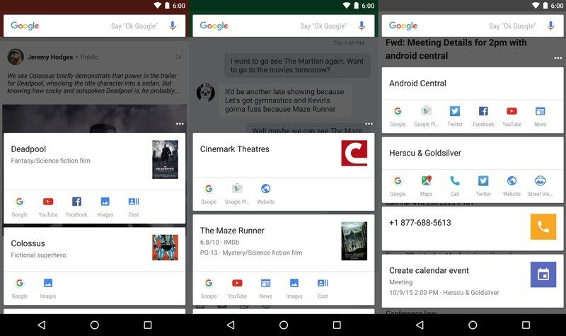
It's early days for Now on Tap, and that means the misfire rate is unfortunately high right now. Some of these misfires are to be expected, like when you abbreviate something in a conversation with a friend and that abbreviation is the name of a major company or service. Other misfires, like when Now on Tap pulls an ancient photo as the header image for someone when their very public social network accounts have a much more recent photo (sorry Phil), aren't quite as forgivable. As we've seen with Google Now, this is something that will improve quickly based on user feedback and constant use. If it feels like we're beta testing this app for Google, that's because we are.
As is always the case when Google Now is mentioned, it's important to be mindful of privacy concerns. Now on Tap is scraping screenshots for keywords and using that information to suggest actions. Now on Tap has to be enabled on purpose before any of these features start to work, and even then app developers have the ability to stop Now on Tap from crawling their pages, which means as long as the app developer is paying attention things like bank apps and the corresponding data don't find their way into these search systems. It's also important to remember no searches are initiated unless you follow through by pressing the button, and in all of our testing so far nothing from the pre-search keyword grabs has shown up in places like Google Now or in any of Google's search information on your privacy dashboard.
Under the hood
Android 6.0 A better relationship with apps
Apps make the world go round these days, and the way we interact with these apps is a big deal. The way apps interact with the operating system is an even bigger deal, especially when a deeper integration with the operating system means a better workflow for the people poking at glass panels all day to get things done. Android 6.0 has introduced a better relationship between users and apps, both in day to day use and the way we look at apps as we move from device to device.
Adoptable storage
There's a group of people out there that really don't like to hear this, but the way we currently use removable storage on Android is awful and in many cases we were collectively better off by not having phone with removable storage. Almost all microSD cards are slower than the storage on your phone, and making an app read back and forth between a slow disk and a fast one just because you want to walk around with 100GB of music or movies in your pocket or you want to install all of the apps is begging for a poor experience. It just is. There's a better way to handle secondary storage systems, and Android 6.0 has finally implemented this method.
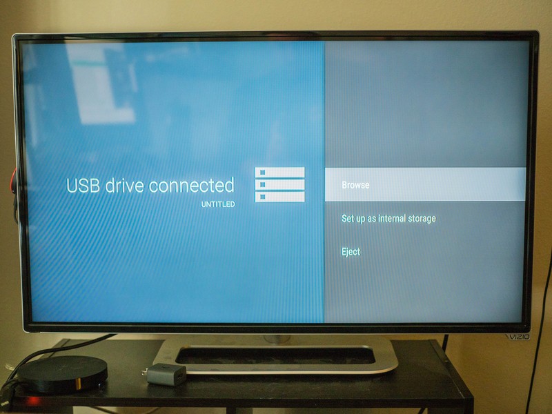
Adoptable storage now allows Android to take advantage of secondary storage systems like microSD cards and USB-OTG drives in a new way. Instead of treating these storage devices like temporary visitors, and by extension making it impossible to store important app data on it so your hardware continues to function as intended if it is removed, the OS can now adopt this secondary storage and treat it like primary storage. This means your microSD card can now be used for app storage and other important things, but it also means you have to format the card once you stick it in your phone and removing it is a really bad idea.
Currently, the only Android 6.0 hardware capable of supporting adoptable storage in any meaningful way is the Nexus Player. While it's a cool trick to take a USB-OTG cable and add storage to your phone or tablet, it makes doing things like walking around with or charging the hardware somewhat tricky. The Nexus Player, on the other hand, has a free microUSB port and doesn't move around. That means you can expand the existing 8GB of onboard storage to whatever you want, which is great if you're playing a lot of games. While it's a little odd neither the Nexus 5X or 6P came with removable storage slots, there's going to be quite a few Android phones updating to Android 6.0 in the not-so-distant future that do.
Auto Backup
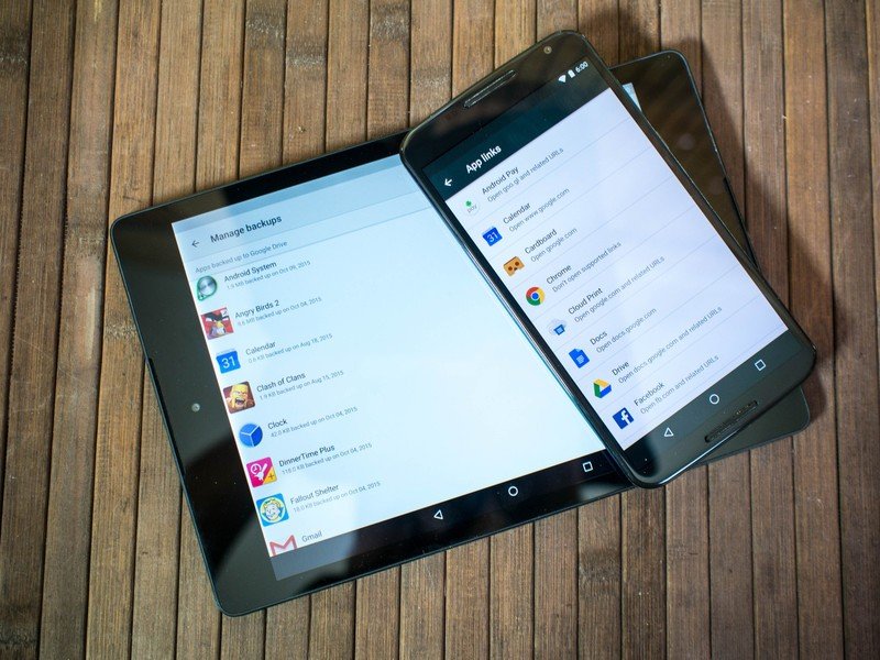
Google does a great job making it so all of the information you save with Google is just sort of there when you log in to another Android phone or tablet with your Google account, but that's only a fraction of the mobile experience. We play games, create playlists, assemble connected home configurations, and almost all of this happens in apps that aren't created or maintained by Google. Unless each individual app developer maintained their own cloud-cased backup, that data used to just be lost when something happened to your phone. Auto Backup fixes this, and all you need is a Google Drive account.
Without your input at all, any app that has been updated to support Android 6.0 will be backed up once a day to your Google Drive.
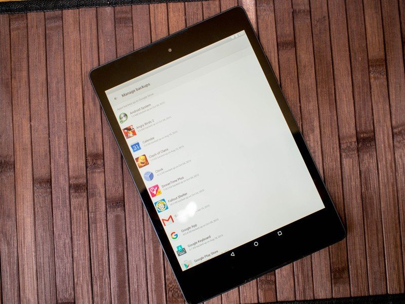
Without your input at all, any app that has been updated to support Android 6.0 will be backed up once a day to your Google Drive. You can see what apps are being backed up if you head to Settings>Manage Backups in Drive, but you can't actually do any managing of those backups from the Drive app. What you will see is when the app was last backed up, and how much space that backup is currently consuming.
When you move to a new phone or tablet, installing an app you have backup data for should call that backup data to your new device alongside the install, making it so you start that app with the data with everything you previously had. Games should have backups of previous saves, playlists should be intact, and settings for your apps should be just as you left them on your previous device.
Of course this requires the apps you use supporting the most recent version of the Android SDK, so it may take a little while for all of your apps to support this backup mechanism. By the time you're moving from your first Marshmallow phone or tablet to your second, there's a good chance nearly all of your apps will support this functionality.
App linking
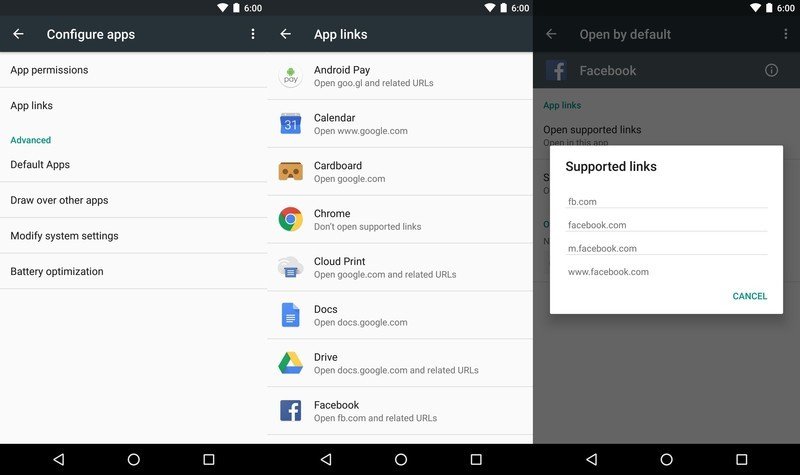
There are a lot of apps out there, and a big part of the Android experience is being able to use whatever app you want as the default app for certain experiences. When you click on a Twitter link, you should be able to choose what app opens that link. It should never be something the OS chooses for you, unless its obvious. While choice is great, if you've only got one app on your phone asking to handle a specific kind of link, Android should be smart enough to go directly to that app unless you tell it otherwise. Now, in Android 6.0, that's exactly what you can do.
For most of us, app linking means fewer button presses between seeing a link and using an app, which is always a good thing.
App linking makes it possible for a link on a page to point specifically to an app, so Android doesn't ask if you'd rather open a YouTube link with the YouTube app or with Chrome, because obviously you want to open that link with the YouTube app. A small modification to the website the link is coming from acts as a nod to the corresponding app on your phone or tablet, and instead of asking how you want to open the link the app just fires up and handles the information. This means things like the official apps for Facebook, Twitter, Google+, etc will work out of the box as long as they are the only apps on your phone meant to handle those requests. If you have multiple apps on your phone made to handle links from their respective services, you'll get the same request form where you choose what should be the default for opening the link.
Users also not have the ability to manually set the behavior for this selection screen, by either setting an app to always accept links or by telling the OS to ask which app you want to open that link with every time you get one of those links. These aren't features most people will use particularly often, but could come in handy when trying to find your ideal Twitter app or trying to choose the best browser for your needs. For most of us, app linking means fewer button presses between seeing a link and using an app, which is always a good thing.
Lock it up tight
Android 6.0 Security and privacy
We frequently say that users are a secure as they choose to be, but truth be told there's always more to be done on an OS and app level to protect users. Android 6.0 introduces new security and privacy functions, designed to give you the tools to better protect yourself. Some of these things are small and invisible, while others alter the way apps touch your phone and your personal data. It's still incredibly important to choose to be secure when using your phone, but these new tools will make that a lot easier to do.
Charging mode by default
Most Android phones offer you the ability to sync photos and music to and from your phone or tablet as soon as you connect to a computer. Some go as far as offering a folder with drivers so your computer has everything it needs to better communicate with your phone or tablet. While it's nice to have these pop ups if that's what you want to do every time you connect to a computer, this connection method on a computer you're not familiar with can be unsafe.
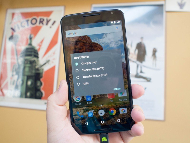
To avoid any potential problems from plugging your phone in to a computer, the default connection in Android 6.0 will now be charge only. This means you'll need to pull down the notification shade and choose to connect to a computer for data transfers before that happens. It adds an extra step if you're trying to move photos off your phone via USB cable, but it also means you can plug in to charge and not worry about the software on the other end of that cable.
APK Validation
If you are the kind of person who installs apps from places that aren't the Google Play Store for things like pirated apps, there's an implied risk associated with your behavior. The stricter APK validation tools in Android 6.0 checks the file manifest against the APK itself, and if these two things don't line up the APK will be considered corrupt. This will decrease — but not remove — the risks associated with installing apps that have been tampered with by requiring any APKs that have been tampered with be re-signed. It's going to mean fewer pirated APKs will install on your phone or tablet, but it also means you're less likely to accidentally install malware.
Also, stop installing pirated apps. You're better than that.
App Permissions
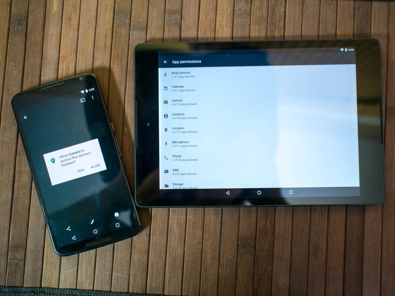
The Google Play Store has made some impressive efforts in educating users on what parts of the phone and what kind of data an app wants to look at before you install it, but it has been an all or nothing affair so far. If you want an app but you don't want that app to access things like your location, your only option was to not install the app. We've seen third-party solutions to this problem, but Android 6.0 is making it possible for users to choose what permissions each app has access to, as well as the ability to revoke those permissions at a later date.
Apps built for or updated to support Android 6.0 are now installed with access to almost nothing. Once that app is installed, in order to access parts of your phone or data, it has to ask for permission.

That Additional permissions section includes things like Car information if you're an Android Auto users, Google Voice, Google Photos, the ability to write instant messages, and accessing your Twitter account. You can expect more to show up here, but for now that's what we've seen. In order to access any of this information from your phone, a pop-up will appear asking for you to give permission to that part of your phone. If you deny permission, the app isn't allowed access to that information. If you grant permission to an app and decide you've changed your mind, the new permissions section of Settings>Apps has a simple toggle switch for you to immediately remove access.
These new app permissions are really important, but it can't be stressed enough that they only work when you're paying attention.
Currently, this only applies to apps that have been made for or updated to support Android 6.0. As we've seen with some of the other features Google rolled out, that list isn't huge right now. Apps that are built for the older versions of Android are still installed with access to the permissions you granted when prompted at the time of install, but you can go and remove access once the app is installed through the same Settings>Apps>Permissions system. If you choose to do so, you'll see a warning pop-up explaining there's a chance some apps will crash if you deny permission since they weren't built to suddenly not have that information. In our tests, total app failure by removing things like contacts access or location access was basically nonexistent, but if you try to remove camera access from a camera app you're going to have a bad time.
These new app permissions are really important, but it can't be stressed enough that they only work when you're paying attention. Just like the terms of service pop-up you've ignored on hundreds of apps and websites before Android 6.0, if you ignore a permission pop-up and agree to everything so you can get to what you want to do faster, you're not any better off than you were with the previous version of Android. This set of tools will help you choose whether you want to share data or hardware access with app developers, but it's important that you use those tools instead of ignoring them.
Fingerprints
We've seen a handful of Android phones using fingerprint sensors over the past year that are surprisingly good, but each of these systems are maintained separately by their respective manufacturers and have their own sets of features. The new fingerprint API creates a single set of instructions for each fingerprint sensor to use as a baseline, and makes it easier for app developers to support fingerprint-based security in their apps by offering a single thing to support instead of having to choose.
With a single fingerprint system in place, any app that requires a login of any kind can rely on a fingerprint to make it easier and faster for users to access their information. Long-term, this could eliminate app-specific passwords for users with fingerprint sensors on their phones, and with the Confirm Credential function in Android 6.0 app developers will be able to use the information from the last time you used your fingerprint sensor to log you in to something. This means you could unlock your phone with a fingerprint, and for a few seconds after that unlock you'll be able to access your secured apps without needing to use your fingerprint a second time.
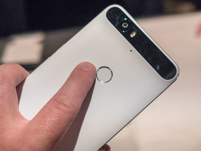
While having a well-rounded API for fingerprint scanning to hook into the security layer as well as application-specific security is a great thing, manufacturers will still have to provide and support a method to digitize a fingerprint and get the data into the system.Android Marshmallow has methods in place for developers to do things with the fingerprint data they collect, but collecting it is up to the people who make your phone. While having a well-rounded API for fingerprint scanning to hook into the security layer as well as application-specific security is a great thing, manufacturers will still have to provide and support a method to digitize a fingerprint and get the data into the system.
And there is no requirement that any of the Android vendors implement any of the new fingerprint APIs. Samsung has a standing system in place that performs in a way they like. It's possible that they forgo everything abut the new fingerprint API and keep doing their own thing. Likewise, new Nexus devices will require support at the OS level for yet another (possibly) proprietary set of sensors and software with their Nexus Imprint system, which is how Google is using the fingerprint APIs on their own hardware.
The good news here is that we now have a system in place that anyone and everyone can use with fingerprint data for security purposes. Partners can make use of this and provide a consistent fell between different models, while still adding in their own features and options.
Just Doze
Android 6.0 The promise of better battery life
Google has been chasing the battery life woes of Android for a long time now, and while every release includes new tools for better power management there's usually a catch. For instance, a lot of those tools are things developers have to implement in their apps, and that doesn't always happen. Android 6.0 is the version where Good Guy Google steps in and puts the foot down, ensuring apps behave in specific ways to ensure your battery lasts longer.
App Standby
Most of our apps use data, but not all of them are respectful about when to check in to grab an update or look for new messages to show you. If you haven't opened your sports app in a few hours, there's a good chance you don't need it checking the scoreboard every couple of minutes. App Standby is Google stepping in when you aren't connected to power and limiting the number of times an app can access the internet if you haven't used the app recently.
This doesn't change the way you interact with that app or that way that app serves you information. As soon as you open the app back up everything will run just the way you expect it would. Additionally, if you have an app feeding you information via a persistent notification on your lockscreen or notification tray, Android leaves those apps alone. This is specifically for apps that are running in the background hours after you've touched them, and limiting their ability to access the web to once a day unless you are either connected to power or you launch the app to use it.
Doze
Few things are more frustrating than picking up your phone or tablet after several hours of not touching it only to find you've lost 20% of your battery doing nothing. Google's new Doze feature tackles this problem by paying attention to what is happening to your phone or tablet and enforcing access rules when your phone or tablet is disconnected from power and stationary for extended periods of time.
When you set your phone or tablet down and don't touch it for a while, Doze places limitations on what apps are allowed to do. You system is essentially forced to sleep, and Android ignores most apps that try to keep the system awake as well as suspends access to wireless and cellular networks for everything but critical functions like the dialer. Everything but the most important parts of your OS stops, save for occasional maintenance periods where apps are allowed to check in and update.
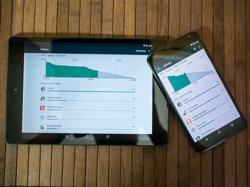
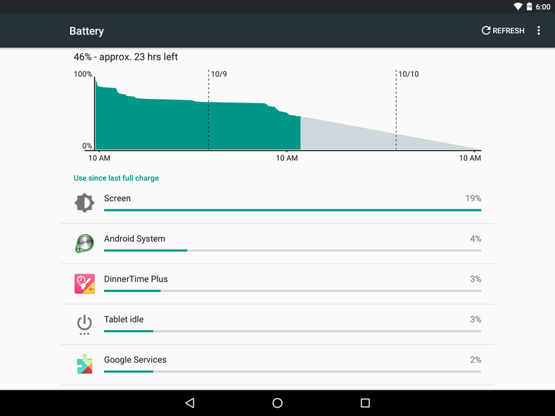
The cool thing about Doze is you can see immediate results in Android 6.0, and it's only going to get better with time. You can see the long lines of inactivity in the battery manager where nothing was allowed to consume power, and Google has tools for adapting apps to work with Doze and App standby so the transitions in an out of these battery saving features are as smooth as possible.

Real world usage
Claiming better battery life through new behaviors is great, but how does this work in real world events? Through our testing, Android 6.0 isn't any better or worse at getting managing power when you are actively using the phone. Browsing the web, playing games, checking email, these are all things that will consume the same amount of power. App Standby reduces the chances of a background app misbehaving by constantly checking in and using your data, but outside of this the biggest place you'll see battery improvement is through Doze.
Google's done a good job delivering noticeable battery improvements in Android 6.0.
There's no doubt Doze does exactly what Google says it does. Battery history on Android will show you how little power the phone or tablet is using when still, and how the OS wakes up at intervals to allow certain apps to check in and update before going back into this deep sleep. The Wifi-only HTC Nexus 9, which would typically consume upwards of 8% battery overnight on Android 5.1.1, is now consuming less than 1% overnight on Android 6.0. The same can be said for the Motorola Nexus 6, which is now consuming 3% battery overnight with a cellular radio on and running instead of the upwards of 15% it used to draw under the same circumstances.
Google's done a good job delivering noticeable battery improvements in Android 6.0, but it is going to depend largely on your usage. For folks who set their phone somewhere and don't touch it for significant portions of the day, this is a huge deal. Even if all you do is set your phone down while watching a movie, the battery savings on a day to day basis should be noticeable.
Devastatingly important updates
Android 6.0 Being together, not the same
Google is faced with a lot of unique challenges with Android. There are a lot of companies using Android to package their own ideas, and that means the experience is rarely the same when you set two products running Android side by side. Choice is an important part of the Android ecosystem, and if Android 5.0 was all about making Google's contributions to Android visible and similarly functional across all Android phones and tablets, Android 6.0 is about taking the underlying pieces that make Google's apps and services run well and making them things other developers can provide functional alternatives to. It means Google wants Android users to have a great experience even if they aren't using Google products, which is fantastic.
Android 6.0 introduces a lot of small but devastatingly important things to the platform. The new sense of polish, refinements to ideas introduced in the previous version, and all new systems for giving users choice and control are going to have lasting effects on how we interact with our phones and tablets. There's a lot of great ideas that look fantastic in this release, and it's only going to get better as more developers take these ideas an run with them.
As is always the case with Android, what we're looking at today is just the start of the chapter. HTC, Samsung, LG, and others are going to be adjusting Marshmallow to suit their products soon enough, and when coupled with seeing what Android 6.0 looks like on the new Nexus phones there's a lot left to learn about this new version of Android. We've all got quite a bit of exploring left to go, but as first impressions go this new flavor of Android is more than a little impressive.

