Android 4.4 vs. Android 10 — How Android has changed over the years
All the way back in 2008, a little phone by the name of the T-Mobile G1 was released. As many of you probably know, it was the first publicly-available smartphone that was powered by Android.
The T-Mobile G1 shipped with Android 1.0, and over the years since then, Android has gone through countless updates that have tweaked and refined it to the point where we are now with Android 10 (and soon to be Android 11). The Android we have today is a far cry from past versions in some ways, and in others, a lot of that old DNA still holds true.
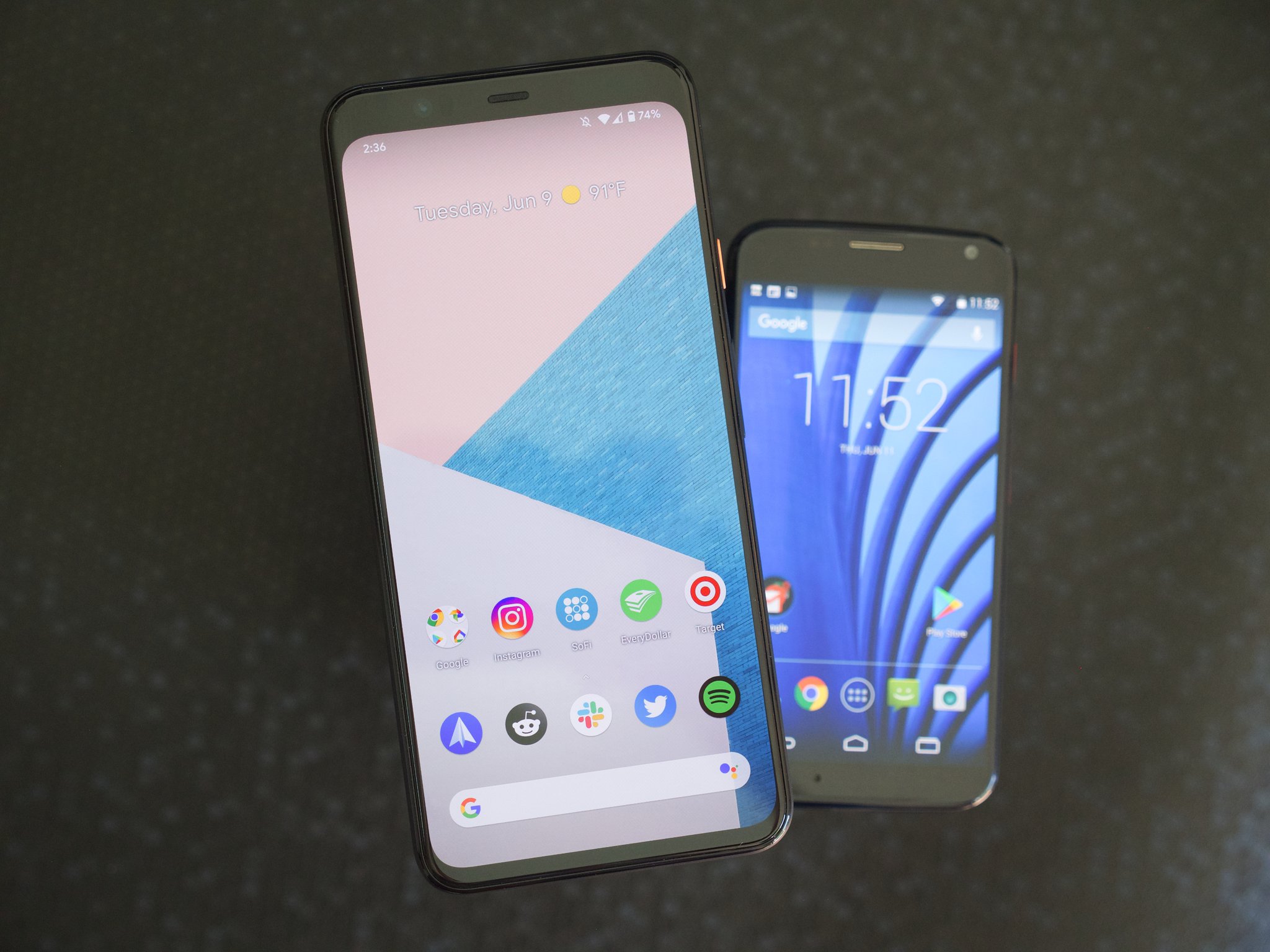
I wanted to get a better idea of just how much Android has changed over the past few years, so I went into my drawer of old phones, dug out my 2013 Moto X running Android 4.4.3, and compared it side-by-side with my Pixel 4 XL on Android 10.
Here's what's changed (and what's stayed the same) between these two hallmark Android versions that are separated by seven years.
Lock screen
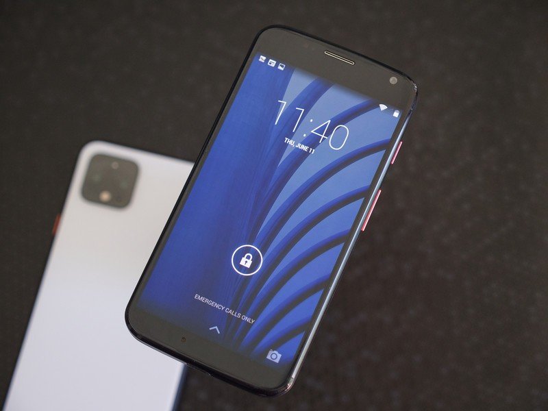
The first thing you see on your Android phone when you power it on is the lock screen, so naturally, that's arguably the best place to start our comparison.
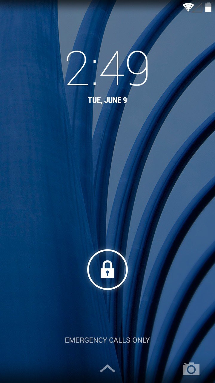
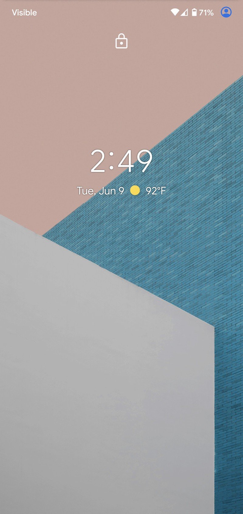
At first glance, it doesn't look like too much has changed in this department. The lock screen on both Android 4.4 and Android 10 shows the time and date, your current Wi-Fi and wireless service signals, and a battery icon. You benefit from a little readout of the current weather on Google's flavor of Android 10, but that's about it.
Source: Android Central
Be an expert in 5 minutes
Get the latest news from Android Central, your trusted companion in the world of Android
That said, there is a pretty significant difference between the two that you can't actually see — notification support.
Getting notifications on your lock screen is just one of those core Android features these days, but that's something that didn't exist in Android 4.4 and earlier versions. You could swipe down from the top of your screen to see your full notification panel, but the experience wasn't nearly as seamless as it is today.
Support for notifications on the lock screen was added a year later with the release of Android 5.0 Lollipop, but it's kind of crazy to think that this is something Android lacked for as long as it did.
Home screen
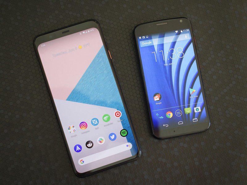
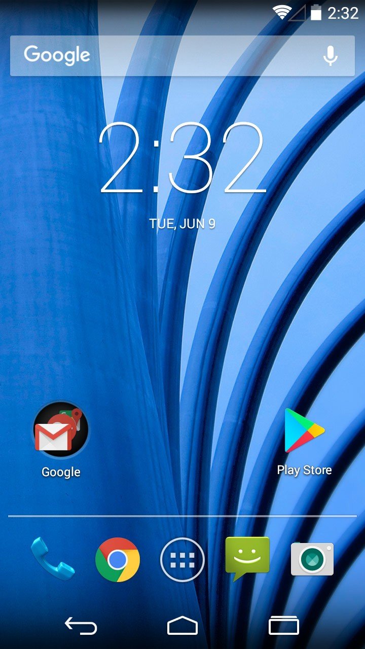
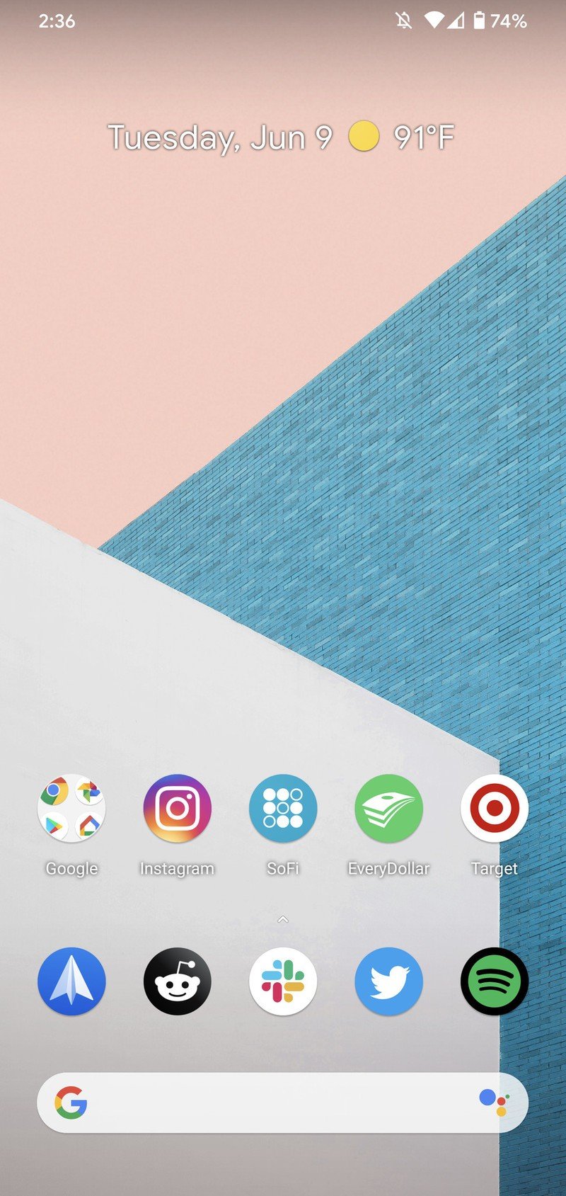
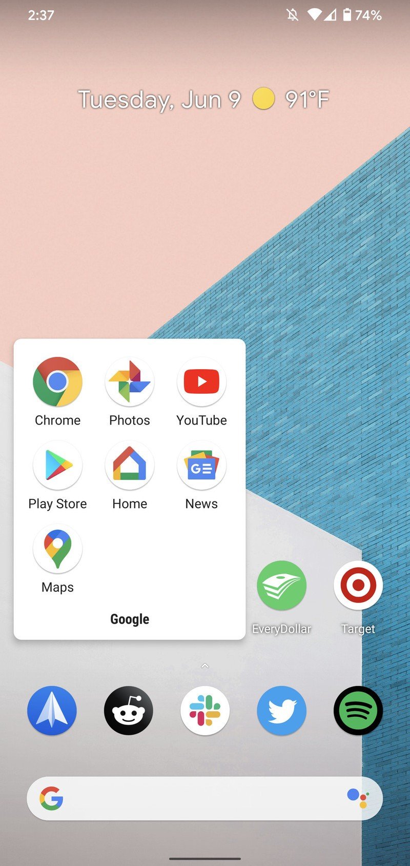
Moving beyond the lock screen and diving into Android's home screen, this is where things get really interesting. The core layout and function of everything has remained the same — you can customize your home screen with apps, folders, and widgets, while the app drawer is home to all of your installed applications. The finer details, however, is where things differ quite a lot.
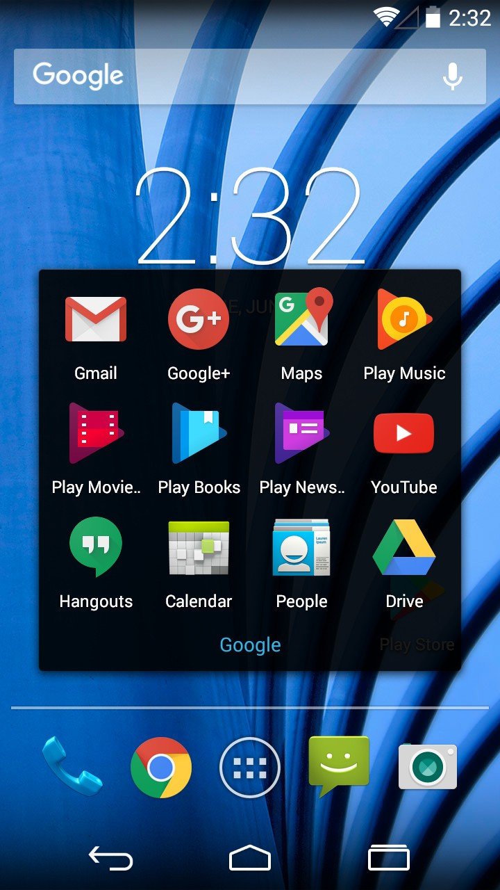
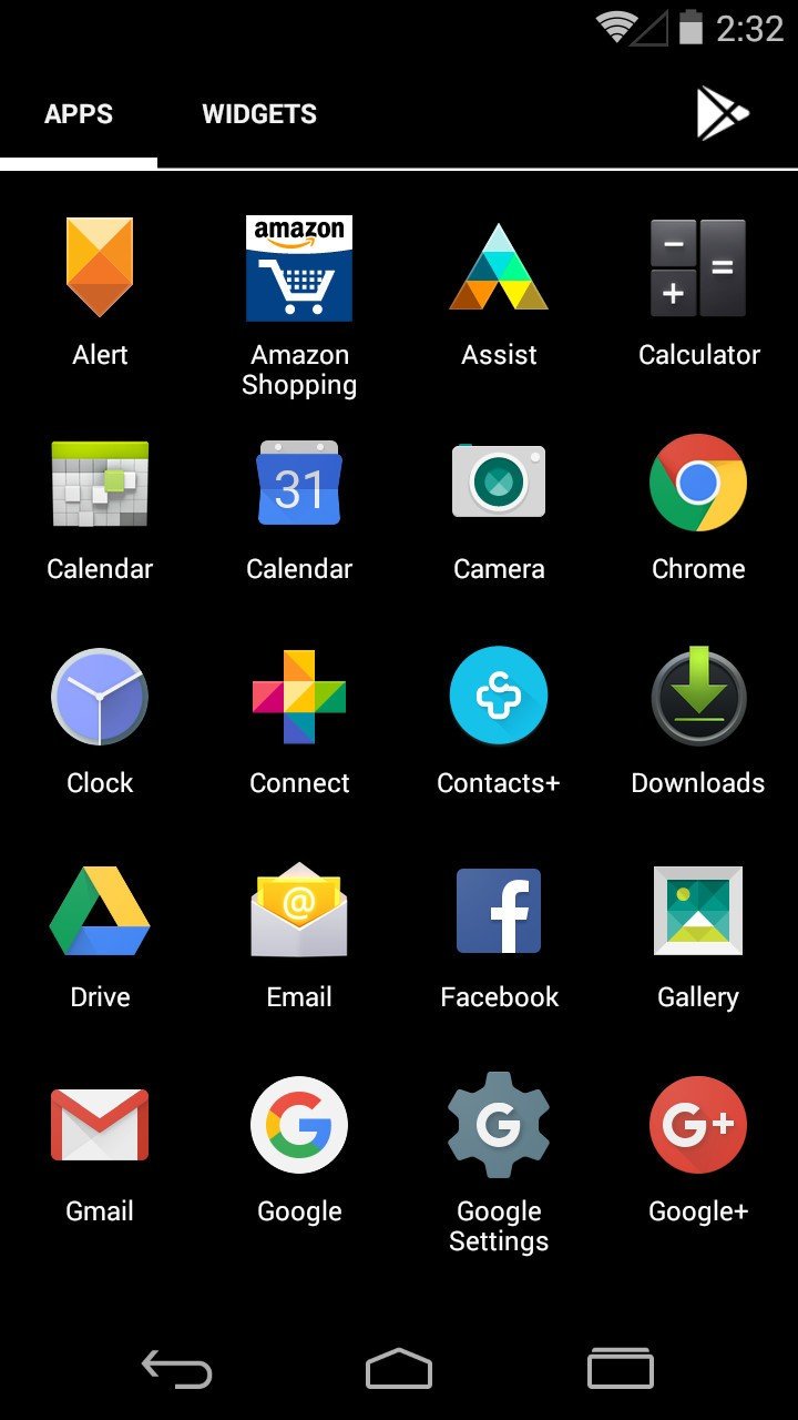
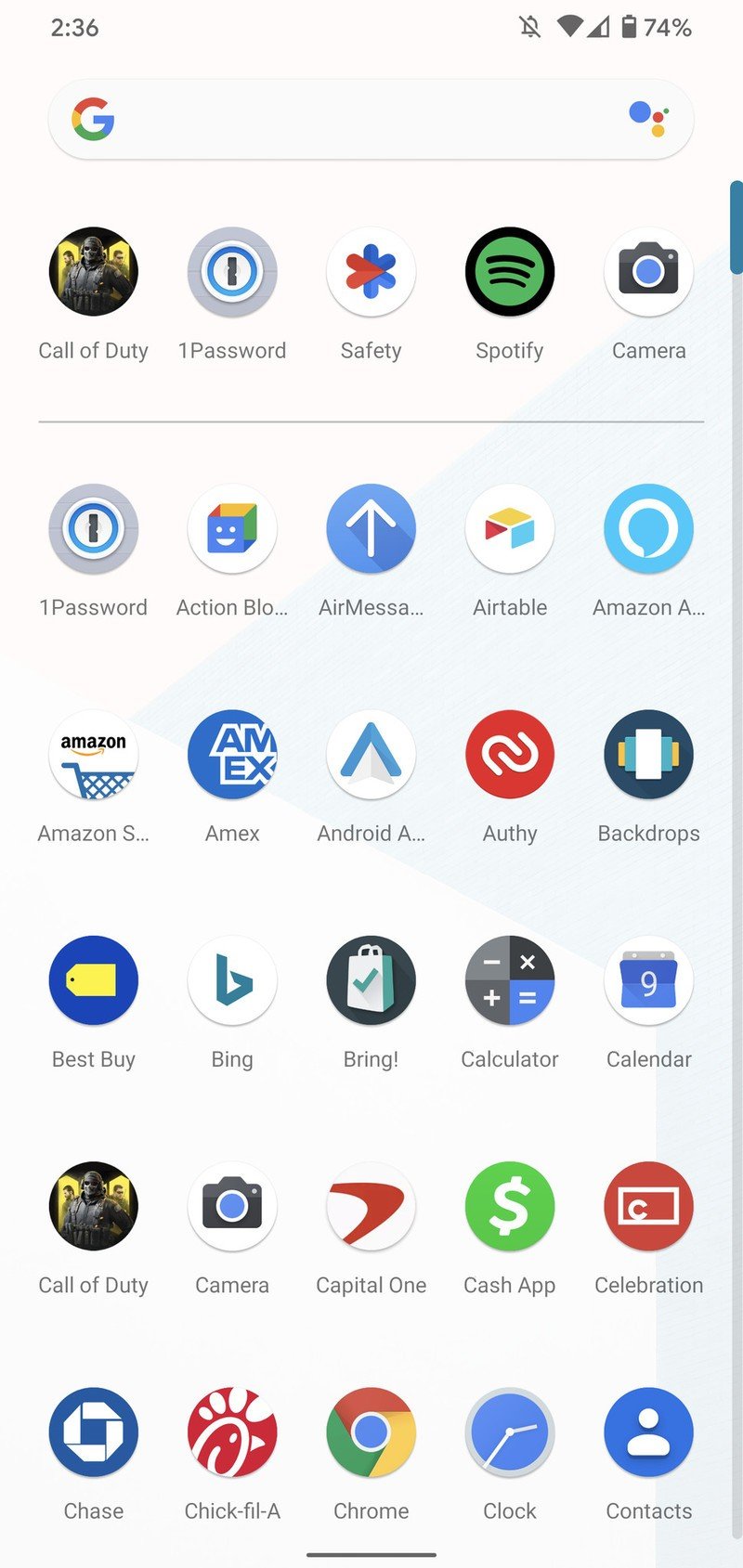
Perhaps the biggest change is how you access your app drawer. In Android 4.4 KitKat, the app drawer was accessed by tapping an app drawer icon; in Android 10, you get to the app drawer by swiping up from the bottom of your screen. Once you're here, things continue to differ. You navigated through different pages of your apps with horizontal swipes in Android 4.4, but in Android 10, everything is on a single page that scrolls vertically. You'll also notice that 4.4 had a section for your widgets, where these are now hidden behind a long-press on your home screen.
Source: Android Central
Source: Android Central
Along with those functional changes, there's also the general user interface and design language that's shifted over the years. This is something you'll see more of as we progress throughout this comparison, but 4.4 KitKat still very much had the Holo UI that Google introduced with Android 4.0 Ice Cream Sandwich. This meant a lot of black/gray backgrounds, no cohesive shape for app icons, and lots of sharp, distinct lines.
Android 10's Material Theme is quite different by comparison, opting for lots of white, rounded corners, and consistent icon shapes for all of your apps. I remember digging how KitKat, Jelly Bean, and ICS looked back in the day, but seeing them through 2020 lenses, there's a grunginess to it compared side by side with Android 10.
Navigation
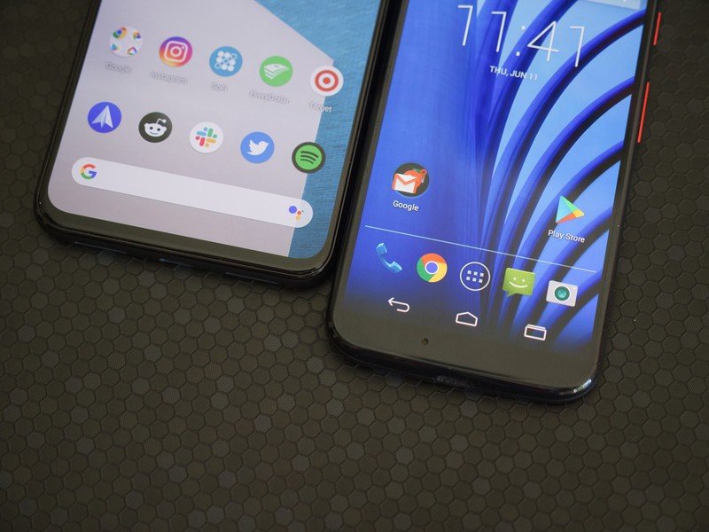
Android navigation has changed a lot over the last couple of years, but for the longest time, it was left alone with no real improvements or changes made to it. Android 3.0 Honeycomb introduced the three-button navigation layout of Home, Back, and Recents, and that's what continued to be the primary form of navigation until Android 9 Pie.
That three-button setup is what we had on Android 4.4, and while it's quite different coming from the fully-gestural navigation of Android 10, it didn't take long at all to refamiliarize myself with this method of using an Android phone.
Multitasking definitely feels clunkier on Android 4.4 compared to how fast Android 10's gestures make it, but pressing the Home and Back buttons feel every bit as responsive and easy-to-use as the gestures for these actions in Android 10.
I'm certainly glad that we've made the shift to gestures in recent years, but it is pretty impressive how well the button navigation holds up in 2020. This is a system that worked incredibly well, and it makes sense as to why Google kept it around for as long as it did.
Multitasking
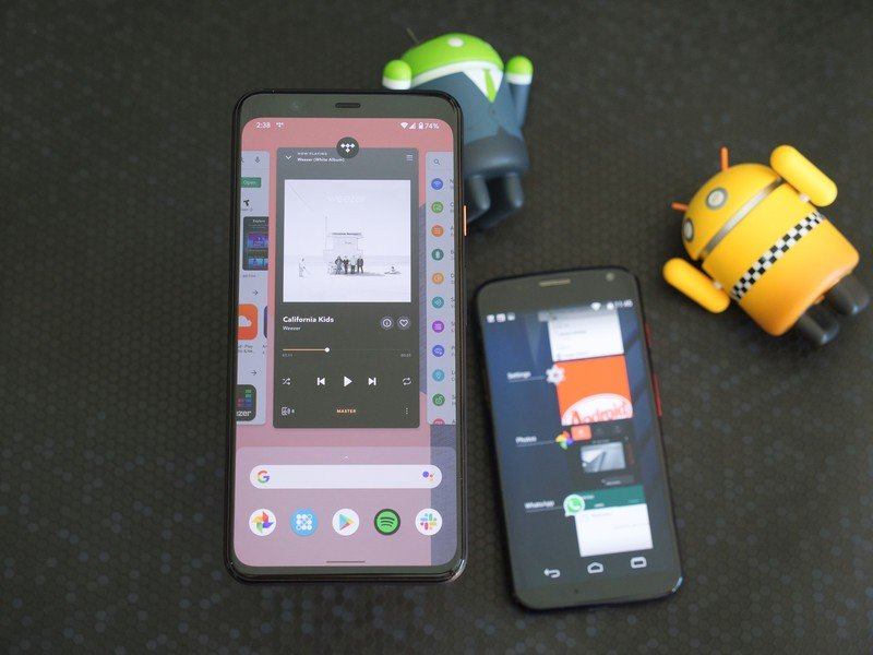
From both an aesthetic and functional point of view, Android's multitasking menu has gone through quite the makeover between versions 4.4 and 10.
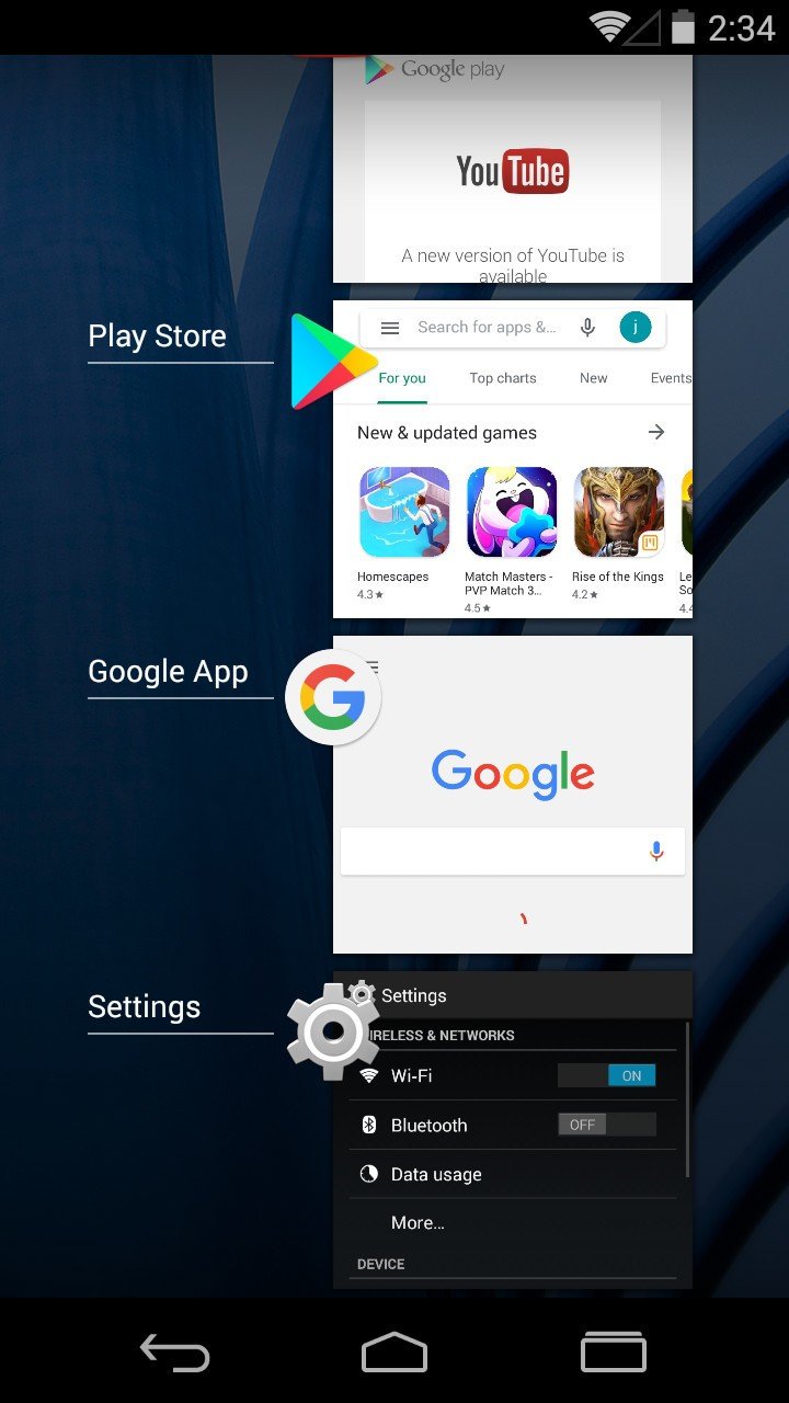
In Android 4.4, your recent apps page is a vertical list of all the apps you've recently opened. You get to the page by tapping the Recents navigation key, tap the app you want to open, and that's all there is to it.
Source: Android Central
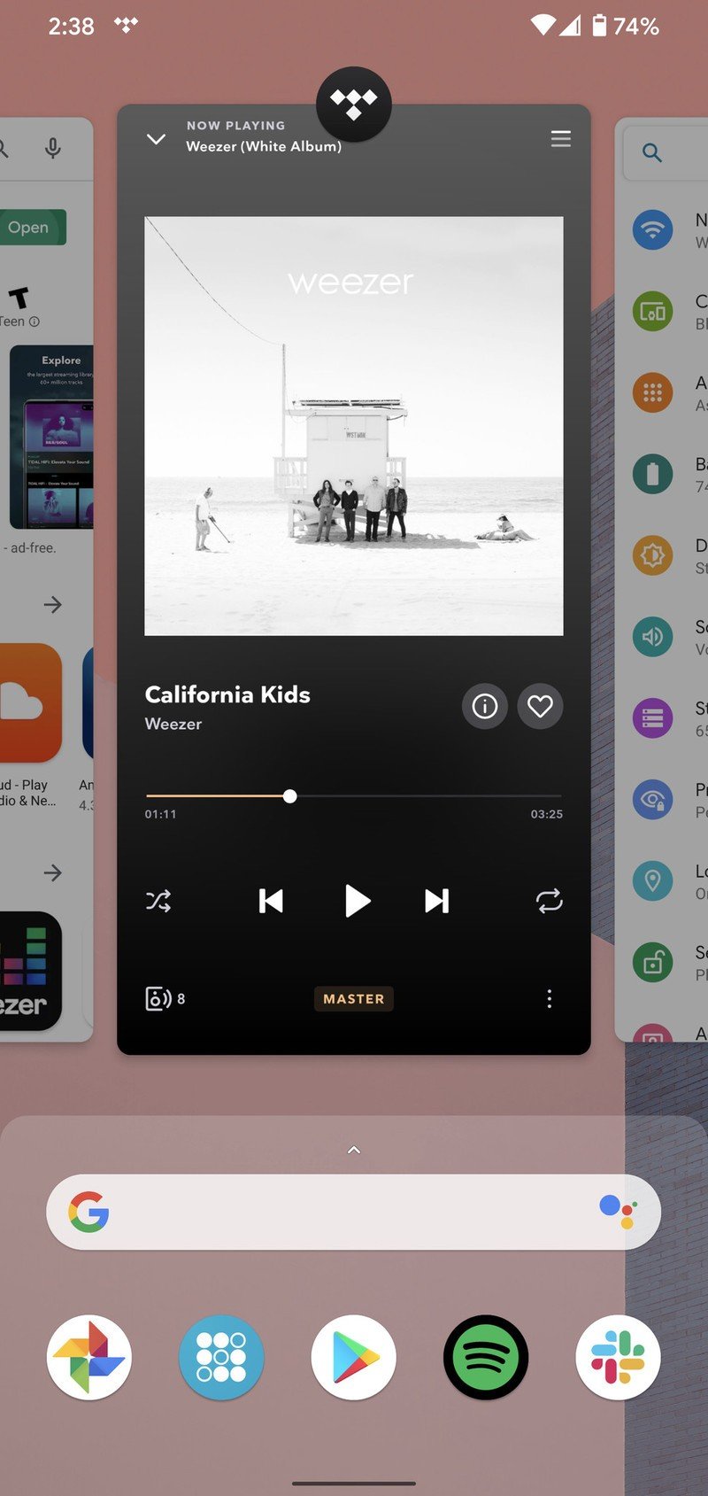
With just one glance, it's easy to see that Android 10 is considerably different. Accessing the page is done by doing a small swipe up from the bottom of your screen, and here, your recent apps are organized as much larger cards with horizontal scrolling. You also get a Google Search widget and a row of recommended apps based on your usage.
Something else that's really neat about how Android 10 handles multitasking is how much easier it is to switch between open apps. In addition to going to the full multitasking page, you can also just swipe left and right on the bottom of your screen to switch between your apps in the order they were last opened. It's also worth mentioning that you can swipe to the right in Android 10 to clear all of your open apps with one tap, whereas Android 4.4 doesn't have anything like that.
The Android 11 Beta has shown that Google is once again re-thinking how the multitasking page works, further adding to the point that the company never seems to be 100% satisfied with it.
Notifications/Quick settings
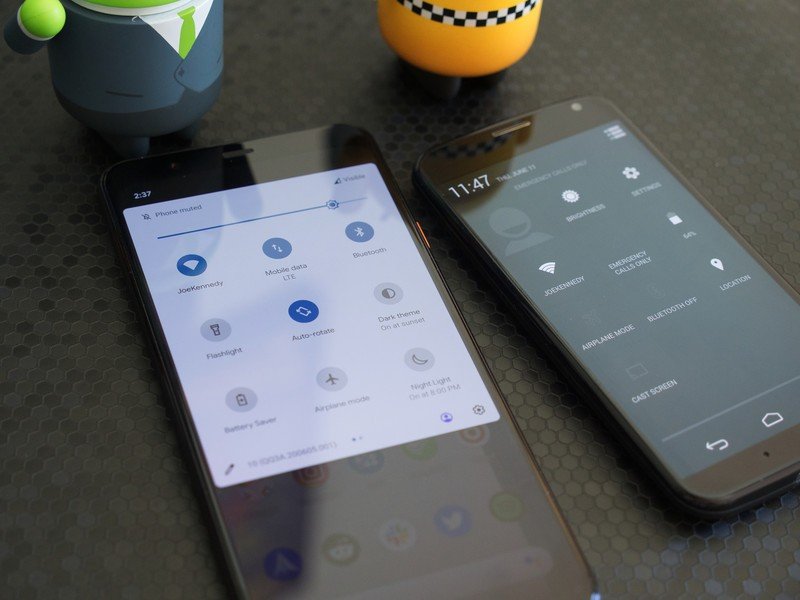
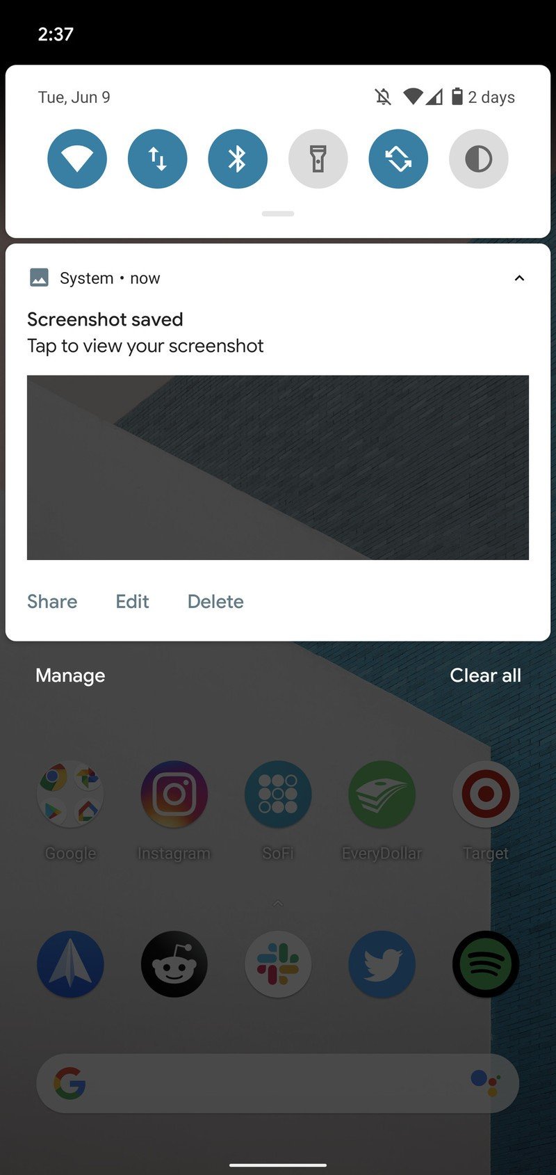
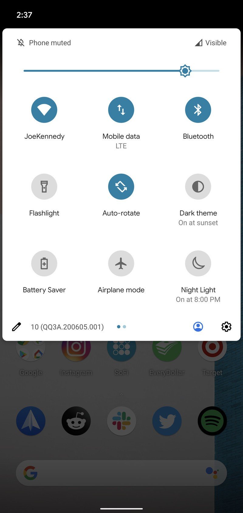
You know how I mentioned the design difference between Holo UI and Material Theme? One of the best examples of this is with Android's notification shade and quick settings.
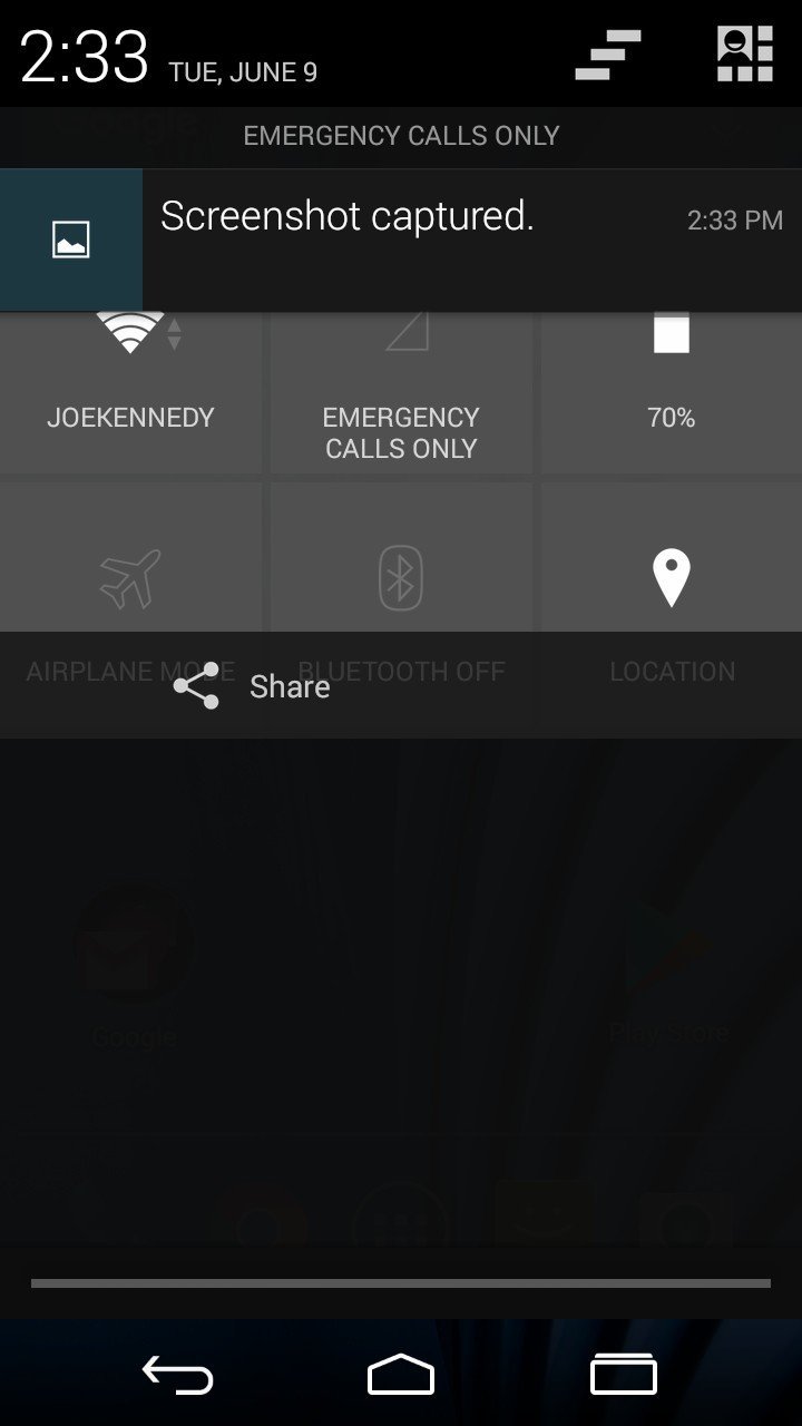
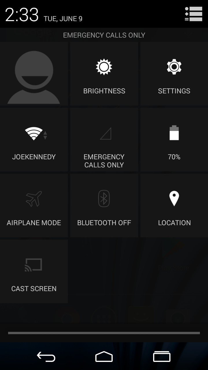
Android 4.4's notification shade defaults to a black background, and as you might notice, it doesn't show any of the available quick settings similar to what you have in Android 10. In order to access any of your them, you need to tap the profile icon in the top-right corner.
Once you're there, you're treated to another bland-looking page of square icons and nothing but a black, white, and gray color palette. It's a huge departure from the rounded and colorful interface Android 10 offers, not to mention it's also lacking from a functional standpoint.
Source: Android Central
Source: Android Central
Tapping on a quick setting in Android 4.4. just takes you into the main settings for that item. If you want to turn off Wi-Fi from quick settings, for example, you need to press and hold on the icon. This is the exact opposite of how Android 10 works, and maybe it's just because I'm used to it, but the implementation we have now feels so much more natural — tap a toggle to directly control it, press and hold for more options.
Android 10 also allows you to change the layout of all your quick settings, along with adding and removing toggles as you see fit — neither of these options are available in Android 4.4.
Quick settings aren't one of those things I actively think about that much, but using these two iterations side-by-side, it's impressive how much they've improved over the years. Compared to what we have now, they kind of feel like an afterthought in Android 4.4.
Settings
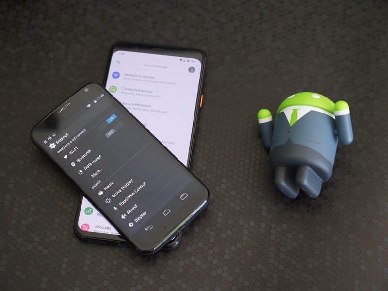
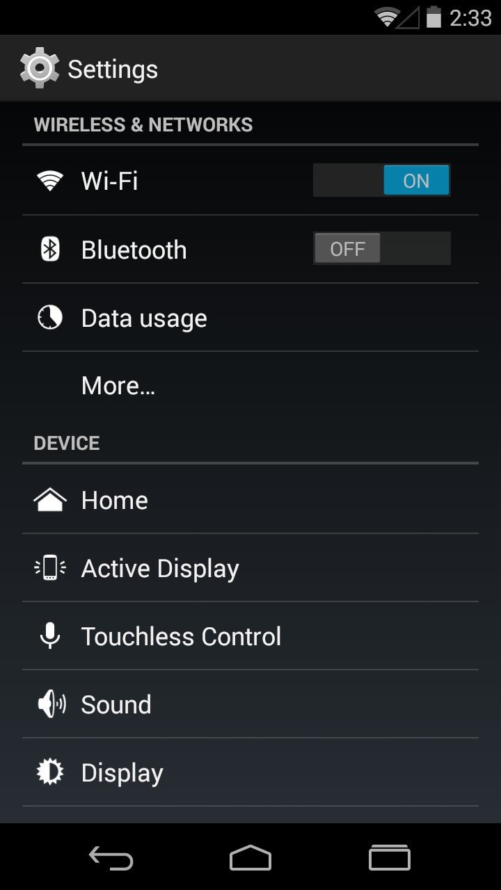
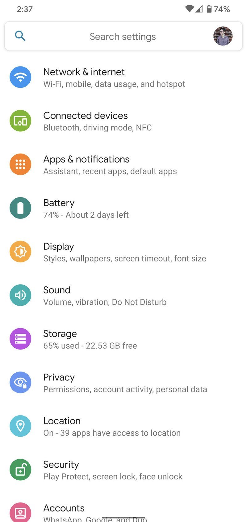
Diving into the full settings page, the design differences between Android 4.4 and Android 10 are even more apparent here. It's another battle of boring blue and gray colors with uninviting icons, which is a night and day difference compared to the round, multi-colored icons and stark white background of Android 10. You'll also notice that Android 10 gives us a handy search bar, whereas Android 4.4 doesn't have one at all.
The core layout of the settings page is fairly similar, though I'd argue that Android 10 does a much better job of grouping everything together. In Android 4.4, you have dedicated Wi-Fi and Data Usage pages, along with a separate Wireless & Networks one that's accessed by tapping the "More..." button — housing things like airplane mode, VPN settings, tethering, etc. All of this is grouped in the Network & Internet page in Android 10, which is a lot less confusing and helps keep the settings menu less cluttered. Android 4.4 also shows all of your connected accounts on the main settings page, while Android 10 hides this in its Accounts page.
Source: Android Central
Source: Android Central
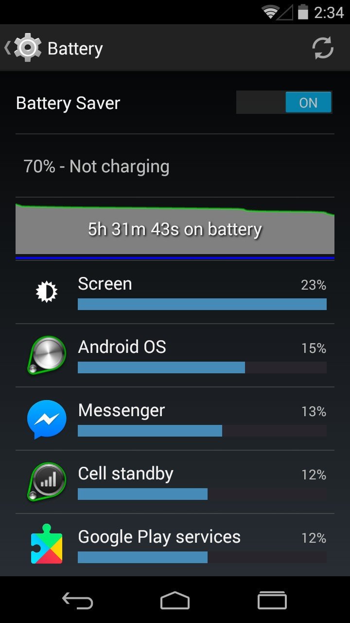
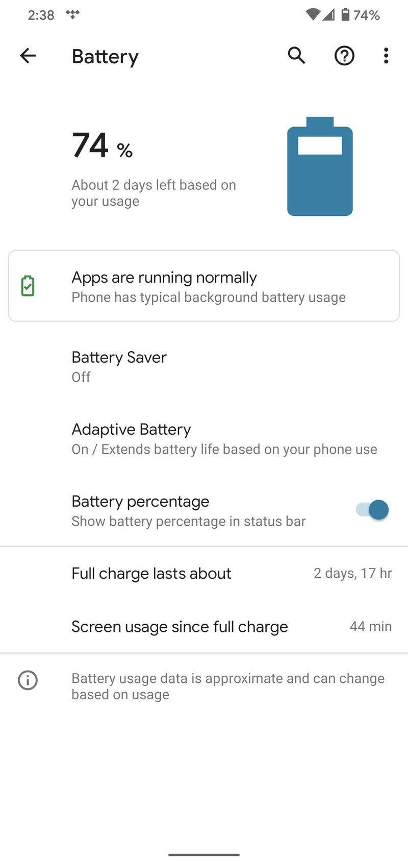
Looking at some of these settings pages side-by-side, Android 10 does a great job at making things easier on the eyes while also adding much more controls. Take the battery page, for example.
In Android 4.4, we see the current battery percentage, how long the phone's been on, what's been using the most battery, and have a toggle for enabling Battery Saver. Android 10 adds additional information about how well or poorly your apps are running, how much estimated time you have left before needing to charge, and the Adaptive Battery feature that learns your usage habits to extend how much use you get in between charges. Having to tap the three dots in the upper-right corner to see the more-detailed usage stats does feel a bit unintuitive, but I don't think there's any denying how much better the current layout looks.
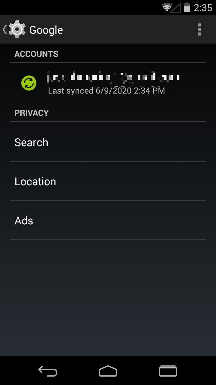
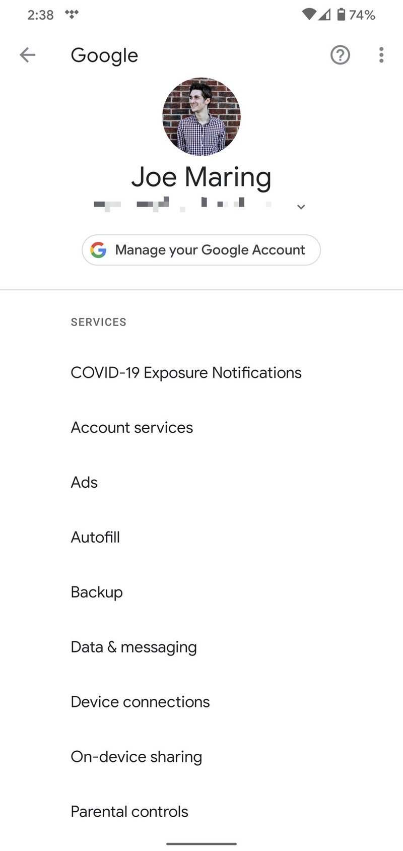
Another fun example is with your Google account settings. Back in the day, tapping your Google account in the settings page only showed your sync, search, location, and ads settings. For everything else, you had to open the separate Google Settings app. Yeah, it was a bad experience.
Comparatively, Android 10 has a dedicated Google section in the settings page that shows you everything related to your Google account.
I wouldn't go as far to say that Android 10's settings are perfect, but I do think the way Google is grouping and organizing things makes a lot more sense than it did a few years ago.
Permissions
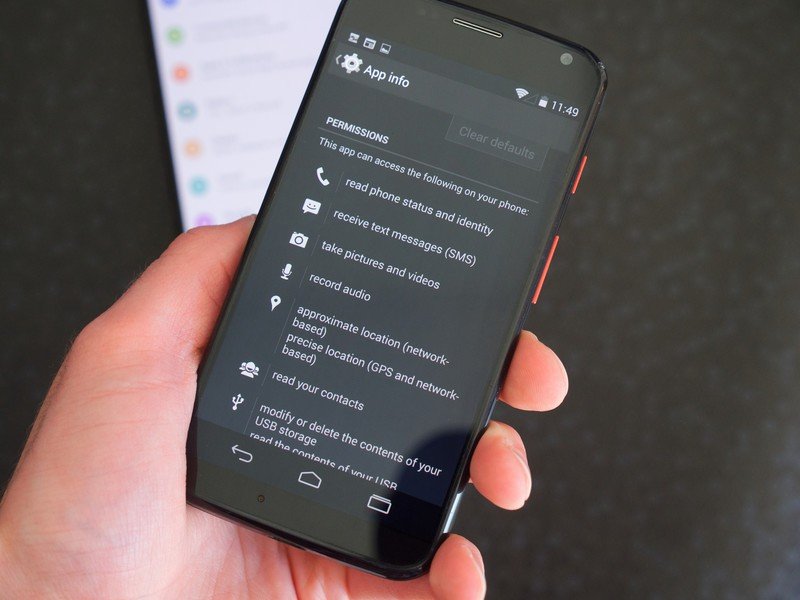
In a world where digital privacy is continually becoming more and more important, app permissions are an essential part of that conversation. There have been far too many stories of apps (both big and small) taking advantage of permissions that we grant to them and abusing things like our phones' cameras, microphones, location, etc.
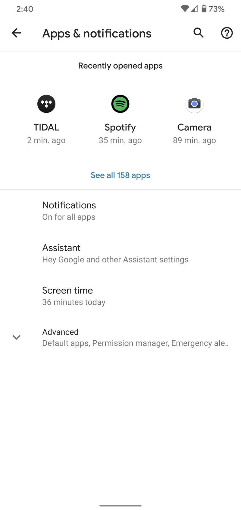
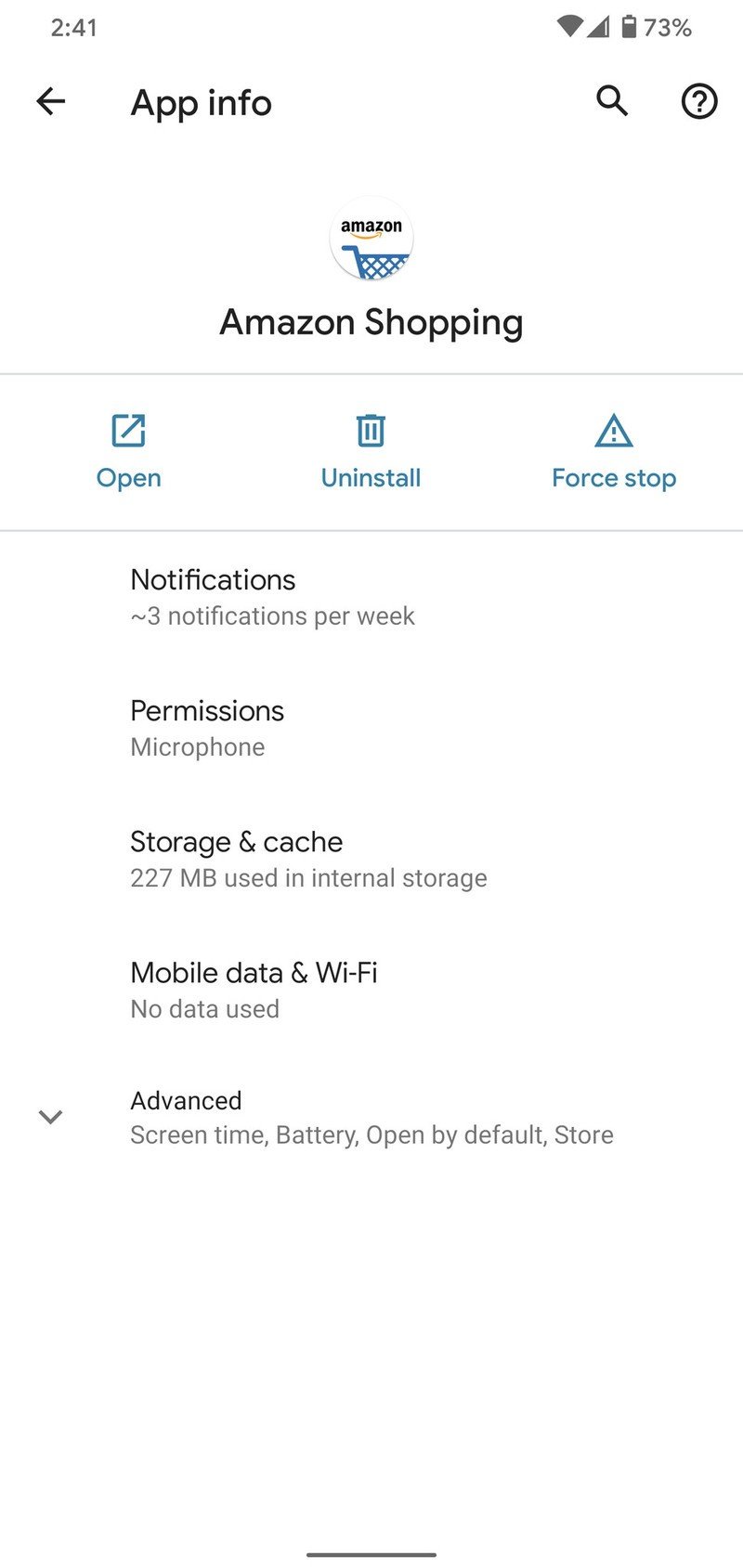
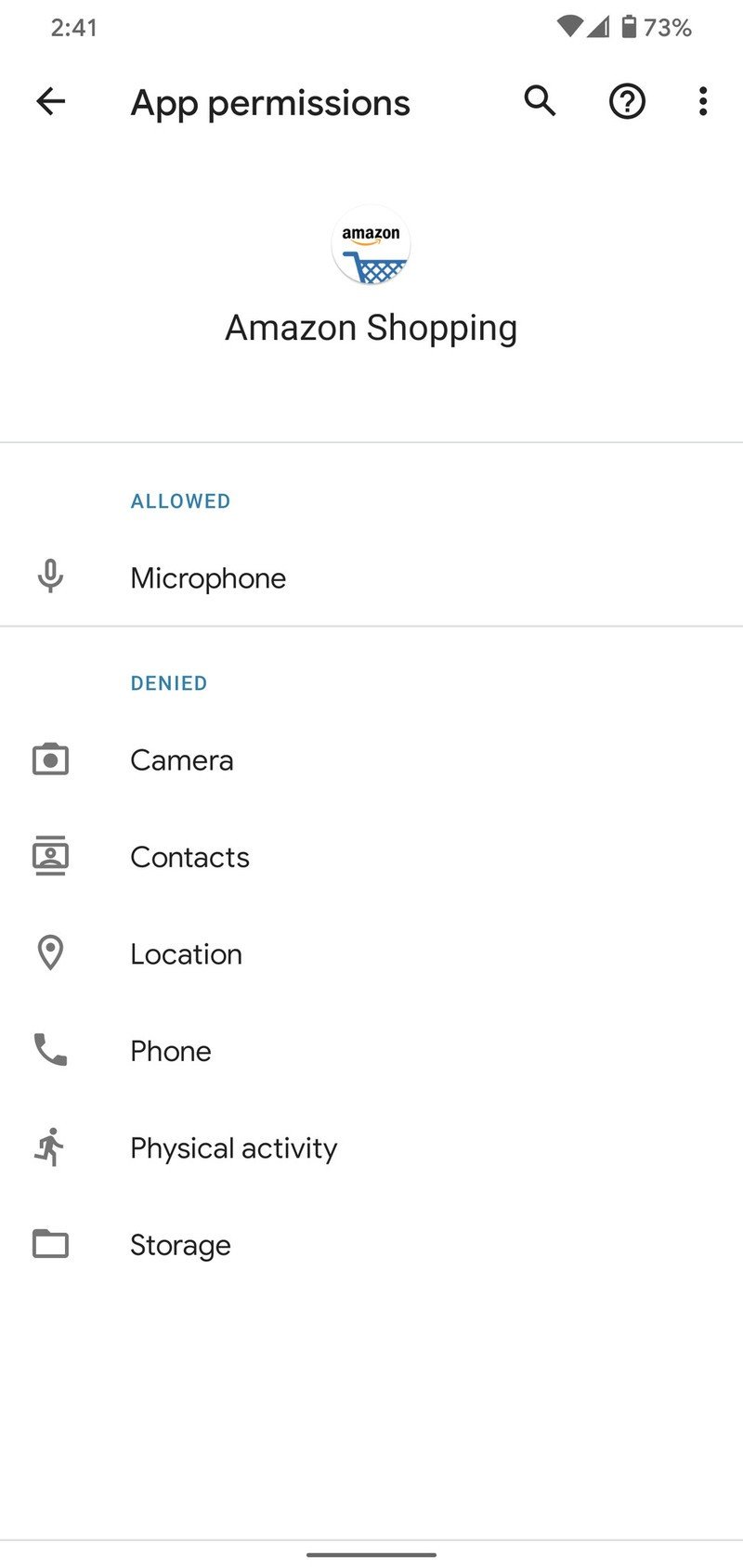
The past couple of Android updates have revitalized permissions in a big way, and in Android 10, they're pretty darn great. You can access app permissions from the App Info page in your device's settings, and from there, it's easy to see what permissions you've allowed to an app and which ones you've denied.
You can allow and deny individual permissions at any time from this page, and looking ahead to Android 11, it's going to enhance them even more with the ability to allow permissions on a one-time basis for your microphone, camera, and location.
Source: Android Central
Source: Android Central
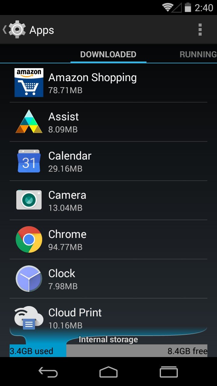
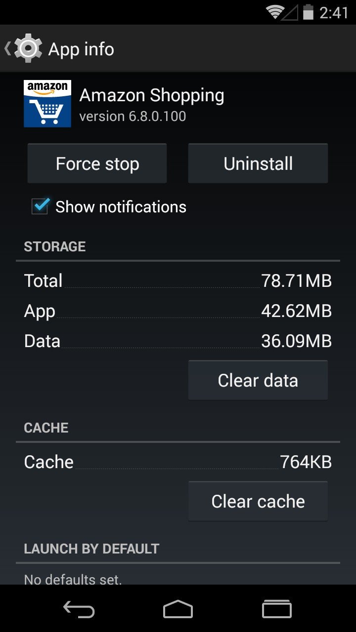
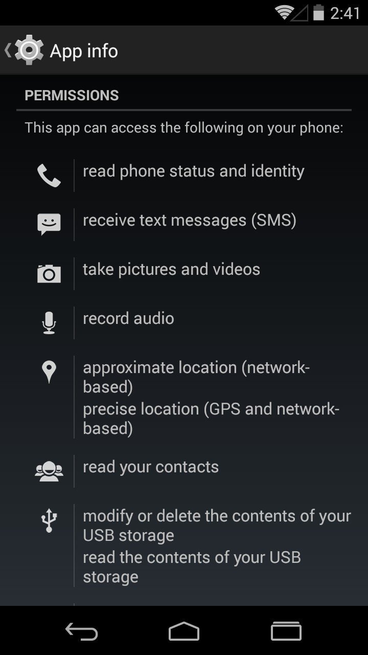
Seven years ago with Android 4.4, nothing like this existed. Apps you downloaded from the Play Store were granted all permissions upon installation, and while you could view these permissions from the settings page, you couldn't actually revoke any of them.
Google did offer permission controls in Android 4.3 with a feature called "Apps Ops," but it was removed in Android 4.4 over fears of it breaking app compatibility. It wasn't until Android 6.0 Marshmallow that app permissions were re-introduced on a permanent basis, and that was just five years back.
Easter egg
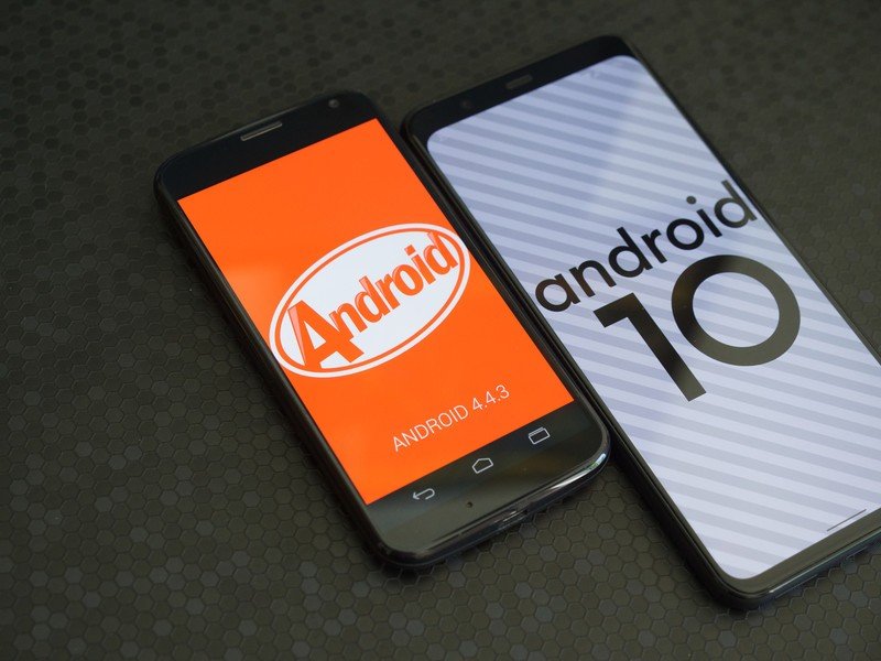
Let's end this comparison on a fun note — Easter eggs!
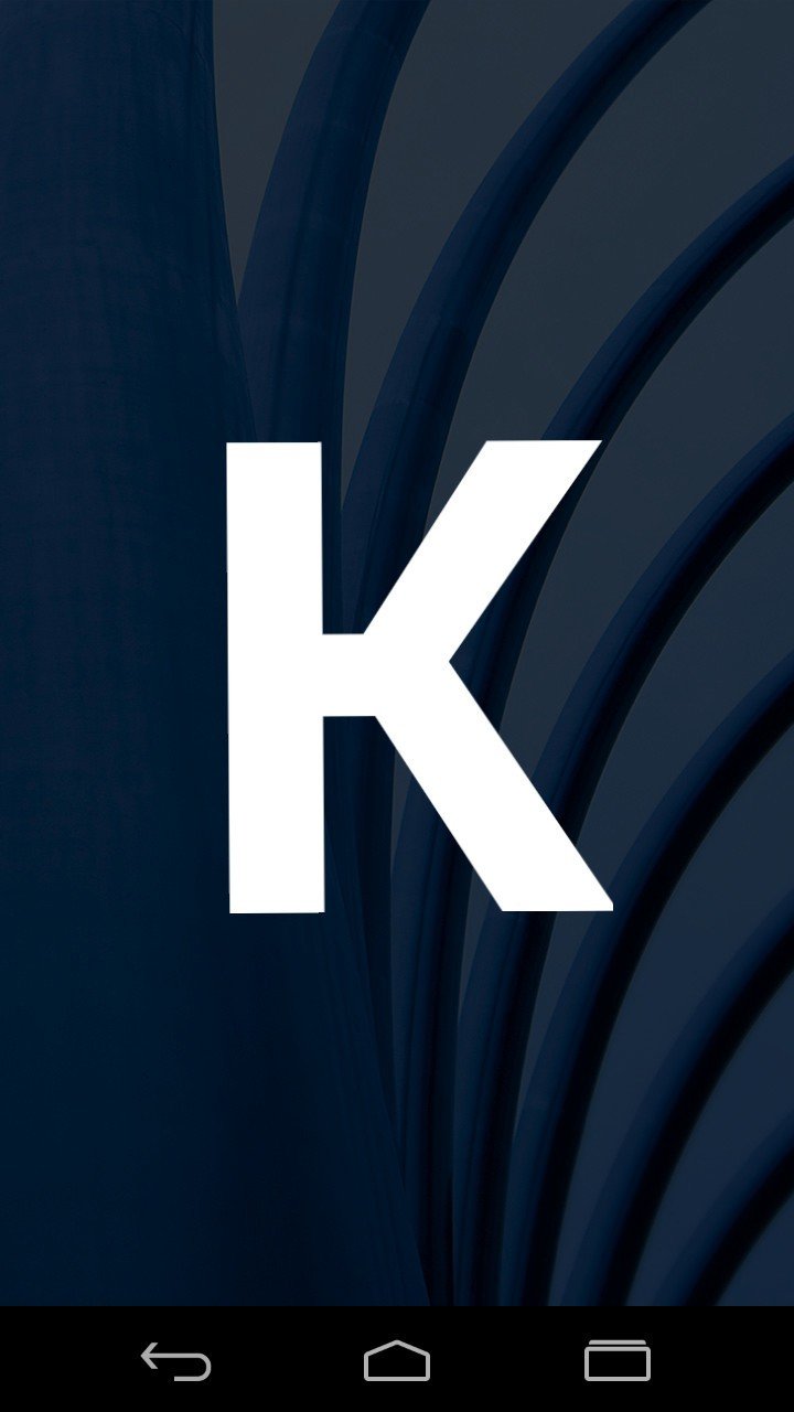
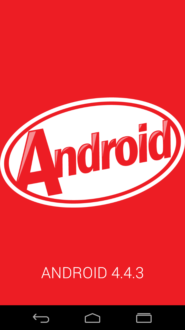
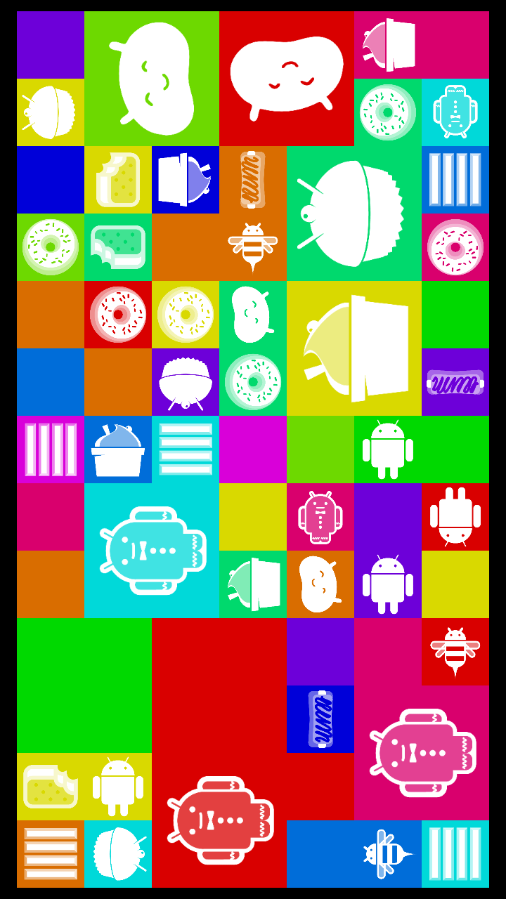
Android 4.4's Easter Egg is rather cute. It starts off with a "K" in honor of its codename being Android K, and holding it reveals the Android logo in all of its KitKat-themed glory. If you press and hold on that, you're then taken to a colorful page of shifting squares with all of the old Android version logos — including Cupcake, Donut, Eclair, Froyo, Gingerbread, Honeycomb, Ice Cream Sandwich, Jelly Bean, and (of course) KitKat.
You can tap on the different squares to change their appearance, and while it's not a fully-fledged game similar to what other Android versions introduced, it's still a lot of fun to mess around with.
Source: Android Central

Source: Android Central
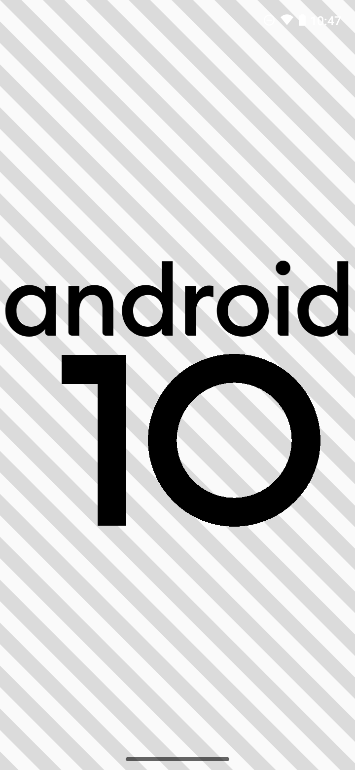
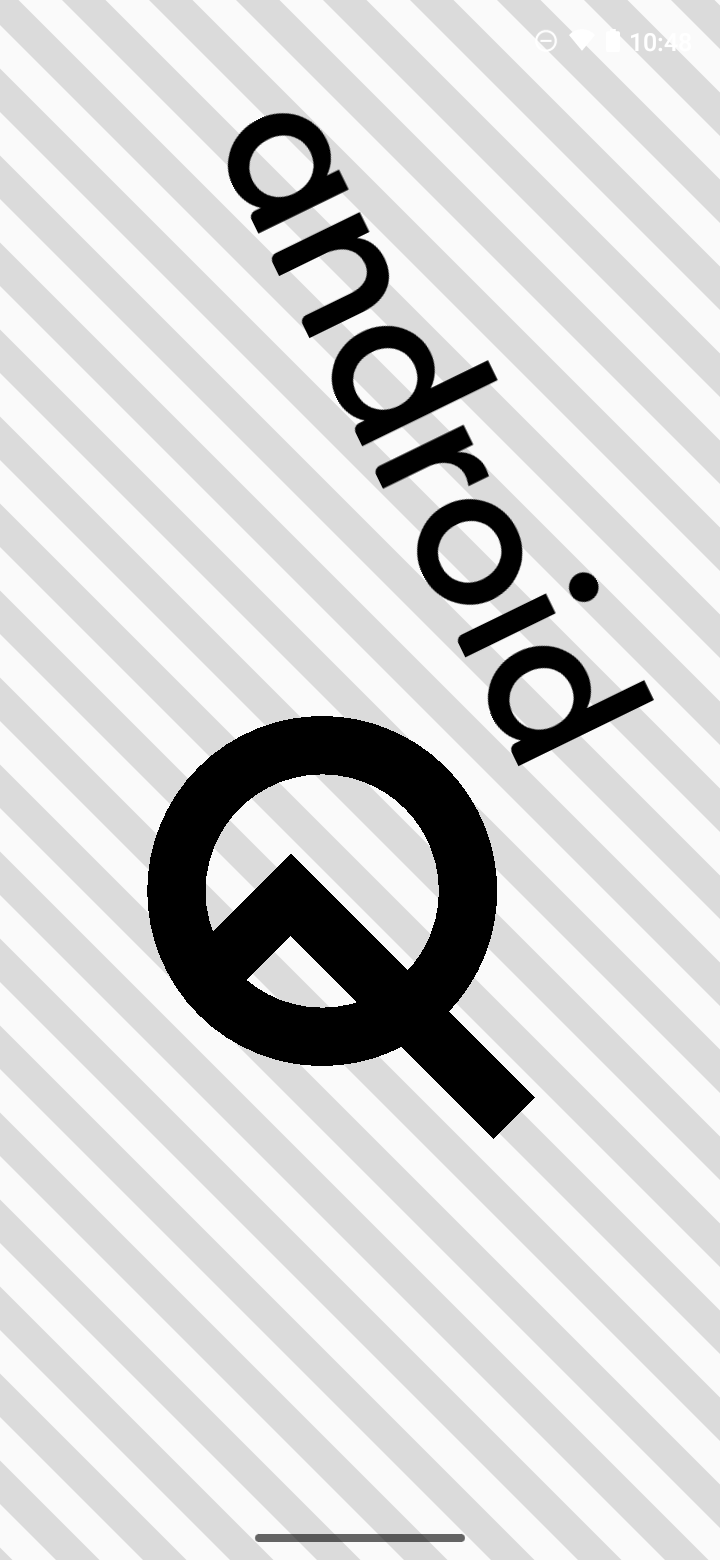
Moving over to Android 10, there's a bit more work involved to see this Easter egg to its fullest potential. It starts off with the typical Android 10 logo, giving you the ability to press and hold on the different items to rotate them as you please.
If you press and hold on the 1 until it's at the correct angle and then place it inside of the 0 to make it look like a Q, it'll snap in place and the background will start to move. Once that's done, press and hold on the newly-formed Q. Just like that, a puzzle will appear!
Google's always done a great job at making its Easter eggs stand out, and with Android 4.4 and Android 10, there's plenty of fun to be had with both implementations.
Wrapping things up
I don't think it's a secret to anyone that Android gets better every year with each update Google rolls out. Every new version of Android adds features and tweaks that result in a better user experience, but with some updates being tamer than others, it can be difficult to see the big picture of things when looking at them on a year-to-year basis.
Stepping back to a version of Android that's seven years old and comparing it to the latest available one, it becomes a lot clearer as to just how much Android has changed in a relatively short amount of time.
Android 4.4 was an excellent piece of software for its time, just like Android 10 is great for 2020. If we look back at Android 10 in 2027, there are bound to be things about it that look horribly outdated and unintuitive.
With that all in mind, we'd now love to hear from you — which style of Android do you personally prefer? The Holo UI days of Android 4.4 are radically different from the Material Theme we currently have in Android 10, but there's stuff to like in both versions.
Leave your answer in the poll below and feel free to drop your thoughts in the comments section!
Joe Maring was a Senior Editor for Android Central between 2017 and 2021. You can reach him on Twitter at @JoeMaring1.

