Latest Android 12 leak reveals dessert name and multitasking improvements

What you need to know
- A new leak spills the beans on Android 12's dessert theme.
- An additional leak has shared details on planned interface changes to the operating system.
- Yet another leak details changes Google plans on making to Android's multitasking tools.
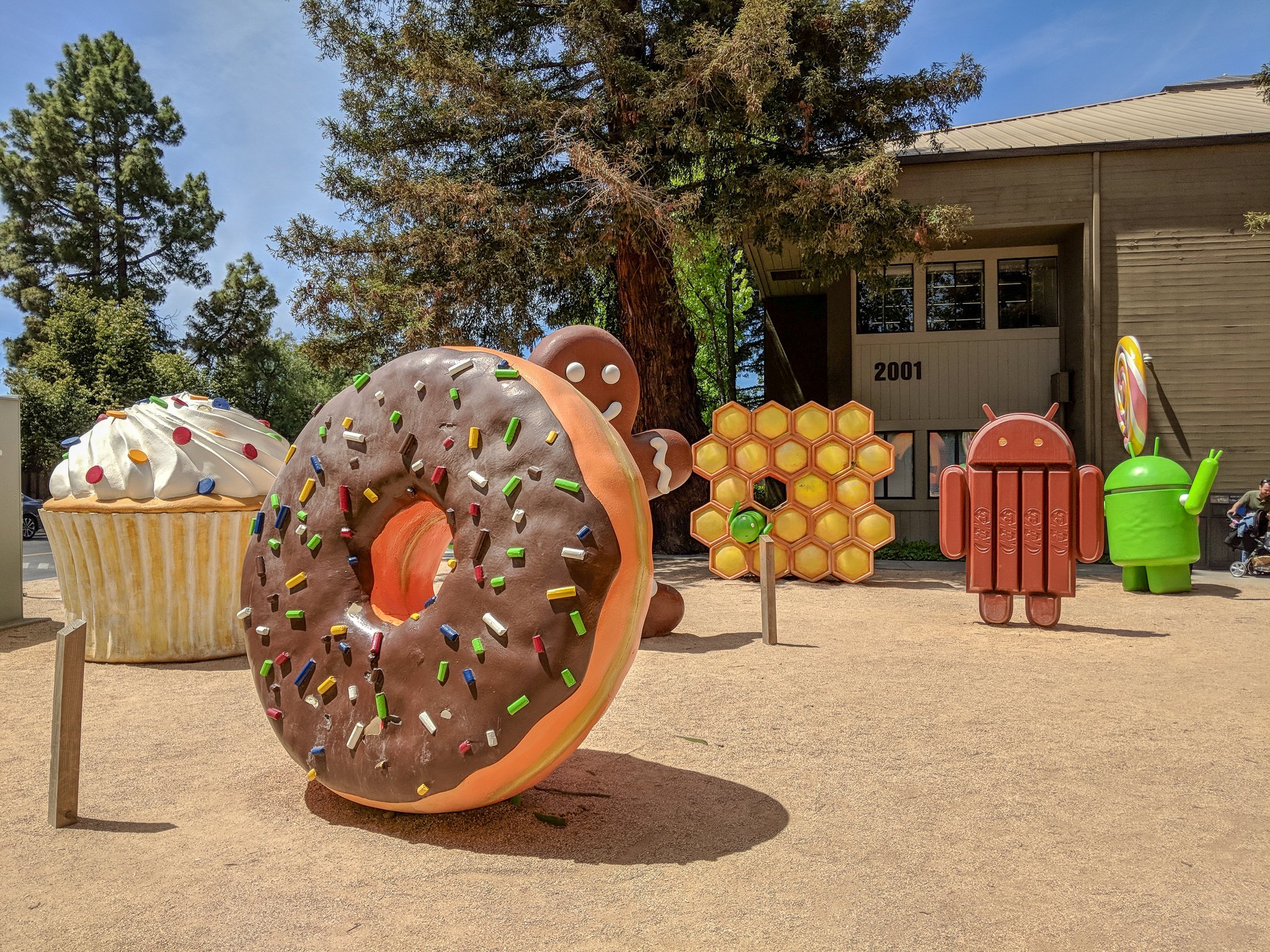
Up till Android 10, the operating system was once known for its tasty treat themed names. While Google dropped those for practical reasons, it has still kept up with privately naming android versions. Android 11 was Red Velvet Cake, and according to XDA , Android 12 has the internal name of Snow Cone. It's worth noting that this wouldn't have been the release name even if Google did still keep Android dessert names around. After all, Lollipop and Kitkat and the internal names of Lemon Meringue Pie and Key Lime Pie respectively.
As for matters a little more substantial than tasty treats, XDA also shared more on Google's plans for Android 12. Other than one-handed mode, Google is working on a redesign known tentatively as Material NEXT as well as improvements to multitasking capabilities.
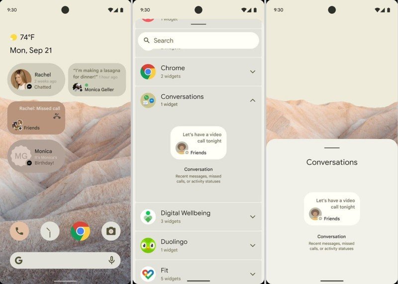
We've already seen glimpses of this planned redesign in the screenshots that were passed around last week, but Google's plans are more comprehensive than that. Android 12 users will see broad changes to user facing elements including the always-on display, the lock screen, and even the placement of Android 11's power button menu where one can find quick access to cards and smart home devices. There's also the advanced theming, previously leaked, but now said to extend to Android TVs as well.

As for improvements to multitasking, those will largely revolve around bubbles and picture-in-picture. Google made bubbles in Android a mainstream feature with Android 11, but developers have yet to fully engage with it. Bubbles will now come with revamped animations to improve ease of use, but there'll also be enhanced functionality to make it more useful overall. XDA says some of these changes are intended to improve bubble usability for Chrome OS. These changes will include bubble resizing and fixed bubble positioning. They'll also now work much better on landscape displays.
Picture-in-picture will come with easier resizing via a new pinch gesture and something known as stashing. With stashing, a user will be able to drag the picture-in-picture window until it's almost off-screen, allowing you to continue to work while not entirely dismissing the window. Finally, Google is introducing something known as App Pairs. It's a feature that lets you save certain configurations of apps to automatically launch in split view. It'll be really useful on foldables and tablets where users have more screen real estate, though it's not clear whether Google plans to bring this to Chrome OS tablets in the future.
It's worth noting that these changes may be more apparent in phones by Google, Nokia, or Motorola. Other companies have built out brand identities for themselves with their own iterations of these features. Xiaomi's floating windows make bubbles redundant, and Microsoft already has something like app pairing on its Duo. Likewise with the UI changes, many of which would either duplicate functionality found on say, One UI 3.0 or MIUI 12.
That said, Google will share more about Android 12 in the coming weeks, but we don't expect a whole lot of detail before I/O 2021 in May.
Be an expert in 5 minutes
Get the latest news from Android Central, your trusted companion in the world of Android
Have you listened to this week's Android Central Podcast?

Every week, the Android Central Podcast brings you the latest tech news, analysis and hot takes, with familiar co-hosts and special guests.

