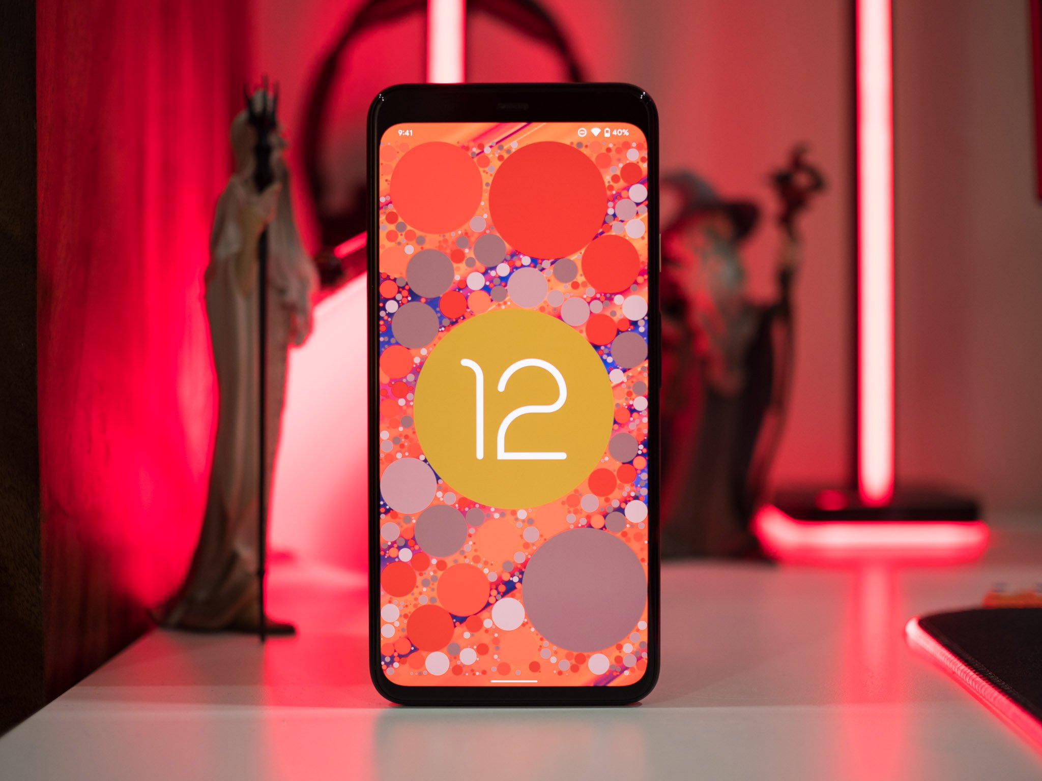
Android 12 review: It's all about you
Android releases have followed a predictable pattern over the last four years: we get a slate of new features, privacy and security fixes, updates to notification management, and if we're lucky, minor changes to the design. Some of those features end up never being used (remember chat bubbles in Android 11?), and most manufacturers ignore Google's design aesthetic and instead use their custom skins.
Android 12 is different. The latest version of Android introduces the biggest visual redesign in Google's history, and it delivers an exhaustive list of new features. Google usually alternates between rolling out new features and making design changes for new Android versions, but this time we're getting both at the same time. The result is the buggiest beta program from Google yet, with even the later Android 12 beta builds featuring phone-breaking bugs.
That said, the new Material You design language gives you a level of customizability that we haven't seen on Pixels, and the new security features are designed to safeguard your privacy. There are a lot of things that Google is doing differently here, so let's find out what Android 12 has in store and when you can try out all the new features on your phone.
Android 12: Availability
After months of beta testing and five public beta builds, the stable version of Android 12 launched alongside the Pixel 6 series and is now available to the Pixels starting with the Pixel 3 series. These are the Pixel devices that are getting the stable Android 12 update:
- Pixel 3
- Pixel 3 XL
- Pixel 3a
- Pixel 3a XL
- Pixel 4
- Pixel 4 XL
- Pixel 4a
- Pixel 4a 5G
- Pixel 5
- Pixel 5a
Like previous years, the Android 12 beta made its way to the best Android phones from 11 third-party manufacturers, including the likes of Xiaomi, OPPO, Vivo, Nokia, Realme, OnePlus, and ASUS. The third-party beta program is a way to get Android 12 into the hands of users that don't have Pixels, with the initial builds offering a "vanilla" Android interface. That's changing as manufacturers start to integrate Android 12 into their own skins.
Xiaomi has introduced an Android 12-based version of MIUI 12.5, with OnePlus following suit with OxygenOS 12 and OPPO with ColorOS 12. Samsung has already kicked off the One UI 4 beta based on Android 12 for the Galaxy S21 series, and a stable build should be rolling out before the end of the year.
Android 12: What's new
Android 12 introduces the first major design overhaul in over seven years, with Material Design making way for Material You. Google has redesigned the interface to make it much more customizable and easier to personalize, and the changes to the UI combined with the new widgets and settings tiles means Android 12 looks very different from its predecessors.
Be an expert in 5 minutes
Get the latest news from Android Central, your trusted companion in the world of Android
Alongside the new design, we're getting a lot of new features: Android 12 has a local app search mode that lets you search within apps seamlessly, there are important privacy additions with approximate location access, Privacy Dashboard, and recording indicators whenever the phone's mic, location, or camera is being used.
There's also a native one-handed mode and gaming dashboard, the ability to take scrolling screenshots, new Conversations widgets that make it easy to initiate conversations with friends and family, new lock screen shortcuts, and updates to notification management.
In short, Android 12 has a lot of new stuff, but some of the core features — like the Material You design — will be exclusive to the Pixels for now. That said, the key privacy and security features as well as local app search should be making their way to all phones picking up the Android 12 update.
Android 12: First things to do
We've already rounded up the best Android 12 tips to help you get a better understanding of all the new features in Google's latest operating system, and we also have detailed how-to guides to get you started:
- How to use local app search to find anything in Android 12
- How to customize quick settings tiles in Android 12
- How to customize your phone with Material You
- How to grant approximate location access in Android 12
- How to use the Privacy Dashboard in Android 12
- How to use Conversation widgets in Android 12
- How to enable one-handed mode in Android 12
- How to take scrollable screenshots in Android 12
- How to change lock screen shortcuts in Android 12
- How to find the Android 12 Easter egg
Android 12: Material You
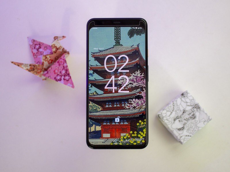
With Material You, Google is undertaking its biggest visual refresh over the last seven years. While there have been design changes in that time as Google refined the Android interface, the underlying Material Design aesthetic was unchanged. However, Material You introduces a new paradigm with bold colors and aggressive styling, and the result is that Android 12 looks very different — at least if you're using a Pixel.
Material You introduces a fresh design that's highly customizable.
Google says that Material You follows a "humanistic approach" to design that doesn't "shy away from emotion," offering designs for "every style, accessible for every need, alive and adaptive for every screen." The design aesthetic was created to cater to users' need for more "expressiveness and control," and the playful styling combined with the new color palette makes Material You stand out considerably from earlier versions of Android; the level of personalization you're getting here is remarkable.
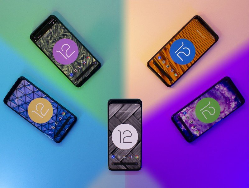
The headlining feature in Material You is the color extraction feature that automatically changes the entire system theme based on your phone's background. You can get drastically varying themes just by changing by wallpaper, with Google flexing its machine learning skills to pick out two dominant colors from an image and using that as the basis for the theme. If you don't want to use the colors from the background, you can pick from a selection of "Basic colors" and use that as the default across the UI.
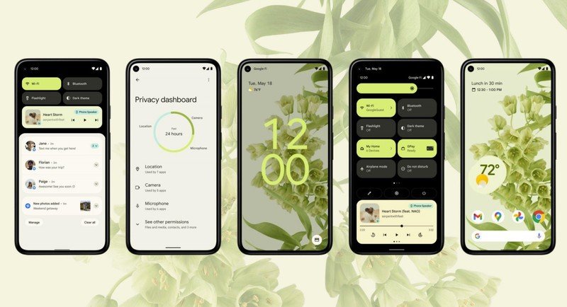
So if you're using a background with red colors, Material You will switch the colors across the system to the same hue. That extends to all parts of the interface, including the lock screen — where there's a large clock that gets the same color as the system theme — widgets, quick settings tiles, toggles, and system apps, including the likes of Gboard.
When Google introduced Material Design seven years ago, it took a long time before updating its first-party apps to the new aesthetic. Thankfully, it's not waiting around with Material You; the Clock, Calculator, and Google Keep have already switched over to the new design, and Google is working on integrating the design into Gmail and other services.
Material You brings fun and quirkiness back to Android — and I love it.
The system-wide font is bolder as well, making it more readable. Google took a page out of Samsung's One UI playbook and introduced large headers for the menus — and unlike OxygenOS 11, it did a thorough job. The large headers push the menu options further down the page, and they extend to the sub-menus as well, making it easier to access the options one-handed.
Google also made it easy to resize elements, and this is particularly noticeable with widgets. Oh, and the animations throughout the interface are smoother and refreshingly playful. Google has been very conservative in terms of Android design thus far, but Material You is about as bold as it gets — and the customization extends to every facet of the interface. The rounded corners and colorful designs with Material You give the interface a fresh new look, and there are enough quirky elements here to make Android 12 fun. That playfulness was missing from earlier versions of Android, and I'm glad that Google isn't taking itself too seriously here.
As is the case with every bold design, the changes introduced with Material You are divisive; not everyone will like the colorful design and the quirky styling. And that's okay; you don't have to use the color picker feature or the other additions. As my colleague Ara Wagoner points out, Material You injects a fresh burst of color into what was becoming a stale design. Google needed to reinvigorate the interface without making it feel cartoonish, and it has managed to do just that.
While Material You brings a lot to the table, I don't see most Android manufacturers switching to the aesthetic. Google isn't even offering that as an option; Material You will be exclusive to the Pixels for now, and it gives Google's phones a distinctive design that was missing from previous iterations.
Android 12: Widgets
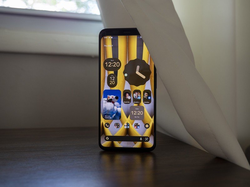
Android widgets fell by the wayside over the last three years, and it wasn't until Apple introduced widgets to iOS 14 that Google started taking them seriously again. Widgets have picked up a much-needed overhaul in Android 12; the clock widget, in particular, looks great, and like everything else in the UI, it changes colors dynamically.
Google finally made Android widgets exciting to use again.
There are four styles for the clock widget: a round analog clock with a revolving dot for the seconds hand, a stacked design with a digital clock, a world clock that shows two time zones side-by-side, and an oblong digital clock. You can easily resize the widgets anywhere on the home screen, and the dynamic colors mean you can play around with the colors and get really cool results.
Google also added a Conversations widget that lets you pin conversations to the home screen. The 2 x 1 widget lets you select contacts that you message often and makes it easier to launch conversations straight from the home screen, and the best part is that it works regardless of the messaging service you use.
Android 12 widgets have rounded corners by default, and they look more modern as a result. They also have faster transitions; there's no delay when you're adding a reminder or creating an event in Google Calendar or when you have to launch the app that's associated with the widget.
Android 12: Quick settings
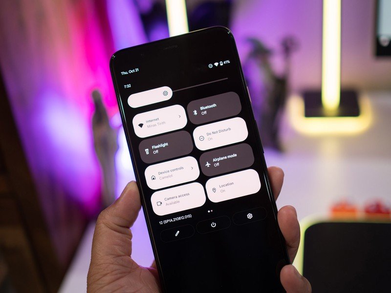
Android 12 brings a radical change to the quick settings tiles. Instead of the usual rounded icons, you'll now see larger rectangular icons that take up a lot of room. The icons and text are now within the individual tiles, and you can access four tiles with a single pull-down and eight tiles with a double-pull action.
I'm not a fan of the fact that there are fewer tiles, but it didn't bother me as much as I thought it would; I use five toggles with any amount of regularity, so it wasn't too difficult to switch to the new format. The large layout makes it easier to access the tiles, and as they use the same dynamic Material You colors as the rest of the interface, they look much more vibrant than before. And as is the case with the rest of Android 12, the tiles have rounded corners.
What I'm not particularly fond of is the width of the brightness slider; it's just too damn big, and the same goes for the volume slider. And because Google doesn't seem to be able to leave the power menu alone, it has removed the smart home dashboard and Google Pay from here and added them as quick settings tiles instead.
I got a lot of use out of the integrated smart home dashboard in the power menu, but Google's data-driven decision-making means features get killed off if they're not widely used. With Android 12, the power button is once again back to being used solely for powering off or restarting your device.
Android 12: Notification management
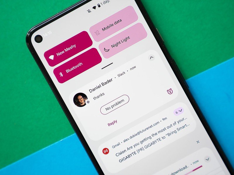
Android 11 introduced the Conversations view that surfaced all one-to-one conversations and messages from friends and family to the top, and while Android 12 doesn't have any big changes in this area, there are a few new additions. The notifications have a cleaner design, and you get the ability to snooze notifications directly from the pane.
Thankfully, the ability to set a reminder from the notification pane is still intact in Android 12. After using the iPhone 13 Pro Max for two weeks, I realized that Android does a much better job in terms of notification management, and Android 12 extends that lead.
Android 12: Privacy and security
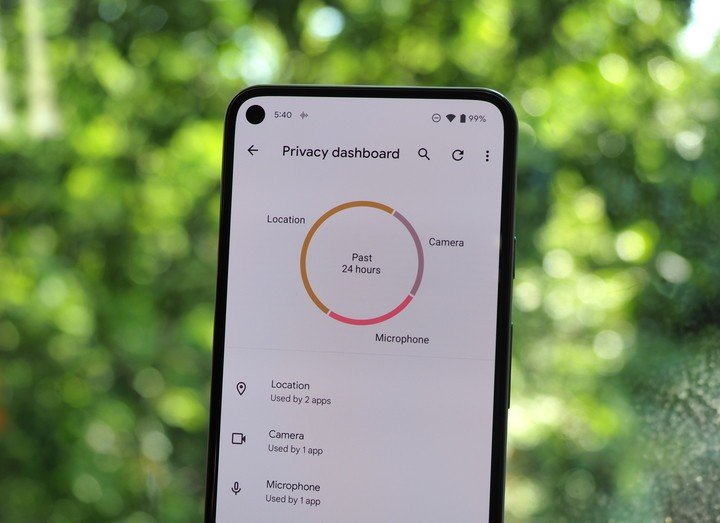
Google is putting privacy and security at the forefront of Android 12, and it is rolling out a slate of new features designed to safeguard your data. There's a new Privacy Dashboard, recording indicators for the camera and mic, and tweaks to Bluetooth scanning.
Much like Digital Wellbeing, the Privacy Dashboard gives you a detailed account of all the apps that accessed your location, mic, camera, and other sensitive data. Alongside the dashboard, there's a recording indicator that lights up whenever your camera or mic is in use; so if there's an errant app that accesses the camera or mic in the background, you will know about it immediately.
Android 12 also changes how Bluetooth scanning works for new devices. Previously, whenever you had to pair wireless earbuds or other smart home gear, you had to enable the location access to find devices. But that's not needed in Android 12, so when you're setting up an accessory, you won't have to give it access to your location.
For most of the on-device machine learning features that exist within Android 12, Google is turning to the Private Compute Core. Think of it as a secure zone that sandboxes the data so that no other service can access it.
Finally, you get the option to turn off system-wide access to the camera or mic with a single toggle. You can set up these toggles in the notification shade, and doing so will cut off all access — including for face unlock. Of all the new privacy features, this is the one I like the most; the fact that I can easily turn off camera access throughout Android with a single button is a huge deal. I also like the Privacy Dashboard that's baked into Android 12; other manufacturers have offered a similar feature for a few years now, and it is good to see it being integrated natively into Android.
Android 12: Search everything on your phone
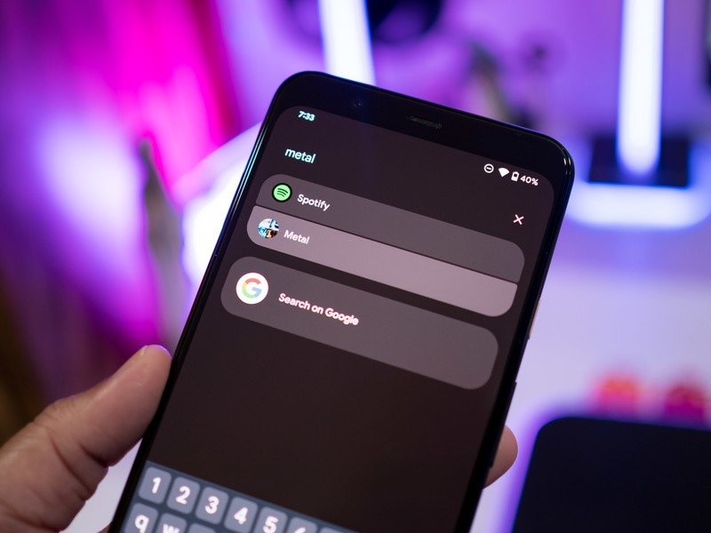
One of my favorite features in Android 12 is AppSearch; it's an on-device search engine that lets you find anything on your phone with the least amount of hassle. It's baked into the search bar in the app drawer, and you can search for a contact, system setting, Spotify playlist, photo taken at a particular location in Google Photos, and so much more.
Instead of digging through my Spotify playlists, I just use AppSearch to quickly pull up the playlist I want to stream and get started. The feature essentially cuts down on the amount of time you spend looking for photos, playlists, or anything else on your phone.
Android 12: One-handed mode
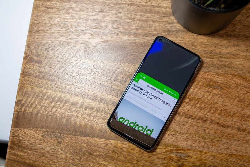
Phones these days are taller and narrower than before, and Google is integrating a one-handed mode into Android 12 to assist with usability. Most phone manufacturers already offer this feature by default, and as we've seen with the screen recorder and scrolling screenshots, Google is adding more and more of these features natively into Android over the last two years.
One-handed mode essentially pulls the screen down to about the halfway point, making it that much easier to access all the on-screen elements. The best part about it is the ease of use; you just swipe down on an app to launch one-handed mode and swipe up to exit. There's also the option of adding a timer to exit the mode, and while other manufacturers usually resort to shrinking the screen to two-thirds of its size, I like the fact that Google emulated iOS here.
Android 12: Game mode
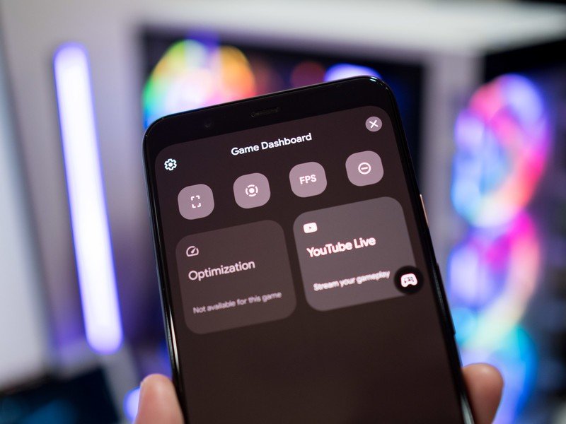
Most Android device makers offer a gaming mode that lets you disable notifications and prioritize network bandwidth for games. There's now a game dashboard, and in usual Google fashion, the feature is located where most users would never bother to look for it. You'll find it in Settings -> Notifications -> Do Not Disturb -> Schedules -> Gaming, and it lets you enable DND when gaming so you don't get distracted by incoming calls or texts when you're in the middle of a game.
You also get the ability to record your game footage, take screenshots, stream directly to YouTube Live, view a real-time fps counter, and optimize the hardware to offer the best visuals. There's another gaming-focused feature that's noteworthy: you now have the option to play a game as it's still downloading, similar to what you'll find on the PS5, Xbox, and Windows.
Android 12: What else is new?

There are a lot of useful additions baked into Android 12, including scrolling screenshots, better link sharing in Chrome, easy Wi-Fi sharing, and more. Here's a rundown of all the new stuff:
- Scrolling screenshots: With Android 12, Google is finally introducing the ability to take scrolling screenshots. Most manufacturers have offered this option for some time anyway, and like screen recorder last year, this feature is now baked into Android.
- Quick Tap: Google has a nifty set of gestures that you can undertake on the back of your Pixel for actions like invoking the Google Assistant, taking a screenshot, or playing and pausing music. This feature isn't available on all Pixels though; you'll need a Pixel 4a or Pixel 5/5a.
- Chrome link sharing: Android 12 has a slightly easier way to share Chrome links. You'll have to zoom out into the overview pane, and you'll see a large icon to share the link. Google could have found an easier workaround to do this, but if you regularly share links within Chrome, there's now a new way to do so.
- Auto-rotate: A cool new addition for auto-rotate is an AI-assisted mode that tilts the screen automatically based on your eye movements.
- Wi-Fi: We got the ability to share Wi-Fi access via QR codes with Android 11, and this year Google is building on that with more options.
- Clipboard security: We have seen a lot of instances of unauthorized clipboards on Android, and Google is cutting down on that by delivering a notification whenever a service accesses the clipboard in Android 12.
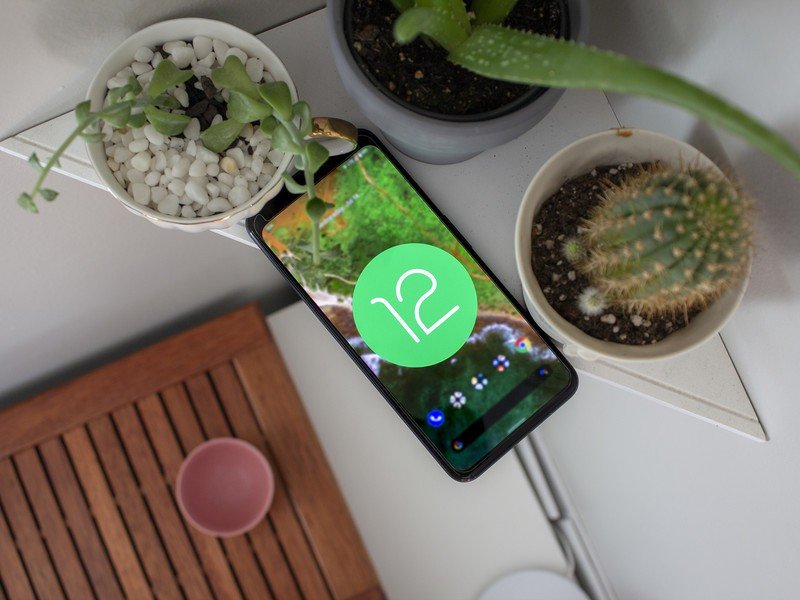
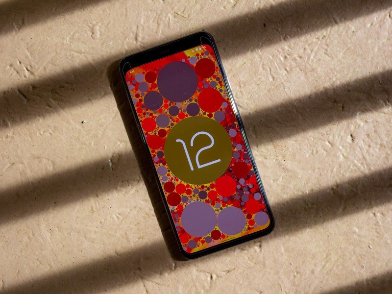
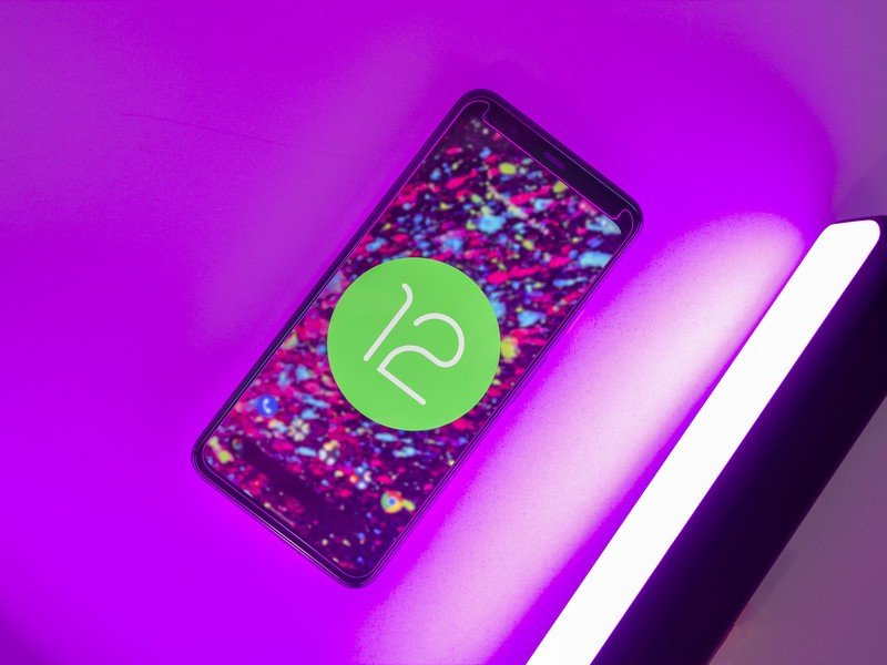
- Android 12 Easter egg: Google hasn't forgotten the Easter egg with Android 12. Like previous iterations, you'll need to go to the Settings, head to About phone, and hit the Android version number thrice. Doing so will surface a clock widget; set the time to 12, and you'll get the Android 12 logo and a splash of color.
Android 12: Should you wait?

With a boatload of new features and a major redesign, Android 12 was bound to be buggy, and that was a defining theme throughout the betas. Even beta 4 — the build where Android 12 technically hit platform stability — had several bugs and frequent crashes, and while beta 5 fixed a lot of the issues, At A Glance was still broken.
With the stable Android 12 build, Google has finally ironed out all the bugs.
Over the last four months, I encountered a litany of bugs on my Pixels. For example, icons on the home screen vanished all of a sudden on beta 2, password managers refused to work with the first two betas, I had issues with DND automatically switching off, banner notifications not showing up, and the media player went missing from the notification pane.
On that note, I have heard from my sources that all the under-the-hood changes in Android 12 is making it harder for manufacturers to integrate the build into their own skins. We've already seen this with the first One UI 4 beta, which has several phone-breaking bugs and performance issues.
That's also the case with the first public beta of OxygenOS 12, so you should wait and see how they hold up before making the switch on your own device. That said, I didn't run into the same issues on the ColorOS 12 beta that launched a few weeks after its rivals, so it looks like the release candidate build has fixed a lot of the bugs from the earlier releases.
The same is true for the stable build of Android 12. Google has finally sorted out the bugs, and for the first time, Android 12 feels stable, and all the features work as intended. So if you're using a Pixel and are wary of switching over, you can do so now.
Android 12: The bottom line
Android 12 is Google's most ambitious effort yet, and it has managed to deliver on a lot of the key features. The Material You design overhaul delivers a fresh take on what was becoming a boring aesthetic, and the focus on personalization means you now get the ability to set up your phone just the way you want.
Android has always stood for customizability, and with Android 12, Google is giving you powerful tools to change the look and feel of your phone right out of the box. The bold design and colorful styling won't be to everyone's liking, but you can tone down the colors without too much of a hassle.
Security is another key area of focus for Google. We got one-time permissions with Android 11, and Android 12 introduces approximate location access for services that don't need your exact location details, a new privacy dashboard that makes it easy to view what services are accessing your data, and recording indicators for when your phone's camera is being used. These additions go a long way in ensuring no errant services in the background use your data without your knowledge.
Having used Android 12 from the first beta to the latest release candidate, the one takeaway that I have is that this is the first step in a larger design overhaul for Google. When Material Design launched seven years ago, Google took a few years to switch all of its services over to the design aesthetic, and it is doing the same with this generation — albeit much more quickly.
Ultimately, it is great to see Google take a bold stance on design; Material You is bound to be divisive, but it is clear that the search giant sees personalization as a core tenet for its vision of Android. Of course, we'll have to wait and see if other manufacturers include most of the styling elements, but for now, Google finally has a distinct design that stands out from the pack.

Android 12
Bottom line: Android 12 is a landmark update for Google: Material You brings a powerful set of tools aimed at personalization, and you can change the look and feel of the interface to your tastes like never before. You'll also find security and privacy features that give you more control over your phone and stability fixes that make Android run smoother. The design changes may not be to everyone's liking, but this is a big step forward for Google and Android.
Have you listened to this week's Android Central Podcast?
Every week, the Android Central Podcast brings you the latest tech news, analysis and hot takes, with familiar co-hosts and special guests.

Harish Jonnalagadda is Android Central's Senior Editor overseeing mobile coverage. In his current role, he leads the site's coverage of Chinese phone brands, networking products, and AV gear. He has been testing phones for over a decade, and has extensive experience in mobile hardware and the global semiconductor industry. Contact him on Twitter at @chunkynerd.
