Android 12 Beta 3 hands on: Game and swatch
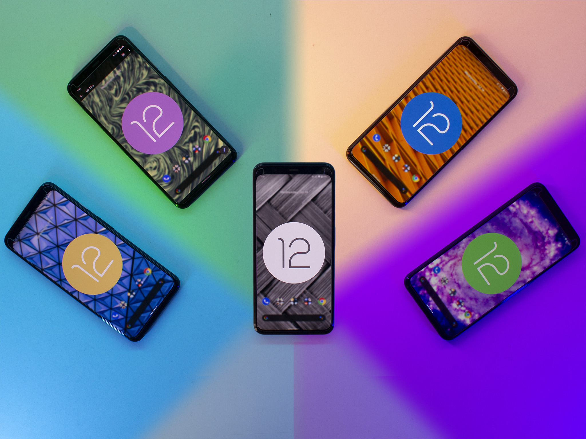
Almost exactly two months ago today, Google unveiled Android 12 and it's fantastical new look. The third beta is available right now for several of the best Android phones and can be downloaded at your leisure. While Google only highlights 3 big additions to beta 3, our Android 12 beta 3 hands on proves there's a lot more to the new build than that.
I conducted this hands on with a Pixel 4 XL. This particular vision of Android 12 is most certainly the "Pixel experience", however, you can expect most of these features will make it to phones that sport a more vanilla version of Android 12. Manufacturers with more customized skins, like Samsung, will likely employ a version of any new features being added in the future. Other features, like the new games dashboard, can already be found on many phones and represents Google adding in features that build up the base operating system functionality.
The colors, Duke. The colors
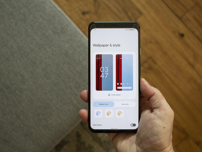
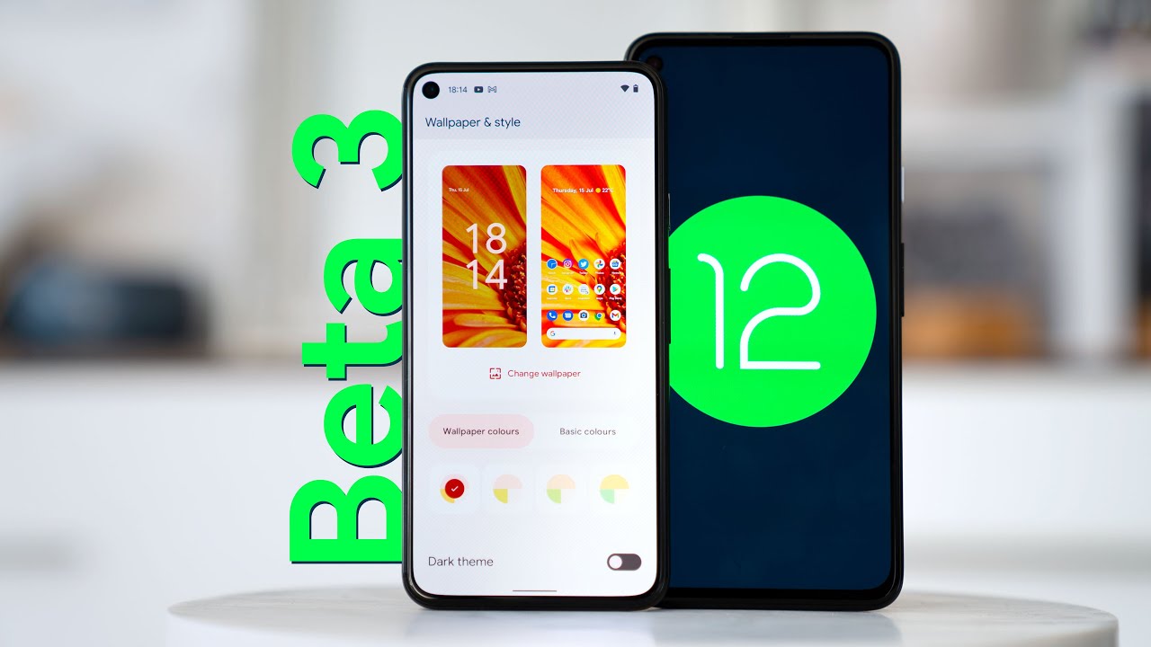
Android 12 beta 2 introduced automatic color theming as part of the new Material You design language, and Android 12 beta 3 now gives users more manual control over how those colors are applied system-wide. The redesigned wallpaper and style picker is a big upgrade from the previous interface, offering more options right up front to choose from and better previews of colors. When you apply a wallpaper, the wallpaper picker now offers four dynamic color options to choose from.
Additionally, you can choose a single solid color to apply to UI elements like the quick settings buttons. For now, these seem to be the same four colors no matter which wallpaper you choose. A vibrant blue, forest green, lavendar purple, and a yellowish-brown can be chosen from in light mode. Dark mode changes these colors to lighter, pastel versions of the same colors. Personally, I was hoping for a lot more colors and hope Google adds more in the future.
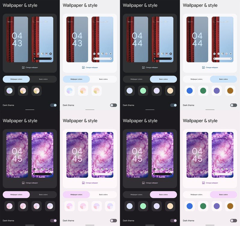
Google has moved the dark mode slider to the wallpaper and style picker for convenience; a setting that just makes sense and lines up with the likes of other operating systems like Windows 11. Switching between light and dark modes will also change up the suggested colors a bit, changing pastels out for brighter colors depending on the base theme.
A new option to theme icons along with the chosen color is also now present in the redesigned wallpaper and style picker, as well. Icons that support automatic theming will receive a new flat, colored look that aligns with the system color. Developers need to update apps to support this function so you'll see plenty of mixed colors until that happens. I'm a big fan of this kind of theming although, curiously, the ability to select the icon shape is missing in this build. We assume this will be added back in Beta 4 but will check with Google to be sure.
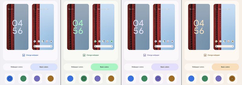
I'm sad that the glitter effect is gone and would love to see Google add it in as an optional feature.
As we've seen (and expected) from previous betas, there are still plenty of visual glitches that Google needs to iron out before release. The Pixel 5 seems to suffer from a particularly high number of visual bugs when compared to the Pixel 4, for whatever reason. One notable example was the status bar choosing the wrong color which makes it nearly impossible to read on certain color backgrounds.
Be an expert in 5 minutes
Get the latest news from Android Central, your trusted companion in the world of Android
That glitter look is now completely gone in beta 3, replaced by a far more subtle fade effect during animations. Personally, I'm quite sad about this being removed and would love to see it added back as an optional effect if users like it. Many OEMs provide users with ways to customize animations throughout the UI and Google should, too.
A tilt and a tap
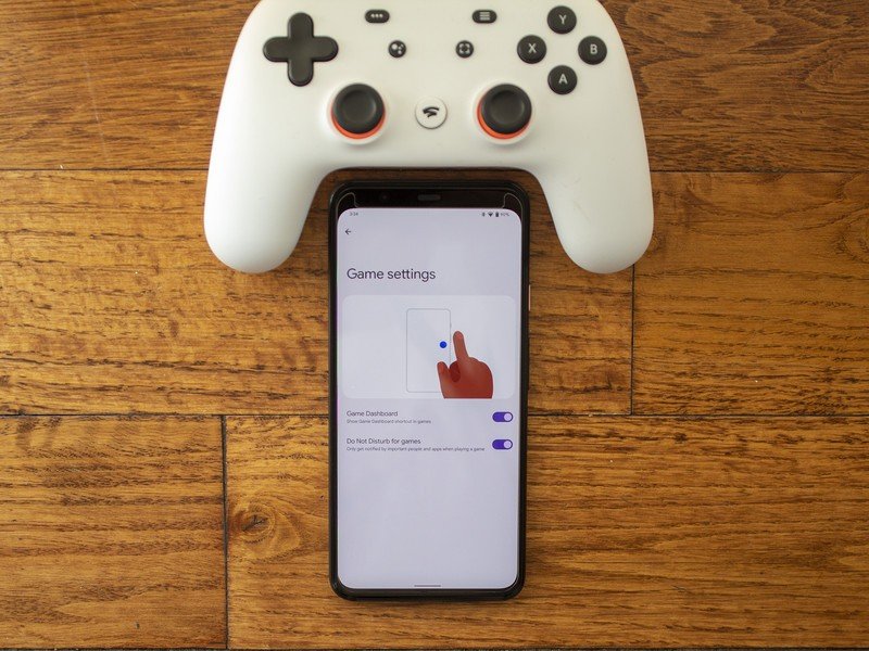
For years now, many OEMs have offered what's commonly known as a gaming toolbox. Google is adding this type of functionality to Android 12 — called Game dashboard — but most of it is still behind the scenes in beta 3. You can find the option to toggle this toolbox in the settings but, for now, nothing happens when you launch a game.
This new gaming API will also allow developers to gain better performance out of phones, help save battery life with a few new tricks, and just make mobile gaming more enjoyable overall.
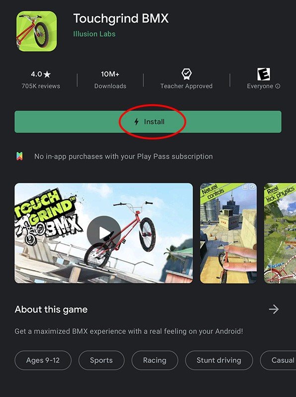
While the new Android Game Development Kit includes several behind-the-scenes additions that users will only notice in the long-run, a new user-visible feature made its appearance in beta 3 that will make a huge difference when downloading on the go: play as you download. As the name suggests, you'll be able to play a brand new game as it downloads.
At just 15% downloaded, I was able to click the play button; an incredible improvement for big games.
I tried it out with Touchgrind BMX — one of the games Google highlighted for the new feature — and it works impressively well. At just 15% downloaded, I was able to click the play button and get going in the game while the rest of the title downloaded in the background. We've seen this concept before on other platforms so, while it's not new to the world, it is a huge quality of life improvement.
Smaller games won't see much of an improvement here, but some of the huge games on the store — here's looking at you Call of Duty: Mobile — can now be played in just a few seconds after hitting download rather than waiting practically forever for a download. When a game supports this feature, you'll see a little lightning bolt next to the word "install" on the button in the Play Store listing. To put it lightly, this feature is friggin awesome.
Machines learning tricks
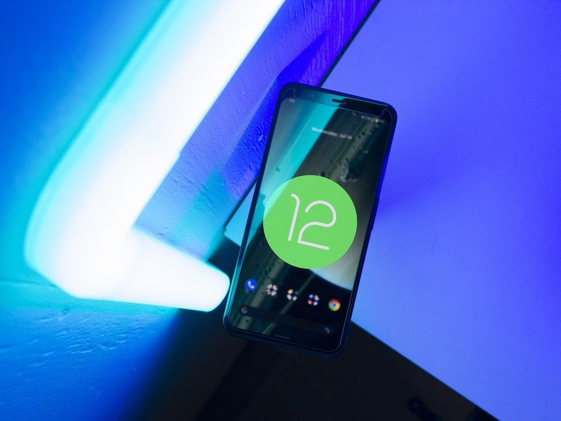
One of the more subtle highlights of beta 3 revolves around device rotation. While you might not notice it at first, your Pixel will now use the front-facing camera to figure out which way you're actually trying to hold the phone. Yes, this is one of those old Samsung features that was employed forever ago and long-forgotten, but Google's new implementation should work pretty well once it's fully implemented.
The new smart device rotation uses the camera to ensure your phone only rotates when you intend it to.
Now, before you get all freaked out that your phone is trying to recognize your face and which way it's oriented, don't; Google is using the new Android Private Compute Core. The visual data is not stored and is only accessible within this private, sandboxed part of your phone's hardware. This brings the number of features used by Private Compute Core up to four, previously joined by Live Caption, Now Playing, and Smart Reply.
You do have to manually enable this feature, found under device rotation, in order for it to work. I tried with it toggled on and off and didn't notice a difference. In fact, I'm pretty sure this feature is largely broken right now for me. Several times now, the phone would get stuck in a landscape rotation and I'd have to spin it around several times before it figured out which was I was holding it. Maybe the machine learning hasn't gotten past infant stage for this particular feature just yet.
The idea is that it's supposed to help users who use their phones while lying down but the results were the same for me when I tested standing, sitting, and lying down. Rotation is also supposed to happen 25% more quickly due to machine learning gesture detection but, again, I didn't notice any real difference.
Filling out nicely
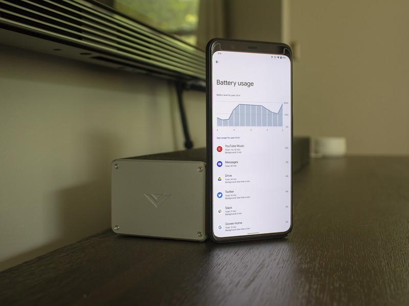
That image above is likely a sight for sore eyes if you've been a Pixel user for a while now. Battery stats are no longer anemic in Android 12, finally displaying actual useful granular data right at the forefront of the battery section in settings. Additionally, it's now easier to manage whether or not apps are performance-optimized for battery consumption — something that some other OEMs could benefit from.
Battery stats are finally useful again!
Search should now work better in all apps that employ the new AppSearch API by working more like other OS's. If you're a Mac user, you'll understand that this functionality is similar to Spotlight Search and could significantly enhance apps moving forward.
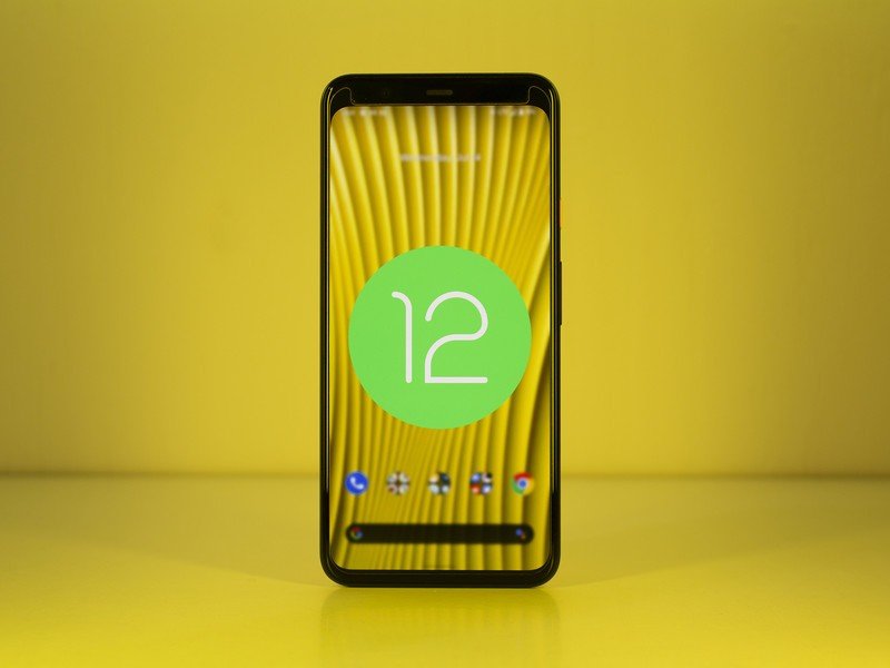
Those new privacy indicator dots just got a new API that developers can use to track their position on the screen, helping to avoid in-app UI elements from being covered by these new icons. For note, you'll find that a few green icons appear in the corner of the screen any time an app accesses your microphone, camera, or location. That helps you know when an app is taking advantage of the three most private permissions at any time.
Many new features, like scrolling screenshots, have been available on non-Google phones for a while.
Folks who have big phones and have a hard time reaching the top with one hand will be super happy with the new one-handed swipe gesture. Google implemented this concept in a previous beta but now allows the entire screen to shrink with a quick swipe down on the gesture bar or navigation bar at the bottom of the screen. Swiping up brings full-screen mode back and feels simply fantastic to use.
You'll also find a handy new scrolling screenshot button when taking a screenshot in Android 12 beta 3. Like the game toolbox, this feature won't be new for folks who are used to non-Pixel phones, as it's been employed in some way by many OEMs for years now. Once again, though, it brings up the least common denominator and makes Google's Pixel line more competetive.
Beta 3 marks the final set of APIs being introduced for developers, meaning we're not likely to see big new features added in the August's Android 12 beta 4. That release should primarily squash bugs and provide an overall more solid experience — a very good thing considering I've run into more bugs in this build than the previous one, including several that forced me to restart the phone. Have you tried Android 12 beta 3 yet? Let us know in the comments below!
Have you listened to this week's Android Central Podcast?
Every week, the Android Central Podcast brings you the latest tech news, analysis and hot takes, with familiar co-hosts and special guests.

