Android 11 Beta hands-on impressions: Rough, but worth installing
After multiple Developer Preview releases, and a little bit of a delay, Google has launched the first official Android 11 Beta. This is a big milestone because in moving to a "Beta" release, Google is locking a lot of things in — there are final APIs for developers to write apps against, and a lot of the features and interface changes are here for us to play with. And anyone can get in on the fun of seeing the next version of Android because the beta is an easy installation over the air to any Pixel.
Here's everything new in the Android 11 Beta
But ultimately this is still pre-release software that's months away from being considered done, so I don't blame you for not wanting to potentially risk your only phone running it. Fear not — I'm taking the hit for you and using the Android 11 Beta on my Pixel 4 XL. Here are my first impressions.
The Beta brings some great features
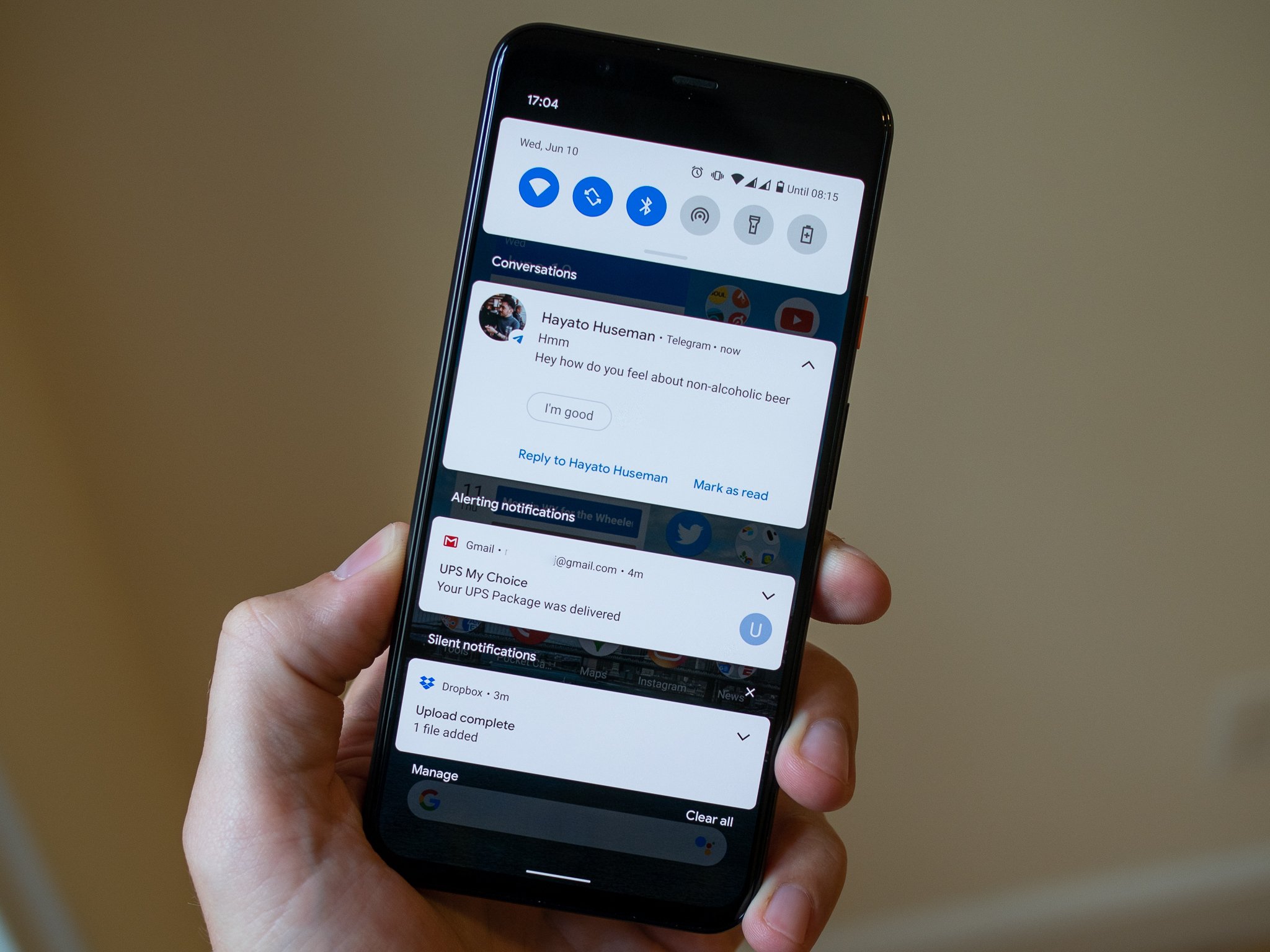
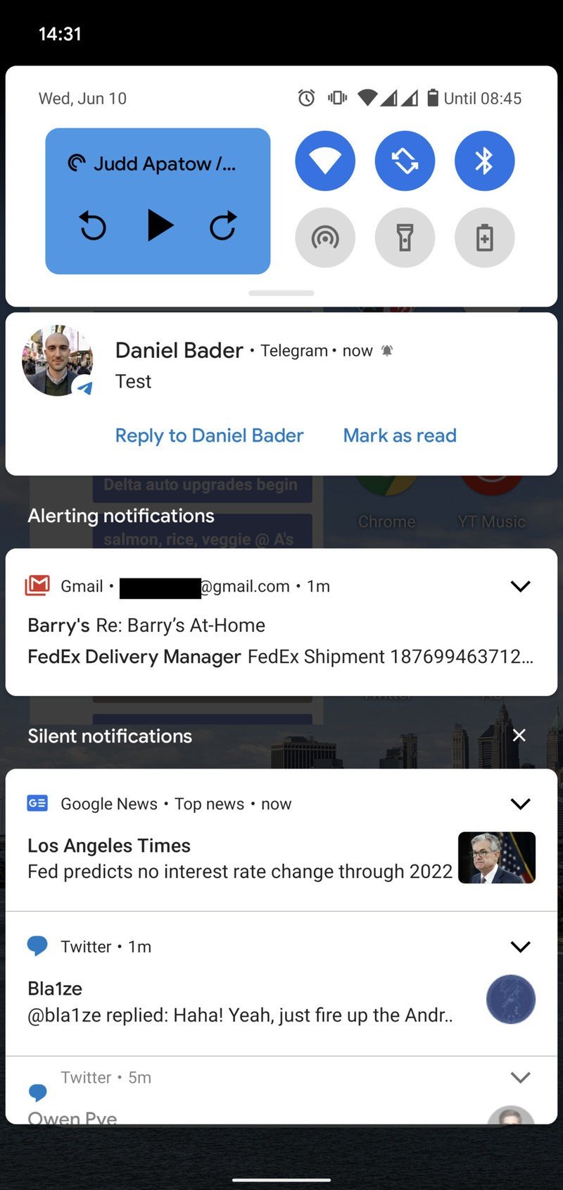
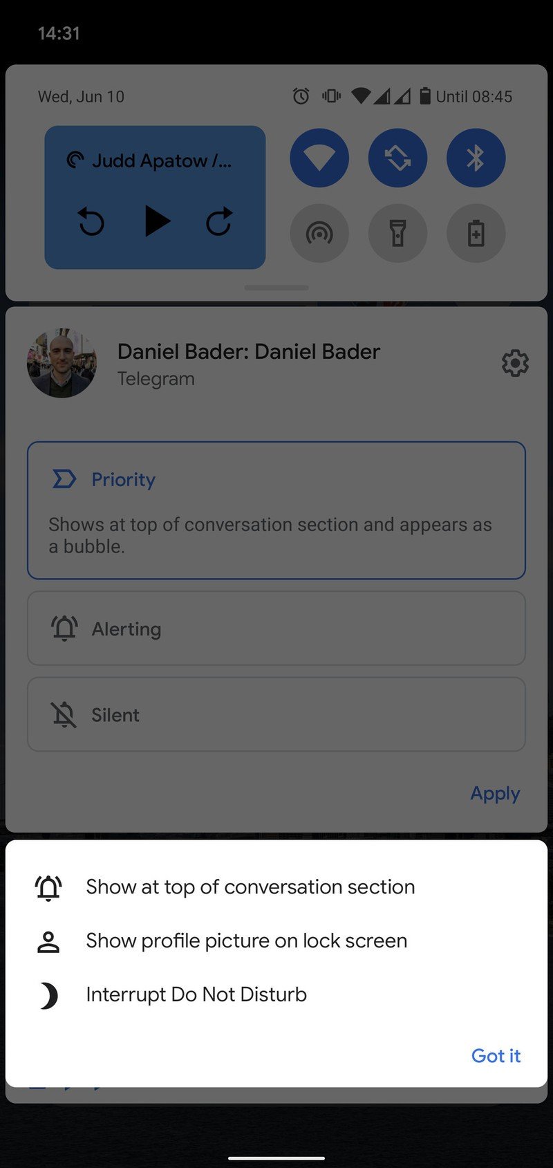
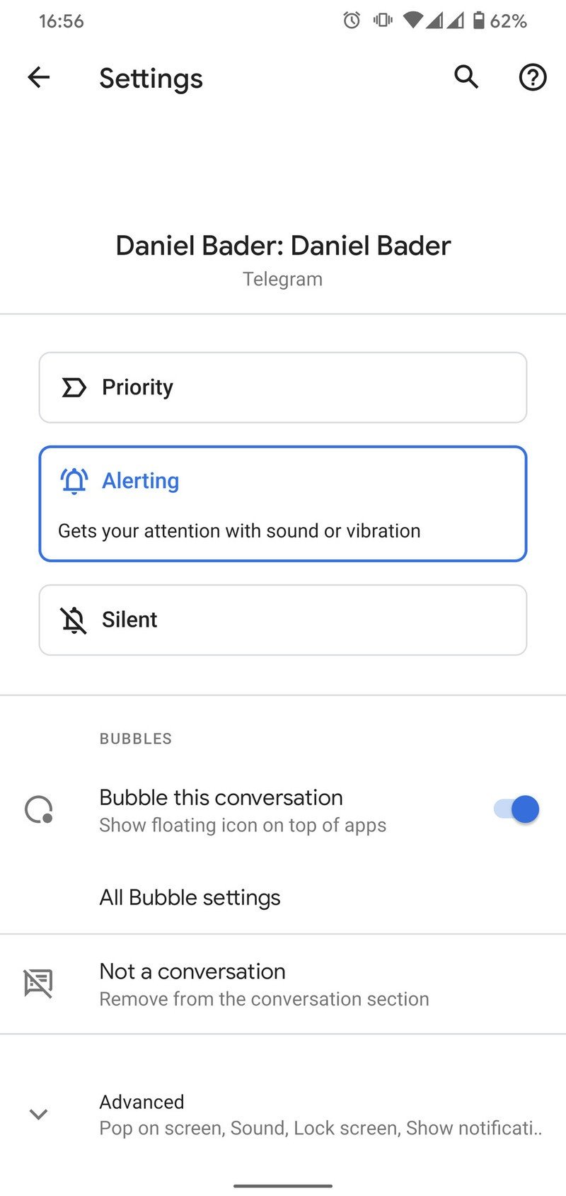
One of the largest points of emphasis in Android 11 is control over notifications, building on the notification channels and management options in Android 10 that were already the best system Google's had. The big change with Android 11 is a delineation of "conversations" from the rest of the notifications. This lets you see notifications from a specific person or group, and have separate notifications for that person, rather than just handling it globally for an entire app. So similarly to the way chat apps will let you star or pin a conversation in the app, you can now set priority, normal, or silent notifications for a conversation at the system level.
Source: Android Central
Conversations deserve to be separated from the rest of notifications.
You can control every aspect of that conversation's notifications in the same way as any app. So for example you can turn on or off chat bubbles, choose whether content shows on the lock screen, whether it plays a sound or vibrates, etc. It has potential to get really complicated if you get granular into every conversation you're having, but chances are you're only going to configure this for a handful of ongoing conversations — and in that case, this is really nice. Even if you don't touch a thing, you'll see "conversation" notifications separated from other apps, and that's already a big win.
That builds on smaller changes to notifications as a whole, such as a new notification history page that lets you refer back to notifications even if you accidentally cleared them (we've all been there) and a general unifications of the ways you manage notifications.
Be an expert in 5 minutes
Get the latest news from Android Central, your trusted companion in the world of Android
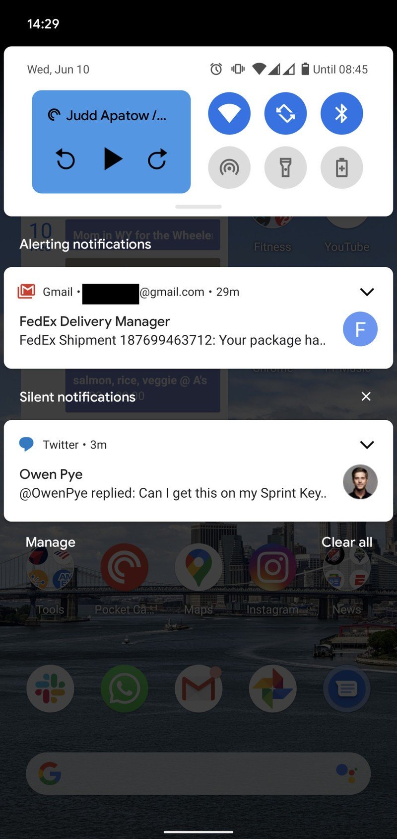
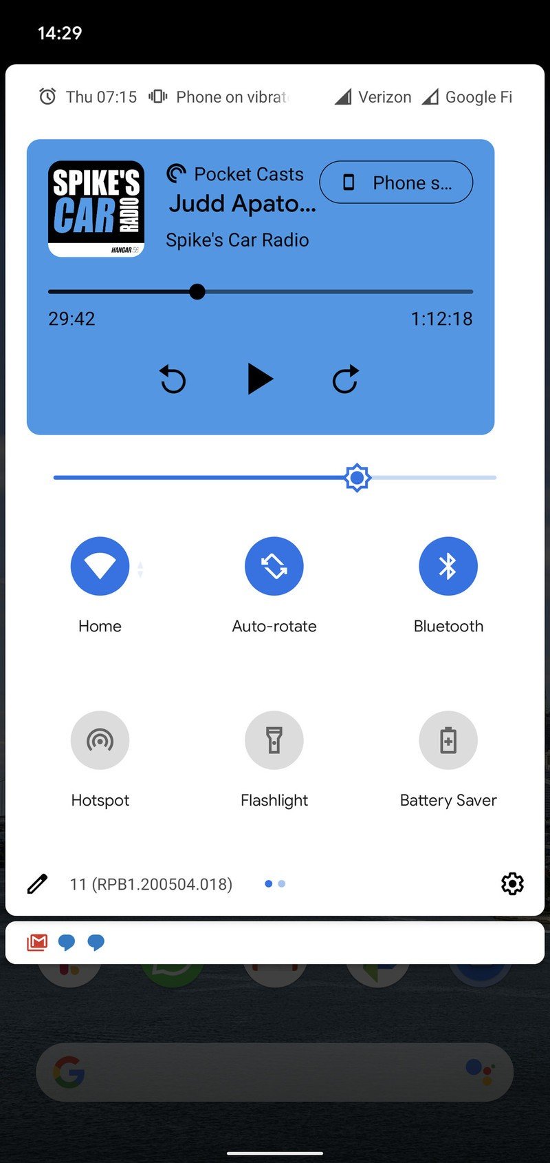
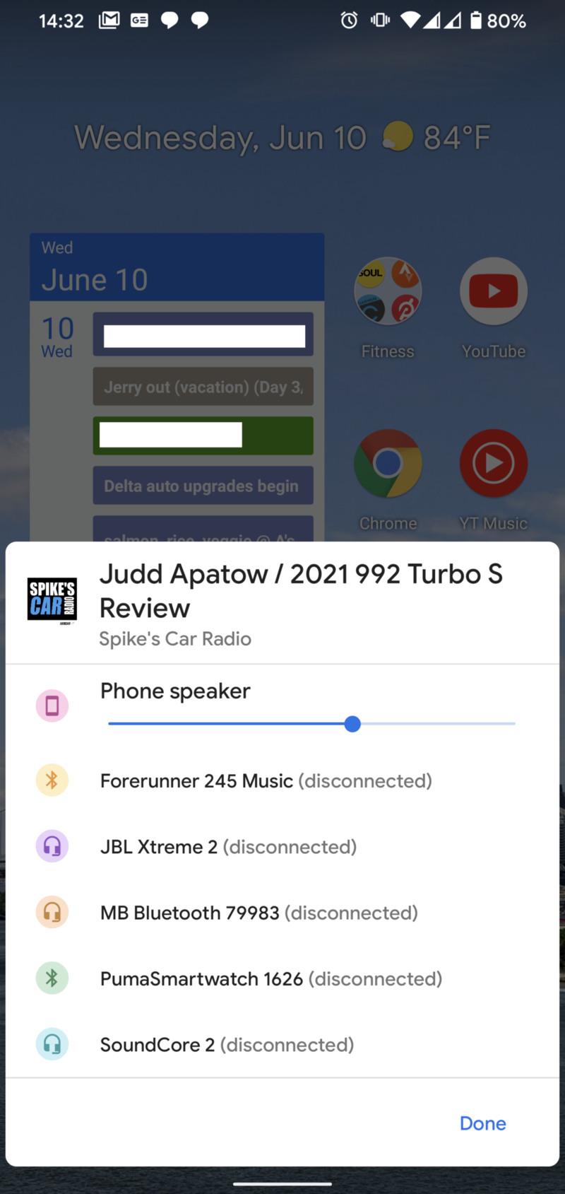
Source: Android Central
Media playback fits in the quick settings just fine — but this implementation needs lots of polish.
Since this new three-tier notification shade now takes up more room, Google has moved ongoing media playback to a permanent position in the quick settings area, which is a good idea — and is something we've seen on other company's software as well. Now when you have media playing that would normally give you a notification, it's squished up next to the toggles for Wi-Fi and Bluetooth, and when you expand the notification shade further you get a replication of the full notification. This still looks ... very unfinished (it isn't even centered!!), but it works and serves its purpose. You also get a quick toggle to bring up an interface to choose where your audio's headed — headphones, speakers, or Bluetooth devices — though I would love to have Cast options built in here as well.
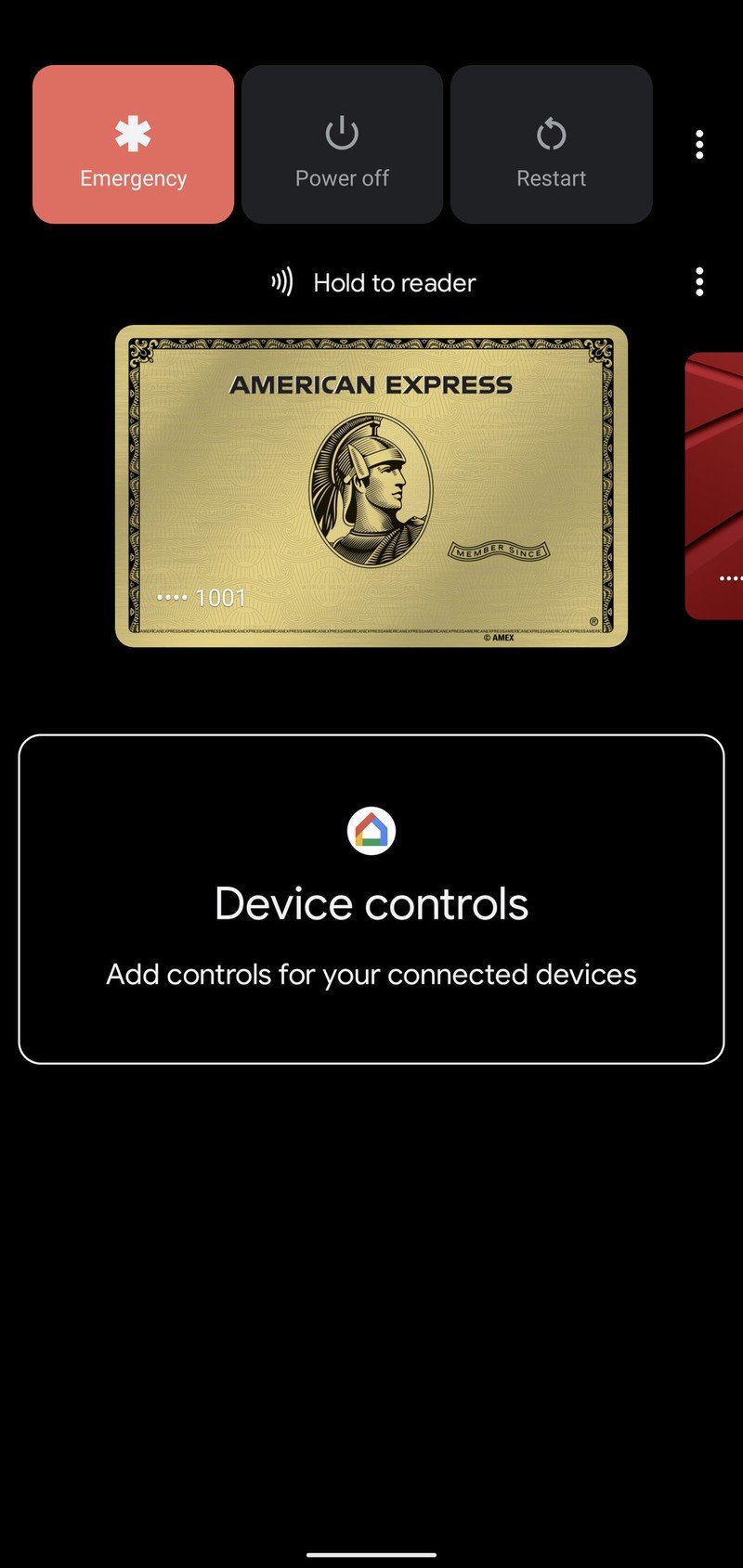
Google hinted at changes to the power menu with the last couple Feature Drop updates for the Pixel, and now we know what it had in mind: there's a complete smart home control interface built into the power menu. So now in addition to the standard power options, emergency button and Google Pay cards, you get a full half of the screen dedicated to smart home controls. These controls are pulled right from the Google Home app, so you don't have to configure them independently here. Very similarly to iOS Control Center, you can quickly toggle on or off items like light bulbs, see the status of locks and doors, and even quickly jump to your security camera video feeds.
Unfortunately, this interface doesn't give you access to play/pause/volume controls for ongoing media playback on Google Home, Smart Display or Chromecast devices, even though those options are available in the main interface of the Google Home app. I really hope that's arriving soon, because if you don't have a bunch of smart home gadgets in your home you won't have any use for this interface — but tons of people have Google Homes and Chromecasts. Without a robust smart home setup, your power menu dashboard is just wasted space.
Android 11: Here's what's new with the power menu and device controls
The power menu is a perfect place for a smart home dashboard — it just needs to expand its scope.
A generally behind-the-scenes change that I really appreciate is the implementation of one-time-use permissions, particularly for items like location and camera. Now when you first open an app that needs permissions, your primary options are "once," "only while using app," and "never" — a clearly privacy-first move. You can still provide always-enabled background permission for things like location, but that isn't the default anymore. And the one-time-use option being elevated to the top of the pop-up is critical. Google even doubles down on this by punishing apps that ask for a permission repeatedly, stopping it from prompting you after you've denied it multiple times.
Finally, I see promise in Google's subtle changes to the Pixel launcher. There are new app predictions at the bottom of the home screen — traditionally called your "dock" — where any empty spaces you leave are populated by suggested apps. The suggestions are ... not great yet, but if anyone could do such a feature right, it's Google. The multitasking menu also makes it easier to screenshot and share apps from your history, saving you from the button combination. And there's now a dedicated text selection option for pulling text from apps in the multitasking view, which is frankly a small thing but incredibly useful for those times where swapping back and forth between apps just to reference information is cumbersome.
A lot of broken and unfinished things
The Android 11 Beta brings a lot of features ... and a lot of broken or unfinished things. Here's just a quick grouping of what I've found so far.
The new "chat bubbles" interface for managing conversations is just completely broken right now. Only certain apps work with it, and in those cases they only kind of work. I was able to get Facebook Messenger to work, which makes sense since the app already had its own similar Chat Heads system, but nothing else consistently worked. And that makes sense — this is the kind of thing that apps will need to be updated to target Android 11 for.
Android 11: Here's how chat bubbles and conversation notifications work
The Android 11 Beta brings a lot of features ... and a lot of broken or unfinished things.
You're now able to pin apps to the share sheet, so when you go to share different types of content the first options will be exactly the apps you expect — but I can only get this to work in some apps with some types of content. Google continues to struggle with the share sheet.
The new autofill API that will make it more visually appealing for keyboard apps to help you fill data into fields in apps and websites hasn't been deployed yet, which is a bummer. This looks promising, considering how well the autofill service already works with on-screen pop-ups.
Android 11 changes the way that apps can interact with the keyboard, recognizing its state so animations can be tailored to the keyboard showing and hiding. Unfortunately this seems to be breaking some apps I try to use a keyboard in — Telegram is particularly bad — where the app won't reflow to fit to the screen with the keyboard in view. Yeah, that means you can't see what you're typing — that's annoying. Others are reporting the keyboard doesn't show up at all, which is even worse.
Is the Android 11 Beta good enough to install?
If you're interested enough in new Android software that you're asking this question, you're probably in the target demographic of people for whom installing the Android 11 Beta is worth your time.
If you're installing on your only phone, consider waiting for Beta 2.
But, if this is your only phone, just know that this is a relatively risky proposition. The first Beta release is technically more stable than the Developer Previews that came before it, but remember that we're still multiple Beta releases away from being truly stable. If you install a Beta on your phone, there's no guarantee that the software will always work properly — you may not encounter crashes or reboots, but individual features may be wonky or performance may not be consistent, and perhaps most importantly there may be app compatibility problems.
How to download and install Android 11 on your Google Pixel
As I've shown here, there are still notable bugs to be found, some of which really get in the way of the daily use of your phone. Then you can add to that the fact that some of the features you're installing the Beta to get just don't work yet anyway. It's all fun to play around with, but unless you have an appetite for tinkering and seeing how things work, I'm going to recommend you hold off for Beta 2 — hopefully some of the rough edges will be softened and the whole experience will be a bit easier to deal with.
Andrew was an Executive Editor, U.S. at Android Central between 2012 and 2020.


