It took a while, but I've learned to love Android 10's gestures

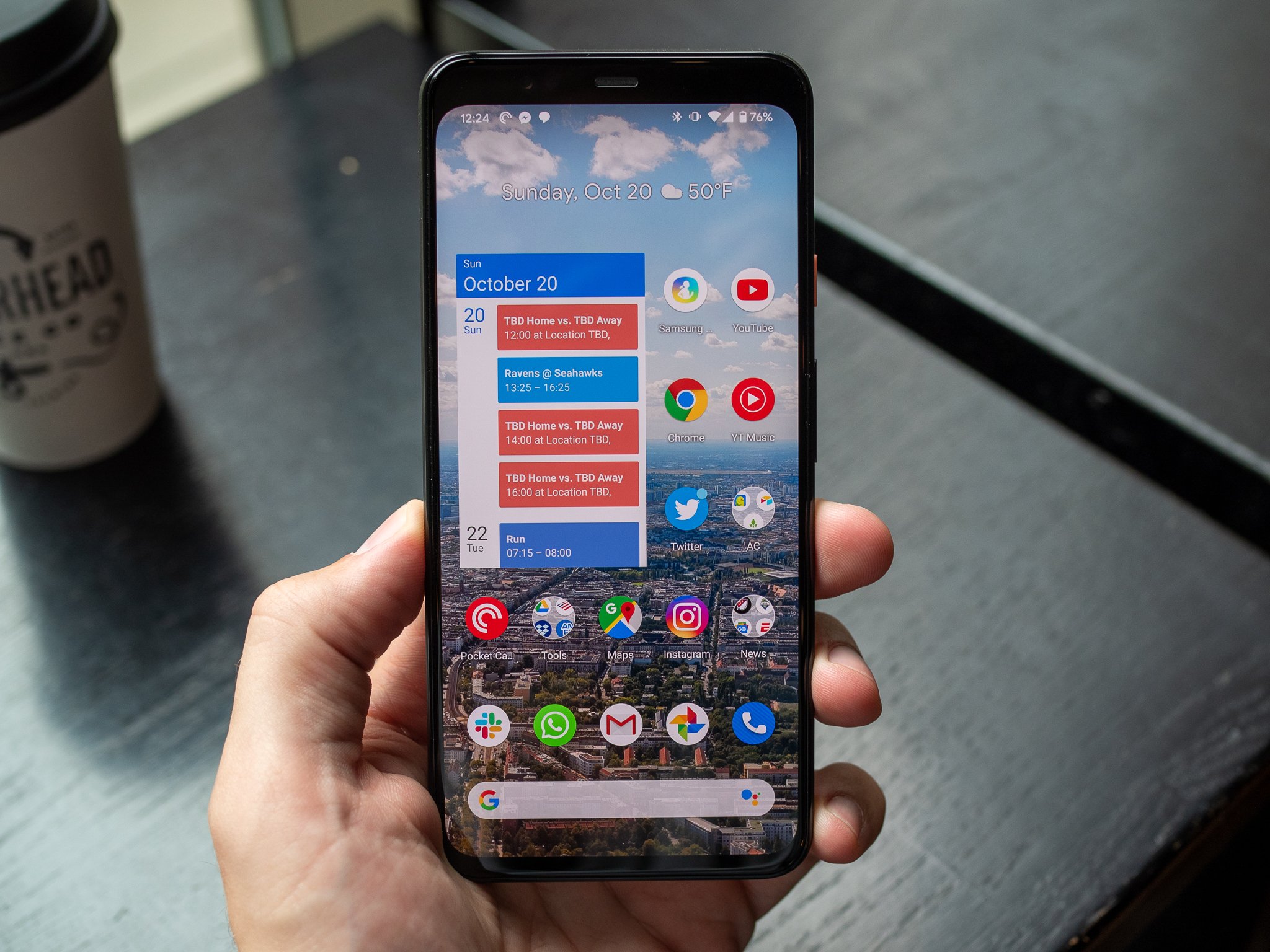
Back in June, before Android 10 (then Android Q) was released, I was extremely miffed by Google's latest gesture navigation system. I couldn't imagine it would roll out considering how it broke a fundamental app interaction, the slide-in drawer. But several revisions later, Google made many tweaks to the gesture implementation that almost fully addressed my concerns. With those improvements, and a couple months of using Android 10 every day, I've come around. The gestures are actually really good.
After a couple months using Android 10 every day, I've come around to the gestures.
After building up sufficient muscle memory, the only real downside of the new gesture system at this point is in a few fringe cases. It's still frustrating how the back gesture overlaps with slide-in drawers, and with apps that need full-screen views with swiping interactions (like media or gallery apps).
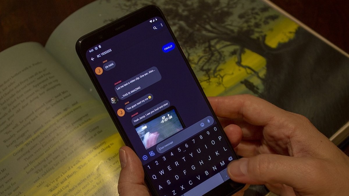
There are still many instances in which I can't get the angle-in swipe just right to access a side drawer, and end up getting the back gesture instead. No matter how much time I spend with Android 10, I don't think I'll ever be 100% on that, and that's frustrating. And the system of swipes you need to be aware of in an app like Google Photos that has swiping within the app, and also a full-screen mode, but makes use of the back gesture, is annoying to deal with. These are issues you don't have to deal with when you have a regular old button to press, or even a bottom-only navigation system like so many companies have implemented.
Even with back gesture issues, this navigation system is still a big improvement.
But even with those frustrations, the Android 10 gestures are easily the best system Google's put together, and there are tons of upsides to using this system over an older bottom bar-based navigation (be it buttons or swipes). Being able to use the back gesture with either hand, anywhere either side of the phone, is a huge ergonomic advantage for something you do hundreds of times a day. And not having to reach to the bottom of the phone to quickly flick back in an app is helpful, particularly as phones just keep getting larger.
You have to separate your frustration with learning something new from the core values of gestures.
You'll also notice that my only complaints have to do with the back gesture — I actually really like the home, multitasking and Assistant gestures. The use of a single continuous swipe up for home, app drawer and multitasking is far more fluid now than in Google's previous attempts. And left/right swiping along the bottom edge for one-by-one app switching is slick and easy to use 100% of the time, unlike Android 9 Pie's finicky implementation. The corner-in swipe for Assistant is also available from both edges, like the back gesture, making it easier to get to while never being activated accidentally.
Change is hard. And changing muscle memory for these core functions of how we use our phone is even harder — this isn't like figuring out a new interface for just one app. But once you make a full attempt to use the gestures, and separate your frustration with the fact that it's different from the tenets of what the gesture system has to offer, you may come around just like I did.
Be an expert in 5 minutes
Get the latest news from Android Central, your trusted companion in the world of Android
Andrew was an Executive Editor, U.S. at Android Central between 2012 and 2020.

