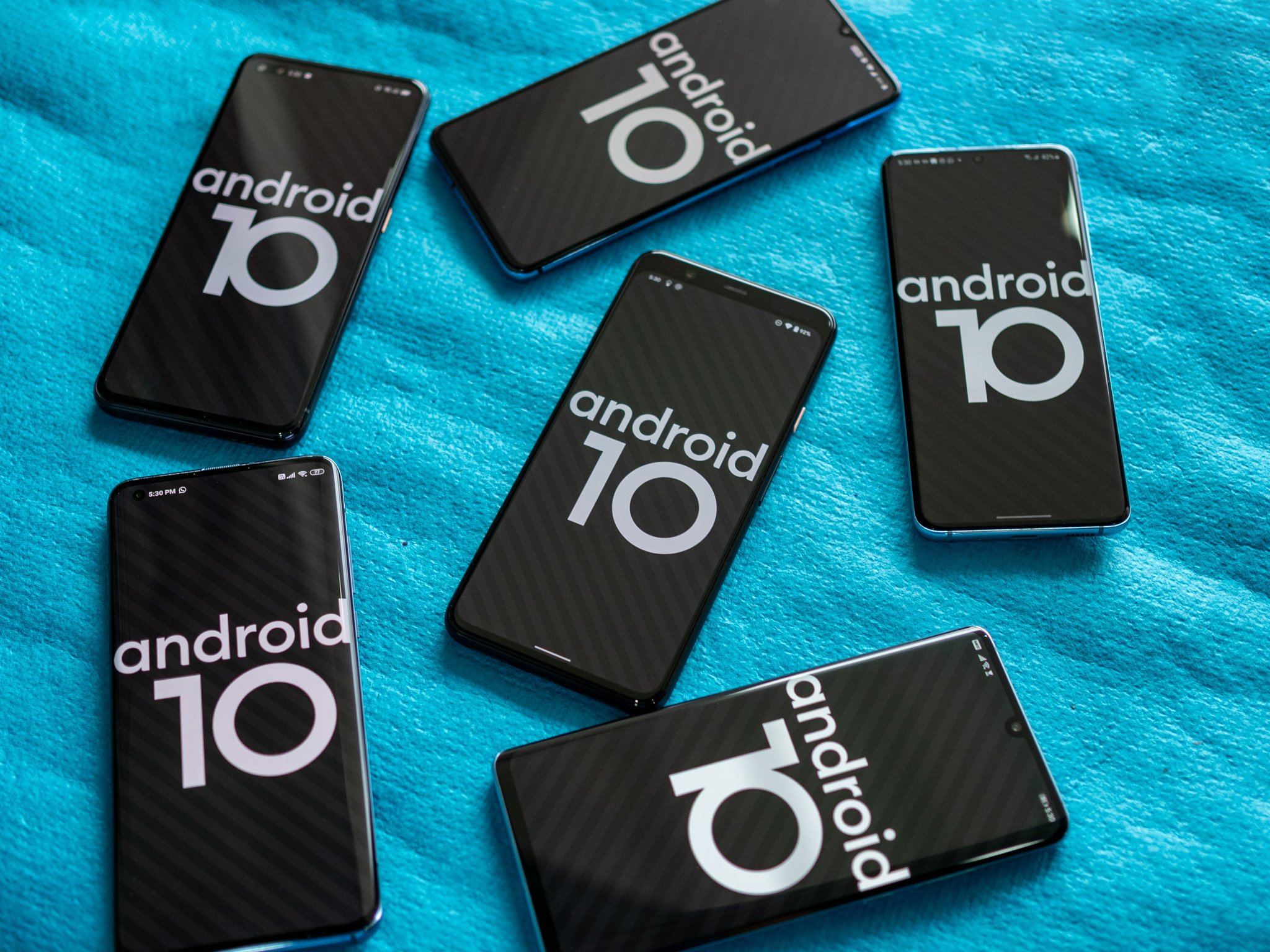
The best part about Android is its diversity — manufacturers add their own unique touches to the interface, leading to vastly different skins. Samsung's One UI 2.0 doesn't have a lot of similarities to Xiaomi's MIUI 11 even though both are based on Android 10 and offer a similar set of core features.
The first beta for Android 10 rolled out just over a year ago, with the stable build making its debut in October. A few companies like OnePlus rolled out the Android 10 update at the end of last year, but for a majority of phones, the update likely showed up earlier this year.
Most manufacturers have finally delivered the Android 10 update to a majority of their devices. With the implementation itself varying wildly between brands, let's take a look at just how different the Android 10 experience is based on what phone you're using.
Google Pixel / Android One Leading the way
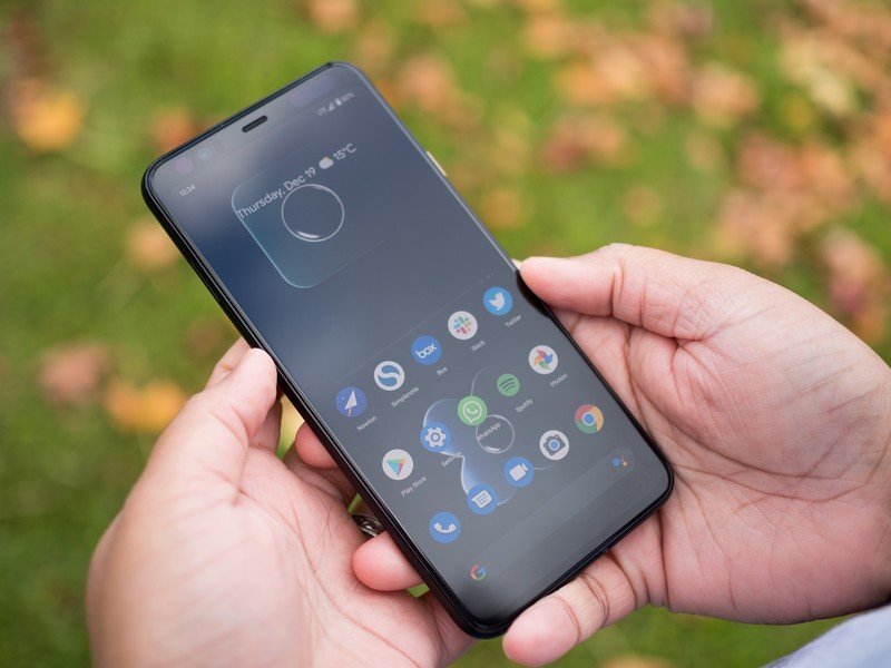
Android 10 didn't introduce a radical design or groundbreaking new features. Instead, Google focused on polishing the interface and adding meaningful changes, like the new navigation gestures, system-wide dark mode, and new privacy controls.
With Android 10, Google focused on polishing the interface and adding meaningful privacy controls.
System-wide dark mode didn't quite work the way Google intended out of the box as there were a lot of apps — including Google's own services — that just didn't have a dark theme. That changed over the last six months as most popular apps picked up a dark mode.
Android 10 also introduced new notification categories that made it easier to eliminate distractions. Silent notifications show up on the notification pane, but they don't trigger an alert — ideal for notifications that aren't time-sensitive. Smart Replies also turned out to be incredibly handy in day-to-day use, with the feature relying on machine learning to suggest quick responses to incoming notifications.
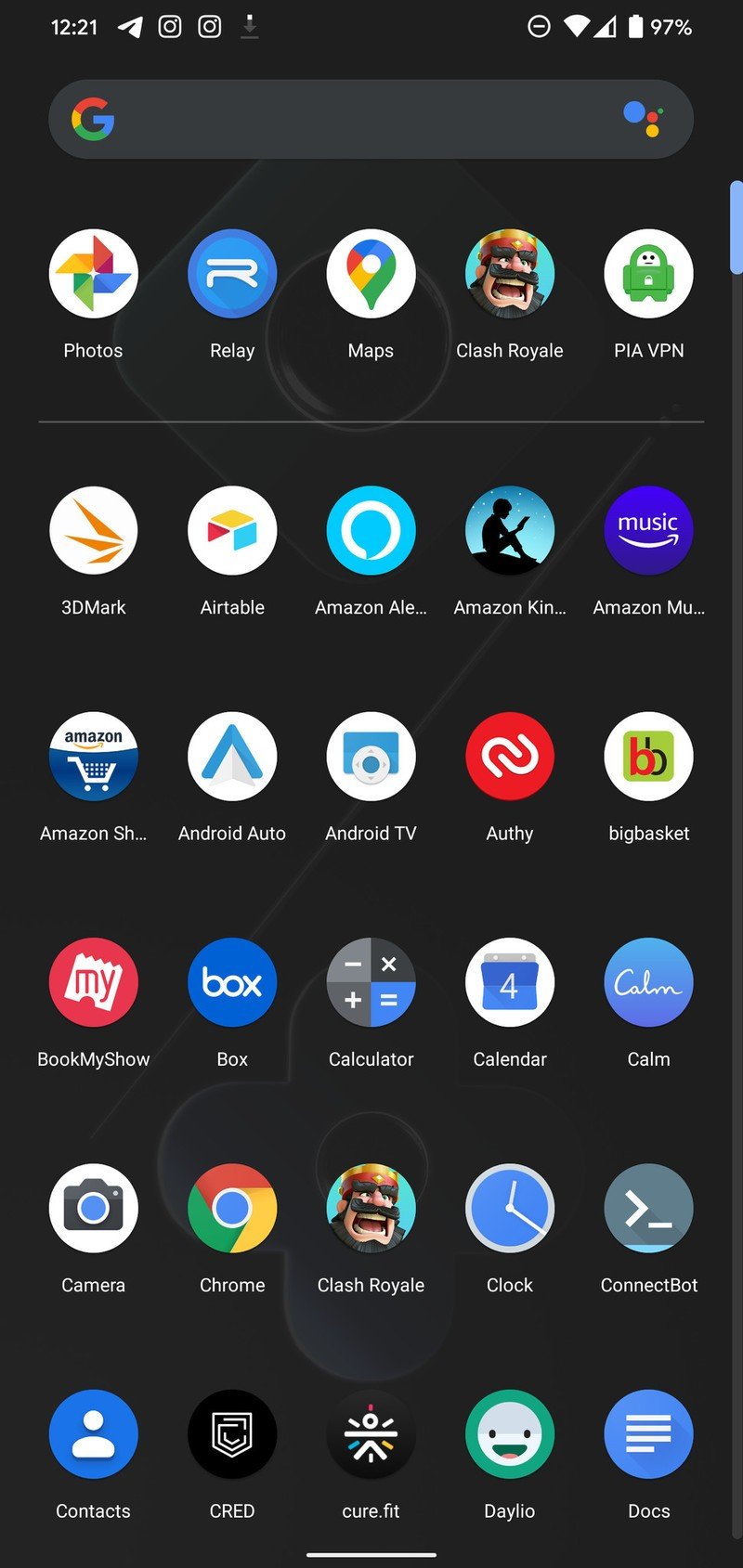
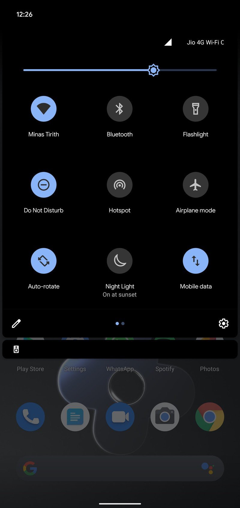

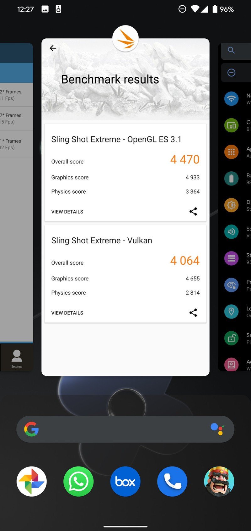
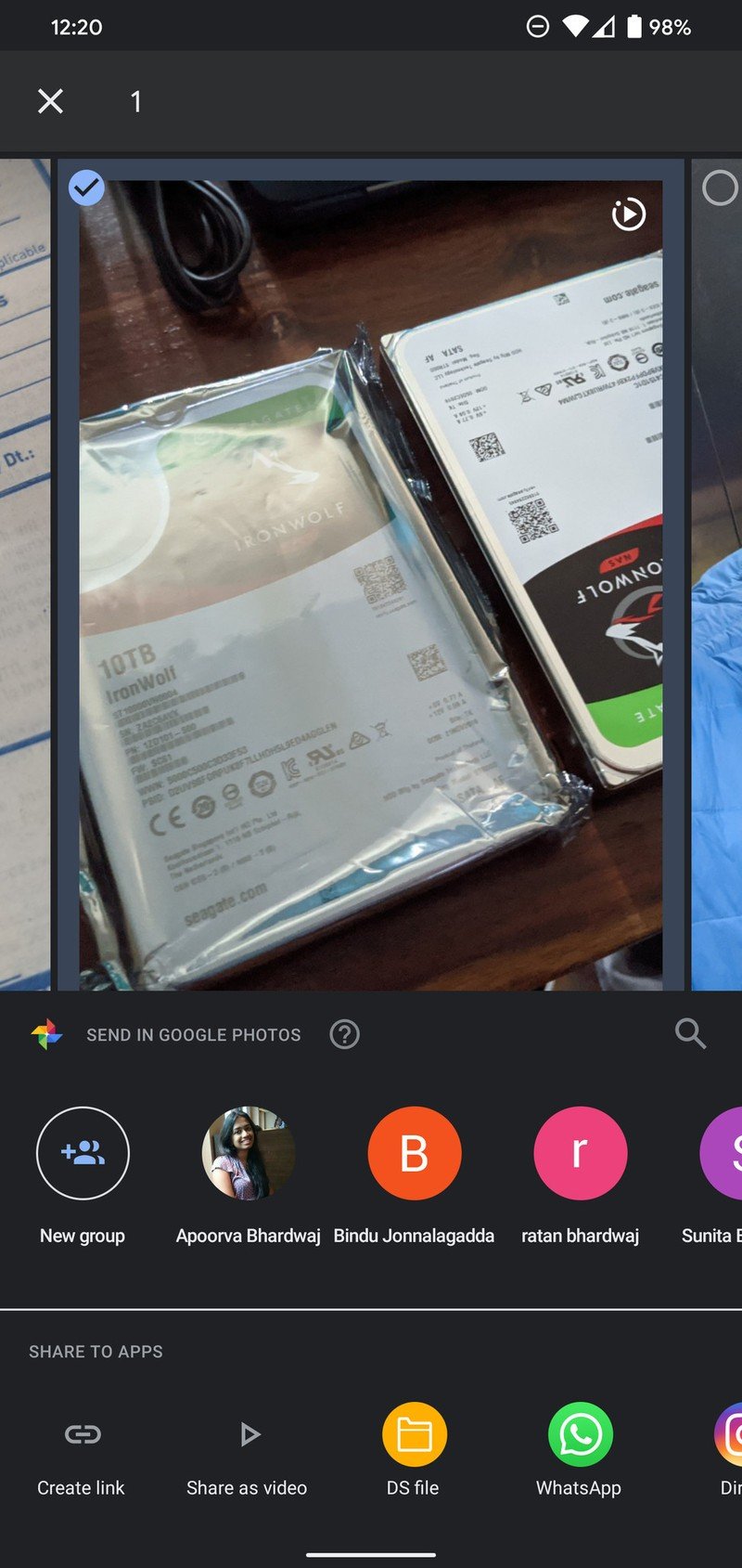
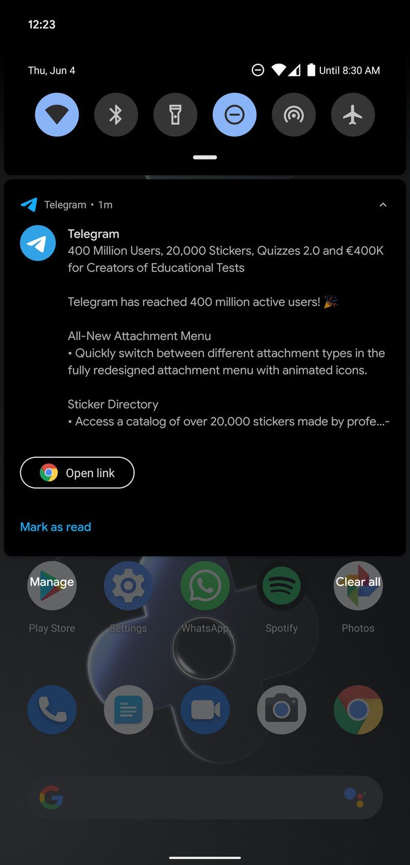
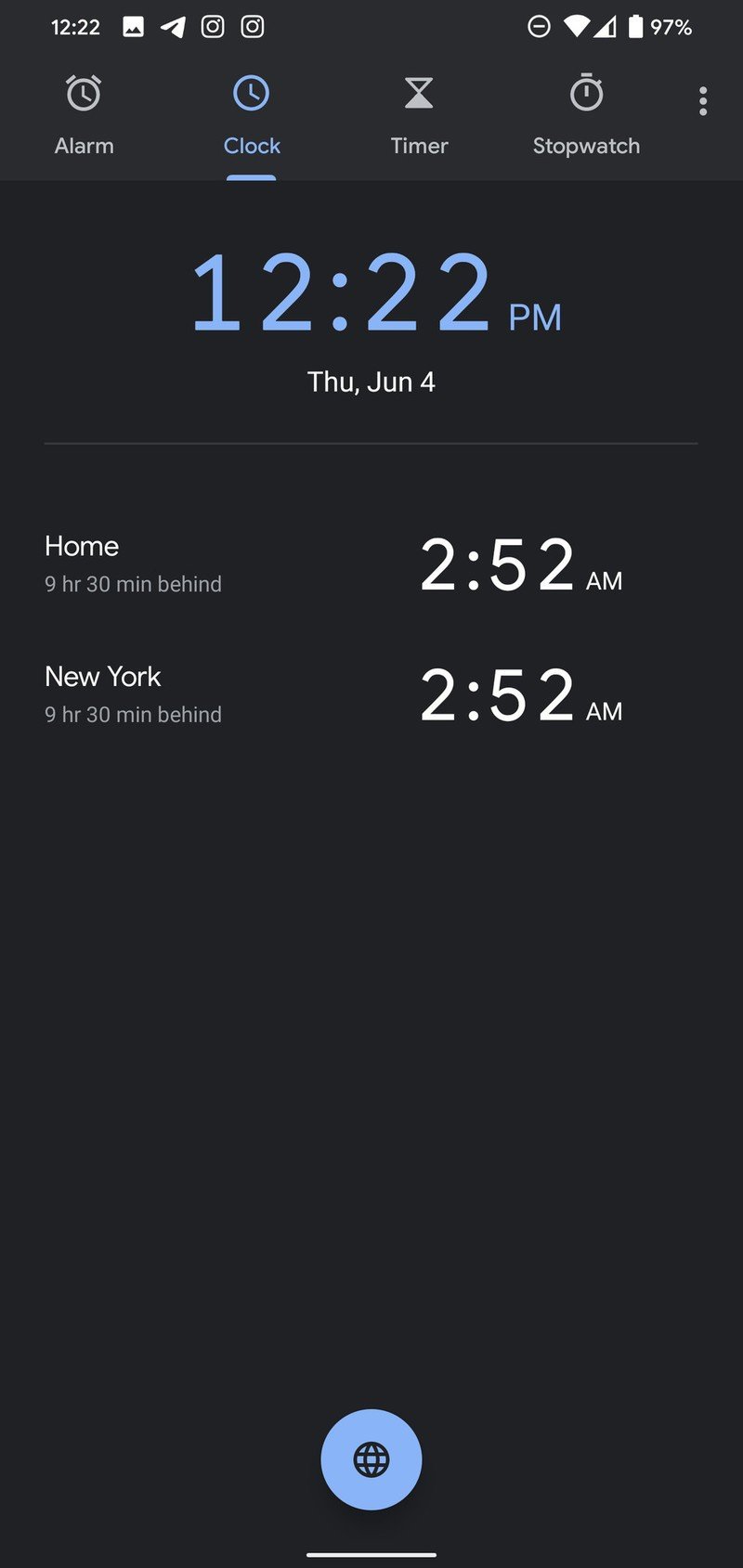
Source: Android Central
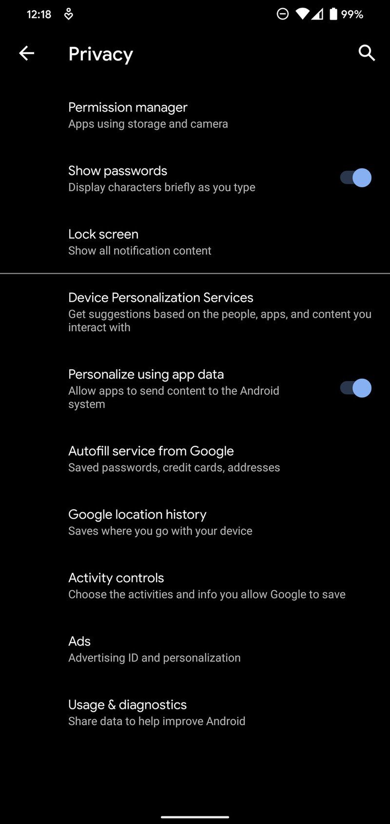
The share menu also got a welcome update, picking up a Material Design refresh and loading faster than earlier versions of Android. Google added new controls to Digital Wellbeing, but the biggest change with Android 10 has to do with privacy controls.
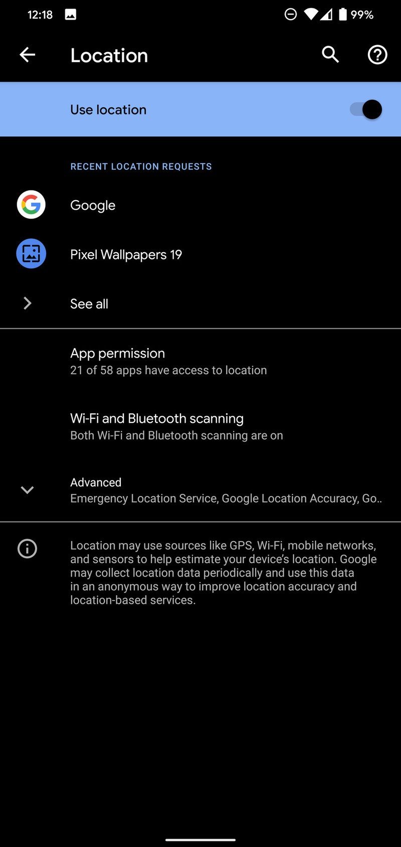
Google switched things around and put all the privacy options in a single menu within Settings, and we also got the ability to limit just how much access apps have to a particular permission. The ability to see just how many apps have access to a permission — and limit that access to only while the app is in use — is a welcome change.
Android One devices have the same user interface, but they are missing a few features that are exclusive to the Pixels. But generally speaking, the look and feel is identical to what you get on Google's phones, and most Android One phones get updated regularly.
Samsung One UI 2.0 Finally on the right path
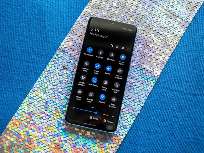
Samsung made a lot of welcome strides in terms of dialing back UI customization, and the result is that One UI 2.0 feels polished and modern. For one thing, Samsung integrated all of the features introduced in Android 10, including Google's default gesture navigation system, app permissions, and a dedicated sub-menu for the location permission that lets you see all the apps that accessed your location info.
All of the Android 10 platform features are baked into One UI 2.0, and you get a lot of extras from Samsung.
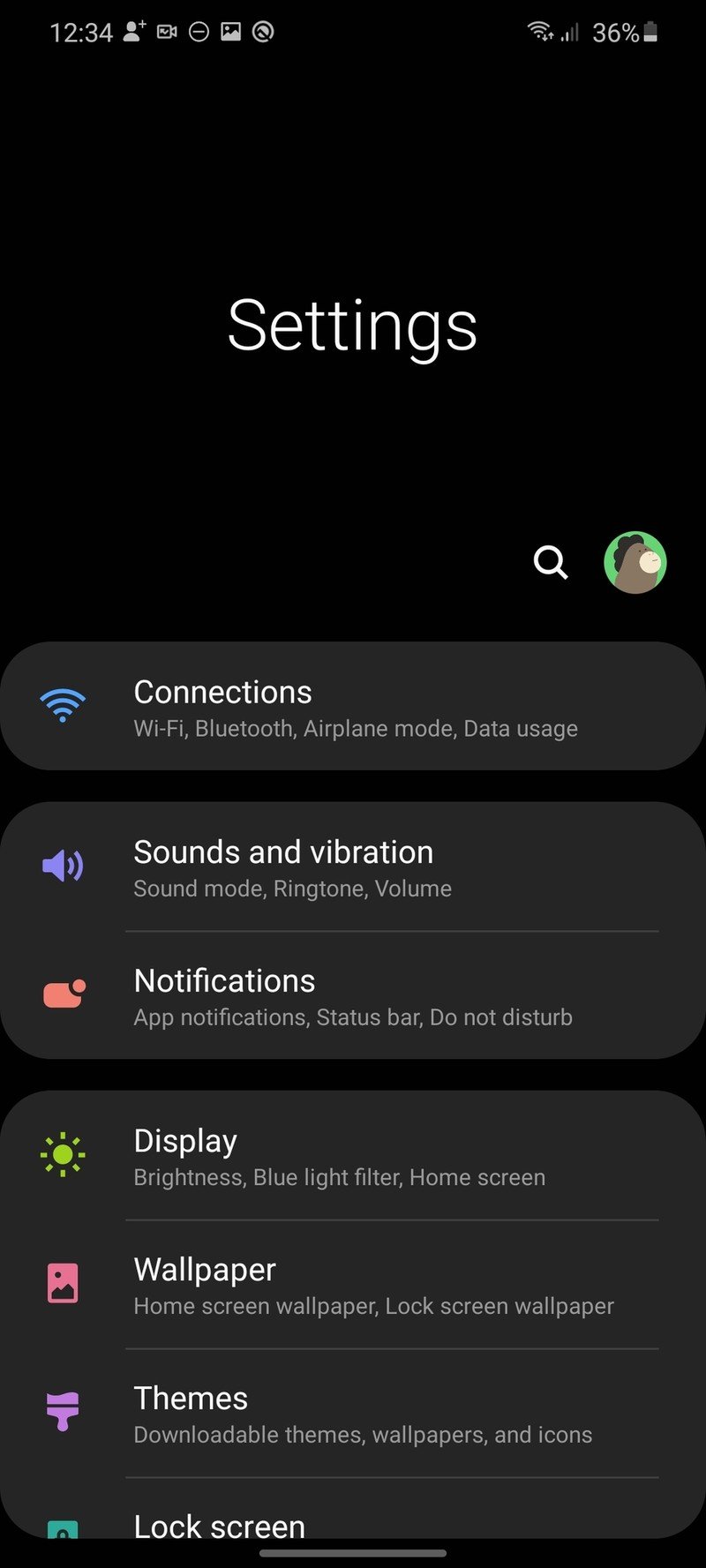
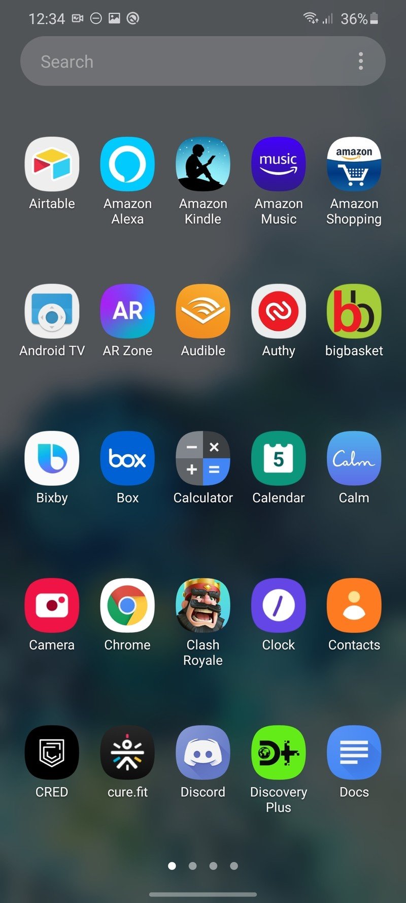
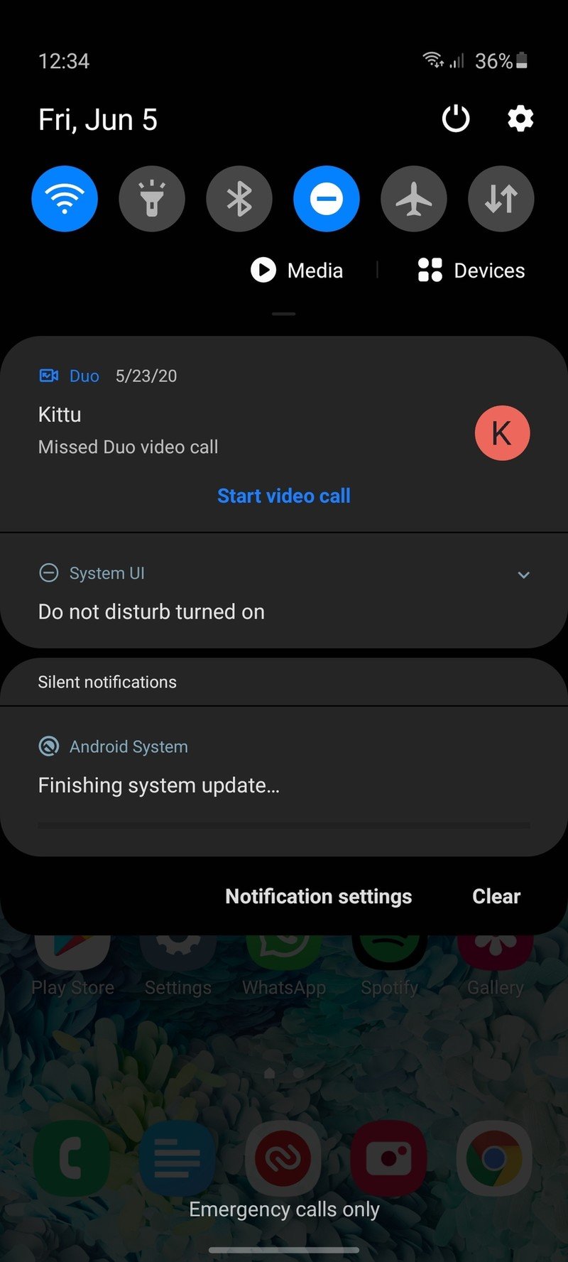
Samsung also carried over Android 10's notification management features, with the implementation unchanged from what you'll find on the Pixels. System-wide dark mode is similarly unaffected, with Samsung switching out its own implementation in favor of Google's solution. The user interface itself is quintessential Samsung: the app drawer scrolls horizontally, you'll still find a few unnecessary animations, and it will take you at least an hour to set up the phone to your liking.
That said, the UI elements look modern, and Samsung's usability-focused UX changes come in handy. Take the notification shade for instance: it covers the entire screen when activated, making it easier to access the toggles one-handed. The settings page is similarly easy to navigate, and all of Samsung's stock apps hold up well.

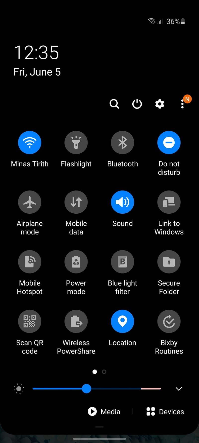
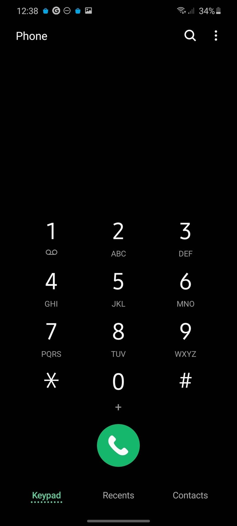
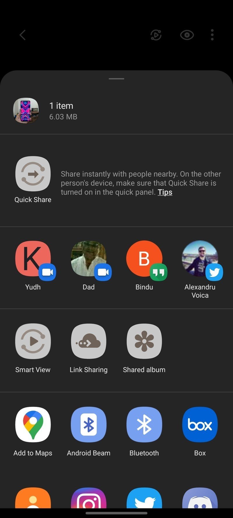
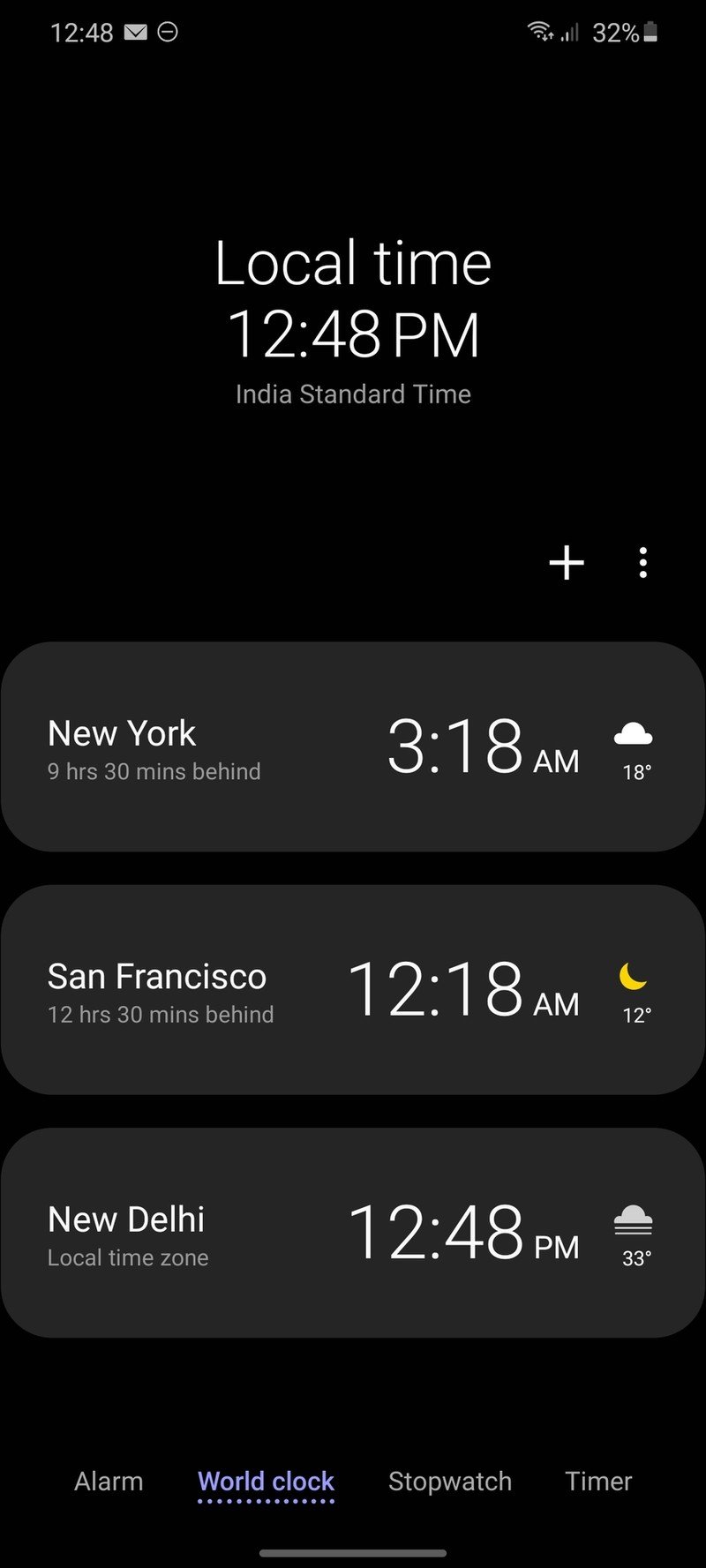
Source: Android Central
One UI 2.0 has more customization options than you'll end up using, with Samsung offering a comprehensive set of features. Dual Messenger is standard, Live Caption is integrated in the UI, you get built-in spam call protection, useful Digital Wellbeing controls, and unique features like Music Share make One UI stand out. Link to Windows is baked in on most Samsung phones as part of its collaboration with Microsoft, and the feature makes it easy to connect to Windows PCs.
Samsung is the largest Android manufacturer by some margin, so it cannot introduce wholesale changes to its user interface without alienating a majority of its customers. In that sense, One UI 2.0 gets a lot of things right.
OnePlus OxygenOS 10 Still the best third-party skin
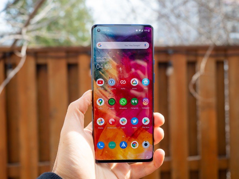
I've mentioned several times that OxygenOS is my favorite third-party skin. OnePlus doesn't deviate too much from Google's design aesthetic, and that means you get a clean interface devoid of overt customization. OxygenOS is a huge differentiator for OnePlus — with hardware now commoditized, the software experience is becoming more and more important, and OnePlus wins by some margin in this category.
More companies should follow OnePlus' lead with OxygenOS.
OxygenOS has a few additional customization options, but for the most part the software experience is similar to what you'll find on a Pixel or other Android One phones. Where OnePlus edges out other phones is in terms of optimization — even though devices like the OnePlus 8 have the same Snapdragon 865 chipset as other 2020 flagships, everything feels just that little bit faster.
OnePlus always focused on speed, and it carried that philosophy over to OxygenOS as well. Everything is instantaneous, there is no lag anywhere in the UI, and using devices like the OnePlus 8 side-by-side with the Mi 10 it's immediately clear just how much work OnePlus put into optimizing the UI to run smoothly.
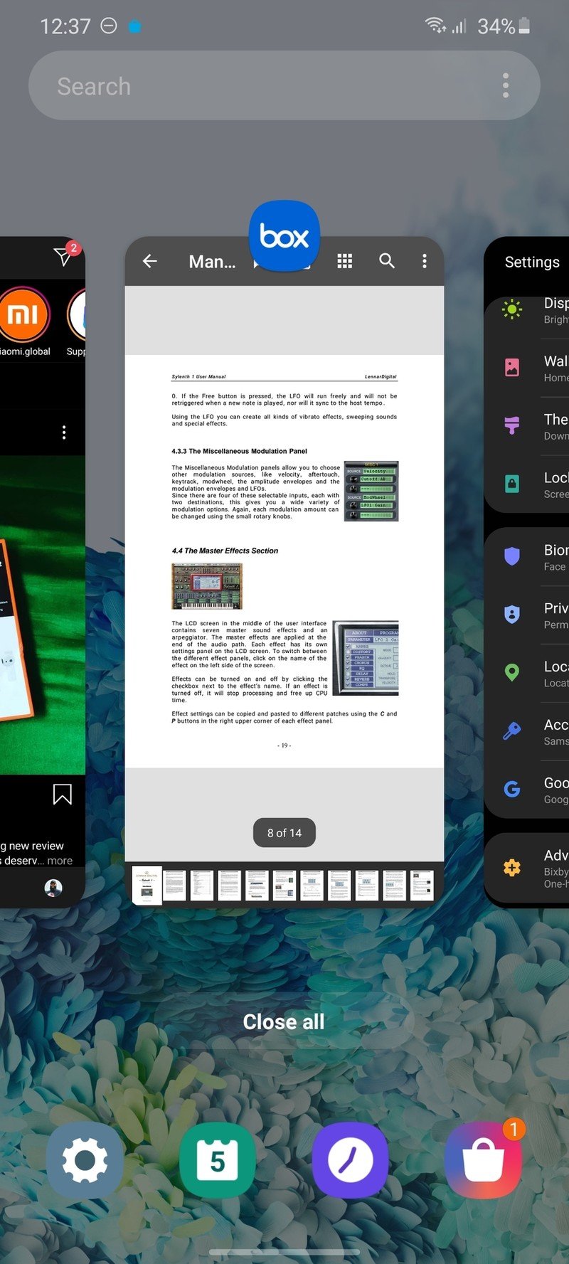
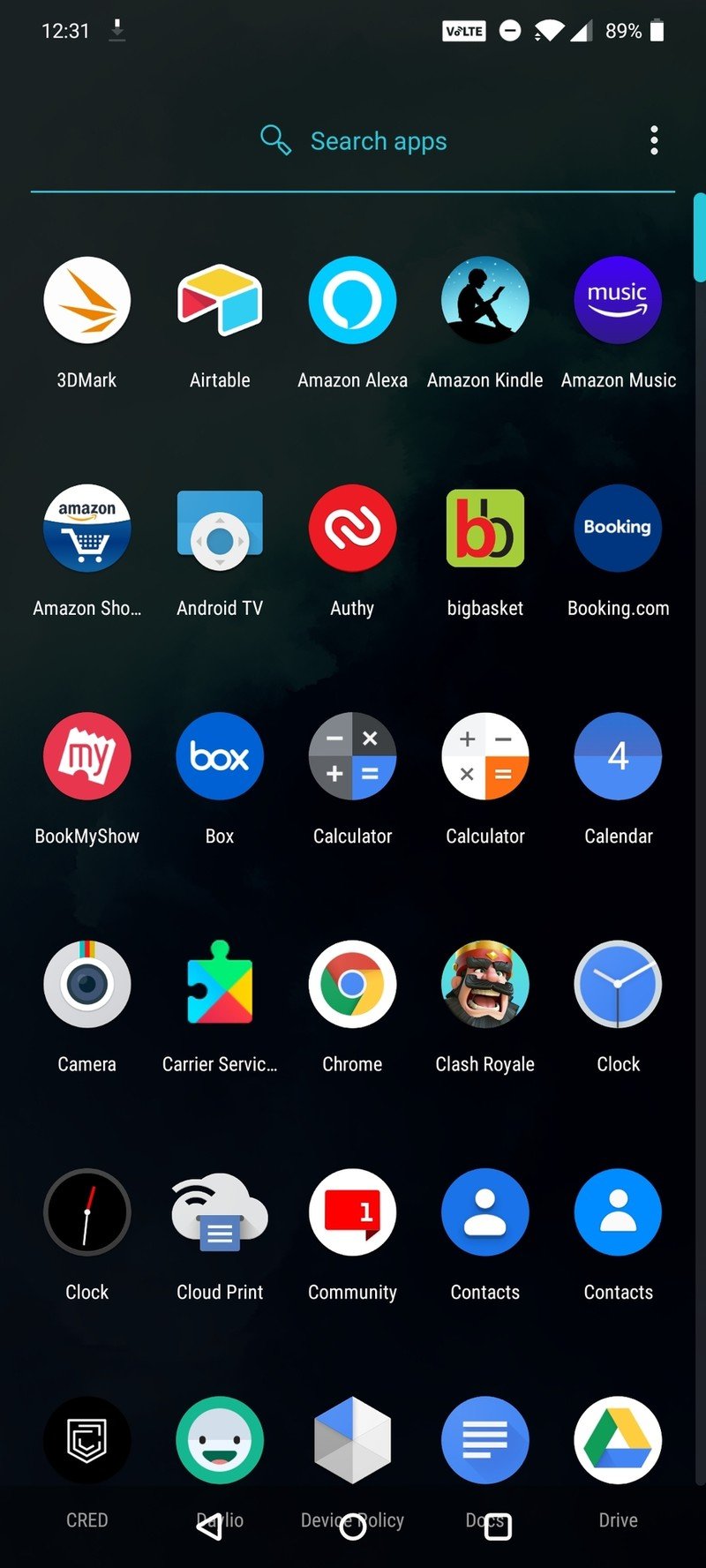
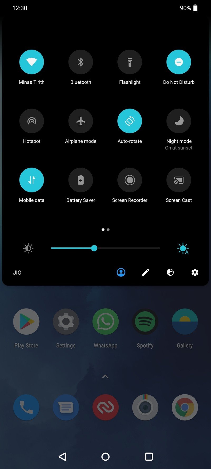
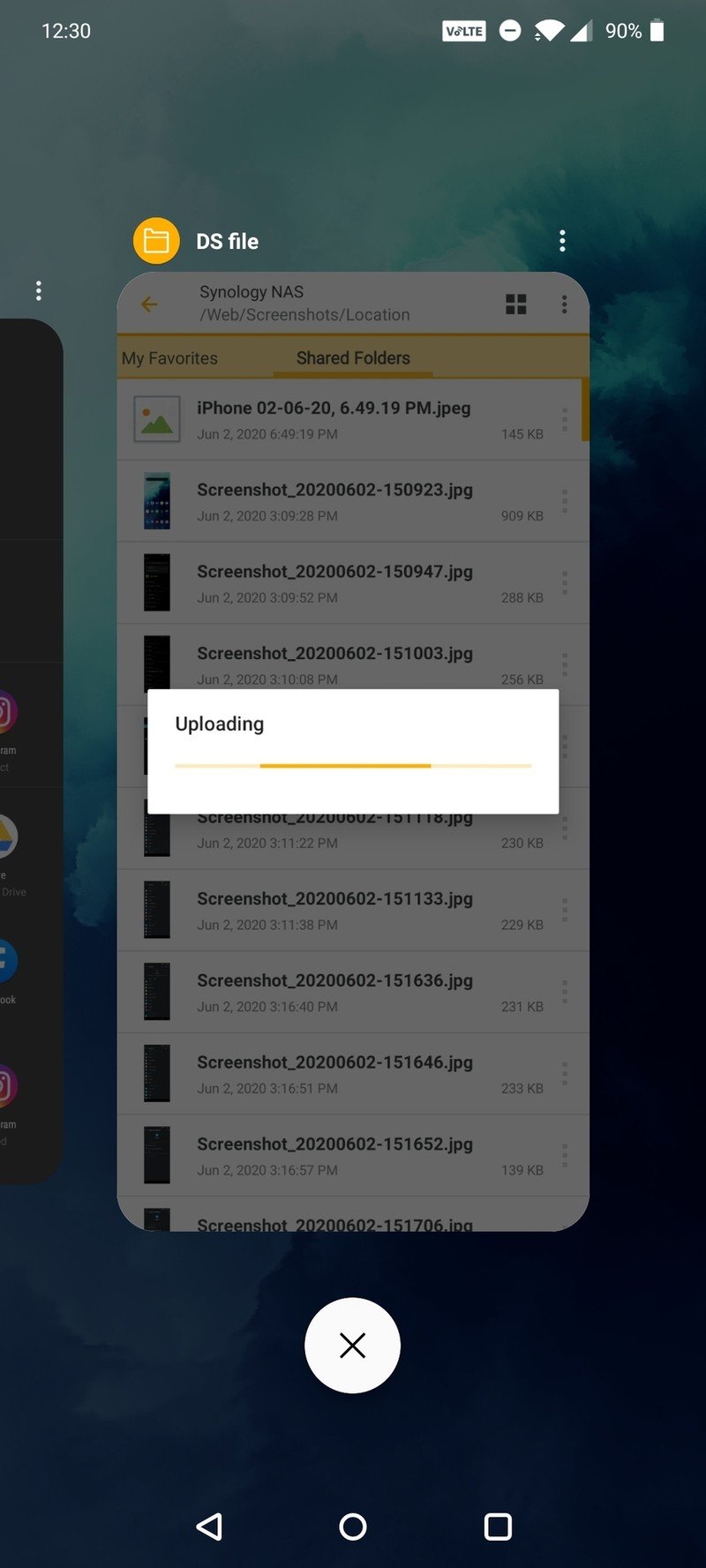
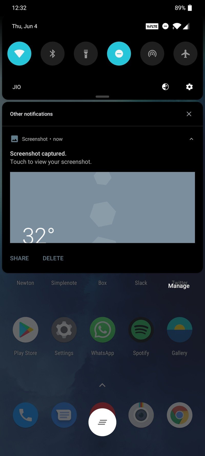
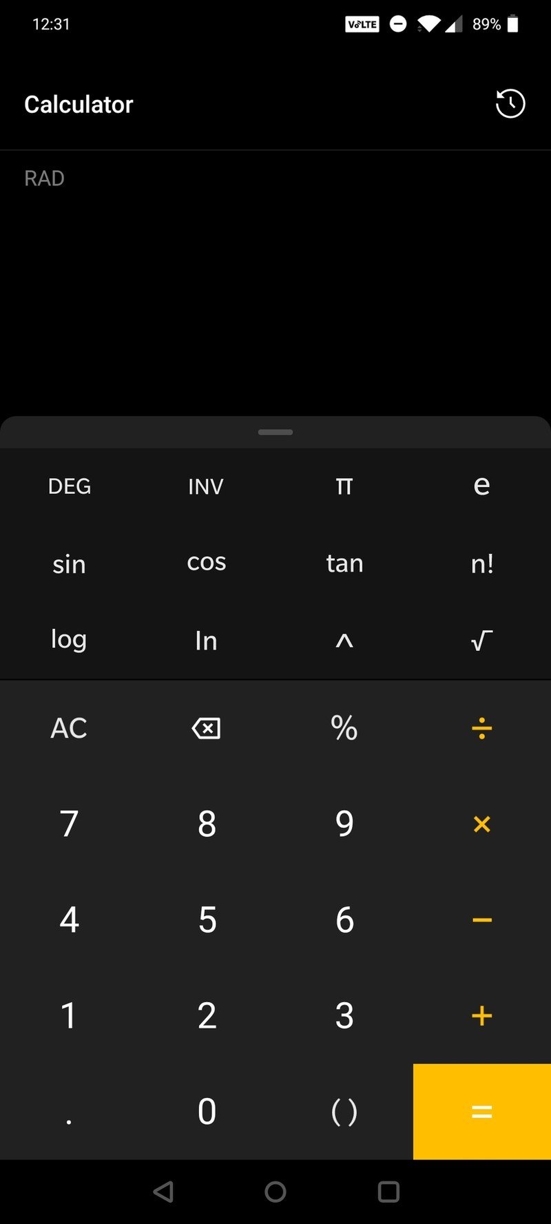
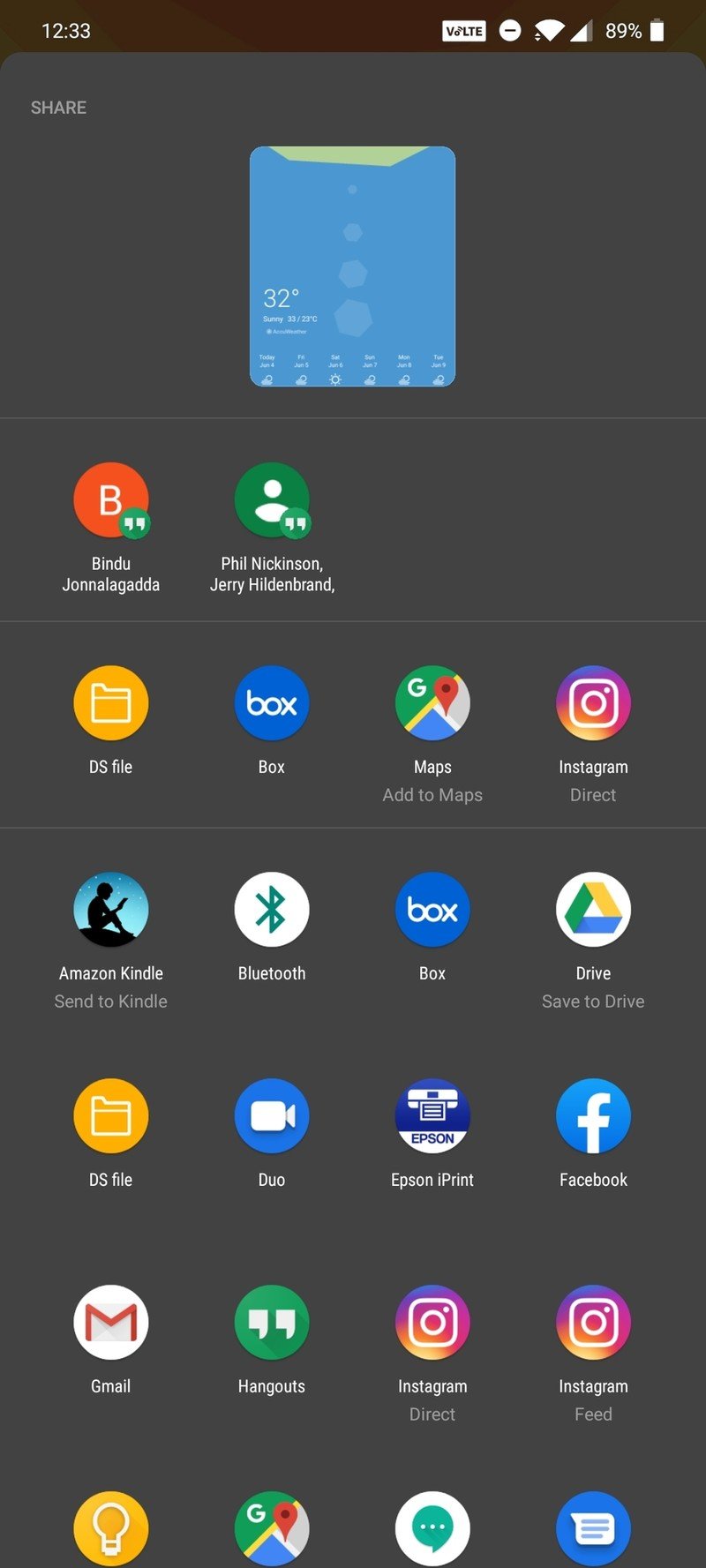
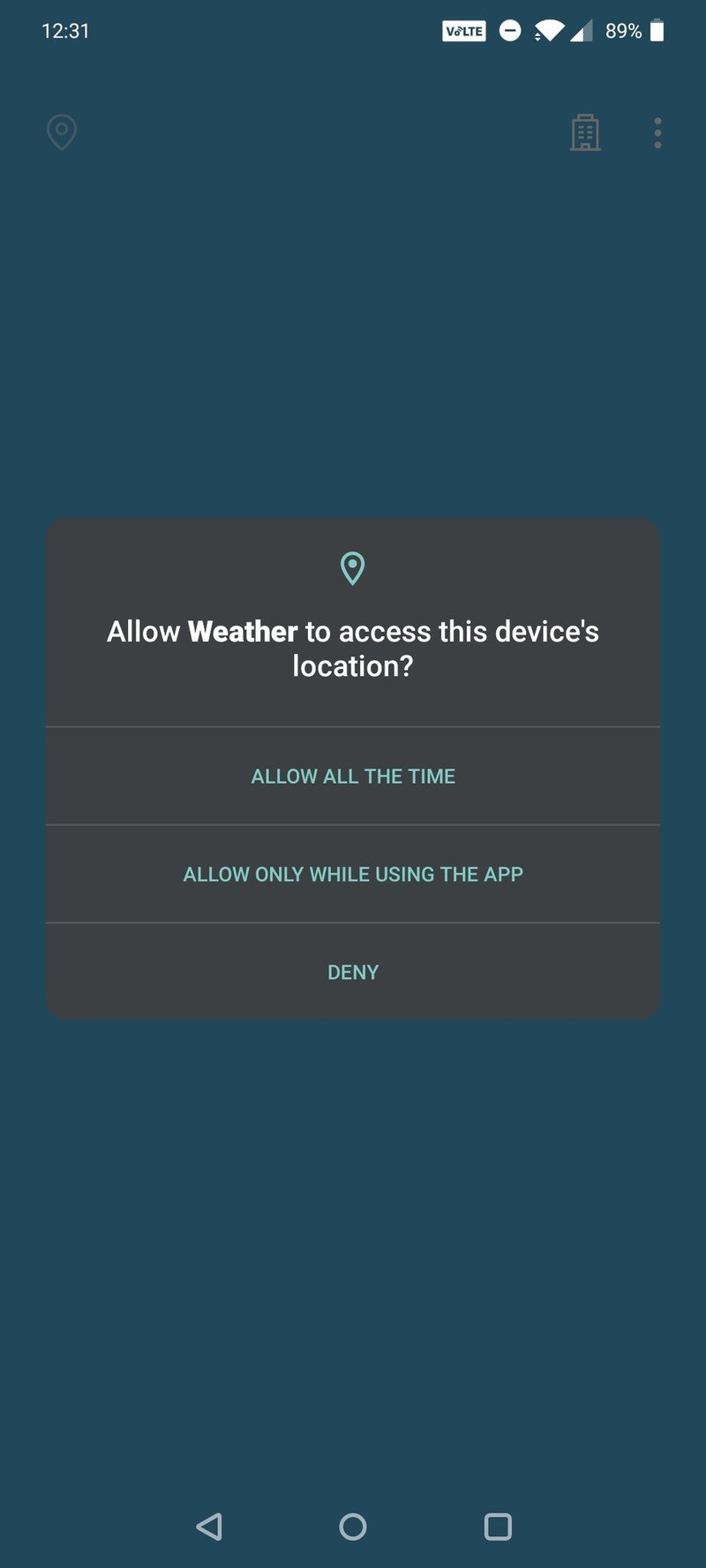
When it comes to features, you get everything that's new in Android 10. Google's default gesture navigation is here, and you can switch to the legacy nav buttons if you're not a fan of gestures. You also get Smart Replies, an improved share menu, and a privacy dashboard within Settings. The multitasking menu is similar to what you get on the Pixels, but there's no app grid underneath. You get a large X button that lets you clear background apps instead.


Source: Android Central
OxygenOS has built-in tools like a screen recorder, ability to add icon packs, change accent colors and tones, and you also get off-screen gestures for music control, launching the camera, and more.
OxygenOS strikes the ideal balance here: there is customization available should you need it, but if you don't care about messing with system settings, you don't need to change anything. Unlike Samsung or Xiaomi, you don't have to tweak settings for an hour to set up the phone to your liking. And that ultimately makes the interface stand out.
Xiaomi MIUI 11 Two steps forward, one step back
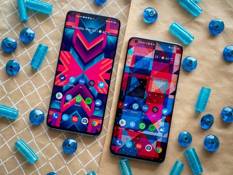
MIUI has over 400 million users around the globe, with the skin predominantly used in China and India. MIUI 11 rolled out at the end of last year, and it was the first version of Xiaomi's UI to be based on Android 10. Xiaomi introduced MIUI 12 last month, and the rollout is set to commence in the coming weeks.
Xiaomi does things a little differently with MIUI. The skin isn't reliant on the Android version, so there are several phones running MIUI 11 that are still based on Android 9.0 Pie. Xiaomi's reasoning is that because MIUI integrates a lot of features from new versions of Android, it doesn't need to update the platform version on older phones.
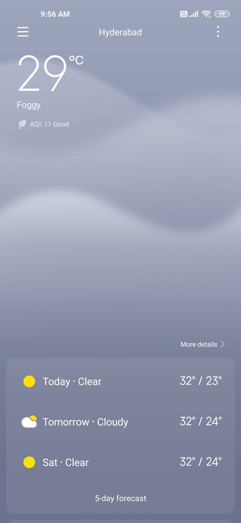
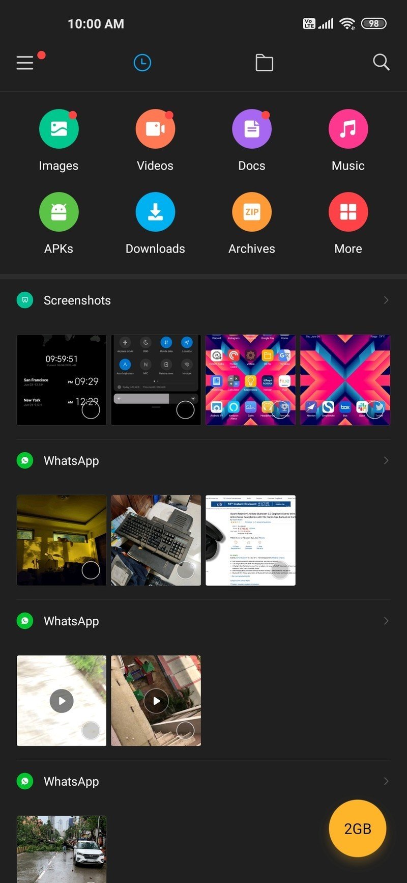
MIUI 11 has Android 10 nav gestures and a system-wide dark mode, and the UI itself is heavily skinned.
Anyway, let's go into some more detail on MIUI 11. The interface itself is heavily skinned, and very different from what you get on an Android One phone. Most manufacturers are dialing back the customization and switching to cleaner designs, but that isn't the case with MIUI 11.
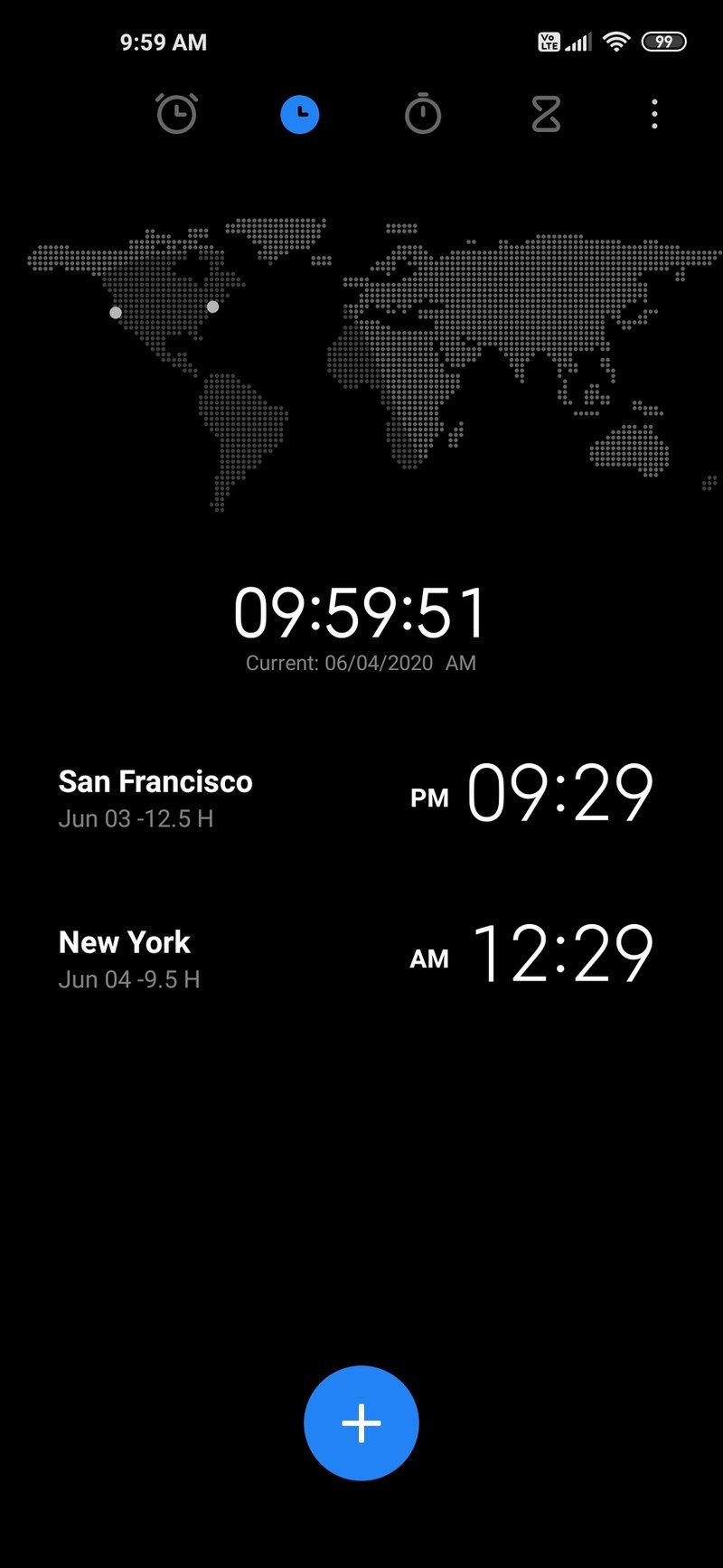
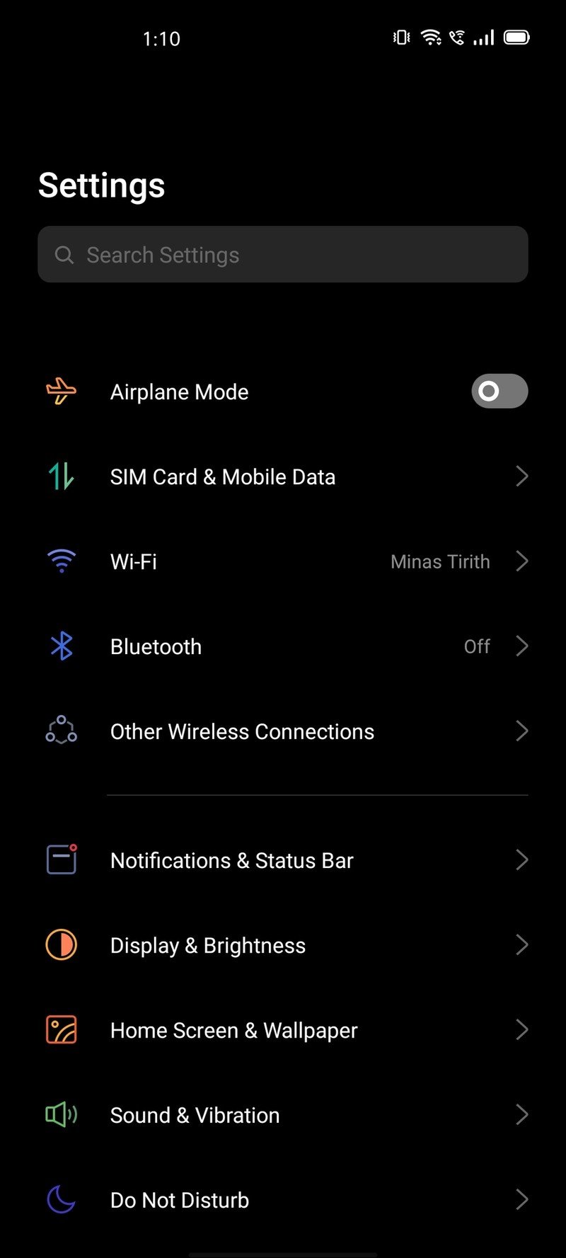
With MIUI 11, Xiaomi switched to a new font with better readability. The system icons received a fresh coat of paint and a rounded design, and several UI elements have been pared back, leading to a cleaner look. This is particularly true of the Settings page, with Xiaomi cleaning up a lot of the extraneous design elements. The result is that MIUI 11 doesn't look as cluttered as previous versions of the skin.
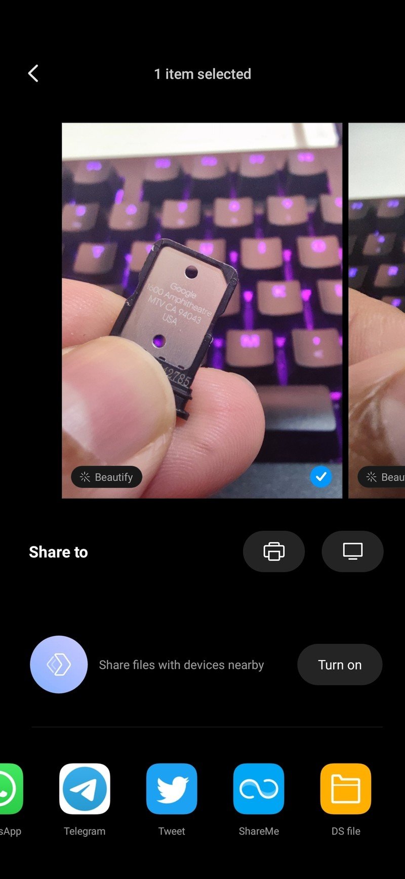
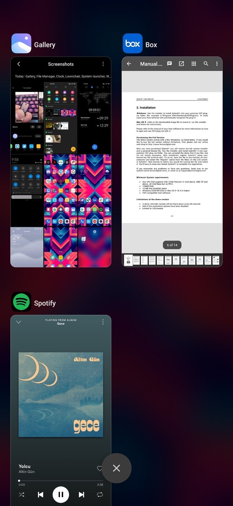
As for features, Xiaomi integrated Android 10's system-wide dark mode and Google's default navigation gestures into MIUI 11. The notification shade is close enough to what you get on the Pixel and Android One devices, and you get Android 10's share menu, but with Mi Share featured above the apps grid instead of Google Photos. The multitasking pane is also different, with Xiaomi still using vertically scrolling app previews.
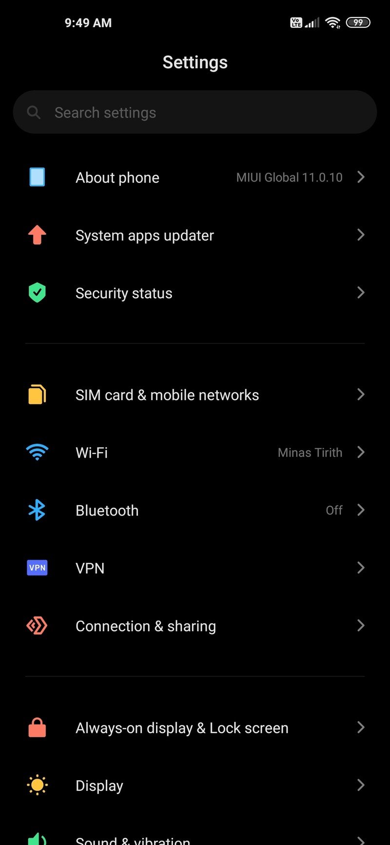
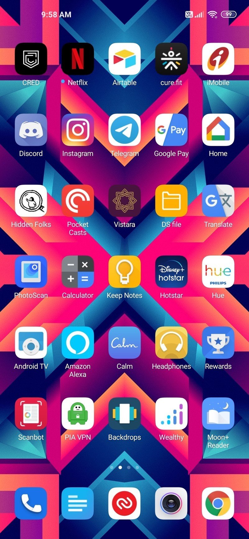
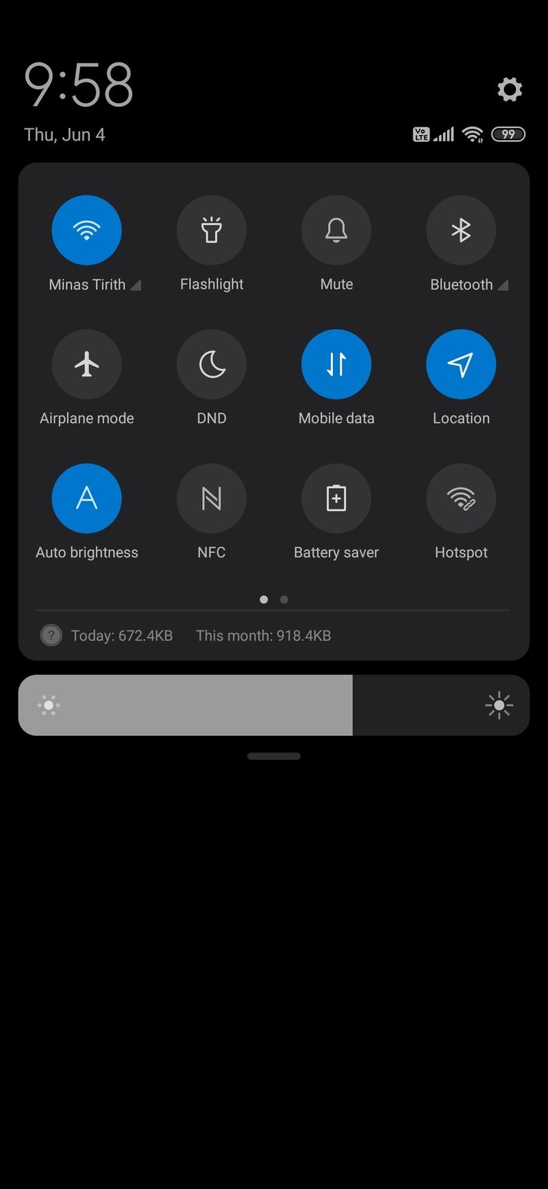

Source: Android Central
Xiaomi adds a lot of its own changes to MIUI 11, and there's a lot of that here. You get nature-inspired ringtones and notification sounds that change based on the time of day. Xiaomi's stock apps are some of the best around, and the calculator in particular offers a wealth of options. Xiaomi also optimized the interface to be smoother and take advantage of 90Hz panels, and there are no issues in this area on the Mi 10 Pro.
That said, MIUI isn't without its faults. MIUI 11 is the only major skin that doesn't come with an app drawer. Xiaomi is fixing this particular issue by introducing the feature in newer builds of MIUI 11, but the fact that it wasn't available right away is a glaring omission. Of course, any conversation around MIUI would be incomplete without talking about ads. Xiaomi's controversial decision to roll out ads in the interface to Indian users soured the brand for potential customers in the country.
I use MIUI for several months a year, and while it has its share of issues, it is clear that Xiaomi is working on making the skin more modern. MIUI 12 brings a host of much-needed fixes, but ads remain a major issue in key markets.
ColorOS / Realme UI Doing all the right things
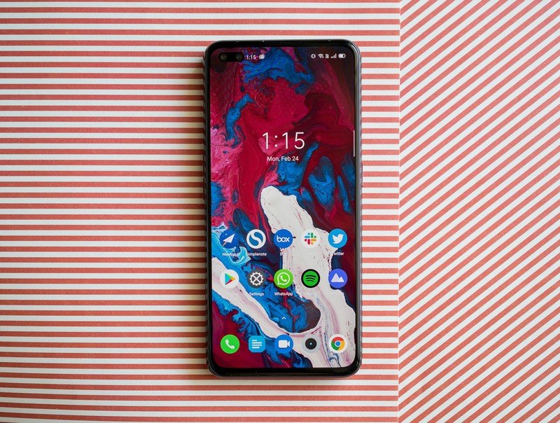
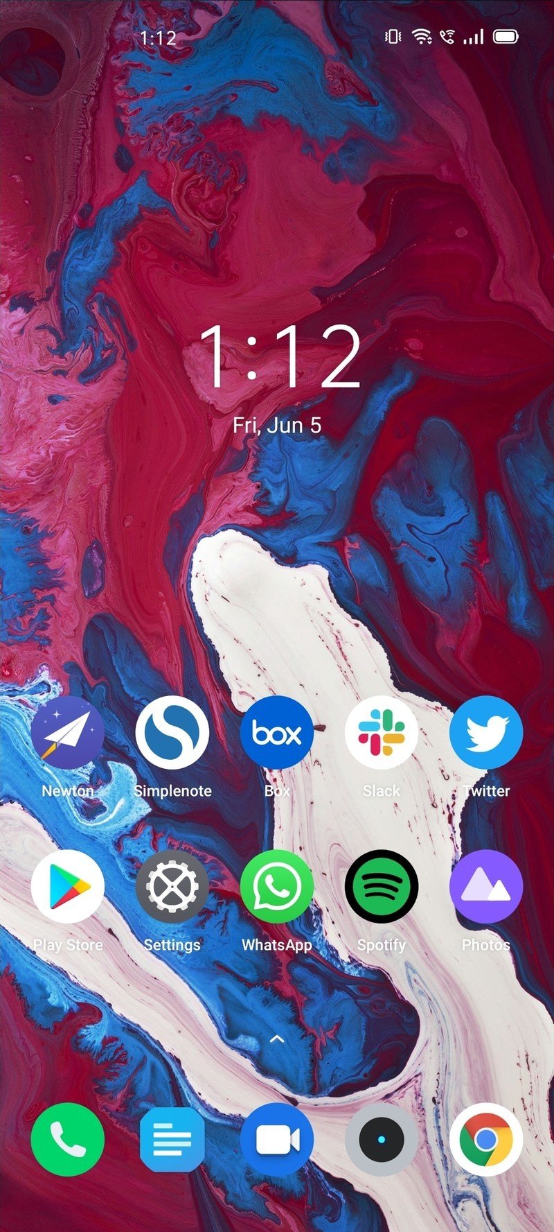
With OPPO now turning its focus to Western markets, its ColorOS skin picked up a host of welcome changes. ColorOS 7 still has its own visual identity — much like MIUI — but the skin is much more palatable to a global audience now. It doesn't feel bloated, and it's clear that OPPO put some thought into the design elements; unlike earlier versions where it was just trying to emulate iOS.
ColorOS 7 is finally ready for a global audience — just in time for OPPO's push into the West.
Of course, ColorOS 7 has its own unique set of customization options: you can easily launch multi-window with a three-finger swipe anywhere on the screen, floating windows make it easy to pin apps, and OPPO has bundled an app that lets you access guided breathing exercises while listening to soothing music.
OPPO also cleaned up the icons and the tiles in the notification shade, and as a result ColorOS 7 feels fresh and modern. It has Android 10's system-wide dark mode and gesture navigation system, a powerful Always On Display for devices that have an AMOLED display, native screen recording, an offline "secure" keyboard for entering your passwords, the ability to turn off network access for selective apps, and much more.
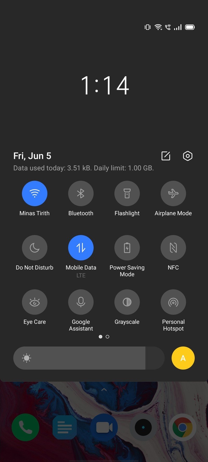
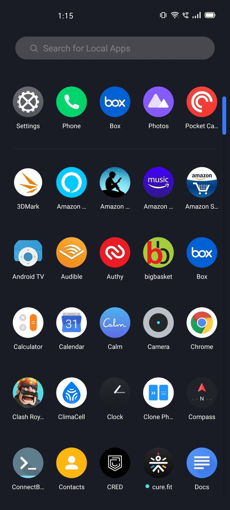
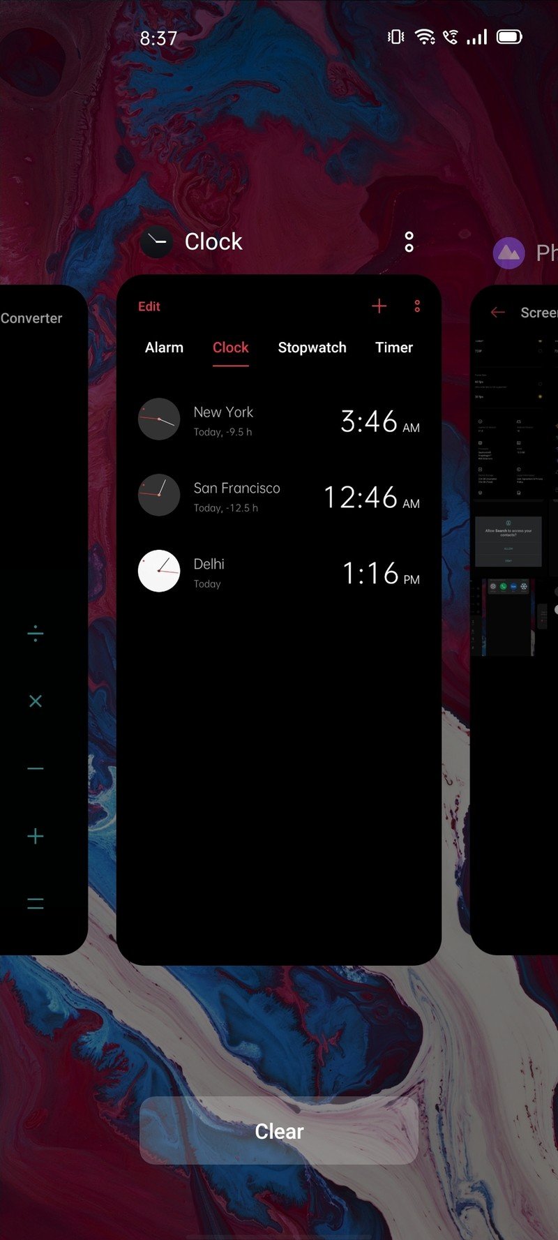
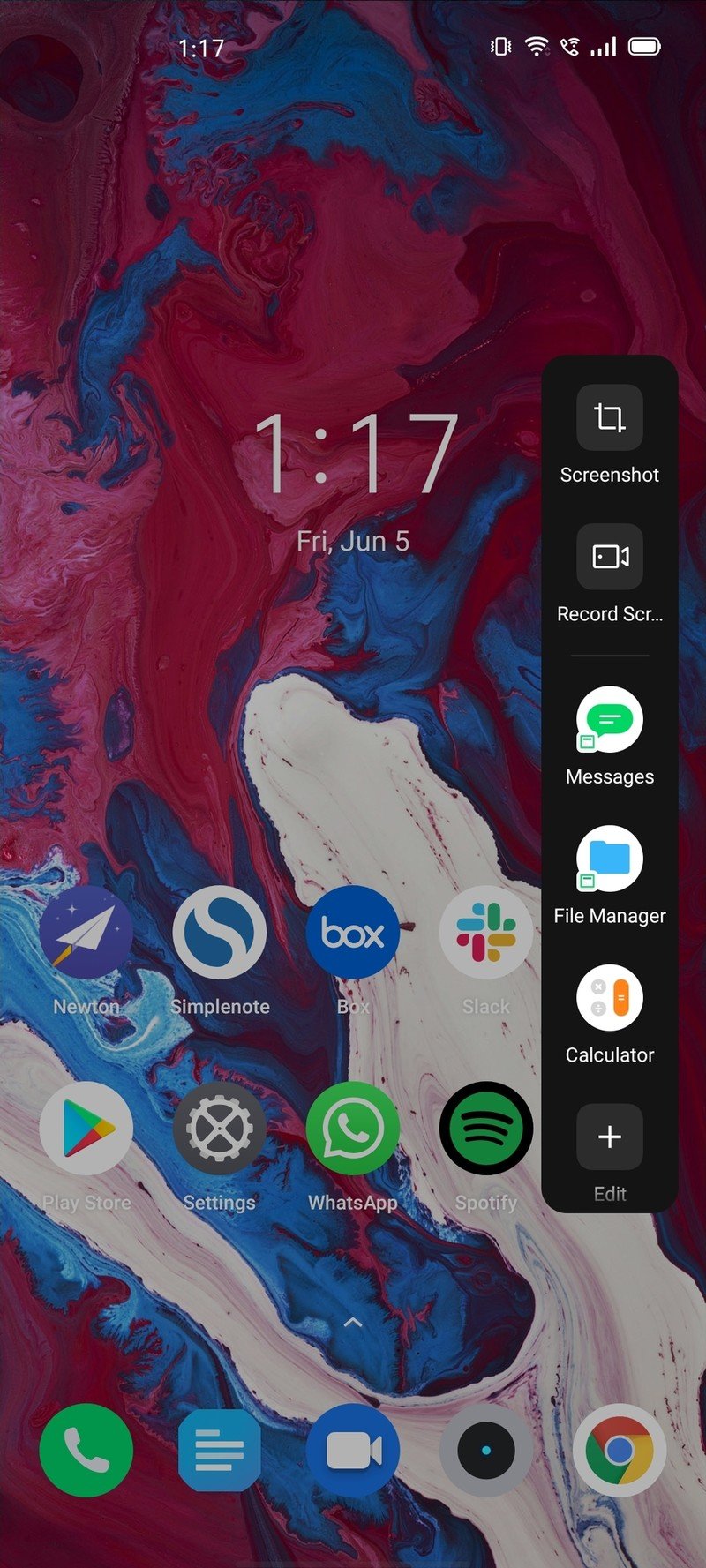
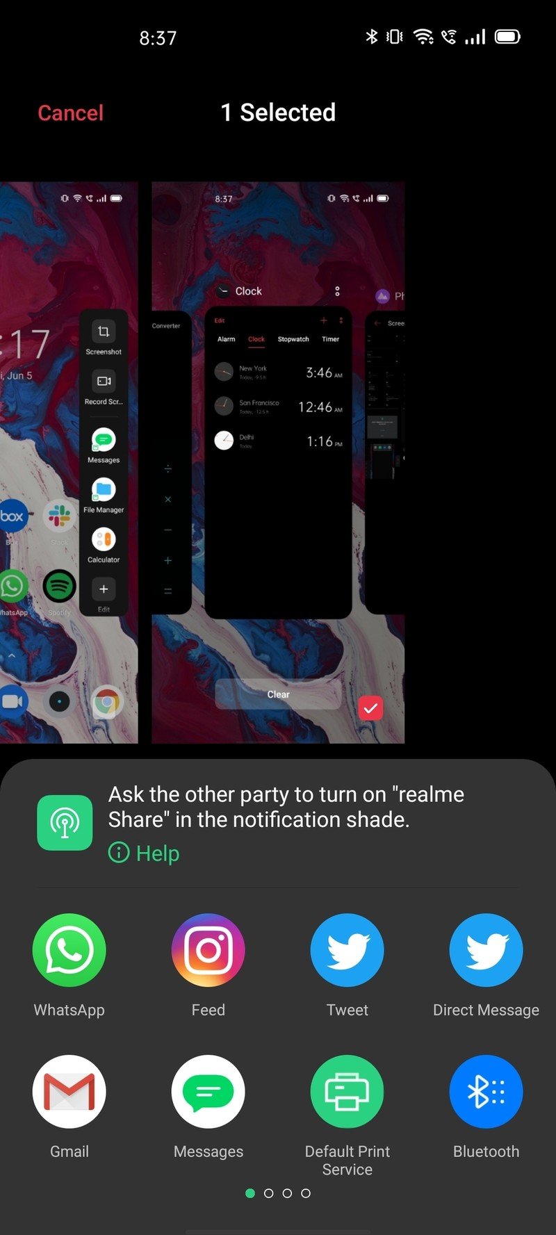


Source: Android Central
There is a lot to like here, and the new UI makes using ColorOS a delightful experience. Oh, and it has an app drawer. This isn't a new feature, but with the likes of Xiaomi still holding out on offering the feature, it was worth a mention.
Now, the interesting part with ColorOS is that Realme also uses the same skin. Sure, the Chinese manufacturer has transitioned to its own Realme UI skin, but it shares the same foundation as ColorOS — and you get a similar set of features.
Be together, not the same
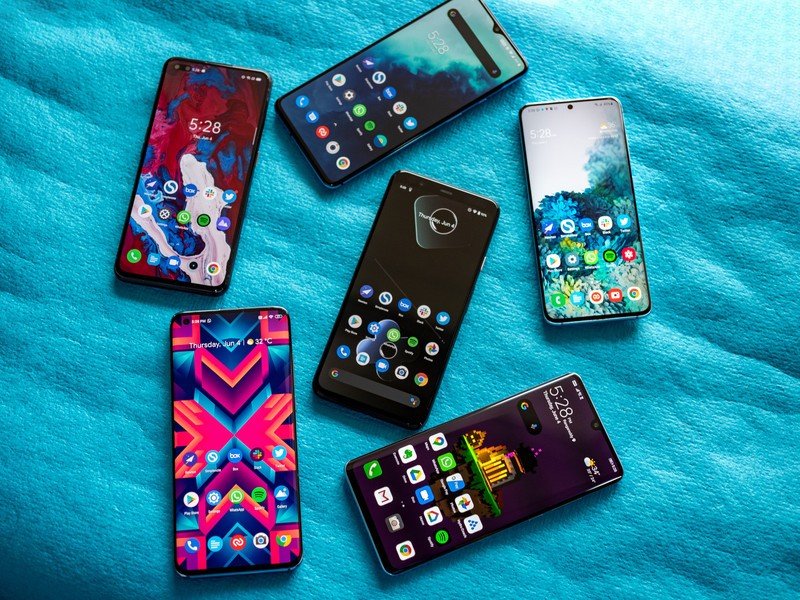
At the end of the day, Android is all about choice. That's what I love about Google's operating system — there is enough variety on both the hardware and software side of things to meet every need. Whether you're looking to buy a phone with the best camera, need a device with silky smooth 120Hz refresh rate, or reliable 5G connectivity, there is a phone for everyone here.
With Android 10, all manufacturers did a great job implementing the platform-level features that Google introduced last year. You'll find Android 10's navigation gestures, system-wide dark mode, granular privacy and location controls, and better notification management as standard on all phones running Android 10.
Regardless of whether you're using One UI, OxygenOS, or MIUI, know that the core features introduced in Android 10 are present and accounted for.

Harish Jonnalagadda is Android Central's Senior Editor overseeing mobile coverage. In his current role, he leads the site's coverage of Chinese phone brands, networking products, and AV gear. He has been testing phones for over a decade, and has extensive experience in mobile hardware and the global semiconductor industry. Contact him on Twitter at @chunkynerd.
