Already bored by the DualSense color scheme? Check out these fan-made ideas

Get the latest news from Android Central, your trusted companion in the world of Android
You are now subscribed
Your newsletter sign-up was successful
Sony decided to drop images of the next iteration in its DualShock controller lineup on this fine Tuesday afternoon. The DualSense, as it is officially called, will be the first of Sony's controllers to launch with a two-toned design instead of a singular color. It is set to release alongside the PlayStation 5.
This time around it will be white and black split between different sections, and I have to say I'm a big fan of the design, especially when it's accentuated by the new placement of the light bars aside the touchpad. But that hasn't stopped people from reimagining it is some other colors. So let's take a look at them.
Twitter user @orcastraw imagines a controller that replaces the black sections with a light pink, and it's pretty damn stylish.
Article continues belowOkay, but what if it was pink?? pic.twitter.com/dA7XqiO6mPOkay, but what if it was pink?? pic.twitter.com/dA7XqiO6mP— Kaitlyn Molinas (@orcastraw) April 7, 2020April 7, 2020
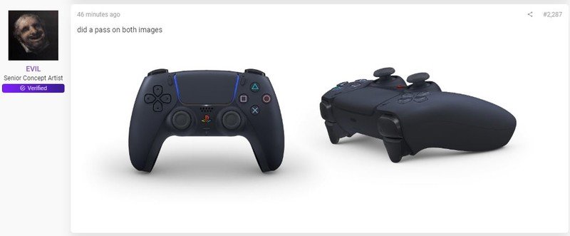
Other like this ResetEra user decided to see what the DualSense would look like with a more traditional color scheme, complete with a fully-colored PlayStation button.
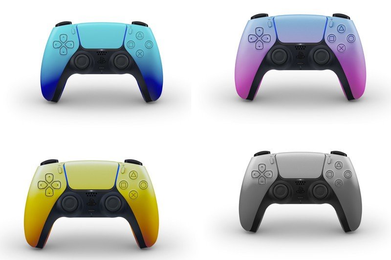
@thefleshmonk on Twitter gave us a look at what the DualSense could look like if it were yellow, pink, black, and a light blue. These ones are a bit too bold for my tastes.
different color scheme mockups#dualsense #playstation5 pic.twitter.com/S82LAVsqXHdifferent color scheme mockups#dualsense #playstation5 pic.twitter.com/S82LAVsqXH— fleshmonk (hiatus?) (@thefleshmonk) April 7, 2020April 7, 2020
@PS4_Trophies took to Twitter to come up with a less vibrant color scheme than the one above, while still spicing it up with some more color.
The PS5 DualSense Controller in the original white. I've added some colored mockups in case you need to visualize possible custom options. I'm really excited by these. Thank you @PlayStation 🏆 pic.twitter.com/Blwd5SIqCzThe PS5 DualSense Controller in the original white. I've added some colored mockups in case you need to visualize possible custom options. I'm really excited by these. Thank you @PlayStation 🏆 pic.twitter.com/Blwd5SIqCz— Brian English 🏆 (@PS5Trophies_) April 7, 2020April 7, 2020
Reddit user Doomster78666 went for the gradient approach so the colors go from darker to lighter as they mask their way to the top of the DualSense.
Get the latest news from Android Central, your trusted companion in the world of Android
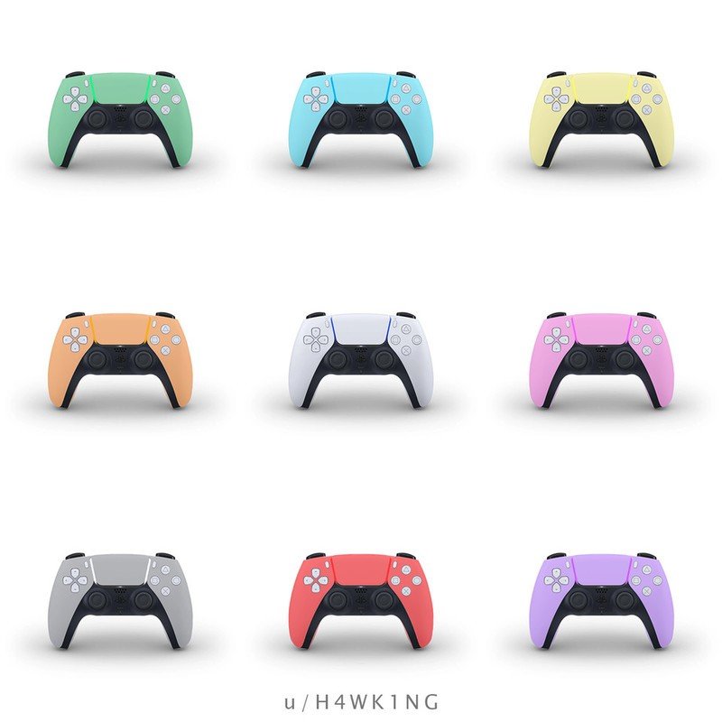
Another Reddit user, H4WK1NG, made nine different color mockups with some lighter color tones than the vibrant ones others are making.
@isaparrot decided to swap the black and white sections and it looks just as nice.
Here's another combination for #DualSense pic.twitter.com/BFS7mnpH5VHere's another combination for #DualSense pic.twitter.com/BFS7mnpH5V— Parrigatooooo (@isaparrot) April 7, 2020April 7, 2020
What do you think?
What I'm seeing is that a lot of people are swapping out the white sections for other colors and leaving the black section intact. I personally like it more when the black section is swapped out for another color and the white stays, like the first pink controller on where.
How do you guys feel about these mockups? Do you like the original black and white color scheme? Let us know in the comments.

Jennifer Locke has been playing video games nearly her entire life. You can find her posting pictures of her dog and obsessing over PlayStation and Xbox, Star Wars, and other geeky things.
