Alex's favorite Android Wear watches

I've used a fair few Android Wear watches since the platform first launched almost a year ago. I've gone from the imperfect and frustrating LG G Watch to the functional but slightly clunky G Watch R, before finally settling on the Moto 360. But the 360 isn't the only watch I'd recommend — there are a few others worth considering, many of them more practical than Moto's circular wonder.
Form over function: Why I'm using the Moto 360
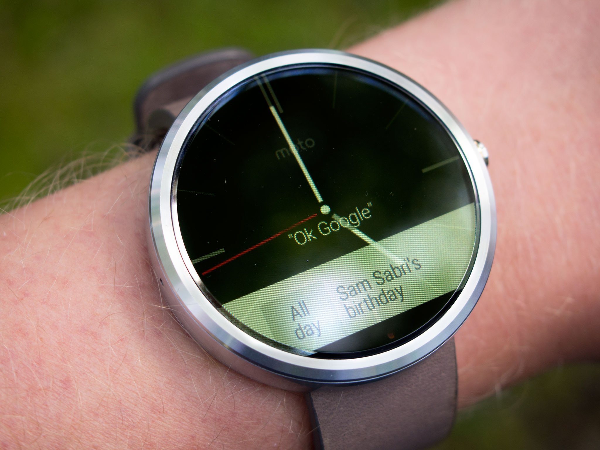
I've used more smartwatches than most people, but in truth the Moto 360 is the only one I've really enjoyed using the whole time. That's mostly due to the way it looks, not the way it works. In contrast to the big, ugly bezels of most smartwatches — including the Apple Watch — the Moto 360's front face is almost entirely screen. Aside from the practical bonus of making notifications and alerts easier to see, it gives the Moto 360 a futuristic appeal that's lacking from, for example, LG's smartwatches. Whereas the G Watch R and Watch Urbane imitate the timepieces of the past, the 360 looks like it belongs in the future.
The Moto 360 looks like a nice, futuristic watch — from a distance
The more neutral appearance also means means it's easier to wear the Moto 360 with just about anything — that's not as easy to say about bulkier watches like the GWaR or Sony Smartwatch 3. The latter might look out of place with a suit, the former with a t-shirt. It's also a matter of personal taste — I've always thought the Moto 360 was the best-looking Android watch, and I still don't think we've seen anything that beats it aesthetically. I'm using a stone 360, which I think has a bit more character than the more common black-on-black version. I'd originally planned to pick up a metal clasp to use with the watch, but I've been pleasantly surprised by the Horween leather strap it came with, and the way in which it's aged thus far.
But while the Moto 360 looks like a nice watch from a distance, that illusion is quickly shattered when you actually pick the thing up. The plastic back and sides, and relative lack of heft overall betray the device as the gadget that it is, not the timepiece it wants to be. I'm also not thrilled with the "flat tire" down below, which seems out of place in such a futuristic wearable. I've gotten used to it, and many of the best watchfaces work around it, but they shouldn't have to. Both are big design issues for Motorola to address next time around.

The simple yet futuristic design makes it easy to overlook the 360's shortcomings in other areas
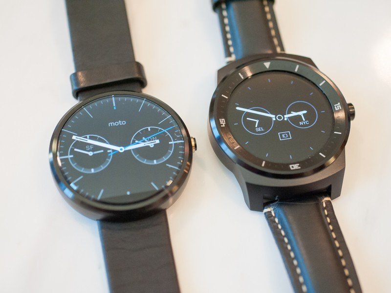
Nevertheless, the Moto 360's design chops have made it easy for me to overlook its shortcomings in other areas, the main one being the fact that it's just not as fast as the Snapdragon-based competition (Moto's watch uses an older TI OMAP-based chip). Scrolling through cards and launching apps is always faster on the G Watch R than the 360, which isn't a huge deal for a device you're only interacting with for seconds at a time, but it is noticeable.
On the other hand battery life, a major area of weakness at launch, is now basically a non-issue for me. I've gotten used to having Ambient Display switched off, and on the latest firmware I'm easily getting to the end of the day with 40 to 50 percent remaining. What's more, Qi charging is way more convenient than the array of proprietary charging docks used by other Android Wear devices. And the ambient light sensor — something I think should be a requirement in all Android Wear devices — means less fiddling around with settings on a tiny screen.
Be an expert in 5 minutes
Get the latest news from Android Central, your trusted companion in the world of Android

The alternatives
It's big and bulky, but I still appreciate the brighter P-OLED screen and faster performance of the LG G Watch R. (I had high hopes for the Watch Urbane, but next to the 360 it's a little gaudy for my tastes.) It's still a decent buy for those wanting a more traditional wristwatch design — albeit in a device that still feels like a gadget. However I'm frustrated by the smaller display size and lack of ambient brightness sensor, both of which make day-to-day use of the watch a more involved experience.
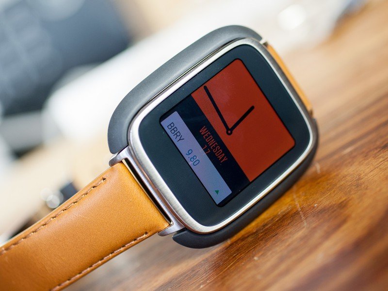
I was also tempted by the original ASUS ZenWatch, which might be the way to go if you're after a square smartwatch. Though it's packing some pretty massive bezels, the ZenWatch's rectangular porthole provides a more natural window into Android Wear's world of cards and lists.

What's next
I think we'll see a new Motorola smartwatch soon — probably sooner than most people expect. Remember it's been over a year since the first model was announced, even though the launch didn't come until later. And it feels like the current Moto 360 model is about maxed out just running the current Android Wear firmware. There are also design issues for Moto (and new parent company Lenovo) to address, from the flat tire to the unsightly plastic parts.
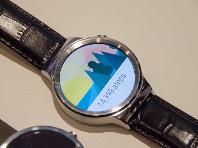
I'm also intrigued by the Huawei Watch — though it's been a while since we heard anything concrete on that device, we may well hear more at Google I/O 2015. And the prospect of multi-day battery life from an ASUS ZenWatch 2 is also interesting, assuming ASUS hasn't compromised in other areas to achieve this feat.
For the time being, though, I'm happy enough with my Moto 360 — it's far from perfect, but for me it remains the best Android Wear device available.

Alex was with Android Central for over a decade, producing written and video content for the site, and served as global Executive Editor from 2016 to 2022.
