What are Adaptive Icons and why do I want them?
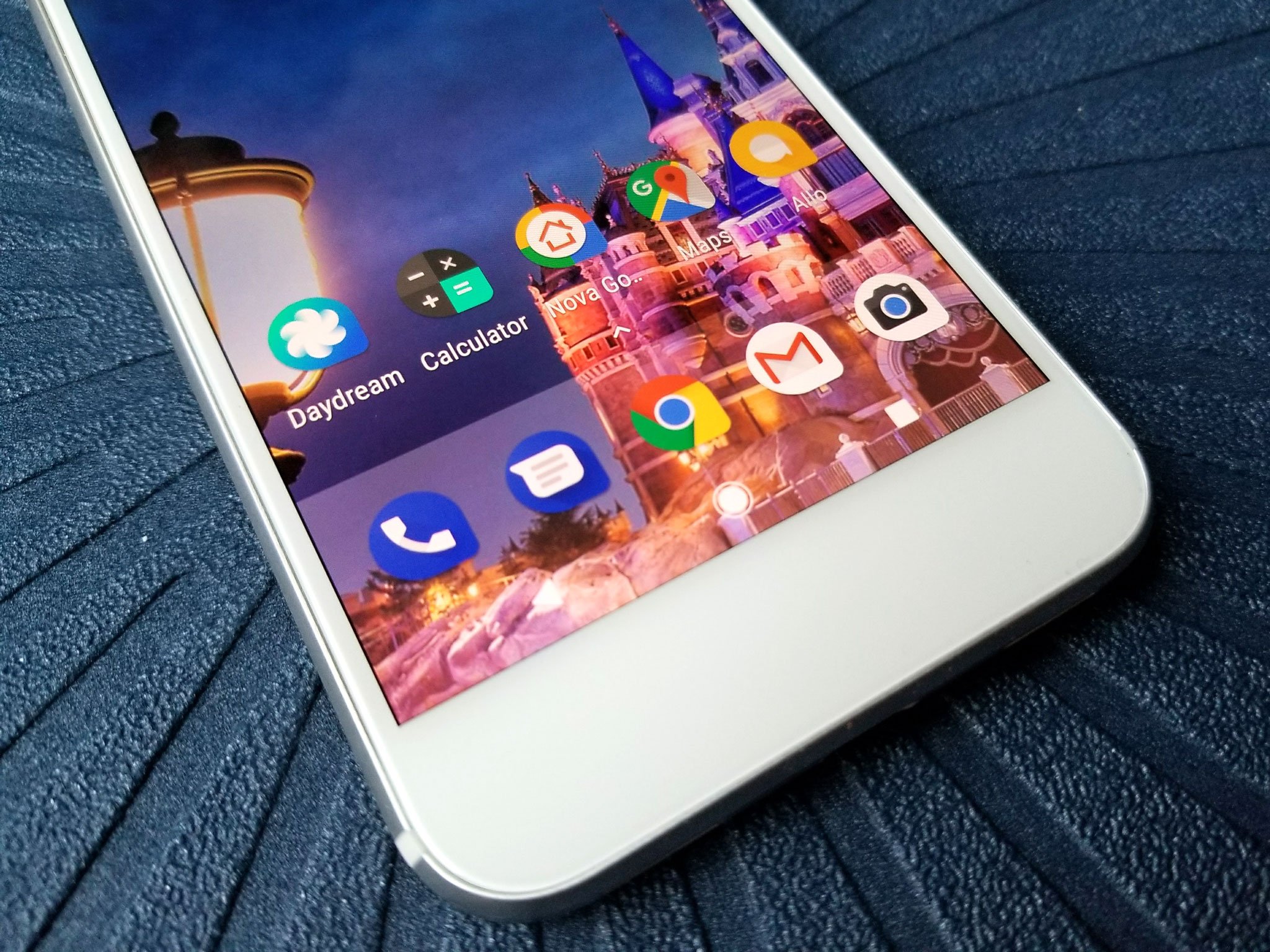
Android is an open system, and it's a diverse system, especially when it comes to its apps and their icons. Some icons are lifted straight from the iOS versions of the same app. Some icons have unique and fun shapes. Some icons are completely flat, while others have deep drop shadows. Your app drawer on Android can look like a bit of a design style melting pot, and with Android Oreo's Adaptive Icons, Google wants to fix it — again.
This is the second year in a row that Google has refocused efforts to standardize and fix app icons in a new version of Android, but what exactly are these new Adaptive Icons? And will this succeed where previous efforts have failed?
Fixing Android Icons, Take 3
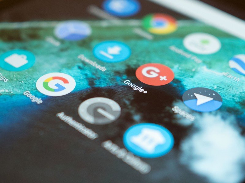
Let us begin with Google's previous attempts to fix Android's app icon problem. Google tried to bring some order to icons with Material Design, including a new template and list of guidelines for creating app icons. Google went even further last year with Android Nougat, pushing app developers to include a round icon in addition to their regular icon in an effort to achieve icon uniformity, at least on their own Google Pixel and other devices running Android 7.1.
This year's solution is Adaptive Icons. Adaptive Icons are a new way of formatting and submitting app icons so that they can be cut down into a variety of shapes depending on the device or launcher a person is using. This means that instead of your Google icons looking one way, your Samsung apps looking another way, and your third party apps being a mess, everything should be consistently shaped and there's even a chance for your app icons to animate in interesting ways.
How Adaptive Icons adapt to their devices
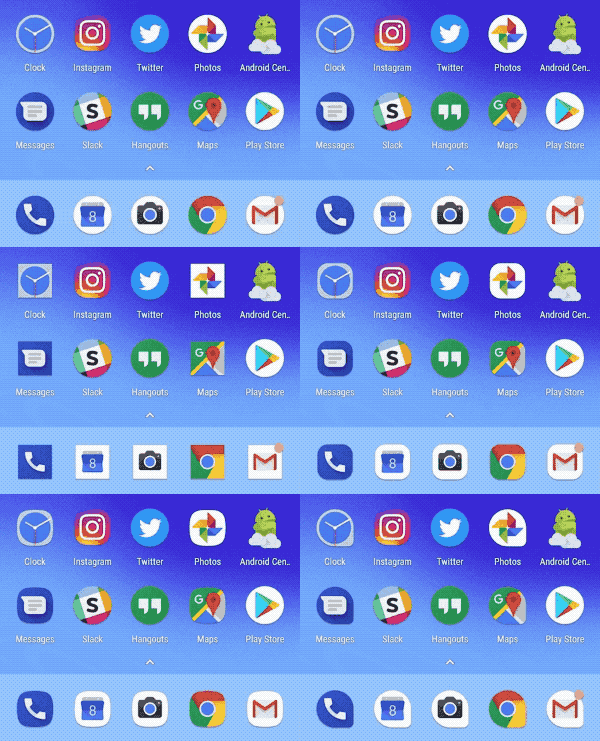
Developers submit Adaptive Icons in two layers, a transparent foreground layer and a solid background layer, which are then cut into shape by the launcher. By submitting an icon in two layers, developers can play with their icons and enable neat light and depth effects based on the way the two app icon layers interact and animate. These effects and the attention they can draw to an app are the carrot for developers. The stick is that if your app doesn't submit an Adaptive Icon while targeting Android Oreo, you get your icon scaled down to fit inside the same mask the Adaptive Icons are using.
These effects and the attention they can draw to an app are the carrot. The shrinking of unthemed icons is the stick.
Manufacturers like Samsung have been skinning apps and sticking them inside their ugly, ugly icon pack masks for years now. It's not hard to see them jumping on Adaptive Icons in order to get some clean uniformity on their devices without being stuck only with the shape Google picked. Samsung can stick with those gag-worthy squircles and LG can use squares and HTC can use hexagons to be different. No matter the shape the manufacturer chooses, the background won't be plain white or some god-awful shade of teal; the background will be that background layer the app developer submitted.
Will it work this time?
Adaptive Icons have the potential to shake up Android home screens, app drawers, and Android theming in a lot of really fun ways. Users won't have to use an icon pack to get some consistency in their app drawer; manufacturers can keep their own style while keeping things even; and developers won't have to worry about their icon being shrunk and shoved into awkward, off-color masks. As a themer, I can only imagine what third-party launchers and icon pack makers could do with Adaptive Icon icon packs.
Get the latest news from Android Central, your trusted companion in the world of Android
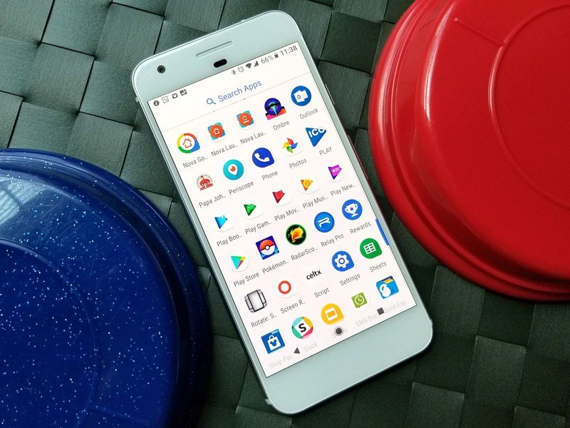
As with the circular icons last year, the only way this solution works is if app developers decide to take the time to build a two-layer adaptive icon. If they don't, — well, there are always icon packs.
Ara Wagoner was a staff writer at Android Central. She themes phones and pokes YouTube Music with a stick. When she's not writing about cases, Chromebooks, or customization, she's wandering around Walt Disney World. If you see her without headphones, RUN. You can follow her on Twitter at @arawagco.
