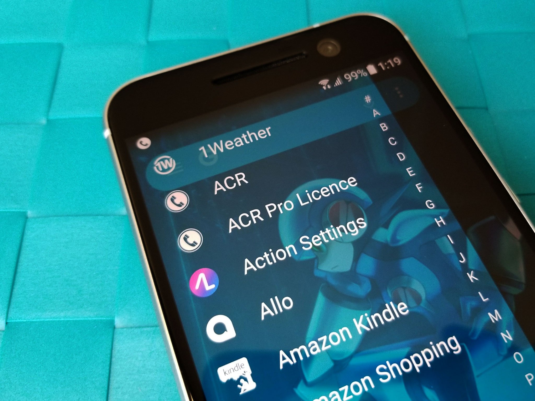
The home screen sets Android apart from other mobile platforms, and it's an excellent marker to judge Android's state and evolution. Folders have gotten more advanced (and far more fashionable) in the last two years. Live wallpapers are starting to experience a bit of a revival. Most importantly, launchers themselves have evolved and been refined, with gestures becoming a far more normalized and integral part of the experience. While many launchers have begun to add gestures to launch the app drawer and other specific actions, gestures have been at the core of the Action Launcher experience for years, and they help make it one of the most intuitive and customizable launchers on the platform.
Action Launcher's evolution
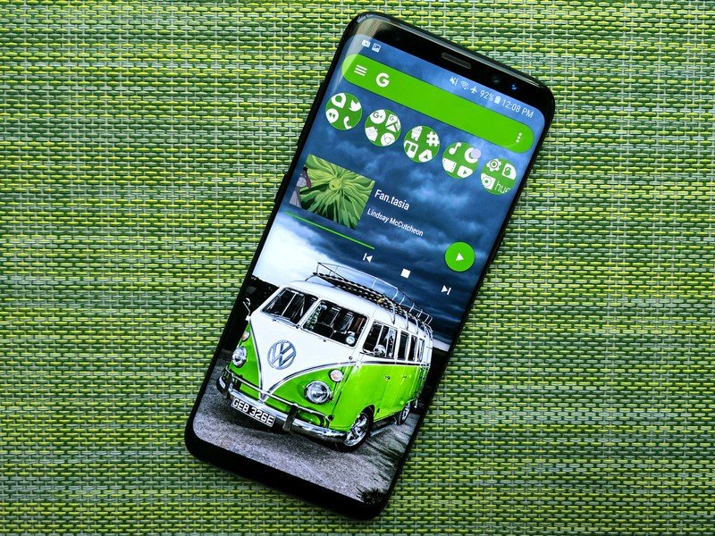
Action Launcher has been around for almost five years now, and in that time it has undergone a few significant evolutions. Almost three years ago, developer Chris Lacy completely re-imagined Action Launcher into Action Launcher 3, which made angry waves among Android users, as it required them to buy a fresh Plus version to unlock the paid features again. Then this summer, Action Launcher dropped the 3 to become Action Launcher again.
Action Launcher's features have evolved and been refined over the years to better imitate Google's vision of the home screen, while still offering up the customization and gesture-based UI that its users can quite quickly become addicted to. It's no secret that Action Launcher has a following that's almost as fervent as fellow market veteran Nova Launcher, including our own Modern Dad Phil Nickinson, and it's because Action Launcher is easy to get your home screen exactly the way you want and then keep it that way.
Hidden treasures
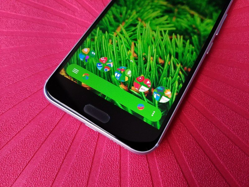
Action Launcher allows you to lay out your home screens with a desktop grid and padding to your liking, but the true magic comes in when we start getting crazy with gesture features. Enable the Quickdrawer for a vertical app list that you can swipe in from the left edge of the screen. Enable Quickpage to get an extra page of widgets and app shortcut space you can summon from the right.
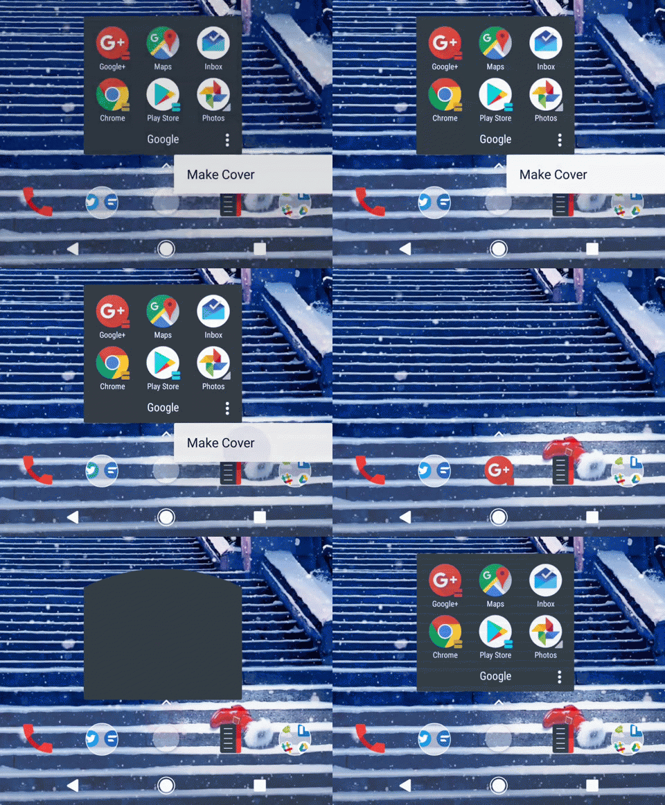
Then we have Covers and Shutters. Covers and Shutters enable Action Launcher to hide unsightly folders and widgets in plain sight by hiding them under normal-looking app shortcuts. Covers make folders practically invisible, setting the first app in the folder as both the folder icon and the tap action for the folder, while swiping up on the new icon will open the folder. Shutters allow you to swipe up or down on an app shortcut on your home screen or Quickpage and open a folder-like window containing a widget from that app. These tools allow you to nest Shutters inside Covers and hide both elements inside a clean-looking home screen. Once you get used to them, it's pretty hard to go back to anything else.
One of the most prominent — and customizable — tentpoles of Action Launcher is its persistent search bar, called the Quickbar. Action Launcher goes beyond the boring one-function search bars most launchers use and allows you to add extra functionality, such as shortcuts to your favorite apps and the Quickdrawer. Action Launcher recently added the ability to colorize the icons in your Quickbar to be more vibrant and better match your themes. You can dock your Quickbar at the top of the screen, or at the bottom of the dock in the Pixel 2 style.
Tenacious delight
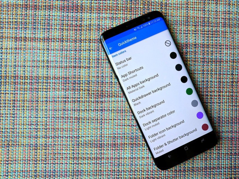
Once you get the launcher set up the way you want, Action Launcher has a few features to make theming an existing home screen layout a breeze. Quicktheme allows Action Launcher to pull colors for its various elements from the set wallpaper, and from some wallpaper apps like Muzei. This means that changing themes can be as easy as just changing a wallpaper, as the launcher colors will automatically adjust. The most you'll have to do is perhaps switch color types and change icon packs. The only downfall here is that Action Launcher sometimes misses the desired colors in a particularly vibrant wallpaper, or in most live wallpapers.
Get the latest news from Android Central, your trusted companion in the world of Android
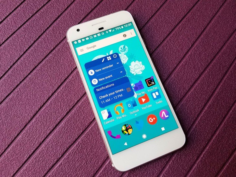
Action Launcher has adapted quite admirably over the years, quickly implementing Pixel folders last year and both the dock searchbar, notification previews and At A Glance widgets from this year's Pixel 2 home screen. Action Launcher has even made the Pixel setup the default for the launcher, allowing new users to get to a Google-esque look without having to set everything up from scratch.
Conclusion
There's still more ground to be broken by Action Launcher, but rest assured this launcher is one of the best on the market. So long as it thoughtfully adapts and evolves along the Android system as a whole, there's no doubt in my mind Action Launcher will be worthy of hosting your home screen. Which Action Launcher features keep you coming back? Are there any features you feel are still missing after almost five years of launcher loveliness?
Let us know in the comments below!
Ara Wagoner was a staff writer at Android Central. She themes phones and pokes YouTube Music with a stick. When she's not writing about cases, Chromebooks, or customization, she's wandering around Walt Disney World. If you see her without headphones, RUN. You can follow her on Twitter at @arawagco.
