New Nest Hub UI redesign could leave your smart display stuck in a boot loop
There's a workaround, but it may not work for everyone

What you need to know
- Some Nest Hub owners appear to be experiencing a screen boot loop.
- The bug supposedly surfaced following the smart display's most recent UI redesign.
- Unplugging the device and then reconnecting it afterward supposedly resolves the problem, but it doesn't seem to be a universal fix.
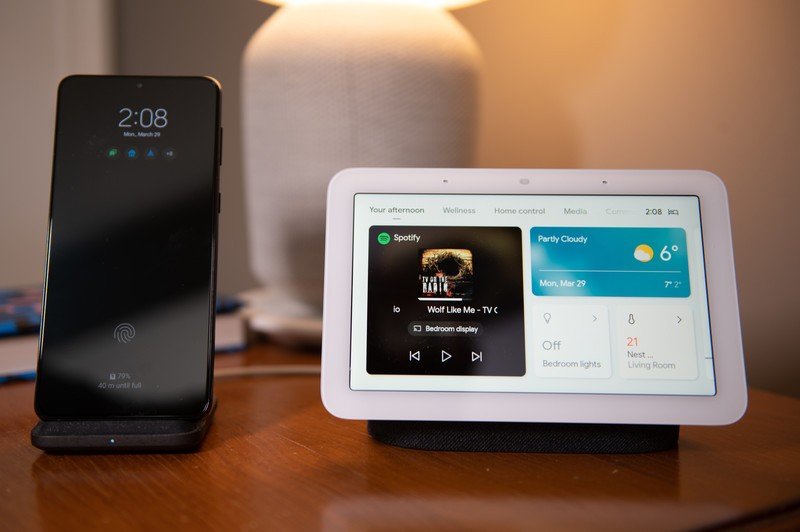
The second-gen Nest Hub has received a fresh user interface that gives users some Pixel phone vibes. The update makes it easier to access the smart display's settings and apps from the home screen, but it may have also inadvertently introduced an unexpected bug for some owners.
Some Nest Hub owners have taken to Reddit to complain about an issue with their smart display, which has caused it to enter a boot loop after the most recent UI redesign. Google's answer to the best smart displays appears to be stuck in a never-ending circling animation.
just_woke_up_and_saw_this_seems_to_be_a_new from r/googlehome
This particular screen boot loop seems to be affecting the Nest Hub (2nd Gen) in most cases. In other instances, the device exhibits a different buggy behavior.
Google did not respond immediately to Android Central's request for comment, but some users discovered a workaround, which included unplugging the smart display (and then plugging it back in). While this appears to work for some people who have encountered the bug, it does not seem to be a universal fix.
As per 9to5Google, affected devices are running Chromecast firmware version 1.56.290464. It's not clear how widespread the problem is, but the complaints are starting to accumulate, as evidenced by this Reddit thread.
Assuming the update arrived on your Nest Hub without any complications, you should now see the date in the top left corner and the time on the opposite side. You can also access the quick settings panel by swiping down from the top of the screen, which replaces the traditional Home Control view.
The new interface also lets you gain quick access to the app drawer by swiping up from the bottom of the screen instead of tapping the settings strip, which has been removed. Previously, you had to swipe up from the bottom and then tap the "See all" button to get to the app menu.
Be an expert in 5 minutes
Get the latest news from Android Central, your trusted companion in the world of Android

Jay Bonggolto always keeps a nose for news. He has been writing about consumer tech and apps for as long as he can remember, and he has used a variety of Android phones since falling in love with Jelly Bean. Send him a direct message via Twitter or LinkedIn.
