iOS 14 stole these 8 useful features from Android
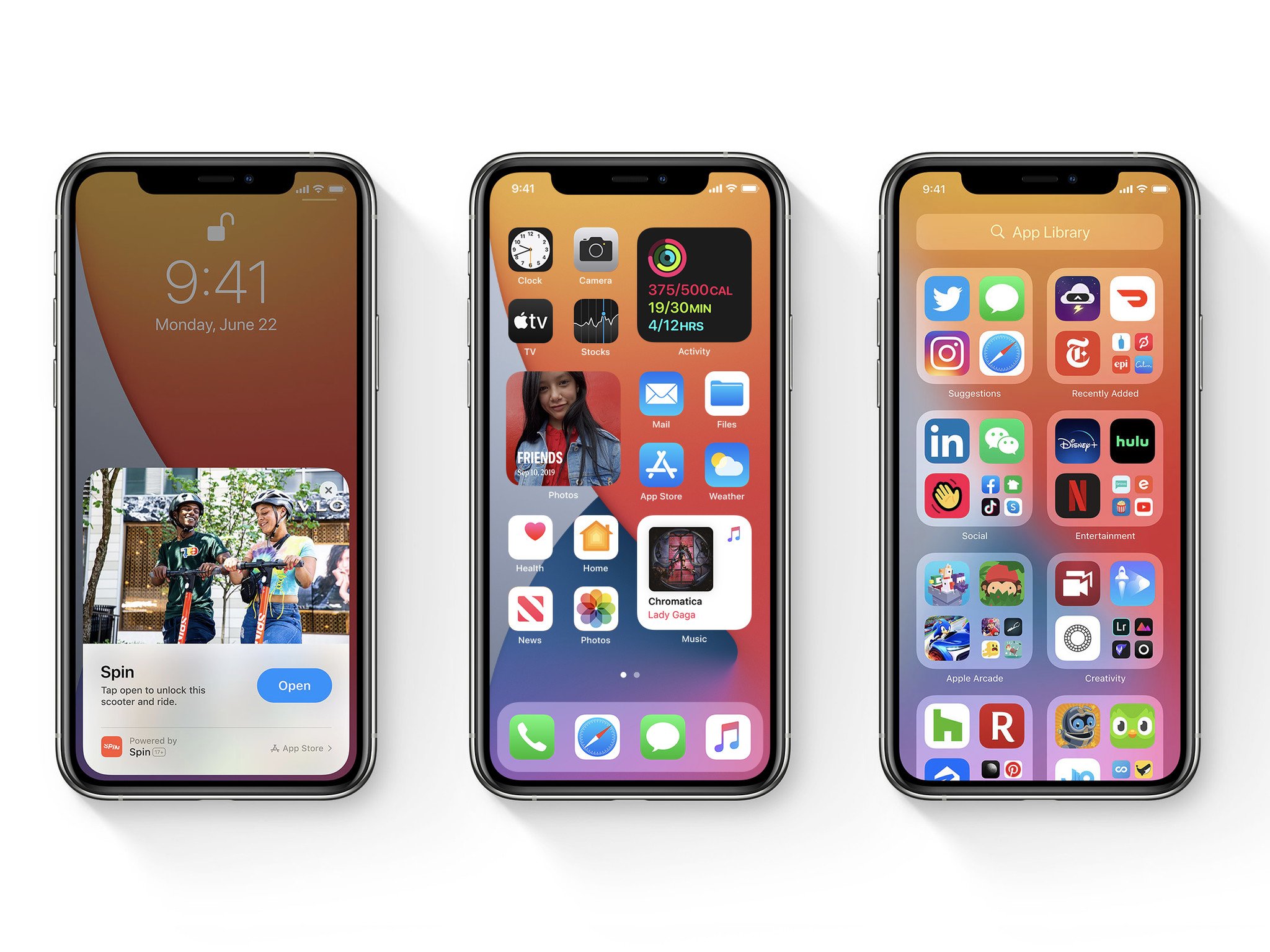
Apple just held its Worldwide Developer Conference, also commonly referred to as WWDC (or my personal preference, dub dub). This year's WWDC is where Apple showcased iOS 14, which looks to be one of the most substantial iOS updates in quite a while. The home screen is more customizable than ever before, widgets are a thing, and — yes — Apple added an app drawer.
If those sound like things Android has had for years, you're right. Apple may talk about some of iOS's features as being revolutionary and groundbreaking, but truth be told, it just looks more like Android than ever before.
On that note, here's a quick look at 8 things iOS 14 copied from Android.
Home screen widgets
Source: Apple
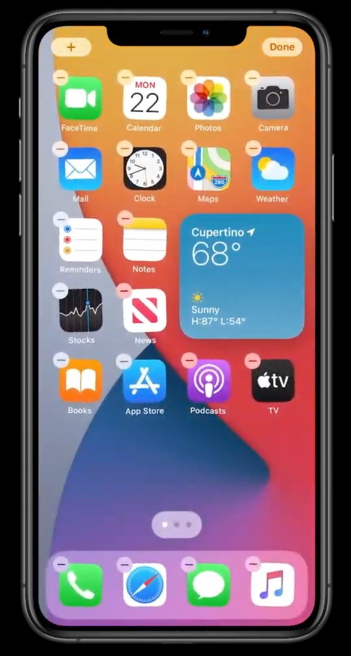
iOS 14 ushers in the biggest change to iOS's home screen than ever before, the first part of this revolution coming in the form of home screen widgets.
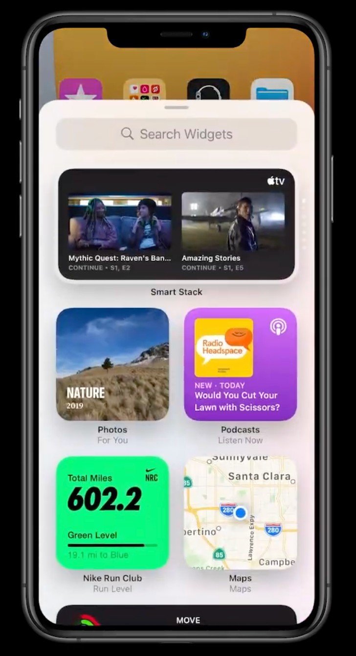
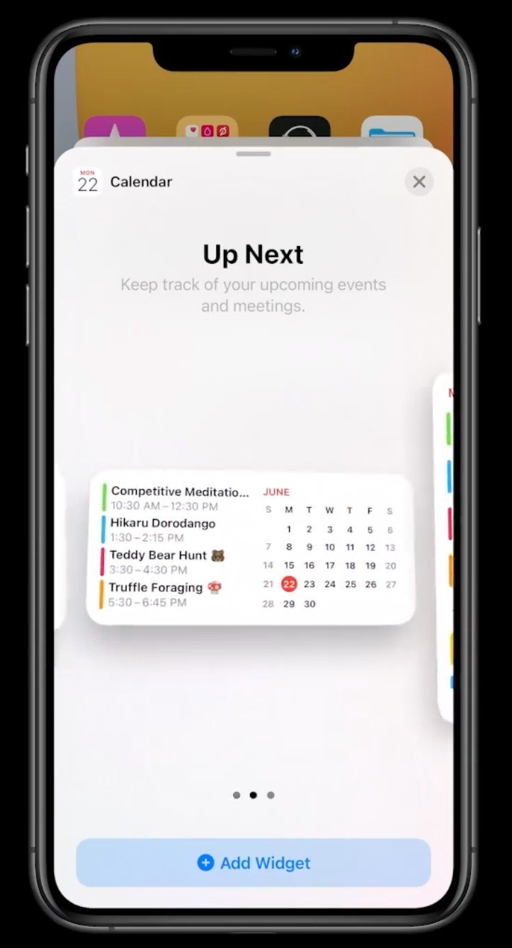
Widgets have existed in iOS for a while, but up until now, they've been limited to the leftmost page. Not only have widgets been completely redesigned, but now you can add them on your legit home screens. Widgets can have different sizes to make sure you get the right amount of information that you want, and you can place as many or few as you want.
Apple also created a new "Smart Stack" widget that automatically displays different app widgets based on the time of day, and while that's something we haven't seen in Android before, the idea of home screen widgets is one that's existed in Android since the very beginning.
Be an expert in 5 minutes
Get the latest news from Android Central, your trusted companion in the world of Android
App drawer
Source: Apple
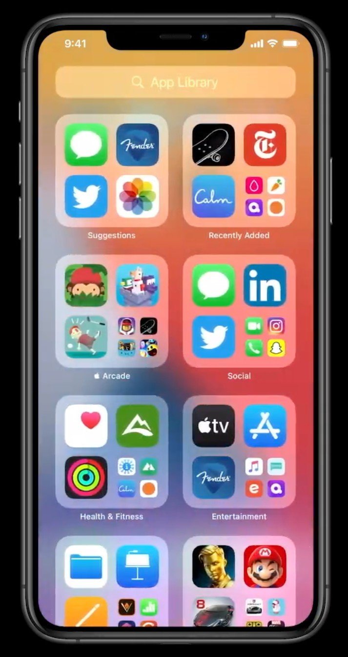
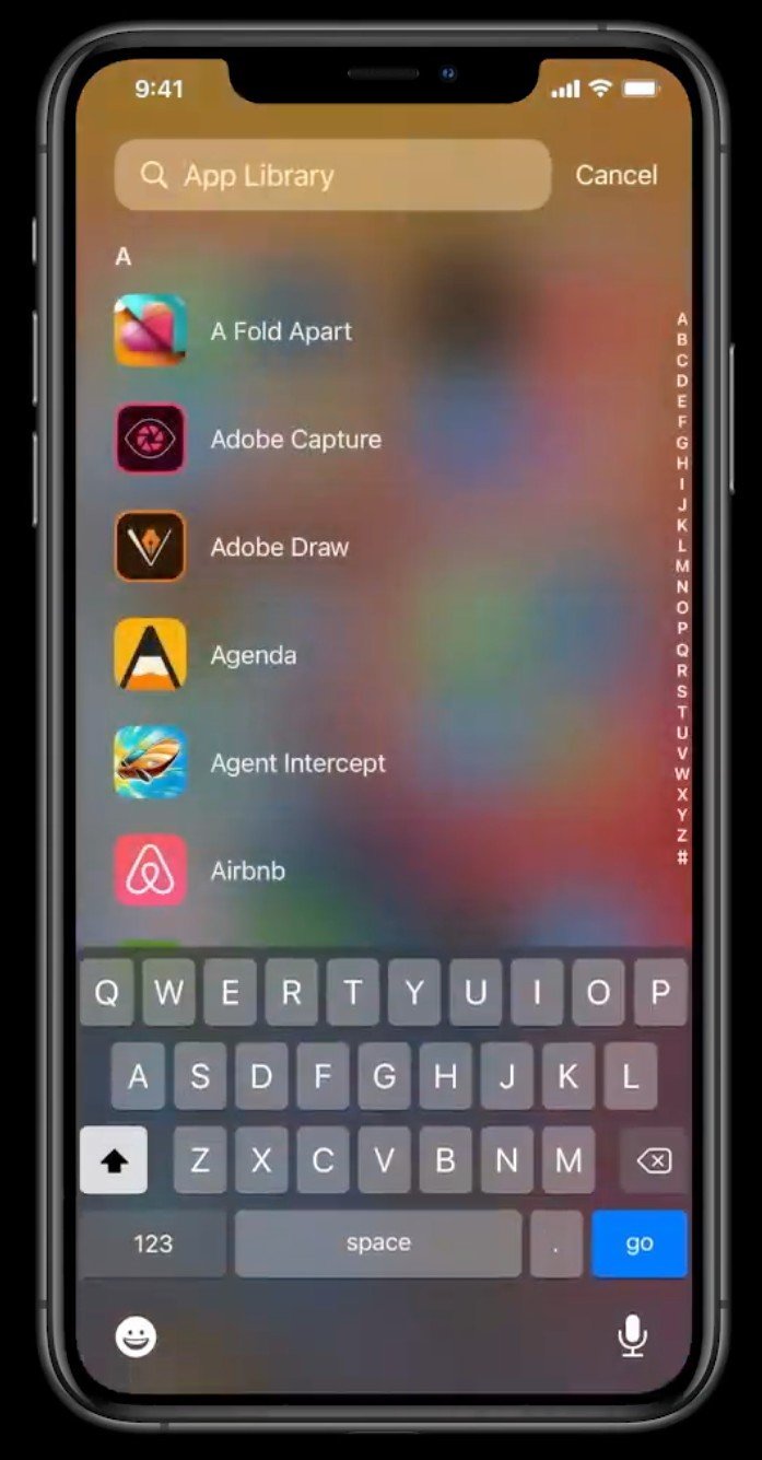
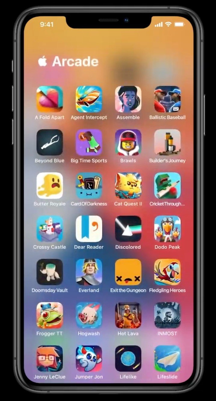
Speaking of the home screen, something else that's coming to iOS is an app drawer. Well, Apple calls it the "App Library," but it's the same basic idea. The App Library lives on the far right of your iOS 14 home screens, and it groups all of your installed apps in smart folders. You can also use the search bar to find a specific app if you don't feel like digging through the pre-made groupings.
This also means that iOS 14 now allows you to hide apps on your regular home screens, further converting it into a very Android-esque experience.
Picture-in-picture
Source: Apple
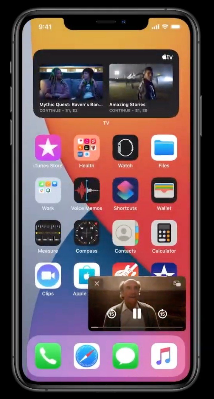
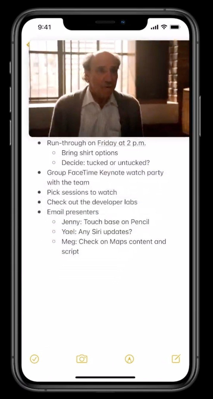
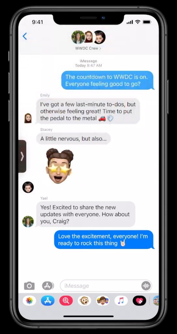
If you have an Android phone, chances are you're pretty familiar with picture-in-picture. Being able to have a video play in a small window on the home screen is something we've had since Android 8.0 Oreo, but our iOS friends have been living life without it.
iOS 14 finally adds picture-in-picture to the iPhone, allowing you to view your video on your home screen or over another app and multitask with ease. You can also hide the PiP player in a sidebar if you want to keep the audio playing but hide the actual video.
Apple may not have invented picture-in-picture, but it is improving on it to make the execution one of the best out there. iOS 14 allows you to easily adjust the size of the PiP player by dragging the corner, which is a small tweak that should make the day-to-day experience substantially better.
Set default apps
Buried on the iOS and iPadOS feature slide... pic.twitter.com/StoxnXCl0uBuried on the iOS and iPadOS feature slide... pic.twitter.com/StoxnXCl0u— Joanna Stern (@JoannaStern) June 22, 2020June 22, 2020
One of the longstanding complaints about iOS has been the inability to set third-party apps as a default app. For example, even if you have Google Chrome installed as the web browser you prefer using, tapping a link would always open it in Safari with no way to change it.
This is finally changing in iOS 14, with users now having the ability to set their default email and browser apps.
Apple sneakily snuck this in as a small graphic during the WWDC presentation rather than explicitly talking about it, so even if the company's a bit ashamed about finally caving to add the feature, it's a great touch that'll benefit a lot of users.
Translate app
Google has a lot of excellent apps/services under its belt, but one of the most useful is Google Translate. While it's been the source of some excellent memes, Translate is a legitimately excellent tool for communicating with people that don't speak the same language as you.
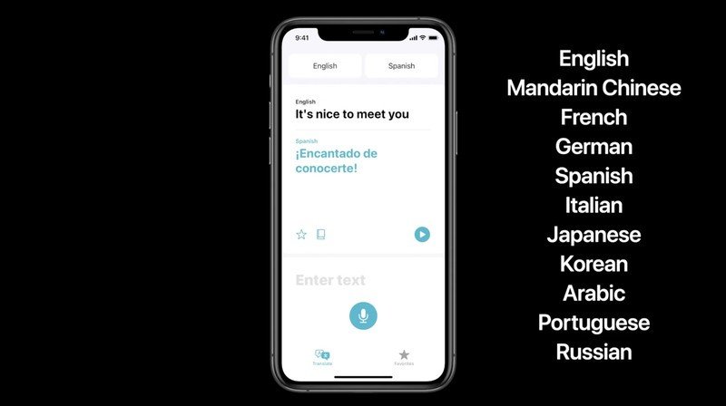
Apple's using iOS 14 to introduce its own Translate app, which functions basically the same way. You choose the language you want to speak, which language you want it to be translated to, and then start talking. When you're done, Translate reads out your message and also shows the translated text on your screen.
The app itself looks good, but there's a big difference compared to what Google offers. Apple Translate is debuting with just 11 supported languages, whereas Google Translate works with over 100.
App Clips
Back in 2017, Google launched the initial test of Android Instant Apps — a way to run lightweight apps and games without having to install them. Just tap a button, and you have instant access to a lightweight version of a fully-fledged application. About a year later in May 2018, Android Instant Apps were made available to all developers under the name "Google Play Instant."
With iOS 14, Apple is taking a page out of Google's playbook yet again with "App Clips."
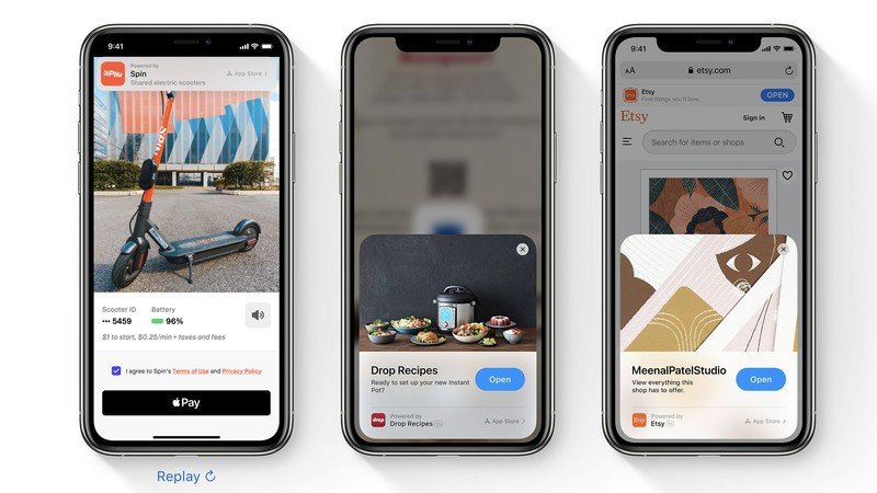
App Clips are Apple's take on Google Play Instant, allowing you to run a lightweight version of an iOS app without having to install it. Scan a QR code, hold your iPhone to an NFC tag, or tap a web link, and just like that you're running an App Clip.
App Clips show up in the new App Library after you use them, and if you want, you get a shortcut for easily downloading the full application.
New Siri design
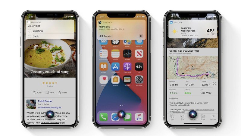
Prior to iOS 14, triggering Siri would result in the digital helper overtaking your entire home screen. It was fine, but it completely took you out of whatever you were previously doing.
Now, Siri pops up with a small indicator on the bottom of your screen that keeps you on the current app or website you were previously interacting with. It's a much more similar approach to what it looks like when you trigger the Google Assistant on an Android phone, and while it's a small tweak, there's no denying that Android did it first.
App permissions in App Store
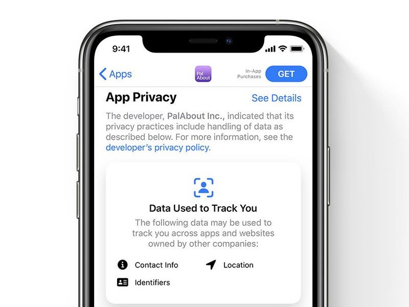
Android has been laser-focused on revamping app permissions over the last couple of years, resulting in the OS feeling more user-friendly and privacy-conscious than ever before. Privacy is one of the company ideals Apple prides itself the most on, which makes it that much more hilarious that it's just now adding app permissions to the App Store.
When you view an app on the App Store in iOS 14, you'll finally see which permissions that app asks for. It's a pretty basic idea, but it's something that previously hasn't been offered on iOS.
Joe Maring was a Senior Editor for Android Central between 2017 and 2021. You can reach him on Twitter at @JoeMaring1.

