7 best Google Photos tips and tricks you need to know
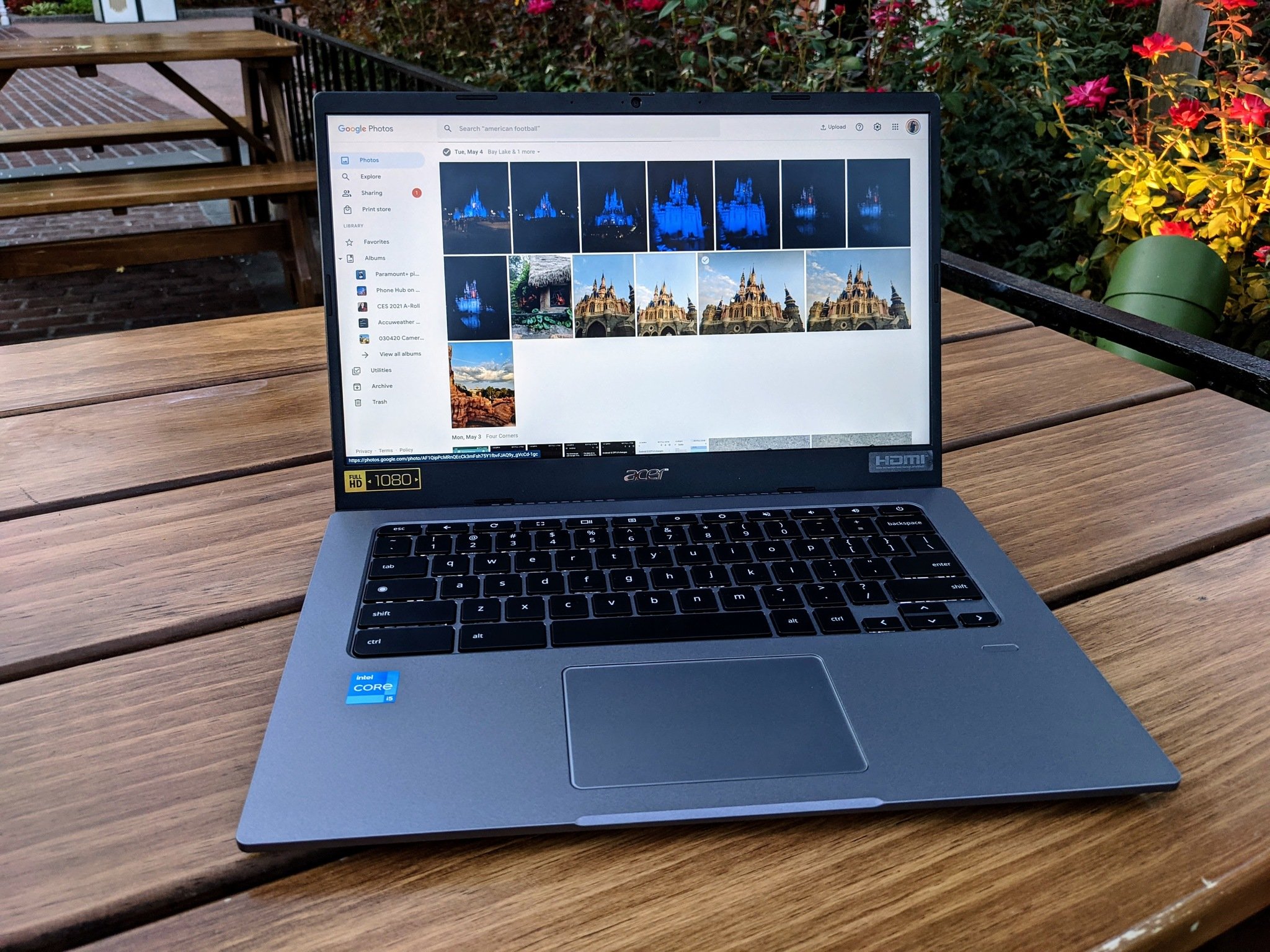
Whether or not you're using the best Android cameras, there's really no reason you shouldn't be using Google Photos to back up and edit the photos you're taking. Google Photos is Google's (formerly free) photo backup, editing, management, and printing service. It's not just one of the best photo backup apps around, it's also one of the best photo editing apps, and it's more than worthy to safely guard the memories of your most precious moments.
Having used Google Photos for six years now, I've picked up quite a few little features and tips to help make Photos an even better service and even easier to use as I take, edit, and share photos both personally and professionally. Want to supercharge your Google Photos experience? Here are my favorite Google Photos tips and tricks.
Mind what you archive and what you delete
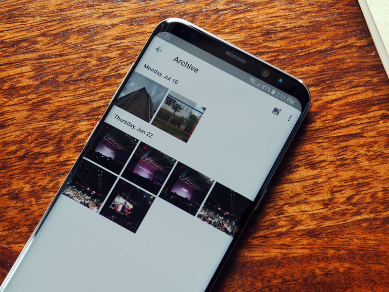
Because most of us have Google Photos backups turned on by default, sometimes pictures get uploaded that we'd rather ... weren't. When you get these photos into your web library, there are two ways to handle any particularly sensitive pictures, but beware of the pitfalls of each.
Archiving a photo is an easy way to get it off the main feed but recoverable if you really, really need it. Whenever I have to take photos of things like insurance cards or registration info, I archive them so that I can still reference them, but they're not sitting in the main Photo feed in case someone starts scrolling through it while I'm stepping back from my computer.
Archived photos still count towards your storage limit — after all, they're still in your library — and they are still searchable, so if someone searches "social security card," it will show up. Archiving used to be how I dealt with all photos I took for articles once I was done, but now that they count towards the storage limit, I'll have to train myself to start deleting instead.
Deleting a photo will remove it from your library and put it in the trash, but the photo isn't actually deleted until 60 days later. This means that if you're deleting a photo that needs to vanish immediately, go to the Google Photos Trash Folder and click Empty trash to nuke it from existence.
Photo editing is better on the web, but video editing is still app-only

I have managed and edited almost all of my review photos using Google Photos for five years. While I could get Photoshop through work, why bother with that hassle when 95% of the time, what I need to tweak is easy as pie inside the Google Photos web editor and app editor?
Be an expert in 5 minutes
Get the latest news from Android Central, your trusted companion in the world of Android
If you're on the go, the web editor will get the job done for photos — and for videos, it's still your only option. While the feature is allegedly, eventually, hopefully coming to the web, the fact that it didn't even come to iPhone until last month means we'll likely be waiting a while. Video editing is still mostly basic features for now, but hopefully, more are coming. For now, you can:
- Trim video length
- Remove audio
- Stabilize video
- Export video frame
- Crop/rotate video
- Adjust brightness/color
- Apply filters
- Markup video with annotations
Thankfully, I don't have to edit videos very often, so I can rely on my preferred editor on the Google Photos website. You can see more controls at a single time rather than having to do each and every one individually in the Google Photos Android app.
When editing photos, here is the methodology that I recommend following to achieve the best look in the fewest steps:

Step 1: Crop your photo. This may be the last tab of the web editor, but doing it first means that it'll be easier to color balance and white balance your photo, as it won't have to account for any super-white or extra dark spots in your photo. Cropping first also means that while you're doing your color tweaking, you'll be looking at essentially the finished photo and can save and download once you're happy with it.
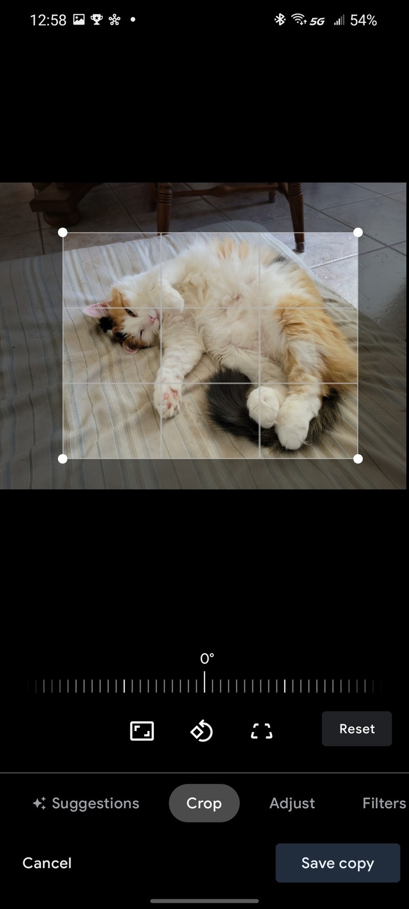
Cropping is five times easier on a desktop/laptop/Chromebook than on your phone. While portrait photos may sometimes (maybe) be okay to crop on-device, any landscape photo will just be too tiny to ensure you've got good margins unless you've got one of those fancy foldable phones like the upcoming Galaxy Z Fold 3.
Step 2: Try your filters. I'm not much of a filters girl since most of my photos strive to be true to life, but before I futz with any brightness/color settings, I'll at least try the Auto filter to see how it does. If you're editing a selfie for social media, you might try all the filters, but no matter what, do filters before the granular controls because, in reality, all the filters are a pre-set combination of granular controls.
Some filters are heavy-handed, and some are more subtle, but they all are just a mix of the granular controls that are automatically applied. This is a good thing because rather than just having that intensity slider below the filter, you can set a filter and tweak its individual components.
If you like the overall look of Bazaar but think it just turned the photo way too cool blue, you can apply the filter and then adjust the Warmth up or Deep Blue down in Step 3: Manual Adjustments.
Always adjust brightness before color
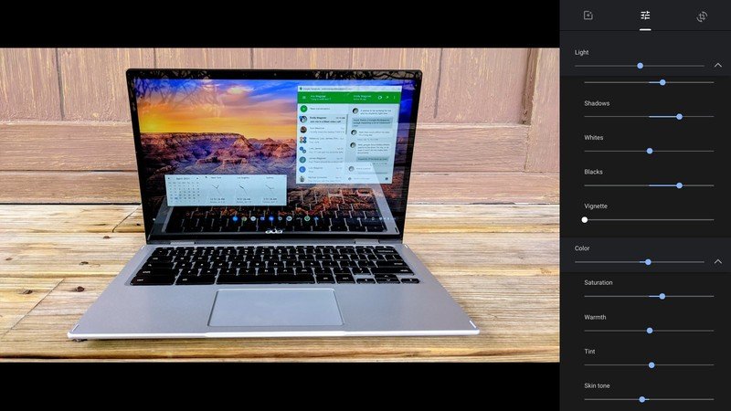
You have two main sections of sliders in the Adjust section of the Google Photos editor: Light and Color. Always do Light/Contrast before you do colors because light will impact color, helping saturation or washing out colors depending on how heavy-handed your editing is.
When editing Light/Contrast, here's your cheat sheet for each slider:
- Light will brighten or darken the photo, mostly using the Exposure and Highlights sliders. Left is darker, Right is brighter, but it can tend to wash out details and make a photo look muted or blown out (over brightened).
- Exposure likewise adjusts the entire photo darker (left) or brighter (right), simulating if you used a different exposure on your camera. Use sparingly, as a little exposure adjustment can go a long way.
- Contrast will decrease (left) or increase (right) the distinction between light and dark sections of a photo. You'll seldom turn it down, but it's another slider that can easily blow out or overexpose a photo if you turn it up too high.
- Highlights make the bright parts of your photo dimmer (left) or whiter (right). Use it with Shadows/Blacks to help improve contrast/brightness without as much chance of blowing out a photo.
- Shadows make the dark parts of your photo darker (left) or brighter (right). If your photo seems a little too dark, turn Shadows up a little and then adjust Blacks and Highlights to compensate.
- Whites will decrease (left) or increase (right) the overall brightness of your photo. Use sparingly, as it's easy to blow out photos with it.
- Blacks will (decrease) or increase (right) the overall darkness of a photo. This is good for blacking out reflections/flaws in a dark surface/background, but don't go overboard.
As mentioned, I tend to tweak the Highlights, Shadows, and Blacks in order to achieve my desired pop of brightness while having good contrast. Moving on to color, these sliders can seem slightly more daunting to those unfamiliar with traditional photo editors or photography terms:
- Color will adjust Saturation, Skin tone, and Deep blue in order to turn all color on your photo down (left) or up (right). If you want greyscale, pull it all the way to the left. Otherwise, I suggest leaving this one alone.
- Saturation makes all colors less (left) or more (right) vibrant. If you turn saturation high enough, it'll draw the faintest colors out of seemingly greyscale elements, but if you turn saturation up too much, the photo looks jarring and fake.
- Warmth refers to color temperature and white balance, making a photo look "cooler" and more blue (left) or "warmer" and more yellow (right). This slider is worth knowing so you can color correct if your camera's white balance was off — or if you were taking photos on an overcast day but don't want to look emo.
- Tint will adjust the hues of your picture, making it appear more green (left) or red (right). Leave this one alone. There are very few instances where you'll need it.
- Skin tone will either decrease (left) or increase (right) the colors in the range of some skin tones. It will boost yellows, reds, and some orange hues. This is another slider that's good for making you look human on grey, overcast days (or if you're a vampire).
- Deep Blue will reduce (left) or boost (right) the blue shades in a photo. I love this slider because I love blue, and this is also a good way to make blues pop in an image without turning Warmth down.
Speaking of pop, the Pop slider at the very bottom of the Adjustment list will boost contrast and color in a specific way that tends to look good on social media. Still, it's a very noticeable type of filtering you won't want for any photos that you want to look natural.
You probably don't need Original size uploads
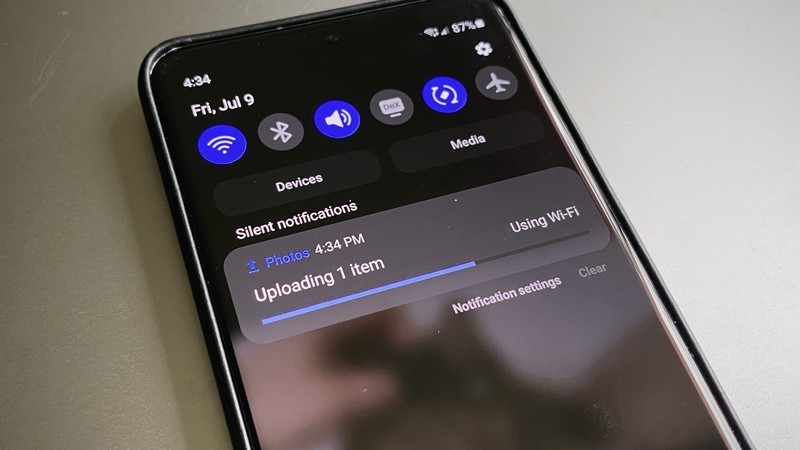
Yes, horror of horrors, your "High quality" photo backups are no longer free. They count towards your Google One limit, and so many have taken to using Original because it all counts, so why bother with compression?
Simple: most cameras, by default, take photos that are already within the size limit for High quality — now called Storage saver — and your photos aren't what's going to eat your storage alive anyway. Video can take up ridiculous amounts of storage once you get above 1080p. Unless you're a budding vlogger or doing professional videos of some kind for work, you don't actually need all those extra pixels anyway.
If you have small children you're constantly videoing or pets that you have to show off when they're doing something good — or bad, or funny, or cute — switching from Original to Storage saver could save you gigabytes of storage a month if your phone shoots in 2K or 4K resolution.
Also, remember that if you're concerned about storage, you can regularly go in and delete photos you no longer need, like the photo of where you parked at the theme park, the confirmation number for a curbside pick-up you bought two months ago, or those 70 shots your daughter took when she grabbed your phone and somehow opened the camera while you were getting breakfast ready.
Clean out your share links regularly
Speaking of regular cleaning, did you know that Google Photos share links don't automatically deactivate after a set time frame? Yeah, that link you shared with your doctor five years ago (the one with the rash close-ups) is still a live link that could somehow be found if a cat walks across the keyboard the wrong way.
You can clean out old share links pretty easily, and here's how:
- Head to the Google Photos website.
- Click the Sharing tab.
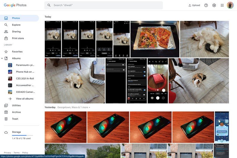
- Click on Other shared links.
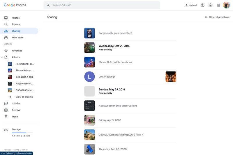
- Hit the trash symbol for a link you want to kill.
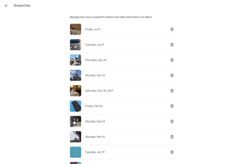
- Tap Delete.
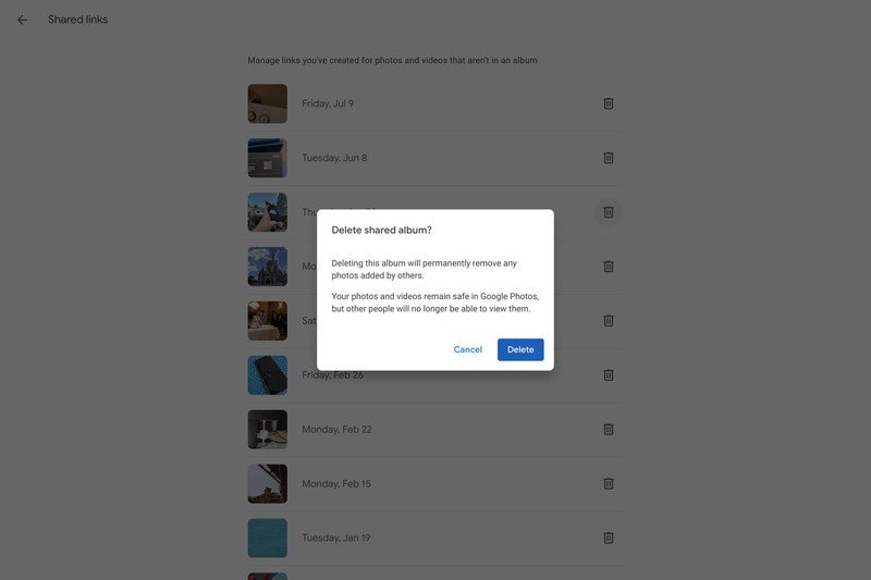
Unfortunately, there's no batch delete option, so you have to go link by link. I recommend either grabbing a nice cold beverage or putting on one of your favorite reruns to watch while you two-click your way through the list.
Photos' search is more robust than you realized
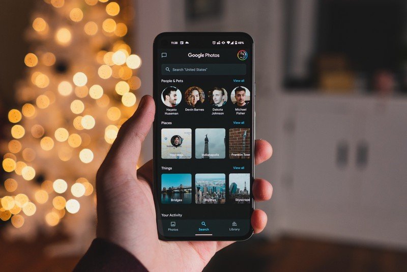
You probably know that Google Photos can recognize famous locations, faces, and common objects in your photos. Still, you might not know that all of this object identification is also used to tag your photos automatically. This means that if you search "car," you'll get all the vehicle photos you've ever taken, but you can type in "SUV" to just see photos of and inside your Honda CR-V.
Type in "flower," and every flower will appear, but if you type in "rose," and it'll single out those varieties to simplify your hunt for that decade-old yellow rose photo. I'll admit that not all searches will work this well: plenty of cats show up when I search "dog," and searching "butterfly" also brought up a few photos without any insects in them at all.
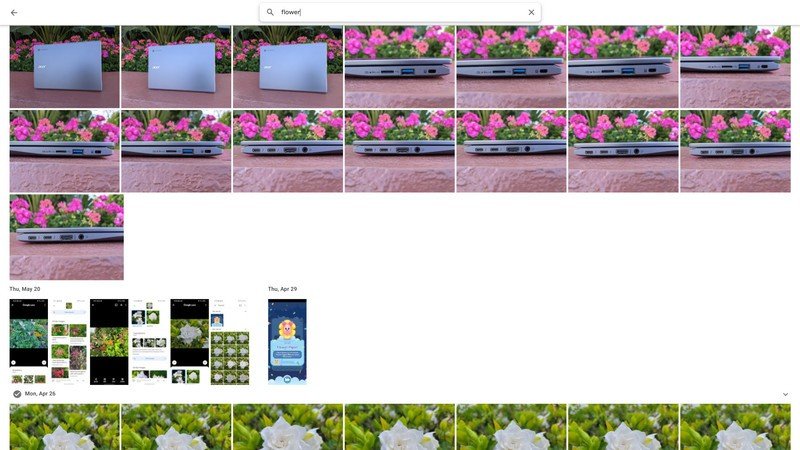

Source: Android Central
And as I stated back in our first tip, Google Photos' search can search archived photos, too, so even if you archived an old photo you didn't think you'd need anymore — like your old Driver's License number from your previous state — can be found with a quick, painless search.
Shave time off your photo managing with these shortcuts
Google Photos website, like Chromebooks and most Google services, has a bevy of useful keyboard shortcuts that you can use to speed up your photo management.
- Shift + A — Archive photo
- Shift + # — Delete photo
- Shift + R — Rotate photo
- Shift + D — Download photo
- E — Edit
- Z — Zoom
- Arrow left/right — Previous/Next photo
- Escape — Exit current screen (exit editor or return to gallery)
E, Z, and Shift + D are my three most used shortcuts for obvious reasons, but remembering how to Archive or Delete using the keyboard can make it easier while culling your gallery of old or unneeded photos.
Now go make more memories
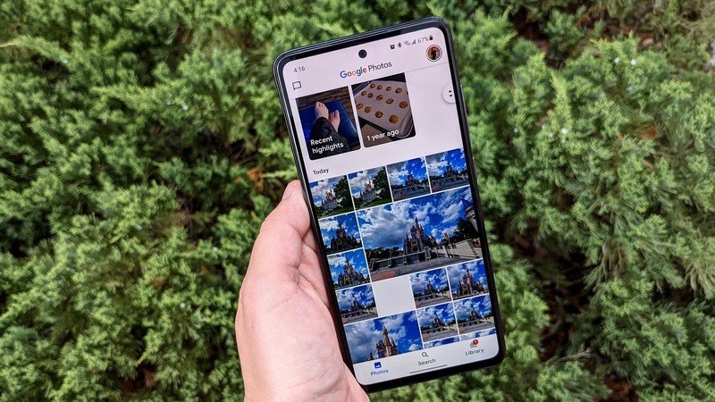
Once you've mastered Google Photos, you'll be ready to dive into actual folder management, Partner Sharing, and having a gallery that's full of photos you actually want, not just every photo you've ever taken in your life. Whether you're a brand-new Photos user or you've been using it since it arrived in 2015, there's always something new to learn, and I'm eager to hear any new tips and tricks you might find during your Google Photos safari.
Ara Wagoner was a staff writer at Android Central. She themes phones and pokes YouTube Music with a stick. When she's not writing about cases, Chromebooks, or customization, she's wandering around Walt Disney World. If you see her without headphones, RUN. You can follow her on Twitter at @arawagco.
