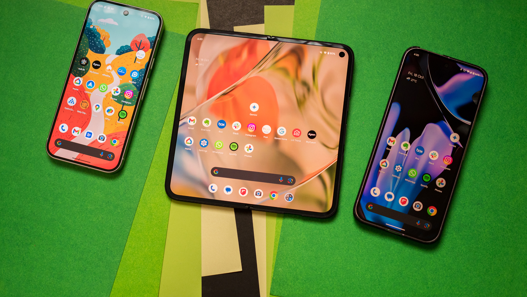
6 iOS 15 features Apple stole from Android — and one Google should steal
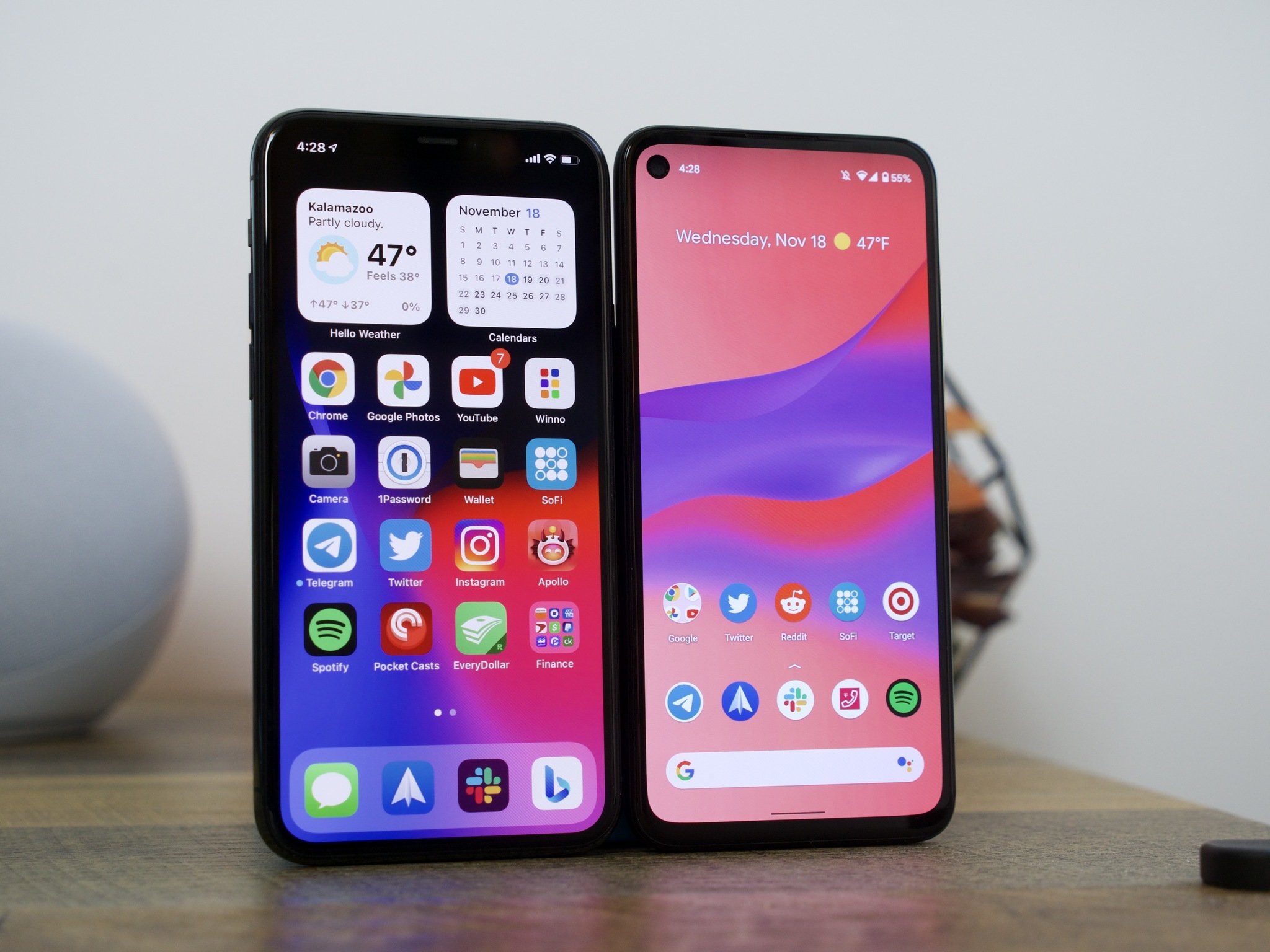
Every year, Apple and Google trade ideas for their newest versions of iOS and Android, respectively. But this year, during Apple's WWDC 2021, it seems like Apple purloined more than a few ideas that Google's integrated into Android over the last few years.
Millions of iOS users won't get their hands on iOS 15 and iPadOS 15 until later this year, so until then, we don't know until then how the new features will fare in the real world. For now, here's a tongue-in-cheek look at six features Apple, um, borrowed from Android with its latest software releases.
iPad widgets and app drawer
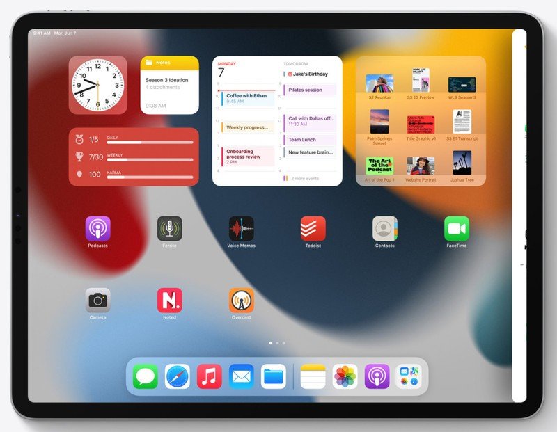
iPad OS 15 introduced two big new updates for the iPad home screen today: widgets and the App Library. If you think this sounds awfully familiar, there's a good reason for that. 2020's iOS 14 introduced both features, but only on the iPhone, not the iPad. It's perplexing enough that Apple took this long to overhaul its terrible home screen, but it's even more perplexing that it made these changes on the iPhone first.
Originally designed for a much simpler time, the iOS home screen didn't take long to age poorly. The grid of icons isn't the best way to organize anything, and it has always been a chore to organize those icons in any meaningful way. Over the years, even Android OEMs who straight copied the look and feel of iOS — including the awful home screen design — made the small quality-of-life improvements like automatic sorting options and ways to group icons more efficiently. Not only that, but the bizarrely wide padding between icons on iPad OS had always felt like a massive waste of space and potential.
Thankfully for iPad owners, iPad OS 15 addresses some of these issues by bringing an app drawer App Library right to the bottom bar of the home screen, making it easy to find all your apps in an alphabetized, logically ordered way. In other words, the same app drawer we've been using on the best Android tablets for nigh 10 years now.
On top of that, a new larger widget size is available exclusively for iPad OS, making better use of an iPad's larger screen size when compared to an iPhone. It's hard to believe that a company such as Apple — who regularly earns awards for its product designs and UX — has taken so long to add such simple, obvious tools to its flagship products. Either way, if you've been an Android user for a long time now, using an iPad home screen will finally make some sense.
Live Text and Spotlight Search are an inferior version of Google Lens
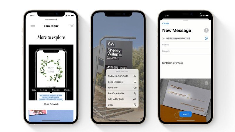
You'd be forgiven for not knowing Live Text is already a feature on Android that you can use right now, since Google didn't give the feature a cute name inside Google Lens, but you've been able to copy real-world text and translate real-world text in Google Lens since 2018.
Be an expert in 5 minutes
Get the latest news from Android Central, your trusted companion in the world of Android
It's an incredibly useful feature, one that is made even more valuable now that Google Lens is integrated into Google Photos so you can act on text in pictures you snapped earlier. In traditional Apple fashion, the features look a little better — especially for the results cards for Spotlight Search, which will recognize people, places, and things inside your photos — but they're long-established features for Google Lens/Photos and have a much wider knowledge base to pull from. Yeah, Spotlight Search will recognize actors, but will it be able to differentiate between a rose and a gardenia? Will it be able to tell what bug is flying angrily around your apartment? Maybe, but Google has half a decade of image recognition experience over Apple, and we don't know how long it'll take Apple's knowledge base to catch up.
Another way in which Live Text beats Google Lens: it's available on Mac, iPad, and iOS while Google Lens is still largely limited to Android. Maybe this will encourage Google to finally bring the feature to the Google Photos website.
Apple reinvents Google Earth and AR navigation

When Apple Maps first launched on iOS 6 nearly a decade ago, the app was first hailed as a typical beautifully designed Apple experience. Shortly after, it was quickly (and deservedly) ridiculed for its shortcomings and outright failures like incorrect or out-of-date directions and Picasso-esque satellite imagery of warped buildings and highways. However, with each subsequent iOS release, Apple continued to tweak, refine, and upgrade the app, to the point where it is now a viable Google Maps competitor in many parts of the world.
Much of this refinement has taken the form of innovative new features like flyover mode in iOS 8 or the new 3D terrain features, detailed landmarks, and picturesque night mode that's coming in iOS 15. However, just as many Apple Maps improvements have come from aping what's worked in Google Maps, like its version of street view. Judging from what we saw in the WWDC keynote, it also looks like Apple is now cloning features like Google Earth's world view that lets you spin the Earth around and zoom in on in a target area, as well as the AR directions that debuted in Google Maps at the I/O conference back in 2018. We'll have to see how Apple's new features stack up against their Google Maps-inspired elements in a head-to-head competition, but I'm betting they'll look pretty doing so.
Apple tries to make Siri more like Google Assistant (and Amazon Alexa)
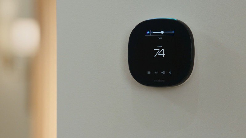
Apple hasn't really focused too much on Siri, and for a while, it seemed like the virtual assistant was being put on the backburner. At WWDC, Apple announced that it's expanding Siri's on-device voice processing capabilities so that Siri doesn't have to be connected to the internet to perform certain requests or respond to queries.
If this sounds familiar, Google Assistant has been capable of performing basic tasks offline for some time, and on-device voice processing has been available least since the Google Pixel 4. It's what powers useful features like Speech-to-Text and Live Caption.
Siri is also finally making a push into deeper home integration with its Homekit service. For instance, if you own a Homepod Mini, you'll finally be able to tell the device to play content on an Apple TV without needing to pick up the remote. It'll also be able to tell different voices apart based on individual user profiles. Not only that, but Apple is finally taking Siri out of its own devices and allowing third-party manufacturers to build Siri into theirs.
Given that Google and especially Amazon both have a myriad of devices with their virtual assistants built-in, it's good to see Apple finally catching up in the smart home space. Of course, part of that now has to do with the joint Matter alliance that the companies are now part of, making it easier for smart home products to work regardless of the ecosystem.
Apple tries to make notifications more like Android — again
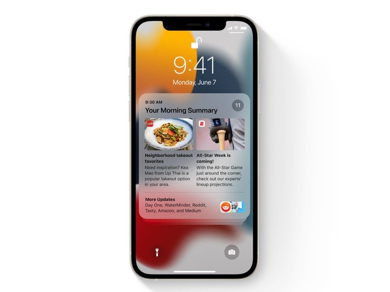
iOS has some incredible features, many of them more thoughtfully implemented than their Android counterparts, but notifications are not on that list. iOS notifications are a disaster, and Apple realizes this with iOS 15 as it gives users more control over what they see and when.
Not only are individual notifications more compact in iOS 15, but they contain more space for images, which is the start of the Android cribbing, but it doesn't stop there. Apple is dividing notifications into categories, making it easier to see only specific groups of incoming pings based on a new Focus mode that, mercifully, syncs between all of Apple's platforms, including the Mac.
Apple is also allowing iPhone users to mute incoming notifications, including messaging threads — something that Android users have taken for granted for a few years now. Apple's taking things a step further, though, using on-device machine learning to suggest which notifications to mute.
Focus Mode already exists to some extent on Android, but iOS 15 really does spend a lot of time thinking about how iPhone users spend time with their devices; there are specific categories, from work to personal time to gaming to fitness, and on-device machine learning suggests which apps should be placed inside specific categories from past usage.
Focus also extends to the home screen, so icons automatically hide — Twitter or Instagram, say — to resist the temptation to open them.
Finally, Apple is trying to manage notifications through a twice-daily notification summary, which packs several important headlines into one place — sort of like a widget.
None of these features will likely solve the underlying noisiness of iOS notifications — Android notifications are easier to interact with and dismiss — but Apple took a bunch of features first found on Android and improved them.
Apple Photos recreates some of Google Photos' best features
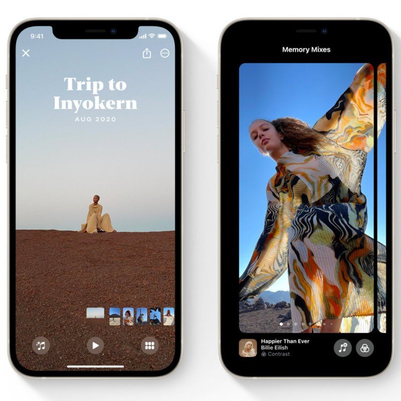
Watching the WWDC keynote was deja vu-inducing, especially when looking at what Apple is trying to do with its Photos app. Google Photos is one of Google's best products, and much of its success comes from the company's ability to surface beloved memories and easily share them with family and friends.
Apple is trying to do the same with a new set of Memories features, which augment iPhone users' photos and videos in dramatic and artistic ways. There are also now more memory types, including holidays, children, pets, and trends — Apple even says it will be able to identify your pets by name.
Finally, there's a new Shared with You section that, as it sounds, consolidates all the photos and videos that other people have shared across iOS devices. If that sounds like Google Photos' Sharing tab, you're right. Apple sees just how successful Google has been by making Photos as close to a social network as possible, and it's following suit.
Bonus: What Google needs to steal
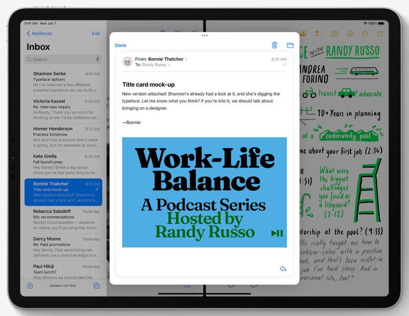
Apple took what Samsung developed and made it so much better when it comes to split/multi-window on mobile. The ability to use a big screen, like the one on the iPad that Apple showed off, to do more than one thing at a time is a no-brainer. Imagine using a computer without an easy way to bring up another app and seamlessly switch between the two.
It's not a new idea because we first saw Samsung do it years ago when the Galaxy Note was the biggest show on earth that wasn't a tablet. While rudimentary, it worked as long as you used the right app and you actually could see and act upon two things at once. Apple took this basic idea and did what it does best -- improve it.
I was particularly impressed with the demonstration using the mail app. Normally, the Mail app on the iPad already sort of kind of has two windows; one with a list of all the junk in your inbox and another to show the contents of a message. Gmail does the same on an Android tablet, and it works pretty well.
The problem is when you cut the real estate in half; you have a list of emails and just a tiny sliver for the preview. Apple solved this with a really nice "pop-up" in the center of the screen that displayed the message exactly the same as it would normally look. You can tap links, reply, forward and do everything else through this window, and it really looks like a great solution. Google totally needs to steal it.

Derrek is the managing editor of Android Central, helping to guide the site's editorial content and direction to reach and resonate with readers, old and new, who are just as passionate about tech as we are. He's been obsessed with mobile technology since he was 12, when he discovered the Nokia N90, and his love of flip phones and new form factors continues to this day. As a fitness enthusiast, he has always been curious about the intersection of tech and fitness. When he's not working, he's probably working out.
