Top 6 things we want to see in Android Q
Believe it or not, but it's now been over six months since Android 9 Pie was officially released. You know what's even crazier? Its first developer preview dropped more than ten months ago. All that's to say that its successor — Android 10 Q — will be here before you know it.
We've really enjoyed our time with Android Pie and recognize it was one of Android's most important updates in a while, but as with all things, there's still room for improvement.
Join me, won't you, as we go through our top most-wanted features/changes with Android Q.
Fix the gesture navigation
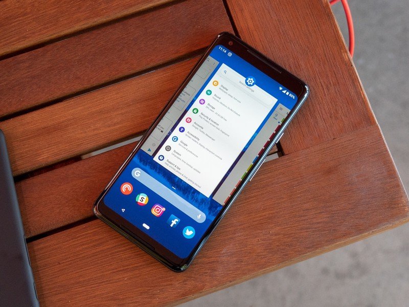
If there's one thing we'll remember Android Pie for, it'll be its introduction of gesture-based navigation for the platform. Google got things off to a decent start and improved the gestures a lot compared to their implementation in Pie's developer previews, but they're far from perfect.
Gestures on Android Pie are kind of confusing. You tap the home button to return to the home screen, do a swipe up to access the multitasking page, and do two swipes up for the app drawer. A quick pull on the home button toggles you back and forth between your most recent apps, but doing a long horizontal swipe on it allows you to cycle through all of your open applications.
Android Pie's terrible, horrible, no-good, very bad gestures need to be fixed.
And then there's the back button that sort of pops up here and there like that family member of yours who's always talking about the good-old days and never wants to accept that the world is changing.
Navigation is a bit of a mess with Android Pie, but it doesn't have to be.
Be an expert in 5 minutes
Get the latest news from Android Central, your trusted companion in the world of Android
Samsung, Motorola, and even OnePlus have all created their own vision of gestures for Android, and truth be told, they're all much better than the stock solution that Google offers. Whether Google straight-up copies one of the other methods we've seen or uses them as inspiration to evolve what we currently have, something has to change.
For the record, this is something that pretty much everyone here at AC, myself included, wants to see.
Better support for one-handed use
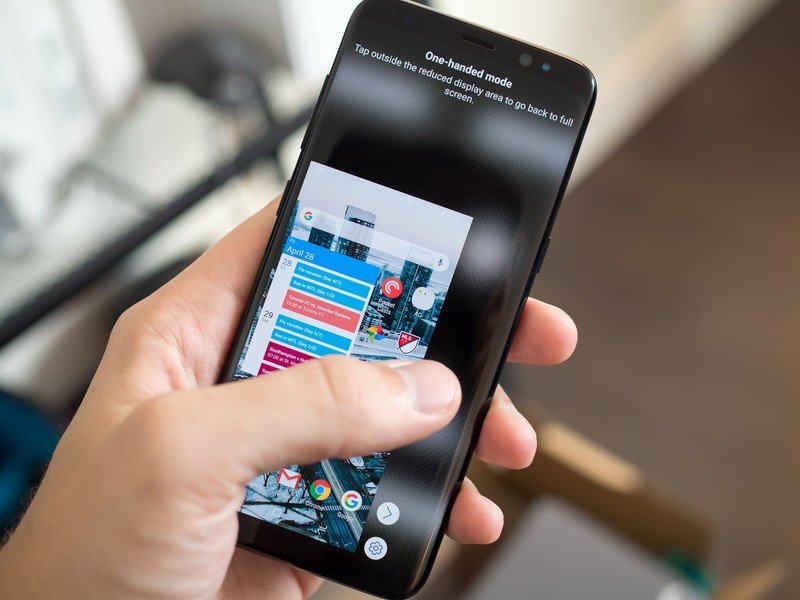
A lot of Android OEMs offer one-handed modes with their custom software for Android, but on its own, stock Android Pie doesn't have anything of the sort.
Phones have been getting bigger and bigger for the past few years, and with bezels continuing to shrink and displays getting narrower, it's becoming increasingly more difficult to reach buttons, toggles, etc. at the top of our screens. With a well-crafted one-handed mode that's ready to use out of the box on any Android phone, life would be a lot easier.
On a similar note, Hayato said he'd like to see Android Q take some inspiration from Samsung's One UI interface that brings UI elements within closer reach by reserving the upper part of your screen as a viewing area of sorts. We certainly don't actually see this happening with Android Q (if ever at all), but it would be pretty exciting to see something like this happen down the road.
A built-in screen recorder
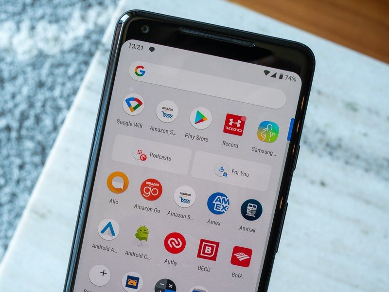
One of Android Pie's smaller additions was a native screenshot editor. It works incredibly well and makes working with screenshots on Android ten times better, but there's something that's still missing all these years later — a native screen recorder.
There are plenty of third-party apps on the Play Store that allow you to record your screen and then share the clip wherever you'd like, but there's no reason something like this shouldn't be baked right into the OS.
This is something Apple added with iOS 11, and to be frank, it's kind of embarrassing that they beat Google to the punch with this one. From showing your relatives how to uninstall Facebook to creating a tutorial on how to edit a picture in Photoshop Express, a screen recorder for Android would be incredibly useful.
System-wide dark mode
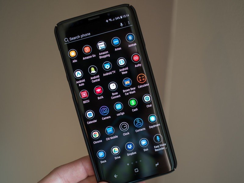
One of the things we see asked for each and every year with new Android releases is a system-wide dark mode. Android Oreo on the Pixel 2 series introduced a dark theme for the Pixel Launcher, throughout 2018, we saw a bunch of Google apps slowly adopt dark themes of their own.
This is all good progress, but we still don't have something that enables a dark mode system-wide throughout the entire OS.
There are rumors that Android Q will finally change that, but that's something we hear with pretty much every Android release. We certainly hope and pray that Google listens to our long-standing prayers, but there's really no telling when we'll get this.
For a deeper dive into Android Q's dark theme speculation, be sure to check our Ara's excellent deep-dive on the topic.
Fade to black: Why Android's dark theme rumors don't matter anymore and matter more than ever
Even more tie-ins with Chrome OS
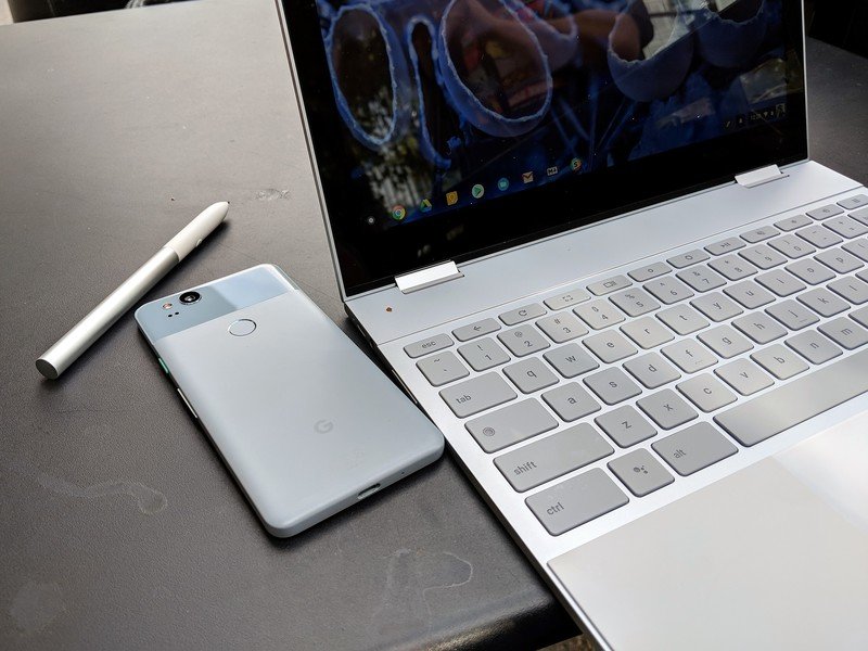
In 2018, Google launched a program called "Better Together" for Android and Chrome OS that allows the two platforms to play nicer together than ever before. Better Together is a new setting within Chrome OS that shows all of the ways using an Android phone with it can make your experience better, such as managing your texts from Android Messages' web client, instant tethering with your phone, and keeping it within close proximity of your Chromebook to unlock it without having to enter your password.
Android and Chrome OS's relationship is better than it's ever been.
This stuff is all great, and now that Google has a system in place for managing these features, it could use Android Q to really go all-in with them.
I want to be able to copy text on my Android phone and then paste it on a Chromebook. When I download an app to my phone, it should automatically download on the Chromebook next time I use it. Notifications across my Android phone and Chromebook could be synced together.
Android and Chrome OS are both phenomenal platforms on their own, and as Google makes them talk better with one another, all that does is give people more of a reason to fully buy into their ecosystems.
A reimagining of the entire UI
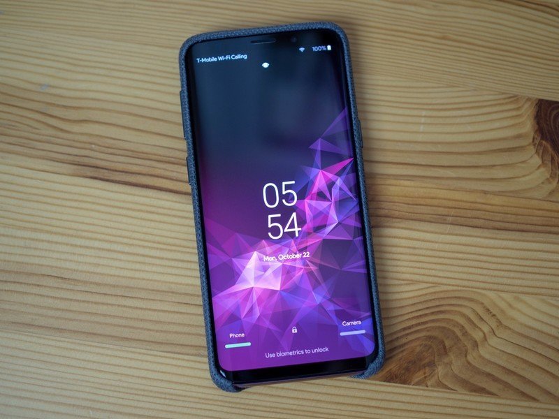
This is a bit of a wild card and something we probably won't see, but I think it'd be fun to see Google really shake up Android's entire interface.
Aside from visual tweaks here and there, the core functions of the OS really haven't changed all that much over the years. All of your apps live in the app drawer, you can add these in a custom order on your home screen, and if you'd like, you can add widgets, too. All of this works, and works quite well, but it's getting very familiar these days.
What would a reminaged UI for Android look like? I honestly don't know, and at this point in the operating system's life, I'm not sure if something like that's even possible. Even so, the tech geek inside of me can't help but long for something radically new. A new way of accessing apps, customizing my phone, and a new way of doing just about everything.
That might be something I need to wait for Fuchsia for, but that's not going to stop me from dreaming.
What do you want to see?
With all of that out of the way, it's now time for you to chime in. What do you want to see in Android Q? Sound off down in the comments below!
Joe Maring was a Senior Editor for Android Central between 2017 and 2021. You can reach him on Twitter at @JoeMaring1.

