6 things to look for in an icon pack
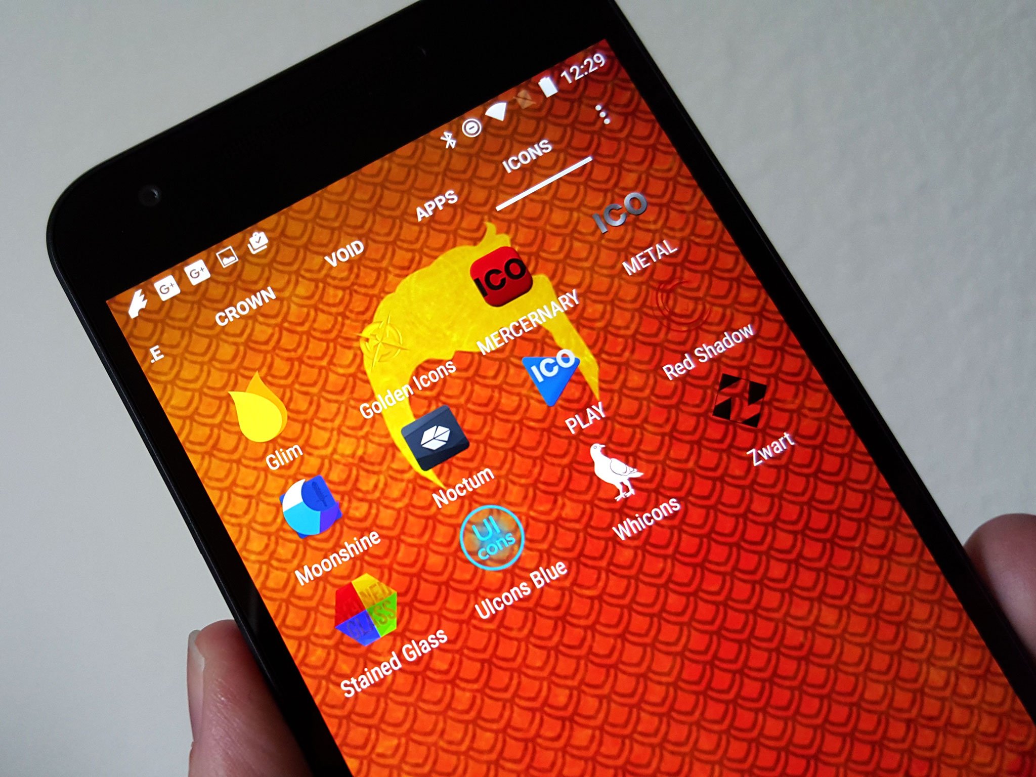
Want to make your phone look new without completely changing up your home screen layout or trying a bunch of new widgets? Just switch icon packs. Finding an icon pack that perfectly matches your theme is cool. You know what's really cool? Finding an icon pack that'll go with five themes, or 10. Or finding an icon pack that doesn't leave any awkward gaps in your app drawer.
Good icon packs are out there. Here's how I find them.
Style
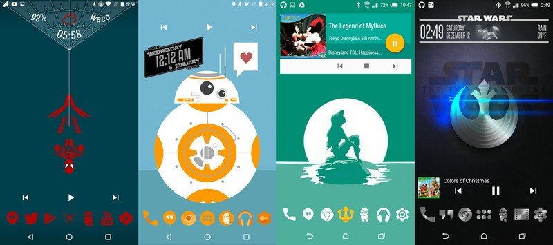
Above all other things, a pack's icons have to look good to you. I don't care how awesome the support is. I don't care how masterfully they handle unthemed icons. I don't care if they have the best icon picker known to Android. If the icons don't look good to me, it's not going to matter because I will hardly ever use them.
Icons are something you look at every day, so the icons in a pack need to be something that you like and something you won't tire of too quickly. Don't get what's popular if you don't like it. I still haven't bought some of the most popular packs on the store because I personally just don't like them.
App/Launcher Support
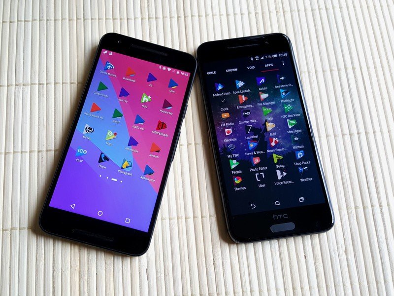
Icon packs are handled different ways by different launchers. That's why even if you buy an icon pack in Google Play, it might not work properly work in every Android launcher you try. Depending on what launchers accept the access intent required to see and act on masks and shaders, a launcher might take all, part, or none of the masking a developer has programmed for their pack. This is why icon packs may also look better on some launchers than others, like PLAY on Nova (right) versus PLAY on ZenUI (left).
There are also millions of apps out there. Icon pack developers don't have time to theme them all. While we'll get to unthemed icons in a minute, it is worth noting that when trying to see how many apps you use are themed in a pack, you cannot go strictly on the number of icons the pack contains. MY PACK HAS OVER 9,000 ICONS … but it's actually just 900 apps in 10 colors (Not that that isn't an accomplishment in itself). Look through the pages of sample apps in their Google Play listing, and if all else fails… . Buy the pack, apply it, and count the holes. You have 15 minutes to see if there are too many for your liking.
Speaking of holes...
Be an expert in 5 minutes
Get the latest news from Android Central, your trusted companion in the world of Android
How holey is your icon pack?
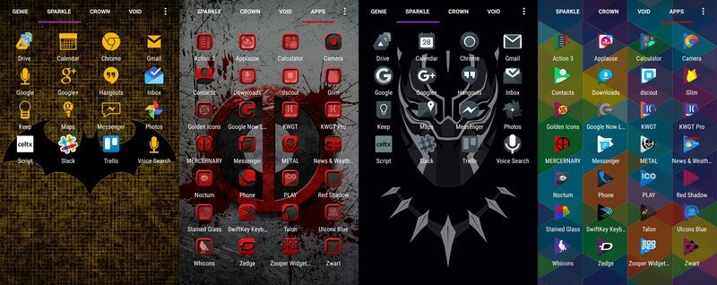
Again, you can't theme every po-dunk game some high schooler coded in class and put in Google Play on a dare. I get that. That's fine. But that doesn't mean that there have to be big gaping holes in my app drawer between your shiny silver icon pack and the boring old icon my app came with.
The way developers used to get around this was by putting a mask over the unthemed app icons. Most packs still do this, to varying levels of success. See the pack in the middle here? It's using square icon masks to tint all app icons, but the masks are almost worse than the holes. Now take a look at Noctum. You see any holes? No? That's because instead of an old-school mask, MLV uses shader.xml to tint unthemed icons using the same color scheme as his pack. I wish all icon packs did this, but even if they did, not all launchers would support it.
Some packs with specialty shapes also have icon masks that will have the app conform to the shape of the pack. Sometimes, these work really well, like in PLAY. Sometimes… not so much.
We also have variant or alternate icons. Alternate icons can be generic icons that you can use to sub in for apps that weren't themed. Some icon packs have a few dozen alternates, some packs have a few thousand alternate icons. I am still waiting for icon pack developers to start adding Google emoji to their alternate icons … Waiting and waiting ...
How many times can you use this pack?
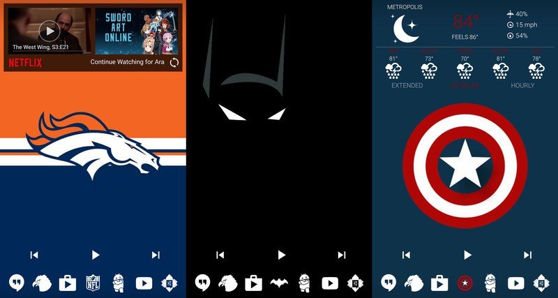
I am perfectly fine blowing a few buck on an icon pack that I'll use for a month and never touch again… but I absolutely adore finding new packs that I can re-use from theme to theme. Golden Icons was a pack I downloaded for my Aladdin theme last Halloween, but I keep coming back to it when I find walls in Wallpaper Wednesday.
Solid color packs like Zwart and Whicons have been suggested multiple times in my previous articles, because solid white and solid black icons are easy to match to themes. I also keep Glim on my devices for when I want to use color-variants on my home screen for a theme.
What kind of support is the developer giving this pack?
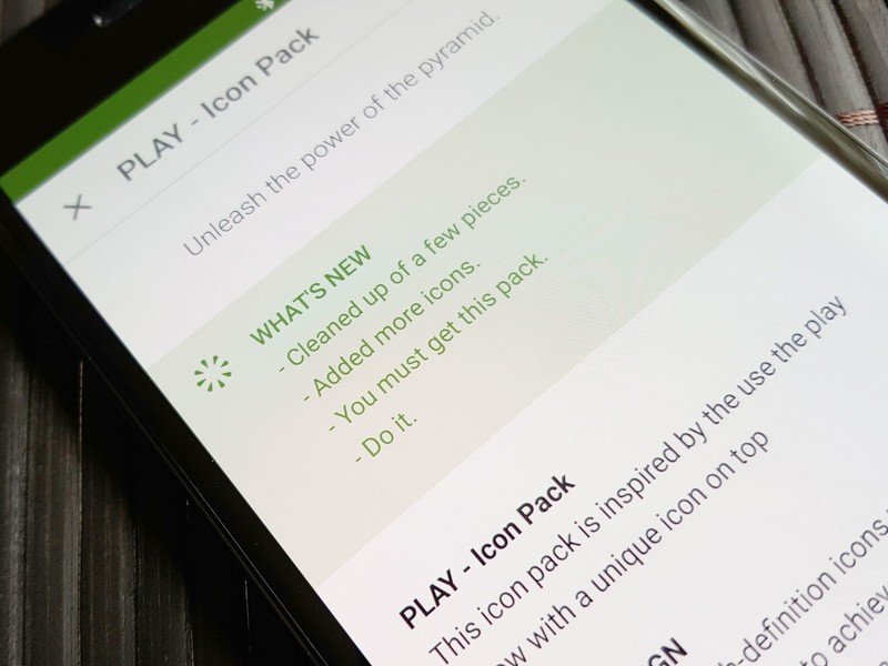
Supporting an icon pack can be a full-time job if your pack is popular, but icon pack support isn't always quite as necessary as it is for other apps. If an icon pack has enough of my icons themed, enough custom/variant icons to fill the holes, and fits my theme, then it doesn't matter if it was last updated at the beginning of 2015 or 2014, I'm using it. I use what fits.
However, if an icon pack is getting decent support, I'm more likely to apply themes that'll use it. I'm not saying an icon pack needs monthly updates with 300 new icons, but the occasional 'we answered some icon requests, and we fixed these icons that've gotten updated designs' update really makes me happy to use a developer's pack. Icon requests are a double-edged sword for icon pack developers, because they help fill gaps that their users are seeing, but they also take up a lot of time if the tool is abused. If you're submitting requests, limit yourself to five apps.
I prefer paid packs.
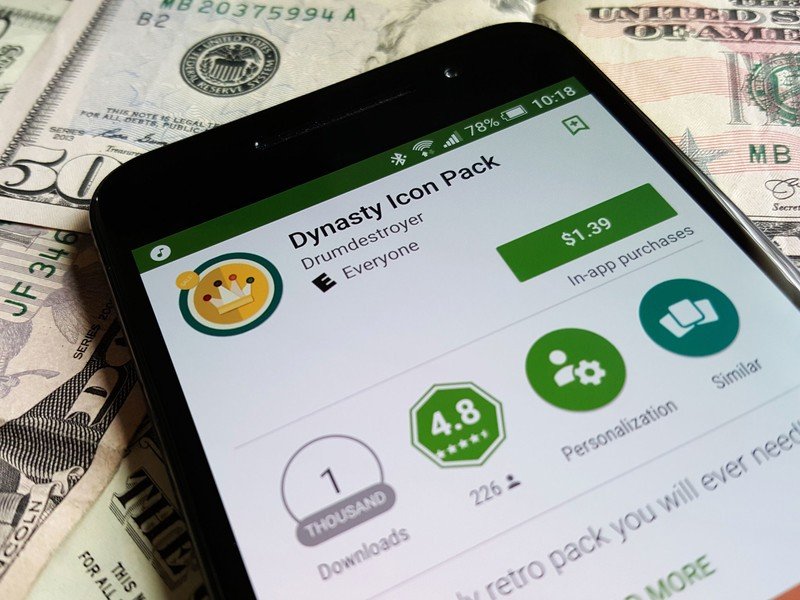
Yeah, free icon packs are great, and considering icon packs are about as luxury an app as it comes, free icon packs will continue to be what the bulk of the market uses. The bulk of the market is wrong. Paid packs are where it's at.
Icon packs are exhausting to develop and maintain. Developers deserve to have that work compensated. If that's in the form of a separate paid pack or a donate button in the app, fine. But if you're turning away from an icon pack because it's three dollars, I'd like to throw something at you. Like some exploding kittens. Paid packs have a tendency to get more long-term support, better quality support, and better quality product. So skip your third Monster of the day and pay for the app. Or just download Google Opinion Rewards and use the rewards to pay for icon packs. That's what I did for a long time before my themes outpaced my surveys.
Do not confuse this for saying all paid icon packs are gems. They are not. There are a lot, a LOT of crap icon packs out there that cost money just like the good ones. But hopefully using the other criteria listed in this article, you can figure out which are which before you give them your money.
Ara Wagoner was a staff writer at Android Central. She themes phones and pokes YouTube Music with a stick. When she's not writing about cases, Chromebooks, or customization, she's wandering around Walt Disney World. If you see her without headphones, RUN. You can follow her on Twitter at @arawagco.
