5 ways Android 11 is better than iOS 14
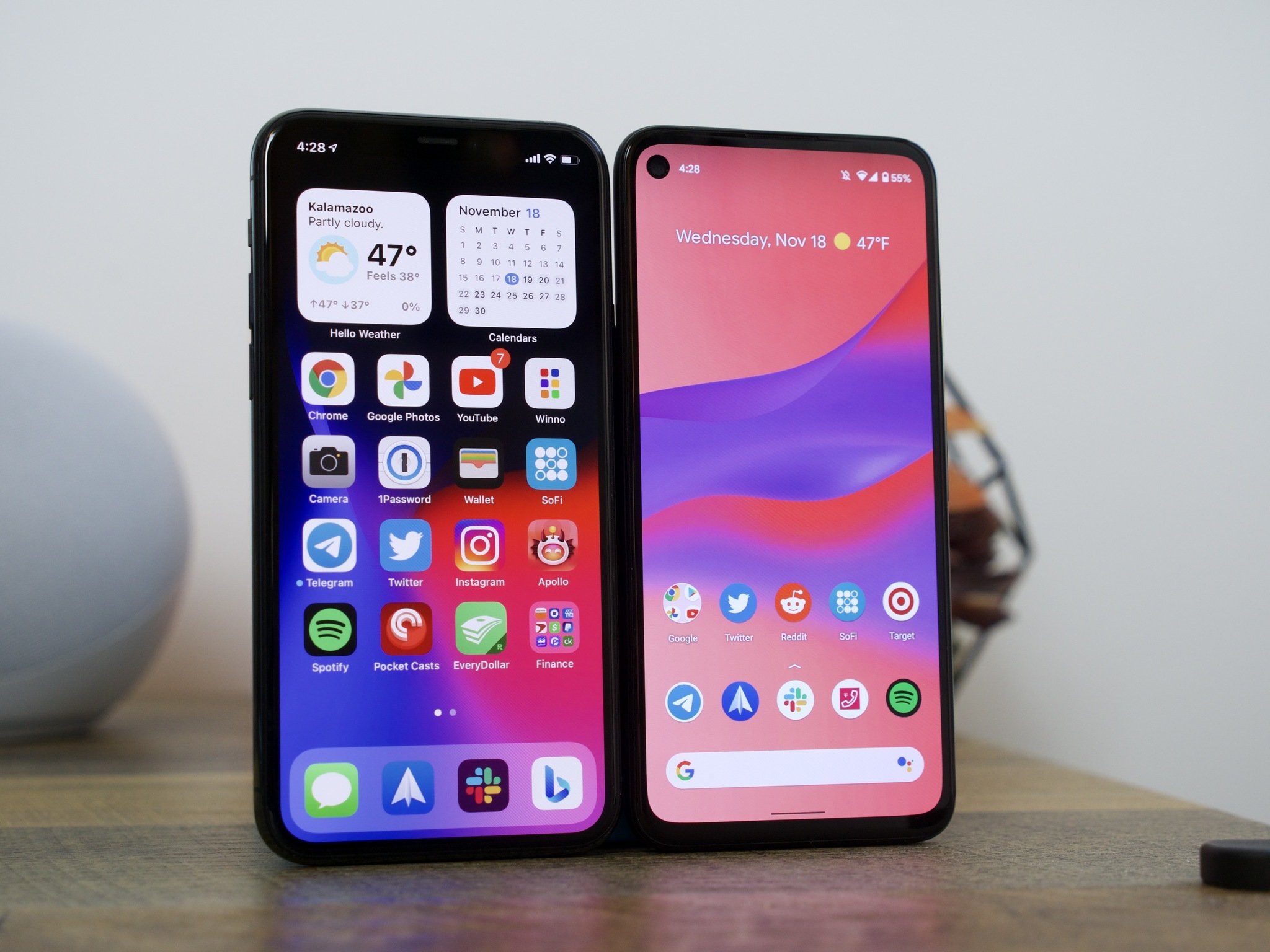
Android vs. iOS is one of the most hotly-contested battles in the entire mobile tech space, and chances are, that won't be changing any time soon. There are some people that absolutely love Android, others that can't use anything but iOS, and that creates a lot of back-and-forth.
We aren't here to definitely say that Android is objectively better than iOS in every single manner, but we do want to take a closer look at the most recent updates with Android 11 and iOS 14. The former offers minor improvements here and there on top of a familiar foundation, whereas the latter introduces a complete makeover that makes iOS more similar to Android than it's ever been before.
iOS 14 is an impressive bit of software that does a lot of things really well, but if you ask us, there are certain things that Android 11 continues to be better at. To explain what we're talking about, here are five reasons why Android 11 is the better operating system compared to iOS 14.
1. Notifications are infinitely better
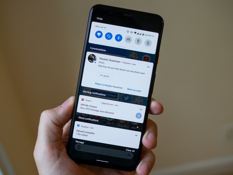
One of the biggest arguments people make in Android's favor is how it handles notifications. Notifications on iOS have been really mediocre for a while now, and with Android 11, Google took an even bigger lead than it already had.
Android 11 breaks up your notification tray into three distinct sections, ranging in priority from Conversations, Notifications, and Silent. Notifications and Silent already existed in Android 10, and with the introduction of Conversations, it's now much easier to see things like texts and Telegram messages compared to everything else that's pinging your phone. Things that are classified as Conversation notifications get pushed to the very top of your notification tray and show the profile picture of the person that messaged you (along with an indicator of which messaging app the message came from).
It's a small change, but as someone that carries two phones daily — one with Android 11 and one with iOS 14 — I always feel like I do a better job of staying on top of notifications with the Android phone. Things are distinctly organized, I can quickly see if there's a new message waiting for me, and I generally feel like I have control over what's going on.
Those aren't things I can say about iOS 14's notification management, which continues to be a jumbled mess all these years later.
Be an expert in 5 minutes
Get the latest news from Android Central, your trusted companion in the world of Android
2. Chat bubbles help organize multiple conversations
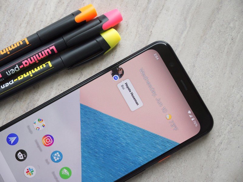
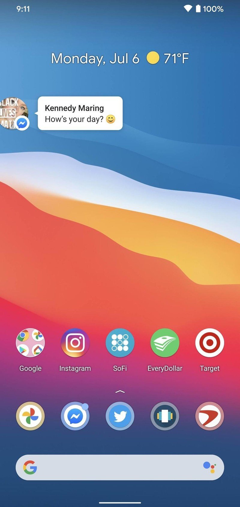
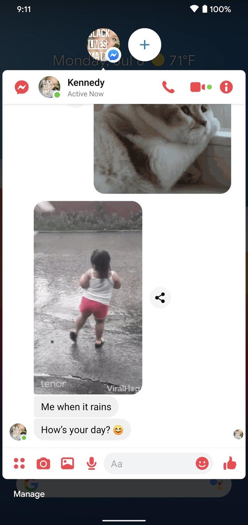
Speaking of conversations, another big addition to Android 11 are chat bubbles. When you're looking at a Conversation notification, there's an icon on the notification that will expand it out of the notification tray and into a floating bubble on your home screen — aka a chat bubble.
Tapping on the chat bubble shows a preview of that ongoing conversation, allowing you to scroll through previous messages, type a new one, etc. Tapping it again minimizes it back to the bubble icon, which can be moved anywhere on either side of your display.

Source: Android Central
Chat bubbles work with a variety of messaging apps, including things like Facebook Messenger, Telegram, Google Messages, and others. You can have multiple conversations from different apps bundled in one chat bubble, making it easy to hop back and forth between conversations no matter where they're taking place.
Chat bubbles can seem a bit gimmicky at first, but if you're someone that does a lot of messaging on your phone, they're a legitimately great way to keep things organized and within reach even if you have a ton of other notifications pouring in throughout the day. iOS 14 doesn't offer anything similar to chat bubbles, and that'll likely be the case for the foreseeable future.
3. Permissions are ultra-powerful
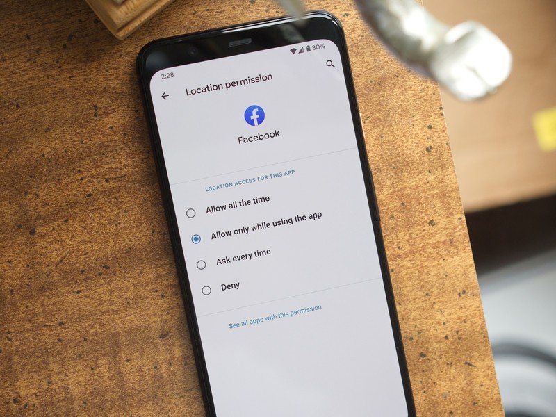
Taking charge of your digital privacy is always something we'll advocate for, and one of the best ways to start doing this is by gaining control of application permissions on your phone. It's far too easy to just allow all permissions when installing a new app, but the fact is that most apps don't need access to everything they ask for.
To its credit, iOS 14 has very good permission controls. You can look at permissions for any app that's installed via your Settings, with there being toggles to quickly enable and disable permissions as you please. When you open a new app that's asking for something like your location, you'll also be asked if you want to allow access just that once or any time you're using the app.
Permissions were a big focus for Google with Android 11, with them seeing a couple of key updates. The first brings Android up to feature parity with iOS, with Android 11 now allowing you to grant location permission to an app only once. Android goes a step further, however, by offering this one-time feature for microphone and camera requests, too.
Something else that's only found in Android 11 is auto-resetting permissions. If you've allowed permissions to an app that hasn't been used in a few months, those permissions will automatically be revoked. You can re-grant them the next time you open the app, but it's a way to ensure forgotten apps don't have access to things they don't need.
4. Smart home controls are just a button-press away
Whether it be light bulbs, your thermostat, or a wall outlet, chances are you have some smart home equipment in your house/apartment. Being able to control your lights while you're on vacation or kick on the heater on your way home from work is incredibly convenient, but juggling a bunch of different apps to do all that is anything but.
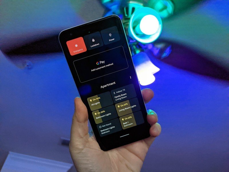
Both Google and Apple have done a good job at bringing all these controls into one central place between the Google Home and Apple Home apps, but Android 11 makes things even better by letting you add your most-used controls right in your power menu.
No matter what you're doing on your phone, holding down the power button will reveal the revamped power menu. You still have the usual power controls, but Android 11 now uses this place to also showcase your preferred card for Google Pay and any smart home controls that you want. Now, turning on the kitchen lights or adjusting the temperature can be done by just holding your power button and tapping the shortcut you've added.
My Google Home app is kind of a cluttered mess thanks to how many things I have connected, so having quick access to my most-used controls this way is so much better. iOS 14 also offers fast access to smart home toggles with the new shortcuts in your quick settings, but that still requires turning on the screen and then swiping down. Being able to press the power button at any time, regardless of whether my phone's screen is on or off, is a much better experience in day-to-day use.
5. Android is still more customizable
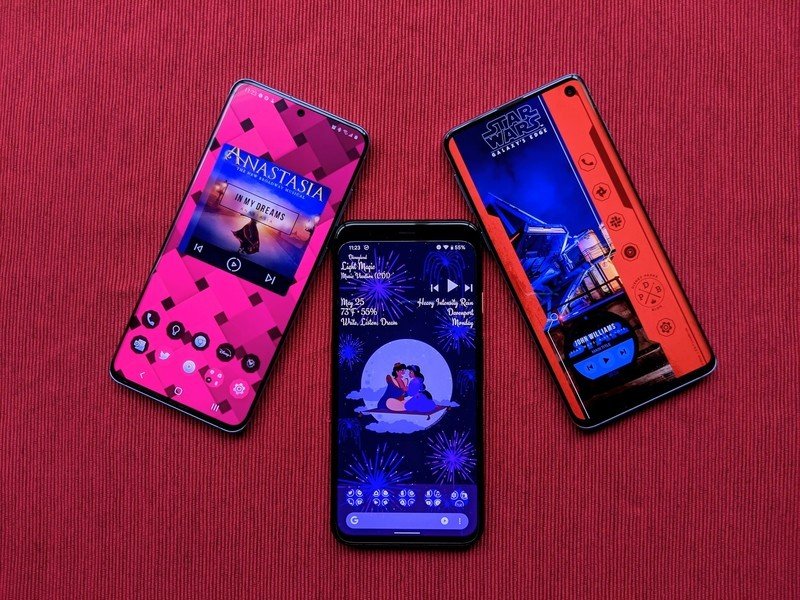
Without a doubt, the highlight feature of iOS 14 is its expanded customization. You can hide home screens you don't want to see, there's an app drawer to view everything installed on your phone, you can set default apps, and we finally have widgets that can be placed on home pages next to app icons. It's one of the biggest changes we've ever seen for how iOS operates, and the execution is pretty darn great.
Apple deserves a lot of credit for everything it changed in this regard, but even with everything that's new, Android 11 continues to offer more customization options — and by a long shot.
Take default apps, for example. iOS 14 now allows you to change your default web browser and email app, but that's it. If you want to change things like your default navigation or camera app, that's not possible right now. Furthermore, if you ever turn off/restart your phone, you'll need to re-enable those default apps as Apple resets everything back to its own stuff. Compared to the default app setup we've had on Android for years, it's a much worse experience.
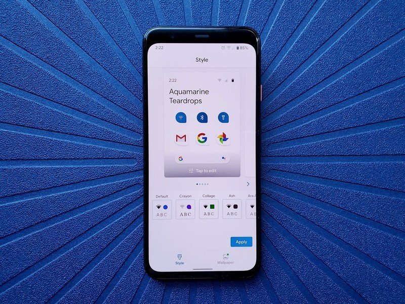
Custom icons are kind of a thing in iOS 14, but it requires you to create a Siri Shortcut for every single app you want to change the icon for. And, since you're creating a Siri Shortcut and not actually changing the app icon, you won't see your custom icon in the app drawer or anywhere in the system outside of the home screen. Compare that to Android 11 or any previous version, where changing an app icon is as easy as installing a custom icon pack and diving into your launcher settings.
On that note, you still can't use a different launcher on iOS 14. You can move your apps around and add widgets, but that's it. Android has seemingly endless third-party launchers that can transform your entire home screen in the blink of an eye, allowing you to really make your phone just the way you like it. No matter if you have the best Android phone or not, everyone on Android gets these expansive customization options.
Which operating system do you prefer?
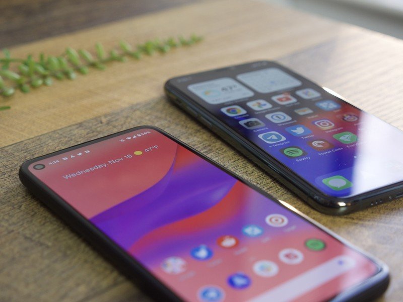
This is a question that'll likely get a lot of heated responses, but we want to know — do you prefer Android 11 or iOS 14? Both platforms bring a lot of good to the table, and we're curious what features from either one you find most useful.
Keep it civil, polite, and we'll see you down in the comments.
Android 11 at its very best
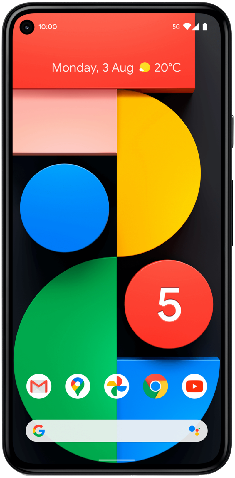
There are a lot of things that we like about the Pixel 5, with one of those being its software experience. The Pixel 5 offers a clean and uncluttered take on Android 11 that's both easy to navigate and incredibly functional thanks to the genius software goodies exclusive to Pixels. The Pixel 5 is also backed by guaranteed updates, meaning you can look forward to Android 12, 13, and 14 as the years go on.
Joe Maring was a Senior Editor for Android Central between 2017 and 2021. You can reach him on Twitter at @JoeMaring1.

