This is how Android Oreo is going to be more user-friendly
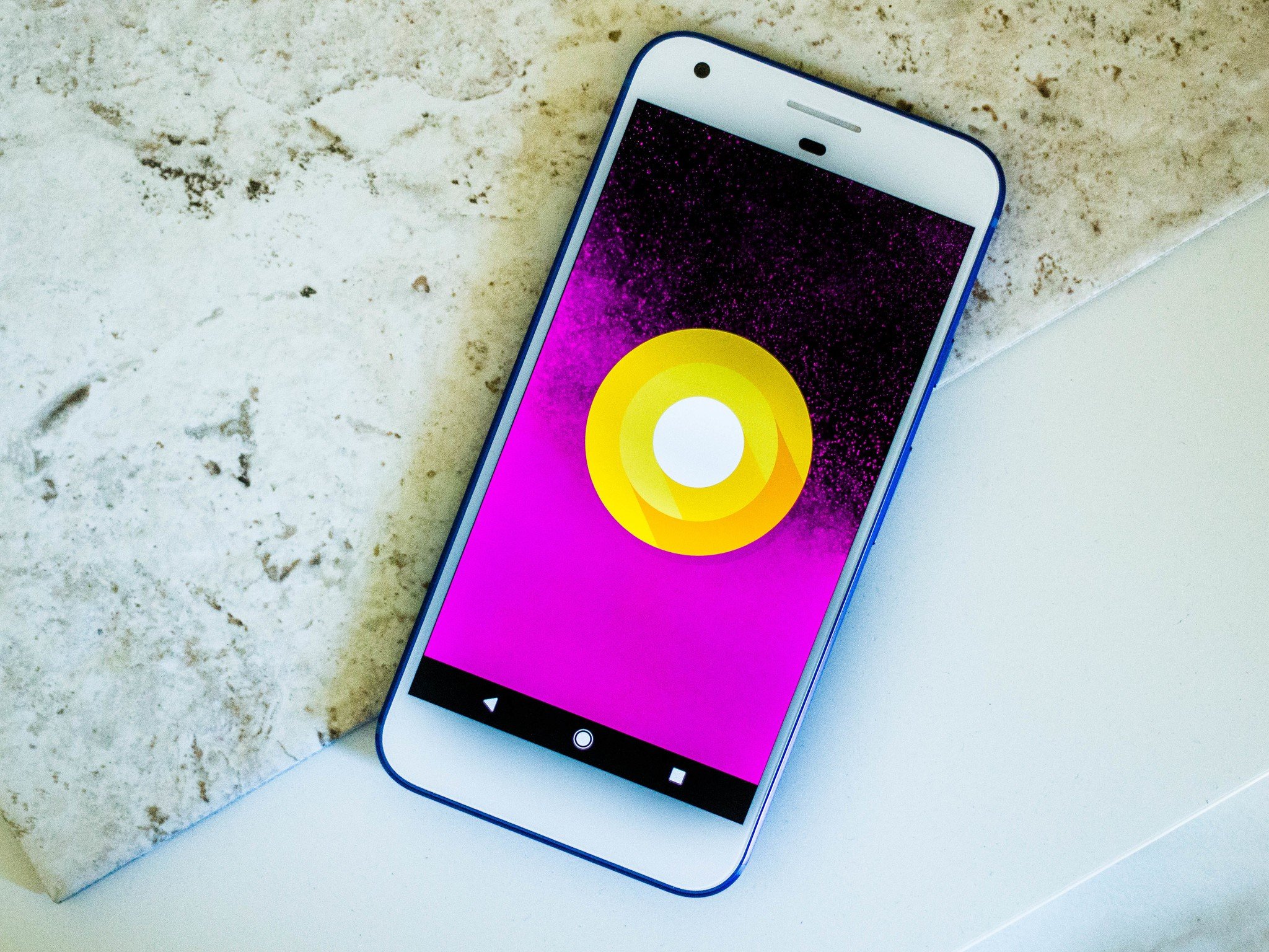
I confess: I've only been living with Android Oreo for a couple of days. I know that plenty of Pixel and Nexus users have already had the opportunity to roll with the new notification dots and bright white notification shade for a while now. They've also had time to get used to Android O's new, horrifically expressive emoji. I'm barely through the first cycle of recovery myself, but am using them despite my apparent state of denial.
Sorry — we're not here to talk about the emoji (I've already talked about that). We're here to speak of the Android Oreo Developer Preview, which recently hit its fourth and penultimate beta stage. I finally downloaded it in an attempt to prepare myself for Android Oreo's imminent arrival, despite its knock on my Pixel XL's battery life. Soon, we'll finally learn what dessert it's named after, and those who upgrade to it will have the pick of a few more user-friendly features compared to its predecessor. Here's a look at some of the new and improved interface elements to look forward to in Android Oreo.
Big and little notifications
I still don't know how to feel about the dynamic notification panel for Spotify. Apparently, this is something that we'll see more of as support sprouts up in the Play Store. The gradients are gentle, and I appreciate the larger playback controls, but sometimes the algorithm that determines the color scheme is completely off.
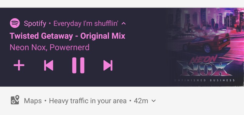
I like the smaller, subdued notification panels, however, particularly for things like traffic reports and minor updates. I don't have as much of an inclination to immediately swipe them out of the way, even when the data becomes outdated. They also look nicer paired with the giant music controls.
Type in your wake-up time
Frankly, I hated the dial method of setting the alarm in the default Android clock app. If I'm tired — or perhaps still a bit full from dinner — the last thing I want to do is attempt to set the alarm at a precise time by dragging my finger across the screen. The old method of setting up an alarm resulted in my waking up at the oddest times — 6:57, 7:14, and 8:23, to recall a few.
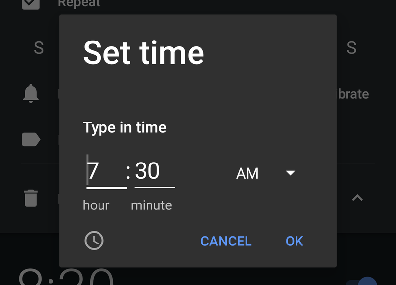
In Android Oreo, there's a little keyboard icon that pops up when you're setting your alarm so that you can be accurate with your time without a finicky dial to set it up. All you have to do is type in the time and select whether it's for AM or PM.
There's also a new alarm indicator in the notifications panel, which you'll see after you swipe down twice. You can tap it to immediately jump to the alarm section of the clock app.
Be an expert in 5 minutes
Get the latest news from Android Central, your trusted companion in the world of Android
Know your volume
I'm so sorry for all the times I brought my smartphone into the yoga studio, and my ringer was still on. Even with Nougat's robust notifications letting me know whether my ringer would go off, I'd often forget to check the nuance of the sound profile.
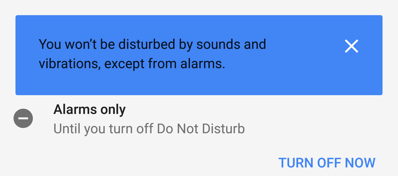
In Android Oreo, when you hit the volume button all the way down, you'll see a bright blue notification alert that notifies you of your volume profile. It's much more apparent than the way Nougat does it!
It's easier to see in the sun
While storming through San Francisco's uncharacteristically sunny streets, I noticed Android Oreo's lighter notification background is easier to see in direct sunlight. The background is a mix of stark white and soft gray with black on top, so there's contrast working in your favor even when there's daylight glare working against you.

I also appreciate the attention to detail in the notification shade, at least concerning how the buttons have been laid out. The settings button isn't as big as it used to be, but it's right there in the first swipe down, as opposed to the two swipes it took in Nougat. Another swipe down lets you edit your Quick Settings and offers immediate access to switch between your account and the guest profile so that you can hand your phone off to your little tyke to use it for playing games and nothing else.
Quietly more informative
My favorite part of Android Oreo is the fact that there are little indicators laid throughout the interface to let you know how things are doing in the background. I mentioned my battery life isn't doing so well — I'm not sure what's causing that the time of writing this, but at least I can see the battery percentage drop in real time in the status bar.
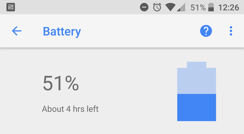
If you swipe or tap into the Settings panel, you'll see other helpful indicators listed throughout, like which settings exist within certain categories, and how much storage and battery life you have left for the day. There's a new Connected devices category, too, which displays what's casting on your network and offers quick access to things like Android Beam and Printing options.
What's your favorite part of Android Oreo?
How's the latest developer preview treating you? Do you have favorite parts of Android O that you're enjoying? Or is there anything from past versions of Android that you miss? I'd love to hear about it in the comments.
Florence Ion was formerly an editor and columnist at Android Central. She writes about Android-powered devices of all types and explores their usefulness in her everyday life. You can follow her on Twitter or watch her Tuesday nights on All About Android.

