5 things I love about the Galaxy S21 — and 1 thing I hate
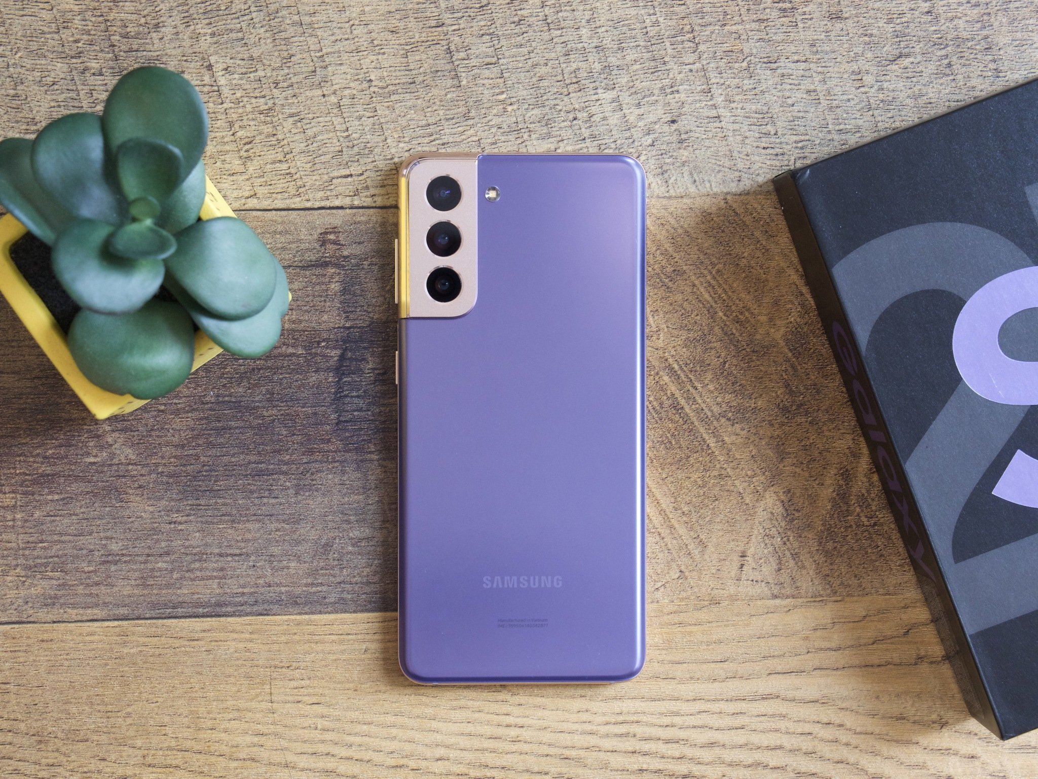
Following the announcement of the Galaxy S21 series, one of the three new phones has had my attention the most — and it isn't the top-of-the-line S21 Ultra. While there's no doubt the Galaxy S21 Ultra is the device to get if you want one of the most powerful Android experiences around, my interest has been drawn to the smaller (and cheaper) baseline S21.
I've been using the regular Galaxy S21 as my daily driver for a little over two weeks, and during that time, it's quickly stuck out as a phone that I don't want to stop using. As someone that missed out on the last few generations of Galaxy S releases, hopping into the S21 has been a treat.
There are a few things, in particular, that have stuck out during my time with the S21. Today, I want to highlight why it's been such a joy to use — and one thing about it that I still haven't warmed up to.
The design of the Galaxy S21 is nearly perfect
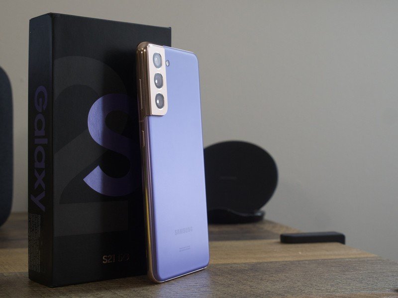
Beauty is in the eye of the beholder, but from both an aesthetics and functional perspective, the design of the Galaxy S21 has been nothing but flawless in my book.
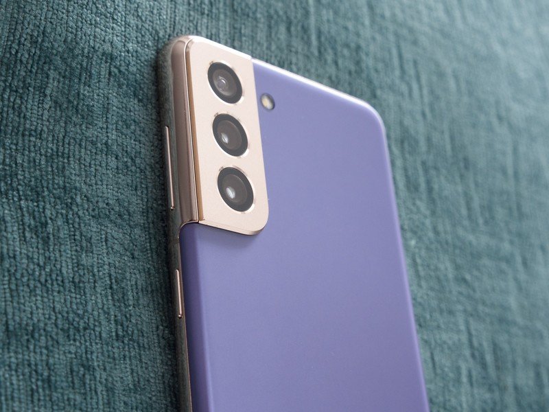
Samsung made a big deal about its contour-cut camera housing on the S21, going as far as to call it the "biggest step forward in design" we've ever seen for the Galaxy S series. I initially thought that was nothing but marketing hyperbole, but after actually living with the hardware, I kinda have to agree with them.
By moving the camera hump all the way to the edge and building it into the frame of the S21, the overall design looks so much more seamless and complete than any other modern smartphone I've used. Not to mention, the Phantom Violet colorway with its gold accents is downright stunning.
Another design choice I've been really happy with is Samsung's decision to use plastic for the back of the S21. Some people argue that it makes the phone feel less premium than its S21+ and S21 Ultra siblings, but the reduced heft makes using the Galaxy S21 so much more comfortable in daily use. Add that together with a thin design and an excellent display (more on that below), and the Galaxy S21 ends up being one of the more practical phones I've used in a while.
Be an expert in 5 minutes
Get the latest news from Android Central, your trusted companion in the world of Android
The Galaxy S21 has a beautiful and functional display
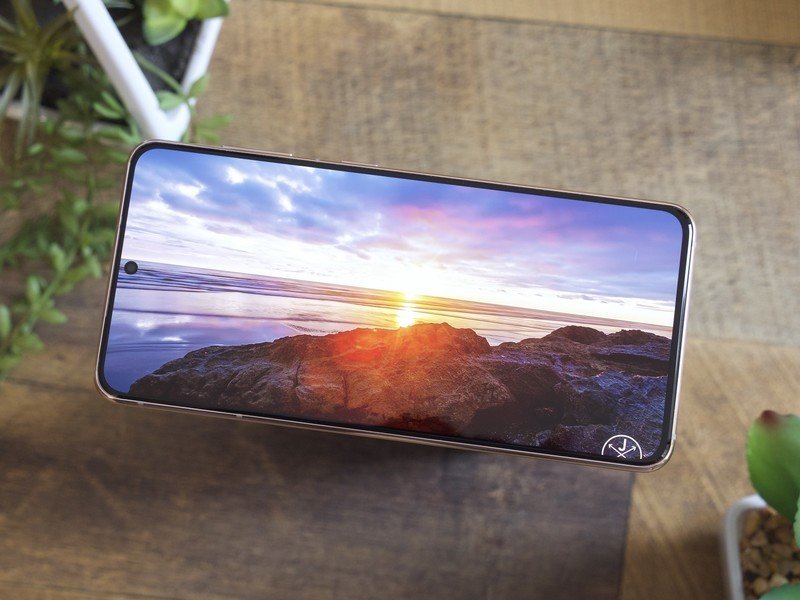
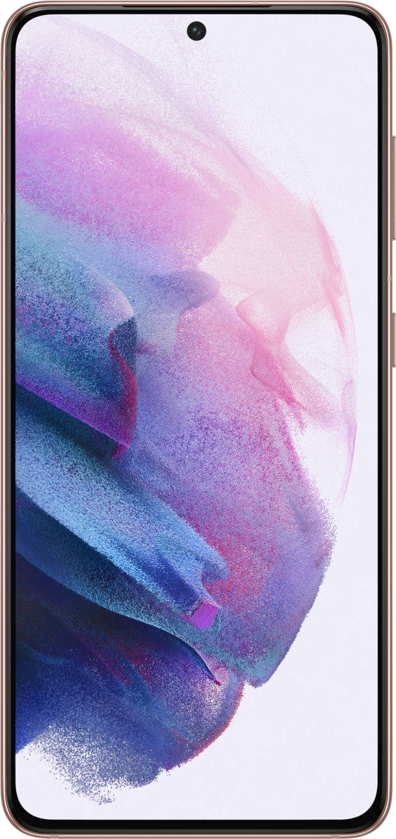
In addition to the contour-cut camera being a big change for the Galaxy S family, another notable shift in design has to do with the display. Samsung's been a huge proponent of curved smartphone displays for the past few years, but with the regular S21, we have a completely flat screen.
From the size to refresh rate, this is an incredible display.
On top of that, the size of this display has also struck a really fantastic balance of being small enough for comfortable use and large enough for ample content consumption. 6.2-inches isn't exactly tiny, but thanks to incredibly tight bezels and the thin/lightweight design, it's never felt intimidating the way something like the Galaxy S21 Ultra does.
And, since this is a Samsung phone, the display itself is nothing short of amazing. The Dynamic AMOLED panel showcases rich and vibrant colors, the 120Hz refresh rate allows everything to be buttery smooth, and the 2400 x 1080 Full HD+ resolution is perfect for a screen of this size. I've heard the complaints about this not being a 3200 x 1440 Quad HD+ panel, but at 421 ppi, I've never found myself yearning for more pixels.
In other words, the Galaxy S21 has everything I want to see on a smartphone display. It's gorgeous to look at, has a super-fast refresh rate, and comes in at a size that can be comfortably used my smaller hands.
The Galaxy S21 offers a versatile camera system
With just about every handset offering ample performance, quality displays, and reliable battery life, the camera has quickly become one of the most defining traits for a new smartphone. In the case of the Galaxy S21, I've been pleasantly surprised with what Samsung brought to the table.
On paper, the Galaxy S21's camera package isn't all that different from what we saw last year with the S20. There's a 12MP primary camera, 12MP ultra-wide, and 64MP telephoto with 3x optical zoom — a pretty typical affair as far as 2021 phones are concerned. But after using the S21 as my go-to camera for the past couple of weeks, I've thoroughly enjoyed my experience.
Coming to the S21 from my Pixel 4a, simply having the option to shoot with ultra-wide and telephoto sensors has been a big upgrade for me. And in my testing so far, the secondary cameras aren't that much worse compared to the primary shooter.


The best way I can describe the Galaxy S21's camera is that it's incredibly consistent. There's lots of detail, vivid colors, and even some natural bokeh in certain shots. It's also one of those phones that handles itself just fine regardless of the lighting condition you're in, which is always a nice touch.
Yes, there are better options out there if you want the very best Android camera experience in 2021, but as a camera system that offers ample flexibility, ease-of-use, and consistent results — the Galaxy S21 has fit the bill perfectly.
The Galaxy S21's fingerprint sensor is massively improved
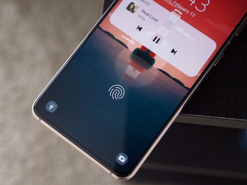
Fingerprint sensors aren't one of those features we think too much about in 2021, because for the most part, they're at a stage where they just work — that is, unless you've used a Samsung phone within the last couple of years. Samsung's been using in-screen ultrasonic fingerprint sensors on its last few generations of Galaxy phones, and thanks to slow/inaccurate performance, they've always been a headache.
Thankfully, that finally changed with the Galaxy S21. Samsung used the S21 to introduce a new generation of its ultrasonic sensor, touting a larger and faster sensor compared to previous devices. And you know what? It finally delivers.
In-screen fingerprint sensors have never been my preferred manner of biometric authentication, but for the first time on a Samsung phone, I can use it without constant annoyance. It's fast, consistent, and no longer something that's putting a damper on the rest of the user experience. There's not much else to say, except for the fact that I'm really, really glad Samsung finally got around to addressing this.
You can get the Galaxy S21 basically for free
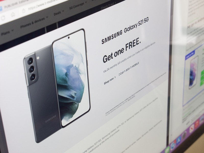
One of the biggest surprises of the Galaxy S21 is its price. Samsung shaved $200 off the MSRP compared to last year's S20, meaning the S21 will only set you back $800. That kind of year-over-year discount is impressive enough on its own, but where things get even better is when you factor in all of the ongoing S21 promotions currently available for the phone.
Take Samsung's website, for example. You can get a $700 instant credit when trading-in an eligible phone, along with up to $100 in credits to spend on accessories for it. T-Mobile has been offering an even better deal, allowing new and existing customers to trade-in a phone and get up to $800 in credits — effectively making the S21 free. For this particular promotion, trading in a phone like the $350 Pixel 4a or three-year-old Galaxy S9 still makes you eligible for the full $800 credit. It's nothing short of insanity.
That T-Mobile deal is how I was able to get my Galaxy S21, and taking a look at other carriers and retailers, you'll find similar offers that make owning the S21 a lot easier than you may initially think. Discounts and promotions aren't exactly new in Samsung's book, but with the Galaxy S21, the company went all-out like never before.
What's not so great? I'm still not sold on One UI
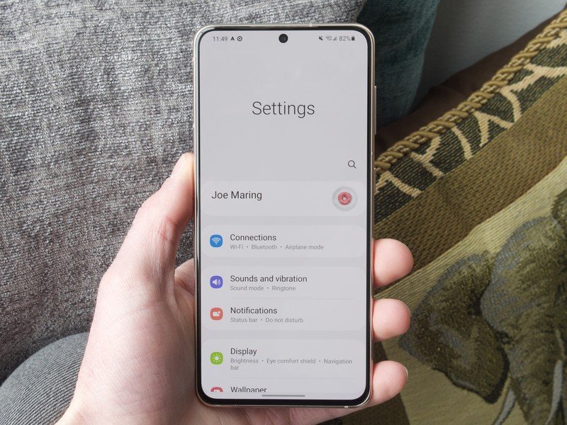
While my time with the Galaxy S21 has been mostly positive, there's one aspect that I still find myself struggling with. Yes, it's One UI.
My preferred Android interface is the stock/Pixel setup, and obviously, that's not at all what One UI is. I've disabled/deleted as many of Samsung's first-party apps that I can and have replaced the home screen launcher with Lawnchair, but even with those tweaks made, there are still things about One UI that I can't escape.
Even in its third iteration, One UI still has some unavoidable funk.
First thing's first, there are the ads. In certain Samsung applications and with invasive push notifications, One UI is a piece of software that's constantly pushing advertisements at you. It's not something you should ever have to deal with on any phone, and the worst part is that there's no way to completely stop these from showing up.
I also don't understand some of the changes Samsung made to Android 11. Android 11's smart home controls are still here — but you don't access them by holding down the power button. Instead, you have to swipe down to view your Quick Settings and then tap the Devices toggle. There's also no shortcut for your debit/credit cards in Google Pay, with Samsung still only offering its Samsung Pay shortcut on the home and lock screen.
Then there are the aesthetics of One UI, which personally, I'm just not the biggest fan of. From the gaussian blur in the notification panel to the overly-complicated Settings layout, certain aspects of One UI still feel bloated in a way I don't necessarily like. I'm gradually learning to live with Samsung's software and finding ways to adapt to it, but it's certainly a relationship of compromise.
My go-to Android phone for 2021 — so far
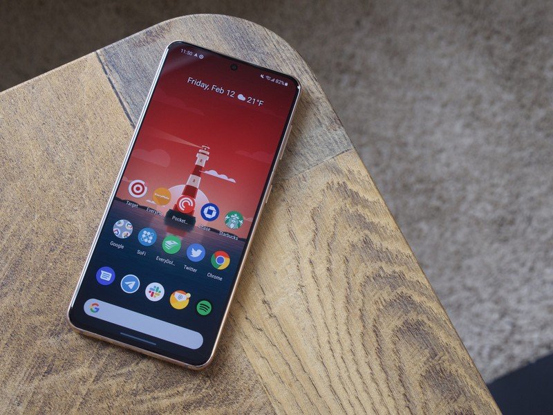
The year is still quite young, but at least for right now, the Galaxy S21 is going to remain as my go-to handset for the forseeable future. It's a device that works incredibly well for my workflow, and now having used it for a couple of weeks, it's easy to see why it's on our list of the best Android phones you can currently buy.
Even with my gripes around One UI, the rest of the S21 experience is too good to overlook.
Joe Maring was a Senior Editor for Android Central between 2017 and 2021. You can reach him on Twitter at @JoeMaring1.
