2016 Nexus phones may feature a significantly redesigned launcher

It looks like Google is set to radically alter the look and feel of the launcher on this year's Nexus phones. The updated launcher was obtained by Android Police, giving us a look at some of the key changes.
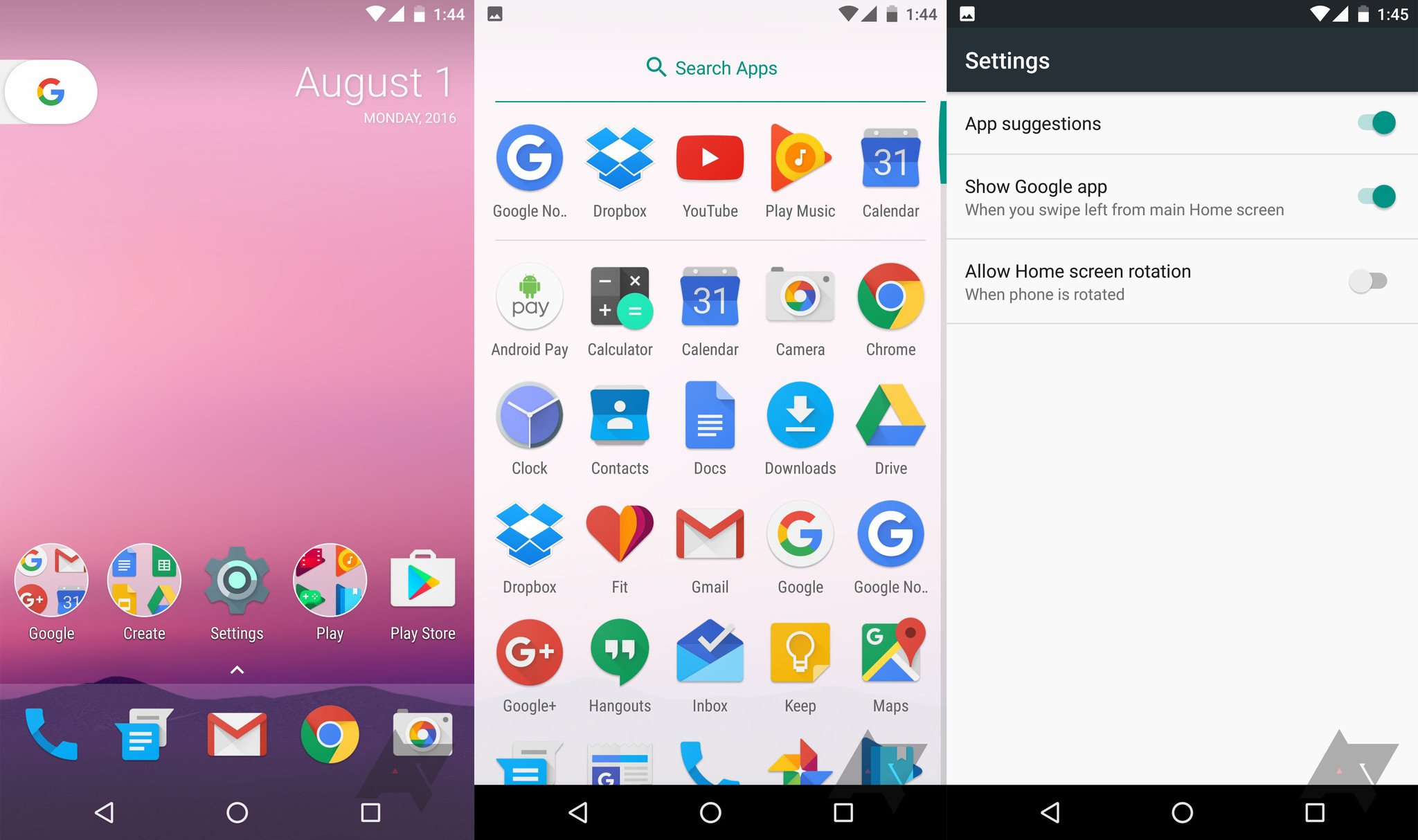
A notable difference is the lack of an app drawer icon. To access the app drawer, you'll have to swipe up from the bottom of the screen, or tap the arrow located above the bottom row of the home screen. You can close the app drawer by swiping down anywhere on the screen, or hitting the back button.
Another key change is the lack of a Search widget on the home screen, with a calendar widget taking up its place. There is a G button next to the widget that you can tap to start searching. The changes are likely to integrate Google Assistant into the launcher, and the screenshots suggest that the redesign is a work in progress. There's no mention if the launcher will be available widely, but it looks like will be offered initially on this year's Nexuses.
What do you guys make of the changes?
Be an expert in 5 minutes
Get the latest news from Android Central, your trusted companion in the world of Android

Harish Jonnalagadda is Android Central's Senior Editor overseeing mobile coverage. In his current role, he leads the site's coverage of Chinese phone brands, networking products, and AV gear. He has been testing phones for over a decade, and has extensive experience in mobile hardware and the global semiconductor industry. Contact him on Twitter at @chunkynerd.
