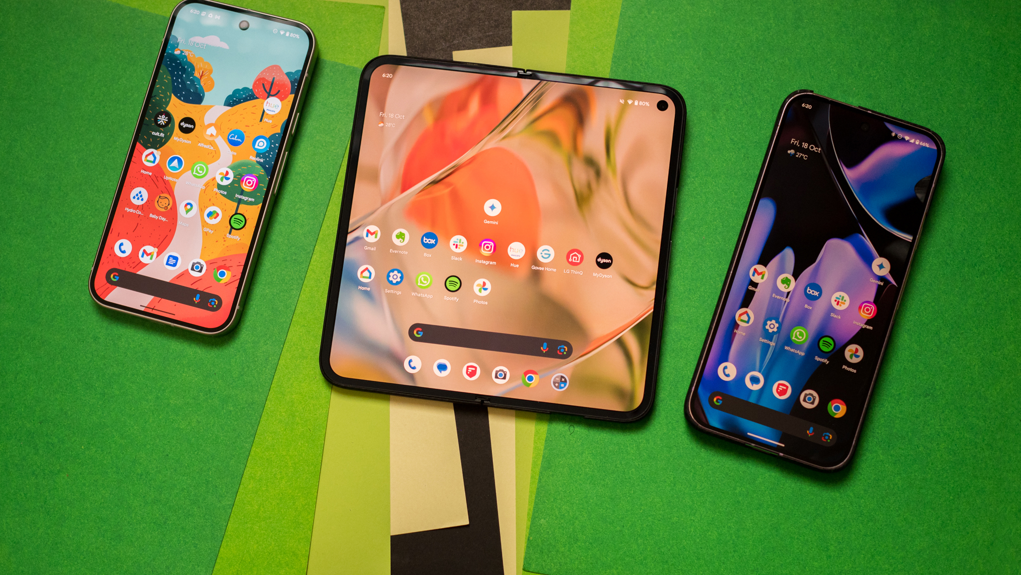
What's new in Android 3.0 Honeycomb
We got our first real taste of Android 3.0 -- "Honeycomb" -- on the Motorola Xoom tablet during CES in early January. It's a pretty big leap from the Android we know and love today, to be sure. But most of what we saw were demonstrations, video of what Honeycomb can and will do.
But today Google released a preview of the Android 3.0 software development kit -- the tools developers need to make applications. Along with the updated SDK, Google's compiled an excellent highlights package. Join us after the break where we'll walk you through the some of the major changes, and what we can expect in the coming year.
Ed. Note: Remember that this is based off a preview of Android 3.0, and things are very likely to change. We'll update when warranted.
Designed for tablets, or at least larger screens
There's been a little back and forth about this, but make no mistake -- Honeycomb is intended for Android tablets. One look at the user interface (UI), and that's plenty apparent. But it's also going to make its way onto smartphones. Matias Duarte -- the UI guru behind webOS who later left for Google -- said as much during a recent interview.
And Google makes no bones about it in the first sentence of the highlights (emphasis ours):
Android 3.0 is a new version of the Android platform that is specifically optimized for devices with larger screen sizes, particularly tablets.
Does that mean your lowly 3.5- or even 4-inch phone won't be getting Honeycomb? Look at it this way: Anything you're holding in your hand as you read this (save for a Nexus S) is waiting on an upgrade to Android 2.3 Gingerbread -- and a good number of us are still waiting on Froyo for our phones.
Point is, when it comes to smartphones "with larger screen sizes," we're not expecting Honeycomb upgrades anytime soon, except maybe for the Nexus S. New hardware later this year is a whole 'nother matter, though.
Be an expert in 5 minutes
Get the latest news from Android Central, your trusted companion in the world of Android
A brand-new user interface
Holographic UI
Again, hardly a surprise, as we've seen it on the Xoom. It's being referred to as a "holographic" UI. And indeed there's very much a three-dimensional effect going on. (This is going to look way cool once 3D screens become practical.)
Home screens
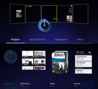
Fear not, multiple home screens haven't gone anywhere. You still have five of them on which to place app icons, shortcuts and widgets. You'll be customizing everything through a "dedicated visual layout mode."
The System Bar

Somewhere, someone at Microsoft is going to go a little nuts over this. But Honeycomb has a "System Bar" that's docked at the bottom of the screen. With it you'll have your notifications (moved from the top of Android 2.3 and previous), system status, a clock and soft navigation buttons.
The Action Bar

When you're running an app -- say, like gmail -- you'll have an "Action Bar" at the top of the screen. That's another UI element that's very much in line with what you'll find on a desktop computer program -- or Windows Mobile, for those who can stand to think of it.
Multitasking and recent applications
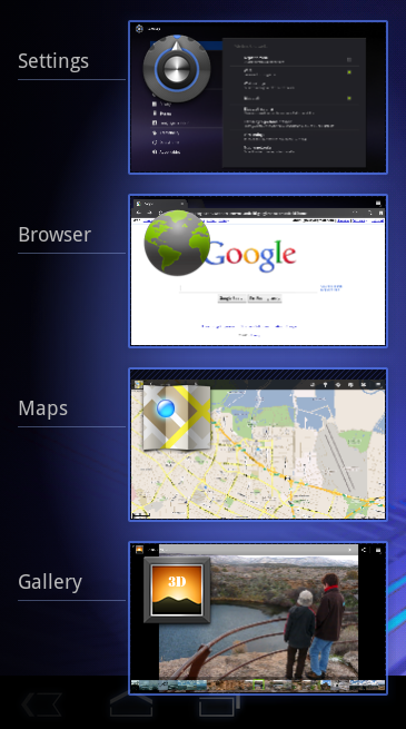
Hey, multitasking isn't going anywhere. And we're getting a new way to switch from one app to another. There will be a "Recent Apps" list tucked into the System Bar. The list will show you a thumbnail of the app -- in the state that you last left the app.
Yes. This sounds very much like desktop computing to us, too.
A new keyboard
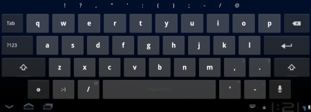
Makes sense. As anyone who's used the Samsung Galaxy Tab or some other Android tablet can attest, simply scaling up a current keyboard doesn't really get the job done.
Third-party keyboards are coming, too, as we know Swiftkey already has one in the works.
Revamped cut/copy/paste

This looks a lot like what we've got in Gingerbread, actually. Though going by a screen shot hardly will do it justice. After you've selected text, you can choose an action from the (you guessed it) Action Bar.
New Google apps
We're getting reworked "standard apps" (often called Google apps or Gapps) in Honeycomb.
Web browser
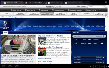
The browser switches to tabbed browsing instead of windows. There's also an "incognito" mode (borrowing from Chrome). You can automatically sign into Google sites, and sync bookmarks with Google Chrome on your desktop.
Multitouch support has been enabled for JavaScript and other plugins. That means a plugin -- say Adobe Flash -- can now detect more than one finger on the screen. Snazzy. There also are improvements for when you're viewing a non-mobile site.
Camera and photo gallery
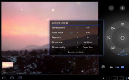
The camera app has been redesigned for larger screen sizes. You get quicker access to settings such as zoom, focus, flash, exposure, etc. Frankly, those are improvements that we should have in Android 2.2. Let's hope that gets ported over post haste.
Contacts

A big change from Android 2.x to Honeycomb is the use of multiple panes on a single screen. Whereas you'd see a contact list, choose a contact and then have that contact fill the entire phone screen, it'll now do so on multiple panes. (Google's also called these "fragments.")
E-mail/gmail
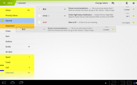
The stock e-mail app is getting quite the makeover. And we presume the gmail app (which you see here) gets it, too. Like contacts, it'll take advantage of the dual-pane UI. You'll also be able to select multiple messages and act on them, tell attachments to sync at a later time, or use an e-mail widget.
And -- this is our favorite -- you'll be able to drag and drop items, like you see in the image above. That's new in the Android 3.0 framework and can be used in various apps.
Other improvements
High-performance graphics
What's on the screen is just as important as the technology driving it. And in Android 3.0, the graphics get a major boost. Open GL hardware acceleration has arrived for 2D graphics. And for 3D graphics, there's a special renderscript that serves as an API for 3D scenes, as well as a universal shader language. That's nerdspeak for "It'll look good and be fast."
Multicore processor support
This is a big one, as dual-core processors have finally arrived. But, strangely enough, Android hasn't had true support for them until Honeycomb. And Google says that applications that are only written to take advantage of one core still can benefit from the change.
Bigger and better widgets
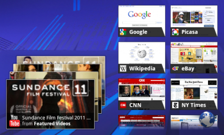
Widgets are getting bigger and better. You can flip through 3D stacks, have grids or lists. You can also interact with widgets in new ways, including scrolling and flipping the items within a widget.
Multimedia and connectivity
Nerdy, but important. There's new HTTP live streaming, meaning you can feed Android an M3U playlist URL and it'll know what to do with it. Most important, it means you'll possibly be able to watch Apple keynotes now. :p
There's also a new DRM -- digital rights management -- framework. That's the thing you hear about when the record labels and other publishers accuse you of stealing their work.
There also are new stereo Bluetooth profiles, so apps will be able to better interact with your accessories.
New enterprise support
This has been a big headache for a lot of you, we know. We'll just crip from Google here and tell you that "developers of device administration applications can support new types of policies, including policies for encrypted storage, password expiration, password history, and password complex characters required."
Older phones, and older apps
The good news: Android 3.0 is fully compatible with current Android applications. That's not to say you won't see updates for Honeycomb, but your favorite app should at least be functional even if the dev doesn't touch it.
But like we said at the outset: We'd be real surprised at this point if anything but the most recently announced smartphone gets updated to Honeycomb. In fact, we'd go so far to say that a dual-core developer phone might not be out of the question in the next six months. (Boy, we've got our fingers crossed for that.)
More's in store
So those are the broad strokes of Android 3.0. The APIs could still change. Features may be added or removed. We'll updated this post as necessary. But in the meantime, sit back, relax, and enjoy the preview Google gave us at the beginning of January.
&

