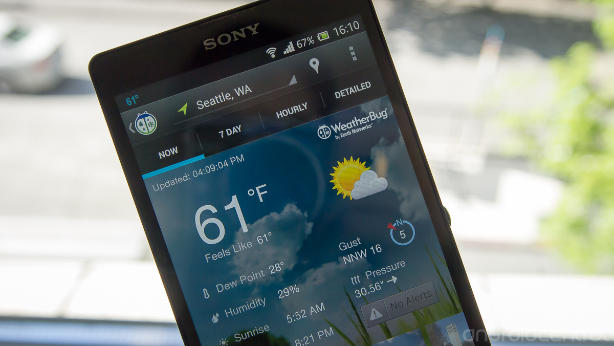
WeatherBug refreshes user interface in latest update

Improved navigation, live updating and photos section all included
The popular WeatherBug app has just undergone quite a redesign in the Play Store today, bringing in a completely new interface. The overall experience better follows current Android design guidelines, with a tabbed interface that makes it easy to get between current weather, forecasts and detailed information with just a swipe. Further functions and navigation are handled behind a slide-in panel from the right, and the overflow bar at the top takes care of the rest.
On the content side there are "tiles" in the interface that stay up to date with the latest data, a new photos area where you can view shots of the area and different background themes for the whole app. It's a big visual refresh that certainly looks nice to our eyes, and drastically improves usability of the whole app. You can take a look at the free version of WeatherBug from the Play Store link above, or grab the paid version right here as well.
Be an expert in 5 minutes
Get the latest news from Android Central, your trusted companion in the world of Android
Andrew was an Executive Editor, U.S. at Android Central between 2012 and 2020.
