Sony Xperia ZL review
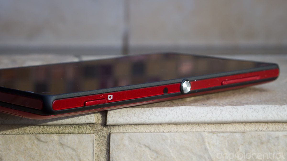
When we first laid eyes on the Xperia ZL at CES 2013, it may not have gotten the attention that it deserved. As the svelte, glass-backed and waterproof Xperia Z was stealing all of the camera time at the Sony booth, tables full of Xperia ZL devices sat unused. While the plastic exterior may not be as striking as the Z at first glance, the ZL is nearly identical in every other way -- a far cry from the "mid-range device" some purported it to be. Sure you don't get waterproofing or a glass back panel, but you do get the same specs, camera and a much easier to hold curved plastic shell in it's place. It's hardly a compromised device.
In a way, the Xperia ZL (and Z) are the first examples of a refocused and reinvigorated Sony, one that wants to release devices with a modern OS, this year's specs, and compete with other manufacturers on the highest level. On paper, there isn't a whole lot to complain about here. But in a time where we're seeing some seriously high-end devices just make their way onto the market, can Sony's effort from January of this year still stand up against the rest? Let's find out in our full Xperia ZL review.
Pros
- Even with a 5-inch display, the Xperia ZL is no harder to use in one hand than smaller devices thanks to very small bezels and on-screen navigation buttons. The camera produces very high quality photos, does great with automatic settings, and a dual detent hardware shutter key is a nice treat. The software will feel very familiar to anyone who has used stock Jelly Bean, and is likely the least offensive of the OEM customizations out there today. The ZL also has enough supported radio frequencies to give you HSPA+ and LTE on just about any carrier in the world.
Cons
- While the display looks great when using the device, it has very poor viewing angles even slightly off-axis. Even though it isn't a carrier device, Sony loads up the ZL with almost two dozen pre-installed apps, most of which aren't very useful. The camera takes great photos, but the camera software isn't always the most intuitive to use.
The Bottom Line
Aside from a few minor gripes, Sony has put together a great device with the Xperia ZL. The phone looks great and feels good in the hand even with the large display. If you're in the U.S. and have the money to spend on an unlocked device (the ZL runs $629 direct from Sony), you'll be rewarded with a phone that's top of the line in design, specs and software. Best of all this may be one of the few unlocked phones this year that supports both AT&T and T-Mobile fully on LTE and HSPA+ 42.
| HardwareSoftwareCamerasBottom line | Sony Xperia ZL ForumsSony Xperia ZL device info |
Xperia ZL hardware
Sony went all the way on making sure the Xperia ZL had every high-end spec available to it when the phone was announced. Making this phone tick is a Snapdragon S4 Pro (APQ8064) processor clocked at 1.5GHz, backed up by 2GB of RAM and 16GB of internal storage (which is expandable by up to 64GB with a microSD card). Save for a step up to a Snapdragon 600 processor -- found in the HTC One and Galaxy S4 -- there's not much more you could expect Sony to have here, and given the time of the ZL's announcement back in January that chip just wasn't ready to go yet.
Get the latest news from Android Central, your trusted companion in the world of Android
On the front of the device you'll find a pleasantly pixel-dense 5-inch 1080x1920 display, and around back you'll see the camera pod holding a 13MP camera. As usual, we'll get into more details about these a bit farther down in the review.
Build Quality
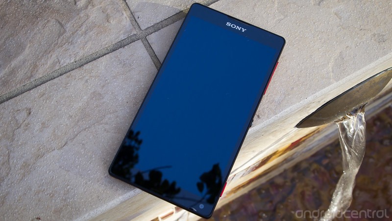
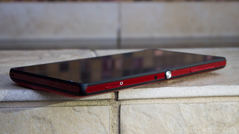
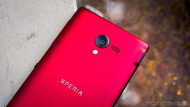
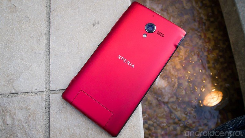
Sony may have thrown much of its cutting-edge design power behind the Xperia Z, but the ZL is no ugly sibling by any stretch. The "Sony Style" design is alive and well here, and while that design language has proven to be a bit polarizing over the years, I think they've knocked it out of the park here. The mix of a solid sheet of glass for the screen surrounded by accenting flat black and glossy red plastic inserts (white and black versions are also available), along with then a matte red plastic back plate is very appealing. You'll certainly get a few looks -- in a good way -- when pulling this phone out of your pocket.
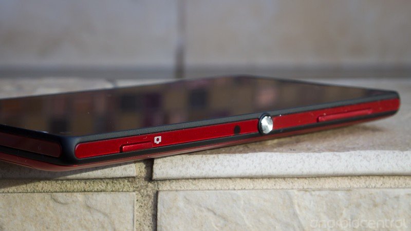
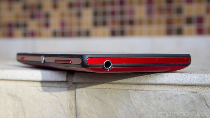
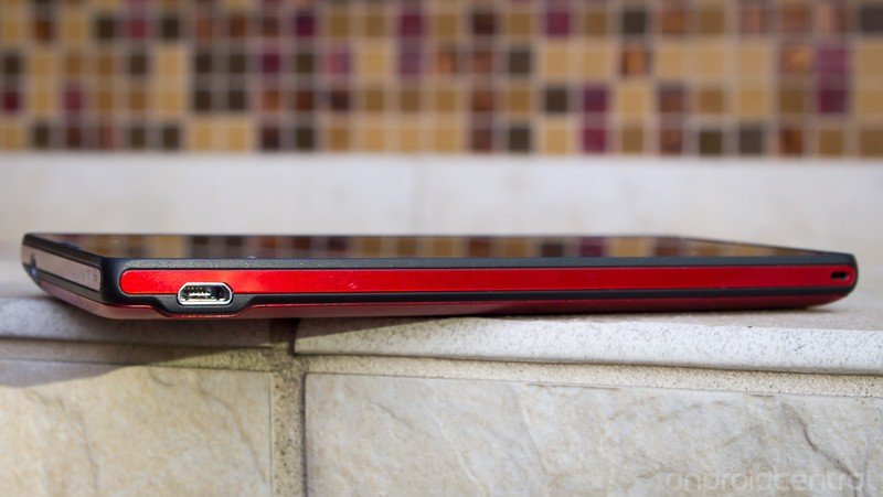
The most "Sony" of all the physical features on the Xperia ZL may be the circular metal power button, which protrudes authoritatively dead center on the right side of the device. While it takes a bit to get used to having a power button that low down the side of the device, I found it to be very easy to hit no matter how I picked up the phone. Above the power button you'll find a volume rocker, which is narrow compared to the power button but still easy to hit. The left side of the device is clean save for a micro USB port at the very top and an entry hole at the bottom for a lanyard loop. The top edge has just a 3.5mm headphone jack, and on the bottom you'll find the other side of that lanyard loop hole.
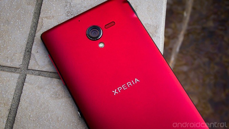
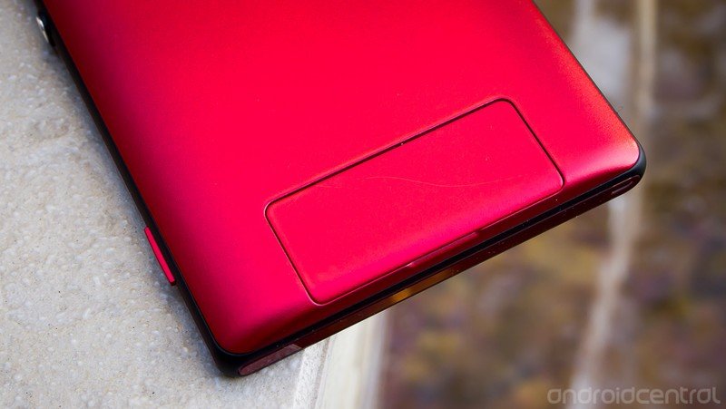
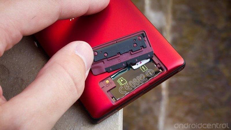
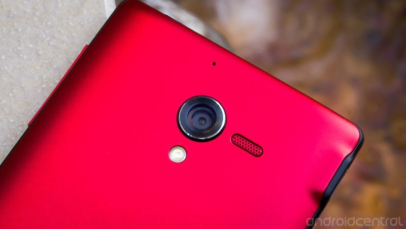
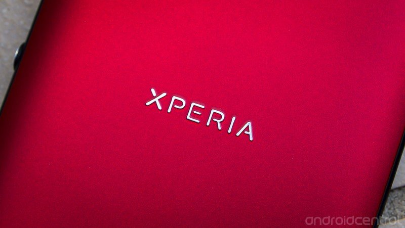
The back of the Xperia ZL, while still red (or white, or black) is a different texture from the inserts on the side of the phone, which almost makes it seem like a different color. The inserts have a glossy coating over them that dull down some of the texture inherent to the color being used, which is much easier to see on the back. This isn't just a solid red, it looks as though it has small specs of grey and black in it. It's hard to explain, but it still looks nice to our eyes. That back plate houses a 13MP camera pod (which sticks up noticeably from the back) and LED flash at the top, flanked by a small speaker to the right and mic above. Down at the bottom there's a partially removable flap that houses your Micro SIM and microSD card slots. The flap fits pretty well into the spot with a satisfying click, but it unceremoniously breaks up what would otherwise be a very nicely designed back plate.
Ergonomically, the Xperia ZL was much easier to use in one hand than I would have expected given the 5-inch screen size. The bezels around all sides of the screen are kept to a minimum, even on the bottom edge thanks to on-screen navigation buttons. The end result is a device that is 7.5mm shorter than the Xperia Z, and about 1mm narrower as well. It is even 2mm shorter than the Nexus 4, which only has a 4.7-inch display. The difference is of course made up in thickness -- the ZL clocks in at 9.8mm -- and while it isn't the thinnest phone ever, the curved back makes it easy to hold. That's in stark contrast to the angular and ergonomically-challenged Xperia Z.
Display
Around the front, the Xperia ZL packs Sony's latest display technologies. We're looking at a 5-inch 1080x1920 TFT display (that's 441 ppi), along with "Mobile Bravia Engine 2" which is software that is supposed to help enhance quality of photos and videos. The display is insanely high density, and looks great in terms of clarity and color representation, as most LCDs do. Outdoor visibility is pretty good with the screen brightness cranked to 100-percent, but it isn't necessarily any better than other modern displays out there. I kept the phone at about 70-percent brightness most of the time and things looked fine both indoors and out, except for direct sunlight.
Unfortunately, things deteriorate quite quickly when viewing the ZL's display off-angle. The entire display washes out considerably when the phone is tilted at any angle other than directly (and we mean directly) at your eyes. For example when sitting at my desk on my laptop, with the phone directly to the right of the computer, the entire screen looks as though it has a milky white hue to it. While you may not be using your phone off-axis very often, it is a little annoying when you want to just glance at the phone on the table or show something to a friend next to you and one (or both) people will get a sub-par viewing experience.
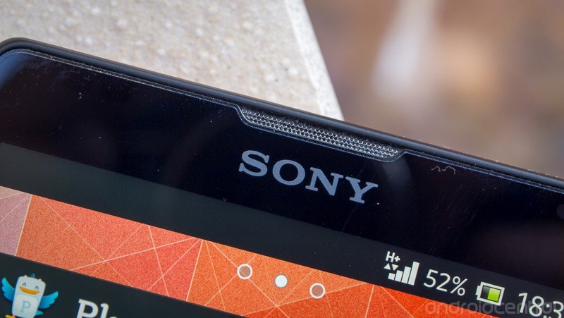
Another quick grievance with the display isn't the panel itself, but rather what's on top of it. As is the case with just about all Sony devices, the Xperia ZL ships with a screen protector pre-applied to the screen. This isn't your regular peel-off-and-go protector though -- it actually isn't designed to be removed by the end user. Unfortunately no one told me that (nor did the phone, quick start guide or user manual), and my OCD tendencies immediately had my thumb nail picking at the corner of the protector to remove it. It wasn't that difficult to have a corner lift up, but you quickly realize this isn't your standard factory protector when it won't peel up further. The protector is applied perfectly, but still doesn't feel like glass, collects extra lint and dirt around the edge of the screen, and overall just looks cheap. We would greatly prefer the screen protector included in the box and not pre-applied.
So a quick PSA for Sony newcomers: DO NOT attempt to remove that screen protector! No matter how much it annoys you. It's not supposed to come off.
Radios
From a super-nerdy unlocked phone perspective, the radio set on the Xperia ZL may be one of the most exciting parts of the device. Unlike most devices that make some kind of compromise on frequencies or radios to cut costs and serve a certain market, we're looking at pretty much any frequency you could ask for here. Here's your breakdown:
- GSM/EDGE: 850, 900, 1800, 1900MHz
- HSPA+ 42: 850, 900, 1700/2100 (AWS), 1900, 2100MHz
- LTE: Band I, Band II, Band IV, Band V and Band XVII
That's a whole lot of numbers to digest, but what it means is the Xperia ZL will work with EDGE, HSPA+ 42 and LTE on pretty much any carrier around. And most importantly for many of our readers here in the states both AT&T and T-Mobile are completely supported, including LTE. For the duration of our review we used the device on T-Mobile and had speeds just as we expect from the Nexus 4 and the same SIM.
Wireless data aside, the Xperia ZL has a full complement of sensors and radios. From Wifi and Bluetooth to GPS and NFC, they're all here. Call quality on the phone was just fine -- that is, if you even make calls on your phone anymore.
Battery life
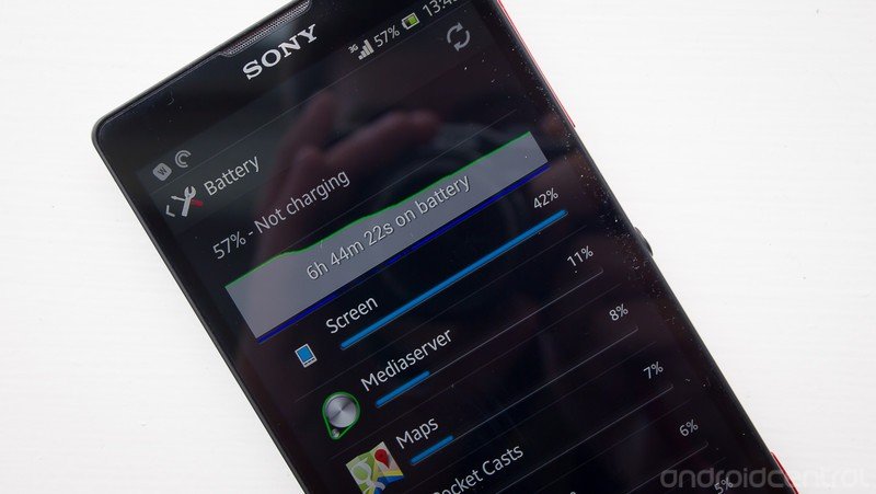
You'll have to just trust Sony on this one, but underneath that non-removable back case is a 2370mAh battery. We'd say that's right in the middle of the pack for battery sizes nowadays, and with a 5-inch 1080P display you'll need every extra mAh you can get. In my daily use of the device I had no problem making a full 12 hour day out of it. I generally kept the display brightness parked at about 70-percent, and would see anywhere between 2 and 3 hours of "screen on" time during the day depending on what I was using it for. Days with more time out of the house (I'm usually on Wifi over 50-percent of the day) saw the battery drain more, but that can also be attributed to turning up the screen when outside. The screen is a major drain on every mobile device, and the Xperia ZL is no exception.
Overall we never saw any alarming drain of the ZL's battery, and we can't fault it for regularly making it through a full work day with consistent use. If you are slightly worried about the battery, Sony has included a bit of software in the settings to help prolong the phone's life. Under "Power management", you'll find a few toggles -- STAMINA mode, Low battery mode and Location-based Wifi -- that can all add up to some battery savings if you're willing to put up with the compromises. STAMINA mode disables data traffic when the screen is off, with the handy addition of a whitelist for apps that are still allowed to connect. Low battery mode can automatically trigger things like lowering the screen brightness and screen timeout time, turn off vibration, GPS, Wifi and others when the power level gets low.
Xperia ZL software
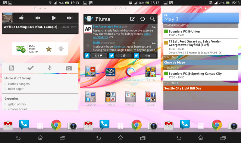
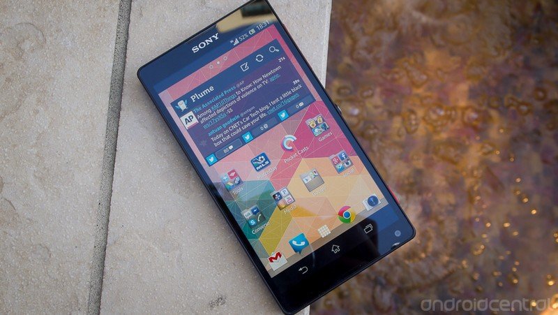
It's a rare case among some of its recent launches, but Sony has shipped the Xperia ZL with a modern version of Android -- in this case Android 4.1.2 Jelly Bean. As manufacturers tend to do, Sony has put its own touches on the software to make it fit into the rest of its branding and designs. In this case, that means a flat, clean interface that is mainly grey, black and white with little pops of blue color added. It falls in line with previous Sony software, and is what I would call less offensive than other manufacturer's takes on the Android interface.
Launcher and interface
While the overall "look and feel" of the software customizations are different from stock, the ZL doesn't function much differently than you expect on a stock device. As far as menus, buttons and functions around the OS are concerned, everything will be where you expect it, just with a little visual flair added. That's evidenced from the on-screen navigation buttons down to the settings menu, where everything has been kept relatively clean.
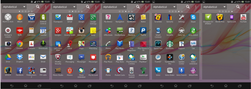
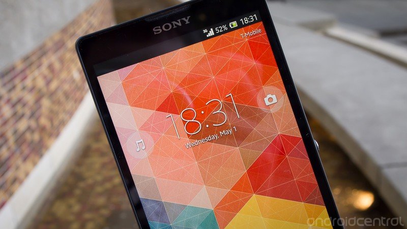
Sony's launcher is pretty basic, but again has its own way of doing things. The lock screen is plain and can be unlocked with a swipe up or down anywhere on the screen, with a nice clock display and quick launch buttons for music controls and the camera. Once on the home screen, you'll see a standard array of screens with a standard dock, status bar and app arrangement. The app drawer is customizable in terms of sorting, although it only holds apps and not widgets as stock would. You can access customizations -- including widgets -- with a long-press on the home screen or from the settings menu inside the app drawer.
Sony includes several "themes" that change the look of the device and wallpapers, and it's actually quite nice to have an easy way to mix things up. Beyond just the launcher, the color accents throughout the entire UI will change from the default blue to green, red, or grey (for example) depending on the theme selected. You of course have access to some great Sony wallpapers also.
Bundled apps
Even though this is a non-branded and carrier unlocked device, Sony has still loaded up the ZL with plenty of its own pre-installed apps. At my count there are at least 20 different Sony apps loaded, not taking into account the useful ones such as Notes and an FM radio. While Sony has done a good job making a consistent platform of content apps such as Sony Music Unlimited, things just get out of hand having this many pre-installed.
Luckily, it seems as though every one of the apps can be either disabled or actually uninstalled, which is great if you want to clean up your app drawer or even save a little bit of space.
Performance and usability
In daily use, the Xperia ZL performed just like a modern high-end device should. Apps opened quickly and performed smoothly, the launcher and app drawer were quick (although a touch jerky on rare occasion) as were the settings. I never experienced any crashes, freezes or random reboots (I never even saw the launcher redraw), which is a good sign as well. Whatever customizations Sony has made to the software don't seem to have interfered with the improvements that have been made in Jelly Bean as far as interface smoothness go. Coming from a Nexus 4, I never felt as though I was getting a sub-par experience with normal routine on the ZL.
Xperia ZL cameras
Much like the other internals of the Xperia ZL, Sony has put what is likely its best camera sensor to date into the phone. We're looking at an Exmor RS 13MP sensor with an f/2.4 aperture here, and while that may not be as good on paper as the f/2.0 that we see on some HTC handsets, we never came across any issues using the camera.
Pictures
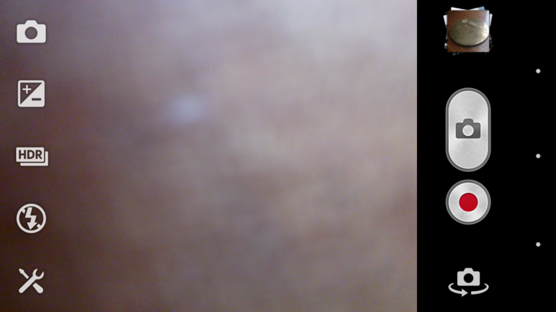
The Xperia ZL sports a crazy number of settings and tweaks that really go beyond your average phone's camera interface. Five buttons line up on the left side of the viewfinder, which let you access groups of settings. The top one lets you select the shooting mode, where you'll find things like scenes, panorama, the dedicated video camera and picture effects. The second button will let you granularly adjust exposure (in +/-0.3 increments), and the others round out to turning on/off HDR, the flash, and access general camera settings like timers, ISO, geotagging and the like.
Having options is great, but we ended up finding that the "Superior auto" mode took the best shot in 90-percent or more of situations. The idea of this mode is that it analyzes the scene and switches modes and settings appropriately to give the best shot. The interface indicates which scene or shooting mode its switching to, and it does a good job of figuring things out. Pictures in Superior auto are limited to 12MP instead of 13, but you won't notice a difference. If you're looking to take the phone out of your pocket in any given situation and have it take an acceptable (or better) picture, Superior auto is the way to go.
If instead you're trying to give a certain look to a shot, manually changing your exposure, ISO and metering options can lead to exceptional results. There is plenty of headroom on the ZL's camera to learn your way around the settings and make the most of that 13MP sensor. This is aided by the inclusion of a dual detent physical camera key, which with a little stabilization can help reduce movement and blurriness in shots. There is still a software shutter key, of course, as well as tap-to-focus when you want to get a different focal point.
Click images to open full res in a new window
Stills taken with the Xperia ZL were extremely crisp and clear, with good color reproduction and dynamic range (even without HDR). While in Superior auto the camera will try extra hard to properly expose the entire photo and may give less striking shots, the option to switch over to full manual control of your pictures will satisfy the nerdiest of camera buffs. We really didn't find any situation in which the ZL captured what we would call a "bad" picture -- the worst you could get was an "acceptable" shot. And that's saying something, as the top end of what this camera is capable of is beyond most phones out there. The conversation about some of the pictures taken with the ZL went beyond "that's a nice picture for a smart phone" to instead "that's just a great picture from any camera."
With all of the praise to be had, there are just two spots where the ZL's camera software is lacking. First is the interaction between the gallery (called "Albums") and the camera, which isn't nearly as smooth as it is by default in Android 4.1. Sony has removed the ability to swipe between the camera and gallery interfaces, as well as the vertical swipe to delete photos. Because the interface (and on-screen navigation buttons) quickly hide when viewing photos, it takes extra taps to switch between taking pictures, viewing/deleting them, and getting back to taking more pictures. Second is the panorama mode (called "Sweep Panorama"), which is set to a fixed width -- which means you can't start and stop the panorama wherever you want. You'll want a third party app to take panoramas here.
Video
The Xperia ZL captures 1080P video, and unlike many phones is actually set to 1080P by default. The quality seems quite good, as does the sound captured from the rear-facing microphone. Video can be captured directly from the main camera UI via a secondary button, but if you want to do any tweaking to the settings you have to flip over to the dedicated video mode.
There are a few subtle tweaks you can apply to the video if you'd like, including an HDR mode, which just like in a still image increases the vibrancy and contrast of your video. If you really want to start tweaking you can manually set exposure, white balance and metering much the same as if you were taking still photos.
Front camera
The ZL has a 2MP front-facing camera, with a very awkward placement in the bottom right corner of the screen. Although we have certainly seen devices before with this placement, the top of the device seems like a more natural place for it. When holding the device in portrait you get a very unflattering view of your face, but it works well enough if you hold it in landscape instead. The camera takes fine pictures, and has a small subset of the customizations available to the rear camera, such as HDR, image stabilization and timers.
The bottom line
For the first time in most people's recent memory, we can actually speak of Sony in the same breath as other manufacturers when talking about flagship phones. From the high-end hardware specs and striking design to the fluid and unobtrusive software, Sony has seriously stepped up its game with the Xperia ZL. There are a couple of small gripes, but we all know too well that no phone is without flaws or compromises. Sony has made a phone that can compete on the highest level set by other manufacturers in every respect, and even best them in some areas. If you're ready and willing to buy your phone unlocked, we see no reason why the Xperia ZL shouldn't be on your short list of phones to get in 2013.

Andrew was an Executive Editor, U.S. at Android Central between 2012 and 2020.
