Samsung Nexus 10 review

Get the latest news from Android Central, your trusted companion in the world of Android
You are now subscribed
Your newsletter sign-up was successful
We get giddy around here when new Nexus devices get released. Some of you guys and gals do, too. This go ‘round, we get a twofer with both the LG Nexus 4 (check out Phil's great review), and the Samsung Nexus 10 hitting Google Play at the same time.
'Tis a good time to be an Android fan.
The screen is beyond beautiful, and the next-generation hardware under the glass should be able to push Android in ways we would have never thought possible a scant 12 months ago -- and maybe it pushes it a little too far. But make no mistake -- the Nexus 10 is at the pinnacle of tablet technology. We've never seen specifications of this caliber before, and everything about the Nexus 10 just screams bad-ass.
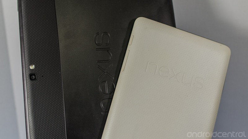
Article continues belowThe Nexus 10 is in an odd spot though, as one of its biggest competitors is for sale right beside it at Google Play, and checks in a good bit cheaper. I’m talking about the Nexus 7, of course. The new hardware in the Nexus 10 has to justify the extra $200 price, and that leads to the million dollar question. Is being the best spec’ed and best value 10-inch tablet enough to pick the Nexus 10 over it’s 7-inch brother? Let’s have a look and find out.
Win a Nexus 10 of your own in the Mobile Nations Passport contest!
Pros
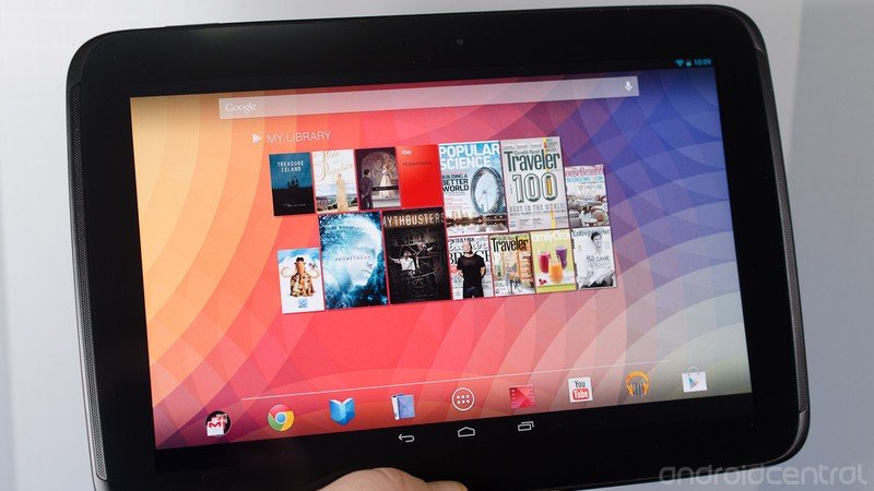
- The Nexus 10 currently has the best mobile hardware available. The 2560 x 1600 display not only looks good on paper, it also delivers crisp text and images, and HD video is stunning. Matched with the A15 dual-core Exynos 5 CPU, the thing is a powerhouse. All this beautiful hardware is put together in a package that's light, thin, and easy to hold. Your first impressions of the Nexus 10 will be good.
Cons
Get the latest news from Android Central, your trusted companion in the world of Android
- High bitrate HD video really taxes the system, and tasks in the background make video playback of these files suffer. The Mali-T604 GPU maxes out at 2560x1600, so this may be an issue where we've already reached the hardware limits. Pushing a lot of pixels also makes benchmarks score lower, if that sort of thing bothers you.
The Bottom Line
The Nexus 10 is the best 10-inch Android tablet, period. All the checkboxes are ticked, and the price is competitive with other models that don't offer the same gorgeous display or blazing fast CPU. Add in the Nexus software experience, and you have the complete package. The drawbacks are there (no TegraZone titles brings a tiny tear to my eye), but they are very few and are quickly outweighed by the positives. Decide if you want the 7-inch experience or the 10-inch experience, and if you decide to go big, buy with confidence.
Hands-on
The hardware
You'll know you're holding a Samsung tablet when you have the Nexus 10 in your hands. I'm not calling that a good thing or a bad thing, but it looks and feels very much like a revamped Galaxy Tab because it's so thin and light, and it shares that same design with the speakers on either side. The tablet is built of "quality" plastic -- as in matte soft touch finished and not glossy and shiny -- which according to Matias Duarte is by design to make the unit as light as it is (603 grams). It's slightly curved towards the screen around the edge, giving it a unique feel, almost like a very shallow bowl. While it doesn't give you the elegant feel the spun aluminum tablets from ASUS offer, it doesn't feel cheap and handles well, with a slight top-heavy feel when holding it by the bottom bezel in landscape.
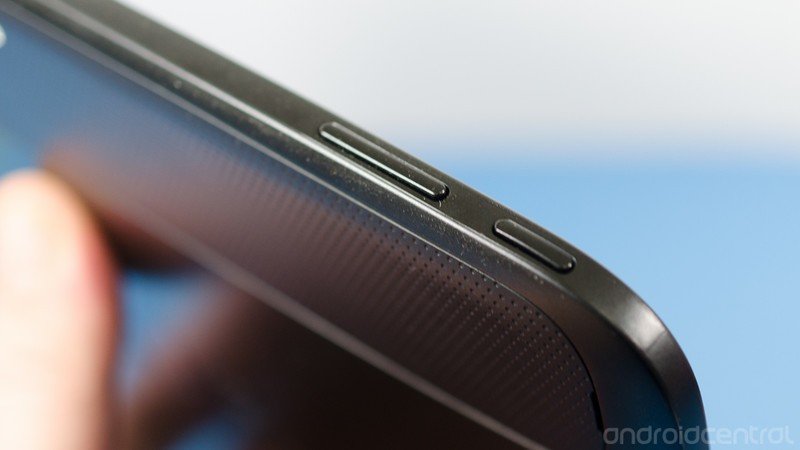
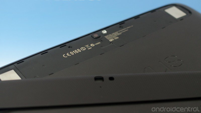
In the looks department, I think the Nexus 10 scores a 10. The speakers and controls, a power button and a volume rocker, match the color and texture of the tablet well, and nothing seems out of place or glaringly ugly. Another nice touch is the removable back cover. It's a strip about 1.5 to 2 inches high across the rear of the device surrounding the camera and flash. It's reminds me of the battery cover of the Galaxy Nexus, meaning it's very thin and flimsy feeling plastic once you're removed it and are holding it in your hands.
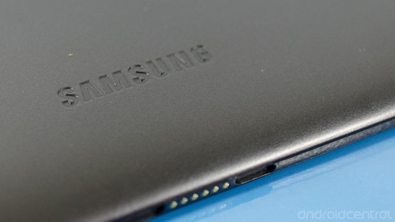
Because it's removable, it makes a great place to put all the screen-printed information that the FCC requires, the model number, and the requisite "Made in Korea" label. With the cover in place all you see is solid black, with a Nexus (and smaller Samsung) logo. The cover was designed to attach a smart-cover style case right to the Nexus 10 to protect the screen and serve as an on/off mechanism via magnets. The fact that it hides the typical numbers and assorted mumbo-jumbo that's usually printed on the back of a tablet is just a bonus -- but a nice perk for those that place a value on how their devices look.
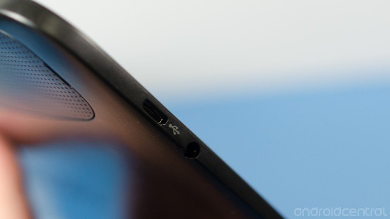
In addition to the mentioned controls (oddly placed on the top left of the tablet while in landscape), you've also got a standard microUSB connector for data and charging on the right hand side. Just underneath, you have the 3.5mm headset jack. On the opposite side (that'd be the left if you're not following along) you've got a standard micro HDMI port for connecting the Nexus 10 to a television or monitor. I was a little puzzled when Phil informed me that Miracast wasn't enabled on the Nexus 10 (though it's touted as an Android 4.2 feature) but truth be told I'd prefer the micro HDMI port. A $6 cable and I'm off to the races, sending video out to any display with an input.
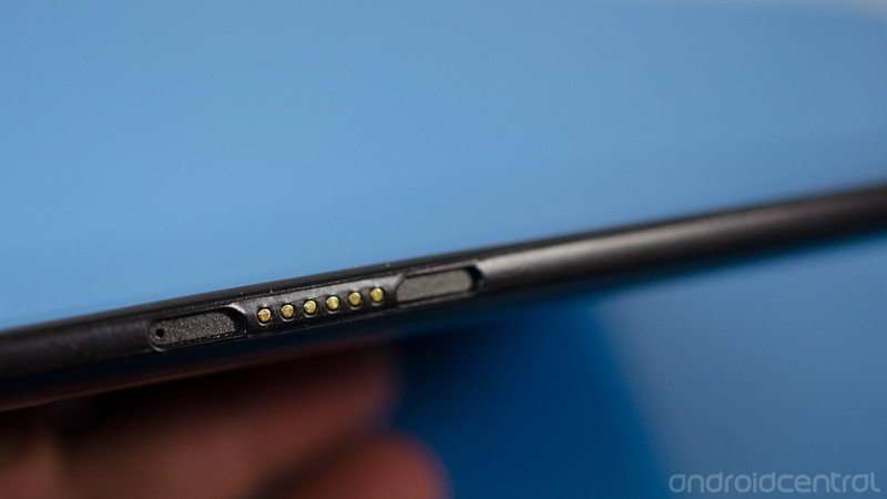
On the bottom of the tablet, you've got your pogo pins, and two spots for a magnetic adapter of some sort -- one on either side. Hopefully we'll actually see some sort of accessory use them, as Daydream feature combined with nice sounding speakers would make for a great nightstand clock. Make them Samsung, and we will buy them.
All-in-all, it's a well built device that you won't be afraid to use. Other than a daily cleaning to wipe the fingerprints away, there's not much here to go wrong and a little care should get years of use from this one.
The display
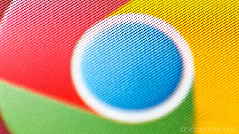
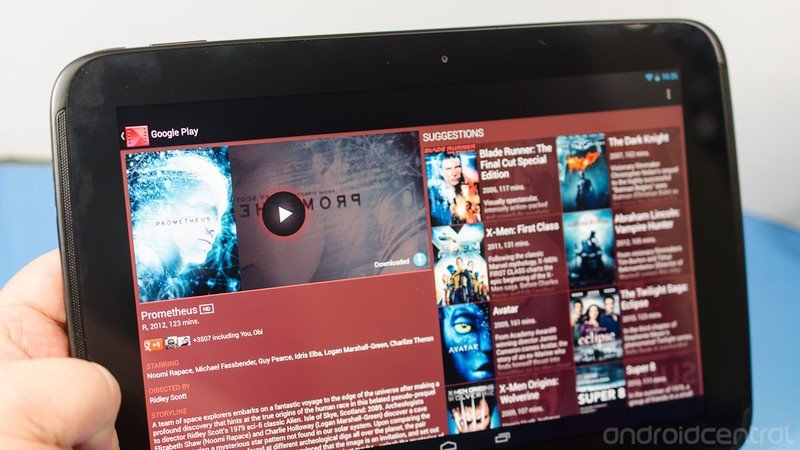
The panel on the Nexus 10 is hands-down the best display you've ever seen on an Android tablet. The 2560 x 1600 resolution screen has a whopping 300 pixels per inch, and the true RGB stripe PLS technology makes text crisp and clear, images sharp and lovely, and HD video a feast for your eyes. It's covered with a sheet of Gorilla Glass 2, and it's clearly one of the highlights of the device. It's one of those things that you can't unsee, and every tablet you use afterwards just won't measure up. Imagine the best quality and highest pixel density phone you've used, only in a nice and big 10-inch size. Or think of it this way: the Nexus 10 has the same resolution as a new "Retina" 13-inch MacBook Pro, but has a higher pixel density.
You will like this screen. It is that good.
Of course, nothing is perfect, and this is no exception. The resolution means that there are a whole bunch of pixels to push around, which takes computational power. The GPU is maxed out with this resolution, and all the extra lighted points means more battery is used to keep it turned on. We saw this when another tablet manufacturer increased the resolution to the point where amazing comes to mind, and a thicker unit with a bigger battery was in order.
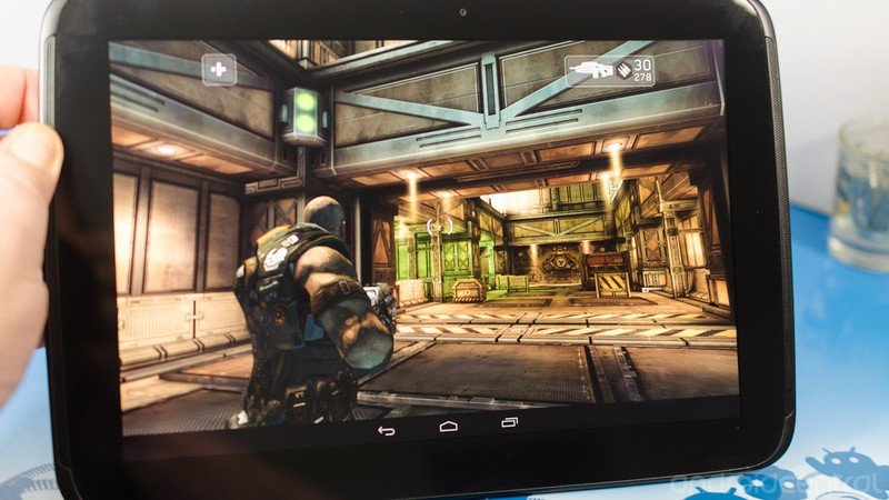
In the end, you'll find that the innards are more than sufficient to drive the screen in just about every situation -- from video watching, to picture viewing, to gaming -- with ease. This is a good direction for Android tablets to be heading, and for many will be reason enough to purchase.
The speakers
The speakers get a section of their own, because they're also much better than anything we're used to. To start with, they are along the right and left bezel (while holding the Nexus 10 in landscape) and face forwards -- towards the user -- versus being placed on the side or the back. Music sounds good, movies sound good, even silly notification tones sound good.
I'm not seeing any mention of special technology being used here, so I guess it's a testament to speaker placement. Whatever it is, it's a joy not to have to cup my hand at the back of the tablet to direct audio towards the front of the tablet. I'm looking squarely at you Nexus 7.
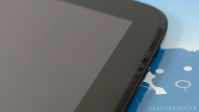
To round things out, they also look pretty darn good. They're tucked into the edge of the bezel, and the grill spans the height of the tablet itself. My thumbs don't end up blocking the sound, and I can sit next to the wife on the couch and watch a video or two. Little things like this mean a lot for the end user.
The processor

The Nexus 10 has the very best ARM processor available on board. No ifs, no ands, no buts. The Exynos 5 Dual uses two ARM Cortex A15 cores running at 1.7GHz, with a shared 1MB L2 cache. The A15 architecture also uses 3-issue, Out of Order instructions with advanced SIMDv2 support.
What all that means is that this isn't anything that you're used to. This CPU is a generation ahead of powerhouses like the Tegra 3, The Qualcomm S4, and the A6. This chip is for things like Chromebooks, future generation tablets, and ARM based laptops. Add in native support for USB 3.0, SATA 3, and HDMI 1.4 and you have the next generation made available today, erm, Tuesday.
Combined with what's currently the best GPU available in the Mali-T604, the SoC is a beast. It's got a huge front-end, with highly improved data structure, and the fast clock speed means there's a great big pile of power in there for hackers and geeks to tap into and do wonderful things with.
Performance
If the hardware is that good, why isn't it blazing fast? Well, it is sometimes. The hardware had to be that good, because nothing else available will drive that ultra-high screen resolution. When you're not pushing things with a few extra million pixels that change and need rendered, the Nexus 10 will amaze you with how well it performs. Other times, like when watching high bitrate video or playing games not yet optimized with new graphics, it only runs good.
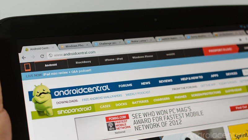
With pre-release software, I can make the Nexus 10 stutter with a dozen or so tabs open in the Chrome browser, or when playing 1080p video from the device storage. As a test, I killed background tasks (something you should never do in day-to-day use) and could make the stuttering during video playback stop. Nothing I could do would fix stuttering in Chrome, though.
A contact at Google has told me these issues have been noted, and will be fixed -- it's not just me seeing them. Hopefully, this happens with the final version of the software before it's shipped and we don't have to wait very long for some sort of performance patch. In the end, though, the Nexus 10 is a great performer in most cases the way it stands. Wifi signals seem strong, probably thanks to the MIMO+HT40 (Multiple Input Multiple Output) 802.11 n enhancement, GPS locks fast and is accurate, and there's enough battery to watch about seven hours of streaming video through Netflix. Outbreak, The Babysitters, and Act of Valor if you were curious.
The short version -- there's enough oompf under the glass to deliver a pleasant experience, even with the GPU-shredding high resolution screen. I'm not complaining.
The software
As mentioned, the review units Google sent out aren't running the final build of the software. This means the two features I was most looking forwards to in Android 4.2 -- multi-user login and lockscreen widgets -- aren't in place yet. When Google updates these units (they don't get this one back until I get to try multi-user accounts and widgets on my lockscreen, dammit) you can bet we'll jump right into it.
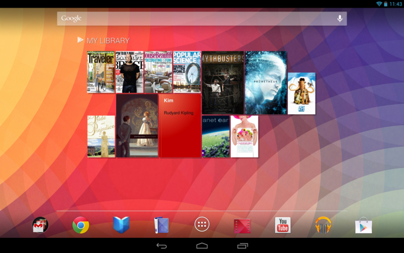
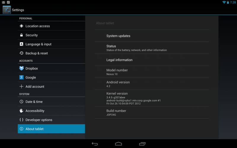
Because it's a Nexus, that means it will be running the latest version of stock Android, which means 4.2 Jelly Bean in this case. Android 4.2 turned out to be pretty much as we predicted -- a polishing of the overall interface and some completion to the behind-the-scenes stuff that was started with Android 3.1. Honestly, we're relieved to see Google cleaning up things they had in the works rather than dive into new features and ideas. It gives us a break, and allows the coders and designers to finish their ideas and implement them the way they envisioned. Android 4.2 takes the ubiquitous jumble of ICS and Jelly Bean features and presents them to the user in a more refined, and sane, package.
Having said all that, you won't find a lot of changes if you've been using a tablet with stock Ice Cream Sandwich or earlier versions of Jelly Bean. Everything you're used to is still there, it just works a little better and integrates a little more. Incremental upgrade? You betcha.
There are a few features worth looking at, so let's have at them!
Quick settings
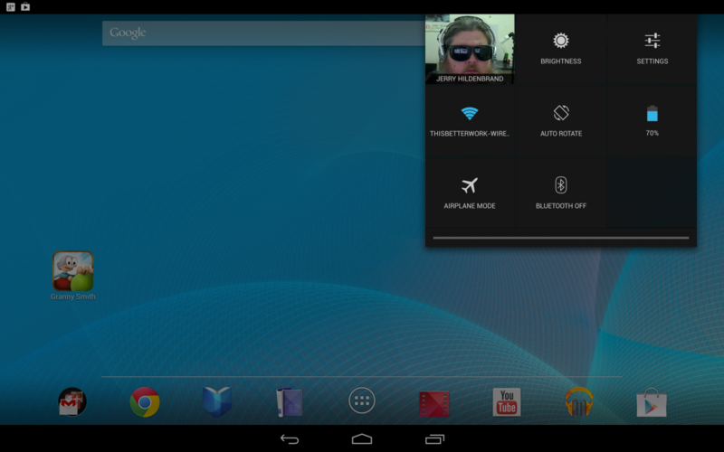
Everyone loves shortcuts to the commonly changed settings on their device. Things like Wifi, Bluetooth, rotation and brightness are settings we all find ourselves changing from time to time. Since we're all far too busy to waste time opening the settings and scrolling to the appropriate category to switch these, we love having quick access to the shortcuts. Or maybe it's 'cause we're lazy. Either way, it's easy to change them now.
If you take your finger and swipe down from the right side of the notification bar, you get the pull down pictured above. You'll see your pretty face in there, that's your Google+ profile. Besides the rest of the settings that are self explanatory, there's a blank spot. Blank spots intrigue me. Is it for one of the missing features from this build, or does it mean that third party developers will be able to add their own settings to the quick-settings shade? Hopefully the latter, as it should make a great spot for weather or something else that interests you. Android is known for customization options like that, and as long as it can be turned off, I think the option for anything should be included.
The hard part will be remembering that it's there. Unlike the phone interface where the notification shade is divided into two different panes, the tablet layout has them split. Even in portrait, the left two-thirds of the notification bar will give you the standard notification panel when dragged down. At that point, I find myself just tapping the settings button and doing things the old way. Maybe it's muscle memory, or just the old dog new trick scenario. Anyhoo, it's there. It's quick, and they're settings. Quick-settings are go!
The new keyboard
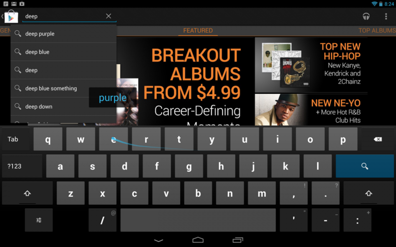
The new Android 4.2 keyboard is like a mixture of Swype and SwiftKey. You can use it as you normally would, or get predictions and corrections based on what you're typing, or you can go full tilt and swipe your way across the keyboard, spelling words in your wake. It's hard to tell from the screenshot (this is difficult to capture) but a blue trace shows the path of your finger and your predicted world is spelled out in a bubble above the keys.
It's pretty slick, and pretty accurate, but the stock keyboard still isn't perfect. There's no way to precisely position the cursor, instead you have to tap in the general area and fine tune it with the blue arrow pointer just like the 4.1 (and earlier) version. And what's wrong with a number row? Or at least allowing a long press on the top row give you the corresponding number.
Good thing you can easily change the keyboard out for one that better suits you.
Application support
Some applications take advantage of Android's development model and build apps that utilize the extra space a tablet has to offer, and some don't.
A lot of noise is made about the dearth of "tablet" apps in Google Play. In reality, there is no such thing. Any and every app can be developed to run on both your smartphone and your tablet -- all 675,000 or so of them. Of course, some developers prefer to create a separate "HD" version of their app to use on tablets, and these numbers get tossed around any time it's convenient to talk numbers about the other side. Forget all that noise, and realize that just about every application in Google Play will run on your new Nexus 10.
All of Google's applications, and a good many third-party applications use code and assets to make their applications take advantage of all the extra real estate a tablet has to offer, and some don't. The ones that don't will work the same way, with more empty space. Apps don't get doubled or blown up to scale to the bigger screen, because screen size isn't hard coded into an app if developers followed the guidelines and coded it right.
Developers, especially game development houses, may want to update their apps and insert a set of super high resolution textures to use with the Nexus 10, but it handles every app that I use on my Galaxy Nexus and Nexus 7 with no issues. Yes, apps built to use the space a tablet offers look better, but the ones that don't still function. This may seem like a no-brainer, but I wanted to investigate very closely how this insane resolution screen would affect the user experience in the Play Store with third party apps (enough to give it this separate section) and came away pleased with the result.
What the Nexus 10 does offer is a way for developers to test apps at WQXGA (Wide Quad Extended Graphics Array) without spending a fortune. If an app looks good blown up to that size, it's going to look good just about everywhere. The Nexus 10 was designed to encourage apps that look good on tablets. I hope it works.
The camera
Unlike it's smaller sibling the Nexus 7, the Samsung Nexus 10 has both front and rear cameras. Around front, you have a 1.9MP camera that was clearly designed for video chatting (read -- Google Hangouts). The quality is fair at best, but it focuses and adjusts fast, eliminating many of the issues other phones and tablets have when hanging out with your friends. If you've got a laptop with a built-in camera, expect similar results.
My favorite Hangout chair
The rear camera is a good bit better. Surprisingly, it's as good or better than the rear shooter on the Transformer Prime -- and that's saying a lot considering it's a freaking tablet. In fact, it's good enough to almost justify holding it up to snap pictures of your kids school play or whatever it is people take pictures of with their tablet.
My opinion of it being too big to use as a camera aside, the pictures look pretty good. The usual limitations apply, like the flash washing things out terribly and low light just murdering the images, but feed it enough light and keep things fairly still and the pictures are better than average. There's no fancy image rendering chip, or name-brand lens, just a solid 5MP shooter.
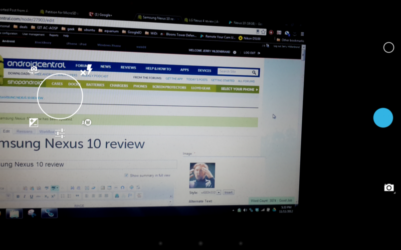
The camera software is the same improved version we see on the Nexus 4. It's the stock Android 4.2 camera, and it offers everything we have seen before as far as settings go. Now, to get to them you tap the screen and have a skeletal ring with the options versus tapping a button to open a new dialog box. It works nicely, and as soon as you get used to where the settings are changing them is a breeze.
Gone is the burst mode we saw with Jelly Bean 4.1, but the camera (at least on this hardware) is still very fast. Tap the blue dot and it takes a picture. Tap it again, and it takes another -- as fast as you can tap it. This, as well as the new settings interface, stays the same whether you have the front or the rear camera in use.
See the full Photo Sphere version on Google+
Panorama is still included, and it works as good or better than ever. Of course, the thing everyone is talking about (and that you likely wish I would get to soon) is Photo Sphere.
We've had a chance to play with Photo Sphere on other Jelly Bean phones thanks to our own AC moderator and hacker Dylan, but using it on the Nexus 10 hardware is nothing like any of the hacked versions. Photo Sphere image sections are grabbed quickly (almost too quickly), and the final stitching is fast and much more accurate.
See the full version on Google+
I don't claim to be the Photo Sphere pro, but with the Nexus 10 I can pretty much nail it every time as long as the subject is far enough away. To take one, you switch to the Photo Sphere setting find a starting point, and wait for the countdown dots up top to disappear. Then turn (without taking a step forwards or backwards) until the blue dot is aligned with the socket in the viewfinder. Keep moving the same direction until you have captured what you need or have done a full 360. Then you can tilt the camera up or down to get the sky or the ground the same way. When you're finished, tap the blue square to stitch them all together.
The trick is to keep the device in the same place and pivot it as well as you can, like it's a ball-and-socket joint.
As of right now, the only way to see Photo Sphere pictures is on a phone or tablet with the Android 4.2 gallery or on the full web version of Google+. The pictures above show you what happens if you try to view them as a regular picture. We'd love to see Google drop a viewer app in Google Play or just add viewing to the Google+ app for Android and iOS, but we're not holding our breath.
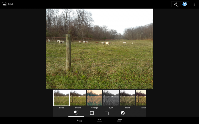
You've also got a slew of editing tools available, where you can crop and adjust your image as well as apply filters and frames. These may or may not be to your liking, but they work really well. It's no substitute for Photoshop (speaking of which, Photoshop touch runs amazingly well on the Nexus 10), but for quick adjustments or to make the perfect hipstergram style picture they're great.
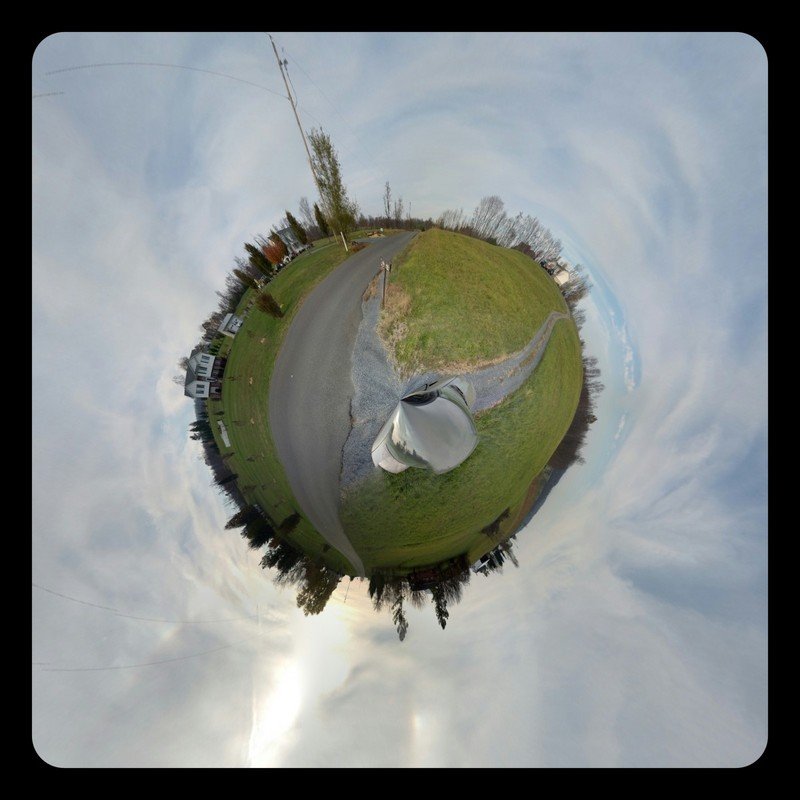
If you've taken a Photo Sphere picture, and given it a full enough view (about 270-degrees or more by my reckoning), you can also make "Tiny Planet" style images. Highlight your picture in the gallery, select the Tiny Planet effect, and adjust the amount of surface you want the sphere to use. If you then select a frame for the picture, the planet is filled in with photo information. If you choose not to use a frame, you get a wild eye effect. Both are pretty slick, and with the right image we should see some seriously cool artwork from these. Unlike the normal Photo Spheres, these can be shared as normal pictures.
The Nexus 10 isn't likely to be your go-to camera, and it wasn't designed to be. But for those times when we do use it, it's nice to see it perform as well as it does.
The bottom line
This is the easy part. You've decided you want or need an Android tablet. Cool. Want or need Wacom stylus support? If so skip this and get a Note 10.1. Need the flexibility of a good keyboard docking station? Skip this and look at the ASUS Transformer line. Need something smaller for easy carrying or holding in bed? The Nexus 7 should be your first choice.
If none of the above applies to you, then this is the Android tablet to buy. Other than the specialized cases above, there is no 10-inch Android tablet that matches the specs, especially the screen, of the Nexus 10. It's not even close. Things get a bit stickier when you factor in the 7-inch size.
Tablets smaller than 10-inches were supposed to be dead on arrival, but the Nexus 7 (and 180-degree turn around release of the iPad Mini) says otherwise. The Nexus 10 doesn't offer the easy holding of the Nexus 7, and I miss that. Reading a book in bed is much nicer with my Nexus 7, and so is putting it in my jacket pocket so I can play Riptide GP at the mall while my wife shops. On the other hand, when it's time to watch a movie or check out some pictures (500 pix looks amazing on the Nexus 10) the screen on the Nexus 10 makes it all worth having.
Like me, you'll have to decide how a tablet best fits your needs. If you decide 10-inches is the way to go, buy this one.

Jerry is an amateur woodworker and struggling shade tree mechanic. There's nothing he can't take apart, but many things he can't reassemble. You'll find him writing and speaking his loud opinion on Android Central and occasionally on Threads.
