The quick take
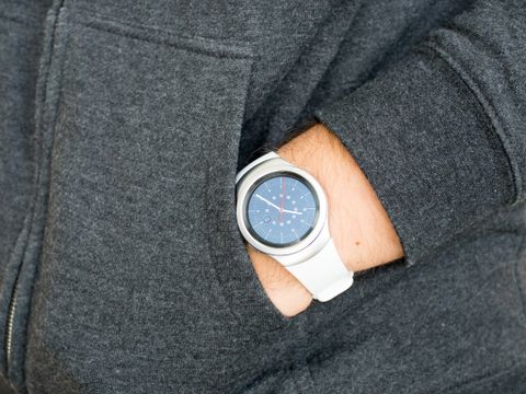
Samsung was a pioneer in the new generation of smartwatches, but it hasn't produced the best overall products in its past few tries. With the Gear S2 it finally has a lot of things right — the watch looks nice, has a good screen, is built well and is now a proper size for most wrists. The Tizen-based operating system doesn't have as many restrictions as before and now works properly with non-Samsung phones, which is huge. Unfortunately the software still feels a little rough around the edges, and tries to do far too much considering the screen size it has to work with.
The good
- Compact and light
- Innovative rotating bezel
- Great screen
- Good battery life
The bad
- Software still tries to do too much
- Native apps offer poor experience
- More complicated than Android Wear
- Notification support not entirely universal
Samsung's best watch yet
Gear S2 Full Review
When you look at the history of the modern smartwatch, it's hard to ignore Samsung's involvement in the process. Though it hasn't necessarily made blockbuster products that have led the wearable industry, Samsung has been eager to keep trying new things with each generation — whether it's large screens, new software interaction or standalone cellular connections in watches. Samsung also hasn't shied away from different operating systems, starting with Android, trying Android Wear and finally settling on Tizen.
With the launch of the Gear S2, it's clear that Samsung has been learning from its mistakes as well — and this is finally the first watch from Samsung that feels like a complete product. The new watch is compact, capable and designed to look like a watch — and the new rotating bezel is a truly innovative way to interact with it. Perhaps most importantly, the Gear S2 works with Android phones other than Samsung's own, which was a bigger issue for most people than the overall quality of its previous wearables.
But while the Gear S2 is a better product than any previous Gear, the competition is a bit stiffer now as well. Android Wear finally has some legs, and Pebble has released new versions of its own watches. Does the Gear S2 have what it takes to be considered as your new primary wrist computer? We're here to answer that question in our full review — read on.
About this review
I (Andrew Martonik) am writing this review after a little more than a week using a silver and white Gear S2 (with a cameo appearance by Phil Nickinson's black and dark grey model). It's a standard Bluetooth and Wifi model (not 3G), and for the entire review period was connected to either a Samsung Galaxy Note 5 or Moto X 2014.
There are two distinct designs of the Gear S2. There's the "standard" model (which I have here) that's a bit sporty in design, and then there's the Gear S2 Classic, which has a more standard watch design with proper lugs and a standard watch band on it. Both are roughly the same internally — the only difference is the case design. There is also a 3G model of the standard Gear S2, which is slightly larger and has a bigger battery.
A new take on Gear
Gear S2 Hardware and display
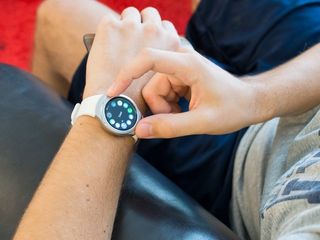
Samsung has tried various approaches to its smartwatch designs, but the one unifying feature — from the original Galaxy Gear to the gigantic Gear S — was that they kind of just felt like little phones. They were all bulky for smartwatches, had relatively large (and rectangular) screens and some even integrated cameras into the bodies or the straps. It doesn't make sense to do so much on a watch, and with the Gear S2 Samsung no longer tries to.
Samsung didn't just move down to the competition, it went smaller with the Gear S2.
Rather than just drop down to the same size on offer by the current crop of Android Wear devices, Samsung went a step further with the Gear S2 and went smaller than what's out there already. The Gear S2 has a slightly smaller display, and is thinner and lighter than your average LG Watch Urbane or Huawei Watch. The only downside here is that there aren't two different case sizes on offer like the Moto 360 2015 and ASUS ZenWatch 2 — you'll have to like the one size available.


First off, let's talk display. Samsung went with a relatively small 1.2-inch circular Super AMOLED screen, at 360x360 resolution, and it looks beautiful. The reliance on black backgrounds in the interface make the whites and colors pop, and while there's no automatic brightness mode I found myself comfortable with brightness set to 80 percent. The resolution is plenty high for this screen size, and it has good viewing angles as well. I just expect Samsung's displays to be good at this point — no matter what the size — and the Gear S2 doesn't disappoint.
The display is really great, and the simplistic stainless steel case is of top-notch quality.
The display is surrounded by a solid casing made of 316L stainless steel, available in a light silver or a dark grey, with a plastic and glass insert on the bottom to allow for wireless charging and heart rate monitoring. And while it doesn't have standard lugs for attaching watch bands, it does extend on the top and bottom to marry up with a proprietary connector for its own bands. The bands are designed to flow seamlessly into the case, giving it a slick look, but some may still prefer the more "standard" look of the Gear S2 Classic instead.
The case is nicely machined in a minimalist design, with the flat and lightly-textured steel being set off just a bit by a shiny bevel all along the rotating bezel that surrounds the screen. That rotating bezel serves as a main way of interacting with the watch, which I'll get to in a later section, but it's important to note that the bezel is very well engineered. It clicks along as a great interaction mechanism for the watch, but also doesn't look out of place (or get in the way) when it isn't in use.
Unfortunately the same can't be said about the dedicated "back" and "home" buttons on the right side of the case, which indeed stand out as not only poor choices for usability but also kind of detract from the otherwise sleek case. A single button would've looked much better, but I can at least applaud Samsung for ditching the big front-mounted home button of previous models.


The Gear S2 comes with a flexible elastomer (aka rubber) band out of the box, with a standard watch buckle in matching metal to the case, and while it still has a proprietary connector it's at least easily swappable and can be changed without tools. Samsung includes both large and small bands in the box — but really they should be called "long" and short" because the only difference between the two is the length. You can mix-and-match the two bands to get the right fit, and while I just used the standard large set, those with smaller wrists will want to opt for the small ones.
The only downside to the standard Gear S2's design is its sporty style, which doesn't work in all situations.
Samsung is only offering the Gear S2 in two color choices, but at the launch of the watch showed off quite a few different band color options. We haven't heard anything more about when or where those band choices will be available (Samsung did eventually sell replacement bands for previous Gears), or if third parties will be able to get in on the action, but I wouldn't put much stock in them becoming available — just pick the color you'll be happiest with out of the box, and anything more is just a bonus.
The elastomer bands give the Gear S2 more of a sport watch feel, not unlike the Sony Smartwatch 3 or any other basic (non-smart) active watch from Nike or Adidas, and that can be a little polarizing. It feels right at home with casual attire and daily wear, but stands out notably if you're dressing up for a nice dinner or a meeting. Of course the opposite is true with a design like the LG Watch Urbane, which is just far too flashy, but I do wish that the standard Gear S2 band and case were a bit more neutral. At least Samsung is offering the Gear S2 Classic, which costs $50 more but has a design that should work in more situations.
More: How to change the Gear S2 straps
Tizen is better, but incomplete
Gear S2 Software and performance
Samsung's Tizen-based smartwatch operating system has greatly evolved since it took over for the Android offering on the first Galaxy Gear. And just like its smartwatch hardware story, Samsung's smartwatch software often feels more like it belongs on a small phone rather than a watch. Though the latest iteration is far simpler to understand and use, I still get the impression that Samsung is just trying to do too much on the watch — particularly for a device with only a 1.2-inch circular display.

The entire interface is navigable with swipes, but the rotating bezel is preferable in almost every situation.
Though this watch packs a touchscreen, there are multiple ways to interact with it that don't involve tapping the screen. The Gear S2 has two buttons on the side — one for "back" and another for "home" — as well as a rotating bezel to help alleviate navigating a rather complex interface on a small screen. The back button simply takes you back to the previous screen you were on, just like on an Android phone, and the home button returns you instantly to the watch face. You can also set a double-press of the home button to launch any app of your choosing.

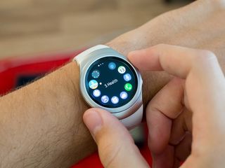
While the entire interface is navigable with swipes, the preferred method is twisting the watch bezel. The bezel clicks while turning, with each click in position being analogous to a full-screen swipe. In most of the interface you'll turn the bezel clockwise to move right, and counterclockwise to move left. In vertically-scrolling lists, menus and apps, you'll turn clockwise to go down and counterclockwise to go up. Turning the bezel means you aren't covering the interface you're trying to manipulate, and on such a small screen it helps to just move in a series of bezel clicks rather than swiping. In multiple areas of the interface, you can highlight items from a radial list with the bezel, and then simply tap the center of the screen to select the highlighted item.
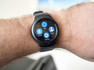
At the highest level of the interface you have a set of home screens, with your watch face of course being the primary screen — a swipe down on the screen returns you to the watch face, and a swipe down again on the watch face gives you quick controls for media playback, do not disturb mode, and brightness controlls. To the left you'll find your notifications as they come in, and to the right you'll find a succession of customizable widgets. There are 13 in total pre-loaded, and you can choose to organize, add or remove them as you see fit — by default you'll have a quick app launcher, as well as widgets for your calendar, S Health step count, weather and heart rate.
The Gear S2's software still feels a bit like it belongs on a phone, and can get confusing quickly when you use it.
For the cleanest possible look you can remove all of these widgets, but you'll still get a blank page to the right of your watch face with a "+" imploring you to add more. Many of the widgets just aren't useful at all, like the full-month calendar widget, or some of the widgets that require deep multi-level dives into apps to make use of. But others, like the media playback control widget and the step counter, are genuinely useful to have at a glance over from your watch face. The best part about these is being able to choose which ones you want.
The main interface paradigm is rather simple to figure out, but it gets quite confusing once you dig deeper into it. Again you get the feeling that there's more smartphone DNA in this watch than anything else, as there are still situations where you need to be several taps, swipes or clicks deep into the interface to get things done. Diving into the settings is just a rabbit hole of lists upon lists, with every option imaginable available, and doing some things like replying to an email can take upwards of five taps on the screen. You can get by with just the simple things on the Gear S2, but there's a lot going on here that can get frustrating and confusing to navigate on such a small display.
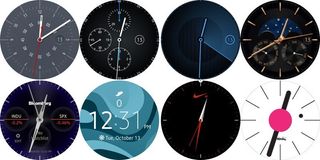
Watch faces
Samsung has done a pretty good job with the watch face offerings on the Gear S2. Out of the box you'll have 15 distinct watch faces to choose from, some of which are branded with pre-loaded apps like Nike and CNN, but in general run the range between modern and classic, as well as analog and digital. Most of the faces can be customized (some more than others), with options to change the dial, hands (if analog), colors and information layout.
You can also browse through dozens of watch faces from Samsung's Galaxy Apps store, though I honestly couldn't find many that appealed to me and was more than happy with a customized version of a pre-loaded face. Perhaps these offerings will improve over time, but only time will tell there — there's nothing in the Galaxy Apps store that can rival the watch face offerings for Android Wear today.
Notifications
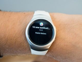
One of the most important experiences on any smartwatch is how it handles notifications from your attached smartphone, and thankfully Samsung has made huge strides in this area compared to the original Gear S. There are two major improvements to the notification system — two-way notification sync, and actionable third-party notifications. Two-way sync means any action you take on the smartwatch is reflected on the phone, and vice-versa, while actionable third-party notifications mean you can actually do things with notifications that arrive rather than just clear them.

When notifications arrive on your phone they're pushed over to the watch and lined up in chronological order — grouped by app — on individual screens to the left of your watch face. You can also have the watch screen turn on when notifications arrive, as well as adjust the vibration intensity on your wrist for notifications. Unfortunately if you turn on this heads-up notification mode, you can't actually clear the notification right as it arrives — you need to hit the back button and then go back to the main notification area to clear it. Baffling, but that's how it is.
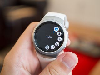
As you scroll or swipe through your unread notifications you'll see an app icon indicating where it came from, as well as a brief bit of information on the content — such as the subject line of an email, or the first few words of a text message. Tapping individual notifications expands them so you can view the full content — as in, you can actually scroll through a 500 word email if you want. If it's a text-based chat — like an email or Hangouts message — that can warrant a response, you can reply with quick canned responses, a set of emoji, voice dictation (which is unfortunately not very well done), or even type in words with an absolutely tiny T9-style keyboard (believe me, it's not great). If you'd prefer to just clear the notification, you can swipe it up on the watch and it'll also clear on the phone.
Notification sync and actionable third-party notifications are a minimum requirement in a modern smartwatch.
Because the Gear S2 now supports more than just Samsung phones that also means it supports non-Samsung apps, and the compatibility is surprisingly good. For example when Gmail messages arrive you can actually archive or delete them from the watch, and when Hangouts messages come in you actually see the person's picture as a background and can reply properly. There are also a few glaring omissions, like a lack of turn-by-turn notifications from Google Maps, and informational pop-ups that are more watch-specific like boarding information from airline apps.
Just as is the case with Android Wear you can't expect every app you have to interact properly with the watch, but it seems as though Samsung has done its part to get popular apps working as expected on the Gear S2. Unfortunately it isn't likely that new apps released further down the road will be supported, and if a developer is choosing to hook into just one wearable platform on Android, chances are they're going to start with Android Wear.
Apps
Samsung using Tizen for its wearable platform has many advantages, but one of the biggest downsides is in its handling of apps. Because there's no inherent link between the apps on your phone and the watch outside of just basic notifications, if you want any more complex interaction you need to install an app on the watch directly. Samsung showed off dozens of apps from well-known names at the launch of the Gear S2, but unfortunately a large number of those have yet to show up in the Galaxy Apps store for download. And those that have are quite a pain to install, involving downloading the watch app from Samsung's store, often followed by another app download from the Play Store on the phone side, and then some complicated setup.
Some of the big name apps aren't here yet — but unfortunately even those that are here aren't great.
Apps like CNN, Bloomberg, Nike+ and Here Maps are on-board, but dozens of others — like Uber, for example — aren't here and have no time frame of when they'll arrive. But I'm not losing much sleep over it, because the app experience as a whole isn't that good anyway. As you'd expect there isn't a ton you can do on a 1.2-inch screen, and reading CNN articles three words at a time or scrolling through Bloomberg headlines just isn't in any way something I want to do on a watch.
Really, outside of direct fitness trackers and small utilities, there isn't much you can do on a watch that would warrant a full app running on it. And while the apps do run smoothly and work, they don't offer a good enough experience to make you want to use them on the watch instead of just taking out your phone. The only real downside of not having local apps is for things like messaging, where it's impossible right now to initiate something like a Facebook Messenger message, a Gmail email or a Skype call — the only way to interact with those apps would be through a reply to a notification.
S Voice
Samsung's S Voice service — think Google voice search, only from Samsung — is baked into the watch, and getting beyond the awkwardness of trying to interact with a watch for voice controls, it has some limited functionality. You can initiate phone calls by number or name, send text messages (though only if you use the default app on your phone), show contact information, get calendar information, play local music, set an alarm and get current weather.
You can turn on always-listening mode to respond to your command of "Hi Gear" or train it for any other phrase, which works any time the watch is on, but that feature is turned off by default, likely for battery concerns.
The voice command list is relatively limited, and S Voice just isn't as robust as Google's offering on Android Wear.
While voice commands for calls and texts seem to work, other natural language queries like "What was the Seattle Seahawks score last night?" just came up blank and queries such as "Send an email to Phil Nickinson" returned a "no matching applications found" error. It's hard to knock S Voice too hard considering that voice commands aren't the biggest feature of a watch, but when it doesn't work properly for basic Google-style searches or can't handle basic queries, it limits the number of times I'm going to actually turn to it throughout the day.
S Voice is also the speech-to-text engine when you're sending messages or speaking voice replies to messages, as an alternative to the other text input methods. Voice replies are rather accurate, but the method for taking input and sending the message is a bit clunky. S Voice doesn't do a good job of identifying when you've stopped speaking when you're replying to a message, leaving you to simply hit the "send" button to stop the recording — I really wish it would identify the end of your sentence as it does in the main S Voice interface.
Gear Manager
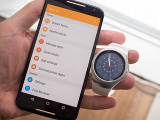
In order to get up-and-running with the Gear S2, you'll need to have the Gear Manager app installed on your phone. The Gear Manager app itself hasn't changed dramatically since Samsung's last wearable release, but quite importantly the compatibility of this companion app has opened up to non-Samsung phones. The full list of supported phones is right here{.nofollow}, but basically anything running Android 4.4 or above with 1.5GB of RAM should work just fine.
Samsung finally supports other Android phones, and thankfully the experience is nearly identical.
Gear Manager is the middleman that lets your phone talk to your watch, and it's necessary because Android doesn't inherently talk to non-Android Wear smartwatches. You can use the app to change your watch face, choose which apps give you notifications, and toggle a few different settings on how the phone interacts with the watch. You'll also find it puts a persistent notification (in the shade, not the status bar) telling you the watch is connected, but you can simply "block" it in the phone's application settings without issue.
Thankfully the experience of using the Gear S2 on a Samsung phone and any other Android phone is nearly identical. Of course things are a bit more seamless on the Samsung phone on account of the Galaxy Apps store and Samsung's apps being pre-loaded on the phone, but you can overcome these things on any other device — the Gear S2 hooks right into the stock dialer, messaging app, calendar and other system-level functions on compatible phones. I never had any issues or notable differences in app performance, notifications or Bluetooth connection when using the Gear S2 on a non-Samsung phone (in my case a Moto X 2014).
Just charge at night
Gear S2 Battery life
With the Gear S2 being relatively small and thin, I was immediately worried about how Samsung was going to handle battery life with the 250 mAh cell inside. Thankfully my concerns were completely overblown, as I haven't had a single worry about battery life on the watch. Leaving the Gear S2 at 80 percent brightness (remember, there's no automatic brightness) with its ambient display mode on, S Voice listening for a wake-up phrase, and receiving nearly all notifications on the watch, I would end each day with at least 20 percent battery life — many times ending with up to 40 percent.
Now that's with what I'd consider "normal" smartwatch usage, as in I wasn't interacting with it all day. I would regularly check messages, archive Gmail, check my step count, look at the weather or my upcoming appointments on the calendar — but I didn't regularly perform lots of voice searches or do anything that kept the screen on more than 20 seconds or so at a time.
If you do plan to use the watch on a more frequent basis — as in more often than when notifications arrive — I'd recommend turning off the ambient watch face mode and lowering the brightness to get the most out of the 250 mAh battery. You can also flip into a limited Power Saving Mode, just like Samsung's phones, that severely limits functionality to preserve battery. In any case, I don't think you can actually expect the Gear S2 to make it through multiple days of use comfortably, which is hardly a knock on it considering that's the case on just about any other non-Pebble smartwatch out there.
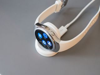
You'll be charging every night, but at least the cradle is well designed.
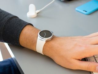
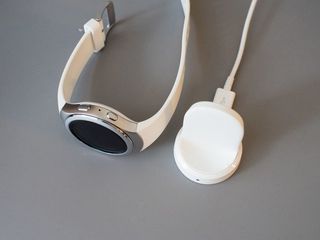
The Gear S2 charges wirelessly, which is preferable from a case design standpoint but does mean that you'll need the included dock to get the job done (even though it's Qi, the band design makes it tough to use on other charging pads). The dock is a simple small cradle that holds the watch with the screen vertical and the strap ends resting on the table, similar to the Moto 360 2015's cradle, but unlike that model the Gear S2 actually holds magnetically to the back of the cradle for a secure charge. The entire cradle is quite a bit smaller than Motorola's offering, which is good.
The vertical cradle style certainly looks nicer when on display on your desk or bedside table, but it's far less practical if you plan to bring it with you when you travel when compared to the flat disc-style charging attachments. That's a small deal for most, but considering the watch will need charging every day you'll have to bring this thing with you wherever you're going to be spending the night.
The best Gear, but not the best smartwatch
Gear S2 Bottom line
It's hardly a stretch to say that the Gear S2 is Samsung's best effort yet at making a compelling smartwatch. The hardware is very attractive and well made, and between the standard and Classic version you'll likely be able to settle on one that fits your style. The Gear S2 is refreshingly small for a smartwatch, and the rotating bezel is a genius way to overcome issues related to interacting with a very small touch screen. The screen is absolutely top-notch, and the battery lasts a full day without worry.
Unfortunately, the software on offer is still a bit of a mixed bag on the Gear S2. It's very capable when it comes to handling basic notifications, giving you glanceable information and using native functions provided by Samsung. On the other hand, the third-party app support is anemic and poorly implemented at best, interaction between the watch and the phone can be a bit clunky, and voice commands and speech-to-text leave something to be desired.
Samsung clearly learned a lot of lessons from the original Gear S, but with the Gear S2 it's still trying to do far too much in the software considering the limitations of the screen size. Having lots of options and features on a watch is great in theory, but those extra options and interactions get in the way of getting things done on the watch — and in the end the goal should be to interact with the smartwatch less, not more.
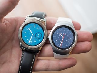
Should you buy it? Android Wear is still in the lead
One of the biggest hurdles facing Samsung on previous Gears was its limited support of just its own phones, which with this generation it has finally eliminated. Though that opens up the Gear S2 to dramatically more people, it doesn't mean the Gear S2 has vaulted to the top of the list of smartwatches to buy if you have an Android phone.
While the hardware on the Gear S2 is really great, and surely on-par with other Android Wear offerings in the same price range, the software doesn't quite offer the great experience it may have seemed to at first glance. And even though Samsung has made leaps in adding support for third-party apps and improving its overall interface, there's no getting around the fact that Android Wear more seamlessly integrates with all Android phones and is simpler to use.
Sure there are places where the Gear S2 beats Android Wear — namely in the use of widgets, the rotating bezel for interaction and (albeit limited) on-watch apps — but those few wins don't overtake the issues in interface and interaction that are handled much better on Android Wear. And when we're talking about a $299 or $349 smartwatch, I don't think you should feel the need to settle for something that doesn't work as well as the other offerings out there.
Where to buy the Gear S2
Amazon BestBuy Samsung Macy's Expansys UK
Where to buy the Gear S2 Classic
Amazon BestBuy Samsung Macy's Expansys UK{.nofollow .cta .shop}
Andrew was an Executive Editor, U.S. at Android Central between 2012 and 2020.
