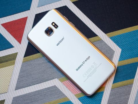
The quick take
Samsung is undeniably putting its marketing power behind the "edge" version of the Galaxy S7. It's bigger, flashier and more expensive than the standard phone, and it's for those who want to stand out from the crowd just a bit more. Compared to the compact Galaxy S7 the larger size of the GS7 edge is going to cause problems for some people, but if you want the boost in battery, head-turning curved screen and handful of extra software features, the Galaxy S7 edge is the one to get.
The Good
- Excellent screen
- Solid performance
- Great camera
- Waterproofing is a big bonus
The Bad
- Pre-installed software still bothersome
- Back glass a fingerprint magnet
- Only 32GB models available
- Edge screen software not super useful
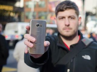
The best Samsung phone of its time?
Samsung Galaxy S7 edge Full review
Over the past five years, innovation in the smartphone world has moved at a relentless pace. In terms of external design, component power and overall user experience, you can't argue that the phones of today are exponentially better than those from just five years ago. With such amazing advances in so many areas, consumers don't expect just one new and exciting feature per product release … they want everything to improve.
At first glance, it seems as though Samsung's strategy with the Galaxy S7 edge is at odds with those consumer demands. Physically, it's not unlike the Galaxy S6 edge+, which was also released just six months ago — it has a very similar metal and glass materials, similar screen size and the same dual curved display. At the same time, many features are unchanged — you get fast internals, a brilliant screen, wireless charging and familiar software.
But what if there wasn't all that much in the Galaxy S6 edge and S6 edge+ that needed to be changed in the first place? Why change things just to seem like you're doing something to make improvements, rather than focus on the few areas that needed fixes? If you take this view, you'll see Samsung may have taken the right approach.
Expandable storage. A bigger battery. Waterproofing. Simple software improvements. Top it off with a better low light camera, even though the Galaxy S6 edge already had a great shooter, and from Samsung's eyes it just checked the only boxes that were left unfilled in last year's flagship. Does it add up to an experience worthy of 2016, or does the Galaxy S7 edge feel more like a refreshed flagship of the past year? We're here to answer that in our full review.
About this review
I (Andrew Martonik) am writing this review after a week using a Verizon model of the Galaxy S7 edge, in New York, NY, Atlanta, GA and Seattle, WA. For the duration of the review, an Under Armour Band fitness tracker was connected over Bluetooth.
Pretty pictures
Samsung Galaxy S7 edge Video review
Words are one thing, but seeing a phone in action is another thing altogether. To pair with our written review, we've worked up a full video review of the Galaxy S7 edge as well. Check it out above, then read on for our full nuanced opinions on the phone in the rest of the review.
Line items
Samsung Galaxy S7 edge Specs
It's best to kick off a review by getting the nitty-gritty specs out of the way first. These are all of the little line items, speeds and feeds that enable the Galaxy S7 edge to handle everything you throw at it — the specs mean nothing without the experiences that take advantage of them, but you can argue that the converse is also true.
Lots of predictable upgrades on the inside.
The Galaxy S7 edge incorporates a very predictable upgrade in specs over last year's model, and in some areas sticks with the same specs as before. The one outward-facing move is in display size, where the GS7 edge comes in a 5.5-inches over last year's 5.1 (though the GS6 edge+ was 5.7) but sticks with the same Super AMOLED display tech and 2560x1440 resolution. On the inside, a small bump to 4GB of RAM is welcomed, as are the new processors — you'll get either a quad-core Qualcomm Snapdragon 820, or Samsung's latest octa-core Exynos 8 processor.
Two different processors
As we go through the Galaxy S7 edge review, it's worth noting that there are actually two different processors out there, depending on where you buy the phone. In the U.S., China and Japan, the phone will have a Qualcomm Snapdragon 820 quad-core processor. Elsewhere around the world, you'll likely find a Samsung Exynos 8 octa-core processor instead.
Differences between the two phones in terms of performance and battery life should be negligible, but it's worth keeping in mind when you see impressions of the phones that they do have different processors running the show. This review is entirely based on the use of a Snapdragon-powered U.S. model.
The two other notable spec table changes are storage and battery. You'll only have the option to buy a Galaxy S7 edge with 32GB of internal storage; of course that's paired with the new microSD card slot, which can take up to a 200GB card, but for those who want everything to be internal there aren't 64 and 128GB versions any more. The battery also jumps to a rather large 3600 mAh, which is 1000 mAh more than the Galaxy S6 edge and even 600 mAh more than the Galaxy S6 edge+.
Here's a full breakdown of the spec table, as compared to last year's Galaxy S6 edge and the direct competitor from another company, the Apple iPhone 6s Plus.
| Category | Galaxy S7 edge | Galaxy S6 edge | iPhone 6s Plus |
|---|---|---|---|
| Operating System | Android 6.0 | Android 5.1.1 | iOS 9.2 |
| Display | 5.5-inch 2560x1440Super AMOLEDDual edge screen | 5.1-inch 2560x1440Super AMOLEDDual edge screen | 5.5-inch 1920x1080IPS LCDPressure-sensitive touch |
| Processor | Quad-core Snapdragon 820or Octa-core Samsung Exynos 8 | Octa-core Samsung Exynos 7420 | Dual-core Apple A9 |
| Storage | 32GB | 32/64/128GB | 16/64/128GB |
| Expandable | microSD up to 200GB | No | No |
| RAM | 4GB | 3GB | 2GB |
| Rear Camera | 12MP f/1.71.4-micron pixelsOIS | 16MP f/1.91.12-micron pixelsOIS | 12MP f/2.21.22-micron pixelsOIS |
| Front Camera | 5MP f/1.7 | 5MP f/1.9 | 5MP f/2.2 |
| Connectivity | Wi-Fi 802.11 ac MIMOBluetooth v4.2 LEUSB 2.0, NFC | Wi-Fi 802.11 ac MIMOBluetooth v4.1 LEUSB 2.0, NFC | Wi-Fi 802.11 ac MIMOBluetooth v4.2 LE, USB 2.0, NFC (Apple Pay) |
| Charging | micro-USBFast chargingQi wirelessPowermat wireless | micro-USBFast chargingQi wirelessPowermat wireless | Lightning connector |
| Battery | 3600 mAh | 2600 mAh | 2750 mAh |
| Water resistance | IP68 rating | No | No |
| Security | One-touch fingerprint sensorSamsung KNOX | One-touch fingerprint sensorSamsung KNOX | Touch ID fingerprint |
| Dimensions | 150.9 x 72.6 x 7.7 mm | 142.1 x 70.1 x 7 mm | 158.2 x 77.9 x 7.3 mm |
| Weight | 157g | 132g | 192g |
The same, with subtle changes
Samsung Galaxy S7 edge Hardware
As was the case with the Galaxy S4 following the Galaxy S3, heaps of digital ink have been (and will be) spilled online about how Samsung's new Galaxy S7 edge doesn't look demonstrably different from its predecessor. Even though as a standalone product with its curved display and flashy colors the Galaxy S7 edge stands out from a crowd, it's easy to mistake it from a distance as the Galaxy S6 edge — or particularly the GS6 edge+ — of 2015.
Depending on whether you're familiar with a Galaxy S6 edge or S6 edge+, this may come as a good or a bad piece of news. For those who enjoyed the smaller Galaxy S6 edge, it's a bit rough — the GS7 edge is bigger and has even less metal to hold onto thanks to the new curved glass back. If you're used to quite large the 5.7-inch GS6 edge+, the drop of 0.2-inches will be a welcomed sight — particularly in how it narrows the phone and makes it easier to reach across.


For the uninitiated who have yet to lay a finger on a recent Samsung flagship — and in particular either previous curved Galaxy S6 variant — you're really in for a unique experience here. No matter what phone you're coming from, it's hard to deny the beauty of the Galaxy S7 edge, and the physical changes made — no matter how subtle — from previous generations are very much function-over-form in nature. The new curved glass back, borrowed from the Note 5, offers the Galaxy S7 edge a better surface for wrapping your fingers around. The slightly thicker build gives more room for battery, and also helps reduce the camera bump on the back to less than half a millimeter.
Samsung isn't messing with a good thing.
The phone manages to be built like a solid, considerable piece of machinery while also keeping the weight in check and evenly distributed. The metal machining, external finishes and how the parts match up are all on the highest level. In terms of the actual usable functions of the device, from the headphone jack to the buttons, Samsung has taken the simplest route and put them where you expect — no back buttons, funky layouts or gimmicks. At this point Samsung has elevated its design story to focus on standout beauty and elegance, not useless changes in the name of "differentiation" that would actually turn into negatives.


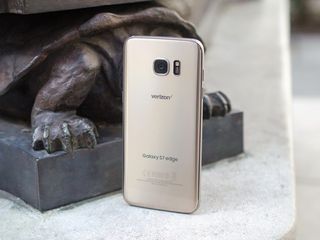
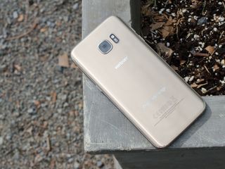
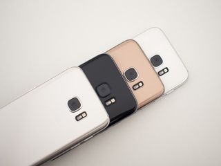
That same philosophy is at play in the available colors of the Galaxy S7 edge, with four options that skew toward high fashion rather than being playful. The completely ostentatious gold variant shown in this review is as loud and gaudy as you'd ever want it to be, but it's undeniably eye-catching and appealing to certain buyers — and it's the color Samsung chooses to use for a majority of its marketing. Both the silver and gold colors are extremely glossy and reflective to the point where they can shoot quite the flight beam on someone or work as an impromptu mirror if cleaned up nicely — in other words, they turn heads when you're using them. The black model is the conservative one (and probably my personal favorite) with far less gloss to it and even fewer silver accent pieces than the dark blue of last year, while the white model (only available internationally) strikes a nice middle ground between the bright mirrored finishes and the murdered-out black.
These are high fashion colors; but damn, those fingerprints ...
And that brings me to the same complaint as I had with the previous model: this phone acquires and displays an impressive amount of fingerprints and smudges.
Covering the back of your phone in a solid pane of glass has always been a recipe for finger oil accumulation, but when you add that to the mirror-like gold and silver finishes it's downright bothersome. The Galaxy S7 edge is actually impossible to keep clean unless you plan on wearing gloves every time you use it, and while those bright colors and smooth lines look great in marketing materials they're quickly turned into something far less attractive once you lay your hands on it.
Same wonderful display
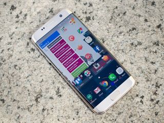
One area of the Galaxy S6 and S6 edge+ that needed no additional work was the display. Despite having much of the attention spent on the mind-bending dual curves that accent the sides of the phone, the display quality is top-notch amongst any phone display out there, curved or flat. Samsung has the exact same Super AMOLED display tech and QHD (2560x1440) resolution this year, albeit cut into a slightly different size at 5.5-inches diagonally.
But no matter the size, the screen here is absolutely superb in every aspect. Colors really pop, the viewing angles are great (important on the curves in particular) and text is sharp as a tack. You can argue that the colors are a bit over-saturated and unnatural, but even though there's an option in the settings to turn down the saturation I leave things at the default because they just look so good.
One of my favorite features of Samsung's latest displays is their incredible range of brightness, meaning you can crank it way down at night to reduce eye strain or let it go all the way up during the day. And when you leave automatic brightness turned on and are in direct sunlight, a special display mode is engaged to eke out a few extra nits to make it easier to see.
Sticking with micro-USB
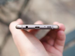
Beyond the physical looks of the phone, a good bit of focus is being put on Samsung's choice to stick with a micro-USB port on the bottom instead of the newer USB-C standard. Considering the hardware similarities to last year's flagship lineup it isn't too surprising that the same legacy port is back in 2016, but there are a few other things to take into consideration as well.
For as great as USB-C is, micro-USB does everything Samsung needs it to do.
Samsung has said that keeping compatibility with the current Gear VR headset was a priority, which necessitated keeping the port. It also has a long legacy of consumers with previous Samsung phones that it feels would prefer to keep those cables and docks around when they upgrade. Beyond their own intentions, they also just feel consumers aren't ready to upgrade their infrastructure of third-party accessories to USB-C despite all of the port's benefits.
Can you knock Samsung's unwillingness to jump into the future USB standard? Absolutely. Will it do anything to change Samsung's approach? Probably not. For now, even though USB-C is the new standard and has plenty of upside, micro-USB is doing everything Samsung wants it to do and for that reason sees no reason to move on just yet.
Fingerprint sensor, now with more possibilities
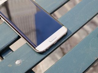
Plenty of focus is being put on fingerprint sensors in 2016 phones, but we should remember that Samsung was right there at the early stages of this game (at least amongst Android manufacturers) in launching the Galaxy S6 and S6 edge with excellent one-touch fingerprint sensors. These were a night-and-day improvement over the capable, but finicky swipe-style scanner in the Galaxy S5, and Samsung has carried over the same top-notch experience to the Galaxy S7 edge.
The biggest improvement this time around doesn't come from any change in the hardware, actually, but rather the access to Android 6.0 Marshmallow's new fingerprint authentication APIs.
With this new support, any app that targets Android's standard fingerprint authentication system will work perfectly on the Galaxy S7 edge — and that's extremely important as the number of Marshmallow-focused apps grows this year. Apps that only target Samsung's own proprietary fingerprint APIs from pre-Marshmallow releases will still work, too, which boosts the install base of capable apps until the new Marshmallow-enabled one start to fill up the Play Store.
Return of the microSD card slot
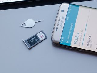
The SIM card slot on the Galaxy S7 edge is in the same place as prior models — on the top edge of the phone — but this year it harbors a little something extra: room for a microSD card. Samsung heard a considerable amount of angst regarding its decision to remove the microSD card slot from its flagship Galaxy phones in 2015 after having it every previous iteration. And no matter how many people actually miss the feature compared to how many it seems like, the slot is back on the Galaxy S7 edge.
But of course no feature addition comes without some sort of issue, right? This time adding the microSD card back to the Galaxy S7 edge brings up an interesting conversation because the phone is running Android 6.0 Marshmallow, which added a new way of handling removable storage called "adoptable storage." Adoptable storage allows the phone to take in an external storage device and integrate it to the system so that it can be treated as internal storage.
An SD card slot is something a lot of people were clamoring for, even if it doesn't work as adoptable storage.
That's a departure from the way previous versions of Android used an SD card, and for a multitude of reasons Samsung has decided not to include adoptable storage in its Marshmallow build for the Galaxy S7 edge — not the least of which being user confusion and worries over data corruption when a low-quality SD card is used. When you insert an SD card into the Galaxy S7 edge it works just like it did in any pre-Marshmallow phone you may have used, in that it's simply mounted as a separate volume for you to store data of your choosing on. That is, except for some kinds of data that just don't play well with removable storage of this type.
For example the SD card is best used for media storage, where the files are large and the speed requirements are relatively low — like movies and music loaded from your computer, or pictures and video generated on your phone. Whether you can install apps onto the SD card is a case-by-case situation you'll find by visiting the application settings, but chances are your most intense and powerful apps won't be allowed to move. You also wouldn't want to use the external storage for data that you don't want to be easily removed from the phone with a simple SIM tray tool.
Whether the SD card is all that useful when it's implemented this way is up for debate, but knowing that it is there for those who want to use it to its full potential is good. It doesn't have any effect on the phone if you choose not to use it, and it opens up a way for you to expand storage later if you need it.
TouchWiz has matured
Samsung Galaxy S7 edge Software
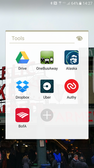
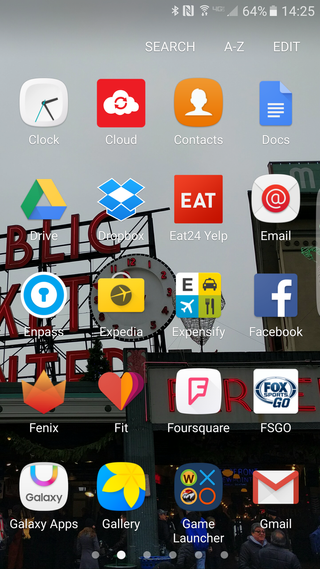
We've endured yet another year of "leaks," "sources familiar with the matter" and "confirmed reports" relating to Samsung supposedly dramatically overhauling its Android interface, and in little shock to myself Samsung hasn't done anything of the sort. Samsung's take on Marshmallow is much like its builds of Lollipop, which in itself was an improvement over previous versions but hasn't been a massive departure from what immediately preceded it.
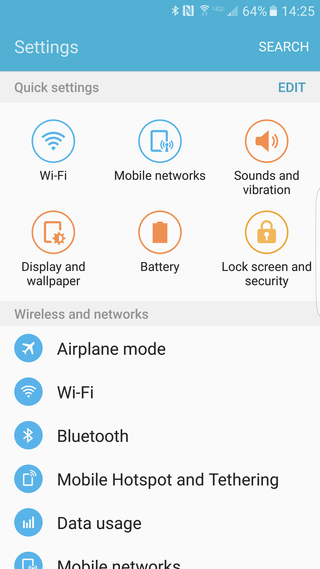
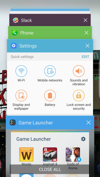
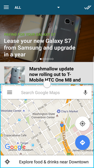
TouchWiz on Marshmallow
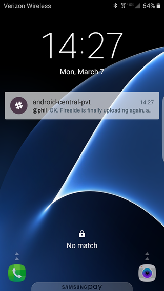
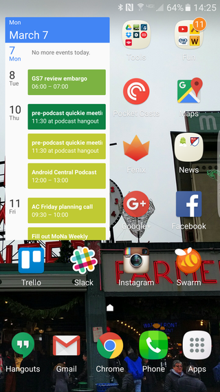
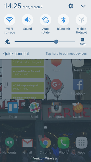
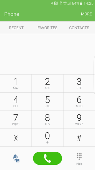
Marshmallow marks a point of subtle design changes around the interface. The biggest being the flatter, quieter notification shade that drops bright colors for subtle blues and greys, and a few Material Design-inspired animations throughout the user interface. Awkwardly placed drop shadows and unnecessary 3D animations are gone, which is a welcomed change, but much of Samsung's interface is the same as you'll find on a Galaxy S6 edge still on Lollipop. (Also remember that last year's Galaxy S phones are in the process of being updated to this same Marshmallow software.)
The settings menu, keyboard and default apps are just a few pixels away from being the same as before, which in this case is actually just fine considering that they were already very flat and modern after their previous updates. The vast majority of the interface is very refined by Samsung at this point, and beside the common complaint of people not liking it just because it's not "Stock" Android, it's hard to argue that this software doesn't work really well.

A word on security updates ...
We've been placing increased emphasis on monthly security updates since Google announced them in the fall of 2015. And Samsung has dedicated a website to security and what's new in its own updates.
While we applaud the transparency, the truth remains that it's a crapshoot when (or whether) a carrier-branded Samsung phone will be updated. While it's not quite a deal-breaker for us, it's something to keep in mind when purchasing.
There's definitely some room for Samsung — the world's largest smartphone manufacturer — to improve on this front.
Naturally the bump to Marshmallow also brings in those base features (aside from adoptable storage, as noted above) that we have all learned about at the end of 2015, which Samsung has implemented properly here. Doze and app optimization are built in to hopefully extend battery life when things aren't in use, runtime permissions help make it clear when apps are accessing different parts of your phone, new APIs for apps that need fingerprint authentication and so much more. Getting these changes for "free" are often far more interesting to some than the features Samsung adds after the fact.
New features
Refined looks are one thing, but altogether new features are always welcomed with any phone release and are often bigger changes than just the interface design.
One of the biggest features you're likely to use every single day is the new "always on" display. Now when you turn off your display, it goes just two seconds before turning back on a handful of pixels to display some useful information. You can tell it to show one of several clocks, a calendar or simplistic background image, with each one only taking up a small portion of the actual display thanks to the Super AMOLED screen tech that only lights up the required pixels to display an image.
This system barely uses any battery over the course of the day (Samsung says one or two percent), and saves you from having to power on the whole screen just to check things like the time or date. Unfortunately even the most information-dense of the widgets is rather sparse compared to the likes of what Motorola and Nexus phones offer, as you won't get a full set of notifications or changing information as the phone pulls it in.
Add these features up, and the software update gets kind of exciting.
Switching gears, Samsung has brought the "scrolling screenshot" option over to the Galaxy S7 edge after making it exclusive to the Galaxy Note 5. It's a wonderful way to capture more than just what's visible in the current window of the screen, and adds to an overall-improved screenshot function that makes it faster to capture and share from the Galaxy S7 edge.
In a surprising move, Samsung has added two rather large gaming-focused features to the phone as well. A new "Game Launcher" pulls in all of your games to a specialized folder so you can tweak a couple of settings before launching into them, including the ability to turn off notifications while you're in a full-screen game. Another option is called "Gaming Tools" — with this turned on, you get a small interface to handle certain gaming-focused features while inside a game. You can quickly lock the Recents and Back keys, minimize your game, take screenshots and even record your gameplay with just a couple of taps.
Shocker: Samsung's keyboard is actually quite good now. After several generations of keyboards that just had a weird timing and poor autocorrect tendencies, making it impossible for me to consistently type, the latest one shows an exponential improvement. I went through this entire review period typing everything from quick messages to long emails on the default keyboard with little issue — I could make it maybe five messages on the old keyboard before I swapped it out. I'm still not a huge fan of the integration with contacts (especially when it comes to email addresses) for auto correction, but considering the dramatic improvement here I'm happy to say that's my only issue with it.
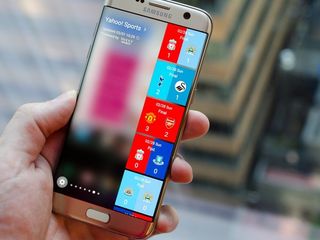
Edge screen
Some of the biggest feature changes come in the "edge screen" portion of the software, which is now filled with features more akin to the failed Galaxy Note Edge than what was available on the Galaxy S6 edge. Aside from the ability to change the size and transparency of the handle that brings in the edge interface, the interface change here is all about bigger and more involved edge panels.
The edge screen now goes beyond just apps and contact buttons, and adds in deeper experiences that you'll actually spend more than a couple seconds looking at and interacting with. Several new edge panels are pre-installed but not enabled, though a new "Tasks" pane that lets you go directly into specific parts of apps is enabled as one of the three defaults.
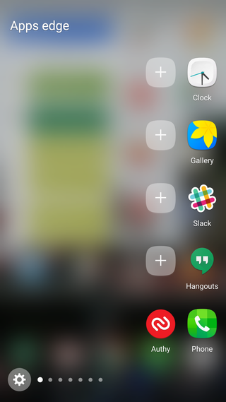
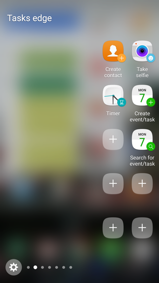

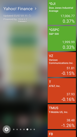
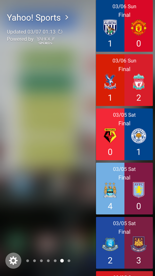
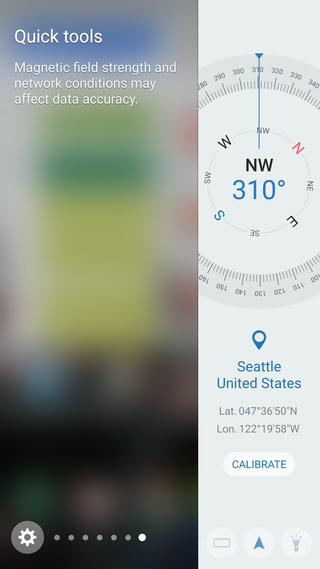
The new edge panels from Samsung include displays for weather, calendar, place profiles, tools like a compass and ruler, and Milk Music. There are also several Yahoo-partnered panels, including a news headline updater, a stocks ticker and sports score panel. The edge panels take up a lot more room on the screen
Samsung's third swing at the edge screen is the best yet, but it still isn't compelling.
Samsung's third swing at the edge screen also reintroduces the ability to download third-party edge screens from Galaxy Apps, which once again has the potential of letting developers get in on this new platform. At the time of this review there are a grand total of five edge panels available for download, and only three of them are actually from an independent developer. It's pretty neat that Samsung is opening this back up, but I don't see a world in which developers get behind it considering the limited scope and potential of actually making any money with them.
At this point I'm starting to understand the edge screen a tad more. It's a really good way to quickly switch between apps without heading back to the home screen, as well as contact people you get in touch with most — unfortunately it's still not a great experience when it comes to much more than that. Panels that show the weather and give you quick music controls are useful, but seeing small snippets of headlines or the latest sports scores just isn't well suited to what still amounts to about one third the width of the phone's display. The fact that tapping anything in these third-party Yahoo or CNN panels just opens up the browser to a webpage with more information isn't helping things, either.
I'm all for the innovation on neat software like this, and it helps justify the extra purchase price of the "edge" variant of the phone, but there needs to be a lot more improvement here if I'm to completely integrate these edge screen experiences into my daily life.
Actually, a trade off
Samsung Galaxy S7 edge Cameras
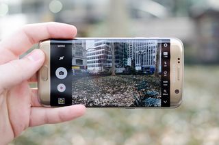
It's undeniable that the Galaxy S and Note phones of 2015 offered some of the best (if not the best) camera experiences of any phone. The 16MP sensor behind a super-bright f/1.9 lens, supported by great processing software, was a revelation. And after just four phones released with that sensor and lens combination, Samsung scrapped it entirely to move onto what we find in the Galaxy S7 edge.
In terms of numbers, it's pretty easy to wrap your head around. The camera sensor is now a lower 12MP resolution, which has the upside of making each individual pixel larger — now 1.4-microns instead of 1.12. It's also paired up with a new lens with a wider aperture of f/1.7. That sensor change also enabled a new "Dual Pixel" feature, as Samsung calls it, which means every single pixel on the sensor is being used for phase-detection autofocus (PDAF). That enables incredibly fast focusing times, whether you're picking up the camera to take a fast shot or moving between focal points on the fly.
Image quality


Samsung has focused its marketing on low light photos, so I'm going to start here with my analysis. When it comes to nighttime shots, the Galaxy S7 edge predictably excels. The bright lens and sensor bring in plenty of light, and the software does a good job of processing things. Resulting shots are smooth and stay true to the scene in terms of brightness — the camera doesn't attempt to over-brighten the scene to make everything visible, which is a good thing.
Low light is a point of emphasis, and it delivers.
Leaving the camera in Auto HDR mode actually surprisingly keeps HDR turned off most of the time in low light, and when you examine the EXIF data you can see why: the camera is for the most part using very slow shutter speeds to take in more light, keeping the ISO down to reduce grain.
The camera doesn't hesitate to use shutter speeds as low as 1/10 of a second, which may seem fast if you aren't privy to how cameras work but when compared to the usual 1/2000 or so of a daylight shot that's a very long time to keep the shutter open. Even with OIS (optical image stabilization), shutter speeds that slow can sometimes result in blurry (or at least soft-looking) photos.
I didn't experience completely blurry shots as often as I would've expected, but if you're not steady you will see soft images here. Knowing that it's all in the name of smoother low light shots I totally understand it, and if I wanted to do anything different the Pro mode won't hold me back in this regard.


Moving on to bright scenes, where the Galaxy S6 edge was a wonderful standout, things aren't quite as rosy here. Your average quick snapshot during the day is very good, as you'd expect out of any higher-end device released in the last year, particularly in situations where the subject is very close. In typical Samsung fashion the pictures are extremely pleasing to the eye and very vibrant, meaning they look great but aren't a perfect representation of the actual scene — a common thing that phones do. Edges are crisp, colors look punchy and the only real issue I can find in these situations is that the white balance tends to be a bit warm.
Where the issues start to creep in is in situations where there are bright and dark parts of a scene: for example a dark wall or shadow cascading across the shot. These shots are a big test of a camera's dynamic range and are historically tough for small sensors like those in smartphone cameras to handle. The Galaxy S7 edge takes in these scenes focusing strongly on the bright and vibrant parts of the photo, as you'd expect, and really leaves something to be desired in terms of quality in the dark portions. Dark areas get very blotchy and are noticeable immediately compared to the crisp bright parts of the photo. This is the case even with HDR turned on, which is designed to fix just these sorts of issues.
Hindsight can be a funny thing, but I would've been happy if this kept the Galaxy S6 edge's camera.
While the quality of the overall picture is still good, particularly when viewed at a phone size, the problems with these pictures are far more apparent when you actually zoom into them a bit. Even zooming in on a scene by 25 percent reveals lots of visual aberrations and chroma noise from aggressive over-smoothing of dark areas. Of course most people won't be zooming in on photos to evaluate their quality, but these problems exhibit themselves even when viewing a photo at its normal size if you're one to be looking for things to critique in a photo.
Samsung's decision to try and over-smooth these dark areas seems to be attempting to cover up for a shortcoming in the sensor that's unable to properly resolve a wide dynamic range in a single shot, and it's hardly the first smartphone camera that we've seen do just that. Photo "quality" is mostly subjective, particularly in phones where we take such a wide variety of photos with little planning or setup, but you can objectively say that in some situations the Galaxy S7 edge takes photos that aren't as good as the Galaxy S6 edge of last year.
As someone who really loves what Samsung did with cameras in 2015, that's a big disappointment. Last year Samsung was really only challenged by the LG G4 in camera quality, and this year depending on how other companies step up their camera games Samsung may be looking at some stiff competition. The Galaxy S7 edge still takes really wonderful pictures and can stick with the best of 'em in low light situations in particular, but to see a camera offering that isn't a complete upgrade from last year is a tough pill to swallow.
Hindsight can be a funny thing, but at this point I would not have been disappointed if Samsung kept the exact same camera from last year in the Galaxy S7 edge.
Camera software
The camera interface is basically unchanged from last year, which I'm completely fine with in this context — Samsung has one of the best camera interfaces out there. The simple set of quick toggles and buttons on either side of the viewfinder surface the most important features of the camera, and everything else is just a tap away in either Settings or Modes. Behind Settings you'll get every toggle you'll need for camera-wide changes, and Modes will let you quickly move to other shooting options like Pro, Panorama, Live broadcast, Slow motion and Hyperlapse (a new one).
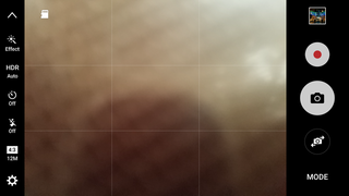
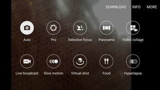
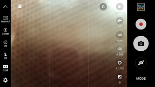
The camera interface is just as fast as we've come to expect from Samsung, and it can still be launched in about one second with two presses of the home button at any time. The Pro mode is still a very nice feature to have for those who want to tweak every possible bit of the camera experience, but most people will stick in Auto and have a great time shooting.
One important point to break out here is how the Galaxy S7 edge's camera handles using an SD card. Adding expandable storage by default sets that storage to be where pictures and videos are saved, save for burst shots which are still saved to internal storage for speed reasons. You'll see a small SD card icon in the viewfinder reminding you that that's where photos are going. One of the only real downsides of this system is due to how file permissions are handled — photos written to the SD card can't be deleted or modified by other apps, so for example if you use a third-party gallery app like Google Photos, you'll be unable to delete SD card-stored photos from that app. You can only delete them from Samsung's Gallery.
Video and front-facing camera
The Galaxy S7 offers a variety of video modes. You can shoot standard video in 1080p or up to 4K (UHD), as well as Hyperlapse time lapses and 720p slow motion. When shooting standard video at lower than 4K resolution you can also use digital image stabilization, which together with the hardware stabilization provides dramatically smoother video. Overall the quality is good here, though the microphones can leave a bit to be desired when compared to a dedicated video camera. Be sure to check out the video above for some clips of what the Galaxy S7 edge can do.
When it comes to selfies, the Galaxy S7 edge is good, but like last year still isn't great. The 5MP camera with f/1.7 lens definitely has the numbers right, but the fixed focal length can still provide for a little softness around your face depending on how you're holding it. But if you nail the framing and take advantage of the HDR mode you'll get some solid selfies from the Galaxy S7 edge. The "Panorama selfie" is still an awesome feature, as are the handful of ways you can actually take photos that don't involve craning your hand to tap a shutter button.
Every phone should have it
Samsung Galaxy S7 edge Waterproofing
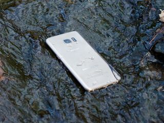
In 2014, after several months using the Galaxy S5 and loving its waterproof rating, I wrote that the feature should come standard on every phone. My feelings haven't changed since, though a majority of high-end phones still skip waterproofing. Thankfully, the Galaxy S7 edge brings an IP68 rating for dust and waterproofing.
It can survive in water — that doesn't make it a rugged phone.
Just what does that mean exactly? The Galaxy S7 edge can handle full submersion in water up to three feet deep for 30 minutes. That's far longer than anyone would actually feel comfortable leaving their phone in water, but the important point remains that the phone can come in contact with liquids and nothing bad will happen. Whether that's an unfortunate drop in the toilet (hey it happens), a bump into the sink while you're washing dishes or your clumsy friend spilling a beer on it at the restaurant, the Galaxy S7 edge will handle it just fine.
Now this doesn't mean the Galaxy S7 edge is anything approaching a rugged phone, nor should it be treated as such — the waterproofing really is here just to save your phone from accidents involving liquids. I couldn't consistently get the camera to record pictures or video under water, and the phone is quick to tell you to dry out the USB port if you try to charge it at any point close to the phone being submerged. Of course the physical design of the phone isn't designed to take much damage, either — keep that in mind before you go tossing this thing around. It may survive the water, but maybe not the rest of the actions that put it in that position.

Actually using it
Samsung Galaxy S7 edge Daily use
We know the specs. We know the features. But what's the Galaxy S7 edge like to use every day? That's the real question. Aspects of the phone like battery life, general interface performance and the speaker quality are big parts of how you experience the phone.
Battery life
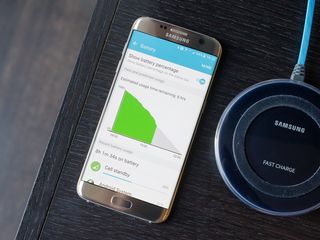
For some of us, there was no feature bigger (erm, smaller) of a disappointment on the Galaxy S6 edge than its battery life. Despite the gesticulating over how easy and fast it was to charge the phone, you just couldn't deny that the phone wasn't set to last through a day for most people. That turned into a disappointment for Samsung as well, which heard the calls and boosted the battery size in the Galaxy S7 edge to 3600 mAh.
If you've been following smartphones for any length of time you'll know that there isn't a direct correlation between battery size and battery life, and boosting the battery in the Galaxy S7 edge by 20 percent over the Galaxy S6 edge+ hasn't exactly added the same amount of longevity through the course of the day.
It's a full-day phone, but it will come up short if you push it too hard.
After several days using the phone in a variety of conditions I can say that it's safely a 16-hour phone in my regular use with some battery to spare, which of course includes tons of email, messaging, podcast listening and camera use. My screen is on for at least three hours every day, though like most people it's usually not for extended periods at any given time.
If I had heavier needs, like when I was traveling and hitting mobile data heavily, I could kill of the entire battery in just 12 hours — though I haven't found any of my recent phones to be able to handle such usage and still make it through the entire day. With a lighter day that involved mostly standby time resting in my pocket, I was easily hitting 20 hours of usage before I got down to the five percent battery mark to engage Power Saving Mode.
Those usage numbers are only slightly better than I experience on the Galaxy Note 5 and S6 edge+, and are just about reaching what I get out of the Nexus 6P on an average day as well. This larger-than-average battery capacity is definitely required to get the Galaxy S7 edge through a full day without making you worried about where a power outlet is, and it means I rarely worried about battery life on the phone. It doesn't, however, give you the confidence of "do anything, no consequences" battery life that so few phones can offer.
Performance
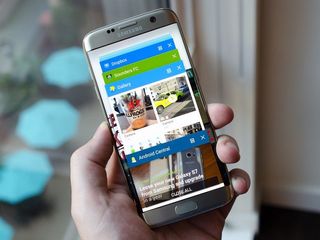
With these internal specs it would be surprising if anything else was the case, but it needs to be said that the Galaxy S7 edge really flies through anything you could want to do on a phone with a 5.5-inch screen. Whether that's a single heavy game or quickly switching between a handful of your favorite apps — or heck, using Multi Window to run two at once — the phone didn't slow down or give up. Samsung's own apps, crucially including the camera, were flawless in their performance.
I've yet to see a phone that was truly free from all slowdowns and hiccups, particularly once they get loaded up with apps, services and user data, but these small hiccups were few and far between on the Galaxy S7 edge — I only found a few simple delays in launching apps after closing a heavy game or updating several apps out of Google Play at once.
Speaker
When Samsung moved to this sleek new design last year, it clearly didn't plan to incorporate big speakers as a tentpole of the experience. You'll find the same speaker blasting noise out of the bottom of the phone through an eight-hole grille next to the micro-USB port, and while it's hardly challenging the likes of the Moto X or Nexus 6P it does get plenty loud for speaker calls and short videos.
Since the quality isn't that great — and frankly can't be with this size of speaker — Samsung does let you crank up the volume pretty considerably to try and at least give you something to work with, even to the point of introducing notable distortion depending on the type of audio. Chances are you won't need to push this thing to 100 percent volume to get what you need out of it (again, you won't be listening to music on this), but if you do it really shows off the relatively low quality of the speaker. I really would like to see Samsung move to a front-facing speaker(s) setup, but I'm just not sure how there would be room to do so in this current industrial design.
Worthy flagship
Samsung Galaxy S7 edge Bottom line
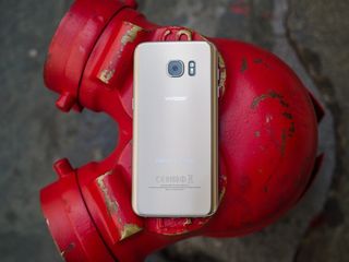
When you pull everything on offer in the Galaxy S7 edge together, it's pretty darn impressive. Don't let the physical similarities to the Galaxy S6 and S6 edge turn you away — there is so much to like about this year's flagship.
The phone is gorgeous to look at, and even if it collects some fingerprints on the back and the curved screen makes it a tad tough to hold those are small obstacles to overcome to have such a great design in your hand every day. It has all of the top-end specs you're looking for, great performance and still manages to get through a full day on the battery without carrying around a charger or battery pack. Samsung also brought back the SD card slot and waterproofing — all without changing the profile of the phone.
The latest version of Samsung's software hasn't changed the interface dramatically, but Marshmallow itself brings lots of useful improvements and the extra features that Samsung added in this release add up to a notable improvement from what we got with Lollipop. The edge screen experience may not be one that brings you over to buying a Galaxy S7 edge, but it also picked up notable improvements and can do even more than before.
And even the parts of the phone that were unchanged from the past models are standout features. The screen is absolutely the best available today, and the fingerprint sensor is still great to use every day.
Perhaps the only puzzling part of the whole experience is the camera. The Galaxy S6 edge set sky-high expectations that the Galaxy S7 didn't universally exceed, which leaves us a tad sour. Even still, this camera stands to be in the running for the best of the year, which really shows just how far Samsung is pushing its camera technology.
Should you buy it? Yes
Now here's the golden question: whether you should actually put down the hard-earned cash on a Galaxy S7 edge. Aside from its exceptionally high price that will likely push toward $800, there isn't really much you can find to keep the phone off of your short list if you're in the market for a high-end phone. If you're coming from an earlier Galaxy S phone it's pretty much a no-brainer, and if your phone from another manufacturer is over a year old you're likely to see lots of value in that upgrade as well.
Really, the only thing that will weigh heavily in keeping average people from upgrading their older Galaxy S phone to the new Galaxy S7 edge will be the external design similarities to the previous generation. Keeping things very similar has the upside of building a strong and consistent brand that's recognizable across years, but that doesn't do much in the way of getting people to upgrade to a new phone when it looks basically the same as the one in their hand today.
But looks can be deceiving — the visual similarities shouldn't keep you from considering the Galaxy S7 edge. It is in every way an improvement over the Galaxy S6 edge, and in nearly every way a better choice than the Galaxy S6 edge+ that was released just six months ago.
Where to buy the Galaxy S7 edge
This is always a tricky question when it comes to a device that's available globally from a variety of retailers, but we can at least offer up some handy links of those who want to buy in the U.S. from one of the major carriers. Verizon, AT&T, T-Mobile and Sprint all have the Galaxy S7 edge for sale, and you can also check out major retailers like Best Buy to buy for use on any of those carriers as well.
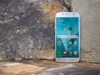
Also: Read our Galaxy S7 review!
The Galaxy S7 edge is a seriously great phone, but it's only half of this year's Galaxy S launch from Samsung — there's also the "standard" Galaxy S7. It's smaller and flatter, but offers much of the same experience we've covered here. It's worth learning about it to help you decide which of the two is right for you.
Hit the link below for our comprehensive Galaxy S7 review.
Andrew was an Executive Editor, U.S. at Android Central between 2012 and 2020.
