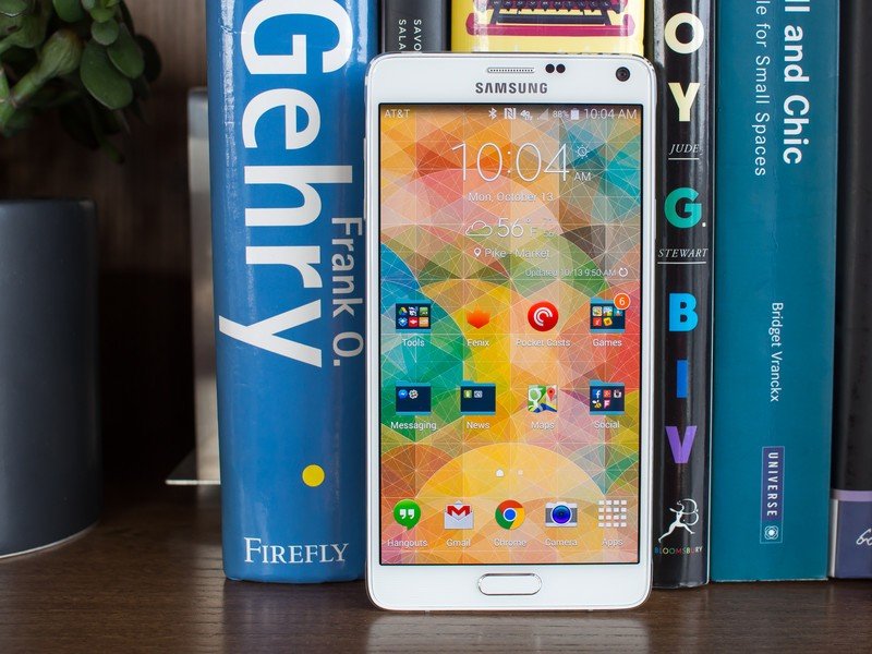
Since Samsung unveiled the Galaxy Note line in the fall of 2010, it has stood as the "tock" to the Galaxy S' "tick" in the product cycle year after year. The leading Galaxy S device of the year introduces all of the new software features, a new form factor and a new internal specs, while the Galaxy Note later in the year refines the physical design, enhances the software with new S Pen features and often fixes the pain points introduced with the Galaxy S — all while doing a little something extra with the increased screen real estate.
In many ways you could say the Galaxy Note is the device that Samsung really uses to push its limits. Where it tries things to see what sticks, then integrate it back into the next-generation Galaxy S.
This year is no different, and the Galaxy Note 4 is tocking right along, improving dramatically on the Galaxy S5. With a brand new aluminum exterior that looks and feels great, optical image stabilization on the camera, a new higher-resolution QHD display, top-end internals and small refinements on the software, this is a device any manufacturer would be happy to call its leading flagship.
Article continues belowDespite generally playing second fiddle to the Galaxy S5, it's actually not hard to say that the Galaxy Note 4 contains all of the features we wish were in the GS5 — if not for its larger screen size that's physically too much to handle for many. This is the real 2014 flagship for Samsung, and it's called the Galaxy Note 4. Read along for our full review.
About this review
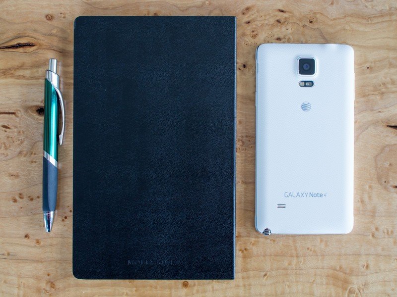
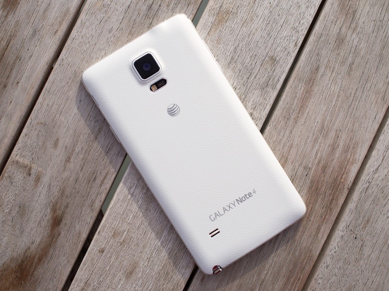
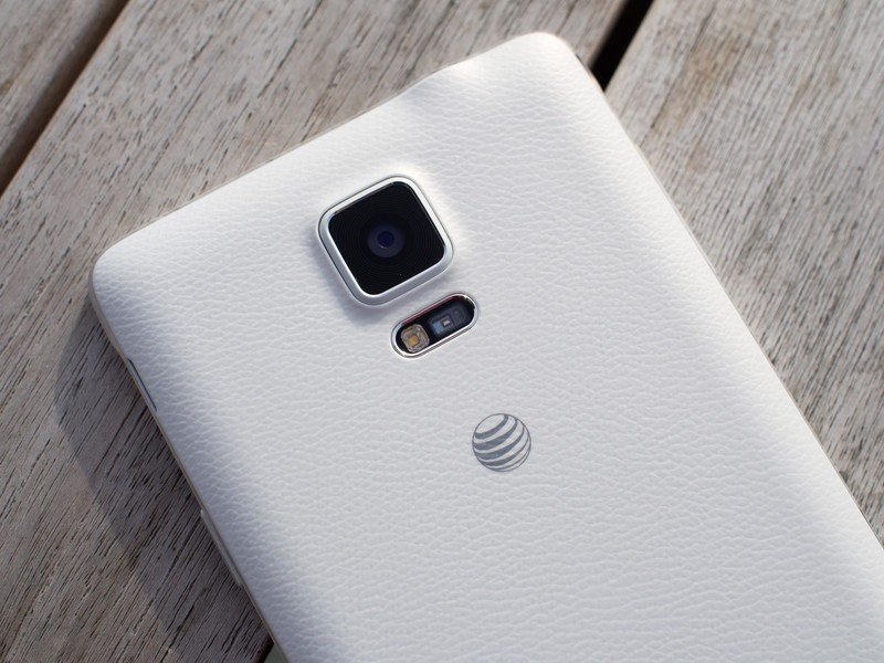
We're writing this review after a week using a white, AT&T-branded Galaxy Note 4 in the greater Seattle area with great LTE coverage from the carrier. Our Note 4, provided by Samsung, was running software build UCU1ANIE. For the majority of our time with the Note 4 we had an LG G Watch connected over Bluetooth as well.
Galaxy Note 4 hardware
The best-looking, best-feeling Samsung phone yet
Samsung's switch from plastic to metal for its primary smartphone build material has been a long time coming. Although the Galaxy Alpha — which has nearly identical design and materials — may have spoiled the surprise for some by being released first, the Galaxy Note 4 will likely be the first time regular consumers get their hands on a metal phone from Samsung.
Get the latest news from Android Central, your trusted companion in the world of Android
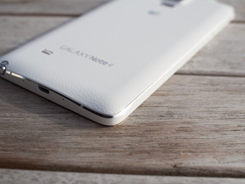
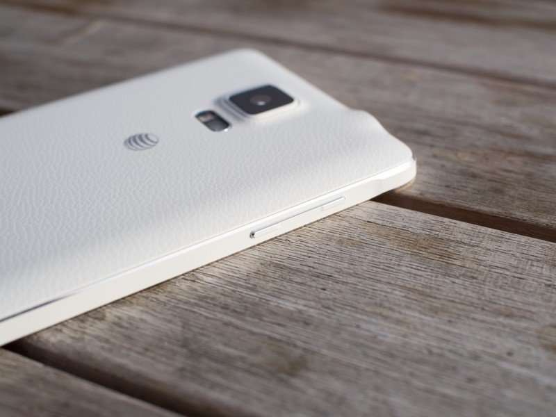
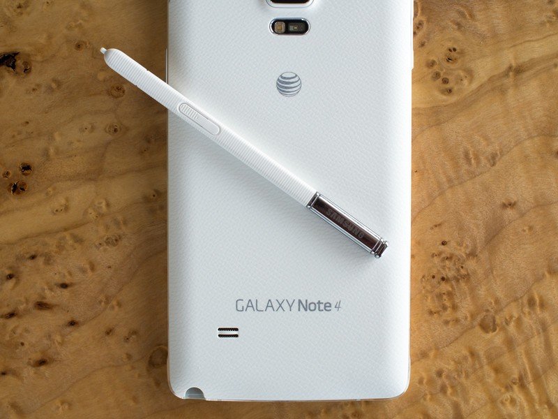
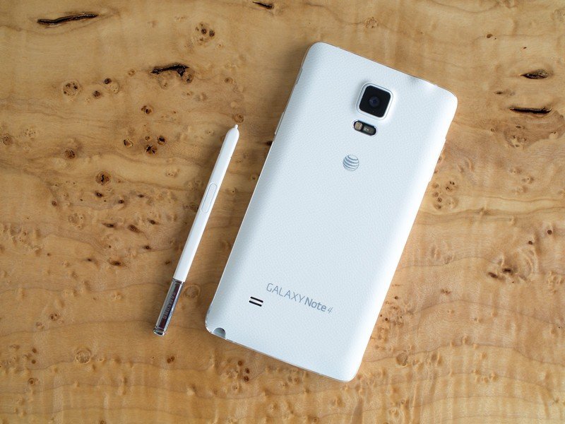
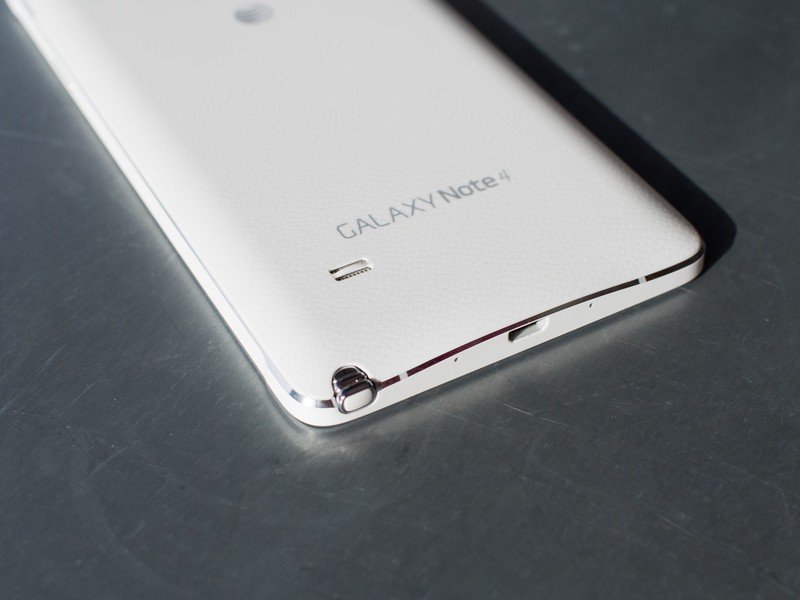
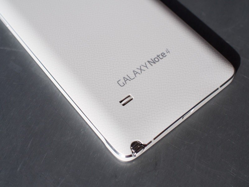
The metal — a combination of aluminum and magnesium — curves around the edges of the Note 4 in a solid band, with the flat portions taking on a very slightly textured color that matches the rest of the phone. The shimmery chamfered edges above and below the colored stripe add contrast and give it that "Samsung" kind of bling, showing off that this is indeed a metal phone. The metal runs deep into the device as its frame, adding rigidity as well.
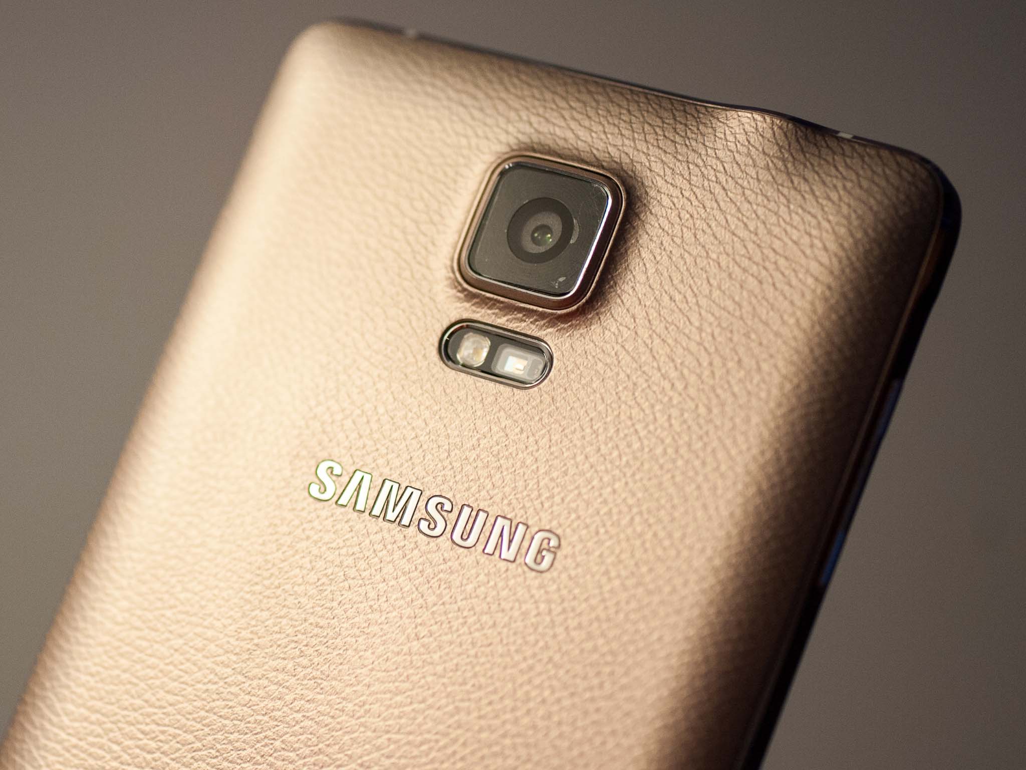
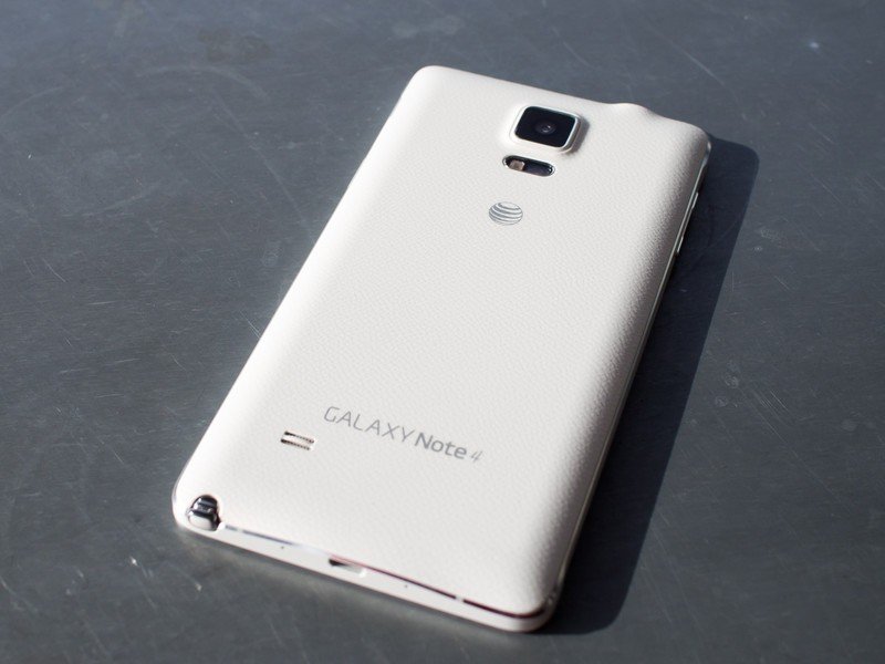
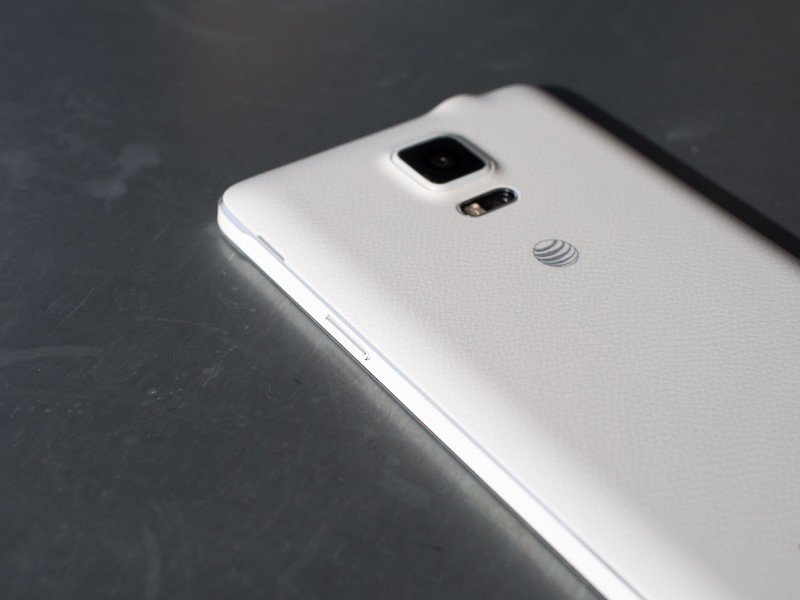
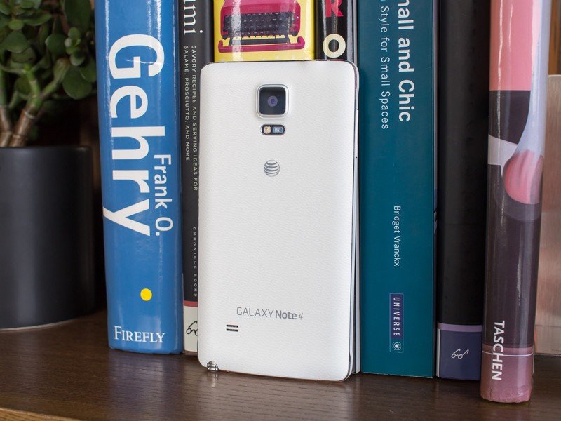
I can't overstate how this build simply puts Samsung devices of the past to shame, with an air of class and beauty you just can't squeeze out of a plastic device. Even though the entire back of the phone is still plastic (and removable, by the way), you don't seem to care so much because the main contact points for your hand and fingers are all metal. The plastic meets up with the metal seamlessly on the back, with nary a gap to be seen.
The Note 4 puts Samsung devices of the past to shame, with an air of class and beauty you just can't squeeze out of a plastic phone.
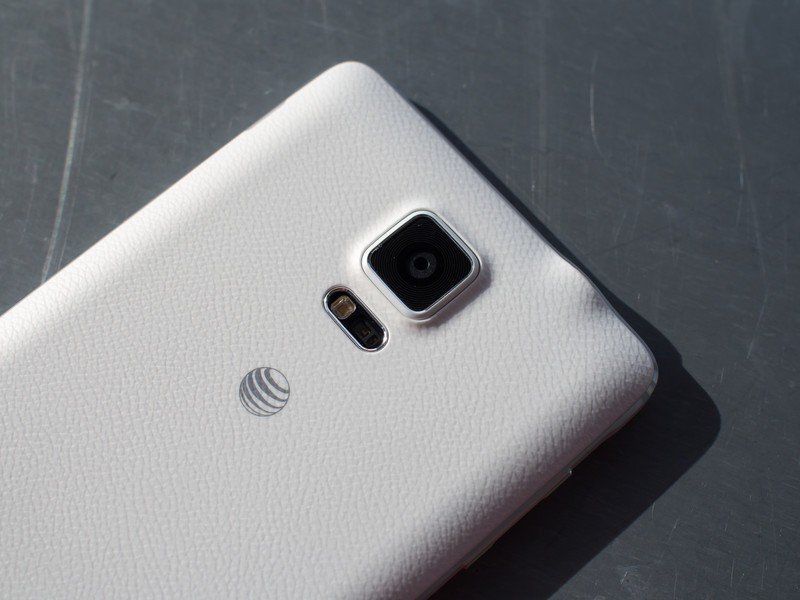
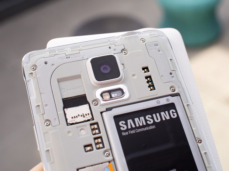
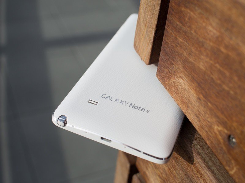
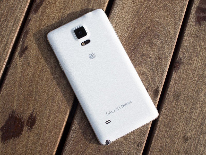
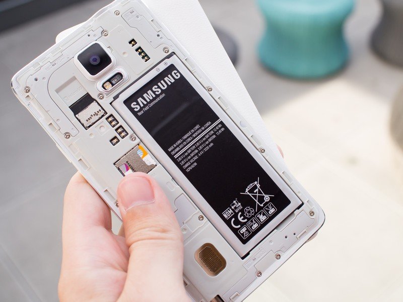
The inclusion of a plastic back lets Samsung work in its (in)famous faux leather pattern — though it does lose the stitching introduced on the Note 3 — but it also reduces the overall weight of the device to just 176 grams. That's just 10 percent heavier than the HTC One M8 in a much larger size. The plastic also lets Samsung keep its trademark removable battery, as well as stow the SIM (which is a Micro, not Nano, by the way) and SDcard slots underneath so that nothing breaks up that lovely metal band around the edges.
Perhaps most important, the Note 4's plastic back improves usability dramatically by giving you something to hold onto when using it in one hand. The textured material has more grip to it than any all-metal surface, and every little bit helps when you're fighting an uphill battle of one-handed use on a 5.7-inch phone.
For all it does, the plastic back hasn't saved Samsung from needing to inject a little bit of plastic into the metal for antenna reasons, and you'll still notice four small lines — two on top, two on bottom — that ever so slightly show up on the chamfered edges. It actually took me about a day to notice they were even there as they're cleverly disguised, so I can't complain too much.
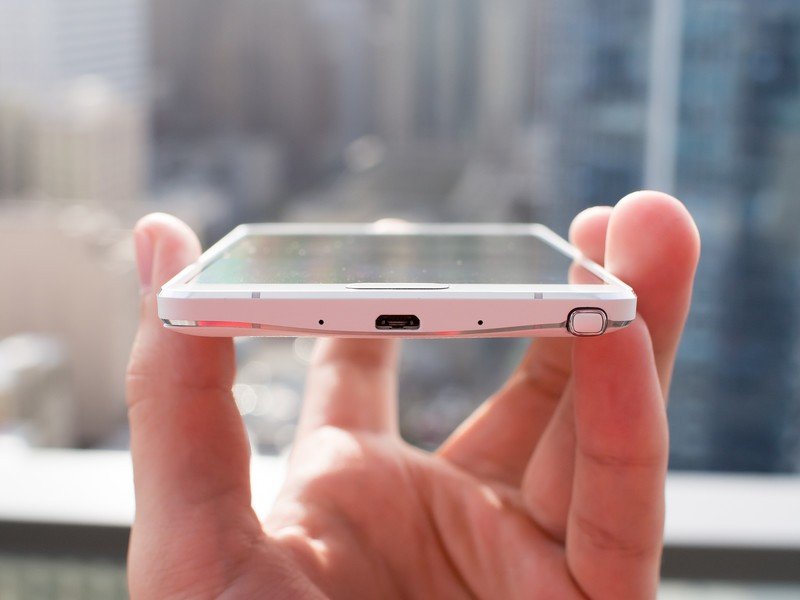
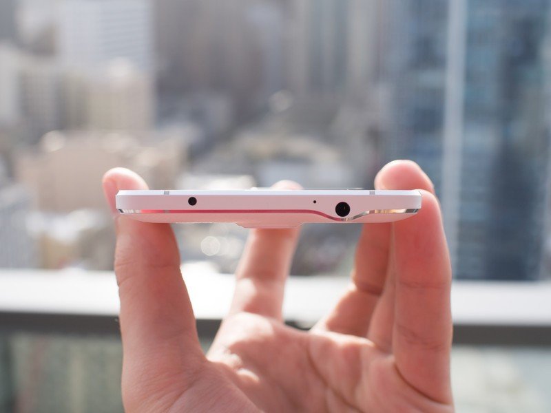
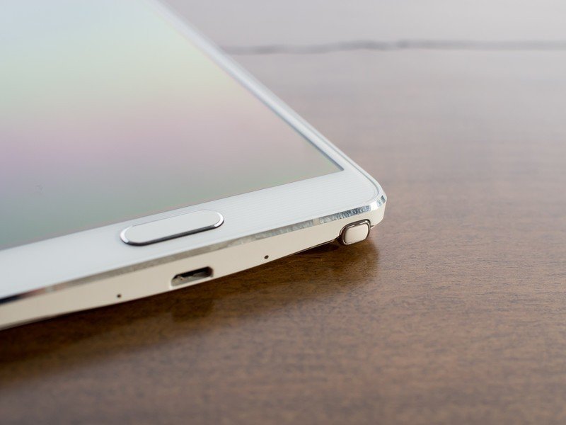
Volume and power buttons are found in the standard places, as are the headphone and USB ports. The buttons match the metal edges perfectly and are easier to find and press in regular use than previous versions. Samsung has decided to ditch the USB 3.0 port and go back to 2.0 for some reason, but as an added bonus there isn't a flap to be seen over the port here like the Galaxy S5 — the tradeoff being that the Note 4 isn't water resistant.
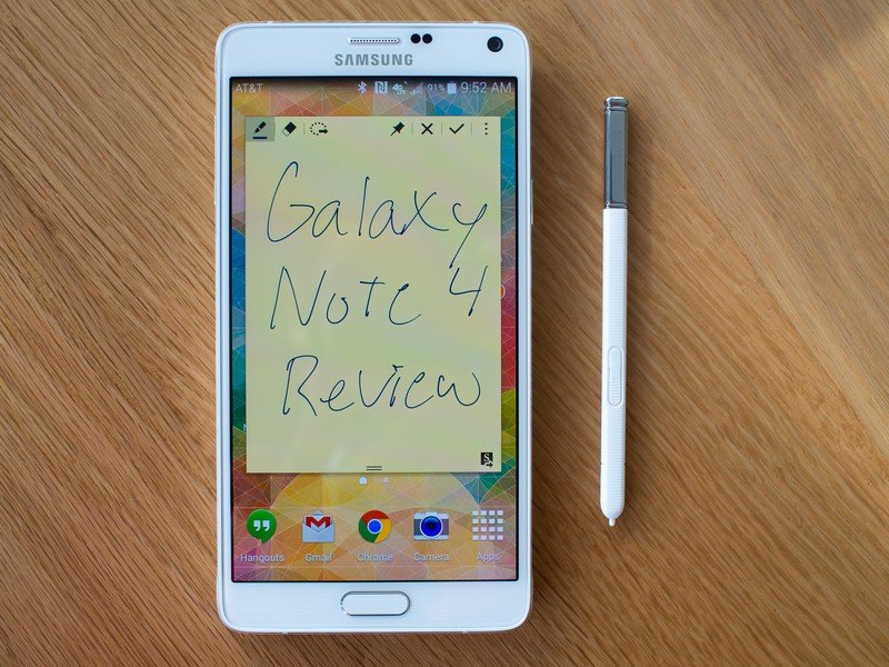
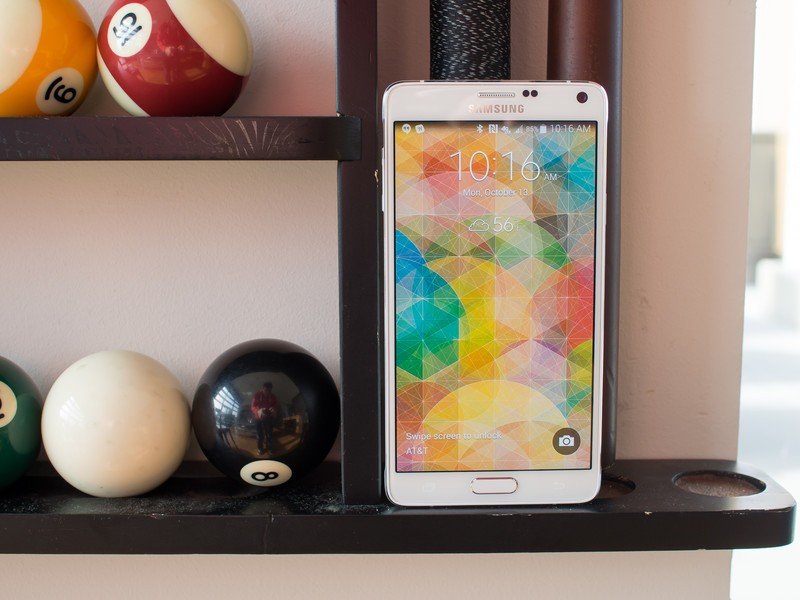
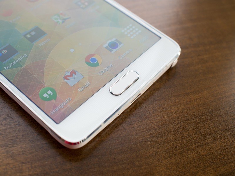
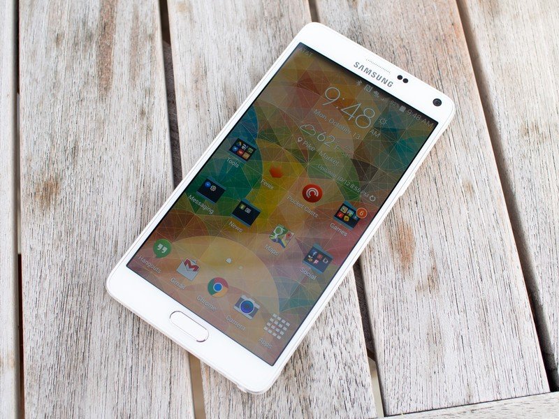
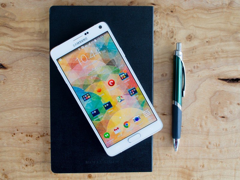
The front of the Note 4 is distinctly Samsung, with a logo and speaker above the screen balanced out by a large rectangular physical home button on the bottom. A pair of sensors and a new 3.7MP front-facing camera join the speaker on top, while capacitive multitasking and back keys flank the home button on the bottom. The screen glass has a very light lined pattern underneath it on the bezels, while the glass itself flows nicely into the metal edges.
The Note 4's size means it's still a bit of a hassle to use one-handed.
Despite the dramatically improved feel of a metal chassis and the added texture of a plastic back, the Galaxy Note 4 is still a bit of a hassle to handle in daily use. With a 5.7-inch display and notable bezels on the top for sensors and bottom for navigation buttons, the Note 4 is still above the range of "normal" sized phones — even as that definition has changed over the years.
At 153.5 x 78.6 x 8.5mm it comes in a touch taller and thicker, but narrower, than the Note 3, which in itself is still considered quite large. For further reference, that's 7mm taller and 4mm wider than the LG G3. Samsung isn't trying to mislead anyone into thinking this phone is manageable in one hand on a regular basis, and as I'll get to in the software section of this review it has expanded the one-handed use features to act as a crutch when you only have one hand free.
But no matter what you do in the software, the Note 4 is still going to be just too large for many people to handle. These large-format phones aren't getting any smaller, and our hands aren't getting any bigger — the tradeoffs of what you get for the size are just getting more enticing.
Galaxy Note 4 specs
What more could you ask for?
Lurking beneath the beautiful exterior of the Note 4 are internal specs that follow a logical evolution from the Galaxy S5 (but match the Korea-only GS5 LTE-A), keeping the phone on the bleeding edge of what's available in late 2014. A Snapdragon 805 quad-core processor is clocked at 2.7GHz and paired up with an Adreno 420 GPU and 3GB of RAM — all necessary materials to push around a brand new 2560x1440 Super AMOLED display.
The Note 4 ships with 32GB of internal storage by default, which is important because a full 7.78GB is locked up by the system in this AT&T model. Even after getting the Note 4 set up and installing several dozen apps (including games) I still had almost 18GB free — plenty of breathing room for most. If you somehow need more, an SD card slot under the back plate will add up to another 128GB.
Samsung has also brought over two headline features from the Galaxy S5 — the finger scanner in the home button, and the heart rate sensor under the camera on the back. For most people they will basically just be a pair of meaningless one-time use features, but for a small set a finger scanner and heart rate sensor will be worth having.
These are the same parts as the GS5, and for that reason they haven't made their way into my personal life — the finger scanner just isn't good enough (particularly when fumbling this large device) and the heart rate monitoring isn't something I need on a regular basis.
Galaxy Note 4 display and speakers
This display. My oh my, this display.
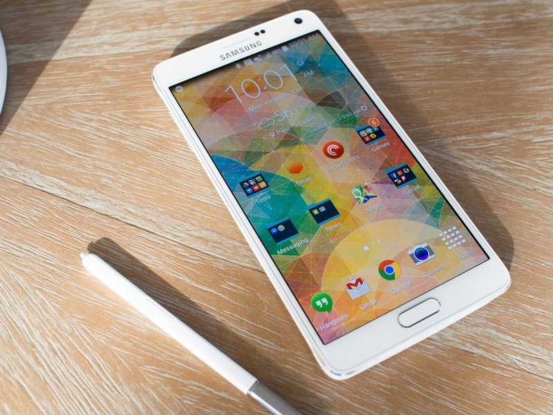
Rather than increasing the physical size of the display coming from the Note 3, Samsung has just pumped up the pixel count to a rather impressive 2560x1440 and improved many characteristics of the panel. Though they were beaten to this high resolution by the LG G3 it doesn't make the display any less impressive, and it's no stretch at all to say this is the best display Samsung has ever put in a phone.
This is the best display Samsung has ever put in a phone.
Even with the notable improvements in outdoor viewing and brightness introduced in the Galaxy S5, the Note 4's display kicks things up another level. There's a reason why DisplayMate said this is the best screen out there, bar none — it's bright, insanely crisp and easy to see in daylight, even with the white model I have that has more reflective bezels.
With Samsung's software adding some adaptive tuning and brightness controls based on the app and content you're looking at, you may not be getting the most accurate picture but you're certainly getting a beautiful one. If you choose to turn off the adaptive software controls it mellows things out a bit, but it's still worthy of praise in either case.
I'm hard pressed to find a single flaw in the Note 4's display, but the one minuscule gripe I have is that in very low light situations when you have the brightness all the way down the screen tends to look a bit blue. That's something that often comes with the territory when you use an AMOLED panel, and thankfully color reproduction is great in all other situations, but it's something you notice in that very specific situation.
But that's like criticizing one subpar brush stroke on a work of art — there's still no reason to say that this display is anything but the absolute pinnacle of what's available in a phone today. I put it right up along the LG G3, with the tiebreaker being your personal choice on LCD versus AMOLED. But even that choice is a tough one, as Samsung is doing some very interesting things with the AMOLED technology that it has refined over the years.
Full disclosure: For the sake of completeness, I also need to mention that my Note 4 came with a group of a couple dead pixels at the top edge of the display. Because of its size and positioning the dead spot didn't change my daily use, but it may be noticeable in some pictures of the display in this review. We've reached out to Samsung for comment, and more information on its dead pixel policy. But as it stands there's no reason to assume this is indicative of an issue with all Note 4s.
The Note 4's single rear speaker isn't particularly loud or impressive.
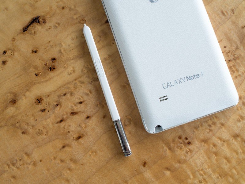
For all of the praise I can heap on the Note 4's display, its speaker quality isn't worthy of such kind words. A small, fingernail-sized loudspeaker is found on the back of the phone, and a small bump in its grille keeps it lifted off whatever surface it's on. Despite that clever design choice the Note 4's one small speaker just isn't that loud, and with the huge size of this phone — presumably to be used for media watching — you expect a bit more in terms of audio.
It's more than adequate for ringtones, notifications, speakerphone calls and the like, but you won't want to watch more than a short YouTube video without plugging in some headphones. This isn't HTC's BoomSound — actually, it's not much of any sound.
Software and performance
The design we know, with tighter screws
For all the major notable changes in the Note 4 when compared to the Galaxy S5, the software on this phone is nearly identical to that on its smaller cousin. When you set the two side-by-side you do notice subtle differences, and I have to say that they're all for the better.
The notification pane has been cleaned up, with no more "S Finder" and "Quick connect" buttons gumming things up. It also drops the time to now show just the date in a larger font in the top bar, and the full layout of quick settings no longer has tacky line dividers.
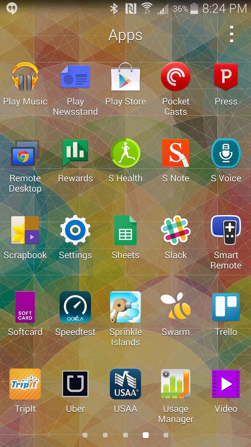
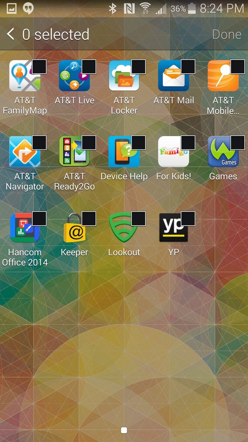
The launcher changes are just as subtle, with the "home" indicator changing from the look of a house to just a house-shaped pentagon and the "Apps" shortcut losing its heavy drop shadow. The page indicators in the app drawer also lose their drop shadows, while the still horrendous-looking app folders tone down their swoopy animations.
The leftmost home screen pane is now populated with a view called "Briefing" that replaces the old "My Magazine" branding but keeps much the same functionality. Similarly to Blinkfeed on recent HTC devices, Briefing (which is still powered by Flipboard) is an aggregator of news and content for you to browse through at your leisure. It's basically just like having Flipboard embedded into your launcher for casual reading of news from top sources, and it just isn't as useful as having Google Now over on that left side. It took a few days, but after realizing that I don't use it on a regular basis I turned it off in the settings. If I want to read Flipboard, I'll just open the Flipboard app.
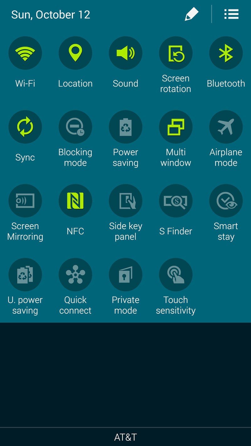
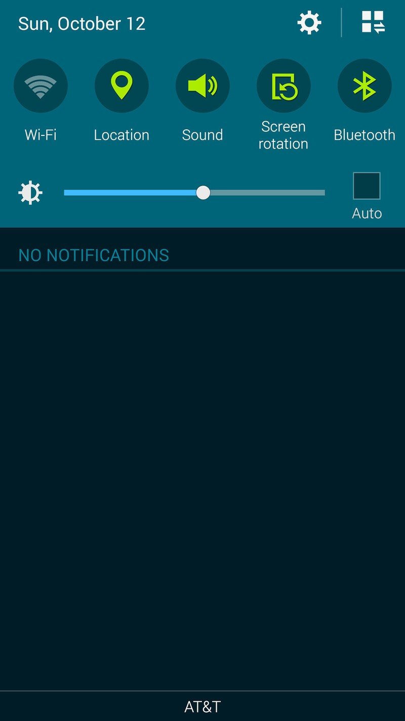
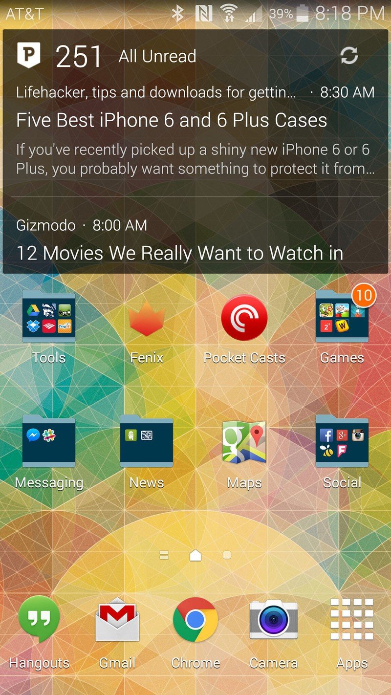
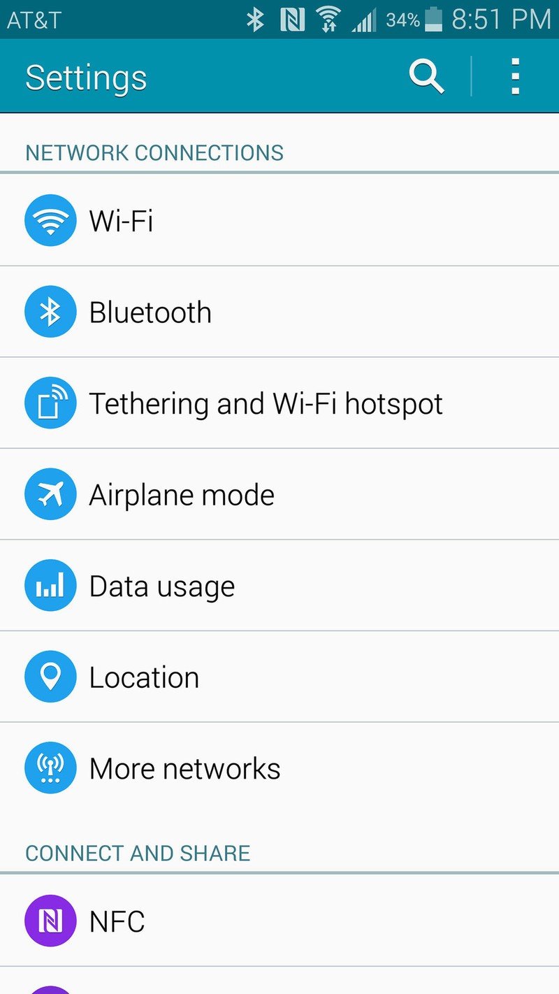
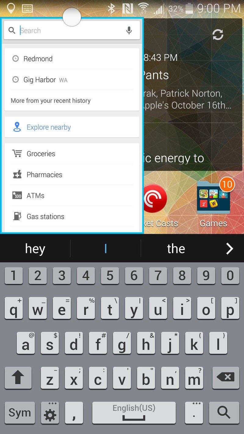
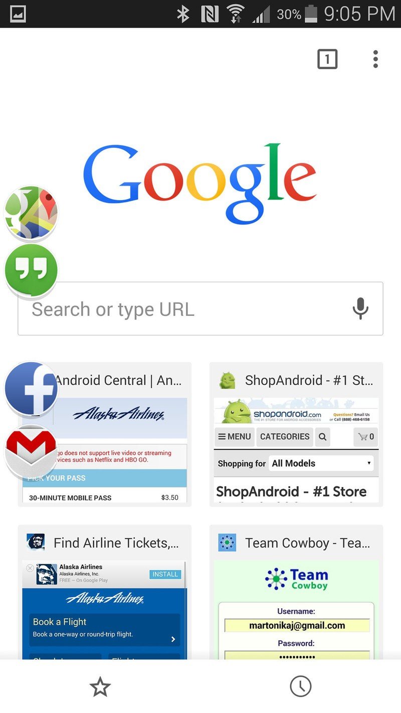
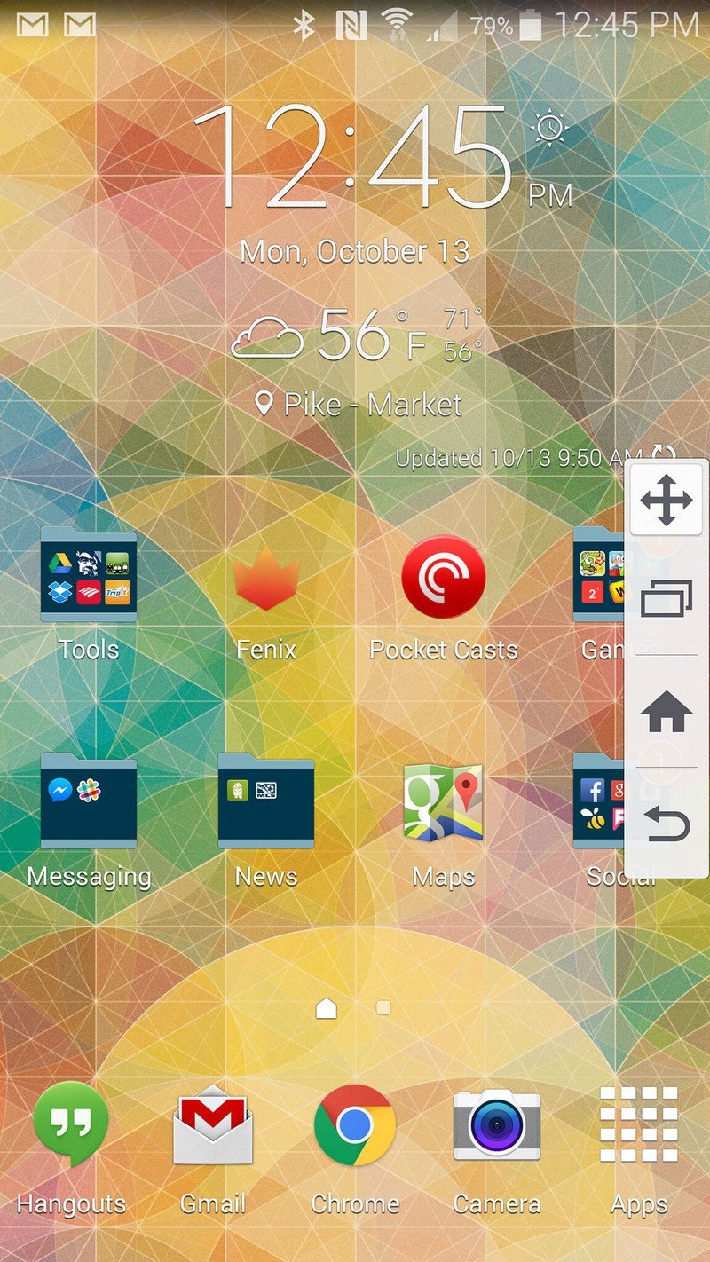
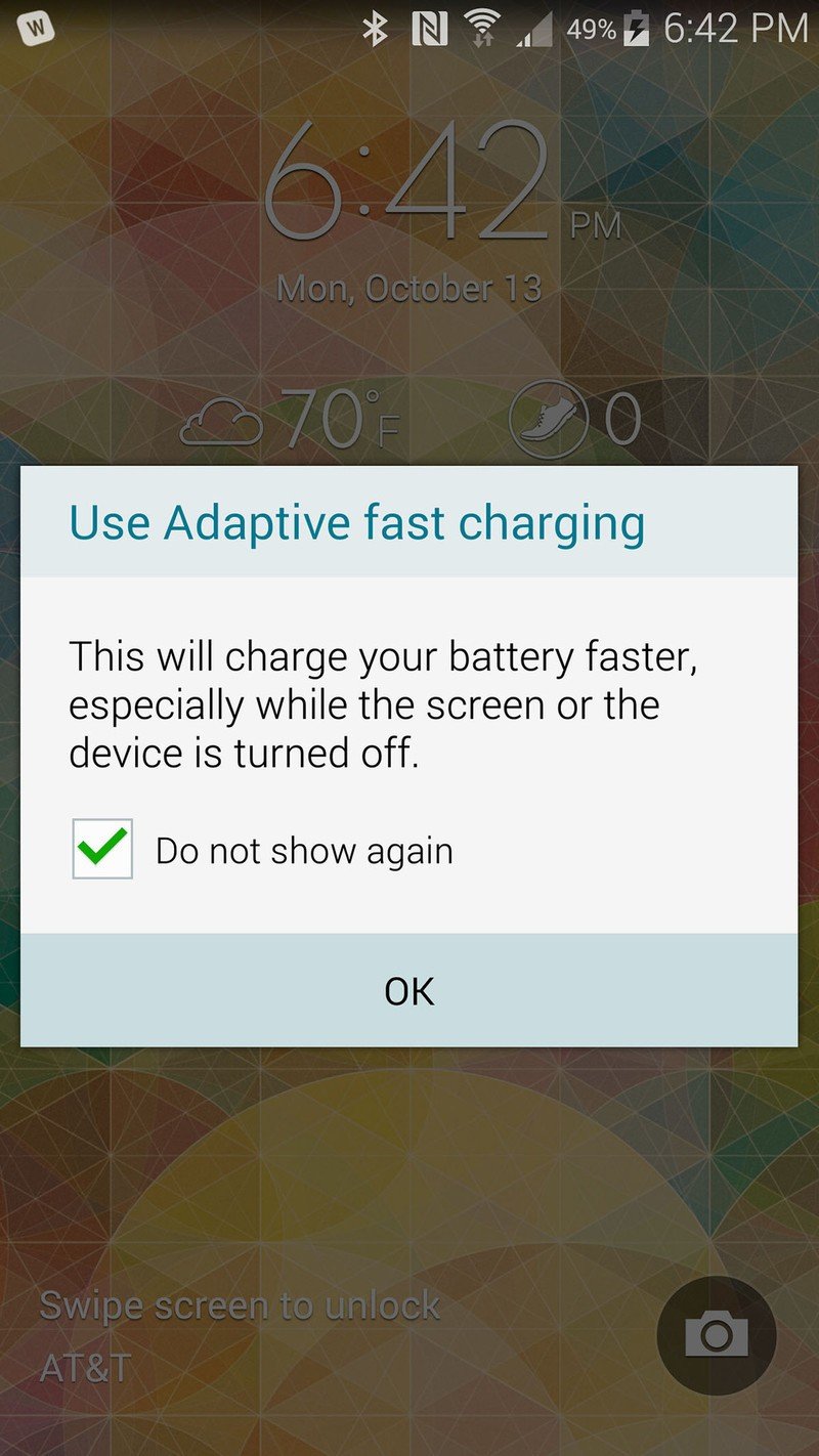
TouchWiz on the Galaxy Note 4 is lighter, brighter and just a little friendlier.
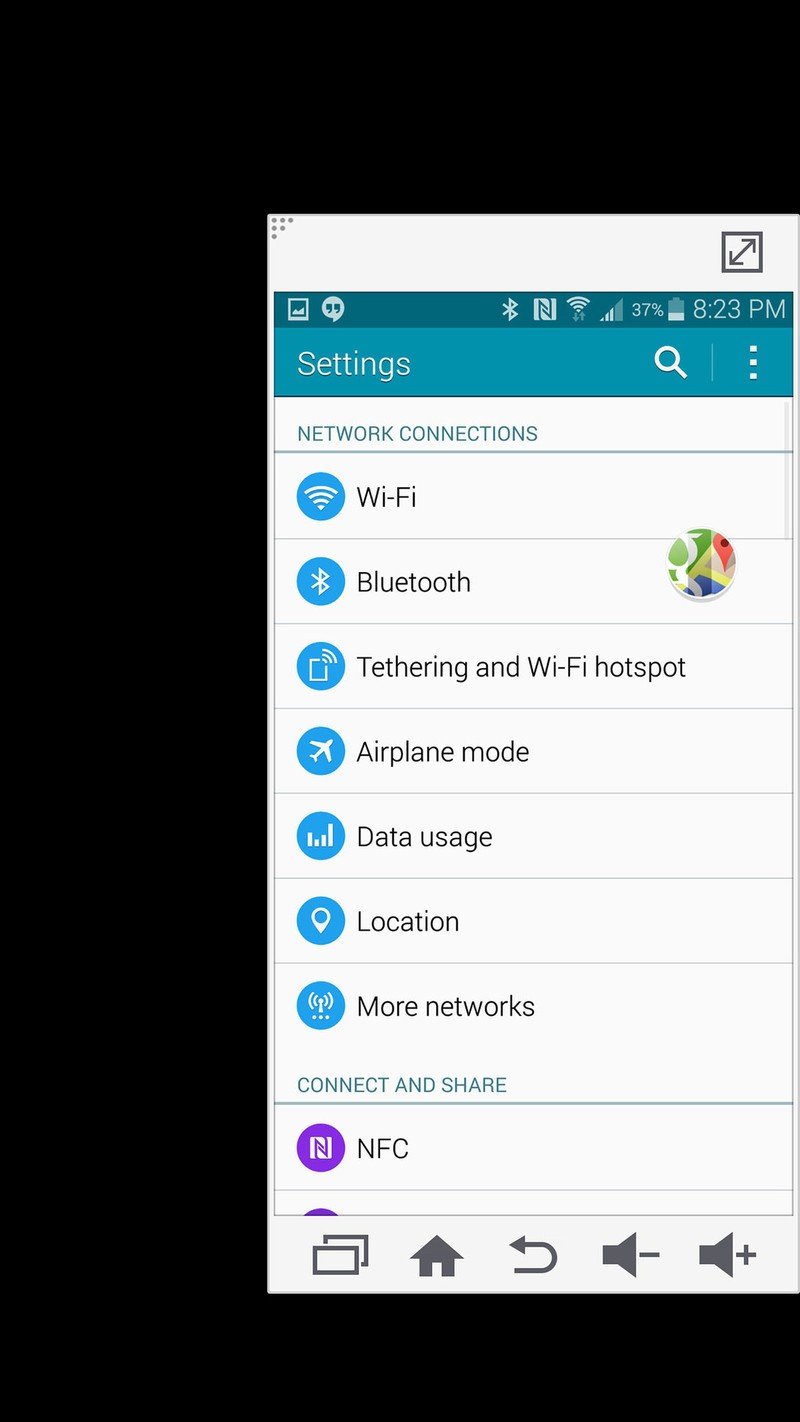
Across the app drawer settings and device settings Samsung has shifted to a much more appealing white background with black text over the previous deep blue with white motif. Though it's a bit more of a power drain on an AMOLED device, I personally like the move to a white background — it's more friendly, easy to read and provides nice contrast to the rest of TouchWiz which is still very heavy on blues and greens throughout. The Settings have also been simplified to only offer a "list" or "tab" view, with the old "grid" view hitting the dust.
At this point you have to think this is just Samsung trying a few different things to tighten up TouchWiz's design as it waits for the big transition to Android L. Considering how many Samsung phones are out there it's no stretch to say that in many markets there are more people who are familiar with Samsung's UI than those who are not, so it's really tough to throw much design snobbery their way at this point.
After a full week with the Note 4 using the stock launcher, keyboard (which is actually a joy to use on this huge screen) and lock screen I wasn't left clawing my eyes out, and I think that says something about how Samsung has refined things. It isn't going to change dramatically — barring some complete 180 with the release of Android L — so we better get used to it. And if you don't really care for Samsung's software no matter what, go ahead and toss your favorite launcher and keyboard on there — I think you'll come out happy in that situation.
The biggest sign of change in the software on the Note 4 is in the arena of the S Pen, Multi Window and One-handed operation. Samsung has always focused on the power of the Note and its additional screen size as a gateway to getting more done, and with the changes this year it's one step closer to realizing that goal.
The Galaxy Note 4 S Pen
The S Pen potentially is the area that has seen the least amount of change, and that isn't necessarily a bad thing. Samsung's don't-call-it-a-mere-stylus has always been great, and now just like many other areas of the Note 4 it has been notably — but not substantially — improved.
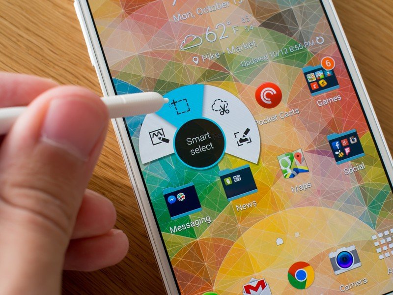
The pen itself is now ribbed to help you hold onto it better, and the single button still opens the same "Air command" interface for launching into often-used S Pen features. The old "Pen window" feature is gone, but you get the familiar Action memo, Smart select, Image clip and Screen write options. Action memo has been beefed up to let you pin quick notes to your home screen as widgets, but it can still of course launch you directly into S Note if you choose.
S Note has received a big visual makeover, but the functionality is much the same as before. You still get hand/palm rejection when writing intensely, as well as a smattering of brushes, colors and other options.
Samsung hasn't really reinvented the S Pen, but it's beefed it up in a few areas.
The S Pen now also now works more like a traditional mouse cursor when using Samsung's included browser, indicating to you when a link is clickable as you hover over it with the pen. You can also hold down the S Pen's button to drag and select images or text for editing, which is a bonus that reduces the number of times you're swapping between stylus and finger.
I still tend to worry that for many who own a Galaxy Note, the S Pen spends most of its life safely tucked away in its holding slot, and there's nothing introduced on the Note 4 that's going to change that behavior. In many cases the S Pen is used as a fine-pointed implement to do things you could do with your finger anyway, and I think that usage comes up short of what Samsung would hope for when it comes to the Note series.
Multi Window and one-handed operation
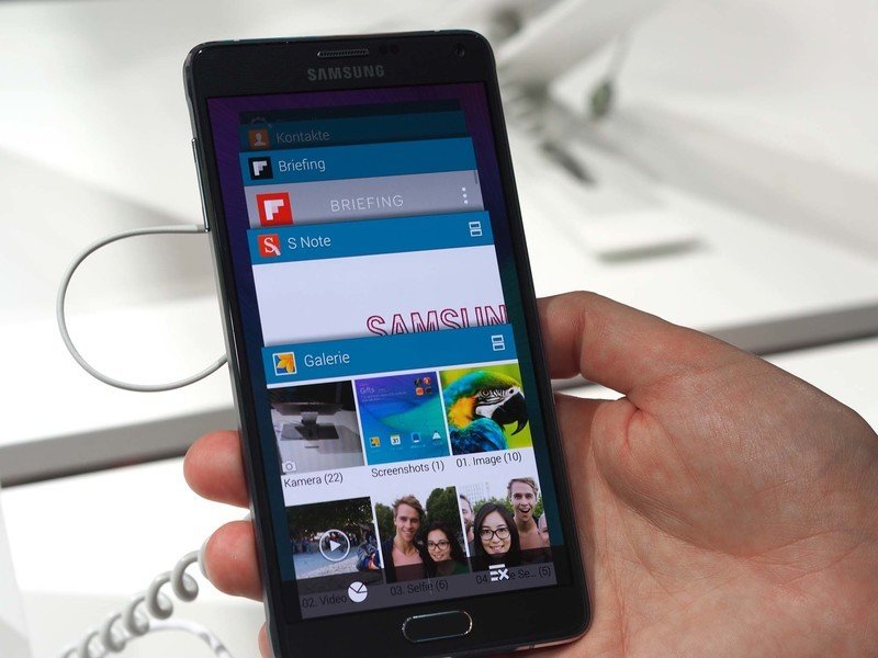
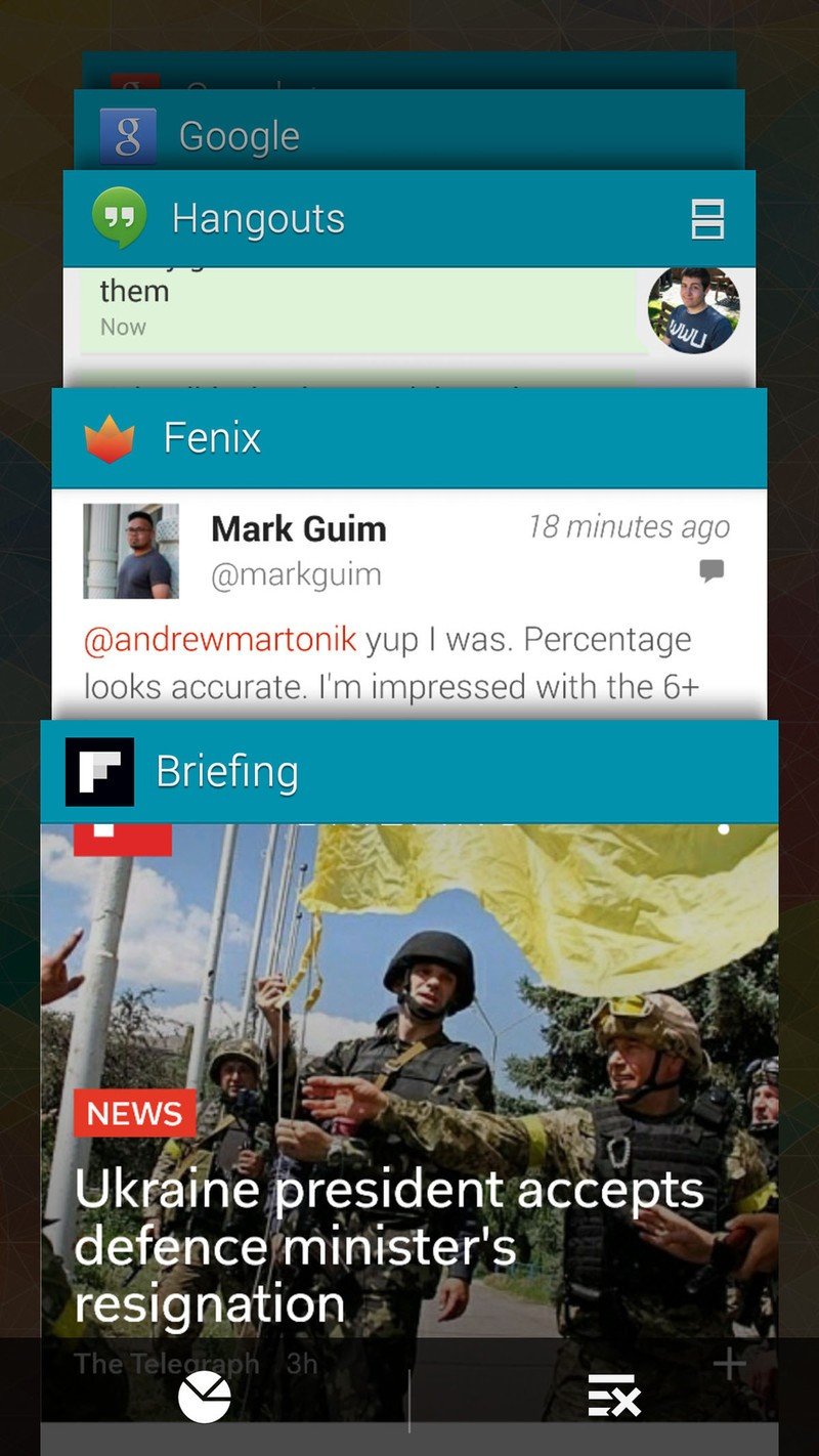
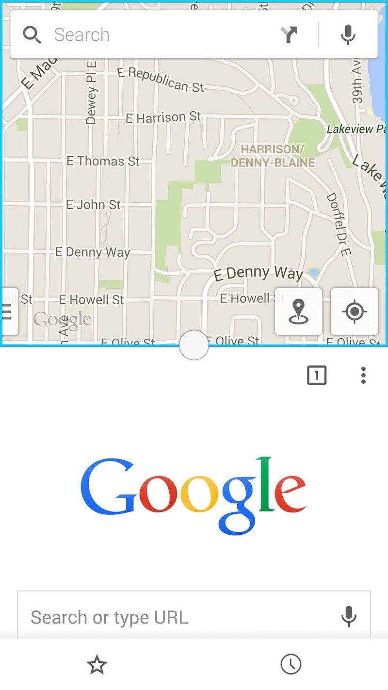
The Multi Window feature is now much easier to use and no longer requires a persistent tab on the side of your screen. You can launch apps into a split-screen view with a tap of a button on the app's card in your Recents (multitasking) view, opening that app in the top half of the screen and launches an app picker in the bottom to get things going. You can also long-press the back button to open up a familiar sidebar to get a list of Multi Window capable apps that you drag onto the screen.
These are two huge improvements to the way Multi Window works, but it still comes down to being a relatively niche feature that only works with some apps. Opening up my Recents list right now I have six apps that work with Multi Window, but also nine that do not.
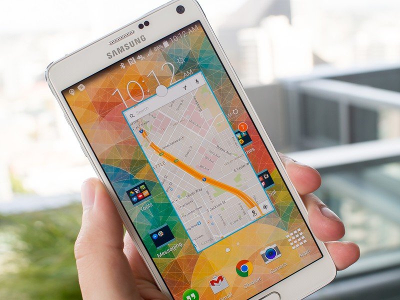
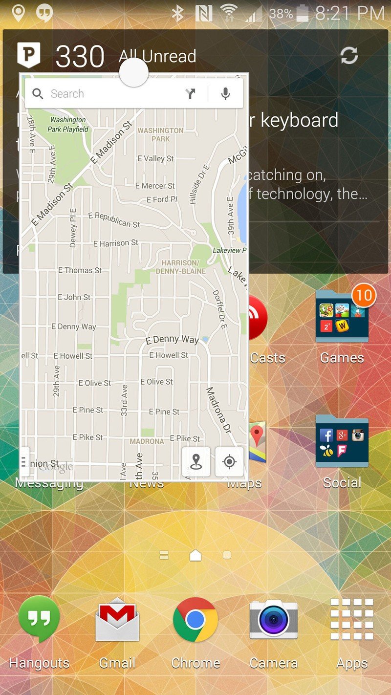
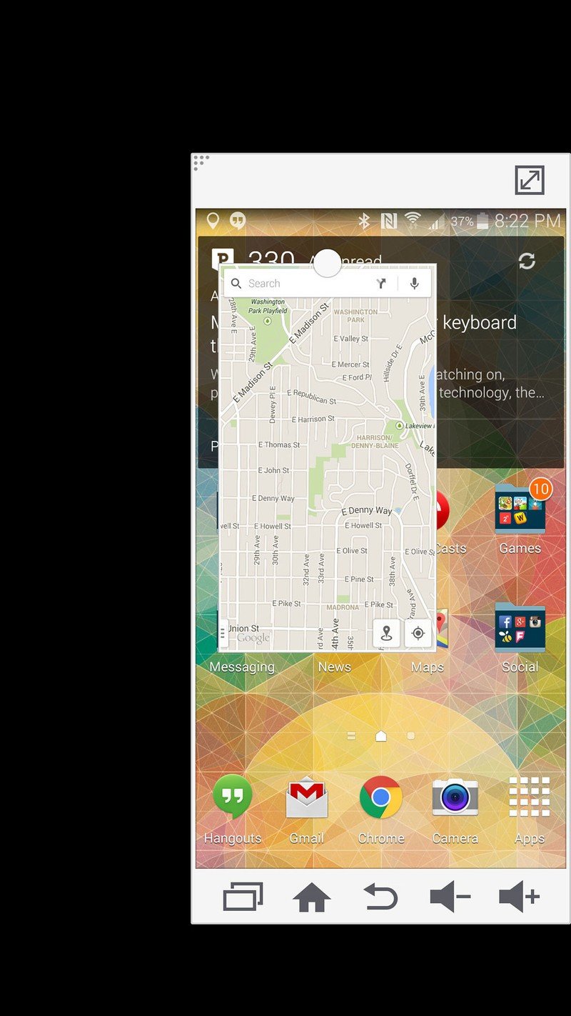
Building on the Multi Window, the Note 4 also includes the ability to run small windowed apps — called "pop-up apps" — on top of other content on your phone. There's also a new gesture that lets you accomplish it — just swipe in diagonally from the top-right corner of the screen to shrink down the current app into a small window. It's a little too easy to accidentally do when you're swiping down the notification shade, but once you know not to go near the top-right corner for notifications you'll be OK.
After resizing, a familiar white circle at the top of the pop-up app lets you move around the small window or access functions, including a new feature that lets you collapse windowed apps into a small persistent bubble that can be recalled into a full app at any time, much like Chat Heads in Facebook Messenger.
I found windowed apps to be more useful than full-on Multi Window mode.
I found windowed apps to be more useful than full-on Multi Window view for quick tasks like checking out a map while recalling an address from a web page, or looking up a phone number and tossing it into a Hangouts message. You can have multiple pop-up apps open at a time, but only up to five concurrently — though considering how quickly it gets confusing I can't understand why you'd want more than five.
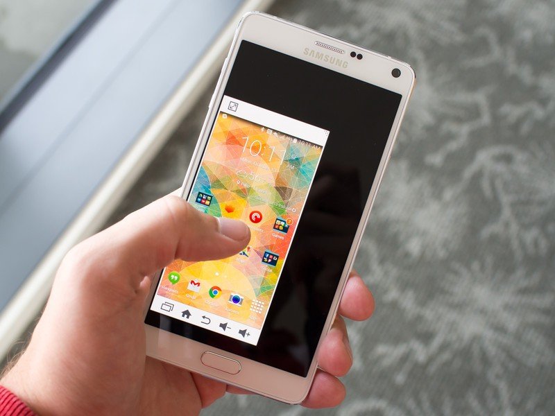
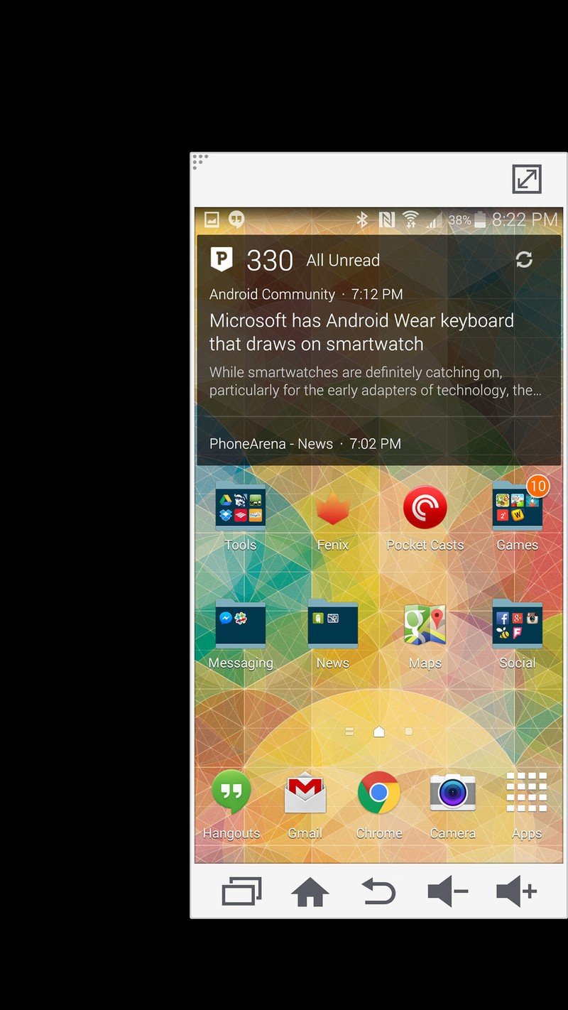
But wait, there's more. Samsung has also improved the so-called "one-handed operation" options from the Note 3. "Reduce screen size" is the feature that lets you shrink down the display to a much smaller size, making it reachable with one hand. Simply swipe in from either edge and quickly back out towards the edge to enable it, and your screen will shrink down to the side you swiped on.
You now have just three controls for the shrunken window, letting you return it to full size, adjust its size with a drag on the corner, or move the window around with a long press. You also get a full appointment of on-screen keys, letting you access Recents, Home, Back and volume up/down without moving your thumb nearly as far.
If you want to keep your window large but just making it easier to reach the navigation buttons, Samsung's "Side key panel" is a pop-out bar on the edge of your screen that houses softkey versions of the Recents, Home and Back buttons that save you from reaching down to the bottom of the phone.
Sadly, the "reduce screen size" mode is actually a life saver for using the Note 4 in one hand on a regular basis. I say "sadly" because you're putting to waste over half of that brilliant 2560x1440 display to use your gigantic phone in one hand and not drop it on the sidewalk while sending a text message. But without one-handed operation features enabled, the Note 4 is entirely a two-handed device. If you want to play with a large device, you're going to have to deal with semi-awkward software features that helps you forget the physical size sometimes.
Taken together, the new windowing options and improvements to old mainstays increase the usability of the Note's large screen, but lean towards confusion from time to time. There were situations in which I ended up with a miniaturized screen on the note, with an even smaller windowed app inside it and an additional windowed app shrunken down and pinned to the home screen. That's far too much to handle, even on a 5.7-inch device, and I had to use each feature sparingly as to not get overwhelmed — I can just imagine out how out of control this can get for an average user.
Galaxy Note 4 Performance
My biggest concern going into using the Note 4 was how much of a drain the new 2560x1440 display was going to put on performance. But it turns out the combination of upgraded hardware under the hood and software optimizations on Samsung's part have the Note 4 silky smooth performance right on par with that of the Galaxy S5, even with more pixels to push.
I can't think of a single instance in which the Note 4 stuttered, even with heavy multitasking and graphics-intensive apps in use. I never saw as much as an animation jitter or a dropped frame, let alone a full-scale OS slowdown. It's insanely impressive to see everything running smoothly on such a high-resolution display, particularly after experiencing frequent software slowdowns on the LG G3 with the same QHD resolution. And that's not always been the case with Samsung's software, particularly in early release builds on a new device.
The Note 4 continues its positioning as a powerful device with the latest iteration, and there isn't a single reason to think you could push this phone beyond its boundaries with current apps.
Quick odds and ends
At the risk of pushing this review to novel size, I'm going to list a few quick hits to round out the review:
- LTE and Wifi both worked as expected, with data speeds and ping times right on par with other devices on AT&T.
- GPS was also accurate, but seemed a bit slow to relocate me after moving around a lot. This could be something with the way AT&T is handling location with its cell towers, so that will have to be narrowed down after we use other versions.
- The phone maintained a perfect connection to the LG G Watch over Bluetooth and I never noticed it disconnect while in range.
- Phone calls on the AT&T network sounded just like normal phone calls.
- AT&T includes nearly 25 pre-installed apps, of which roughly 20 are of no use to me and were swiftly uninstalled. It also sets your homepage in both the Samsung browser and Chrome to an AT&T page.
- AT&T has baked in its own setup system when you first start the device, and if you skip past it as to not integrate with the AT&T cloud services you're dumped straight to the home screen to set things up on your own manually.
Galaxy Note 4 battery life
A one-day device, and nothing more
Big phones give manufacturers the ability to include equally big batteries, and in some cases that leads to big battery life as well. You're getting a 3,220 mAh battery — in the tall and skinny shape of the GS5 — behind the 5.7-inch display here, and that big cell is being used heavily on the Note 4.
Though Samsung is (albeit loosely) positioning the Note 4 as a "two-day" device in lighter use, I found it capable of getting through just a single day with the way I use a phone.
With a standard day of use on auto brightness, with a mix of Wifi and LTE, handling multiple chat apps, push notifications from social networks, two email accounts and podcast listening, the Note 4 made it with me to bed after 15 hours off the charger (and three hours screen on time) with roughly 15 percent battery remaining. Night after night the Note 4 was consistent — a full day of use, and somewhere around 15 to 20 percent battery remaining when I hit the hay.
On an extremely heavy usage day with multiple hours of podcast listening, mobile hotspot use to my laptop, over four hours of screen on time and flying for two hours (with the phone on in-flight Wifi) I had the Note 4 tapping out after eight hours away from the charger. That's pretty admirable for the heaviest use scenario I could put it through, and usage that has had many of my past phones dead hours earlier.
A two-day battery champion it is not, but the Note 4 is capable of getting through your work (or fun) day without turning you into a wall hugger.
That's enough battery life that I wasn't ever worried about not making it through a day, and I never relied on Samsung's Power saving and Ultra power saving modes to keep the Note 4 from dying on me prematurely. Depending on your own usage that may mean you need to throw the phone on a charger for a few before you leave the house for a long night out, but that's the case on most leading devices today. And if you do, Samsung's "fast charging" mode (as well as Qualcomm Quick Charge) will help juice up the Note 4 at a faster rate if you have a high-output charger to use — the one in the box is a 5V/2A model that will do the trick, adding 50 percent battery in about 30 minutes.
A two-day battery champion it is not, but the Note 4 is more than capable of getting you through your work (or fun) day without turning you into a wall hugger. And unless a phone can reliably get through a full two days — as in, off the charger at 7 a.m. one day and still going at 10 p.m. the next day — it's not really worth having more battery in there than what will get you one full day. I never had to worry about battery life on the Note 4, and that's what's most important — I'm going to plug my phone in every night whether it has 15 percent or 45 percent battery remaining.
Galaxy Note 4 cameras
Building on strengths, minimizing one weakness
For all of the leaps in technology made with the Galaxy S5, one of its real pain points was the camera performance. Though phase detection autofocus and brilliant pictures in good lighting conditions were great, that came at the cost of low light performance (ironically the opposite of its competitor, the HTC One M8). As anyone with a GS5 will tell you — it's roughly impossible to take a good picture after 5 p.m. with it.
Rear camera
Adding OIS makes a huge difference, but it's no low-light cure-all.
In an effort to smooth out those issues, the Note 4 takes that same 16MP sensor with phase detection autofocus and adds the one feature that was sorely missing on the GS5 — optical image stabilization. OIS is quite the buzzword (buzzacronym?) in mobile photography nowadays, but this neat little feature that physically stabilizes the camera module in its housing — to counteract movement in your hands — is no joke. It really enhances what a camera is capable of, so long as the software is done right to take advantage of it.
The results speak for themselves — simply adding OIS to the Galaxy S5's camera dramatically enhances the photographic capabilities of the Galaxy Note 4. Low light shots have gone from impossible to acceptable. Video is smoother without the need for software stabilization. In a rare case where you use digital zoom, you're far less likely to have motion blur. Samsung has actually removed all software stabilization modes from the camera interface, indicating that hardware stabilization is the way to go.
But just adding OIS isn't a perfect fix — this is still the same sensor and software that were completely unable to produce a usable image in low light just a handful of months ago when the Galaxy S5 was released. Low-light images are still either too grainy or too unnaturally smoothed out, and the camera often misses exposure and ISO in an attempt to brighten an image rather than to make it crisp.
It seems as though the software still doesn't entirely know what to do with the data it's handed in low light situations — there's no dedicated "night" mode, and it isn't always a foolproof solution to leave HDR on either. The camera can always focus, but you're kind of stuck with a "shoot and pray" approach with too few manual controls to tweak it yourself and too much uncertainty with auto mode. Even late at night the Note 4 doesn't seem to slow the shutter speed down enough to make a difference and really take advantage of having OIS in there.


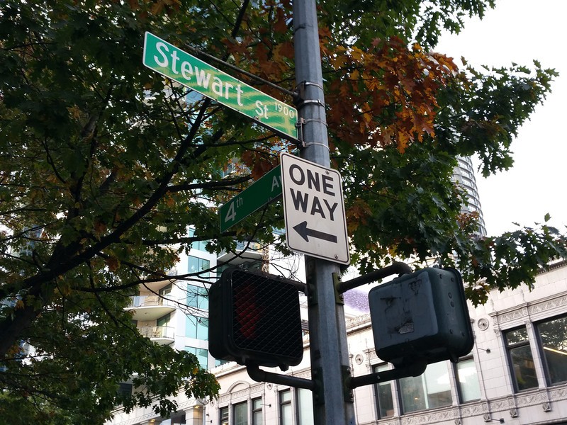



In low light the Note 4 is more often than not offering up images that are worthy of Instagram or showing your friends on your phone the next day, and that's about it. It's a huge step in the right direction, but it's clear to me that Samsung has more work to do to strike the balance of performance in a variety of shooting situations.
But to Samsung's credit, it actually isn't positioning the Note 4 as a low-light photography champion. And the phone, just like the Galaxy S5, takes absolutely stunning photos in more ideal lighting conditions with slick software and insanely fast capture speeds. It was hard to take a daylight shot on the Note 4 that wasn't worthy of showing off, and the fast capture in HDR means you can always get subtly punchy photos with good contrast.
Given the choice of having OIS or not, I'll take having it every single time — but in the case of the Note 4 it feels like you're not getting the full value of this hardware feature just yet. In contrast, one of the Note 4's big competitors, the LG G3, is absolutely taking full advantage of its OIS to take really great pictures in low light without any noticeable hit to daylight performance. It's a head-to-head duel for another article, but right now the G3 still seems to have the better all-around camera.
Video
The Note 4 records UHD (3840x2160), as well as 1080p and ½-, ¼- and ⅛-speed slow-motion video just like the Galaxy S5. The inclusion of OIS helps with video stability, and just like still pictures Samsung has removed software stabilization entirely to let the hardware handle it. Slow motion (particularly ⅛-speed) dramatically darkens the video, as is the case on any slow motion camera, but is still quite good. OIS helps a ton with camera shake in handheld shots, and standard video comes out well. Be sure to watch the video samples above.


Front camera
A whole bunch of ways to take selfies, naturally ...
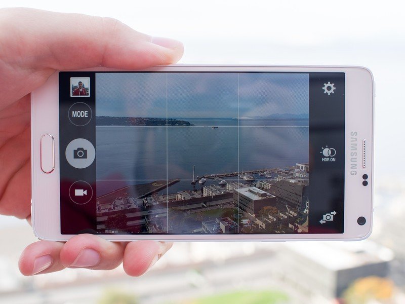
With 3.7 megapixels to work with and a few new software features on the front camera, Samsung is embracing the "selfie" culture of today at an increased pace. With a wide-angle lens and new panorama selfie mode it's easier to get you and your friends into a single shot from the front-facer, and both modes offer surprisingly good images. Though as you'd expect you're still best turning the phone around and using the rear camera when possible. To help you along Samsung includes a "Rear-cam selfie" option that automatically takes a picture when your face is detected in a pre-determined area of the frame.
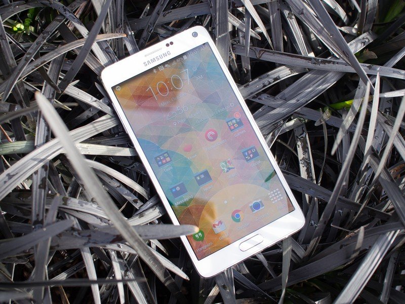
Galaxy Note 4: The Bottom Line
Bigger. Better.
Samsung sure knows how to add just the right things to each iteration of its leading Galaxy S and Galaxy Note lineups to make the decision difficult as to whether you should upgrade from the previous model. But in the case of the Note 4, the enhancements from the Note 3 and even the Galaxy S5 have this device on an entirely different level.
The Galaxy Note 4 is a big, important upgrade from the Note 3, and even the Galaxy S 5.
The move from plastic to metal on the Note 4 is a welcome one, and it's not just a checkbox feature. The design is well-executed and tied together cohesively, while retaining Samsung's trademark design traits. It feels better in the hand than any chintzy plastic phone Samsung has made before by a wide margin, and there's really no downside to be seen here.
The metal wraps around an absolutely gorgeous QHD display that has all of the characteristics you want — high brightness, crisp imagery and punchy colors — out of a phone today. Underneath the display you have industry-leading specs that can handle anything you want without a hiccup.
Though the S Pen hasn't added much functionality since 2013, the small tweaks to the way you can handle multiple windows and apps on this large display are welcomed, if still a bit confusing to the average user. But if you're a one application at a time kind of person, there's nothing forcing you into those more advanced features.
And saying all of that without mentioning the camera is somewhat burying the lead. Samsung has taken a camera combination that produces some of the best daylight shots with easy-to-handle software, and added OIS to markedly improve low-light performance and smooth out video recording. And while it's far from perfect, there are many points of this camera to be excited about.
Then there's the Galaxy Note 4's size. Despite Samsung's improvements in one-handed use on the software side and physically making the Note 4 narrower than the previous generation, there's no getting around the size of this phone when it comes to daily use. Even with my large hands it's just too big to manage most of the time, and makes me yearn for a smaller device that I don't fear dropping on a regular basis.
But for many people who have already given in to having a huge phone that's physically tough to manage, understanding the tradeoffs at play there, the Note 4 marks a dramatic improvement in hardware, specs, display and camera that will assuredly be welcomed with open hands (emphasis on needing two hands) by many. You no longer have to have a phone that's made out of ugly, creaky plastic in order to have a larger screen or some of Samsung's catchy features.
There's no doubt in my mind that the Note 4 is the best device Samsung has ever made relative to what's available from others in its respective launch year — the one big question is whether or not you think you can handle the size of this phone. If you can, you'll be rewarded with one hell of a device.

Andrew was an Executive Editor, U.S. at Android Central between 2012 and 2020.
