Samsung Galaxy Note 3 review (European version)
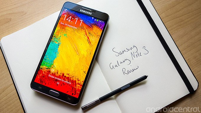
Samsung’s beastly third-generation Note handset is everything a big-screened Android phone should be
For better or worse, we’re now surrounded by Android smartphones with enormous displays. Most of the major manufacturers have flagship phones with screens measuring around, or slightly above, the five-inch mark. But it wasn’t always this way. Thinking back to our time with the first Galaxy Note some two years ago, what stood out was just how weird it felt to use such a large, unwieldy handset. The original Note was brilliant from a technical standpoint, but also expensive, bulky and the wrong shape for comfortable one-handed use. Not to mention the fact that the Android of 2011 simply wasn’t ready for this kind of device. We weren’t convinced this new category of smartphone-tablet hybrids would take off. How wrong we were.
The Galaxy Note sold tens of millions of units, and so did the Note 2. And today Samsung’s Note series phones can be spotted in public just as frequently as many others. So as another year of the smartphone release cycle draws to a close, it’s time for a third Galaxy Note. This year devices like the Galaxy Mega and Xperia Z Ultra have challenged the boundaries of what can reasonably be called a smartphone, and so you might think that Samsung would drift towards the six-plus-inch mark. However what we saw at IFA 2013 a few weeks ago wasn’t some pocket-stretching behemoth. The Galaxy Note 3 was thinner and lighter than the Galaxy Note 2, with a larger screen in the same physical footprint. It seemed a measured response to a market obsessed with ever-increasing screen sizes.
But other manufacturers have taken notice of Samsung’s success in this area, and there’s more competition than ever for the Galaxy Note this time around. Sony and LG already have devices on the market, and HTC is widely expected to launch a 5.9-inch phone of its own in the weeks ahead. So is the Note still the best device out there for buyers seeking that perfect balance between smartphone and tablet? Find out after the break, in our definitive review of the Samsung Galaxy Note 3.
Pros
- Fast performance. Large, bright screen with vivid colors and good daylight visibility. Thoughtful software additions that make good use of the stylus. Great multitasking options. Soft-touch finish of the black model feels great in the hand. Excellent battery life. Powerful camera with 4K video recording. More software features than you could ever want...
Cons
- Samsung’s TouchWiz isn’t as pretty or as well-designed as some other Android UIs. The faux-leather back won’t appeal to all tastes. SIM-free price is very high.
The Bottom Line
It’s big and brash and expensive — but it's also brilliant. And whether you're a power user looking for the bleeding-edge specs or a professional seeking a larger screen with stylus-based productivity features, the Galaxy Note 3 is the best device in its class, and a phone that's earned itself an enthusiastic recommendation.
Be an expert in 5 minutes
Get the latest news from Android Central, your trusted companion in the world of Android
| Video walkthroughHardware reviewSoftware reviewCamera reviewBattery lifeWrap-up | Initial hands-on at IFA 2013Video walkthrough |
Video walkthrough
Galaxy Note 3 hardware review
The Galaxy Note 3 is unashamedly rectangular
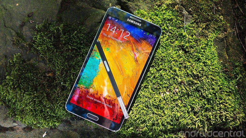
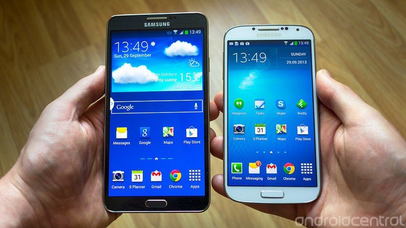
Let’s start off with the obvious — like both its predecessors, the Galaxy Note 3 is a very big phone. It may no longer lay claim to the title of the world’s largest smartphone, but with a 5.7-inch display it remains on a hefty handset. The Note 3 is roughly the same physical size as the Note 2, with bezels being trimmed down to allow for that extra 0.2 diagonal inches of screen. It’s also thinner and substantially lighter, at 168 grams, down from 182. This, together with its new, angular design, improves usability in a big way. We’d hesitate to call it a one-handed phone — the menu key can be difficult to reach with your thumb, and you’ll need to summon all your dexterity to pull down the notification shade — but it’s undoubtedly easier to use in this way than any previous Galaxy Note device, and that’s all down to design improvements.
The Galaxy Note 3’s industrial design is familiar, yet different. From the front it’s clear what kind of device you’re dealing with — the Note 3’s flattened edges and sides convey a more businesslike vibe than the curvier Galaxy S phones. In fact, it’s a bit of a throwback to the design language of the first Galaxy Note. It’s not trying to be inspired by nature, or designed for humans, or any of that nonsense. The Galaxy Note 3 is unashamedly rectangular. It has the look of a tool, not a toy, and that’s not something you can say about many Samsung phones.
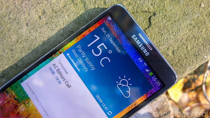
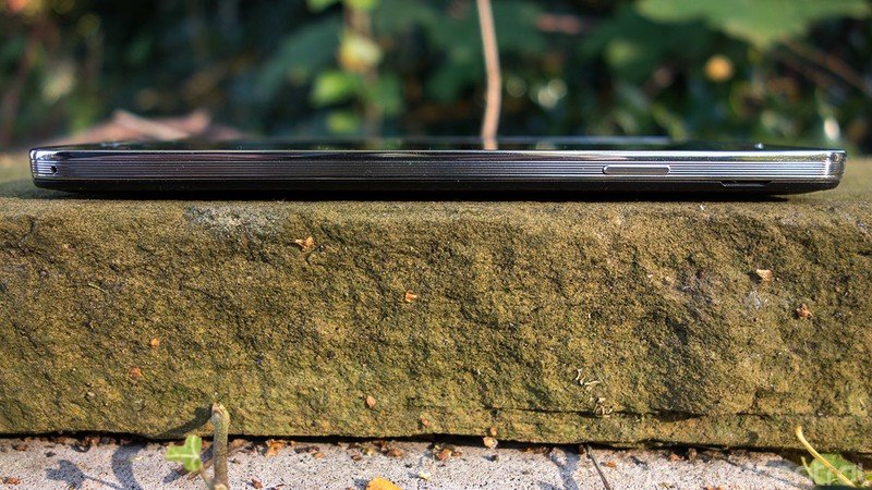
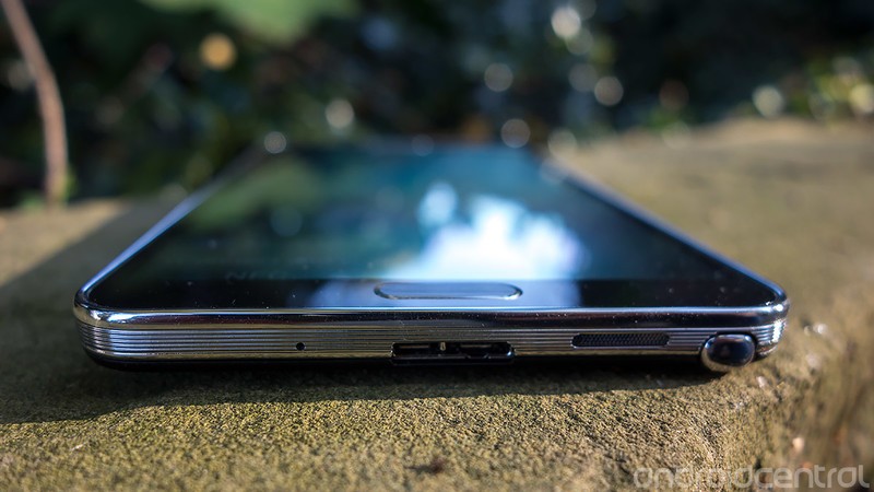
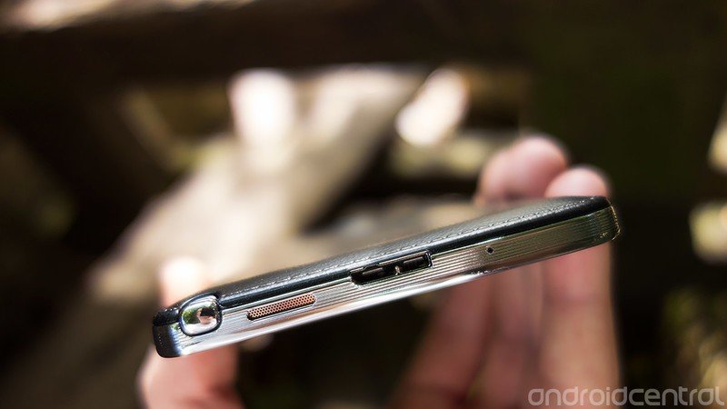
The Note 3’s sides, furnished in a faux-metal-looking plastic, are flatter than we’re used to seeing from a Samsung phone, and have a ridged texture which makes the phone easier to grip. Peppered around the edge of the Note 3 are various ports and buttons — power on the right, volume on the left, headphones up top and microUSB down below.
But this is no ordinary microUSB port — the Note 3 has microUSB 3.0 port, allowing it to transfer data at faster speeds, provided you have a computer which supports the standard. USB 3.0 also allows for faster charging — 900mA versus USB 2’s 500mA. For the fastest charging time, however, you’ll want to use the bundled wall charger, which charges at 2,000mA. We should also point out that the Note 3 will charge and sync just fine over a standard microUSB (2.0) connector, as the new port is backwards-compatible.
As there are no gaps on the battery door for speakers or microphones, both are strategically situated on the device’s trim — we counted three mics and one loudspeaker. The speaker is of decent quality, but not outstanding, and due to its location (facing down, not back) the output sounds tinny (screechy, even) when you’re using it at high volume levels. Were it not for the insane bass and clarity offered by some of the competition — most notably, HTC’s BoomSound — we probably wouldn't care too much, but it’s worth pointing out as a relative weakness of the Note 3.
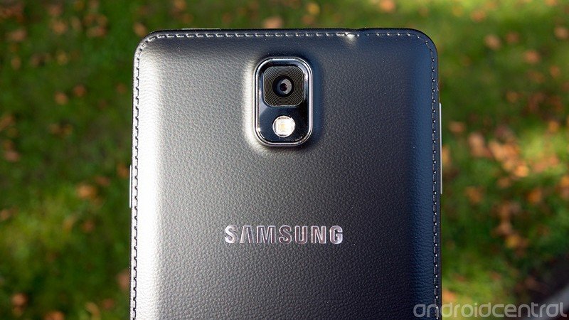
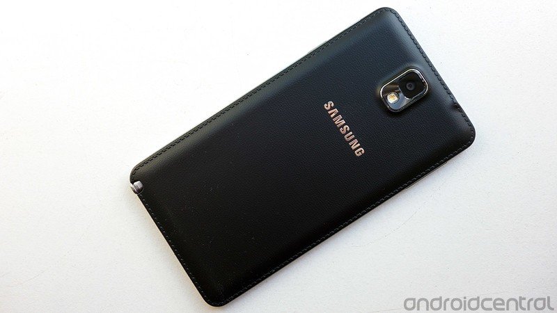
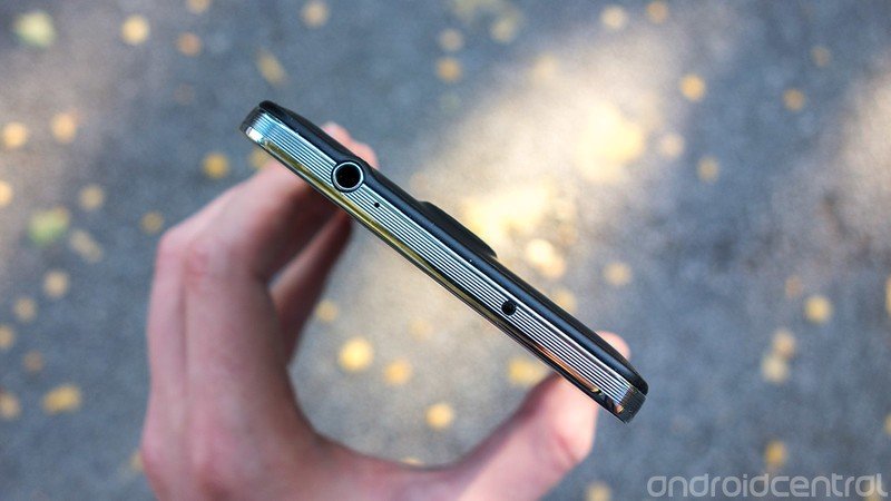
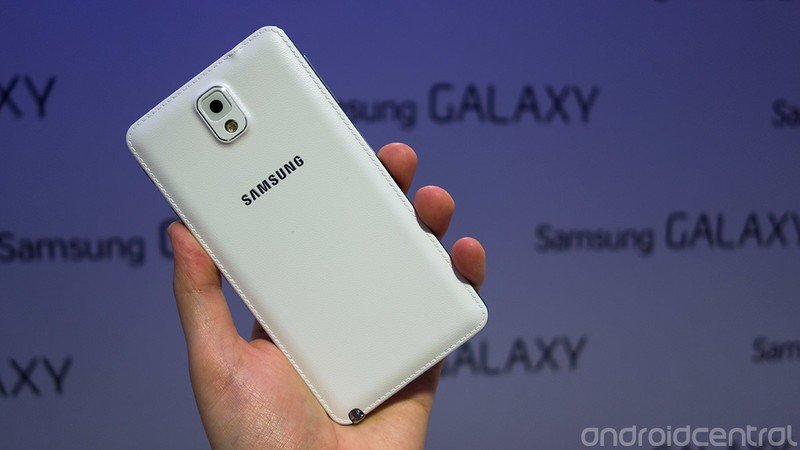
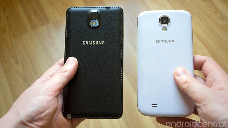
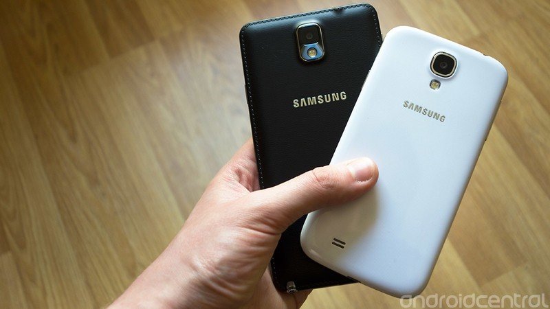
The trim is also the only part of the phone that’s still made of shiny plastic. That’s right — the back of the Note 3 is no longer made of the glossy, slippery polycarbonate substance we’ve been complaining about since the days of the Galaxy S3. Instead, there’s a faux-leather effect, complete with imitation stitched border and a texture that varies depending on which color option you pick.
On the black Galaxy Note 3 we’re reviewing, the battery door has a soft-touch finish which feels great in the hand — far better than any recent Samsung phone. Choose the white or pink versions and you’ll get a more traditional matte finish. Not shiny plastic, just textured plastic, though it’s more obviously plastic than the back of the black model.
The whole fake leather thing has turned out to be a polarizing design decision. We’ll be the first to admit it looks a little goofy, especially on the white and pink variants — and again, in our opinion the Note 3 looks more at home in black than white. But whichever color option you’re dealing with, the matte-textured back makes the Note 3 much more pleasant to hold. It’s easier to grip, and it doesn’t feel slimy or get gunked up with finger grease like the Galaxy S4. We sincerely hope this is a sign of what’s in store for the next generation of Samsung smartphones.
The matte-textured back makes the Note 3 much more pleasant to hold
Protruding slightly through the back panel are the phone’s 13-megapixel camera and LED flash. There’s also a 2-megapixel front-facer with 1080p video recording capabilities. It’s a squared-off lens design which reminds us a little of the Galaxy S2.
The phone’s front face is completely flat, punctuated by a speaker grille up top and a large central home button down below, and the Note 3’s home key has a firmer, more confident click than that of the Galaxy S4. Depending on which model you pick up, you’ll get one of two very subtle patterns around the screen. The black version has very dark brushed metal effect under the glass; on the white version, it’s a checkered pattern similar to the one found on the Galaxy S4.
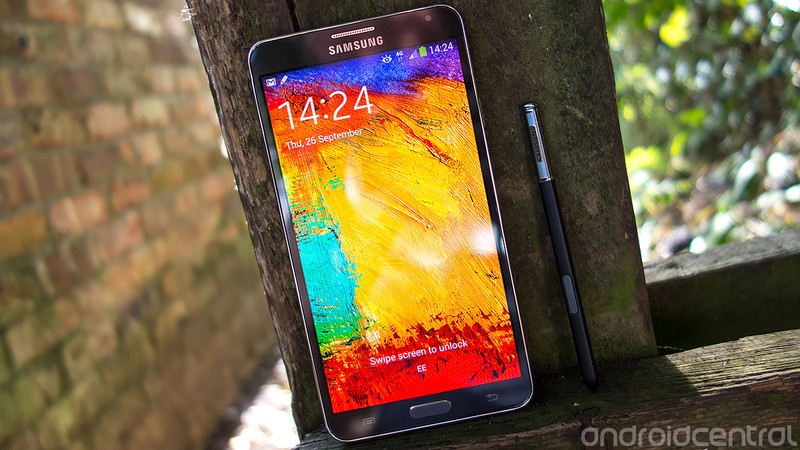
The display
The screen is explosively bright and colorful
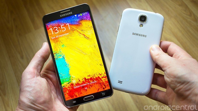
The Galaxy Note 3's display is a 5.7-inch Full HD 1080p SuperAMOLED panel; it’s the most impressive SuperAMOLED screen so far, and among the best mobile displays we’ve seen on any device. In a nutshell, the screen is explosively bright and colorful. It offers the vivid colors and deep blacks we’ve come to expect from AMOLED panels, but with improved brightness and daylight visibility — a typical shortcoming of earlier AMOLEDs. Whether this is due to software tuning or the use of superior panels, the result is a screen that’s brighter than that of the Galaxy S4, and easier to use in daylight as a result. In addition, the Note 3’s display brightness level seemed to ramp up much more aggressively than the S4 when set to auto-adjust.

Macro shots of the Galaxy Note 3 and Galaxy S4’s screens don’t reveal any obvious subpixel-level differences. (The tiny dots of colored light that make up each pixel.) The Note appears to be using the same sorta-PenTile subpixel layout as the Galaxy S4, with pixels made up of two green subpixels, one red and one blue in a diamond formation. Despite that similarity — and the reduction in overall pixel density caused by the move to a larger panel size — the Note 3’s screen is the clear winner in our eyes.
Naturally the brightness, vividness and size of the Note 3’s display makes it ideal for viewing photos and watching movies, and by default the device is set up to automatically adjust color balance based on the type of content being viewed. (There’s also some noticeable sharpening being applied to images viewed in the Gallery app.)
S Pen 3.0
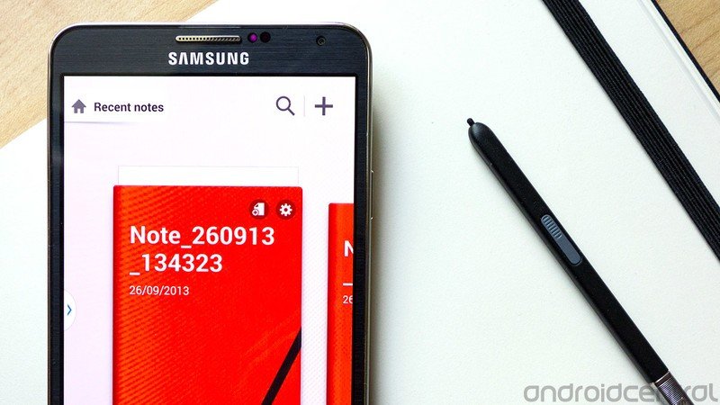
Besides its sheer size, the main thing setting the Galaxy Note line apart from other smartphones is its bundled “S Pen” Wacom-based stylus. For the uninitiated, the pen is pressure-sensitive, and the phone can detect it at a distance, as you’ll see if you hover over certain areas of the screen. We can’t say we noticed any major differences in responsiveness or speed compared to previous S Pen iterations, but Samsung’s stylus has always been pretty responsive. As before, a single button allows you to interact with the phone in various ways, including bringing up the “Air Command” shortcut menu, and clipping out sections of apps.
It’s now possible to dock the S Pen with the button facing either up or down
The S Pen is securely stowed in a silo on the bottom right corner of the phone, and pulling it out will automatically unlock the phone and bring up the Air Command menu, from which you can select a few common stylus-related tasks. You’ll also see notification icon while the S Pen is out, which should help you avoid losing the stylus.
The biggest breakthrough on the hardware side is the new S Pen’s shape. It’s now possible to dock it with the button facing either up or down, removing the minor inconvenience of having to correctly align the pen before sliding it back into the phone.
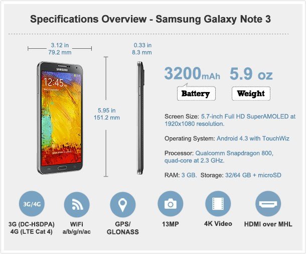
Internal hardware
As was the case with previous Notes, the Galaxy Note 3 arrives with bleeding-edge smartphone hardware onboard. There’s Qualcomm’s latest 2.3GHz quad-core Snapdragon 800 CPU running the show, with 3GB of RAM — the largest capacity of any Android device — and a base level of 32GB of storage in the West, with a 64GB model also being offered. That’s expandable by up to another 64GB through the built-in microSD slot. (And like many other Samsung phones, it’s also possible to offload certain apps to the SD card.)
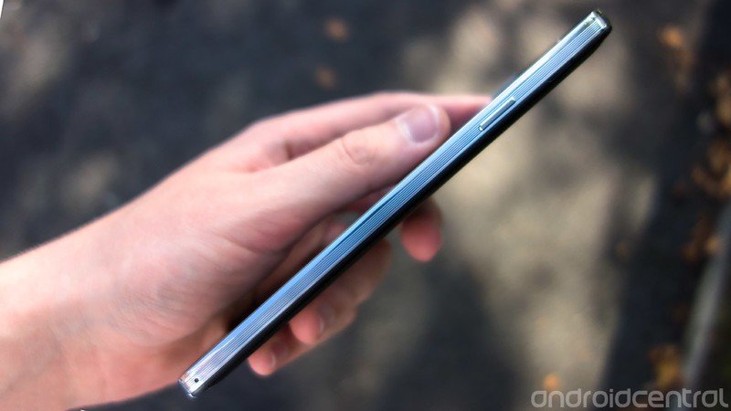
The Snapdragon 800 provides enough horsepower to see that you get a smooth, responsive experience running current apps and games, and that you’re future-proofed for the life of a two-year contract. As we’ve discovered in our time with other Snapdragon 800 phones, this chip delivers more performance than most Android apps know what to do with right now. Demanding 3D games run without a hitch, and if you’re into synthetic benchmarking then the Note 3 will make your favorite apps produce very high numbers indeed.
It’s also nice to see 32 gigabytes becoming the standard for high-end Samsung phones after the houpla surrounding the 16GB Galaxy S4’s low amount of available storage. On our European Galaxy Note 3 theres a little over 25GB remaining after initial setup, which is more than reasonable.
Connectivity-wise, the unlocked European Galaxy Note 3 we’re reviewing supports DC-HSDPA (42Mbps) connectivity alongside Cat. 4 LTE, which has a theoretical maximum download speed of 150Mbps. That’s a step up from the Cat. 3 LTE support of earlier devices, which maxed out at 100Mbps down, though you’ll of course be limited by whatever flavor of LTE your own mobile operator has deployed. In addition there’s Wifi a/b/g/n/ac support and Bluetooth 4.0, both of which work as expected. And the same can be said for voice calls too, which came through loud and clear on our test device.
A word on region locking
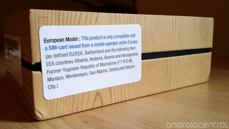
Around the European launch of the Galaxy Note 3 there was some online commotion over Samsung’s apparent decision to lock some “unlocked” versions of the phone sold in Europe and Latin America to SIMs from their specific regions.
After a few days of uncertainty, it emerged that it’s the first SIM you use in the device that influences whether or not your device is locked down. “Activate” it with with a SIM from its home region, and you’ll be fine. Start it up for the first time with a SIM from outside the approved area and you’ll be locked down. The situation is far from ideal, but at least it’s pretty clear how international users can avoid falling victim to Samsung’s region lock. And if you do find yourself with a region-locked Note 3, Samsung says its service centers can unlock them for you.
More: What’s going on with the Samsung Galaxy Note 3 region lock
Galaxy Note 3 software and OS review
The Galaxy Note 3 runs Android 4.3 Jelly Bean — the first non-Nexus, non-Google Play device to ship with this latest version of Google’s OS. Among other benefits, Android 4.3 brings OpenGL ES 3.0 support, the advanced graphical capabilities of which boost the Note’s credentials as a gaming device.
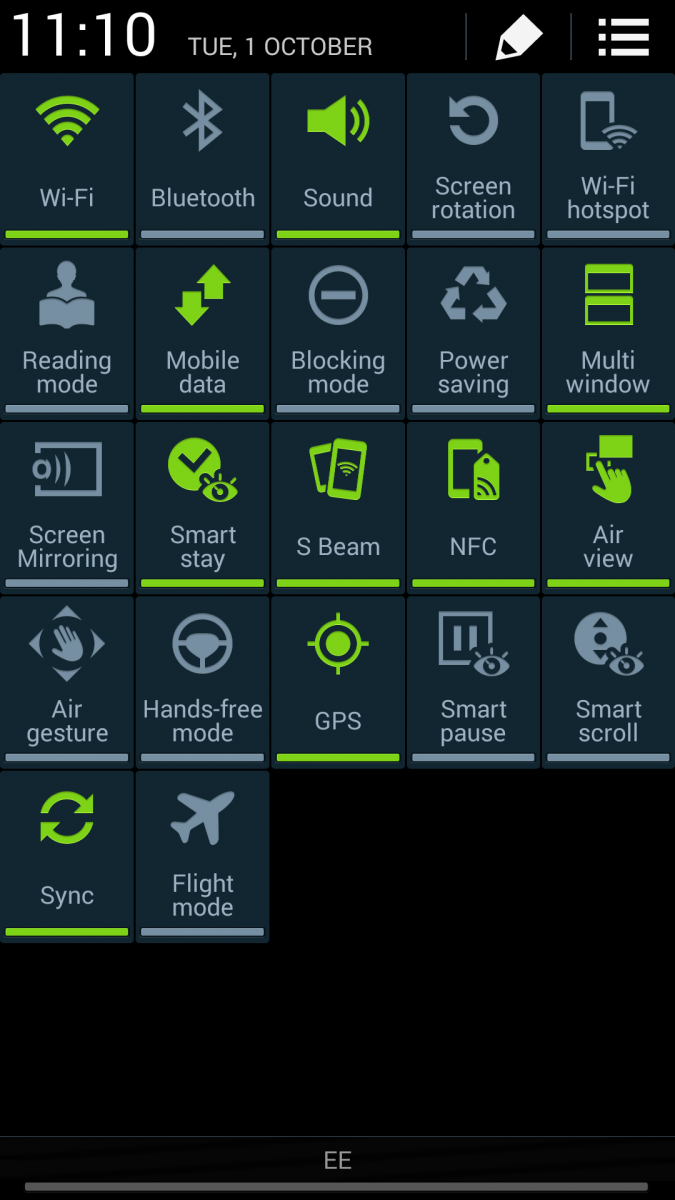
Atop Android 4.3 sits Samsung’s TouchWiz software, which despite the addition of new features and apps still closely resembles the UI seen on the Galaxy S4 series. It’s not as pleasing to the eye as other interpretations of Android, such as Google’s “stock” Android UI, or HTC’s Sense, but it is incredibly feature-packed, and absolutely teeming with stuff to toggle on and off, and various settings to tweak.
Performance in Samsung’s UI is quick and responsive across the board, which is no surprise considering the high-end hardware powering the Note 3. The differences compared to the Galaxy S4 are subtle, and often difficult to pin down, but actions like app launches, button presses and on-screen animations just seem to have a greater immediacy to them on the S4.
Every software feature of consequence from the S4 has also made it across to the new Note
Before we dive into all the new capabilities of the Galaxy Note 3, it’s worth stating that every software feature of consequence from the S4 has also made it across to the new Note. That’s an absolutely huge battery of functionality and built-in apps. You can interact with the screen without touching it using Air View and Air Gesture, Samsung’s hover touch and gesture control features. The S Health app ties into the built-in pedometer, allowing you to keep track of how far you walk and how many calories you’re burning. And the Peel-based WatchOn TV app lets you browse listings and control your TV using the front-mounted IR blaster.
Granted, these aren’t things you’ll necessarily use every day. And as we pointed out in our Galaxy S4 review, we’d label more than a few of them as gimmicks. But they’re there, should you need them, on the Galaxy Note 3. For the lowdown on all these Galaxy S4 features, be check out our review of that device.
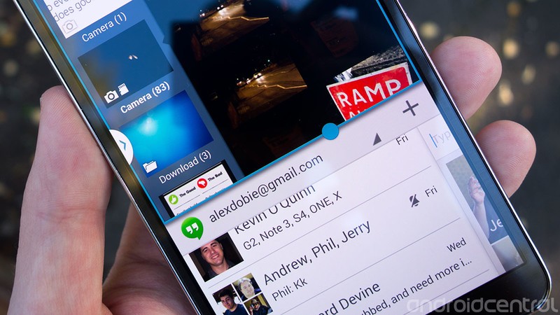
New ways to multitask
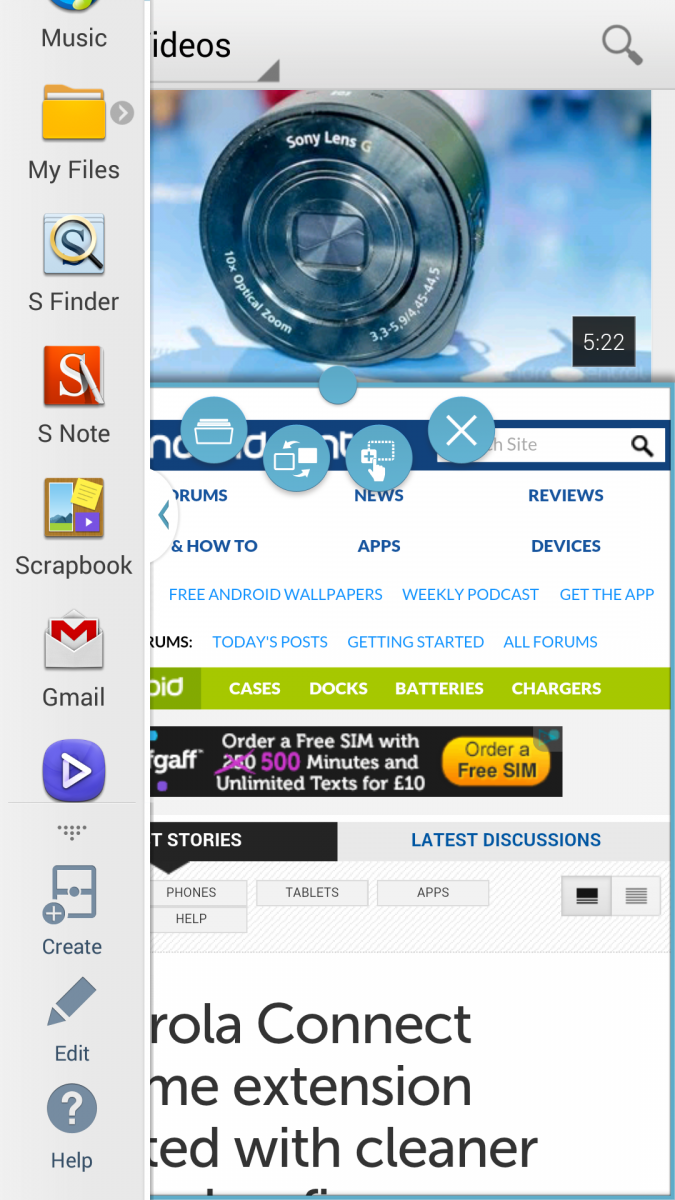
Multi-window has been further augmented on the Galaxy Note 3
The Galaxy Note series has always been targeted at power users, and it was last year’s Galaxy Note 2 that first debuted Samsung’s split-screen multitasking feature, “multi-window.” Multi-window has been further augmented on the Galaxy Note 3 in a few different ways. Firstly, a few more apps are now supported, and significantly, support has been extended to all the Google Play apps, including Books, Music, Movies and Magazines. It’s now possible to save pairs of apps for quick access, for example, if you’re always watching YouTube and browsing at the same time, you can save this pair and access it from the slide-out multi-window bar with a single tap.
In some cases, it’s now possible to load two instances of the same app, allowing you to chat with two people at once in Google Hangouts of ChatOn. And if you want to get really fancy, you can now drag and drop certain stuff between apps — for example, by dragging an image from the Gallery app into the Messaging app to send it as a MMS message.
The final multitasking trick up the Note 3’s sleeve is called Pen Window — a feature activated from the “Air Command” menu that lets you create windowed applications. Only a handful of apps are supported, unfortunately, with the only useful ones being YouTube and Hangouts.
Split-screen multitasking and windowed apps make sense on an oversized smartphone like the Galaxy Note 3, and Samsung’s tweaks to these areas are genuinely useful. However users will find themselves constrained by the still-limited number of apps that support these features.

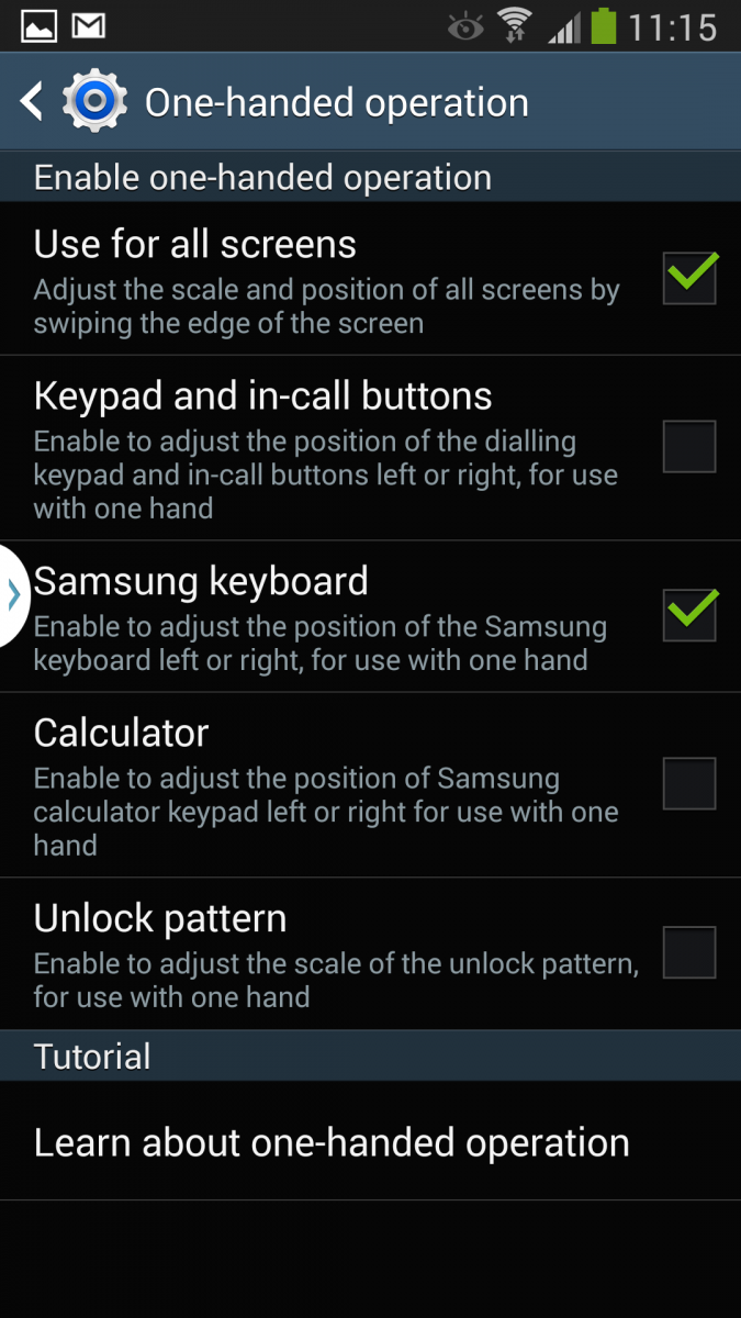
Everything in a window
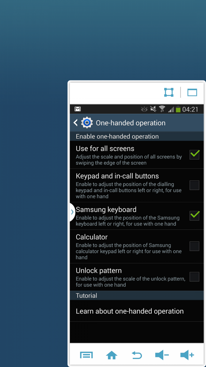
As is the case with many other big-screened smartphones, the Galaxy Note 3 includes a handful of settings designed to help with one-handed use. These include tweaks for the built-in Samsung keyboard which shrink it down and stick to to the left or right side of the device — a feature we’ve seen before on the Galaxy Note 2. But the Note 3 takes things a step earlier, with a new gesture-activated option for sending the whole UI into windowed mode. With “One-handed operation > Use for all screens” enabled, drawing an arrow gesture inwards from the edge of the screen shrinks the entire UI down into a small, moveable, resizable window.
It’s not a completely ideal way to experience apps on a phone with a 5.7-inch display. But if you’re having trouble reaching the entire screen with your thumb, it’s a quick and effective temporary workaround.
Air Command and other new apps
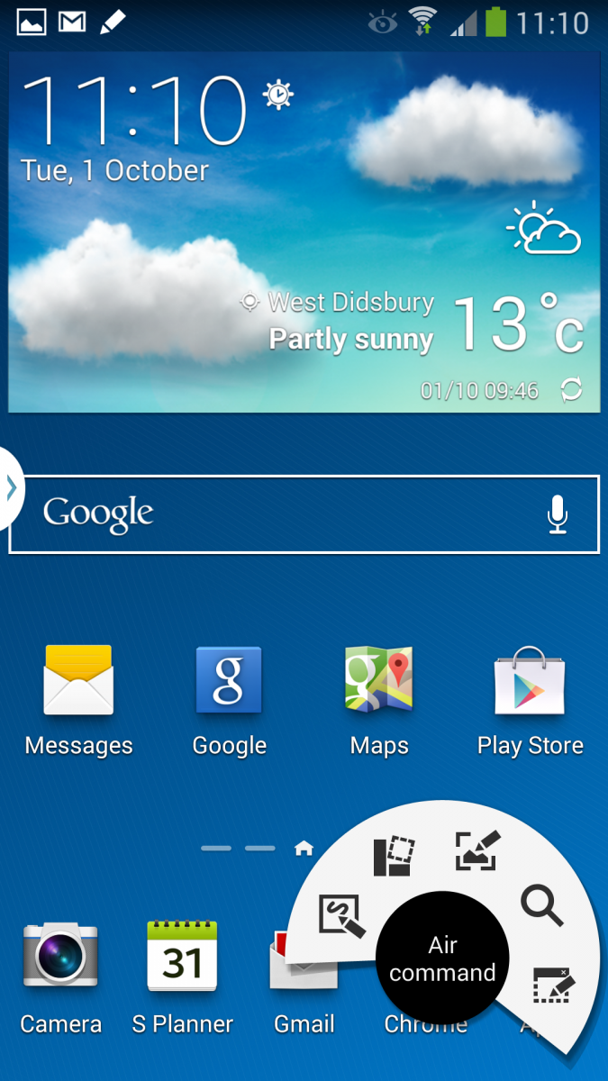
Although it’s been a key feature of the Galaxy Note series, it’s often felt like the S Pen’s software integration hasn’t been as tight as it could be. Samsung’s answer to this on the Note 3 is a new radial menu called Air Command. It’s activated when you first remove the S Pen from its holster, or you can bring it up manually by hovering the pen over the screen while pressing the button.
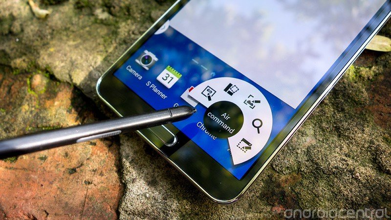
From here you can quickly get to five of the main pen-enabled apps and features.
As before, you can write on the screen using the S Pen. And you can cut out snippets of whatever’s on-screen and directly share to other apps using Android sharing intents. Sure, this sort of thing is possible on most Android phones using screenshots and a cropping tool, but the Note 3’s approach is far more elegant — just cut around an area of the screen using the S Pen, then select the app to share to. The cutout tool has been overhauled on the Note 3 to make this kind of sharing much easier than before.
Action Memos are a new kind of note that can be activated through the Air Command menu. Essentially a sort of digital Post-it note, they allow you to quickly write down info and then push it to certain apps. For example, jot down a phone number and then hit the “phone” button to call it in the dialer app, or do the same with an address and Google Maps. It’s the speed with which you can get into the Action Memos app that makes it particularly useful, and it can just as quickly be minimized down to a tiny icon if you need it out of the way.

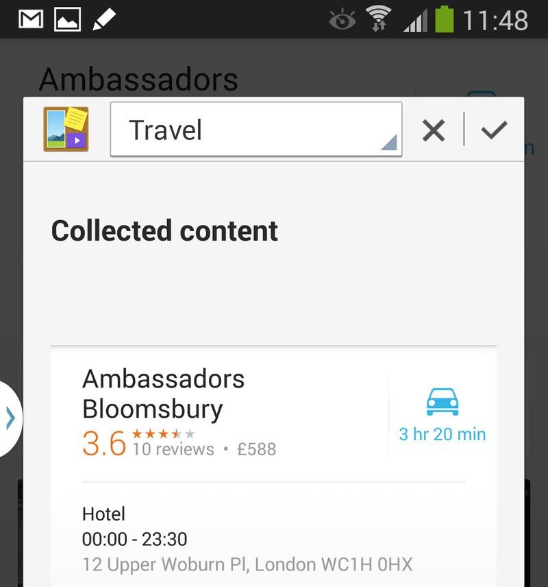
The new Scrapbook app is a glorified, categorized clipboard, allowing you to collect cuttings of various apps, web pages and videos. Activated through the Air Command menu, you first clip out the area you’re interested in, before categorizing it and saving it to the Scrapbook, where it’s synced with your Samsung account. Certain background info is also picked up along with the cut-out area — for example, URLs and text from web pages, and this info also ties into Samsung’s own S Finder app, which is used for searching on-device content. As with Action Memos, it’s the ease with which you can get stuff into the Scrapbook that makes it most useful.
Handwriting recognition has been implemented throughout the software
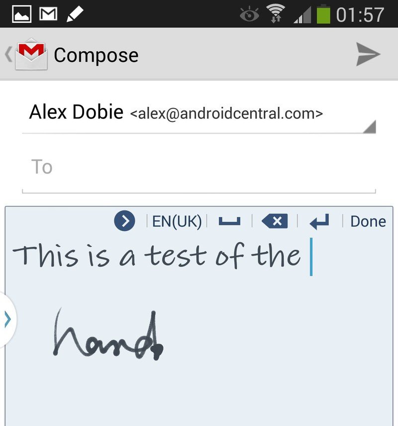
Handwriting recognition has also been implemented throughout the software. Written notes can be recognized and indexed by the S Finder app, as (obviously) can saved Action Memos. But the neatest handwriting recognition feature is one that’s easy to miss. With the S Pen unholstered, you can hover over any text field and tap on the icon that appears write directly into that field. No need to first bring up the keyboard, simply type directly into the box that appears. The Note 3’s surprisingly fast and accurate handwriting recognition takes things from there.
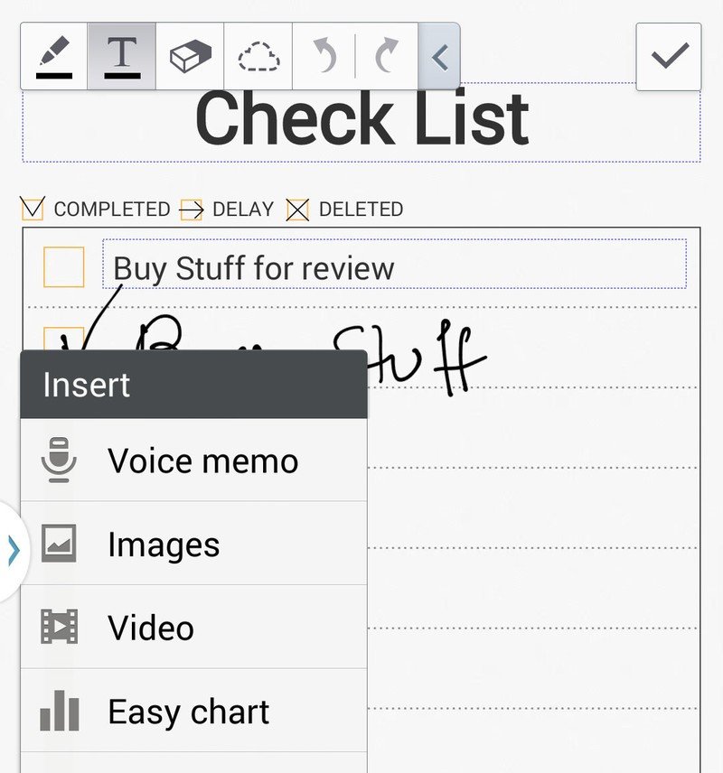
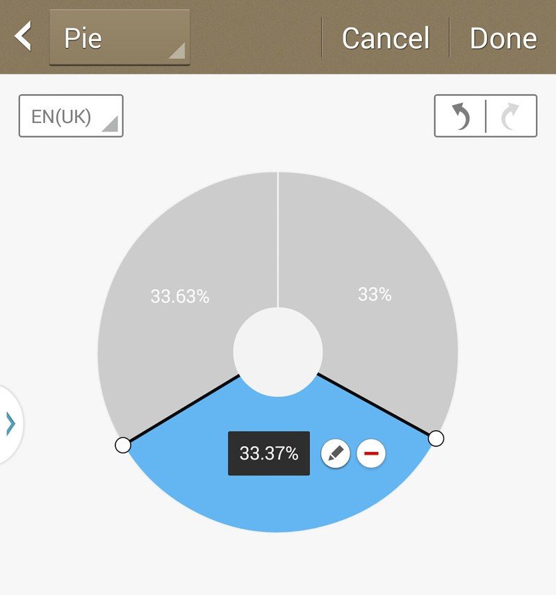
The dedicated S Note application has been overhauled on the Note 3, with a more attractive UI and support for a wide range of templates for different kinds of note-taking. And the types of content supported in notes has grown ever larger to include voice memos, images, video, as well as stuff from externals apps like Google Maps and the Scrapbook. There’s also an “easy chart” editor, which lets you draw charts and graphs using the S Pen, and and then edit the values by writing them directly. (It’s a sign of how confident Samsung is in its handwriting recognition that this seems to be the only way to edit chart values.)
Evernote sync for notes is included too, and Note 3 owners can also claim three months of Evernote Premium membership. The standalone Evernote app, incidentally, is bundled on the Note 3 too.
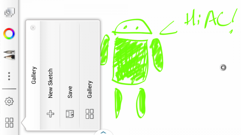
A more creative use for the S Pen can be found in the AutoDesk-powered Sketchbook app, which provides a wealth of sketching tools that can be used to create intricate layered drawings. There’s a vast array of drawing tools, brush types, guidelines and filters available to help people more artistically inclined than ourselves make pretty pictures.
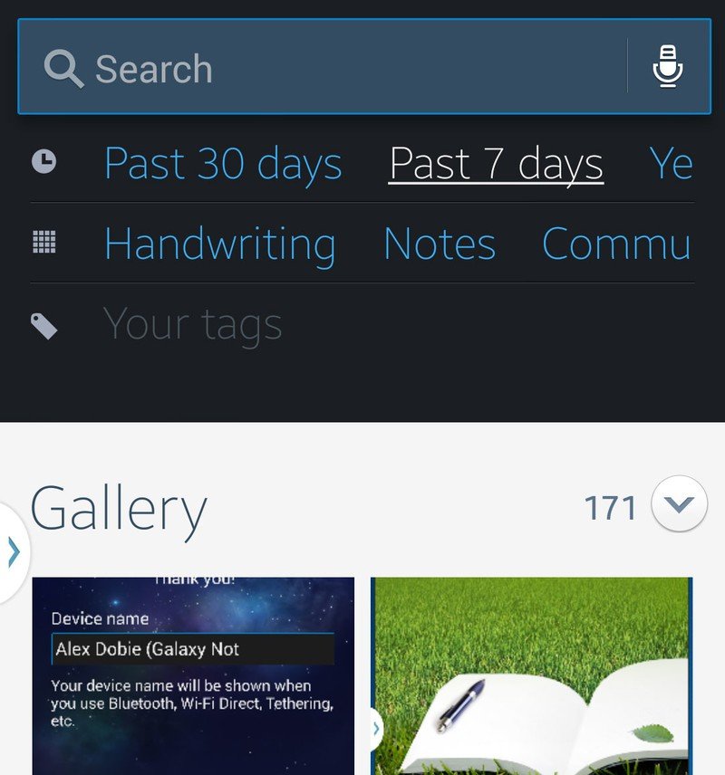
The Note 3 is the first device to feature Samsung’s new on-device search app, S Finder. This isn’t a competitor to Google Search per se, but something designed to help you sift through the wealth of content stored in all your phone’s various apps, not to mention all the photos and videos you’ve taken. Like many Samsung-specific features, it works best if you’ve bought into the Samsung ecosystem — web history, for instance, is tracked. Searches can be narrowed down by time, type of information or your own personal tags, and on the whole it the app seems to work pretty well — though be prepared to be inundated with results for old calendar appointments and emails if you’re not specific enough in your searches.
S Finder managed to return results without delay on our week-old Galaxy Note — we’ll be interested to see whether that speed can be maintained once there’s a few months’ worth of content on there. The app is at its most useful when given just a timeframe to work with — for example, the last seven days. This conjures up a card-like layout showing all your on-device activities — text messages, calls, photos, notes and more — in a Google Now-style card arrangement. Potentially, it’s a very powerful tool, provided you’re using the right apps.
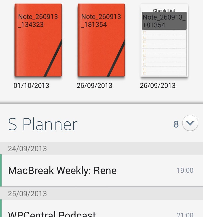
Samsung has bundled Flipboard on Galaxy devices since the Galaxy S3, and now there’s a new Flipboard-based home screen reader included in the TouchWiz launcher. Similar in concept to HTC’s BlinkFeed, “My Magazine” can be activated by swiping up from the bottom of the home screen. It consists of three mains areas — news, which it selects based on your interests, personal, which shows you on-device content like text messages, gallery items and notes, and social, which uses the Flipboard API to suck in content from various social networks. The implementation is decent, but unfortunately like HTC BlinkFeed there’s no way to completely disable it — if you don’t “My Magainze,” your only option is to ignore it.
There seems to be a clearer vision behind many of the new software additions
The standalone Flipboard app is included too, giving you the same stuff in a slightly different layout, for whatever reason.
While the Galaxy S4’s plethora of new features struck us as being slightly scatterbrained, there seems to be a clearer vision behind many of the new software additions on the Galaxy Note 3. Most of them fall into the note-taking, multitasking and organization categories, while others like the Sketchbook app help the device to find new uses as a small Wacom tablet for creative types. The practicality of these new features is going to depend on the kind of smartphone user you are, though, and many less experienced users will likely be overwhelmed by the sheer number of features available, not to mention the apparent crossover between them. (S Note versus Action Memo versus Screen Write versus SketchBook, for instance.) Tutorials are in place to help new Note 3 owners get to grips with the each app, however.
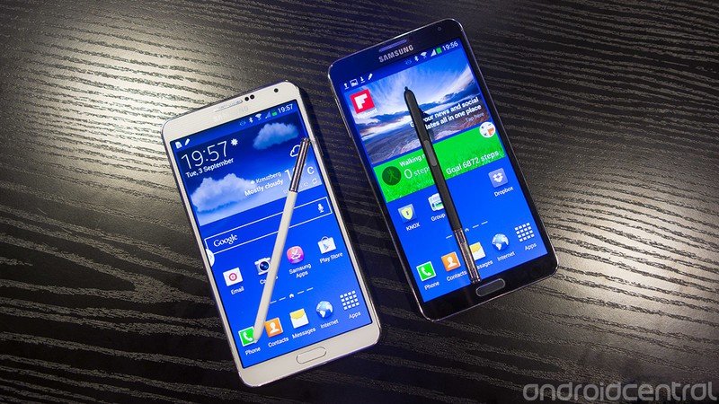
Samsung has included just about every smartphone software trick you could imagine
Between the base functionality of the Galaxy S4 and the new features introduced in the Note 3, Samsung has included just about every smartphone software trick you could imagine on its new handset. Out of the box, the new Note has a bewildering number of features, to the point where it might take someone completely new to the Samsung ecosystem the life of a two-year contract to see it all. And we still have mixed thoughts about whether that’s a good thing or not. A large feature set ensures there’s something for everyone, but overwhelming owners with often gimmicky features doesn’t always make for the best user experience.
Nevertheless, our biggest complaint about TouchWiz is more fundamental than any one app or feature, and it has to do with the way it looks. Samsung’s UI remains a hodgepodge of various design styles that don’t quite gel into a cohesive whole — perhaps a side effect of the past few years of feature creep. There’s no one app or feature we can point to that looks terrible, it just appears there’s not as firm a hand on the software design rudder at Samsung as there is at, for example, HTC or Google.
But there are some real sparks of genius among the Note 3’s mess of new features. Ubiquitous handwriting recognition, for instance, gives Note owners yet another reason to use the S Pen. And the S Finder app does a much better job of handling on-device searches than the current version of Google Search. In many ways, Samsung’s approach of software features mirrors its smartphone strategy — throw a bunch of different options out there and see what sticks.
Some other software-related quick hits —
- The default TouchWiz “clock” lock screen widget now does a little more when you swipe down, giving you weather info and details of upcoming appointments.
- Samsung’s high-security KNOX feature makes its debut on the Note 3, allowing you to lock down your device if you’re big on security, or if your employer requires it. Power users who like to tinker, however, will want to leave it disabled.
- Like the Galaxy S4, the Note 3 includes an IR blaster, which works with the built-in WatchOn TV app, allowing you to use the device as an oversized TV remote.
- You can now create folders within the app drawer, which is a great way to avoid the inevitable clutter once you’ve got a lot of apps installed.
- You can now search Samsung’s sprawling Settings menu using a new search bar within the Settings app.
- The stitched leather effect present in the S Planner (calendar) app on earlier Samsung phones is no more on the Galaxy Note 3. Go figure.
Galaxy Note 3 battery life
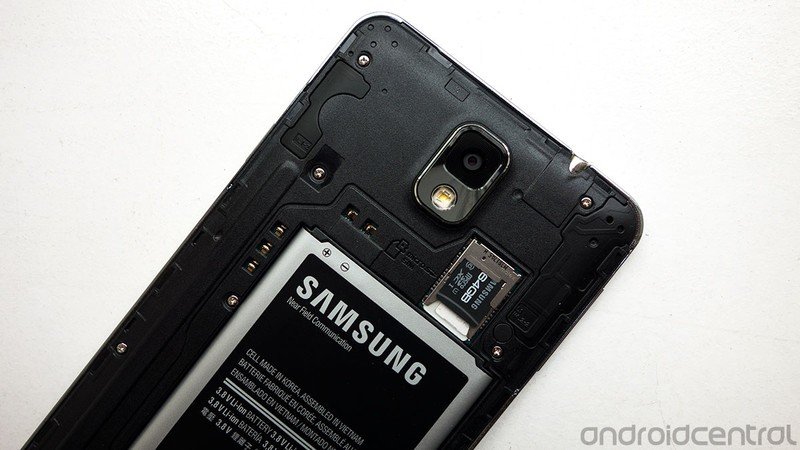
The Galaxy Note line has a track record of delivering excellent battery life, and we’re happy to report that the same is true of the series’ latest iteration. The Note 3 is fitted with a removable 3200mAh battery, only a moderate step up from the Note 2’s 3100mAh unit, but a hefty battery by smartphone standards nonetheless.
We had real trouble killing the Galaxy Note 3 off in under a day, even with heavy usage
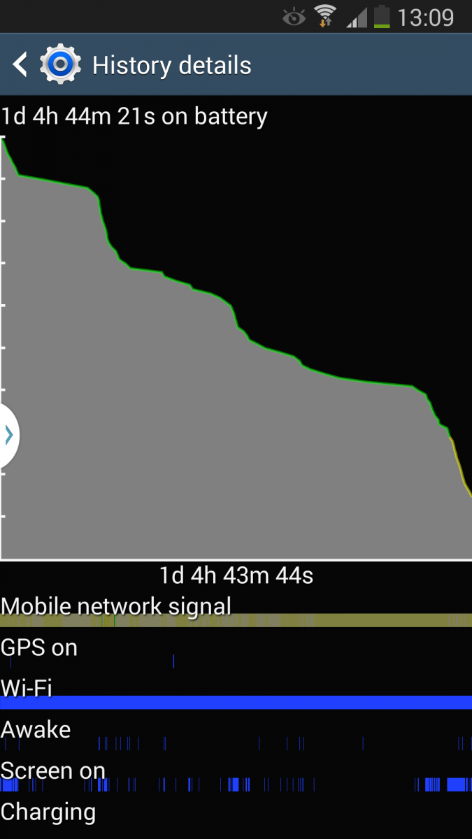
We had real trouble killing the Galaxy Note 3 off in under a day, even with heavy usage. Our first proper battery rundown lasted just under one day and five hours, which got us to 15 percent charge with a little over five hours screen-on time. During this time our usage consisted of some 4K video recording, taking a hundred or so photos, browsing the web and checking social networks over LTE, HSPA and Wifi — with a little bit of Google Play Music streaming thrown in for good measure. (Brightness was set to automatic, with the adjustment level set to +5.)
On subsequent days with more moderate usage we’d frequently hit the 24 hour mark with 40 to 45 percent still remaining. So we feel confident in saying that unless you’re going completely nuts, you’re going to be hard pushed not to get a full day’s use out of this thing.
As a Snapdragon 800 device, the Note 3 also benefits from Qualcomm’s Quick Charge 2.0 tech, and we were frequently surprised to see how quickly the Note 3 was able to charge itself using the bundled 2A wall charger. On top of that, the fact that the battery’s removable gives you the option of extending your time away from a wall socket even further by packing a spare.
Galaxy Note 3 camera review
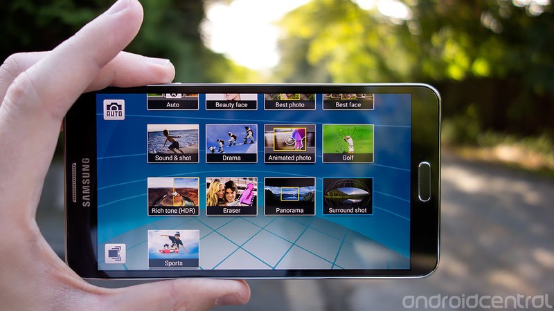
The Galaxy Note 3 has a 13-megapixel rear camera in addition to a basic 2-megapixel front-facer. As far as we can tell, the Note 3’s camera capabilities are almost identical those of the Galaxy S4, and the Note shares the various strengths and weaknesses of that device. Overall, it's a great all-rounder that’s capable of producing some fantastic looking images. It may be superseded in terms of raw optics by the likes of the Nokia Lumia 1020 and Sony Xperia Z1, but the Note 3 is more than up to the task of general smartphone photography, and it’s pretty versatile to boot.
The Note 3’s camera capabilities are almost identical to those of the Galaxy S4
Colors are generally accurate, if slightly exaggerated in some shooting modes, and Samsung’s software does a good job of eliminating visible noise without being too heavy on fine details. Details do quickly melt away in low-light conditions, however the option to automatically switch to night mode helps out here to some degree.
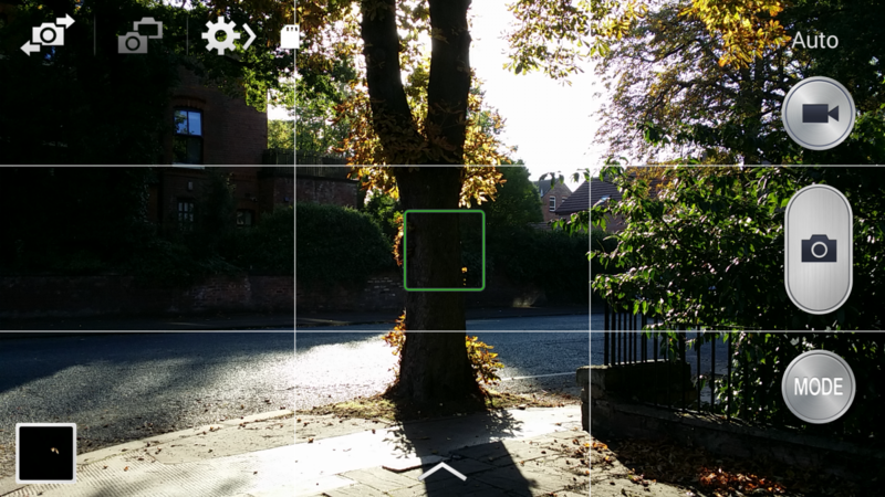
The familiar, Galaxy Camera-inspired Samsung camera app is back, and it’s still one of the best Android camera apps out there. The “mode” button gives you quick access to 13 different shooting modes, including some favorites from the S4, such as the “Animated photo” GIF creator and “Eraser shot,” which lets you eliminate unwanted passers-by and photobombers. While useful, these fancier photo tricks require a little setup, and so aren’t ideal for time-sensitive captures.
While the Galaxy Note 3’s camera doesn’t have OIS (optical image stabilization), there are software stabilization modes you can activate for photos and video. We didn’t notice any significant changes with this feature turned on, however.




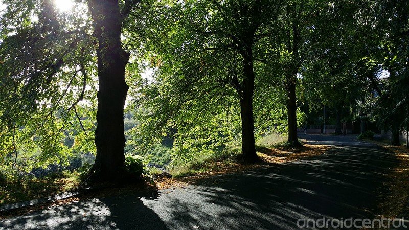





The subtle shutter lag present on the Galaxy S4 is significantly reduced
So what’s new? Well, the main differences come down to the extra CPU horsepower delivered by the Snapdragon 800 chip. The subtle shutter lag present on the Galaxy S4 is significantly reduced, if not completely gone. HDR and panorama shots, subject to a few seconds of “processing” dialogs on the S4, capture almost instantly on the Note. And then there’s the big one — 4K video.
The Snapdragon 800-powered Galaxy Note 3 can record video at up to 3840x2160 resolution, which is most likely a higher than your TV or computer monitor can display. So why bother? Well, we were initially keen to dismiss the idea of 4K video on a smartphone, but since testing it we’ve been impressed with the quality of “Ultra HD” footage the Note 3 can record. Even downscaled and viewed on a 1080p display, the huge jump in video quality is plain to see.
Right now, for many things, 4K is probably overkill
The main reason the Note 3’s 4K video looks so good is because it doesn’t half-ass the bitrate. (Basically, the amount of data used to represent each second of video.) The phone produces 4K footage with a bitrate of 48Mbps, compared to around 17Mbps for 1080p video. A high bitrate means sharp video that takes full advantage of the 3840-by-2160-pixel canvas. The other side of the equation is that 4K video is highly demanding of the phone’s storage — just five minutes of 4K video will produce a file just shy of 1.5GB. (And that’s actually the limit for each recording — you can’t shoot more than five minutes of 4K in one go.)
Right now, for many things, 4K is probably overkill. But there’s actually a compelling argument for shooting ridiculously-detailed video on a smartphone. If you care about what you’re shooting, why wouldn’t you want to capture it in the highest possible quality? Obvious examples include parents using smartphones to record their kids, or travelers using them to capture a place they may never return to. Why turn down the chance to capture these things with as much fidelity as possible, even if the means to play them back at full resolution isn’t quite mainstream yet?
Another new camera feature on the Note 3, Surround shot works like Google’s Photosphere or LG’s VR Panorama feature, creating a 360-degree image that captures everything around you. Like Photosphere it takes some time and practice to get right, and it’s trickier than shooting a regular panorama. But the results are just as rewarding when you get it right, and Samsung’s software seems to be a little more tolerant of movement and alignment issues than Google’s Photosphere.
Helpfully, the Surround shot camera gives you a rotating sphere that makes it clear how many tiles you’ve filled in, as well as whether you’re missing any. That helps to avoid unsightly black gaps in your image from missed captures. Once you’re done, you can view your Surround shots in the Gallery app, or share them to Google+ where they’re viewable as Photosphere images.
So the Galaxy Note 3 takes the proven Galaxy S4 camera experience and augments it with quicker captures, less waiting around for stuff to happen and a couple of important new features, like 4K video and Surround Shot. In summary, it's a highly capable mobile camera.
The bottom line
In late 2013, the prospect of owning a 5.7-inch phone is more reasonable than it’s ever been before. This year's consumers can pick up a high-end, big-screened smartphone like the Galaxy Note 3 without sacrificing too much in the way of usability. Part of that is down to the shape of the device, its reduced weight and trimmed-down bezels — and Samsung’s done a great job at creating a 5.7-inch phone that’s about as hand-friendly as you could realistically expect.
Relatively speaking, there’s now a smaller hardware gap between traditional high-end smartphones and oversized devices like the Note 3 than was the case two years ago. Compared to our time with the original Galaxy Note in 2011, our Galaxy Note 3 review process has seen us fixating more on build quality and software capabilities than on the challenges involved with holding and using this type of device. That’s because having a big phone isn’t such a big deal anymore. The market has adjusted, and so have we as smartphone users.
So should you buy a phone as big as the Galaxy Note 3? Well, that still depends on what kind of consumer you are. As much as oversized smartphones are more mainstream than ever, there are still trade-offs to be made. Unless you’ve got big hands, the Note 3 will be a device you use with two hands, not one. There’s also the additional bulk to consider — the Note’s going to take up more space in your pocket or bag than a regular-sized smartphone.
In exchange for the extra heft, however, you get a highly compelling piece of technology. The Galaxy Note 3 offers the best build quality of any recent Samsung phone, some of the fastest internal hardware to be found in any Android device, triple-A battery life and one of the finest smartphone displays out there. Not only is it the best Galaxy Note yet, we’d argue it’s Samsung’s best handset yet.
It’s big and brash and expensive — but it's also brilliant.
Samsung also sits ahead of the pack when it comes to software for larger smartphones. The new software additions on the Note 3, though numerous and potentially confusing, add value and make sense considering the kind of device it is. The focus on multitasking and helping users get more out of the S Pen was a sensible choice, and one which propels the Note 3 ahead of the big-screened competition. Now if only Samsung could apply this kind of focus to its overall UI design.
Unsurprisingly, the price of admission for this sort of device is relatively high. In the UK, you’ll pay north of £600 ($975) for an unlocked SIM-free Galaxy Note 3, and if you’re buying on-contract than then your carrier will pass this cost onto you some form or other. This is a device that requires deep pockets — both literally and figuratively.
It’s big and brash and expensive — but it's also brilliant. And whether you're a power user looking for bleeding-edge specs or a professional seeking a larger screen with stylus-based productivity features, the Galaxy Note 3 is the best device in its class, and a phone that's earned itself an enthusiastic recommendation.

Alex was with Android Central for over a decade, producing written and video content for the site, and served as global Executive Editor from 2016 to 2022.

