Samsung Galaxy Note 10.1 - 2014 Edition review
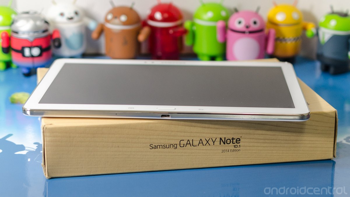
it's time for Samsung's yearly refresh of the popular Note series, and this go-around we're going to take a good look at the big boy of the bunch — The Samsung Galaxy Note 10.1 - 2014 Edition. Which we're going to call the Note 10.1 for the rest of this review.
We first saw the Note 10.1 back in Berlin at IFA 2013, and we were impressed with the thinness, the responsiveness and above all the beautiful 2560 x 1600 screen. This automatically addressed our biggest complaint about it's predecessor, namely it's 1200 x 800 resolution. Through all the rage on the Internet about LCD versus AMOLED, everyone can agree that Samsung is capable of building wonderful displays. We knew this was going to be one we wanted to look at. We like it when a product puts us all into full-on Android-nerd mode. And now is our chance.
You'll have your chance soon, because the Note 10.1 will be available starting October 10, in two Wifi-only models. You'll pay $550 for the 16GB version, and $600 for the 32GB version. That's a lot of money for anything. Hit the break and decide if it's worth it.
Galaxy Note 10.1 - 2014 Edition forums
A walkthrough
The Note 10.1 also addresses one of our other complaints about the original — the construction. While the first 10-inch Note felt flimsy and delicate, the 2014 edition is much more sturdy. You have a faux-chrome band around the entire edge and the plastic used for the back of the tablet is thicker and textured. It's a much nicer feeling tablet all around.
Another change from last year's Note 10.1 is the addition of a physical home button. You'll find it on the bottom bezel, along with two capacitive buttons (menu and back) that now work with the S Pen. Whether Samsung wanted a unified design for esthetic reasons, or for a common set-up for the software team we don't know, but the on-screen buttons from the original are no more.
Let's have a look at what makes this tick.
Be an expert in 5 minutes
Get the latest news from Android Central, your trusted companion in the world of Android
The hardware
A 10-inch tablet is one jumbo piece of glass, and presenting it the right way is important. We mentioned the band around the edge of the tablet as well as the textured (leather-textured, if you will) thicker back, and they all meet on the sides of the Note nicely. The plastic rolls over the edge of the trim band, and the trim band rolls over the edge of the glass. All the edges are rounded, but you get an angular feel rather than the rounded feel the last generation of Note devices gave off. The corner radius is also smaller, making the Note look rectangular over all. It's a good look. Our unit is in bright white, which seems to be easy enough to keep clean.
This is one of the nicest full-sized tablet screens out there
Nestled along that chrome-styled band are the controls, ports and speakers. The bottom of the device has a microUSB (not the 3.0 version in the Note 3) smack in the middle, a microSD card slot and speaker grill on the right, power, volume and IR across the top, and a 3.5mm headphone jack and second speaker to the left. The position of everything is fine and reachable. It's not as if you're going to use a 10-inch tablet one-handed anyway.

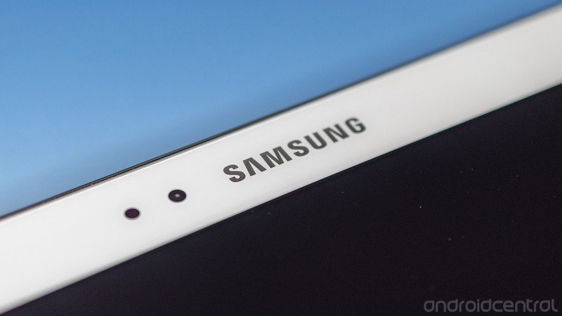
Perched in the upper right corner is the S Pen. Two things users of other Note devices will appreciate right away are that it will go into it's cubby-hole either direction (see the Samsung logo in the image above) and that it's slightly thicker. It gives it a bit better feel with a little more meat to grab onto. It's also sporting more features in the software, and the Wacom-powered digitizer is running at an outstanding 2560 x 1600 resolution. These improvements make the S Pen the whole reason for picking up a Note 10, and it's the device's killer feature.
The screen
The display is great. It's clear, crisp, and the resolution makes watching video or reading text a wonderful experience. Billed as a "Super clear LCD" the capacitive touch screen displays 16 million colors with a 2560 x 1600 resolution that gives the Note 10.1 a whopping 299 ppi density. It displays those colors well, with special Dynamic and Movie modes as well as an Adaptive mode that helps determine which setting is optimal. You'll like this screen, and it's one of the nicest full-sized tablet screens out there.
The engine
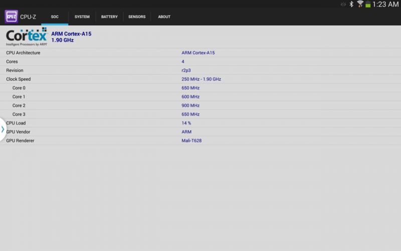
Under the hood you have the Exynos 5420 paired with 3GB of RAM. This makes the internals the pinnacle for spec junkies and hardware nerds alike, because this is the first we've seen of either. The 3GB of RAM is easy to understand, you have an extra GB to do more things faster, making the TouchWiz experience better. The CPU itself is pretty special, because of its capability to be a true eight-core processor. It can use the Heterogeneous Multi-Processing (HMP) big.LITTLE model, which will allow any or all of the cores to operate at will.
In this model, the kernel is aware of both the quad-core A7 cluster and the quad-core A15 cluster, and a heterogeneous aware scheduler will run the cores independently as needed. In addition, the Exynos 5420 also enables a fix to the cache coherency interface, enabling the CPU cores to work more efficiently with the Mali T-628 GPU.
There's no word on whether this will be enabled at launch or if users will have to wait for a software update to enable them. Our unit appears to only allow four cores to be enabled at once, and looks to be running the old-style kernel scheduler. We've reached out to Samsung for full clarification now that the press blackout has lifted.
The full specifications
- Platform: Android 4.3 with TouchWiz
- Display: 10.1-inch Super clear LCD with 2560 x 1600 resolution, 299 ppi
- Memory: 3GB RAM; 16/32/64 GB storage; microSD card slot
- Camera: 8MP rear with LED flash; 2.0MP front
- Connectivity: 802.11 b/g/n/ac dual-band Wifi; Bluetooth 4.0; A-GPS and GLONASS
- Sensors: Accelerometer; proximit; compass
- Battery: 8220mAh Lithium Ion
- Dimensions: 243.1 x 171.4 x 7.9 mm, 535 grams
The software
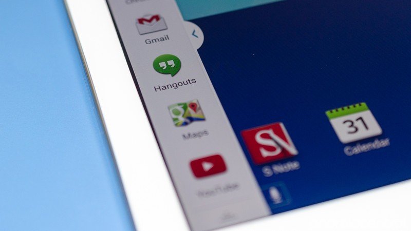
You're buying a Samsung tablet if you pick up the Note 10.1, so you had better expect lots of colorful tweaks and software additions entwined into Android. Everyone has an opinion about TouchWiz, but with this tablet you're using it whether you like it or not if you want the S Pen features and support. I have to advise you to not buy this if you want to wipe it clean and install CM on it. Instead, save a couple hundred dollars and buy a tablet without the S Pen.
each version of TouchWiz looks a little more refined than the last
We'll stay out of that debate and instead focus on the out-of the-box experience, which isn't bad. There are tiny issues like animations that seem to flutter (that'd be less than a stutter in Jerry's dictionary of made-up meanings) on occasion, or a few millisecond pause when you want to open Air Command while the UI sound plays, but for the most part things are smooth and fluid. This is difficult to pull off on a 10-inch tablet, because the screen elements are in our field of vision longer. We notice every tiny slowdown or glitch.
TouchWiz is also slowly maturing, and each version looks a little more refined than the last. Special touches like the walkthrough video that plays when you first use S Note are a nice touch, and we hope Samsung continues down this path. You still have to contend with some of the things you may find irritating, but you'll have that with any operating system. We're not going to say TouchWiz is better or worse than any other flavor of Android, but we will say it's better than the last version of TouchWiz — and that's what matters.
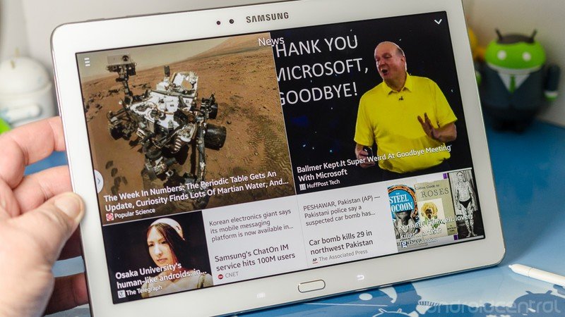
There are also some big new features built into the operating system. My Magazine is a very nicely done Flipboard clone, complete with news, personal data, social networking and local information built into the flip-card interface. Think of it as Blinkfeed on steroids, with more data in more categories. The two drawbacks here are that you can't add your own sources, and like Blinkfeed, you can't shut it off if you would rather not use it.
The full suite of Samsung apps and features are available, just as you would expect. Multi-window applications are there and work as designed, facial and eye tracking to keep the screen from blinking out are there, Adaptive sound, blocking mode, nearby devices — all that you saw from the previous Note devices is still around and minus some small improvements works just the same. You'll feel right at home coming from a last-generation Note tablet.
Air command
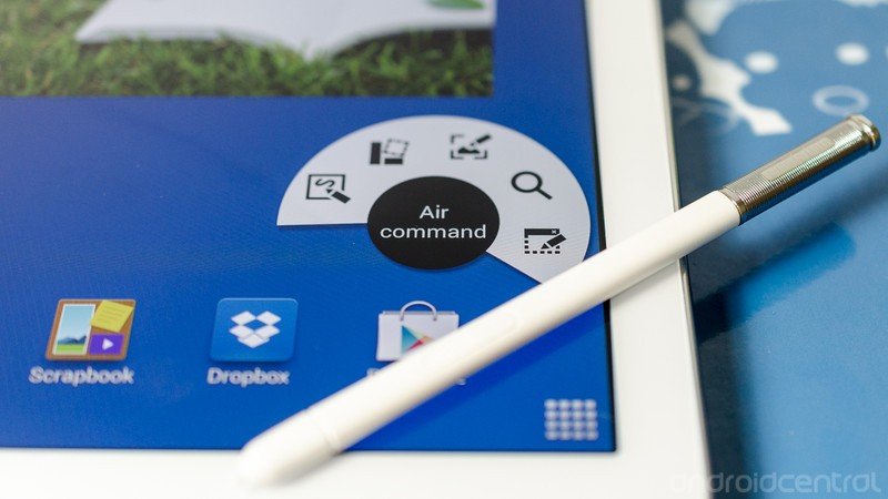
Air command encompasses the new S Pen features, and makes for a fine addition to the Note software. When you remove the S Pen from its holder it will automatically open, or you can just hover the S Pen over the screen and tap the button to activate it.
It's a simple semi-circular menu that shows you the five new powerful features. There doesn't seem to be a way to trigger it without the S Pen, but since most of the features require you to use the advanced stylus, we'll be forgiving. On the Air command window, from left to right:
- Action memo allows you to write with the S Pen, then place your text into an actionable memo. You can create a contact, add a web link, an email address, a location or add it to a scrapbook entry. The software works surprisingly well, provided your handwriting isn't too sloppy.
- Scrapbooker allows you to attach any sort of media to a scrapbook note, simply by drawing around it with the S Pen. It captures anything on the screen within the boundaries of your container, and it's intelligent — for example it will save a YouTube video as a video.
- Screen write lets the user save an annotate what they see on the screen with a variety of brushes and tools for decorating. It can be fun, but it's also a powerful tool for sharing ideas or instructions.
- S finder is a new way to search your content and the web, using variables like time or content type. Admittedly, we haven't had the Note 10.1 long enough to grow a large library of on-device content, but initial testing looks very positive. We'll continue to try this until we send the unit back to Samsung.
- Pen window works by drawing a window outline, then choosing from a list of pre-installed apps — calculator, alarm, YouTube, contacts, ChatOn, Hangouts and the stock Web Browser — to fill it with. This window is fully actionable, staying above the rest of your displayed content. You can resize or move the window at will, and close it with a simple tap. I can tell you from experience it works very well with Google Hangouts, and I'm going to miss the feature when I send this one back and return to my Nexus 7.

Another addition worth mentioning is the full Knox security package. Users are able to create a separate and secure instance of the OS, complete with its own secure App store. Once installed and configured, your Knox secure container is just a tap in the status bar away. We're curious to see how well this holds up after some large-scale adoption with these new Note devices.
All in all, this is the best version of TouchWiz yet. That may not be the best praise in the world, but it's a direction we like to see Samsung moving in and we think you will as well.
The camera
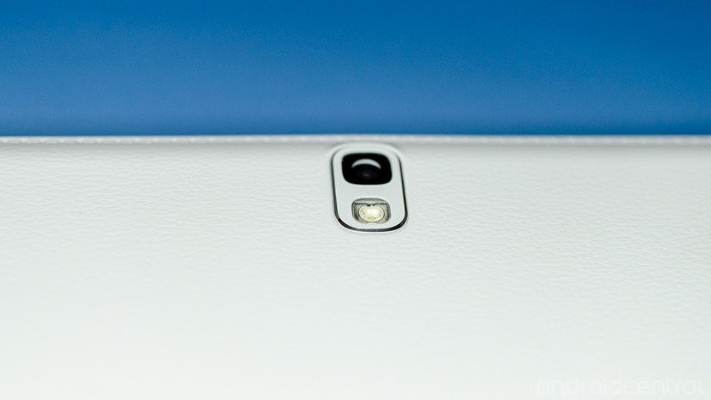
Please don't be that guy. While the camera in the Note 10.1 is fairly capable under perfect conditions, it's still cumbersome and pales when compared to the shooters in even the average smartphone. The 8MP sensor gets confused in bright light, often over exposing shots and delivering blurry pictures. Other times, it takes pictures that are pleasant to look at, and once in a while it will take an excellent picture.
The front facing camera is adequate for video chatting, which is exactly what we like to see in a front facing camera. Five stars here, would use again. The camera software is the same award-worthy software we see in the latest Samsung phones and tablets, with multiple shooting modes and plenty of adjustment.
The video cameras are nothing special, as you would expect. They will take average looking video at 1080p, but again chances are that your smartphone will do a better job and be easier to manage. One interesting addition to the rear camera is a fast motion mode, which creates time lapses at 2x, 4x or 8x. These are output at the full 1080p quality. See an example below.



The verdict
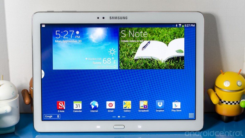
Right up front — this is a worthy upgrade from the original. It's faster, better built, and has better S Pen functionality. That's a no-brainer and if you're looking to upgrade last-years model you can buy with confidence. You're the power user Samsung has in mind for the Note series, and the 10-inch version fills a legitimate need for you.
Conversely, if you're looking for a tablet and would never use the S Pen features, don't let the great screen lure you in. It's beautiful, that's true, but you'll be paying a premium for features you don't want or won't use. The next big thing, possibly even from Samsung may be a better match for your needs.
I'm intrigued by the Note series. I see situations where the S Pen could be a huge time saver, and think it can boost the productivity factor of what is basically an entertainment portal. Artists, musicians, teachers, construction workers, warehouse employees — the list goes on and on of people who may find the Note features worthwhile and useful in their day-to-day life.
A blogger who likes to fish isn't necessarily on that list, but I'm very much looking forward to an 8-inch Note refresh (I prefer the smaller tablets to the larger) so I can enjoy the S Pen functions. The poor screen and flimsy build of the last model have been addressed, and for most folks — provided you'll use the features — the Note 10.1 will offer a long, useful life.

Jerry is an amateur woodworker and struggling shade tree mechanic. There's nothing he can't take apart, but many things he can't reassemble. You'll find him writing and speaking his loud opinion on Android Central and occasionally on Threads.
