Roundtable: Pebble Smartwatch

I, Phil Nickinson, hadn't been a watch-wearer for years. I'm still not convinced I'm one now — strapping a timepiece onto your wrist doesn't feel particularly 21st Century — but here I am, with a Pebble proudly displayed on my arm. And I'm not alone. Myself, Jerry, Alex, Andrew — Pebble wearers, all.
It certainly took long enough, right? Pebble has been the darling of the "crowdfunding" world since it launched its $100,000 campaign on Kickstarter on April 11, 2012 — and walked away with more than $10.2 million in backers' money just 37 days later. Fast forward more than a year and watches finally started shipping to those who pledged. In August 2013, Pebble found itself on sale at Best Buy.
Now? It's safe to say the Pebble made it, albeit in a limited fashion. Samsung has since come into the game with the Galaxy Gear smartwatch, but to lukewarm reviews. So there's still room for the upstarts.
We've yet to really weigh in on the Pebble. Given that it's been out for a bit now, we're going to do things differently and discuss it in more of a roundtable fashion. So with that, we present our collective views on the Pebble smartwatch.
First and foremost, this is a watch. Let's talk about the look and feel of the Pebble as a timepiece.
Jerry Hildenbrand
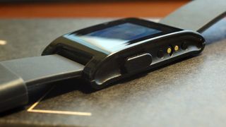
The Pebble is one of those items where you're paying for the function, not the materials or design. It's not ugly, but a square (more or less) piece of plastic and a silicone rubber strap aren't why you're buying the Pebble. You buy the Pebble because of the way it extends the screen of your smartphone.
It's fairly comfortable and is "easy" to wear. I take mine off at night, but that's not really a requirement for comfort's sake. The e-ink display works well in this configuration, especially when paired with the basic black body and strap. You may not win any fashion awards for wearing the Pebble, but you will get noticed.
Be an expert in 5 minutes
Get the latest news from Android Central, your trusted companion in the world of Android
Alex Dobie
Let's be honest, the Pebble isn't much to look at. It's basic, plasticky and utilitarian. The screen is small, monochrome and easily scratched, and the strap is a basic (though comfortable) strip of rubber. But you're not paying for what it looks like, you're paying for what it does — that is, primarily, the convenience of having notifications on your wrist.
It's comfortable and functional, but it's not going to turn any heads. You could get a better-looking watch for your $150, for sure, but that's not really the point. Generally speaking, traditional watches (dumb watches, if you will) tend to prioritize form over function. They're fashion items after all, and that's their job. The Pebble is the opposite, and that takes some getting used to. And it's going to be interesting to see where the line between looks and brains ends up being drawn on future smartwatches. In this area, Apple's the one to watch.
Andrew Martonik
Nobody will ever see a Pebble on your wrist and think it's a traditional analog watch.
Nobody will ever see a Pebble on your wrist and think it's a traditional analog watch. The upside of that is people may think you have some super cool smartwatch (you do), but the downside is this device doesn't exactly fit with attire for every situation. Depending on your color choice it isn't going to stand out too much given its size, but this certainly isn't a fashion statement just yet.
Putting aside the fact that it looks kind of … well, nerdy, the Pebble feels great on the wrist even with its included band (which can be changed as well). It's thinner and lighter than some of the other smartwatch options, and has even been comfortable enough for me to wear while on the computer and while sleeping — two things that larger watches of mine just don't fit with.
Phil Nickinson
Let's face it — you get what you pay for. And the Pebble's design clearly puts function over form. That's not to say there wasn't any thought put into it — the button scheme is simple and intuitive. But the watch itself is gaudy. I tend to think it's not unlike those of us who wear it — more than capable, but a little awkward.
Being able to swap out bands is a big thing, though. And I completely expect a sexier design in whatever is to come from Pebble.
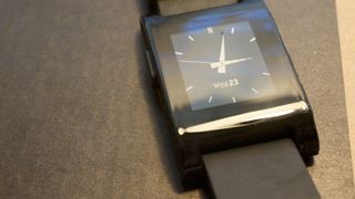
This isn't exactly a $20 Timex, though. The Pebble's currently going for $150. It's a bit of an investment.
Jerry Hildenbrand
You buy a Pebble because of what it can do. There are plenty of other $150 watches that look better, never need recharging, and wear just as easy as the Pebble. But they don't tell me much more than the time.
With a small, but diverse, selection of applications and custom watch faces, the Pebble can send and receive information from your Android and display it on your wrist. Android apps have been written that extend the notifications of just about any other app to the pebble, and even hardcore Android apps like Tasker are supported.
Alex Dobie
It's worth remembering who Pebble's target audience is: early adopters and tech enthusiasts.
You can spend as much money as you want (or indeed, as much money as you have) on a watch. So in the grand scheme of watches, $150 isn't a huge amount of cash. It's also worth remembering who Pebble's target audience is — for the moment, mainly early adopters and tech enthusiasts. And if you're the sort of person who, in 2013, wants or needs notifications , shortcuts and apps on your wrist, chances are spending $150 to get that isn't such a big deal.
Andrew Martonik
As we've discussed, you're clearly not buying the Pebble as a fashion statement or a timepiece. You buy a Pebble because you want a connected watch that can offer you more information at a glance and can be customized to the Moon and back.
You're getting a lot under the hood for your $150 investment, not to mention access to a wide ecosystem of apps and utilities through Google Play and the web that drastically expand the possibilities of what your Pebble can do. Let's also keep in mind that this is the first consumer-available version, making the price even more impressive.
Phil Nickinson
I have absolutely no qualms about paying $150 for Pebble. This isn't some mainstream smartwatch with economy of scale. This is an early entry into the wearables category, with software that works not just on a small number of Android phones — but damned near every Android phone, and the iPhone as well.
OK. So we've got an expensive watch that's more than a watch. It ties into our Android smartphones. (And, yes, the iPhone, too.) How are you using it with your phone?
Jerry Hildenbrand
Probably the most important thing for me, is that it can act as a Trusted Bluetooth device for my Moto X. This works out great, because another thing I use the Pebble for is notifications for Google Voice, SMS Messages, and calls. These notifications are ones I don't want to miss. That means I'm always wearing my Pebble, so my Moto X is always unlocked while I'm carrying it.
I also like how easy it is to program the Pebble. the SDK is well-documented and easy to use, and anyone who knows a little c (programming language) can write apps or build watch faces. For folks who don't feel like mucking around in source code, there's a great online watch face generator as well.
Alex Dobie
Most of the time my Pebble serves as email screening device. If I'm out and about, the Pebble keeps me apprised of the torrent of email going through my accounts, and makes it easier to dismiss unimportant stuff and act on anything urgent. Same deal, to a lesser extent, with IMs, texts and calls. And crucially, I can do all this without constantly checking my phone.
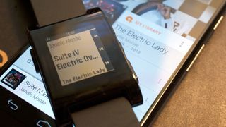
It's also a great Bluetooth remote control for music playback — tapping a button on your wrist is way easier than fiddling with a wire attached to your headphones, or again, pulling your phone out and unlocking it to change tracks.
Andrew Martonik
Whether my phone is in my pocket or across the room, I can easily see whether notifications are worth picking it up.
The Pebble is primarily serving its purpose as a smart notification device to let me know what's going on on my phone without turning on the screen. Whether my Nexus 4 is in my pocket or just across the room, I can easily see whether or not notifications are worth picking up the phone to interact with.
Beyond that, I've customized a couple of new watch faces with an app called Canvas for Pebble, which lets me take a look at the current weather, time, date and charge status of my phone right from the main screen. I have to admit I haven't jumped too deeply into the custom watch face scene on Pebble, but I can already see the crazy number of possibilities if you want to tinker with it.
Phil Nickinson
Jerry stole my Trusted Bluetooth Device thunder. (That's what I get for listing him first in this roundtable.) But he's absolutely right. It's a conspicuous accessory — as in I'll notice when it's gone missing — that serves as an optional bypass for my lock screen. And it works flawlessly in that respect.
Compared to, say, the Samsung Galaxy Gear, the Pebble is a pretty low-tech affair. Is that actually a good thing?
Jerry Hildenbrand
Sure, there's no camera or pedometer, but what is being sold works pretty flawlessly — and seamlessly — with Android.
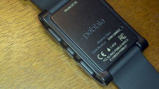
I prefer to think of it as minimalist, not low-tech. Sure, there is no camera or pedometer built-in, but what is being sold works pretty flawlessly — and seamlessly — with Android. The way your phone can communicate and control the Pebble is certainly a little limited, but the components all work very well. Sometimes, getting a few features just right is better than having a bunch of them without polish.
Alex Dobie
It's a strength and a weakness. Its low-tech nature means it can hit a price point way below Samsung's, while its slightly less advanced features means it's able to last for several days on a single charge, as opposed to just over 24 hours. But it runs the risk of being swept away in the tidal wave of fancier smartwatches that are sure to appear in the coming months. When Apple and Google come out with their own watches there's no doubt that Pebble will have to raise its game, or focus entirely on the low end of this emerging market.
Andrew Martonik
It may not have the flashy styling, AMOLED display or camera, but in terms of real-world utility and performance the Pebble just as capable as the Galaxy Gear. It does just a handful of things, but does them well without any fuss and has a real set of tools for expanding capabilities in the future. A device doesn't have to look over-the-top futuristic to be a tool you can really use in your daily life.
Phil Nickinson
It's good, perhaps, in terms of price, but that's about it. You have to strike a balance between available tech and reasonable price, and the Pebble, I think, has done a good job there, especially in the first generation. Pebble's going to have to grow up some if it wants to continue to compete.
The Pebble isn't for everyone. But how would you recommend it for someone not as educated in the ways of Android nerddom?
Jerry Hildenbrand
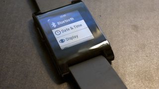
If someone wants a watch that does more than just tell the time, and doesn't mind spending a few minutes to set up an app on their phone, the Pebble is a nice — and relatively cheap — way to get there. It's also pretty fashion-forward on that level where techy, futuristic accessories look good.
Alex Dobie
Right now smartwatches aren't for everyone. That may change some day, but for the moment the Pebble is an early adopter product, and I wouldn't try to sell it to the "average" consumer. We're just not there yet. Similarly, if you can see that one of the things the Pebble does really well is a good fit for you, you probably won't need too much convincing to pick one up.
Andrew Martonik
For those who aren't as tech-savvy, I think the Pebble would be a good entry point into the smartwatch world. Before recommending it to someone I'd be sure that they were ready to tinker with it a little bit and understand its limitations out of the box, but in the end I think it can offer $150 worth of value to anyone if they're willing to see it for its core strengths.
Phil Nickinson
You need to be a little bit of a nerd to love the Pebble. And maybe that's how you position it.
Face it, you need to be a little bit of a nerd to love the Pebble. And maybe that's how you position it — as a gateway drug for becoming a true geek. It's a pretty quick and easy way to bring that sort of tech to your wrist — and there will be plenty more where that came from in the future, so why not get out ahead of it now?
Moreover, it's important for Pebble to get its name out in public as much as possible now — ahead of any second-generation device.
It's pretty safe to assume there's a new version of the Pebble in the works. What would you change in a follow-up?
Jerry Hildenbrand
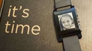
The design. Keep the low-cost, easy-to-configure plastic body so things can be made a little more svelte. The pushers (watch-geek word for buttons) could be smaller and better laid out, and the point of attachment where the strap meets the body could use a bit of design magic so it's not so bland.
I'd also be very interested in a "premium" version made of stainless with a more traditional watch look and feel, with a rotating bezel I can use as a timer in conjunction with a programmable extra second hand. Making the Pebble look a little less like a Casio DataBank and more like a Seiko or classic Timex would attract "watch people" in addition to "gadget people."
Alex Dobie
<
div class="quote qright">Swiping through notifications and messages is just easier than pressing a button on your wrist.
Let's see them implement Android 4.3's notification listener service, and give us truly universal notification content on our wrists. Let me see Skype messages as well as Hangouts. You'll need a way to manage all that stuff, of course, and that means more work on the Pebble app itself. On the hardware side, I want a touchscreen. For all our complaints about the Galaxy Gear, the main thing that makes it more natural to use than rivals is its touchscreen. Swiping through notifications and messages is just easier than pressing a button on your wrist. The next step for voice calls is the addition of mics, allowing you to use take calls as well as screen them.
Do all this without compromising on battery life, and they'll have themselves a sale.
Andrew Martonik
In terms of hardware, I'd like to see them keep the costs down by sticking with a simple and efficient design. Keep using plastic and rubber materials, and just build it well — there's no need to try and jump up in build materials and scare people away with a higher price just yet. On the display side, I'd like to see them keep the sidelit e-paper display to keep battery life high, but maybe they could kick up the resolution or even make a move to a color version to make it more appealing to a wider audience.
On the software front, while third-party developers have done wonders to implement notifications for all sorts of apps and enable tons of customizability, I'd love to see Pebble's first-party offering get bulked up. Again for that average user, the ability to take it out of the box and have notifications for all of the popular apps on your phone would be fantastic. Making it even easier to move content between your phone and watch will be a huge selling point in a Pebble refresh.
Phil Nickinson
Look, the design of the Pebble isn't anything special. (Nor is it particularly pebble-like.) I'd like to see some increased sophistication in design — while still keeping the cost down, if possible. But the two features I'd most like to see are the inclusion of a microphone and speaker — for calls and search — and the ability to act on notifications.
Being able to see emails on my wrist as they come in is great — but I still have to deal with them later. I want to be able to archive or delete from the Pebble. As of now, junk emails are magnified because you can't actually do anything with them. With the Pebble, you quickly learn that your e-mail is filled with far more crap than you might have otherwise thought.
I'm curious what Pebble could come up with if I were to give them an extra $50.
I'm curious what Pebble could come up with if I were to give them an extra $50. The e-paper display is plenty functional (and better on battery), but, dammit, that full-color display on the Galaxy Gear is what moves a watch from novelty nerd status to a full-blown tool. I'd love to see a microphone as well, the better to perform searches from your wrist.
Bonus round! What does Georgia from iMore think of using Pebble with her iPhone?
The Pebble is the first gadget to bring me closer to the Mission Impossible dreams of my inner geek. I wanted it the moment I saw it on Kickstarter, and then I waited, and waited, and waited, for it a ship. A year and some change later, and it was mine. The e-ink display works perfectly, even in bright sunlight, and the flick-to-backlight works just as well at night. The ability to swap watch faces costs me minutes (I refuse to say hours!) a day, and joyfully so.
The ability to view a message or email status with a casual, discrete look at my wrist is supremely useful.
The Pebble connected easily with my iPhone 5, thanks to Bluetooth, but I did have to toggle a lot to get my apps working with it, which was annoying. Also, iOS doesn't allow for as many features as Android does, and yes, I'm jealous about that. (Gloat away, Phil!) However, I mainly use the Pebble for messages, email, and music, and the ability to view their status with a casual, discrete look at my wrist is supremely useful.
My bane, of course, is battery life. I don't put the Pebble under excessive strain, but I do need to charge it every 3-4 days, which is a lot for a watch. (I'm used to charging my watches precisely never!) I'd love to see battery life improved in the future.
I'd also love to see Siri (or Google Now!) integrated with the Pebble so I could control it with my voice, especially while driving. I'm not convinced I need a camera on it, however. I'm not a spy, and I care about image quality enough that I'll use the camera on my iPhone when I want a photo.
It's not the Mission Impossible gadget of my dreams, but it is a sign we're getting closer!
